6 Canadian wind turbines: waffle plots and pictograms
In this chapter, we’ll learn how to read in data from an Excel file via a URL, create waffle plots using the waffle package, and write a subtitle with colored text to be used as an alternative to a traditional legend.
By the end of this chapter, you’ll be able to:
- Load data from Excel files, including those hosted online;
- Create waffle plots using custom icons; and
- Write your own source text function to keep a consistent style across different charts.
We begin by loading the packages required in this chapter.
As in previous chapters, we’ll again be using ggplot2 for plotting, alongside dplyr for importing and manipulating data, with glue used again for creating data-driven character strings. The sysfonts and showtext packages will be used again for loading and rendering different fonts.
This chapter introduces quite a few packages that we haven’t used yet. Try not to be overwhelmed by the number of new ideas introduced - we’ll use many of them again in later chapters to become more familiar with these packages!
-
GGally: for quick exploratory charts to look at relationships between variables. -
marquee: for richtext formatting in charts, similar to the way we’ve usedggtextin previous chapters. -
openxlsx: for importing data from Excel files. -
rcartocolor: a color palette package. -
readr: for importing data, including from both CSV and Excel files. -
stringr: for manipulating character strings. -
waffle: for creating waffle charts and pictograms.
6.1 Data
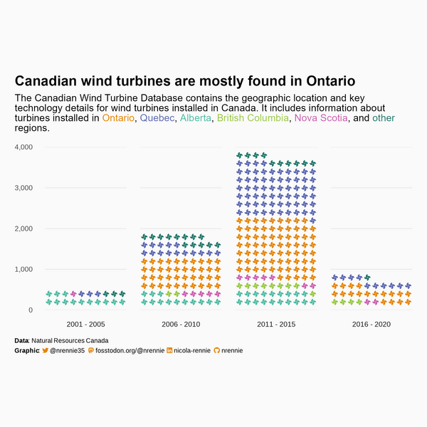
Back in October 2020, data on wind turbines in Canada from the Government of Canada Open Data portal was used as a TidyTuesday dataset (R4DS Online Learning Community 2023). The Canadian Wind Turbine Database provides information about wind turbines installed in Canada, including their power capacity and geographic location (Natural Resources Canada 2021). Rather than reading in the data using the tidytuesdayR package as we’ve done in previous chapters, let’s read in the data directly from the open.canada.ca website.
The Canadian Wind Turbine data contains information licensed under the Open Government Licence - Canada. You can search for more open data at search.open.canada.ca/opendata. See Chapter 11 for further discussion of open data sources.
6.1.1 Reading data with openxlsx
Though the readxl package (Wickham and Bryan 2023) package can be used to read Excel files stored locally, it doesn’t work for reading in Excel files directly from a URL. We could visit the relevant open.canada.ca/data/dataset website, manually download the file, and then read it in using readxl. Alternatively, we can use the openxlsx package (Schauberger and Walker 2023) which allows us to pass in a URL.
Of course, we still need to know what the URL of this file is. If you visit the following webpage for the wind turbines data (open.canada.ca/data/dataset/79fdad93-9025-49ad-ba16-c26d718cc070), and right-click on the link to the Excel file, you can then copy the link address. We save that link address as a character string called url. If you plan to download other datasets from the same site, it can be useful to save the main website as the base_url variable so that you can reuse this string later.
We then use the read.xlsx() function from openxlsx, where we pass in the url variable to the xlsxFile argument:
There are some features of Excel files that can make them more human-friendly but less computer-friendly:
- Multiple sheets
- Empty rows
- Merged cells
Luckily, the .xlsx file we’ve downloaded is both human-friendly and computer-friendly so we don’t have to deal with these issues right now.
Excel files may contain multiple sheets of data. You can use the sheet argument in read.xlsx() to specify the name or index of the sheet you want to read in. Using the sheet name is usually a little bit more robust, as it means your code can withstand (accidental) changes to the order of sheets.
The read.xlsx() function always skips empty rows at the start of the file. However, sometimes the author of the spreadsheet may add a title row then a few empty rows before the real data begins. You can use the startRow argument to specify which rows the data actually starts on.
Merged cells are hard to deal with because it means your data no longer fits into a nice rectangular structure. It depends on where the merged cells are, and what they contain, how difficult they are to deal with. If they’re at the top of the file (e.g., with the title information) then using startRow might be enough. Otherwise, setting fillMergedCells = TRUE in read.xlsx() means that the value in a merged cell is given to all cells within the merge (Schauberger and Walker 2023).
We don’t want to have to redownload the data from the URL each time we want to work on it (especially if the data may be updated), so let’s save a copy locally. We could simply save the Excel file (or we could have used download.file() instead of read_csv()). However, it would be better to save it as a CSV file instead because these files are smaller in size, and can be opened in a simple text editor. Luckily the wind_turbines data is well formatted - there are no merged cells, multiple sheets, or empty rows we need to deal with. This means we can save it as a CSV file using write.csv() with an appropriate file name (and setting row.names = FALSE to avoid adding an additional column of row names).
write.csv(
  x = wind_turbines,
  file = "data/wind_turbines.csv",
  row.names = FALSE
)
We can then use either read.csv() or read_csv() from readr to read the CSV file back in:
wind_turbines <- read_csv("data/wind_turbines.csv")The wind_turbines data has 6698 rows and 15 columns. The first few rows of the data are as follows:
head(wind_turbines)# A tibble: 6 × 15
OBJECTID `Province/Territory` Project.name
<dbl> <chr> <chr>
1 1 Alberta Optimist Wind Energy
2 2 Alberta Castle River Wind Farm
3 3 Alberta Waterton Wind Turbines
4 4 Alberta Waterton Wind Turbines
5 5 Alberta Waterton Wind Turbines
6 6 Alberta Waterton Wind Turbines
# ℹ 12 more variables: `Total.project.capacity.(MW)` <dbl>,
# Turbine.identifier <chr>,
# Turbine.number.in.project <chr>,
# `Turbine.rated.capacity.(kW)` <chr>,
# `Rotor.diameter.(m)` <dbl>, `Hub.height.(m)` <dbl>,
# Manufacturer <chr>, Model <chr>,
# Commissioning.date <chr>, Latitude <dbl>, …The OBJECTID column is a unique row identifier. The data has a row for each wind turbine - with some of the data given on the turbine level and some data on the project level. For the variables related to project level data, this means values can be repeated multiple times within a column for turbines in the same project.
The Province/Territory column specifies which geographic region the turbine is in, with the Latitude and Longitude column giving the exact coordinates. The Project.name gives the name of the project that each wind turbine is associated with, and Total.project.capacity.(MW) the total power capacity of the project in megawatts. The Turbine.identifier column gives a unique ID for each turbine - it is a combination of an abbreviation of the project name, and a number identifying the number of the turbine within the project (also listed in the Turbine.number.in.project as a fraction of the total number of turbines per project). The capacity (in kilowatts) of each individual turbine is given in Turbine.rated.capacity.(kW) (adding up the individual capacities for all turbines in a project gives the value in Total.project.capacity.(MW) multiplied by 100).
The rotor diameter and hub height of each turbine are given by Rotor.diameter.(m) and Hub.height.(m), respectively. The manufacturer and model are also given by the Manufacturer and Model columns. The commissioning date is given in the Commissioning.date column - it appears that some may be given on the project level, whereas others vary for turbines within a project. The Notes column contains free text data with additional information for some turbines. Most of these values are empty, but the column may provide information about whether the capacity of turbines have changed or assumptions about how values were calculated.
6.2 Exploratory work
There are quite a few variables that we might be interested in looking at here - particularly since there are several variables about individual turbines that might be related to each other. For example, do turbines with a larger rotor diameter have a higher capacity? What is the relationship between rotor diameter and hub height? Which manufacturers are most common? Which regions have the most turbines? We might also want to look at the spatial distribution of turbines across Canada since we have the geographic coordinates - we’ll look at plotting spatial data a little bit later in Chapter 11, Chapter 12, and Chapter 13.
6.2.1 Data exploration
Let’s start by exploring the hypothesis that wind turbines with a larger rotor diameter also have a higher capacity. We can make a scatter plot of these two variables as an initial step (see Figure 6.1). The Turbine.rated.capacity.(kW) column is currently a character column even though it contains numeric values, so we wrap the column in as.numeric() before plotting it:
plot(
  x = wind_turbines$`Rotor.diameter.(m)`,
  y = as.numeric(
    wind_turbines$`Turbine.rated.capacity.(kW)`
  ),
  xlab = "Rotor diameter (m)",
  ylab = "Turbine rated capacity (kW)"
)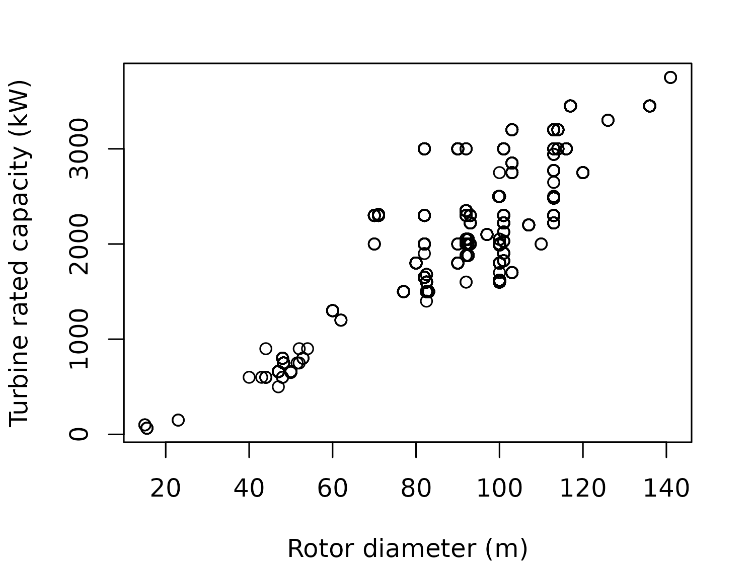
This scatter plot highlights a few issues:
-
We get a warning message about
NAvalues.Warning message: In xy.coords(x, y, xlabel, ylabel, log) : NAs introduced by coercionThis comes from the
as.numerictransformation of theTurbine.rated.capacity.(kW)column. If we inspect this column more closely, you’ll see that there are a few unusual values such as"1903/2126/2221". If we look at theNotescolumn for an explanation, we can see that these values exist because"Some turbines derated such that the farm has an maximum operating capacity of 180 MW". Unfortunately, we don’t know which individual turbines this derating applies to, which makes it difficult to create a scatter plot. The other issue with this scatter plot is that many of the observations are the same, but it’s not shown clearly on the plot. If we later wanted to fit some statistical models to explore this relationship further, a common assumption is that each observation is independent. That’s not true here - many individual turbines belong to the same project, and so are the same model with the same rotor diameter and capacity. Instead, we might want to group the unique values and use the number of turbines of a particular model as a weighting. This could be better visualized as a bubble chart, with the size of the bubbles showing the number of turbines in each diameter-capacity combination.
Remember that you can use View(wind_turbines) to inspect the data in a more human-readable format. In addition to looking at the data, obtaining summaries of the columns, and creating exploratory graphics with base R, there are many packages available to help with exploratory data analysis.
For example, the GGally package (Schloerke et al. 2024) makes it easy to create pairwise comparison plots and correlation matrices for the purposes of exploring some or all columns in your data (see Figure 6.2).

Let’s instead look at the number of turbines in each region, by creating an ordered bar chart. We use the table() function to get a count of the number per region, and sort() to order the counts from smallest to largest. We then use the barplot() function to make the chart, setting horiz = TRUE to make the bars horizontal for easier reading as shown in Figure 6.3.
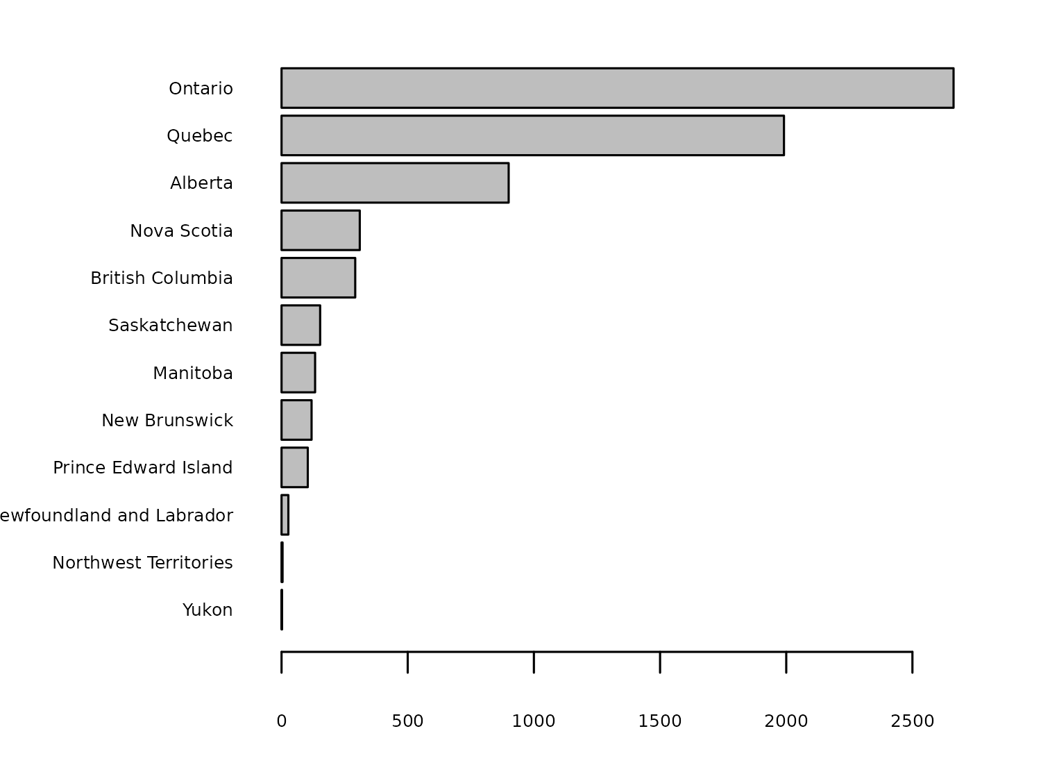
Most of the turbines are located in Ontario, but has this always been the case? We also have information on the commissioning date of each turbine. We could recreate this bar chart for different time periods to see how the geographic spread of turbines has changed over time. We can add wind_turbines$Commissioning.date into the table() function to create a stacked bar chart for each year:
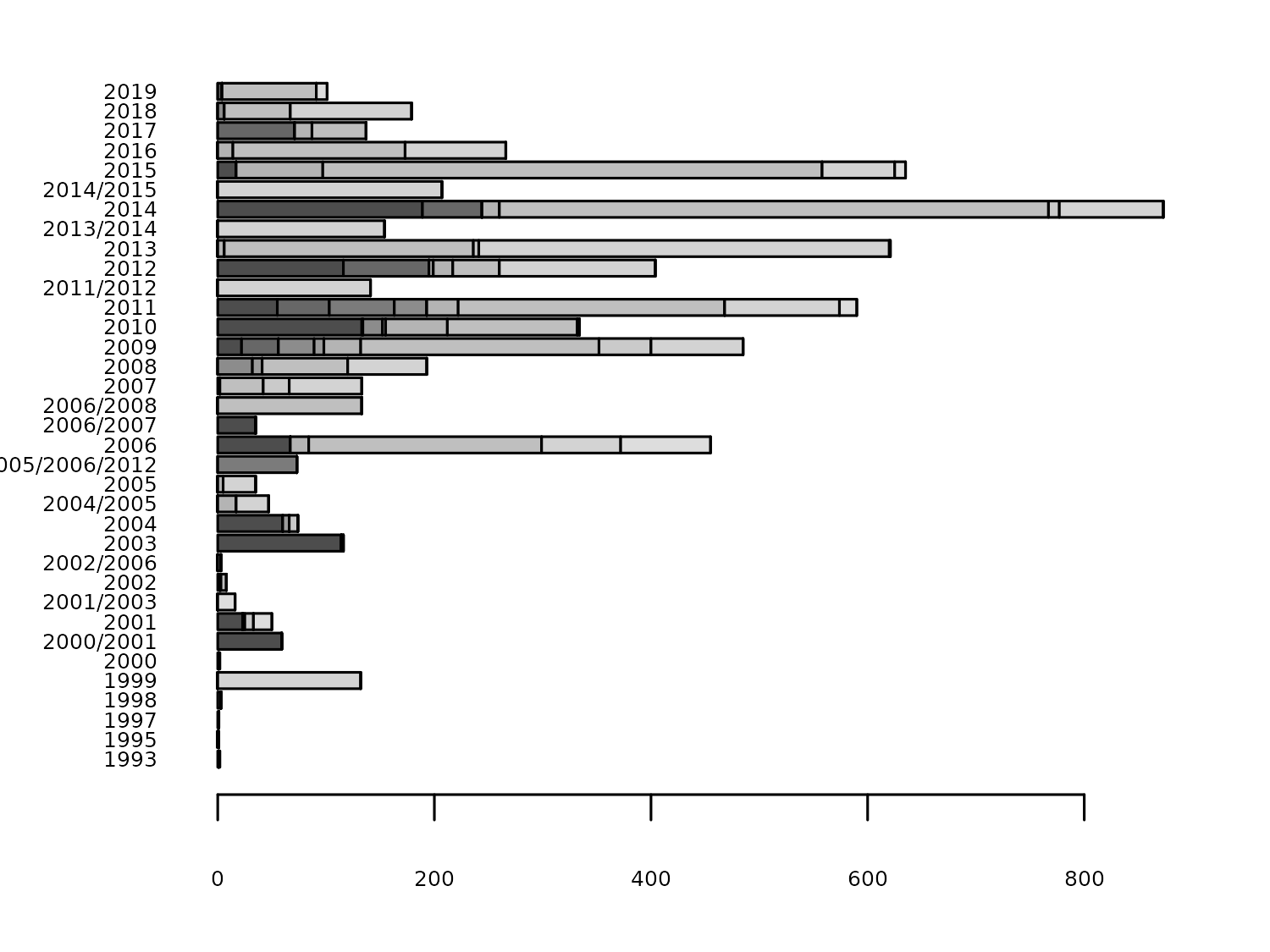
As you can see from the y-axis of Figure 6.4, the Commissioning.date isn’t always given as a year. Instead, it’s sometimes given as a year range. Let’s start drafting out a more aesthetically pleasing version of this plot before we deal with processing the Commissioning.date data.
6.2.2 Exploratory sketches
There are some years for which we have very few observations, and some turbines for which we don’t know the exact year of the commissioning date. Rather than plotting the number of turbines per year, let’s plot the number of turbines in different multiyear time periods. The choice of these time periods is open to the designer. For this visualization, let’s start by considering four, 5-year time periods: 2000-2004, 2005-2009, 2010-2014, and 2015-2019.
Rather than making a stacked bar chart for each year, which can make it difficult to compare one region to another, let’s look at an alternative: a waffle chart. Waffle charts are sometimes referred to as square pie charts. Most commonly, they are visualized on a 10x10 grid, with each grid square representing 1%. The colors of the grid squares represent different categories. The advantage of waffle charts over pie charts (and to some extent bar charts), is that it’s easy for a user to read the percentages - they can simply count the squares! The disadvantage is that if there is less than 1% of values in a category, there’s no easy way to visualize this (although partially colored squares are an option).
Waffle charts can also be used to show counts rather than percentages. For example, each square may represent a wind turbine and the color of the square the region it is in. For example, a waffle chart of counts might look something like Figure 6.5.
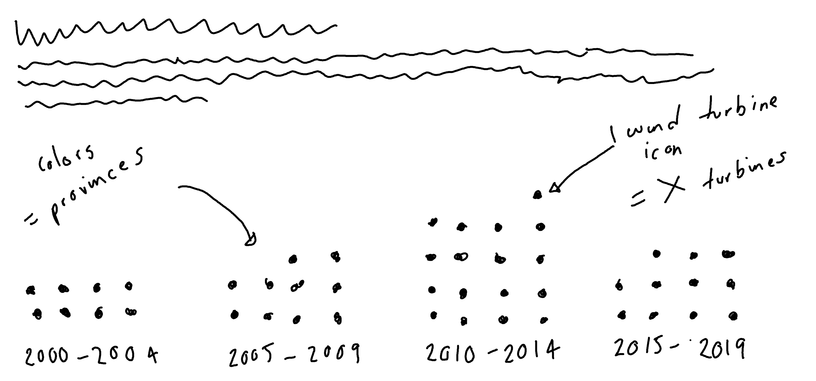
We can make two slight variations to this basic version of the chart:
We have 6698 observations to plot, which is a lot of individual grid squares. Instead, each square may represent some number of turbines, rather than just one.
Instead of plotting squares, we could use icons. For example, we could plot an icon of a wind turbine. This variation of a waffle chart can be referred to as a pictogram. The icons can be colored based on the region in the
Province/Territorycolumn. Instead of using a traditional legend that takes up lots of space, we could use colored text within the subtitle as an alternative.
6.3 Preparing a plot
In order to make a draft of Figure 6.5 using ggplot2, there are a few things we need to prepare:
- The
Commissioning.datecolumn needs to be processed to deal with the multiyear labels, and grouped into 5-year categories. - We need to decide how many wind turbines each icon will represent.
- Some of the categories in the
Province/Territorycolumn may need to be grouped together because they have very small numbers and might have fewer than the number of turbines represented by each icon.
6.3.1 Data wrangling
Let’s start by dealing with the Commissioning.date column. There are three types of values in here:
- Single year, e.g.,
"2019": this is the ideal scenario, and we don’t need to do anything. - Two years separated by a
"/", e.g.,"2001/2003": there are several options for dealing with this. We could either take the first year, the last year, or (if they are non-consecutive years) a mid-point of the year range. Here, we’ll take the last year since this means that all wind turbines with thatCommissioning.datewill definitely have been commissioned by that date. - Three years separated by a
"/"e.g."2005/2006/2012": this is again more complex, but we’ll take the last year for the same reasons as above.
Essentially, this means that:
- If there is no
"/"in theCommissioning.date, we do nothing. - If there is one or more
"/"in theCommissioning.date, we extract whatever comes after the last one.
Let’s make a function that does exactly that, called extract_after_last_slash(). The input for this function is a vector of character strings. We start by checking which elements of the input contain a "/" using str_detect() from the stringr package (Wickham 2023b). We then use str_match() from stringr in combination with a regular expression to extract the element after the last "/". If there is no "/", the output will be NA. The str_match() function returns a matrix with the same number of rows as the length of the input, where the first column is the complete match, i.e., the input. The second column contains the output we want so we use [, 2] to extract it. Finally, we use if_else() from dplyr, to specify if there was a "/" then use the output from str_match(); otherwise keep the original value.
extract_after_last_slash <- function(texts) {
  has_slash <- str_detect(texts, "/")
  extracted <- str_match(texts, ".*/(.*)$")[, 2]
  output <- if_else(has_slash, extracted, texts)
  return(output)
}If you’ve used the ifelse() function in base R before, you might be wondering why there’s a very similarly named function in dplyr and what’s different about it. The main difference is that if_else() is a bit more strict about checking whether you’re doing what you think you’re doing. For example, let’s say we have a vector x of length 4 and we want to replace the values in x that are equal to 0 with something else. If that replacement is of length 3, that doesn’t really make sense. Which value in the vector of length 3 should it use? The if_else() function highlights this issue with an error, the ifelse() function quietly uses the value in the same position.
Error in `if_else()`:
! `true` must have size 4, not size 3.[1] 1 5 2 3The if_else() function from dplyr also preserves types. If you put a Date into if_else(), then a Date is what comes out. That’s not always true with ifelse().
Now, let’s use our new extract_after_last_slash() function! Let’s start by using select() to keep only the columns we actually need: Province/Territory, and Commissioning.date. We then create a new column called Year which is the output of applying the extract_after_last_slash() to the Commissioning.date column. Initially, this column is still a character string so we convert it to a number using as.numeric():
turbines_year <- wind_turbines |>
  select(
    `Province/Territory`, Commissioning.date
  ) |>
  mutate(
    Year = extract_after_last_slash(Commissioning.date),
    Year = as.numeric(Year)
  )
Now let’s group the new Year column into categories. Our categories span 2000 to 2019, so we start by filtering out any rows that don’t fit into this time frame using filter() from dplyr. We then use case_when() from dplyr to actually construct the categories. Here, we make use of the seq() function. The seq(2000, 2004) code creates a vector 2000 2001 2002 2003 2004. If the Year is equal to any of those values, then it goes into the "2000 - 2004" category. And so on. Although R will automatically sort the year categories in the correct order since, in this case, the alphabetical order happens to match the desired order. However, it’s good practice to be explicit about what order the categories should have, so we can also set Year_Group to be a factor and specify the correct order.
turbines_year_group <- turbines_year |>
  filter(Year >= 2000 & Year <= 2019) |>
  mutate(
    Year_Group = case_when(
      Year %in% seq(2000, 2004) ~ "2000 - 2004",
      Year %in% seq(2005, 2009) ~ "2005 - 2009",
      Year %in% seq(2010, 2014) ~ "2010 - 2014",
      Year %in% seq(2015, 2019) ~ "2015 - 2019"
    )
  ) |>
  mutate(
    Year_Group = factor(Year_Group, levels = c(
      "2000 - 2004", "2005 - 2009",
      "2010 - 2014", "2015 - 2019"
    ))
  )
Let’s look at the Province/Territory categories. Using count() and arrange() from dplyr, shows us that there is a big imbalance between the categories:
# A tibble: 12 × 2
   `Province/Territory`          n
   <chr>                     <int>
 1 Ontario                    2662
 2 Quebec                     1859
 3 Alberta                     895
 4 Nova Scotia                 310
 5 British Columbia            292
 6 Saskatchewan                153
 7 Manitoba                    133
 8 New Brunswick               119
 9 Prince Edward Island        104
10 Newfoundland and Labrador    27
11 Northwest Territories         4
12 Yukon                         1
First, let’s rename the Province/Territory column to Region - a shorter name that will make it a little bit easier to work with. As well as the issue posed by small numbers in categories, 12 categories is also a fairly large number to visualize. We might choose to group together the 6 smallest categories. The choice of 6 is fairly arbitrary - but we want a balance between lots of categories with small numbers and few categories with very high numbers. We use mutate() and case_when() again, to change the value in Region to "other" when the region is one of the 6 specified values.
Then, we count up how many turbines were commissioned in each Year_Group and Region combination using count(). We also need to decide how many turbines each icon will represent. It will take a little bit of trial and error to decide on this value - depending on what resolution you want, and how big your final plot will be. Here, we used 20. This means we divide the turbine count by 20 to obtain the number of icons required, rounding the values, as we can only have whole icons.
We filter out any rows where the rounded count is 0, since these won’t be plotted. As an aside, it’s important to think about these values before we simply throw them away. For example, a region which had 9 turbines in a particular time period won’t show up on this plot - since 9/20 is less than 0.5 and so is rounded to 0. This is an unfortunate limitation of this type of waffle plot variation.
turbines_region <- turbines_year_group |>
  rename(Region = `Province/Territory`) |>
  mutate(
    Region = case_when(
      Region %in% c(
        "Northwest Territories",
        "Newfoundland and Labrador",
        "Prince Edward Island",
        "New Brunswick",
        "Manitoba",
        "Saskatchewan"
      ) ~ "other",
      TRUE ~ Region
    )
  ) |>
  count(Region, Year_Group) |>
  mutate(n = round(n / 20)) |>
  filter(n != 0)
The Region variable will be plotted alphabetically by default, but this is rarely the most useful ordering. Instead, let’s order by magnitude - with the exception of putting the "other" category last. We start by using the summarise() function to add up the number of turbines across the different time periods, getting a total per Region. We then arrange() them in a descending order (note the - in front of the n). We then filter() out the "other" category and stick it on the end after extracting the Region column using pull().
Now, let’s apply these new factor levels to the Region column using mutate(). Due to a quirk of the waffle package (Rudis and Gandy 2023) that we’ll be using to make our plot (it plots data in the order it appears in the dataset, rather than according to the factor levels), we also sort the data using arrange() from dplyr.
Our data is now ready for us to plot!
6.3.2 Installing Font Awesome fonts
Before we jump into plotting, we need to do one more thing. In Figure 6.5, we decided we would use icons in the waffle chart instead of just colored grid squares. So we need to find a way of using icons in R.
In Chapter 2, we saw how to load fonts into R using the sysfonts and showtext packages. Luckily, we can use a similar process here to load in an icon font. Font Awesome is a popular icon toolkit that provides scalable vector icons and social logos (more on this in Chapter 7) (Font Awesome 2024). You can download font files containing the freely available icons at fontawesome.com/download, selecting the Free for Desktop option. This will download a zip file containing several font files. For this chart, we only need one of those files Font-Awesome-6-Free-Solid-900.otf. Save this .otf file somewhere you can find it again - such as in a project folder called fonts.
Then, we’ll use font_add() from sysfonts (Qiu 2022) to load the font into R. The family argument is what we want to refer to the font as in R. The regular argument is the file path to the .otf file. We then use showtext_auto() and showtext_opts() in exactly the same way as we did for Chapter 2, to use showtext to render the text.
font_add(
  family = "Font Awesome 6",
  regular = "fonts/Font-Awesome-6-Free-Solid-900.otf"
)
showtext_auto()
showtext_opts(dpi = 300)waffle
The waffle package comes bundled with Font Awesome 5, and you can use the install_fa_fonts() function to help you install the font, as an alternative to the approach described here. Downloading and installing using the font_add() approach will give you access to a wider range of icons since it used the more recent Font Awesome 6 fonts, and it means you don’t have to install the font system wide - you only need to load it into R.
Now we’re ready to plot!
6.3.3 First plot with waffle
We’re going to use the waffle package (Rudis and Gandy 2023) to create our plot. Though the package includes the waffle() function which allows you to create a waffle chart directly from a data.frame, it also includes geom functions to allow you to build charts in the way you normally would with ggplot2. The geom_waffle() function can be used to build traditional waffle charts with grid squares, and the geom_pictogram() function is used for waffle charts with icons, i.e., pictograms. We’ll use geom_pictogram(). This means we start our plot as we normally do, by passing our data into ggplot().
We then edit the aesthetic mapping in the geom_pictogram() function, where we specify the label and color - both mapped to the Region column. This might seem slightly unusual because we don’t want the icon to vary with region. Instead, we want to use the same icon for all categories. However, geom_pictogram() expects label to vary by category, so we map it to region, and we’ll later use scale_label_pictogram() to make them all the same icon. The values argument is also a required aesthetic. We use the n column in the data to specify how many icons should be plotted for each category. The x and y coordinates are automatically calculated when we use the geom_pictogram() function, so we don’t need to map these out in the aes() function.
We also edit a few other parameters of the geom_pictogram() function. By default, pictograms are stacked horizontally as this is often easier to read (similar to horizontal bar charts). However, it’s also very common to put date variables on the x-axis. Setting flip = TRUE will stack the pictogram categories upward, and allow the date categories to go on the x-axis. Setting n_rows = 10 means that each row of the pictogram will contain 10 icons (remember that we’ve flipped rows and columns here). We can edit the size of the icons in the same way we would edit the font size in geom_text(), for example. It might take a little bit of trial and error to find the right size to make sure icons are large enough to see, but don’t overlap. We also need to state that the icons come from Font Awesome 6 by setting family = "Font Awesome 6" (the same name as the family argument used in font_add()).
Finally, we add facet_wrap() to create a pictogram for each date range, placing them in a single row, and moving the facet label to the bottom of the chart.
basic_plot <- ggplot(data = plot_data) +
  geom_pictogram(
    mapping = aes(
      label = Region,
      color = Region,
      values = n
    ),
    flip = TRUE,
    n_rows = 10,
    size = 2.5,
    family = "Font Awesome 6"
  ) +
  facet_wrap(~Year_Group,
    nrow = 1,
    strip.position = "bottom"
  )
basic_plot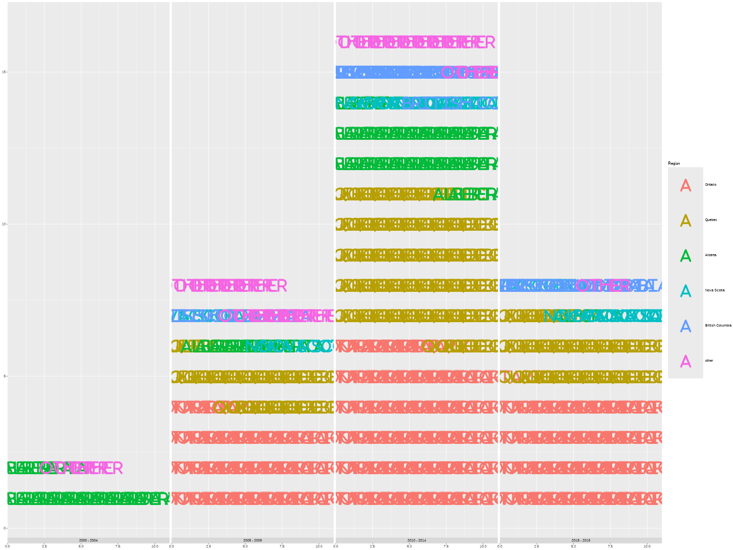
By default, geom_pictogram() and geom_waffle() both assume that the column mapped to values should be plotted as counts. If you’d prefer to plot the values as percentages, set make_proportional = TRUE.
What you might immediately notice about Figure 6.6 is that there are no icons. Instead, the plot has printed the Region names (even though we’ve set family = "Font Awesome 6"). This is because we haven’t defined which icons we want to use. To find an appropriate icon and what it’s called, we can browse the Font Awesome website at fontawesome.com/search and search for related icons. For example, we might search for a wind turbine icon. Though Font Awesome wind turbine icons do exist, they are unfortunately only available with the Pro version. There are other free icons that sort of fit this theme: wind, bolt (to represent energy), or fan, to name a few. We’ll use fan (Font Awesome 2024).
We can add scale_label_pictogram() from waffle to our plot to specify the icons. We would normally pass in a vector of icon names to the values argument - one icon for each category. However, since we want to use the same icon for all categories, we can simply pass in a single name - taking advantage of the fact that R reuses elements of vectors. We set guide = "none" to remove the legend for icons, as they are all the same. Alternatively, you can later set theme(legend.position = "none") as we did in previous chapters to remove the legend.
icons_plot <- basic_plot +
  scale_label_pictogram(
    values = "fan",
    guide = "none"
  )
icons_plotYou might notice that the values on the y-axis in Figure 6.7 are incorrect - there are definitely more than 15 turbines in the 2010-2014 time frame! We’ll deal with the axis in the next section.
6.4 Advanced styling
Now we still need to edit the colors used in the plot, add a title and subtitle (including colored text to replace the legend), and edit the axis labels.
6.4.1 Colors with rcartocolor
We start by defining variables for the background and text colors:
bg_col <- "#FAFAFA"
text_col <- "black"
Let’s also define a color palette that we’ll use for the color of the icons. We’re looking for 6 different colors - one for area. The rcartocolor (Nowosad 2018) package provides access to the CARTOColors color palettes for maps designed by CARTO (CARTO 2016). Although these palettes were primarily designed for coloring maps, the color palettes are also very effective for other types of graphics.
In the rcartocolor package, categorical palettes are referred to as qualitative palettes. We can see all available qualitative palettes with a sufficient number of colors using display_carto_all():
display_carto_all(
  n = 6, type = "qualitative"
)
rcartocolor package.
Although the rcartocolor package has the scale_fill_carto_d() function which we could use directly in our plots, we’ll still save the color palette as a vector of hex codes to allow us to reuse the colors more easily. As you can see in Figure 6.8, in the qualitative palettes in the rcartocolor package, the last color is often gray. That’s a great choice for representing missing data, but when we want different colors for categories it doesn’t work as well. The trick is to ask for one more color than we need, and then throw away the last element in the color palette. We have 6 categories in our plot, so we ask for 7 colors using the carto_pal() function and then extract only the first 6. We’ll use the "Vivid" palette here.
We also make the col_palette vector a named vector by using the names() function, and using region_levels as the names. Although this isn’t necessary for adding the colors to the plot, it will make it easier to extract the colors and ensure each color is mapped to the correct category label.
We can then pass this col_palette vector into scale_color_manual() to apply the colors to our plot. Since we’ll be using colored text instead of a traditional legend, we set guide = "none" to remove the legend again.
col_plot <- icons_plot +
  scale_color_manual(
    values = col_palette,
    guide = "none"
  )
6.4.2 Adding styled text with marquee
We’ve already seen in Chapter 2 and Chapter 3 how to format the title or subtitle text to be bold using the face = "bold" argument inside theme() elements. But what if we want to make only part of the text bold? We can use the marquee package (Pedersen and Mitáš 2024) to add styling to text within a string. The marquee package allows you to use Markdown syntax in text when you’re making graphics in R, including in plots built with ggplot2 or other graphics built with grid.
In Markdown, to make text bold, you enclose it inside two pairs of asterisks, e.g., **bold text**. For example, if we wanted to put the entire title in bold font, we could write the title inside **. In the caption, we might want to embolden the words Data and Graphic to highlight that there are two different fields of information:
title <- "**Ontario is the province with the most wind turbines**"
cap <- "**Data**: Natural Resources Canada | **Graphic**: N. Rennie"
This type of formatting for the plot caption is something that we might like to reuse across multiple plots. And when we want to reuse code, it’s almost always useful to make it into a function. Let’s define a function called source_caption() which has three arguments:
-
source: a character string for the source of the data -
graphic: a character string for the attribution of the visualization -
sep: a character string for what should separate the two pieces of text, which has" | "as a default.
We then use glue() from glue to stick these three arguments together, and include the bold formatting using **. Here we use namespacing (prefixing the function name with the package name and ::) to make it easier to reuse this function in later chapters.
We can construct the caption using our new source_caption() function:
cap <- source_caption(
  source = "Natural Resources Canada",
  graphic = "N. Rennie"
)
cap
**Data**: Natural Resources Canada | **Graphic**: N. RennieYou can see that it’s identical to the one we manually created earlier. We’ll also reuse the source_caption() function in later chapters.
Let’s move onto the subtitle. In this visualization, the subtitle will also be doubling as a legend as we’ll use colored text to denote the different categories. In marquee, text can be colored by wrapping the text in curly brackets, where the first word is pre-fixed by a period and identifies the color of the text, i.e., {.color text to color}, for example, {.red This is red text.}.
We want to add the colors and the text to be colored in a programmatic way. We’ll use square brackets to subset the values and names stored in the col_palette vector. Here, col_palette[[1]] extracts the hex code for the color of the first category, and names(col_palette)[[1]] extracts the name of the first category.
Normally, when we want to write character strings and insert variables into the string, we’d use glue() to combine them. However, the {} that we normally use for variables in glue() will get mixed up with the {} we’ll use for text formatting with marquee. There are a couple of different ways we can get around this problem. One way is changing the delimiters used in glue(). For example, by setting .open = "[" and .close = "]" inside the glue() function. Alternatively, we can use marquee_glue() from the marquee package - an equivalent version of glue() that was built to deal with this problem.
st <- marquee_glue(
  "The Canadian Wind Turbine Database contains the geographic location and key technology details for wind turbines installed in Canada. It includes information about turbines installed in {.{col_palette[[1]]} {names(col_palette)[[1]]}}, {.{col_palette[[2]]} {names(col_palette)[[2]]}}, {.{col_palette[[3]]} {names(col_palette)[[3]]}}, {.{col_palette[[4]]} {names(col_palette)[[4]]}}, {.{col_palette[[5]]} {names(col_palette)[[5]]}}, and {.{col_palette[[6]]} {names(col_palette)[[6]]}} regions."
)
Let’s see what our subtitle looks like when the variables have been evaluated:
stThe Canadian Wind Turbine Database contains the geographic location and key technology details for wind turbines installed in Canada. It includes information about turbines installed in {.#E58606 Ontario}, {.#5D69B1 Quebec}, {.#52BCA3 Alberta}, {.#99C945 Nova Scotia}, {.#CC61B0 British Columbia}, and {.#24796C other} regions.The reason we wanted the "other" category to be in lowercase and in last position when constructing region_levels is to make the sentence read better.
We add these text elements to our plot in the normal way, by passing them into the labs() function.
text_plot <- col_plot +
  labs(
    title = title,
    subtitle = st,
    caption = cap
  )
text_plot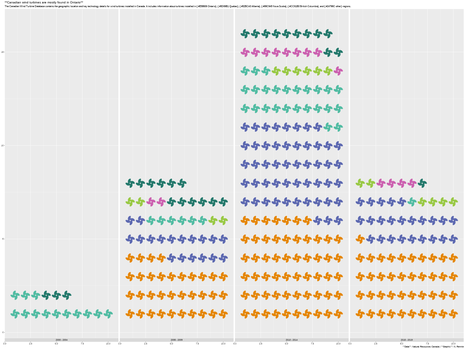
You’ll notice in Figure 6.9 that the formatting hasn’t been applied, and that the ** have been rendered literally. We’ll deal with this when we edit the arguments in theme() - we haven’t actually used marquee yet to format the title text!
6.4.3 Adjusting scales and themes
We can make a final few tweaks to our plot, to apply the formatting with marquee and make it look a little bit cleaner. Let’s start by adjusting the scales. At the moment, the y-axis ranges from 0 to around 15. We know this isn’t correct because we have over 6,500 observations in our data. There are two reasons why the scale of the y-axis is incorrect:
- Each icon represents 20 turbines, so the y-axis labels are currently showing as 20 times smaller than they should be.
- Within each facet, a row contains 10 icons, so the y-axis labels are currently showing as another 10 times smaller than they should be.
Let’s fix that by passing a function into the labels argument of scale_y_continuous(). The function takes the existing y-axis label, multiplies it by 10, multiplies it by 20, and formats it using a thousand separator comma. We set expand = c(0, 0) to remove the extra space at the top and bottom of the y-axis. Let’s also choose slightly nicer break points for the y-axis - ranging from 0 to 4,000 with breaks every 1,000. Unfortunately, we need to specify the limits and the breaks on the original scale rather than on the label scale, e.g., a break point of 15 is actually a break point of 15 * 20 * 10 = 3000. Adding coord_fixed() helps to deal with the overlapping icons issue, by making each icon area square.
scale_plot <- text_plot +
  scale_y_continuous(
    labels = function(x) {
      format(
        x * 10 * 20,
        big.mark = ","
      )
    },
    expand = c(0, 0),
    breaks = c(0, 5, 10, 15, 20),
    limits = c(0, 20)
  ) +
  coord_fixed()
Let’s make a few final edits to tidy up our plot by editing the theme. We’ll use theme_minimal() as a base theme (making the font size a little bit smaller), and then make a few further edits using the theme() arguments.
Within theme(), we start by setting plot.title.position and plot.caption.position to "plot" to align the title, subtitle, and caption text with the edge of the whole plot, rather than the start of the first panel. Some additional spacing around the edge of the plot is added using plot.margin and the background color is edited by using the fill and color arguments in element_rect() for the plot.background argument. The gridlines are also made slightly thinner by adjusting panel.grid.major.
Finally, we edit the plot, subtitle, and caption elements and specify them all using element_marquee(). By using element_marquee(), the Markdown syntax we’ve applied, such as the bold and colored text, will be rendered correctly. You can adjust the color, size, margin and hjust of marquee text in the same way you would with element_text(). If you have some elements of the text rendered with element_text() and some rendered with element_marquee(), you may notice some differences in the text sizing and spacing. Try setting the size of individual elements with the size argument.
The width argument applies text wrapping, where width = 1 means the text wraps to the full width of the plot. This is similar to the way that element_textbox_simple() from ggtext works. However, the width is not set by default, so if you want the text to wrap it’s important to specify the width.
marquee
The marquee package relies on some of the more recent features in the R graphics engine. This means that you need at least version 4.3 of R for marquee text to render correctly. Not all graphics devices support these new features (especially in Windows) so you might need to adjust the graphics device that R uses. The devices made available through the ragg package (Pedersen and Shemanarev 2023) are a good choice.
scale_plot +
  theme_minimal(
    base_size = 7.5
  ) +
  theme(
    # spacing around text and plot
    plot.title.position = "plot",
    plot.caption.position = "plot",
    plot.margin = margin(5, 10, 5, 10),
    # background and grid lines
    plot.background = element_rect(
      fill = bg_col, color = bg_col
    ),
    panel.grid.major.x = element_blank(),
    panel.grid.major.y = element_line(
      linewidth = 0.4
    ),
    panel.grid.minor = element_blank(),
    axis.text.x = element_blank(),
    # format text with marquee
    plot.title = element_marquee(
      color = text_col,
      width = 1,
      size = 12
    ),
    plot.subtitle = element_marquee(
      color = text_col,
      width = 1,
      size = 9
    ),
    plot.caption = element_marquee(
      hjust = 0,
      lineheight = 0.5,
      size = 8,
      margin = margin(t = 5)
    )
  )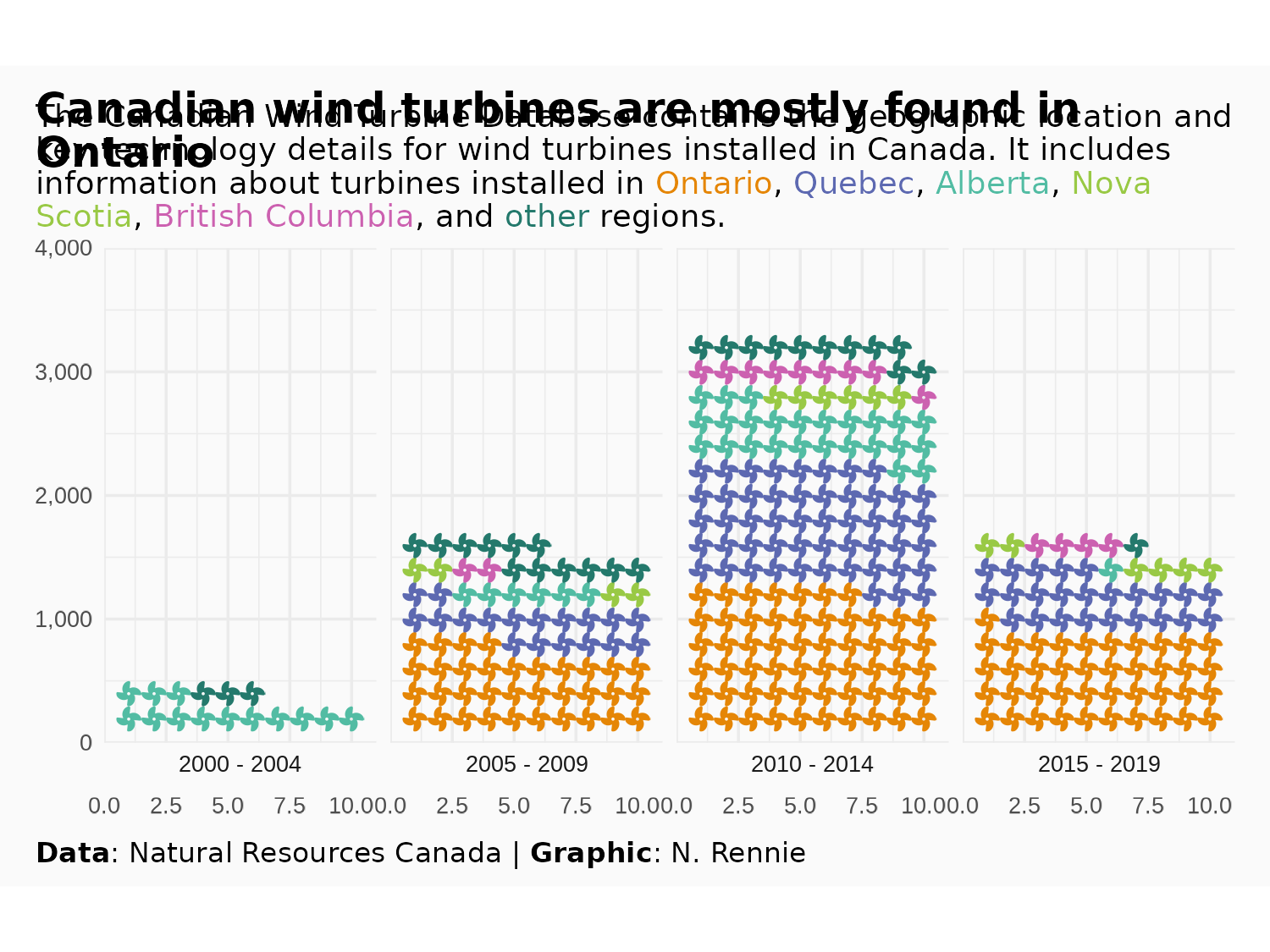
And we’re done and ready to save a copy of Figure 6.10!
ggsave(
  filename = "wind-turbines.png",
  width = 5,
  height = 0.75 * 5
)
6.5 Reflection
The colored subtitle as an alternative to a legend is effective because it uses much less space than a traditional legend - leaving more room for the data. However, there are some elements of the subtitle that could still be improved. We’ve discussed the limitations of waffle plots and pictograms in terms of the lack of representation of categories with small numbers. This means that we had to group some regions together, and so regions with fewer turbines have less information included in the chart. Perhaps the subtitle could be updated to explain to users that each icon represents 20 turbines, and that this means regions with 10 or fewer turbines are not represented.
There’s also some uncertainty around the date used, which isn’t really explained in the chart. When processing the Commissioning.date column, we used the most recent date, but that isn’t necessarily always the best choice. A limitation of the data is that we also only have commissioning date, not installation date or date of first operation. This means that perhaps there are some values in the data that suggest a turbine exists in one time period when it hasn’t yet been built.
Finally, we’ve used a fan icon because the Font Awesome wind turbine icon is only available in the Pro version. Using a wind turbine icon would be much clearer, and more consistent with the theme of the plot. We could look at using an alternative icon font, or we could perhaps use images instead. See Section 14.2 for a description of how we might replace the existing fan icons with a wind turbine icon from a different source.
Each plot created during the process of developing the original version of this visualization was captured using camcorder, and is shown in the gif below. If you’d like to learn more about how camcorder can be used in the data visualization process, see Section 14.1.
6.6 Exercises
Instead of using the icons to represent the number of turbines, recreate this visualization where the icons represent the total capacity (kW). Should you choose a different icon?
Can you arrange both versions (number and capacity) as a single visualization? Hint: you might want to use the
patchworkpackage discussed in Chapter 12.