9 Lemurs: manipulating images in R
In this chapter, we’ll cover how to load and manipulate images in R using the magick and imager packages. We’ll also look at how to combine images with plots using the cowplot package.
By the end of this chapter, you’ll be able to:
- Read images into R, convert between different formats, and perform simple operations like flipping and resizing;
- Remove the background from a photograph using algorithms in image processing packages; and
- Customize a plot to create space for an image overlay, and position the image programmatically.
We begin by loading the packages required in this chapter.
This chapter introduces four new packages:
-
cowplot: arrange multiple plots and add annotations that allows you to have precise control over positioning of different elements. We’ll be usingcowplotto add an image as an annotation. -
imager: provides an interface to the C++ library CImg which allows you to perform image manipulation in R, particularly pixel-level operations and analysis. -
magick: another different image processing package that based on the ImageMagick library, which is good for image editing tasks such as resizing and cropping. -
systemfonts: an alternative way of loading fonts into R that allows you to access and use the fonts installed on your operating system.
9.1 Data
We’re going to explore data about lemurs from Duke Lemur Center (Zehr et al. 2014) which houses hundreds of lemurs across many different species and collects data on them to better understand the factors that affect lemur health, reproduction, and social interaction. The data was used as a TidyTuesday dataset in August 2021 (after being suggested and cleaned by Jesse Mostipak), and so it can be loaded into R using the tt_load() function from tidytuesdayR as we’ve done in previous chapters.
tuesdata <- tt_load("2021-08-24")
lemurs <- tuesdata$lemurs
taxonomy <- tuesdata$taxonomy
The lemurs data contains information on individual lemurs, and is the dataset we’ll mainly focus on in this chapter. The data has 82,609 rows and 54 columns, making it a reasonably large dataset. The first few rows can be inspected with head():
head(lemurs)# A tibble: 6 × 54
taxon dlc_id hybrid sex name current_resident stud_book
<chr> <chr> <chr> <chr> <chr> <chr> <chr>
1 OGG 0005 N M KANGA N <NA>
2 OGG 0005 N M KANGA N <NA>
3 OGG 0006 N F ROO N <NA>
4 OGG 0006 N F ROO N <NA>
5 OGG 0009 N M POOH… N <NA>
6 OGG 0009 N M POOH… N <NA>
# ℹ 47 more variables: dob <date>, birth_month <dbl>,
# estimated_dob <chr>, birth_type <chr>,
# birth_institution <chr>, litter_size <dbl>,
# expected_gestation <dbl>, estimated_concep <date>,
# concep_month <dbl>, dam_id <chr>, dam_name <chr>,
# dam_taxon <chr>, dam_dob <date>,
# dam_age_at_concep_y <dbl>, sire_id <chr>, …The columns give information on the taxon code identifying the species of lemur, the name and sex of the lemur, the lemur’s parents, whether they are still alive, the lemur’s age and weight, and many other variables. Many of the columns give duplicated information, since they express the same data in different units, e.g., the lemur’s age is given in five different columns: in days, weeks, months, decimal months, and years.
Though there are 82,609 rows of data, this doesn’t mean that there are data on 82,609 lemurs. Each lemur has multiple rows of data associated with it, each corresponding to a date (i.e., different age and associated weight measurements). There are many missing values across the data since not all columns are relevant for all lemurs, e.g., if a lemur is still alive, there will be no age_at_death_y value. This also means that if we wanted to process the missing data, we’d likely need to start with a rule-based approach to decide which values should be missing and which ones are unexpectedly missing.
The taxonomy data is essentially a lookup table for the taxon column in the lemurs data. For each taxon code, the taxonomy data provides the Latin name (latin_name) for the species, as well as the common name (common_name). If desired, the two datasets could be joined using the taxon column.
9.2 Exploratory work
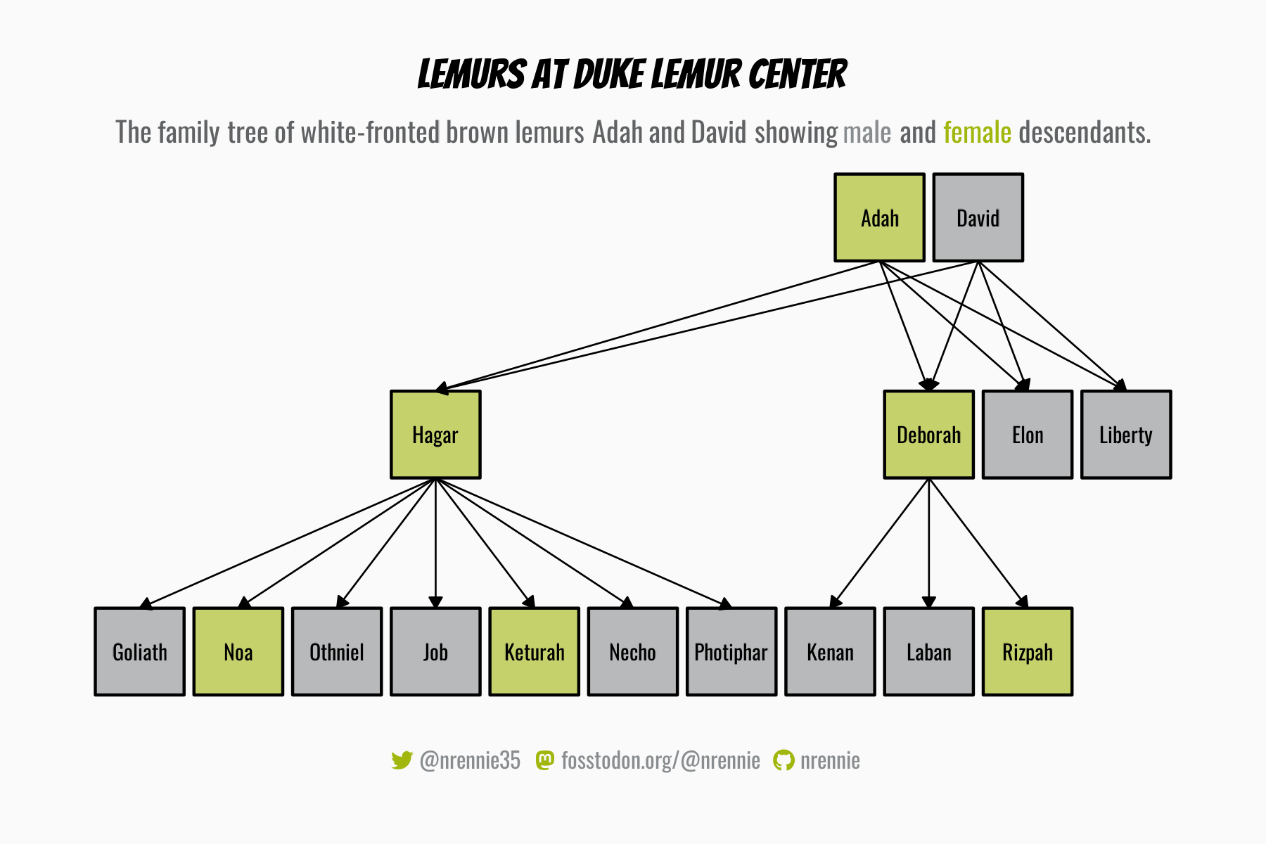
Given the size of the data and the diversity of the variables included, there are many aspects of it that we may wish to explore further. We could use the parental information to construct a family tree of lemurs. We could compare the range of weights and ages across different species of lemurs. We could look at the normal growth curve for lemurs to identify which ones are outside of a normal weight range for their age. There are almost endless options!
9.2.1 Data exploration
Let’s focus in on the growth curve idea, and look at the relationship between lemur age and weight. We can use the base R plot() function to create Figure 9.1, showing the relationship between age in months and weight in grams. As we might expect with a dataset containing 82,609 data points, the scatter plot doesn’t clearly show any real pattern, as there’s too much variability and many of the points overlap.
plot(
  x = lemurs$age_at_wt_mo,
  y = lemurs$weight_g,
  xlab = "Weight (g)",
  ylab = "Age (months)"
)
We know that there are 27 species of lemur in the data, and, even if you don’t know much about lemurs, you might expect that the weights vary by species. A quick box plot of weights by species using the boxplot() function in R confirms this, with Figure 9.2 showing that there are big differences in lemur weights between species.
boxplot(
  weight_g ~ taxon,
  data = lemurs,
  horizontal = TRUE,
  las = 1,
  xlab = "Weight",
  ylab = NULL
)
9.2.2 Exploratory sketches
Given the variability in weights between species, we may wish to focus in on a single species. Let’s keep the chart reasonably simple and create a scatter plot of how lemur weights change with age - essentially recreating Figure 9.1 for a single species and working to make it much more professional looking. Since there are many different species of lemur, and they are not all easily recognizable just by their common name, we’ll add an image of the lemur species in the bottom-right corner to add more context to the chart.
9.3 Preparing a plot
The data is already reasonably clean, especially for the simple scatter plot that we’re aiming to create based on Figure 9.3, so there’s a limited amount of data wrangling required.
9.3.1 Data wrangling
We want to subset the data to consider only one species of lemur. Unless you’re an expert in lemurs, you probably don’t know which taxonomy codes in the lemurs data relate to which species of lemur. We could join the taxonomy data to the lemurs data and then filter the data based on the joined common_name column. However, since the future data processing is so minimal, we could just browse through the taxonomy data, choose a species of lemur from the common_name column, and look up the relevant taxonomy code.
There are 27 species of lemurs included in the data, and for the rest of the chapter we’ll focus on red ruffed lemurs. Red ruffed lemurs have the taxonomy code VRUB. We use the filter() function from dplyr to retain only the rows of data with "VRUB" in the taxon column:
vrub_lemurs <- lemurs |>
  filter(taxon == "VRUB")
This is definitely the easiest data wrangling process in this book, and we’re ready to move on to creating the first draft of our plot!
9.3.2 First plot
Starting with the ggplot() function, we pass in the subset of our data on red ruffed lemurs, and set the age (age_at_wt_mo) as the default variable on the x-axis and the weight (weight_g) on the y-axis. We also use color to differentiate the sex of the lemurs. The scatter plot is then created by adding the geom_point() layer.
basic_plot <- ggplot() +
  geom_point(
    data = vrub_lemurs,
    mapping = aes(
      x = age_at_wt_mo,
      y = weight_g,
      color = sex
    )
  )
basic_plot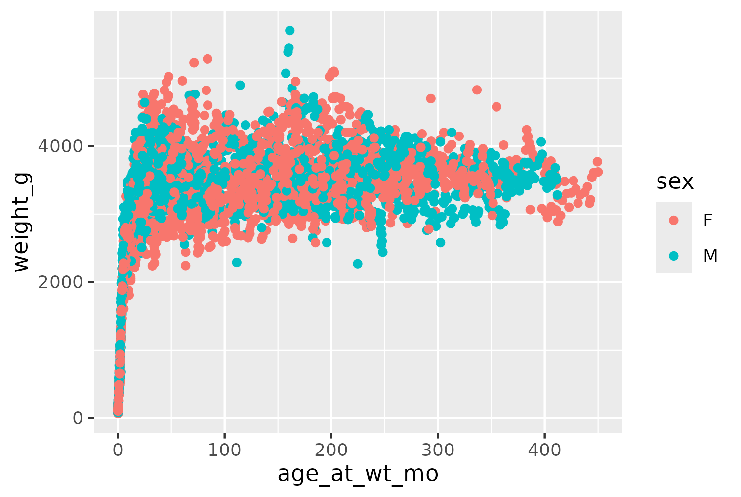
Even though the data shown in Figure 9.4 is a subset of the full data, it still contains 4,166 observations. This means that many of the points in Figure 9.4 overlap, and it’s difficult to see how many points are actually in a specific area. Let’s edit the initial plot code. We can make the points slightly smaller by changing the size in geom_point(). We also make the points semi-transparent by setting alpha = 0.6. This is a useful technique when data points can overlap since areas of the chart with many points will appear darker, when the semi-transparent points are layered on top of each other. Since relying on color alone for visually identifying groups of data is not a good approach in terms of accessibility, we also map the shape of the points to the sex of the lemur in Figure 9.5.
basic_plot <- ggplot() +
  geom_point(
    data = vrub_lemurs,
    mapping = aes(
      x = age_at_wt_mo,
      y = weight_g,
      color = sex,
      shape = sex
    ),
    alpha = 0.6,
    size = 0.8
  )
basic_plot
9.4 Advanced styling
Now it’s time to style and edit the plot to make it more aesthetically pleasing, accessible, and informative.
9.4.1 Colors
For the plot background and text, we’ll choose colors that might be found on a red ruffed lemur such as a light beige (bg_col) and warm brown (text_col). We also need to select two colors to represent the male and female lemurs. When choosing colors for categories, it’s important to choose colors that neither reinforce negative stereotypes nor contradict intuitive color choices. When choosing colors to represent gender or sex, it’s very common to see the stereotypical blue for boys, and pink for girls. We don’t want to reinforce the negative associations for different genders that these colors can have. Equally, we don’t want to make it confusing by choosing the opposite, e.g., blue for girls and pink for boys. Instead, we’ll choose a purple for female lemurs (f_col) and turquoise for male lemurs (m_col). This is not an uncommon color combinations for representing gender, and other good options are discussed in Lisa Muth’s blog post An Alternative to Pink & Blue: Colors for Gender Data (Muth 2018).
bg_col <- "#F5F5DC"
text_col <- "#4E2E12"
f_col <- "#A053A1"
m_col <- "#21ADA8"
The colors for male and female lemurs can then be applied to the plot using scale_color_manual() where we explicitly map the color variables to the values in the data by naming the vector elements passed into values. We could create these color variables as a named vector as we did in Chapter 6, but since we want the labels to be different than the data values (e.g., females instead of F), it’s a similar amount of work to simply pass them in as variables - especially for only two categories.
col_plot <- basic_plot +
  scale_color_manual(
    values = c("F" = f_col, "M" = m_col)
  )
We’ll use colored text and icons in the subtitle to distinguish the two categories as we did in Chapter 6, and so we’ll remove the legend by setting legend.position = "none" inside the theme() function a little bit later. Here, we technically have two legends in one - one for color, and one for shape. If we only wanted to remove one part of the legend, e.g., color, we could set guide = "none" inside scale_color_manual(). This would result in a legend for shape only with the shapes shown in black by default.
9.4.2 Working with systemfonts
Rather than using a traditional legend for color and shape, we’re going to include colored text in the subtitle. Here, we’re also going to include some Unicode icons in the subtitle to identify how the circles and triangles map to the two categories. Unfortunately, the showtext package, we’ve been using to load the Font Awesome icon font and other Google fonts, doesn’t always play nicely with Unicode icons. We’ll look at an alternative font package: systemfonts (Pedersen et al. 2024). As mentioned in Chapter 2, the systemfonts package allows you to locate or load font files available on your local system.
To register a font using systemfonts, we use the register_font() function. It looks quite similar to the font_add() function from showtext for loading local fonts - see Chapter 6 and Chapter 7 to compare them. Let’s load the Font Awesome Brand icons using systemfonts as an alternative approach to the one taken in Chapter 7.
The first argument name will be the name that the font is known by in R. You can choose any name you want, but here we’ll make sure to use the same name as we did for the family argument in Chapter 7, in order for our social_caption() function to still work. The plain argument is the the path to the font file.
register_font(
  name = "Font Awesome 6 Brands",
  plain = "fonts/Font-Awesome-6-Brands-Regular-400.otf"
)In R, a graphics device is the system that is used to render visual outputs (including plots). The graphics device used will vary depending on what operating system you are using and what type of output format you want to create, e.g., png or pdf. The ragg package (Pedersen and Shemanarev 2023) provides graphic devices for R based on the AGG library.
It’s recommended to use ragg for graphics in RStudio because it makes working with fonts easier and provides higher quality images. If you use a different graphics device, the icons or fonts loaded with systemfonts may not appear correctly. To use ragg for the graphics devices in RStudio, go to Tools -> Global Options -> General -> Graphics -> Backend and select AGG. In R Markdown or Quarto documents, you can add a set-up chunk at the top to use ragg which includes knitr::opts_chunk$set(dev = "ragg_png"), or your device of choice.
We can also use register_font() from systemfonts to load the fonts we’ll use for the title and body text of our plot. The difference here is that if, for example, we want to use fonts from Google Fonts, we first need to download the font files.
For the body text, we’ll use Lato, a sans serif typeface designed by Łukasz Dziedzic. The font files can be downloaded from fonts.google.com/specimen/Lato or www.latofonts.com/lato-free-fonts. For the title, we’ll use Passion One - a typeface specifically designed for large titles! It can be downloaded from fonts.google.com/specimen/Passion+One. When you download these typefaces, you’ll see that you don’t just download a single file, you actually download multiple files - one for each variation of the font that is available, e.g., bold and italic.
In register_font(), you pass these different font files into the relevant argument, e.g., passing the font file for the bold version into the bold argument. Note that not all typefaces have every style available. Here, Passion One isn’t available in italic, so we simply don’t pass anything into the italic argument when loading Passion One. If you’re not going to use a particular font style (for example, if you know you won’t write any text in bold when using Lato font), you don’t need to load this style in with register_font(). However, it can be useful to have it available, just in case you change your mind!
register_font(
  name = "Lato",
  plain = "fonts/Lato/Lato-Regular.ttf",
  bold = "fonts/Lato/Lato-Bold.ttf",
  italic = "fonts/Lato/Lato-Italic.ttf"
)
register_font(
  name = "Passion One",
  plain = "fonts/Passion_One/PassionOne-Regular.ttf",
  bold = "fonts/Passion_One/PassionOne-Bold.ttf"
)
We then define variables with the name of the title and body typefaces:
body_font <- "Lato"
title_font <- "Passion One"
An alternative to using register_font() is to install the font on your system, by right-clicking on the downloaded font file and selecting Install. Then ragg should be able to find the font automatically. However, there may be reasons why you can’t or don’t want to install a font systemwide. Using register_font() in a script also leaves a record of how the fonts were installed, rather than relying on other processes happening outside of R.
9.4.3 Adding text
The title for the plot can be defined as a simple character string, which asks the reader a question and encourages them to engage with the plot. To write the subtitle text, we’ll use the glue() function from glue to do two things:
- Add colored text in the subtitle, as we did in Chapter 7.
- Create data-driven text, as we did in Chapter 2.
We’ll also use Unicode characters (for triangles and circles) in the subtitle to substitute the shape legend. Though the Unicode characters are not exactly identical to the shapes plotted on our chart, in the way that the colors are, the shapes are similar enough for this approach to work. The ▲ string adds a black triangle, and the ● string adds a black circle. Though these define black shapes, they will appear in the color we desire. Here, a black triangle really just means a filled-in triangle (with white triangle meaning outline only triangle).
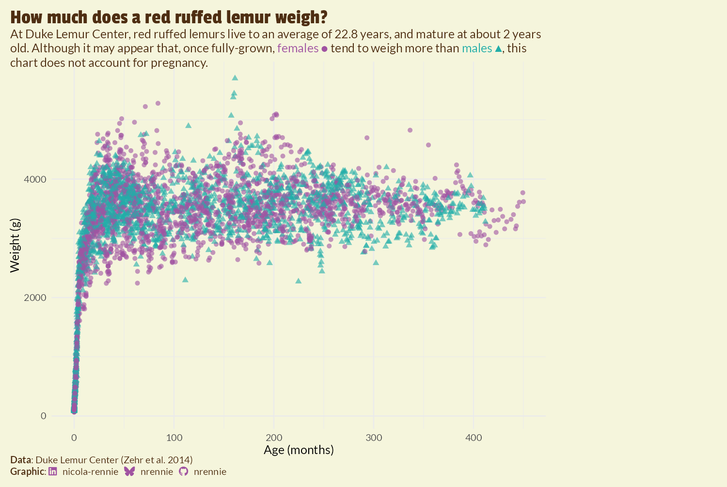
title <- "How much does a red ruffed lemur weigh?"
subtitle <- glue("At Duke Lemur Center, red ruffed lemurs live to an average of {round(mean(vrub_lemurs$age_at_death_y, na.rm = TRUE), 1)} years, and mature at about 2 years old. Although it may appear that, once fully-grown, <span style='color:{f_col}'>females ●</span> tend to weigh more than <span style='color:{m_col}'>males ▲</span>, this chart does not account for pregnancy.")We’ll use the social_caption() function defined in Chapter 7, to create a caption that includes Font Awesome icons for social media (using the colors we defined earlier). We then use the social media caption in the source_caption() function from Chapter 6 and also pass in Duke Lemur Center and the data publication as the source of the data.
social <- social_caption(
  icon_color = f_col,
  font_color = text_col,
  font_family = body_font
)
cap <- source_caption(
  source = "Duke Lemur Center (Zehr et al. 2014)",
  sep = "<br>",
  graphic = social
)
The title, subtitle, and caption text can then be added to the plot using the labs() function, along with x- and y-axis labels showing the variables and units they are recorded in.
text_plot <- col_plot +
  labs(
    title = title,
    subtitle = subtitle,
    caption = cap,
    x = "Age (months)", y = "Weight (g)"
  )
text_plot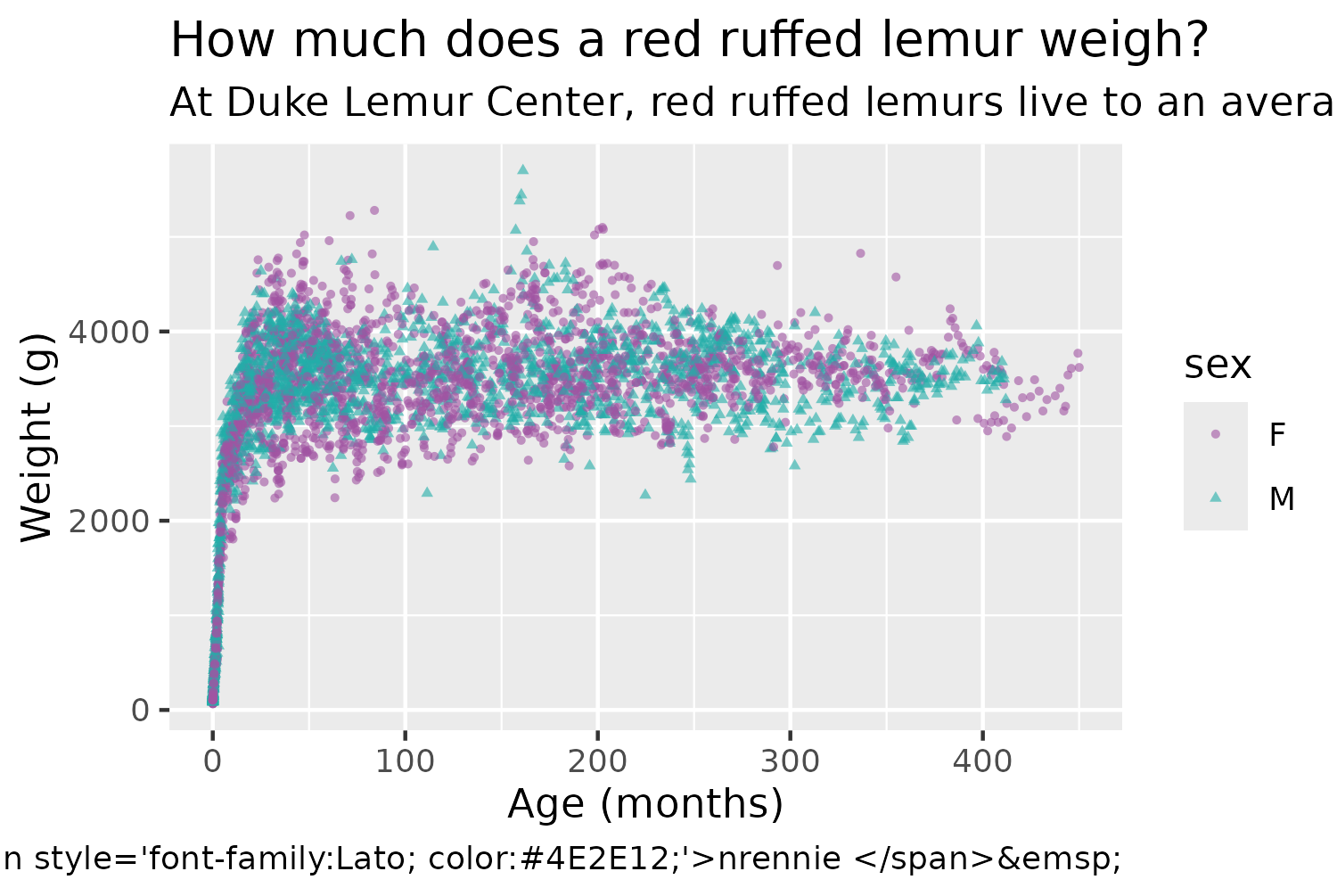
9.4.4 Adjusting themes
Now we need to add some final styling to Figure 9.6 to implement the background and text colors, as well as making sure the raw HTML code is processed correctly.
We start with theme_minimal() as a base, which keeps the grid lines and axes but removes the gray background and dark axis ticks. We also set the base font size as size 6 and use our previously defined body_font variable as the base font family. We can then make a few further adjustments using theme(), where we remove the legend by setting legend.position = "none", add a margin around the edge of the plot, and apply the selected background color using element_rect().
Setting plot.title.position and plot.caption.position to "plot" aligns the title, subtitle, and caption with the outside of the entire plot rather than the panel with the scatter plot - giving a cleaner, more balanced look. The title text is further adjusted with element_text() to use the title_font family, increase it in size, change the color, and add a little bit more space at the bottom of it. As described in Chapter 2 and Chapter 7, we use element_textbox_simple() from ggtext for the plot subtitle and caption in Figure 9.7 to force the long text to wrap onto multiple lines, and to correctly process the HTML code in the caption.
theme_plot <- text_plot +
  theme_minimal(base_size = 6, base_family = body_font) +
  theme(
    # legend
    legend.position = "none",
    # background
    plot.margin = margin(5, 5, 5, 5),
    plot.background = element_rect(
      fill = bg_col, color = bg_col
    ),
    # text
    plot.title.position = "plot",
    plot.caption.position = "plot",
    plot.title = element_text(
      family = title_font,
      size = rel(1.7),
      color = text_col,
      margin = margin(b = 5)
    ),
    plot.subtitle = element_textbox_simple(
      color = text_col
    ),
    plot.caption = element_textbox_simple(
      hjust = 0, halign = 0,
      color = text_col
    )
  )
theme_plot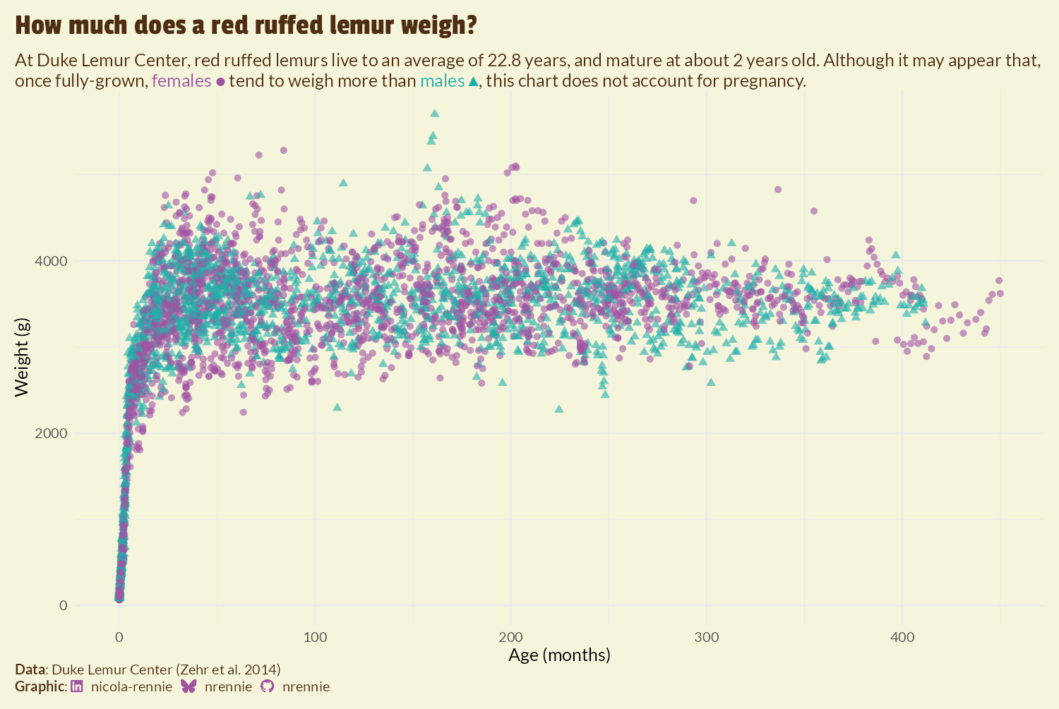
We’re going to add the image to the right-hand side of the plot. The approach we’re taking requires us to make some blank space. Perhaps the simplest approach is to increase the size of the margin on the right-hand side of the plot using the plot.margin argument in theme():
However, as you can see in Figure 9.8, this approach results in the title and subtitle text also being squashed to the left-hand side of the plot, as it doesn’t extend into the margin. This may be desirable for some plots, but it doesn’t work well here. Another approach is to use the expand argument in scale_x_continuous() to increase the amount of space at the right-hand side of the x-axis. However, since this extends the axis, it results in grid lines being included in the additional space. We could play around with the breaks and axis text to remove the unwanted components, but there’s an easier (slightly hacky) solution: add and edit a secondary y-axis.
Secondary axes are almost always a poor choice of chart due to the fact that the choice of transformation for the secondary axis is entirely arbitrary but can hugely impact how the plot is interpreted. However, we’re not actually going to use the secondary axis to present data, we’re only going to use it to manipulate the layout of the plot background. To add some additional margin space on the right-hand side, without squashing the title or adding grid lines in the margin, we can:
- Duplicate the y-axis to create a secondary y-axis on the right-hand side by setting
sec.axis = dup_axis()insidescale_y_continuous(). Thesec_axis()function could be used instead ofdup_axis(), but there’s no need to transform the axis in any way. - Add lots of margin space to the secondary axis labels by expanding the right margin using
margin = margin(r = 150)for theaxis.text.y.rightargument oftheme(). - Hide the secondary axis labels by making them the same color as the background through also setting
color = bg_colforaxis.text.y.right.
We also remove the secondary axis title by setting axis.title.y.right to element_blank().
styled_plot <- theme_plot +
  scale_y_continuous(sec.axis = dup_axis()) +
  theme(
    axis.text.y.right = element_text(
      margin = margin(r = 90),
      color = bg_col
    ),
    axis.title.y.right = element_blank()
  )
styled_plot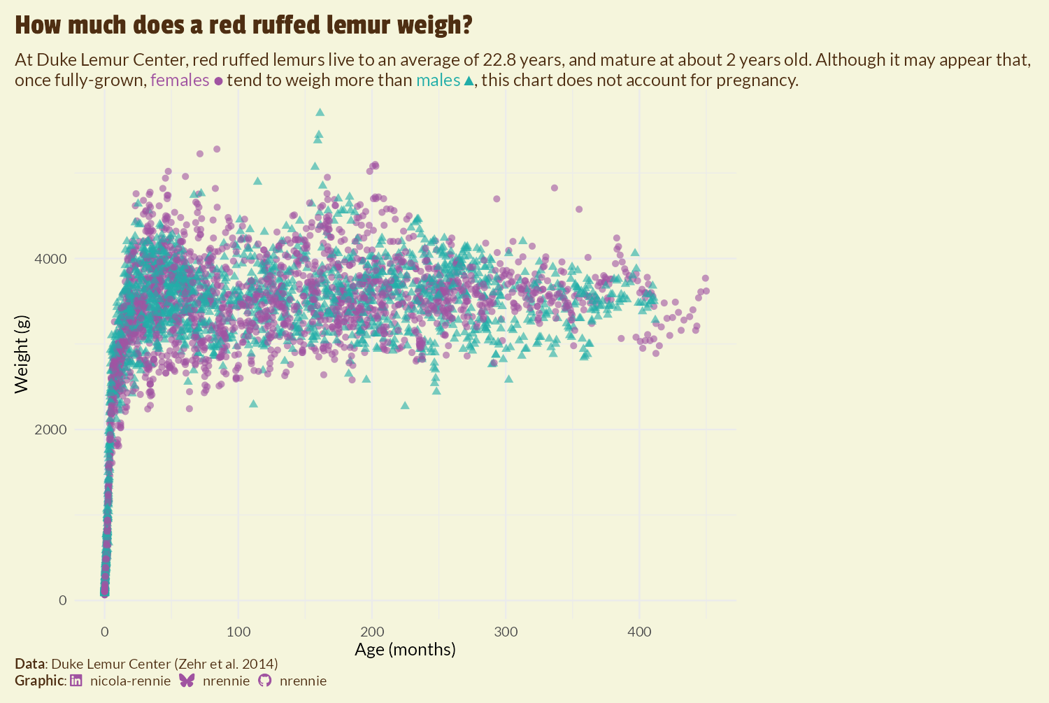
We now have an appropriate space to place an image in Figure 9.9.
9.5 Working with images
Though you might not often find instructions in data visualization books about working with images, there are many reasons why you may wish to overlay an image on top of a plot. Perhaps you need to add your company logo in the corner for more consistent branding. Or perhaps you’re just looking for a way to make your plot more eye-catching!
9.5.1 Manipulating images with magick and imager
The magick package (Ooms 2024) provides bindings to the ImageMagick image processing library, which allows you to manipulate images through rotating, scaling, cropping, or blurring them (to name a few!). It supports multiple different image formats including PNG, JPG, and PDF.
The magick package is not the only R package that enables you to process and manipulate images. A popular alternative is the imager package (Barthelme 2024) which is based on CImg, a C++ library by David Tschumperlé. Both packages have their strengths, and it’s easy to use both at the same time via the cimg2magick() and magick2cimg() conversion functions in imager. There are some operations that are easier in imager, and some that are easier in magick. In this chapter, we’re going to use both packages together to demonstrate how easy it is.
When you’re adding a logo to your plot, it’s (reasonably) easy to know which image to use and where to find it. If you don’t already have the image you want to overlay, you also need to know how and where to find it.
If you add images to plots that you don’t own, make sure you have permission to reuse the image and check that the license file allows you to. Sites such as Unsplash (unsplash.com), Wikimedia Commons (commons.wikimedia.org), or Pixabay (pixabay.com) can be good places to find images that are free to reuse.
For this visualization, we’re going to use a photograph of a red ruffed lemur from Unsplash taken by Jax (Jax (@lysrix) 2017).
We’re going to start with the imager package and use it to read the image into R with the load.image() function. If you were using magick to start with, you would use the image_read() function instead.
lemur_img <- load.image("images/lemur.jpg")
plot(lemur_img)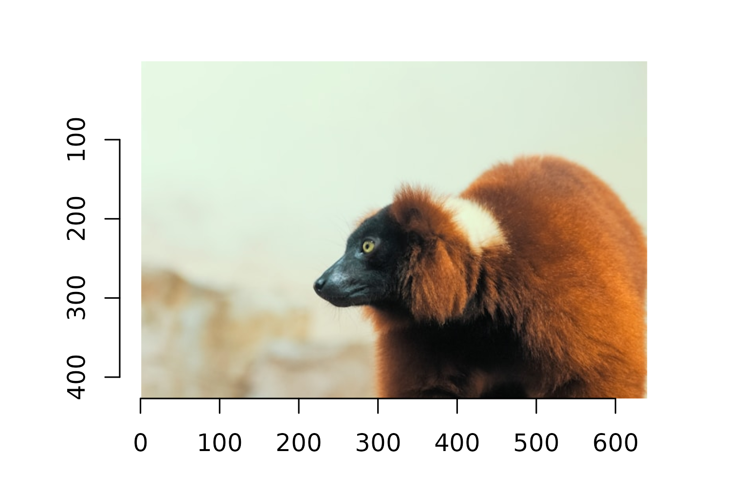
You can view the image to check that it’s been loaded correctly by running plot(lemur_img), and you’ll see that it’s plotted on a traditional base R graphics grid in Figure 9.10, with the axes indicating the number of pixels. Don’t worry about how to deal with this background grid - we’ll deal with that a little bit later!
Though this is a fun image of a lemur, overlaying it on top of the plot in its raw format isn’t going to be the most aesthetically pleasing. The background of the image would be quite clear against the plot. It would be better if the image was simply of the lemur itself with a transparent background. There are many online tools and desktop software available that could remove the background for you, but we can also do this in R!
Let’s start by cropping out as much of the background as possible. In imager, the Xc() and Yc() functions return pixel coordinates for an image, for x and y coordinates, respectively. Subsetting or updating the pixel value of an image based on pixel coordinates essentially works the same way as subsetting or updating a matrix value in R.
Running Xc(lemur_img) <= 200 creates a pixel matrix where all values with an x coordinate less than or equal to 200 are TRUE, and is otherwise FALSE. Setting these values to 0 turns those pixels to the color black. We can do something similar to remove sections where the x coordinate is less than 275 and the y coordinate is greater than 320. It takes a little bit of trial and error to get these boundaries correct, but you can use the plot axis as a guide. Be careful with the y-axis; it goes the opposite direction of most plots!
Now we need to remove the rest of the background. Luckily, there is quite a lot of contrast between the part of the image we want to keep (the lemur) and the part that we don’t (the background). The px.flood() function from imager allows you to select pixels that are similar to some initial pixel. This means we can select a pixel from the lemur, and then use the px.flood() function to select all pixels that are similar to it. The x and y arguments are used to specify the coordinates of the initial pixel to start with. The sigma argument specifies how different we want to allow the pixels to be. Lower values of sigma allow only very similar values to be selected, and higher values of sigma allow more different values to be selected.
It takes a little bit of trial and error to choose the best values for these arguments, and we can visually inspect performance by plotting the boundary lines of the pixels that are considered similar. Passing in the output from px.flood() into highlight() from imager draws a red outline around the similar pixels.
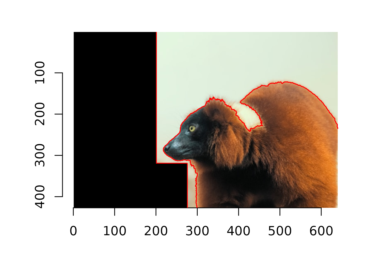
You can see in Figure 9.11 that the lemur’s white collar has been classified as part of the background. We can edit the x, y, and sigma arguments to select this part of the image separately:
detect_outline_2 <- px.flood(
  im = lemur_img,
  x = 430,
  y = 220,
  sigma = 0.063
)
To make it easier to create a transparent background, we turn the non-similar parts of the image, i.e., the areas outside of the selected pixel sets, to black. As we did when cropping the image, we do this by setting the pixel values to 0, i.e., no color.
lemur_img[detect_outline & !detect_outline_2] <- 0We now want to turn the sections of the image that are pure black into transparent sections. The easiest way to do this is through the image_transparent() function from magick. However, our lemur_img image is currently of a format designed to work with imager, and it won’t work out of the box with magick. Luckily, the cimg2magick() function in the imager package converts it to a format that is compatible with magick. For some reason, the cimg2magick() also causes the image to be flipped horizontally. We can turn it back to the correct orientation using the image_flop() function in magick.
Since the image is always the first argument of the image_*() functions in magick (and the output remains of the same class), we can use a piped workflow here, just as we do with tidyverse functions when working with data. Finally, we use the image_transparent() function in magick to turn all pixels that are currently "black" transparent.
lemur_nobg <- cimg2magick(lemur_img) |>
  image_flop() |>
  image_transparent("black")
lemur_nobg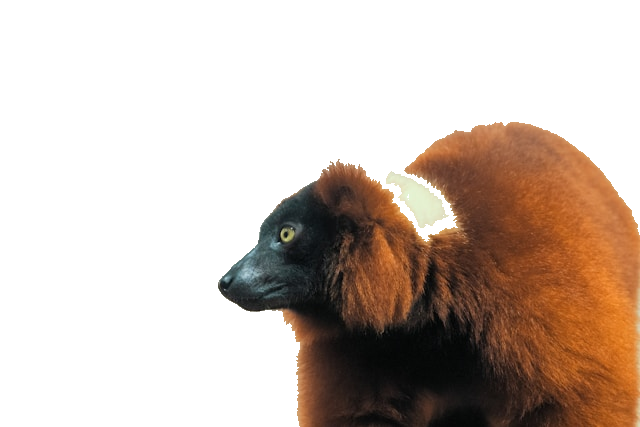
When you print the image with magick, it returns the image itself to the plot window, but it also returns output to the console with information about the image dimensions, format, and file size. You can see that the process of turning the background transparent is not perfect, as the white collar of the lemur has still been partially removed. It’s also a process that requires a lot of trial and error to find the right combination of argument values.
9.5.2 Adding images to plots with cowplot
Before we go ahead with adding the image to the scatter plot, let’s first update the caption to add an attribution for the image, in addition to the attributions for the data and graphic. We can use paste0() to join together the output from the source_caption() function we were already using for the caption, with some additional styled text. You’ll see that this new text is similar to the text described in Chapter 6, with <br> adding a new and ** used to style the word Image in bold text. We can then override the existing caption in the labs() function.
The cowplot package (Wilke 2024) extends ggplot2 and allows you to arrange, align, and combine multiple plots into a single visual. In this chapter, we’re more interested in the cowplot functionality for adding annotations and customization - including images.
There are several other R packages available for arranging different elements together, e.g., combining multiple plots or adding images to plots. The most common for arranging charts is the patchwork package (Pedersen 2024) which we’ll use in Chapter 12 and Chapter 13. The egg package (Auguie 2019) is another popular alternative, with the geom_custom() function being especially useful for adding images. The ggimage package (Yu 2023) can also be used to add images to charts, and is great when you are mapping columns of your data to properties of the images, e.g., file paths or image coordinates.
With cowplot, we start by using the ggdraw() function which sets up a layer on top of our ggplot2 styled_plot object to allow us to draw on top of it. The draw_image() function is then used to add the lemur_nobg image on top. By default, the layer on top of the plot has coordinates running from 0 to 1, with (0, 0) being the lower-left corner of the plot and (1, 1) the top-right. Since we want to position the image in the bottom-right-hand corner, we set hjust and halign to 1, to align the right-hand side of the image with an x value of 1. Setting vjust and valign to 0 aligns the bottom of the image with the y value of 0. The width defines how big the image is - some trial and error results in a choice of 0.4 for the image width.
final_plot <- ggdraw(styled_plot) +
  draw_image(
    lemur_nobg,
    x = 1, y = 0,
    hjust = 1, halign = 1,
    vjust = 0, valign = 0,
    width = 0.4
  )
final_plot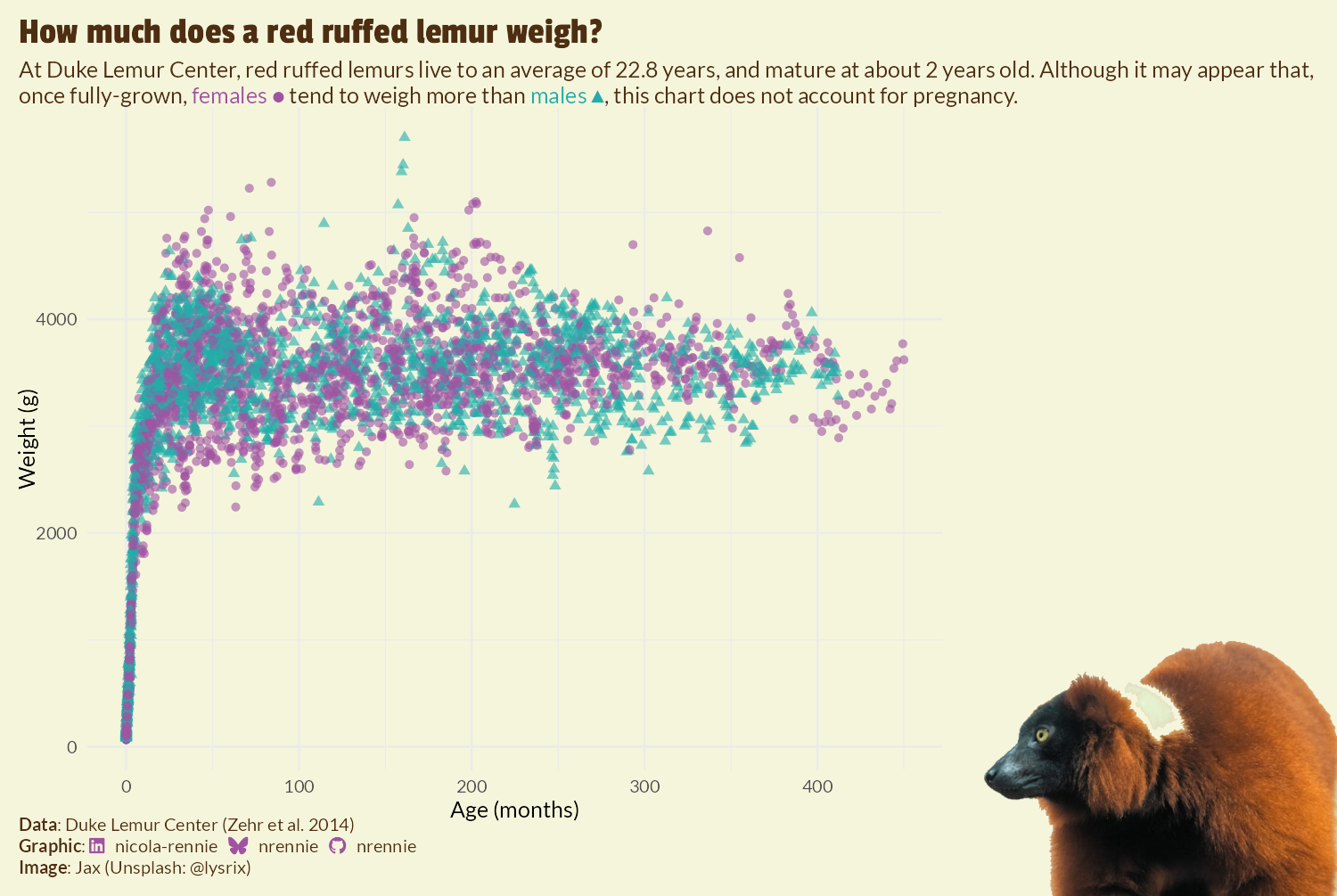
Finally, we save Figure 9.13 as an image using ggsave():
ggsave(
  filename = "lemurs.png",
  plot = final_plot,
  width = 5,
  height = 0.67 * 5
)
When you add the image using cowplot, you may see warnings returned in the console about some of the custom fonts not being found. However, as long as the fonts are appearing correctly on the chart, you can ignore these warnings.
9.6 Reflection
Despite the complexity of the code behind it, this is a relatively simple plot. And that’s where the strengths of this visualization lie - it often takes a lot of work to create a clean and minimal chart. The lemur image adds a fun element to the chart and makes it more eye-catching and interesting without adding complexity to the way the data is presented. The use of shapes in addition to color for distinguishing data for male and female lemurs is another strength, as it increases the accessibility of the chart, making it available to a wider audience. However, there are still a few areas where improvements could be made. The obvious one is the background removal of the lemur image. As we noted earlier, some of the lemur’s white fur has been incorrectly removed, as it’s a similar color to the background.
The plot could be further improved by giving more consideration to the choice of axes - both x and y. Depending on what aspect of lemur ages or weights a reader is interested in, a different choice of axis may be more appropriate. For example, if the interest is in adult lemurs, then subsetting the data to consider only lemurs above a certain age would work better. If the interest is in when lemurs reach their adult weight, then looking at lemurs below a specific age or performing a transformation of the axis (e.g., logarithmic) would make it easier to see the point at which lemurs stop growing. Similarly, the y-axis uses grams as its units since this is how the weight data is recorded. For young lemurs, measuring on a scale of grams is appropriate. However, the majority of lemurs in the data are adults and so perhaps presenting the data in terms of kilograms might make more sense.
It’s not currently clear from this chart that each individual lemur has multiple weight measurements recorded. This means that the data points shown in the chart are not independent - a common assumption of many statistical models. Overall, this is a fun and easy-to-interpret chart that’s quite likely to draw people in to learn more about lemurs. However, if it’s a part of an exploratory step before statistical modelling, it may need a little bit more fine-tuning.
9.7 Exercises
Choose a different species and recreate this visualization.
Based on what you learned in Chapter 8, can you create a parameterized plot function that takes a species (and optional image path) as arguments?