14 Other tips and tricks
There are many functions within ggplot2, and many more within the wider community of extension packages, that the chapters in this book can’t cover. Some of those packages are used to add different geometries, a few are used behind the scenes to help streamline workflows, and a few are more generally useful R packages.
By the end of this chapter, you’ll be able to:
- Preview images at the desired resolution, and record gifs showing the process of making a specific chart;
- Extract and reuse data from existing
ggplot2charts; - Format your code in a consistent way to make it easier to maintain and share;
- Create your template files and functions for pieces of code that you reuse often.
We begin by loading the packages required in this chapter.
This chapter introduces two new packages:
-
camcorder: automatically save graphics, and create gifs from the resulting images. -
ggpattern: allows you to use patterns (alongside or instead of colors) for thefillelements of plots. It includes simple patterns like stripes or dots, as well as more complex ones like gradient and image fills.
14.1 Recording gifs with camcorder
camcorder (Hughes 2022a) is an R package to track and automatically save graphics generated with ggplot2. You can set up your R session to use camcorder by running gg_record(). If you’re using RStudio, you’ll notice that your plots now appear in the Viewer tab rather than the Plots tab.
gg_record(
  width = 6,
  height = 4
)
If you’re reading the online version of this book, you will have seen several examples of gifs showing the visualization development process at the end of chapters. The gg_playback() function combines the previously saved images and saves them to a gif. You can set different preferences using the arguments in gg_playback(). For example, you can define the length of each frame in the gif, make the first and last frames longer or shorter, or set the background color.
Some of the built-in themes in ggplot2 have a transparent background. If you’ve used these at some point during the development process, when you viewed them in RStudio the background likely appeared white. The default background color in gg_playback() is "black" - meaning that your gif might not quite look as you expect. Instead, set the background color to something more sensible, for example your bg_col variable.
gg_playback(
  name = "data-viz.gif",
  first_image_duration = 4,
  last_image_duration = 20,
  frame_duration = .25,
  background = bg_col
)
Note that there are a few plots (including those produced by geofacet) that don’t work automatically with gg_record(). However, you can manually run record_polaroid() manually to capture the image with camcorder and view it at your desired resolution in the Viewer pane.
14.1.1 Setting the size resolution of images
Have you ever spent ages tinkering with a plot you’re previewing in RStudio, before using ggsave() to save a higher resolution image, only to end up with the text looking ridiculously larger (or smaller) than you thought? Or do you struggle to preview plots with your desired aspect ratio? One of the nice features of using camcorder is the ability to preview plots with the same height, width, and resolution that you want your final plot to be in. Simply set the height, width, and dpi (and optionally units) arguments in gg_record() to your desired values. Then what you see is what you save! The ggview (Domin 2024) package also provides similar functionality.
The RStudio Plots tab shows images at 96 dpi, but the default in ggsave() is 300 dpi. This is what causes the mismatch between the sizes of text and other elements. The default dpi in gg_record() is also 300 dpi so it integrates nicely with ggsave().
14.2 Extracting information from plots
In Chapter 6, we reflected that it would be better to use a wind turbine icons instead of the fan icon - since the data is about wind turbines! An alternative to the Font Awesome icons we used in Chapter 6 are icons from Flaticon. You can download Flaticon icons as PNG images for free, as long as you provide attribution. More specifically, you can download a Wind Power icon from www.flaticon.com/free-icon/wind-power_5670189 (Flaticon.com 2024). Let’s save it in an images/ project directory.
Now, instead of plotting icons as fonts, we want to plot icons as images. The problem is that:
- we want to use the
xandycoordinates for the icons provided bygeom_pictogram(), and - we want to use an image instead of a font icon.
These two things aren’t currently compatible.
14.2.1 Extracting coordinates
We’ve already built the plot with geom_pictogram() from waffle, so the x and y coordinates have already been calculated. Luckily, we can use the ggplot_build() function to extract from the basic_plot we created in Chapter 6.
basic_built <- ggplot_build(basic_plot)You can save an ggplot plot as a variable, and then pass it into ggplot_build() to access the data associated with the plot (including data that was calculated by geom functions). The data is stored in the basic_built$data[[1]] element. The x, y, and colour variables are all stored in their respective columns. The variable used to define the facets, Year_Group, is stored in the PANEL column and is given by numbers rather than the original category names.
Unfortunately, PANEL is a forbidden column name for a faceting variable, so we need to start by renaming this column. We also convert this renamed column into a factor, and pass in the Year_Group categories from Chapter 6 as labels.
Let’s use geom_point() as a quick sense check that the x and y coordinates are the values that we’re expecting, faceting by our Year_Group column. You can see the similarity of Figure 14.1 with Figure 6.6.
ggplot(
  data = new_data,
  mapping = aes(
    x = x, y = y
  )
) +
  geom_point() +
  facet_wrap(~Year_Group, nrow = 1)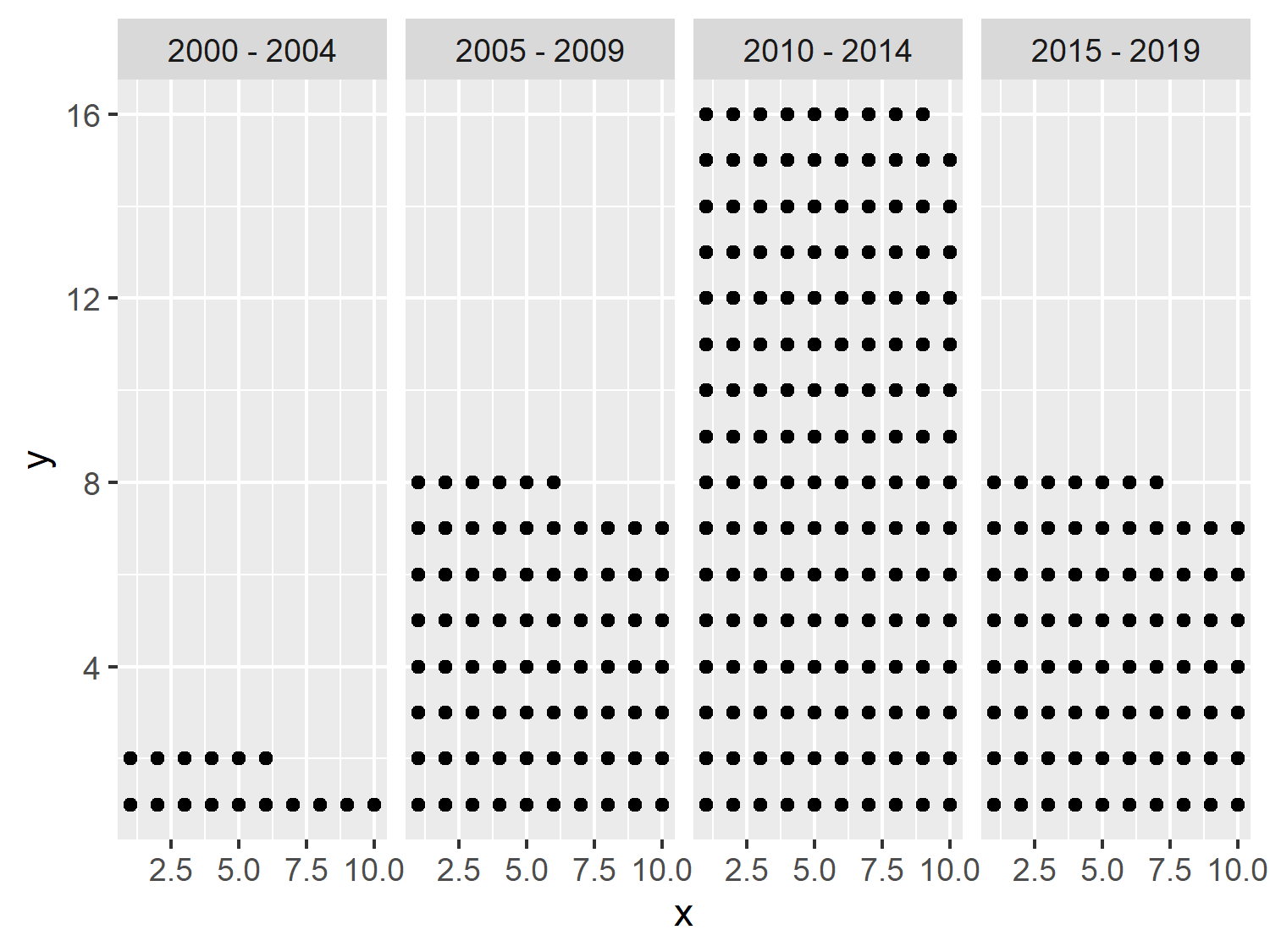
14.2.2 Plotting with ggpattern
Now instead of using geom_point() we want to plot images. We could use ggimage (Yu 2023), or alternatively ggpattern (FC et al. 2024). The ggpattern package provides more ggplot2 geom functions which support filled areas with geometric or image patterns. We can use the geom_tile_pattern() function, and specify that we want to use an "image" pattern and supply the file name of the Flaticon image to pattern_filename. Setting fill = "white" gives a white background to the icons. We can also set theme_void() in Figure 14.2 to remove all of the distracting background elements.
ggplot(
  data = new_data,
  mapping = aes(
    x = x, y = y
  )
) +
  geom_tile_pattern(
    fill = "white",
    pattern = "image",
    pattern_filename = "images/wind-power.png"
  ) +
  facet_wrap(~Year_Group, nrow = 1) +
  theme_void()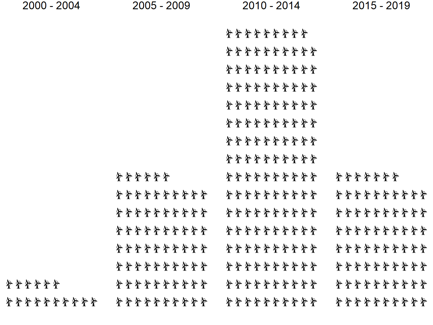
If we wanted to color the icons based on the Region variable, we would need to have multiple copies of the image in different colors. We could combine the information in Chapter 9 about manipulating and recoloring images, along with the information in Chapter 10 about defining image paths based on data values to do this programmatically.
The ggpattern package is not the only way to add pattern fills to charts in R. Since version 4.1.0 of R, patterns and gradients have been available through the grid package in base R, and version 3.5.0 of ggplot2 built upon that functionality to make some pattern fills available as part of the core ggplot2 package.
One of the benefits of using ggplot2 is that they are stored as lists, and all of the information about that plot is stored with it - even information you didn’t pass in! This allows you to use ggplot_build() to take a layout created by one ggplot2 extension package and use it in an entirely different extension - meaning you can create custom plots by mixing and matching features of different extensions.
14.3 Code formatting with lintr and styler
Writing code that follows a consistent style can make it easier for other people to read, makes collaboration simpler, and can help pick up errors in your code more quickly. In R, the lintr package (Hester et al. 2024) checks for adherence to a specified coding style and identifies possible syntax errors, then reports them so you can take action.
The styler package (Müller and Walthert 2023) goes one step further in terms of code styling, and it actually styles your code for you. Although you may be a little bit skeptical of packages that overwrite scripts you’ve written, it makes it quick and easy to style code. Creating a keyboard shortcut for the style_active_file() function means you can apply code styling easily, without having to call a function manually or click a specific button (Rennie 2023c).
As an alternative to the styler R package, you may wish to explore Air, an R formatter released in early 2025. Air doesn’t require R itself to run, and is much faster than styler. However, it’s less easy to customize the styling implemented.
14.4 Template files for TidyTuesday
You may notice that each chapter of this book has followed a similar structure: load packages, read in some data, perform some exploratory analysis, load fonts and colors as variables, write relevant text, create a simple plot, add styling with ggtext, and save a PNG file. This means that for each plot, there’s a lot of overlap in the structure of the .R files and the code they contain.
If you visualize data using R on a regular basis, you’ll likely find yourself repeating similar steps. You might even find yourself copying and pasting code from a previous file to your new file. Like many things in the world of programming, if you find yourself copying and pasting the same thing several times, there is almost certainly a better way of doing it. And in this case there is - template files!
For each TidyTuesday visualization, an .R script with the following file can be created (Rennie 2023b):
date_str <- "2024-04-02"

# Load packages ----

library(tidyverse)
library(showtext)
library(patchwork)
library(camcorder)
library(ggtext)
library(glue)

source("source_caption.R")
source("social_caption.R")


# Load data ----

tuesdata <- tidytuesdayR::tt_load(date_str)


# Load fonts ----

font_add_google("Roboto", "roboto")
showtext_auto()


# Define colors and fonts ----

bg_col <- ""
text_col <- ""
highlight_col <- ""

body_font <- "roboto"
title_font <- "roboto"


# Data wrangling ----


# Start recording ----

gg_record(
  dir = file.path(date_str, "recording"),
  device = "png",
  width = 7,
  height = 5,
  units = "in",
  dpi = 300
)


# Define text ----

social <- social_caption(
  bg_color = bg_col,
  icon_color = highlight_col,
  font_color = text_col,
  font_family = body_font
)
title <- ""
subtitle <- ""
caption <- source_caption(
  source = "",
  sep = "<br>",
  graphic = social
)


# Plot ----


theme(
  plot.margin = margin(5, 5, 5, 5),
  plot.background = element_rect(
    fill = bg_col,
    color = bg_col
  ),
  panel.background = element_rect(
    fill = bg_col,
    color = bg_col
  ),
  plot.title = element_textbox_simple(
    color = text_col,
    hjust = 0.5,
    halign = 0.5,
    margin = margin(b = 10, t = 5),
    lineheight = 0.5,
    family = title_font
  ),
  plot.subtitle = element_textbox_simple(
    color = text_col,
    hjust = 0.5,
    halign = 0.5,
    margin = margin(b = 10, t = 5),
    lineheight = 0.5,
    family = body_font
  ),
  plot.caption = element_textbox_simple(
    color = text_col,
    hjust = 0.5,
    halign = 0.5,
    margin = margin(b = 5, t = 10),
    lineheight = 0.5,
    family = body_font
  )
)


# Save gif ----

gg_playback(
  name = file.path(date_str, paste0(date_str, ".gif")),
  first_image_duration = 4,
  last_image_duration = 20,
  frame_duration = .25,
  background = bg_col
)
There are several components of this script that make it useful:
It’s separated into different sections which can help to break down the process of creating a visualization into smaller, more manageable chunks. In RStudio, the Ctrl+Shift+R keyboard shortcut can be used to add a new section.
It defines variables and code snippets that are used repeatedly in different visualizations. For example, defining variables for the colors and fonts, or using the theme elements from
ggtextto style the title and subtitle text.There are also some elements of the script that are similar for each plot, but not exactly the same. For example, reading in the data using the
tidytuesdayRpackage or saving the gif created bycamcorder. Here, the code is changing based on the date associated with the TidyTuesday data. Instead of manually editing the date in the script in each location, adate_strvariable is defined at the top of the script - meaning you only need to set the date once.
You can also create template files for other aspects of your data visualization workflow, for example, creating a README.md file for each visualization.
14.5 Writing your own helper functions
As you’ve already seen in Chapter 6 and Chapter 7, creating functions for code you reuse frequently can save time and space. We created the source_caption() and social_caption() functions to add a caption with data source attribution, and to write plot caption that contained Font Awesome icons. These functions have then been used in almost every subsequent chapter (and therefore also the template file described in the previous section). What other helper functions might be useful?
To use the Font Awesome icons, you need to load the Font Awesome font files. We did this using
sysfonts::font_add()and specifying a path to the font file. You might also want to load other fonts that aren’t normally available on your system or through Google Fonts. You could write a function that loads (multiple) font files that you use often. You could go one step further and place the fonts and your font-loading function into an R package.For the template file discussed in the previous section, the date was defined as a variable at the top of the script. Instead, you could create a function that takes the date as an argument. The function could then create your .R script, insert the date where it needs to go, and save the file to the desired location.
If you’re creating plots for corporate reports, creating your own
ggplot2theme and color palette functions can save time implementing the same styling and colors for every visualization. It can also make it easier for other people you work with to use the same styling.
You can create helper functions for anything that you do often. If you don’t use Font Awesome icons in your captions, you don’t need to create the social_caption() function. But if, for example, you always save your images in a specific size with a specific background color, create a function that does that. You’ll be amazed at how much time you can save.
14.6 Exercises
Browse through the available TidyTuesday datasets at github.com/rfordatascience/tidytuesday, and choose one you find interesting.
Use the skills and techniques you’ve learned in this book to create your own visualization that tells a story about the data.