5 Animal shelter intakes: making gauge charts with ggforce
In this chapter we’ll discover how to create gauge charts, a type of chart not native to ggplot2, with the help of the ggforce extension package.
By the end of this chapter, you’ll be able to:
- Create a gauge chart by programmatically calculating sizes of plot elements to use new geom functions from the
ggforcepackage; - See how choosing a different aspect ratio or coordinate system can change the look of a chart;
- Analyze your choice of color(s) to check if they are likely to be accessible to people with color vision deficiency.
We begin by loading the packages required in this chapter.
This chapter introduces several new packages, that we haven’t yet used in previous chapters:
-
colorblindr: for assessing the accessibility of color palettes and the use of color in charts. -
ggforce: a package that extends the behavior ofggplot2and provides additional geoms and stats. -
lubridate: a package for manipulating and creating date variables. You’ll see more examples oflubridatein Chapter 8 and Chapter 10. -
scales:ggplot2uses thescalespackage in the background for help with axis limits and labels. However, you can use the functions fromscalesdirectly to transform data, labels, and colors.
5.1 Data
The Long Beach Animal Shelter dataset (Long Beach Animal Shelter 2025) contains information on the intakes and outcomes for over 28,000 animals who were surrendered between 2017 and 2024. Here, the term surrendered refers to all animals who were taken into a shelter, but the dataset also contains information on whether the animals were surrendered by their owner, confiscated, found as a stray, or arrived through other means.
The animal shelter dataset was used as a TidyTuesday dataset in March 2025 (after being curated by Lydia Gibson), and the data is also available via the animalshelter package (Hvitfeldt 2025). Let’s start by reading in the data using the tidytuesdayR R package (Hughes 2022b) and looking at the definitions of the variables:
tuesdata <- tt_load("2025-03-04")
longbeach <- tuesdata$longbeach
The longbeach data is reasonably large with 29787 rows and 22 columns.
head(longbeach)# A tibble: 6 × 22
animal_id animal_name animal_type primary_color
<chr> <chr> <chr> <chr>
1 A693708 *charlien dog white
2 A708149 <NA> reptile brown
3 A638068 <NA> bird green
4 A639310 <NA> bird white
5 A618968 *morgan cat black
6 A730385 *brandon rabbit black
# ℹ 18 more variables: secondary_color <chr>, sex <chr>,
# dob <date>, intake_date <date>, intake_condition <chr>,
# intake_type <chr>, intake_subtype <chr>,
# reason_for_intake <chr>, outcome_date <date>,
# crossing <chr>, jurisdiction <chr>, outcome_type <chr>,
# outcome_subtype <chr>, latitude <dbl>, longitude <dbl>,
# outcome_is_dead <lgl>, was_outcome_alive <lgl>, …Each row of the dataset relates to a different intake, with some animals appearing multiple times, as can be identified by the animal_id column. Further information on each individual animal is provided such as their name, the type of animal they are (e.g., cat or dog), what color they are, their sex, and their date of birth. Many of these columns have an excessive number of missing values, mainly due lack of information about animals that arrive as strays. Additional columns provide information about the intake including the date, the type and subtype (e.g., owner surrender or stray), and a free text response giving a reason for the intake. More detailed information is given on the geographic location of the capture or intake, including coordinate date and jurisdiction. Finally, data is also provided on the outcome for each animal, including when their outcome occurred, the type and subtype (e.g., adopted or died). Some binary variables for different outcomes are also pre-calculated.
5.2 Exploratory work
Given the many different aspects of the animals and their intakes and outcomes that have been recorded, there are lots of variables that we could look into further. What might be an interesting aspect of this data to visualize?
5.2.1 Data exploration
As in other chapters in this book, we’ll start with some basic exploratory plots in base R. For example, we may look at the distribution of variables in each animal_type using the barplot() function in Figure 5.1.
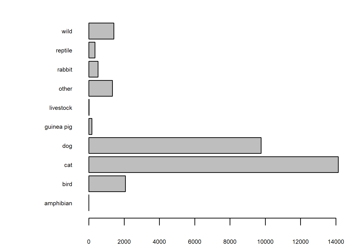
We have lots of observations relating to cats, with dogs a fairly close second. This likely represents how common it is to have these types of animals as pets. We might also be interested in how the number of intakes has changed over time, as shown in Figure 5.2.
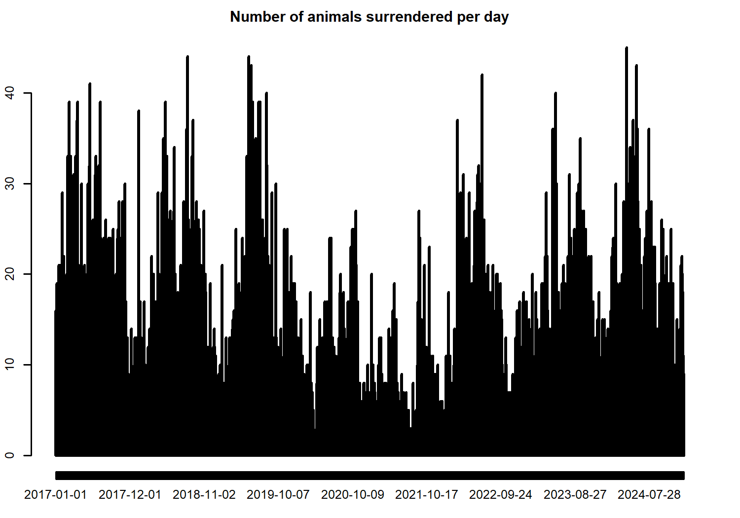
We can see that there are some seasonal differences in the number of intakes, and that there seems to be a slight decrease during 2020 and 2021 - likely related to the COVID-19 pandemic affecting how many animals can be captured.
It’s perhaps more interesting to look at how the number of surrenders for different animal types has changed over time, using the heatmap() function in base R in Figure 5.3.
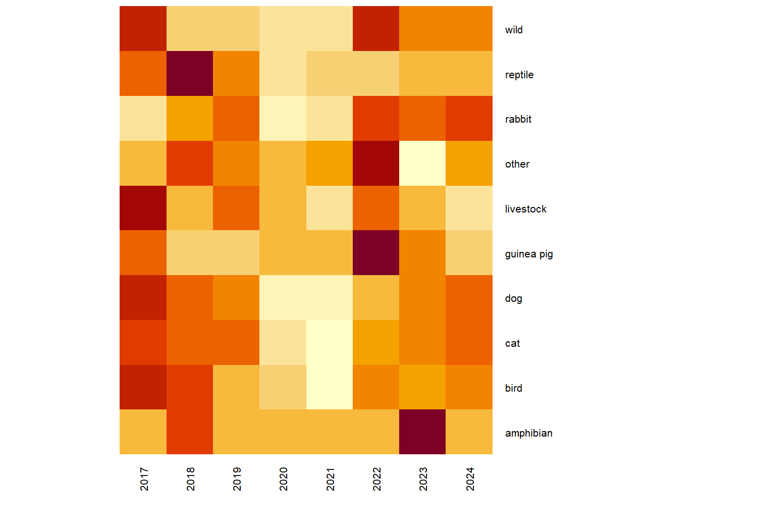
In Figure 5.3, we’ve used the year() function from lubridate to extract the year from the date variable to aggregate the data to annual values since there are very small numbers of some animal types.
Let’s think about how we might visually represent this data in a more meaningful, and aesthetic, way. Although including all years of data allows us to consider trends in the values, sometimes looking at a only a few snapshots can be more effective. For example, by considering only the years 2017 and 2023 as we’ll do here, readers might say, Wow, look how much things have changed!, rather than the perhaps less impactful visual of a gradual trend. This also allows us to compare numbers pre- and post-pandemic, rather than trying to quantify the pandemic impact at the same time as trying to describe a longer term trend.
We can again use year() from lubridate to save the extracted years as a new column, use the filter() function from dplyr to filter our longbeach dataset to consider only the rows for the years 2017 and 2023. Since some of the animal types have very small numbers, even when aggregating to annual data, we’ll use if_else() to include more animal types in the "other" category that already exists. We then use count() from dplyr to count up how many of each animal type were surrendered in each of the years we’re interested in.
# subset data for years and combine animal types
intake_data <- longbeach |>
  mutate(
    year = year(intake_date),
    animal_type = if_else(
      animal_type %in% c(
        "dog", "cat", "bird",
        "wild", "reptile"
      ),
      animal_type,
      "other"
    )
  ) |>
  filter(
    year %in% c(2017, 2023)
  ) |>
  count(year, animal_type)
head(intake_data)
# A tibble: 6 × 3
year animal_type n
<dbl> <chr> <int>
1 2017 bird 352
2 2017 cat 2228
3 2017 dog 1743
4 2017 other 230
5 2017 reptile 57
6 2017 wild 216Our data now shows just the number (n) of animals of each type (animal_type), in each of 2017 and 2023 (year). How might we visualize this data? There are a few obvious options that come to mind: a simple grouped bar chart, a slope chart, or indeed the (not often popular) pie chart. Our choice of data visualization will depend on which aspects of the data we want to show. Do we want to compare 2017 to 2023? Do we want to look at the relative number of different animal types? Or do we just want to show the range of values in the data? In this data, perhaps the most interesting example is a comparison between 2017 and 2023. Although a slope chart would likely work well for this data, we’re going a little bit more experimental with a gauge chart.
At the time of writing, there isn’t a built-in function in ggplot2 to create gauge charts. If you’ve never heard of a gauge chart, the initial sketch in Figure 5.4 might give you an idea of what we’re aiming for.
5.2.2 Exploratory sketches
You can think of a gauge chart as a stacked bar chart which is curved over a half-circle. Here, rather than one stacked bar chart, we have two stacked bar charts.

Gauge charts often also include a dial (or needle) to highlight the value further, but that gets a little bit complicated when we have multiple gauges. So let’s leave that for now.
5.3 Preparing a plot
Gauge charts are not a built-in feature of ggplot2, so we’re going to have to do a little bit of manual preparation before we start plotting.
5.3.1 Data wrangling
We could use geom_col() and coord_polar() to try to make a gauge chart natively in ggplot2. However, the use of polar coordinates in ggplot2 often makes it difficult to add elements such as annotations in the position you’d like them to be. So let’s create a gauge chart a slightly different way!
A gauge chart is normally used to show progress toward a target or a limit. For example, when considering data given as percentages, 100% is a common upper limit. For our data, if we knew the maximum capacity of the shelter, that would be an appropriate choice. However, since we don’t have that information, we don’t really have a natural limit.
So we need to decide on a reasonable one, such as:
- The maximum number of all animals surrendered across all years
- The maximum number of all animals surrendered across the selected years
- The maximum number of animals of a single type surrendered across all years
- The maximum number of animals of a single type surrendered across the selected years
In some sense, the choice is fairly arbitrary and it depends on what you want to highlight. Here, we’ll use the maximum number of animals of a single type surrendered across the selected years. We’ll use ceiling() to round up to the nearest 500 to give us a nicer upper limit.
[1] 2228 2500In R, the round() function can be used to round a number, with the digits argument specifying the level of precision. Supplying negative numbers, allows you to round to the nearest 10, 100, 1000 and so on.
round(1234, digits = -1)[1] 1230round(1234, digits = -2)[1] 1200round(1234, digits = -3)[1] 1000However, for rounding to numbers that are not a power of 10, you can divide by that number, round it, and then multiply by the number again. Replace round() with floor() or ceiling() for specifically rounding down or up.
Let’s divide n by our chosen upper limit, to determine how much progress has been made towards that limit (value) for each category To make it easier for us to plot later on, we then also calculate how far away each category is from that limit (no_value). We no longer require the n column, so we use select() from dplyr to drop it.
We then pivot our data to long format and back again using the pivot_longer() and pivot_wider() functions from tidyr. This results in each animal type having two rows in the data: (i) one row for the percentage to the limit in 2017 and 2023 and (ii) one row for the percentage from the limit in 2017 and 2023.
intake_YN <- intake_data |>
  mutate(
    value = n / upper_limit,
    no_value = 1 - value
  ) |>
  select(-n) |>
  pivot_longer(
    cols = c(value, no_value),
    names_to = "YN",
    values_to = "perc"
  ) |>
  pivot_wider(
    names_from = "year",
    values_from = "perc"
  ) |>
  mutate(YN = factor(YN))
If you think about creating a stacked bar chart (i.e. an unfurled gauge chart), we need to know the end point of each bar (the maximum y-axis value for each bar). This isn’t the percentage for each group, it’s the cumulative percentage for each group and the ones stacked below it. We use the cumsum() function to calculate the cumulative sum across each year and animal type:
# A tibble: 6 × 6
# Groups:   animal_type [3]
  animal_type YN       `2017` `2023` ymax_2017 ymax_2023
  <chr>       <fct>     <dbl>  <dbl>     <dbl>     <dbl>
1 bird        value     0.141  0.101     0.141     0.101
2 bird        no_value  0.859  0.899     1         1
3 cat         value     0.891  0.767     0.891     0.767
4 cat         no_value  0.109  0.233     1         1
5 dog         value     0.697  0.564     0.697     0.564
6 dog         no_value  0.303  0.436     1         1
You’ll notice that the ymax_* values are always 1 for the no_value rows - this is because the no_value is the last bar so we will always have plotted 100% of the data by the time we’ve finished that bar. Note that the data is currently still grouped by animal_type - this will be important later!
5.3.2 ggforce extension package
The ggforce extension package (Pedersen 2022) contains many useful functions which extend the behavior of ggplot2, many of them aimed at exploratory data visualization. We won’t cover many of its functions in this chapter, and instead we’ll focus on how to use it to create gauge charts. ggforce is available on CRAN and can be installed with the usual install.packages("ggforce") command.
5.3.3 Gauge charts with ggforce
The function that we’re interested in for the purposes of creating a gauge chart is geom_arc_bar() . The geom_arc_bar() function makes it possible to draw arcs in ggplot2. You can also use this function to create visualizations such as donut charts or sunburst plots. We’ll use two calls to geom_arc_bar() to create the double gauge chart - one for the 2017 arc, and one for the 2023 arc. There are several required aesthetics when using geom_arc_bar():
-
x0: The x-coordinate of the center of the circle that the gauge chart lies on. For us, this will be a constant value so we can choose any number -0seems like an obvious choice. -
y0: The y-coordinate of the center of the circle that the gauge chart lies on. For us, this will be a constant value so we can choose any number -0seems like an obvious choice again. -
r0: The inner radius (fromx0andy0) of the arc. -
r: The outer radius (fromx0andy0) of the arc. The difference betweenr0andrdetermines how thick the gauge chart will be. For each of the two arcs we will draw, these will be constant. For the outer arc (2023), we can setr0 = 0.7andr = 1, and for the inner arc (2017), we can setr0 = 0.2andr = 0.5. Note that the difference between the radii is 0.3 for both arcs so they are equally thick. -
start: The starting angle for each segment in the arc. -
end: The ending angle for each segment in the arc.
The last part of data wrangling we need to do is compute the start and end values.
5.3.4 Computing aesthetics
The end values are easy: the ymax_2017 and ymax_2023 columns that we already have. We need to compute the equivalent ymin_2017 and ymin_2023 values: what are the minimum values in each stacked bar chart?
Think again about stacked bar charts instead of gauge charts for a second (since it’s a little bit easier to visualise). The minimum value for the first bar at the bottom of the stack will always be zero. For the rest of the stacked bars, the minimum value will be equal to the maximum value of the bar stacked below it. This means that we’ve actually already computed all the values we need and stored them in plot_data. We just need to rearrange them a bit.
There is almost certainly a nicer way of doing this in base R that contains fewer lines of code and is easier to read. Consider the following code block as an experiment in seeing whether we could do this in a piped workflow, without considering whether we should!
Let’s start with the 2017 data. We start off by creating the 0 values for the minimum in the first stacked bar using rep(0, n_types) - since we need one 0 for each animal type in 2017. We then want to get the ymax_2017 values from plot_data except the last one. We therefore use slice_head() to get this subset of the rows (missing the last one in each animal type). Remember that plot_data is still grouped by animal_type. We then stick these ymax_2017 to the 0 we created and pass them into a new column called ymin_2017 using mutate(). The code for the 2023 arc is analogous.
n_types <- length(
  unique(plot_data$animal_type)
)
ymin_data <- plot_data |>
  ungroup() |>
  # start values for 2017 arc
  mutate(
    ymin_2017 = c(rbind(
      rep(0, n_types),
      (slice_head(plot_data, n = -1) |>
        pull(ymax_2017))
    ))
  ) |>
  # repeat for 2023
  mutate(
    ymin_2023 = c(rbind(
      rep(0, n_types),
      (slice_head(plot_data, n = -1) |>
        pull(ymax_2023))
    ))
  )
All of our variables are currently scaled between 0 and 1 (since they relate to percentages towards a limit). To plot this as an arc however, we need to convert this to polar coordinates. We want to start our arc at \(-\pi/2\) (instead of 0) and end at \(\pi/2\) (instead of 1). We can use the rescale() function from the scales package (Wickham, Pedersen, et al. 2023) to define the range we want to scale from and to.
We want to apply this to every column of ymin_data that starts with a lowercase "y", i.e., all of the ymax_* and ymin_* columns so we use mutate() and across() from dplyr in conjunction with the starts_with() column selector function. We need to make sure we set ignore.case = FALSE to prevent dplyr from trying to rescale the YN column as well.
mutate()
In older versions of dplyr, the mutate_at() function would have been used instead of mutate() and across(). The mutate_at() function has now been superseded.
# A tibble: 6 × 8
  animal_type YN       `2017` `2023` ymax_2017 ymax_2023
  <chr>       <fct>     <dbl>  <dbl>     <dbl>     <dbl>
1 bird        value     0.141  0.101    -1.13     -1.25
2 bird        no_value  0.859  0.899     1.57      1.57
3 cat         value     0.891  0.767     1.23      0.839
4 cat         no_value  0.109  0.233     1.57      1.57
5 dog         value     0.697  0.564     0.620     0.200
6 dog         no_value  0.303  0.436     1.57      1.57
# ℹ 2 more variables: ymin_2017 <dbl>, ymin_2023 <dbl>
5.3.5 First plot
We’re now finished with the data wrangling (finally!) and ready to create our first plot. As always, we start with the ggplot() function and pass in gauge_data that will be used for plotting the arcs. The aesthetics for each arc will vary so we’ll hold off on passing them in globally.
We then add two arcs by using geom_arc_bar() twice. We set the x0, y0, r0, and r constants as we described above. Even though we have chosen constant values for the aesthetics, they still need to be inside the aes() function because they are required aesthetics. We then pass the ymin_* and ymax_* columns in as the start and end aesthetics, and set the fill color based on the YN column.
We also use facet_wrap() to draw a pair of arcs for each animal type in a separate facet, choosing to use nrow = 2 to give us a nice rectangular 3x2 grid of facets for our six countries as shown in Figure 5.5.
basic_plot <- ggplot(data = gauge_data) +
  # Outer 2023 arc
  geom_arc_bar(
    mapping = aes(
      x0 = 0, y0 = 0,
      r0 = 0.7, r = 1,
      start = ymin_2023, end = ymax_2023,
      fill = YN
    )
  ) +
  # Inner 2017 arc
  geom_arc_bar(
    mapping = aes(
      x0 = 0, y0 = 0,
      r0 = 0.2, r = 0.5,
      start = ymin_2017, end = ymax_2017,
      fill = YN
    )
  ) +
  facet_wrap(~animal_type, nrow = 2)
basic_plot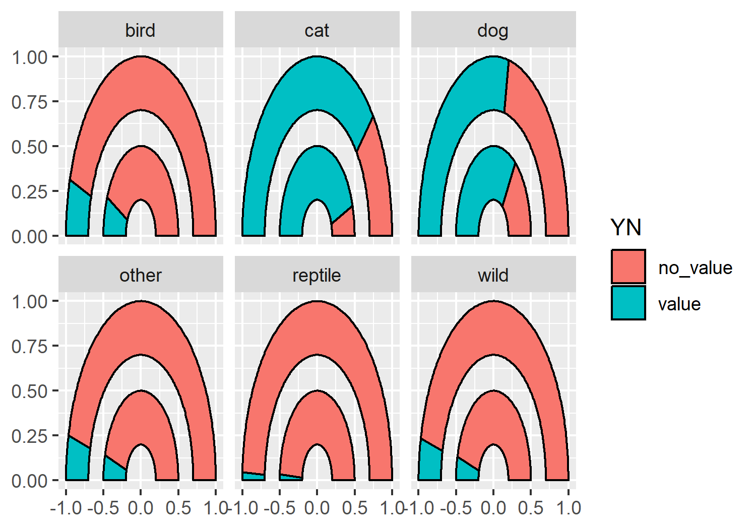
geom_arc_bar() from ggforce, faceted by different animal types.
5.4 Advanced styling
We now have a double gauge chart, but it could look a lot nicer (and more informative)!
5.4.1 Colors
Let’s start by defining some variables for our colors. Here, we define a pink highlight_col which we’ll use for the segment showing the percentage towards the target i.e. the number of animals surrendered. This should be a bright, eye-catching color as it’s the main point we’re trying to communicate. The second_col will be used to show the percentage remaining towards the target, so we can choose a color that is a little bit more similar to the background. The background (bg_col) will be a light gray, the second_col will be a medium gray, and the text (text_col) will be black.
highlight_col <- "#990C58"
second_col <- "#949398"
bg_col <- "#DEDEDE"
text_col <- "black"
Before we add the new colors to our gauge chart, let’s remove the black outline from around the segments - they’re quite thick lines which don’t add anything to the plot. There will be sufficient contrast between the segments with the new colors we’ve chosen. You can remove the outline from the arc by setting color = NA outside of the aesthetic mapping:
basic_plot <- ggplot(data = gauge_data) +
geom_arc_bar(
mapping = aes(
x0 = 0, y0 = 0,
r0 = 0.7, r = 1,
start = ymin_2023, end = ymax_2023,
fill = YN
),
color = NA
) +
geom_arc_bar(
mapping = aes(
x0 = 0, y0 = 0,
r0 = 0.2, r = 0.5,
start = ymin_2017, end = ymax_2017,
fill = YN
),
color = NA
) +
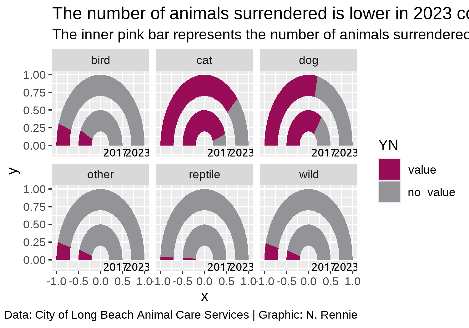
facet_wrap(~animal_type, nrow = 2)Now we can apply the colors using scale_fill_manual() from ggplot2, as shown in Figure 5.6.
color_plot <- basic_plot +
  scale_fill_manual(
    breaks = c("value", "no_value"),
    values = c(highlight_col, second_col)
  )
color_plot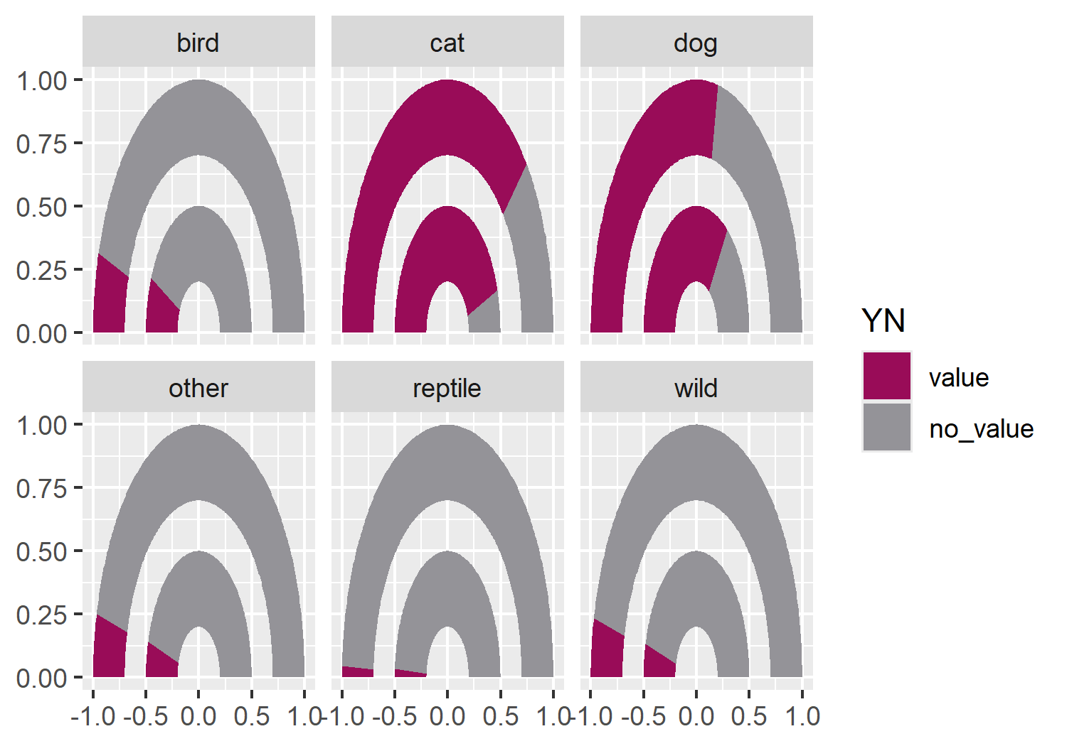
When choosing colors for a visualization, it’s important not to rely too heavily on colors and legends for differentiating groups or communicating information. Color vision deficiency (also known as color blindness) comes in many different forms, and different types affect how people perceive colors in different ways. One way to check if your chart is accessible to people with color vision deficiency, is to view it in grayscale (black and white) and consider if it can be understood without color. If it can’t, consider choosing different colors, or using shapes and patterns to differentiate groups instead. Direct labeling of data and making sure that the order of the legend matches the order of the data can help when legends are unavoidable (Government Analysis Function 2021).
There are several packages in R that can be used to investigate the accessibility of color palettes. One of them is colorblindr (McWhite and Wilke 2024). The colorblindr package allows you to create simulations of what your chart may look like to someone with color blindness. The package also includes colorblind friendly qualitative palettes with associated ggplot2 functions. At the time of writing, colorblindr is not available on CRAN but can be installed from GitHub, using the methods described in Chapter 4.
cvd_grid(color_plot)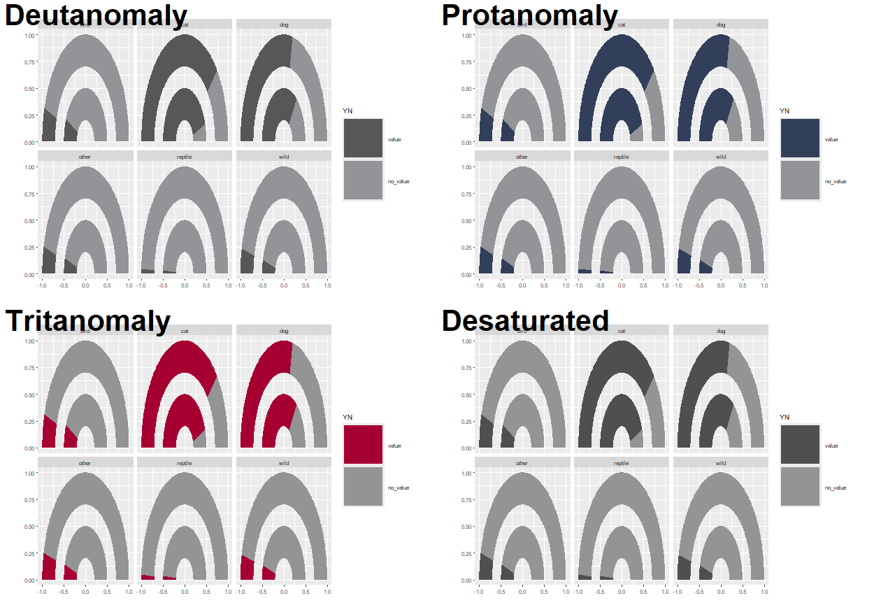
Note that the default color palette in ggplot2 does not show any differentiation when viewed in grayscale, so it’s important to think about which colors you’re using for any chart.
5.4.2 Text and fonts
As we’ve seen in previous chapters, we can load in Google fonts using the sysfonts and showtext packages. Here, we’ll keep it clean and minimal by using the "Ubuntu" typeface for both the title and the body.
font_add_google(name = "Ubuntu")
showtext_auto()
showtext_opts(dpi = 300)
body_font <- "Ubuntu"
Let’s define some text for the title and subtitle. Here, the title defines the key message of the chart, ensuring a reader understands the main point even if they only glance at the graphic. The subtitle gives a brief explanation of how to interpret the plot, and reiterates the main conclusion that we want the reader to take away. The caption variable identifies the source of the data for this visualization, as well as the chart creator.
title <- "The number of animals surrendered is lower in 2023 compared to 2017"
subtitle <- "The inner pink bar represents the number of animals surrendered in 2017, whilst the outer pink bar represents the number in 2023. A decrease is seen across all types of animals."
caption <- "Data: City of Long Beach Animal Care Services | Graphic: N. Rennie"
Since the axis labels do not make too much sense for geom_arc_bar() plots, we’ll remove them later when using the theme functions. Instead, we can add our own labels using geom_text() to the end of the gauges. To make it easier, we can construct a small data.frame specifically for adding text labels. This includes the x, and y coordinates where the text should be positioned (you can read these off from the graph we already have since we haven’t yet deleted the axis labels), as well as the label that should appear.
text_df <- data.frame(
  x = c(0.35, 0.85),
  y = c(-0.1, -0.1),
  label = c(2017, 2023)
)
We can then add this text to the existing plot by also adding a layer with geom_text(), noting that we need to specify the data argument as using the text data.frame we just created. We also need to specify the typeface and size directly within the geom_text() function and can add the title and subtitle text created earlier using the labs() function from ggplot2.
5.4.3 Adjusting themes
We’ll start by removing all of the theme elements such as the gray background, grid lines, and axis labels from Figure 5.8. The easiest way to do this is using theme_void(). We can use the base_family argument of theme_void() to set the typeface that will be used by default for any non-geom text elements that remain.
You may have noticed that the current gauge plots look a bit squashed and not exactly semi-circular. We can fix this by adding coord_fixed() which forces a 1:1 aspect ratio on the plot panel.
theme_plot <- text_plot +
  coord_fixed() +
  theme_void(base_size = 8.5, base_family = body_font)
theme_plot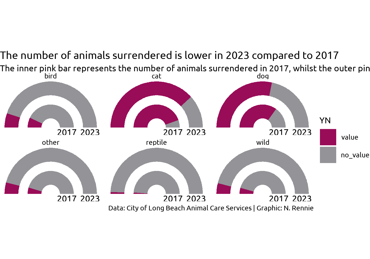
Figure 5.9 looks better, but it’s still not great. What do we still need to improve with styling?
- The title text doesn’t stand out and blends in too easily with the subtitle, similarly for the facet text. Perhaps a bold font would help?
- The subtitle text doesn’t fit onto the page, but we can fix that with the help of the hopefully now familiar
element_textbox_simple()function fromggtext. - Since we’re using
coord_fixed()to force a specific aspect ratio, there are now some odd spacing issues - there is a large white gap at the top and bottom of the plot, and the year labels are slightly cut off at the bottom. - The legend takes up a lot of space and isn’t very informative.
Let’s fix the first two of these issues by editing the theme() elements:
- We use
element_textbox_simple()for the subtitle, making sure to left align the text. - We set
face = "bold"for the title and facetstrip.textand increase the font size using therel()function. - As we’ve done in previous visualizations, we also set the background colors to
bg_coland add some padding around the edges by setting theplot.marginargument.
styled_plot <- theme_plot +
  theme(
    plot.background = element_rect(
      fill = bg_col, color = bg_col
    ),
    panel.background = element_rect(
      fill = bg_col, color = bg_col
    ),
    strip.text = element_text(
      face = "bold", size = rel(1.2),
      margin = margin(b = 5)
    ),
    plot.title = element_text(
      margin = margin(b = 10),
      hjust = 0,
      face = "bold",
      size = rel(1.2)
    ),
    plot.subtitle = element_textbox_simple(
      margin = margin(b = 10),
      hjust = 0,
      halign = 0
    ),
    plot.caption = element_text(
      margin = margin(t = 10),
      hjust = 0
    ),
    plot.margin = margin(5, 5, 5, 5)
  )
styled_plot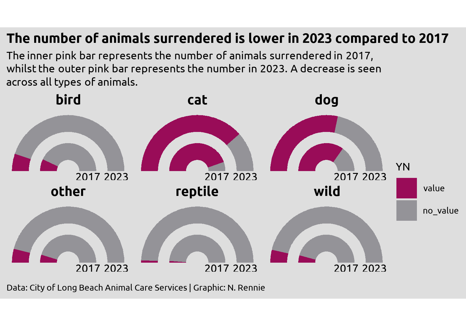
We’re almost there, but the year label text in Figure 5.10 remains slightly squashed. Part of the problem is how much space the legend takes up - it’s leaving too much empty space in the top- and bottom-right corners, while taking away space from other places where we need more of it. This highlights a common problem when developing charts - how big should the visualization be? Choosing the right size of image is especially important when using fixed aspect ratios in your plot, e.g., when using coord_fixed() or spatial coordinates as we’ll see in Chapter 12, since the wrong choice can result in cropped plots or extra white space.
Rather than thinking about width and height, it can often be more helpful to think about aspect ratio and width (or height). This often makes the process of increasing the image size a little bit easier.
There are some aspect ratios that are commonly used, e.g., 4x6, 5x7, or 1x1. Choosing a commonly used aspect ratio can make it easier to arrange multiple plots, especially in websites or slides. If you’re creating a plot as part of a publication, some academic journals or magazines may have specific aspect ratio requirements. Otherwise, use your exploratory sketches as a way of determining which aspect ratio might be appropriate.
Often the choice of width can be based on physical constraints. For example, the visualizations in this book are all around 5 inches wide to fit on the page of the print edition. You may also wish to have multiple sizes of images, e.g., low and high resolution.
Changing the width (or resolution) of a plot, often also means changing other aspects, e.g., the font sizes, which don’t necessarily rescale larger. By setting a base_size and using rel() to edit individual font size elements, you minimize the amount of work. Viewing the plot in at desired size and resolution also makes it easier to set the sizes correctly. See Section 14.1 for more information.
5.4.4 Alternatives to a traditional legend
Although we could simply increase the height of the plot to stop the year labels from becoming squashed, an alternative approach is to address the source of the issue and edit the legend.
We have a few different options for dealing with the legend. Some options might be:
Leave the legend as it is, but reposition it to above or below the main chart, rather than to the right, and put it into a single row. Then it would take up less space. Repositioning the legend will be discussed in Chapter 11.
We could design a custom legend. This might be a good option as double gauge charts are not so common and readers might be less familiar with them. Adding additional information about how they work might prove helpful. We’ll look at how to design and use a custom legend in Chapter 12 and Chapter 13.
We could instead use colored text in the subtitle to indicate what the categories are. For this visualization, highlighting and explaining the dark pink category would be enough. We’ll look at ways to do this in R in Chapter 6 and Chapter 7.
Here, there’s an argument to be made that any form of legend is in fact unnecessary. The current choice of colors and title of the chart makes it clear enough that the dark pink color represents the number of animals in the data (percentage towards the target).
So let’s remove the legend, by setting legend.position = "none" inside theme():
styled_plot +
  theme(legend.position = "none")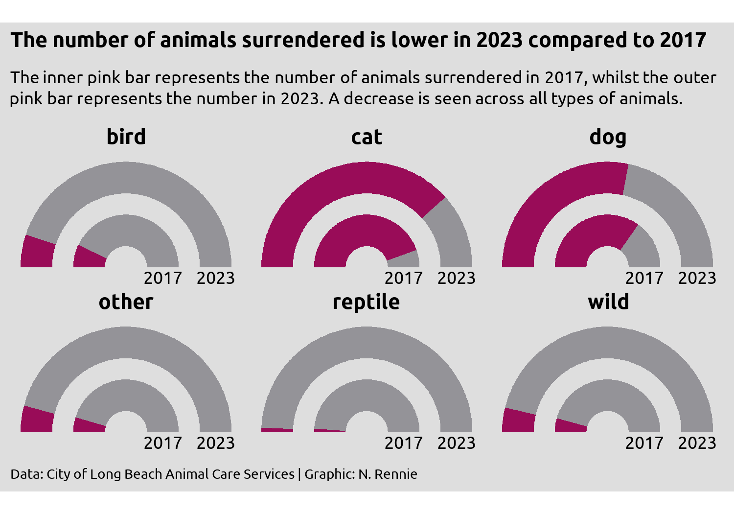
Then save Figure 5.11 with ggsave():
ggsave(
  filename = "animal-intakes.png",
  width = 5,
  height = 0.7 * 5
)
5.5 Reflection
Are gauge charts the most effective method of visualizing this data? No. Gauge charts have their own problems, some of which you can see here. Since the ring representing 2023 is on the outside, the radius is larger, and therefore the area is as well. If you measure the change in arc length between 2017 and 2023, you’ll get different answers than if you measured the proportional change in area for the two. Here, 2023 values are consistently lower than 2017 values, yet they take up more space. Assuming we stick with the gauge chart idea, what further changes could be made to this plot to improve it?
The facet labels could be formatted a little nicer, e.g., using capitalized letters, and perhaps using wild animals instead of just wild. Ordering the facets from overall highest to lowest, would also improve how easy it is to read.
Providing the exact counts as labeled text would make it easier to see what the change in surrenders is. It’s reasonably clear that there has been an decrease across all six animal types, but the nature of gauge charts (no grid lines) makes it quite difficult to get the exact values. What’s the difference between dogs and cats in 2017? It’s too difficult to tell here.
Obtain and use a more intuitive value for the upper limit, as our current choice is rather arbitrary. If none can be found, that’s perhaps more motivation for returning to a simpler chart type such as a slope chart.
Although a full, traditional legend may be unnecessary here, the addition of some colored text may add clarification that the pink area is what represents the main data. We’ll look at using colored text instead of a legend in Chapter 6 and Chapter 7.
5.6 Exercises
Redesign this visualization using a bar chart instead of a gauge chart, and add labels to show the percentage values directly on the chart.
Do you need to change the aspect ratio or coordinate system to improve the layout?