12 Time zones: spatial data and mapping with sf
In this chapter we’ll learn how to obtain map data using rnaturalearth, manipulate spatial data using sf and plot it with ggplot2, and add a custom bar chart legend to a map of the world.
By the end of this chapter, you’ll be able to:
- Manipulate spatial data and change the coordinate reference system used;
- Join data together from different sources and fix mismatches in the way country names are spelled; and
- Combine multiple plots by overlaying one on top of the other.
We begin by loading the packages required in this chapter.
Several new packages are used in this chapter:
-
patchwork: arrange and combine multiple plots (and tables) together, either in a grid layout or as inset elements. -
rnaturalearth: allows you to download geographic data for different countries and regions, at a variety of resolutions and in different formats. -
sf: provides a standardized way of representing spatial data, and it has functions for manipulating it. It integrates easily with othertidyversepackages, includingggplot2.
12.1 Data
The IANA (Internet Assigned Numbers Authority) tz database contains data on the history of local time for different locations around the world (Internet Assigned Numbers Authority 2023). The website states that, “each main entry in the database represents a timezone for a set of civil-time clocks that have all agreed since 1970.” Many websites use the data in the IANA tz database to operate.
The time zones data was used as a TidyTuesday dataset in March 2023, where the data wrangling code was adapted from code by Davis Vaughan. There are actually four datasets included, but we’ll focus on the timezones data for now. We can load the data into R using the tt_load() function from the tidytuesdayR package (Hughes 2022b):
tuesdata <- tt_load("2023-03-28")
timezones <- tuesdata$timezones
The data contains information for 4 different variables on 337 time zones. The zone column contains the time zone name; the latitude and longitude columns contain coordinates for the time zones principal location, e.g., biggest city; and the comments column contains comments from the original time zone definition file.
12.2 Exploratory work
Let’s start by looking at what the timezones data looks like!
12.2.1 Data exploration
Let’s inspect the first few rows of the data using head():
head(timezones)# A tibble: 6 × 4
zone latitude longitude comments
<chr> <dbl> <dbl> <chr>
1 Africa/Abidjan 5.32 -4.03 <NA>
2 Africa/Algiers 36.8 3.05 <NA>
3 Africa/Bissau 11.8 -15.6 <NA>
4 Africa/Cairo 30.0 31.2 <NA>
5 Africa/Casablanca 33.6 -7.58 <NA>
6 Africa/Ceuta 35.9 -5.32 Ceuta, MelillaThe first thing that jumps out is the comments column which appears to have a lot of missing data. Let’s plot it to confirm, making use of the is.na() function to plot only the counts of missing and non-missing data:
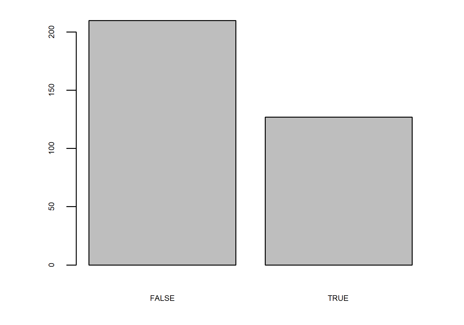
comments column, where TRUE represents missing.
Almost 40% of the time zones have no comments associated with them. Inspecting the data further tells us that these comments typically offer clarification or an alternative for the time zone name. Although we could explore how the presence of these comments varies across the globe, we’ll use select() from dplyr to drop the comments column for now since it’s not the most interesting thing to plot in the data.
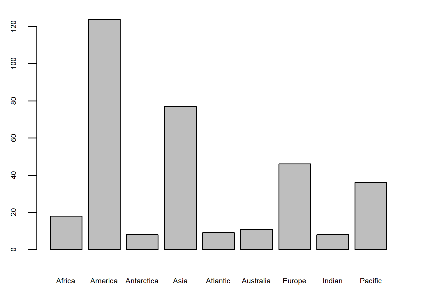
The first column, zone, contains information on the time zone name; it’s typically in the form of "Continent/City". To explore the spread of time zones across continents, we need to split this variable into two (or extract just the continent name from the time zone name). We can use separate_wider_delim() from tidyr to create two new columns from the zone column, splitting on the "/" character. Some of the time zone names have two "/" in their name, e.g., "America/North_Dakota/New_Salem" meaning there are too many pieces for two columns. We can tell separate_wider_delim() to merge the last pieces since it still uniquely specifies the location.
timezones_data <- timezones |>
  select(-comments) |>
  separate_wider_delim(
    cols = zone,
    delim = "/",
    names = c("continent", "place"),
    too_many = "merge"
  )
Now, we can explore how many time zones there are per continent, again using the barplot() function. In Figure 12.2, we can see that the first part of the time zone names does not quite map to continents since there are nine values - but they do map onto large geographic regions.
Of course, when we have coordinate data, the most obvious thing to do is plot those coordinates on a map!
12.2.2 Exploratory sketches
Given that we have a latitude and longitude data for the principal locations (usually largest cities) within each time zone, the first map idea that springs to mind is a world map with the time zone locations plotted as points as shown in Figure 12.4.
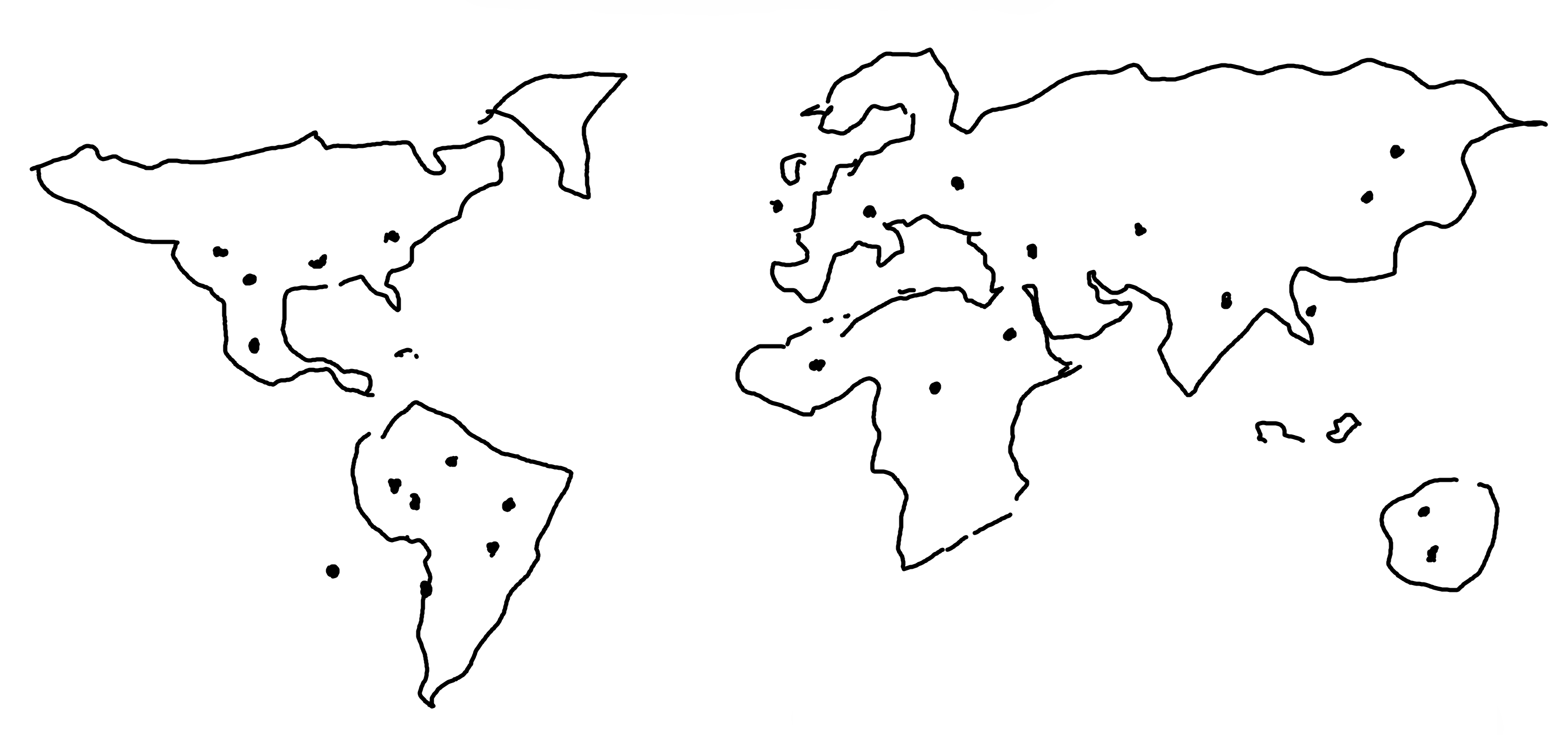
We could color the points based on the geographic region (continent) they belong to. As we’ve already seen, if we do this in ggplot2, coloring based on a variable automatically adds a legend to the chart. Instead of the traditional legend using colored squares next to the category label, we could add our own custom legend - using a bar chart. The bars show the number of time zones per region, and are colored in the same way as the points on the map. This bar chart legend below the map doesn’t take up any more space than a traditional legend, but it does add information (or at least makes the existing information quicker and easier to process).
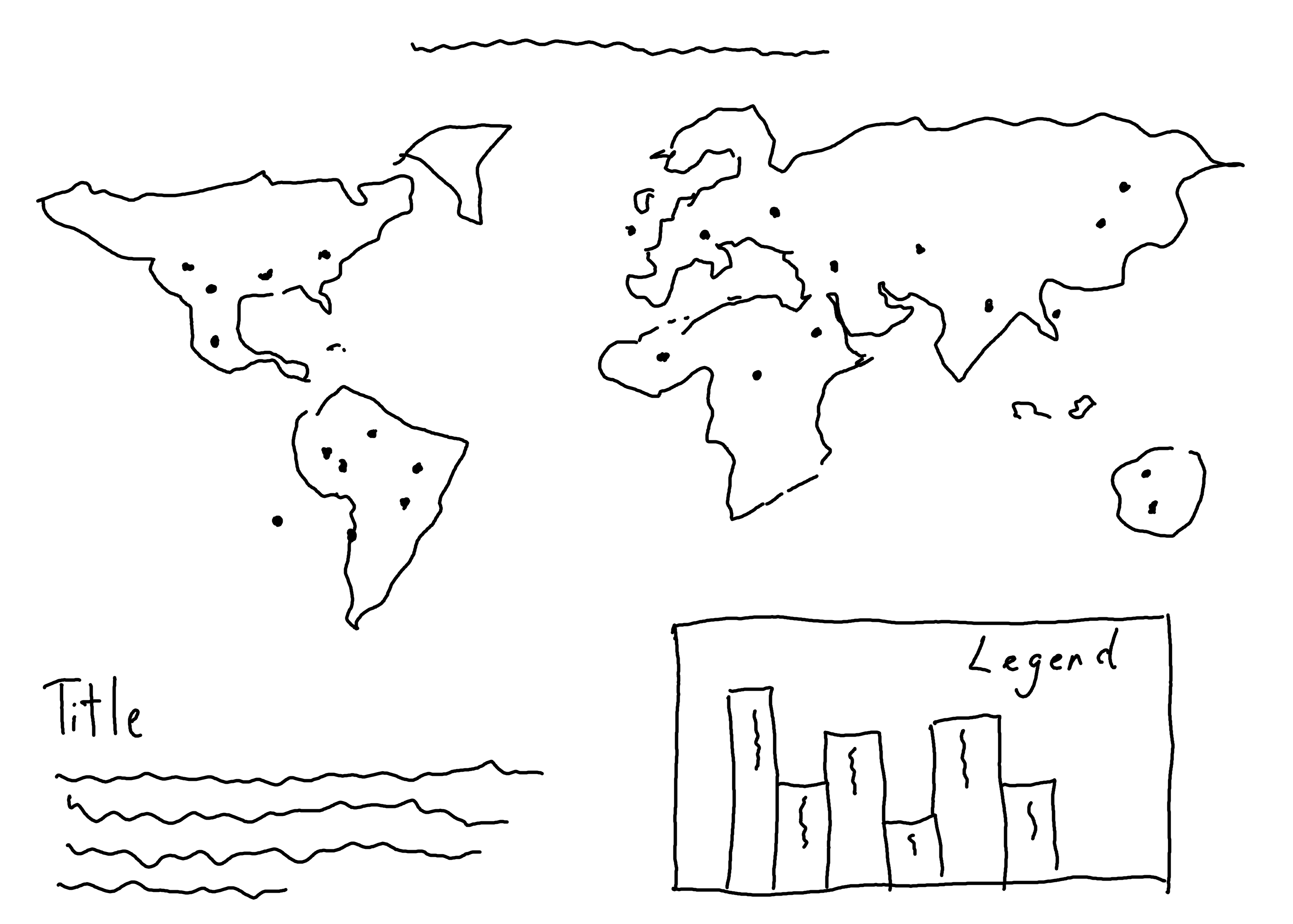
A title and subtitle can be added below the map, next to the bar chart as shown in Figure 12.4. Positioning the text in a more square layout (rather than a long string of text across the top of the chart) makes it easier to read and helps to prevent the visualization from becoming very wide and short.
12.3 Preparing a plot
To make our plot, we need to get some background map data and understand how to work with multiple spatial data files at once.
12.3.1 Maps with rnaturalearth
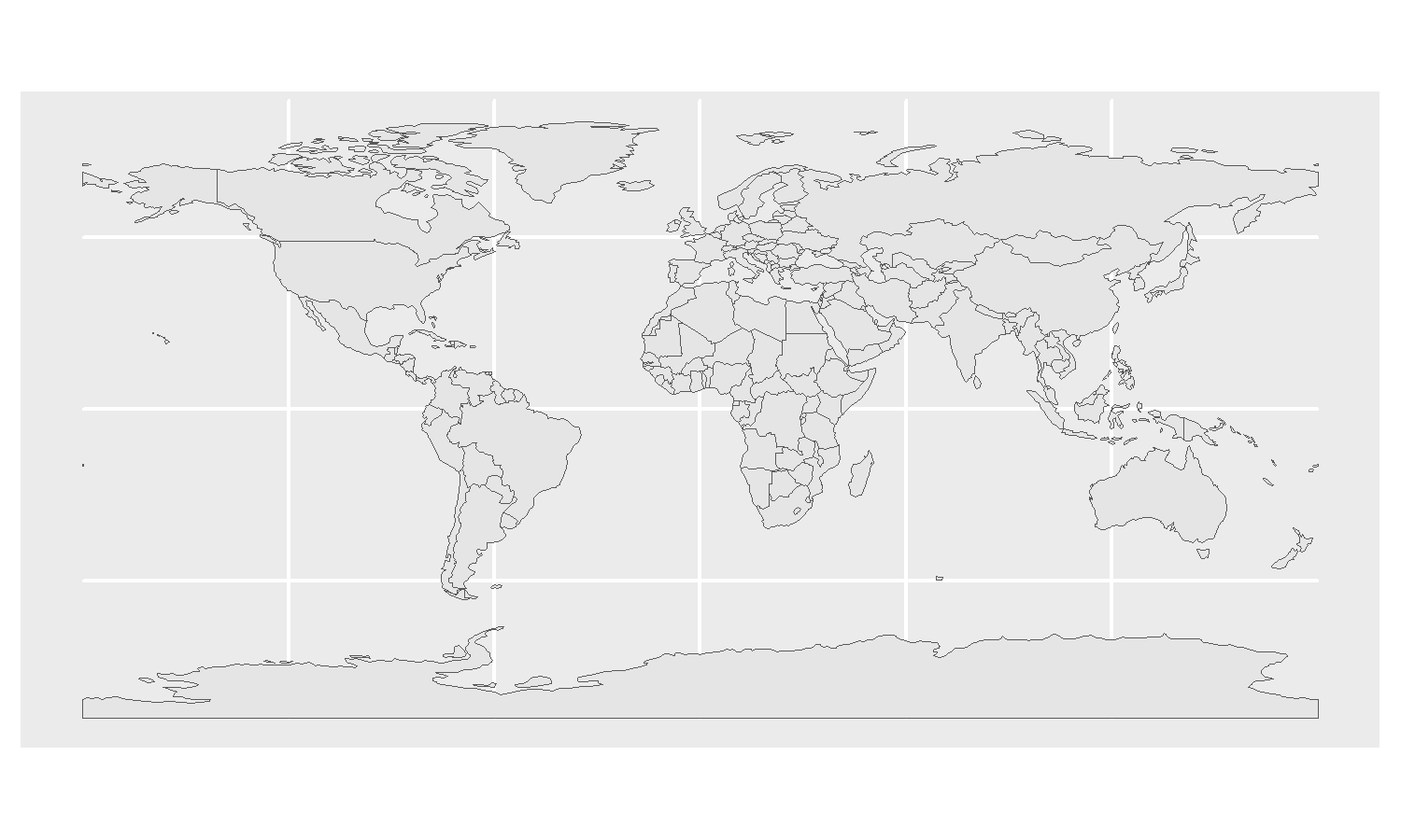
Before we start plotting points on a map, we need a map of the world that we can use as a background to show the underlying countries. In Chapter 11, we used map_data from ggplot2. Here, let’s look at an alternative using the rnaturalearth package (Massicotte and South 2023).
The rnaturalearth package allows you to interact with Natural Earth map data. You can download polygons for different geographic regions using the ne_countries() function. The default is to download data for all countries:
world <- ne_countries()rnaturalearth
If you wanted only the polygon(s) for a specific country or region, you can specify the country argument:
uk <- ne_countries(
  country = "united kingdom"
)
For specified countries, the ne_states() function provides administrative level 1 polygons, e.g., major within-country regions such as states.
The default output from the ne_countries() function is an sf object - where sf stands for Simple Features, which is a standardized model for representing geometric objects such as points, lines, and polygons in spatial databases and geographic information systems (GIS). The sf package (Pebesma 2018) implements simple features in R, allowing simple features to be represented as a data.frame (or tibble).
Since an sf object can be thought of as a fancy data.frame, this means it can be plotted using ggplot2. In fact, ggplot2 has built-in capabilities for plotting sf objects - through the geom_sf() function. We can build maps from sf objects in the same way we build other types of charts: by starting with the ggplot() function, and then layering on the geom_sf() geometry. You’ll notice that there’s one key difference: there’s no aesthetic mapping using the aes() function. Since the spatial coordinates are embedded within the sf object, there’s no need to explicitly map the x and y variables. The geom_sf() function can directly extract and use the embedded coordinates for plotting (see Figure 12.5).
12.3.2 Spatial objects with sf
Though you can combine geom_sf() with other functions and non-sf data, such as geom_point(), it’s often easier to convert the other data to sf objects first. The main reason for this is to ensure the coordinate reference system (CRS) is the same for both geometries. CRSs define how the Earth’s three-dimensional surface is represented, either in a three-dimensional coordinate system (e.g., latitude and longitude) or as a two-dimensional projected map. There are many different coordinate reference systems, each commonly used for different areas of the world. If you’re combining multiple spatial objects, they may have different coordinate reference systems. For example, using the British National Grid (BNG) CRS, London has the following coordinates: X = 492983 and Y = 188837. Under the World Geodetic System 1984 (WGS84) CRS, London has the following coordinates: Longitude (X) = 1.200235W and Latitude (Y) = 53.870659N. You can imagine how these two coordinates cannot be plotted on the same map without transforming them first.
In R, you can use the sf package to set or transform between different coordinate reference systems. The easiest way is by using EPSG codes - numerical identifiers assigned to specific coordinate reference systems. The WGS84 uses EPSG code 4326. This is the coordinate reference system used in the world data that we’re using for the background map. You can check using the st_crs() function from sf which retrieves the CRS from an object:
st_crs(world)Coordinate Reference System:
User input: WGS 84
wkt:
GEOGCRS["WGS 84",
DATUM["World Geodetic System 1984",
ELLIPSOID["WGS 84",6378137,298.257223563,
LENGTHUNIT["metre",1]]],
PRIMEM["Greenwich",0,
ANGLEUNIT["degree",0.0174532925199433]],
CS[ellipsoidal,2],
AXIS["latitude",north,
ORDER[1],
ANGLEUNIT["degree",0.0174532925199433]],
AXIS["longitude",east,
ORDER[2],
ANGLEUNIT["degree",0.0174532925199433]],
ID["EPSG",4326]]To make sure the CRS of the timezones data matches the CRS of the world data, we can set the CRS of the timezones data as 4326. At the moment, the timezones data is not a spatial object - it’s just a simple data.frame that contains two columns with latitude and longitude information. First, we need to convert it into an sf object using the st_as_sf() function from sf, also specifying the column names that relate to the coordinates data.
The latitude and longitude coordinates given in the timezones data are in the EPSG:4326 CRS, so we don’t need to convert the CRS - just set it. We know it’s in EPSG:4326 because this information is given to us with the data, and we can set it using the crs argument of st_as_sf().
If you don’t know which CRS your coordinates are in, the best thing to do is go back to the source of the data to see if you can find that information. Otherwise, you may wish to try the guess_crs() function from crsuggest (Walker 2022) which will guess potential coordinate reference systems for data that are lacking a defined CRS.
You can then use the st_set_crs() function to set the coordinate reference system.
12.3.3 First plot
Since the time zones coordinates are now stored as an sf object, we can plot it in the same way as the world data. We pass in the timezones_sf object to the data argument, and we specify that we want to color the points based on the continent column by passing this into the color argument inside the aes() function:
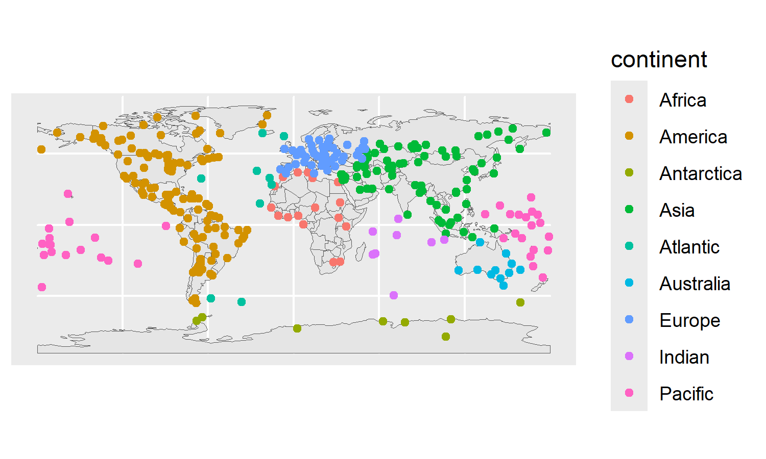
We now have a basic map in Figure 12.6 with points colored by region, and the default legend added on the right-hand side. Let’s get started on a better, custom legend.
Before we create a new legend for the map, we need to define which colors will be used in the legend (and the rest of the plot).
12.3.4 Colors
As we’ve done in previous chapters, we start by defining a text color, highlight color, and background color as variables.
text_col <- "#2F4F4F"
highlight_col <- "#508080"
bg_col <- "#F0F5F5"
Then we define a named vector of colors, mapping the names of the regions to different hex codes. It can be difficult to find a qualitative color palette with enough colors (one for each of the nine regions) that remains colorblind safe. Paul Tol discusses several options for qualitative palettes in his Colour schemes and templates blog post (Tol 2021). Here, we use the muted qualitative color scheme palette (Tol 2021) which has 10 colors (including a pale gray for missing data) and is colorblind safe:
12.3.5 Fonts
Similarly, we also load any typefaces we want to use. Again, for this visualization we’re using Google Fonts, so we can make use of the font_add_google() function in sysfonts. For the title, we’ll use Fraunces, an old style serif typeface inspired by those used in the 20th century. For the body text, we’ll use Commissioner, a sans serif typeface. As we’ve done in previous chapters, we use showtext_auto() to use showtext automatically for plotting fonts, and set the desired resolution using showtext_opts() to set the dpi.
font_add_google(name = "Commissioner")
font_add_google(name = "Fraunces")
showtext_auto()
showtext_opts(dpi = 300)
body_font <- "Commissioner"
title_font <- "Fraunces"
12.3.6 Creating a custom bar chart legend
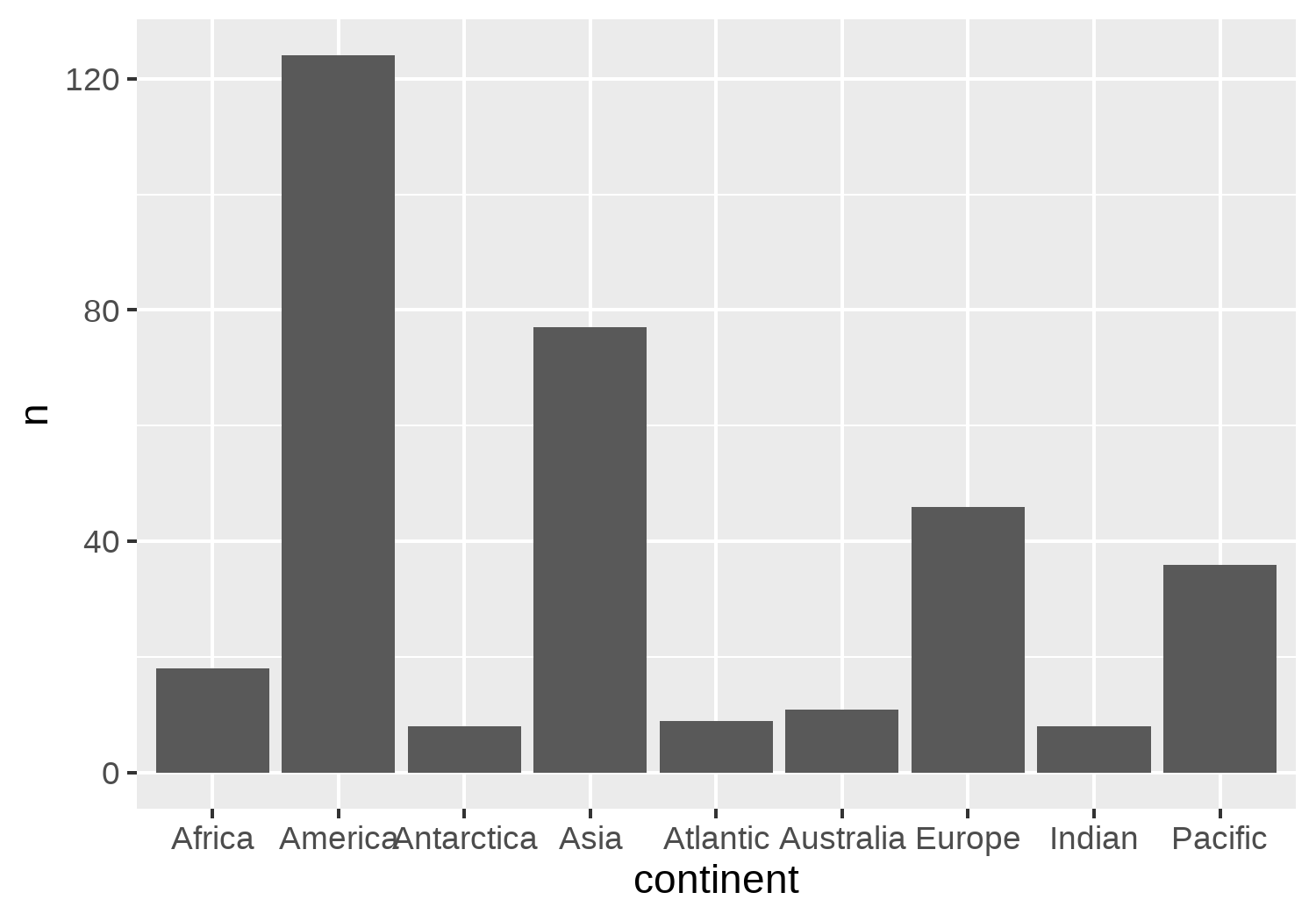
There are many ways to make a bar chart in ggplot2 - the two most often used are geom_bar() and geom_col(). What’s the difference? Well, geom_bar() is essentially a special version of geom_col() that counts up how many observations are in each category for you. For this visualization, we’re going to use the category counts for other purposes besides just defining the height of the bars, so we’ll do the counting ourselves and use geom_col() instead.
We’ll use the count() function from dplyr to count how many observations of each geographical region are present in the continent column. We could use either the timezones_sf data or the timezones_data here as the input data. If you try both, you’ll notice that, as we expect, the count column (n) is the same in both cases, but that the two outputs are not identical! When you run count(timezones_data, continent), you get a two-column data.frame. When you run count(timezones_sf, continent) you get a three- column data.frame that remains an sf object. This is because the geometry column in sf can be described as sticky - you often (though not always) want the sf class to be preserved after any operations. You can remove it using the st_drop_geometry() function from sf:
bar_data <- timezones_sf |>
  count(continent) |>
  st_drop_geometry()
Let’s plot a basic bar chart as shown in Figure 12.7, by starting (as we always do) with passing our new bar_data object into the ggplot() function. We also add the aesthetic mapping via the aes() function and place the continent on the x-axis and the count (n) on the y-axis. We then draw the columns of the bar chart using geom_col().
To make it work effectively as a legend, we need to do two things:
- Color the bars based on the
continentcolumn. - Add labels directly to the bars instead, and remove the x-axis labels and legend.
If you were just creating a normal bar chart (not to be used as a legend), then adding colors to the bars might make your plot look brighter, but it doesn’t add any additional information. The categories can already be distinguished by the labels on the x-axis.
Let’s remake our bar chart as shown in Figure 12.8, this time also mapping fill and label to the continent column in the aesthetic mapping. Adding label to the aesthetic mapping in ggplot() won’t affect our bar chart in any way since we aren’t (yet) adding geom_text(), but there’s no harm in adding it as a global aesthetic mapping here anyway. We’ll also use scale_fill_manual() to set the colors used to those defined in the col_palette vector we created earlier.
bar_plot <-
  ggplot(
    data = bar_data,
    mapping = aes(
      x = continent, y = n,
      fill = continent, label = continent
    )
  ) +
  geom_col() +
  scale_fill_manual(
    values = col_palette
  )
bar_plot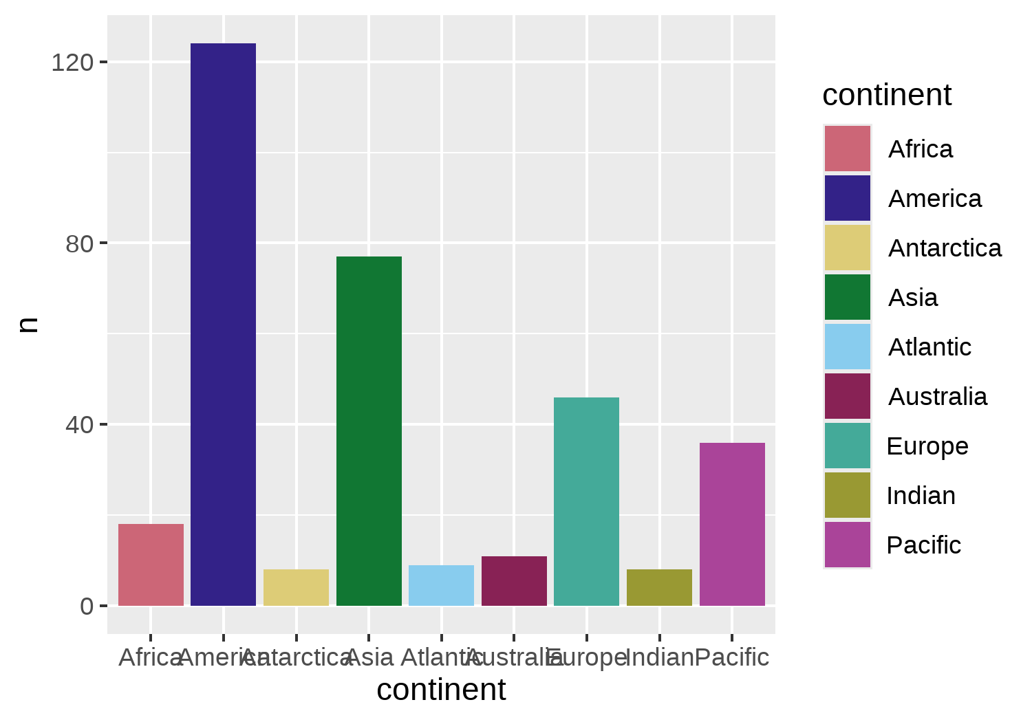
Now we can add the text labels directly to the bars. But where should they go? It’s quite common to add category labels in line with the end of the bar, but that might not work well here. If we add labels within the bars, for regions with few time zones where the bars are short, the text will be very squashed. If we add labels outside the bars, for regions with many time zones where the bars are long, the text will run off the graph or extend the height of the visualization. Neither is ideal. But maybe we could have the best of both worlds. We want to add labels under the following conditions:
When the bars are long, text should:
- appear inside the bar and be right-aligned;
- be light in color to contrast the dark bar backgrounds.
And conversely, when the bars are short, text should:
- appear outside the bar and be left-aligned;
- be dark in color to contrast the light plot background.
It might take a little bit of trial and error to find the value that defines a bar as being short or tall. Here, we’ll use 45. If a region has more than 45 time zones, it’s classed as a tall bar. Otherwise, it’s short.
We want to map the alignment and color of the text to a transformation of the n column in the dataset. This sounds like something that should go into an aesthetic mapping in the aes() function. We already know the color argument can be used to map the text color. The hjust and vjust arguments are used for horizontal and vertical positioning of text. Unfortunately, within the geom_text() function, neither hjust nor vjust can be used inside the aes() function.
Luckily, the ggtext package once again comes to the rescue! We can use the geom_textbox() function from ggtext instead of geom_text(). It works very similarly to geom_text(), but it allows us to map variables to hjust and vjust.
We’ll use case_when() from dplyr to specify the settings for the hjust argument, depending on the value of n. When n is greater than 45, hjust should be 1 to use right alignment; otherwise, it should be 0 to use left alignment. If you wanted to, you could create a new column in the data instead of using case_when() directly inside the aes() function.
Since geom_textbox() draws a box, we need to control both (i) the alignment of the box relative to the coordinates using hjust, and (ii) the alignment of the text within the box using halign. Within geom_textbox() we also use orientation = "left-rotated" to rotate the text counterclockwise by 90 degrees (similar to using angle = 90 in geom_text()). We can remove the background fill color and box outline by setting both fill = NA and box.color = NA, and set the size and font family options using the size and family arguments (where we pass in our body_font variable we defined earlier).
In ggplot2, hjust (and halign) controls horizontal alignment, and vjust (and valign) controls vertical alignment. When text is rotated, the non-rotated alignment arguments should be used. For example, although we’re moving the text up and down, we still use hjust to align the text.
We use a similar process for setting the color of the text - using case_when() to specify if the text should use the bg_col or text_col color based on whether or not it is greater than 45. Note that we wrap the bg_col and text_col variables inside the I() function to use these variables as is rather than treating them as a variable to map to.
Finally, we can also use theme_void() to remove all existing theme elements, and theme(legend.position = "none") to remove the legend in Figure 12.9.
legend_plot <- bar_plot +
  geom_textbox(
    mapping = aes(
      hjust = case_when(
        n > 45 ~ 1,
        TRUE ~ 0
      ),
      halign = case_when(
        n > 45 ~ 1,
        TRUE ~ 0
      ),
      color = case_when(
        n > 45 ~ I(bg_col),
        TRUE ~ I(text_col)
      )
    ),
    family = body_font,
    size = 2.5,
    fill = NA,
    box.color = NA,
    orientation = "left-rotated"
  ) +
  theme_void() +
  theme(
    legend.position = "none"
  )
legend_plot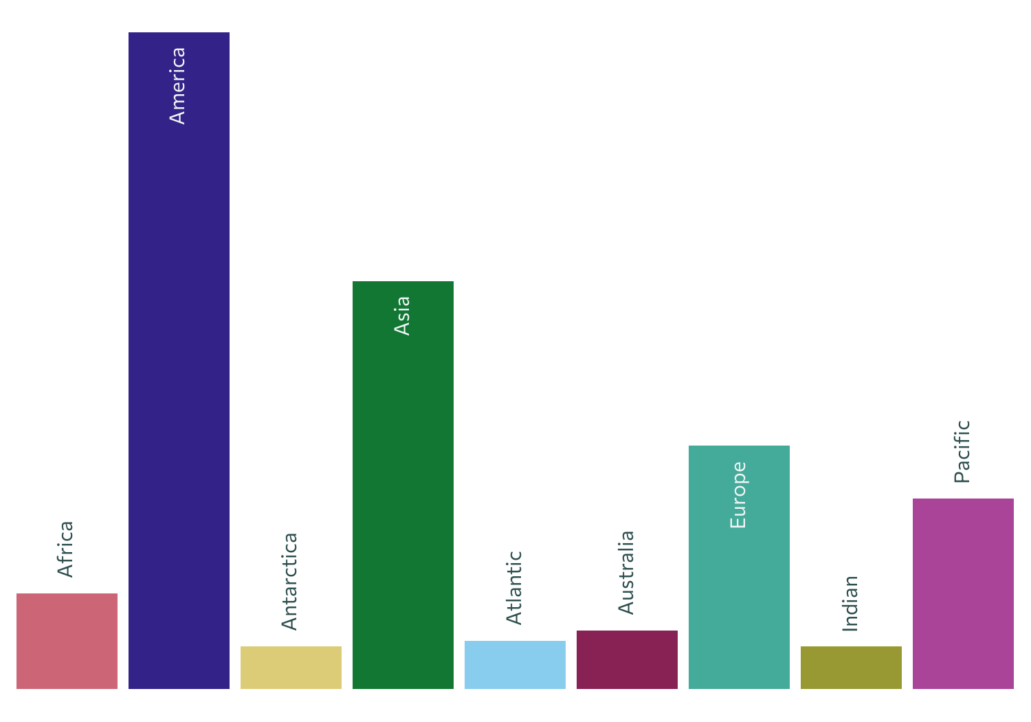
Now we have a much nicer looking custom legend. We can apply some nicer styling to our main map before we join the two together!
12.4 Advanced styling
We have multiple elements of our plots that we need to improve:
- the background map should use our defined colors rather than the defaults;
- the points should also use our defined colors;
- a title and subtitle should be added using our defined typefaces.
12.4.1 Applying colors
Let’s start by redrawing the background map but using our text_col for the border color and a semi-transparent version of our highlight_col for the fill color. We can use the alpha() function from ggplot2 to set the transparency to 30% (0.3).
We’ll also redraw the points again with a small adjustment - let’s change the shape that’s used for the points. You can set the shape using the pch (or shape) argument. There are 25 different options available for pch, which can be specified using the numbers 1 to 25. The shape we’ll use here is a circle with a dot in the middle. Unfortunately, this isn’t one of the 25 available options, so we’ll have to make it ourselves. We can draw the dot in the middle using the default shape but making it a little smaller. We can add the circle by choosing pch = 21 (which allows you to control both the fill and color of the shape) and making it a little bit bigger with a transparent fill.
basic_map <- ggplot() +
  # Apply colors to background map
  geom_sf(
    data = world,
    color = text_col,
    fill = alpha(highlight_col, 0.3)
  ) +
  # Draw points for time zone locations
  geom_sf(
    data = timezones_sf,
    mapping = aes(color = continent),
    size = 0.4,
  ) +
  # Draw outer circle
  geom_sf(
    data = timezones_sf,
    mapping = aes(color = continent),
    size = 1.6,
    pch = 21,
    fill = "transparent"
  )
basic_map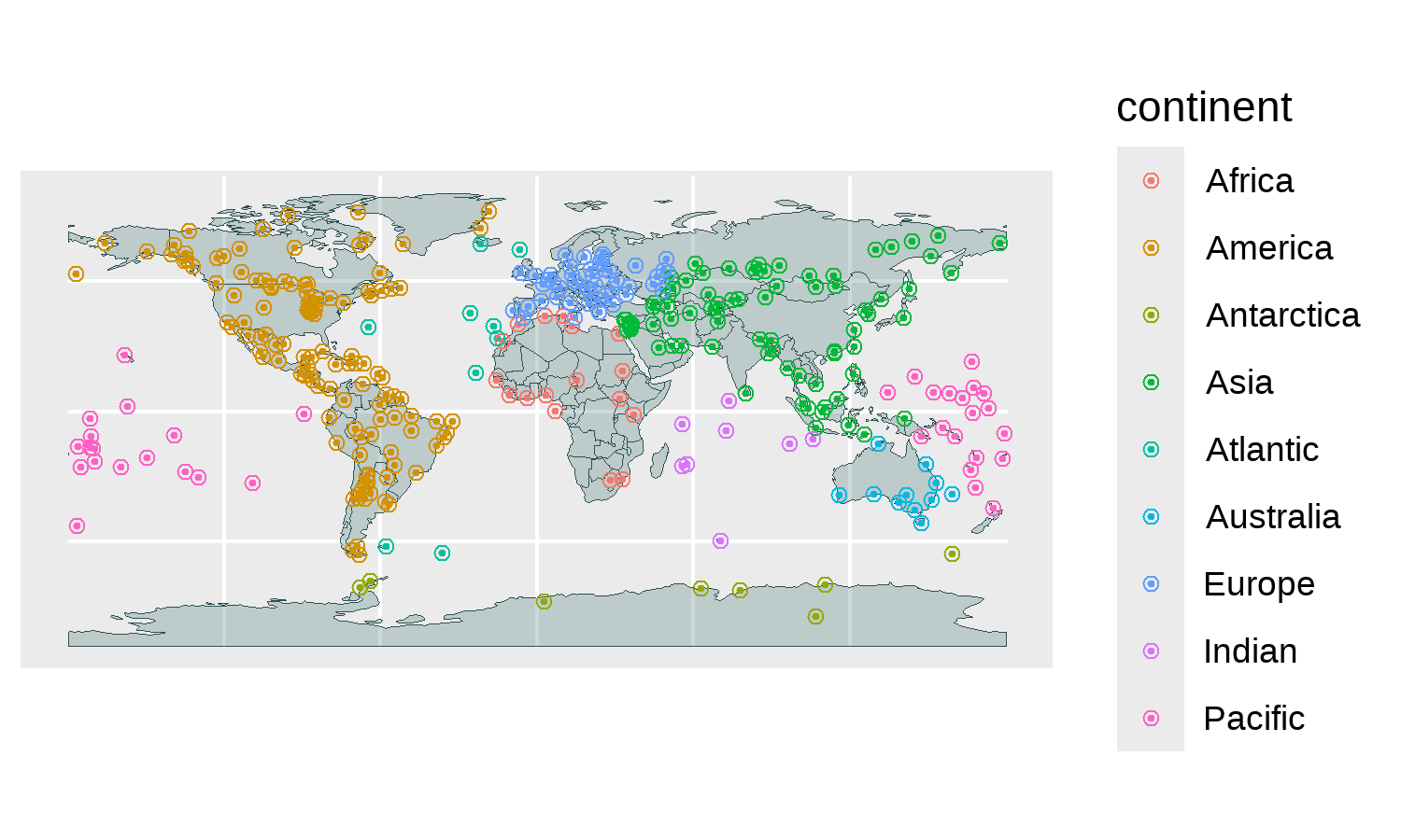
We also apply the same colors for (both of) the points in Figure 12.10 as we did for the bar chart (remembering to use scale_color_manual() rather than scale_fill_manual() for points).
col_map <- basic_map +
  scale_color_manual(values = col_palette)
12.4.2 Editing the axes
Before we add the title and subtitle text, we need to make some space for it (and the legend that we’ll add later). Let’s set the limits of the x- and y- axes using scale_x_continuous() and scale_y_continuous(). We extend the lower limit of the y-axis beyond the range of the data, leaving blank space at the bottom where we can overlay the text. We also adjust the breaks in the x-axis scale to make the grid lines closer together. The choice of grid lines every 15 x values might seem like an odd choice, but every 15 degrees difference in longitude (x-axis) is approximately one hour of time difference (since Earth rotates 360 degrees in 24 hours, or 15 degrees per hour)!
It will take some (probably a lot of) trial and error to figure out exactly how much you need to extend the y-axis by. Here, we want the height of the blank space to be about half the height of the map area. Using st_bbox(world) to return the bounding box of the world map data, you’ll see that the y-axis of the world map ranges between -90 to +83.6. This means extending the y-axis by around 80 or 90 is a good starting point. We also remove the extra padding around the sides in Figure 12.11 by setting expand = FALSE inside coord_sf().
axes_map <- col_map +
  scale_x_continuous(
    breaks = seq(-180, 180, by = 15),
    limits = c(-190, 190)
  ) +
  scale_y_continuous(
    limits = c(-170, 100)
  ) +
  coord_sf(expand = FALSE)
axes_map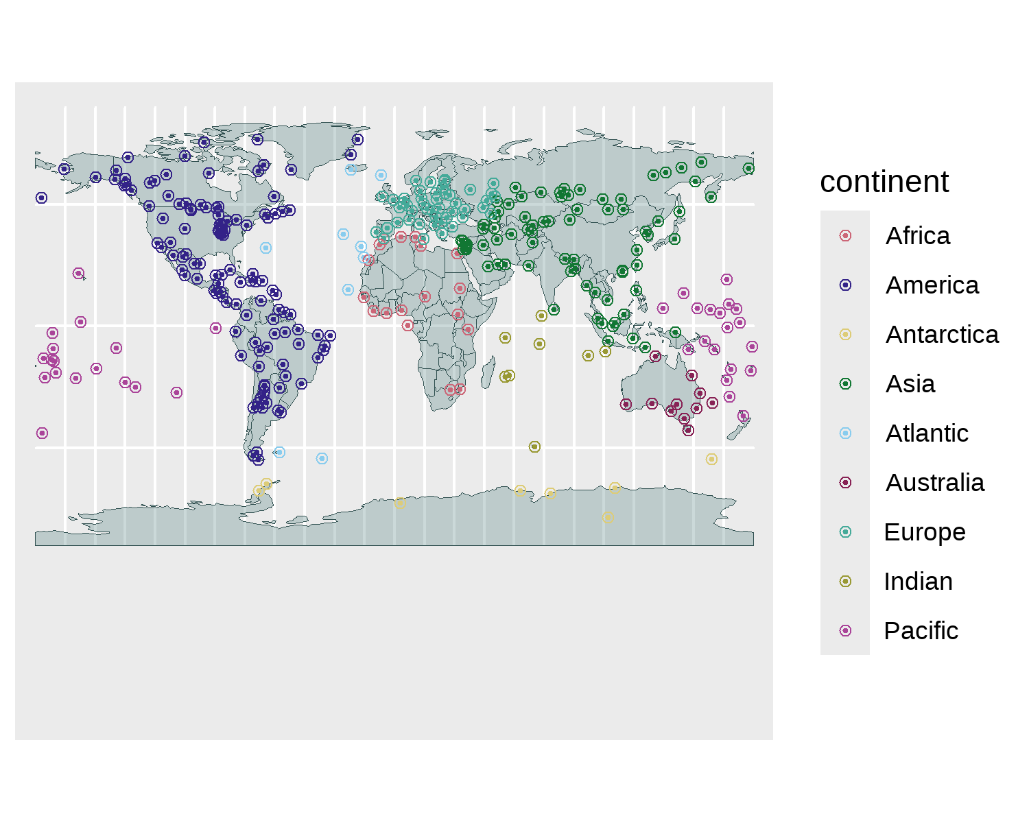
12.4.3 Adding text
We can create our custom Font Awesome icon caption, as described in Chapter 7, which we’ll later add to the top of the visualization:
social <- social_caption(
  icon_color = highlight_col,
  font_color = text_col,
  font_family = body_font
)
As we did in Chapter 6 and Chapter 7, we can also add colored text within the subtitle to denote the categories. This might be unnecessary for this visualization since we have our custom bar chart legend, but reinforcing the color mapping won’t hurt. Here, we’ll use ggtext as we did in Chapter 7 (although you can also use marquee as we did in Chapter 6 if you prefer). This means we’ll be writing HTML <span></span> tags and using glue() to pass in the colors from col_palette vector. Here, we’ll take a slightly different approach of calling the variables - using each vector element name instead of the index. This approach is a little more manual, but it can be useful if you want the written text to be slightly different from the category name. The code is also often a little bit more legible. Rather than using our source_caption() function as we’ve done in previous chapters, we’ll add information about the source directly in the subtitle text.
subtitle <- glue("Time zones tend to follow the boundaries between countries and their subdivisions instead of strictly following longitude. For every one-hour time, a point on the earth moves through 15 degrees of longitude. Each point relates to one of 337 time zones listed in the IANA time zone database. The colors show which time zones are in
<span style='color:{col_palette[\"Africa\"]};'>Africa </span>,
<span style='color:{col_palette[\"America\"]};'>America </span>,
<span style='color:{col_palette[\"Antarctica\"]};'>Antarctica </span>,
<span style='color:{col_palette[\"Asia\"]};'>Asia </span>,
<span style='color:{col_palette[\"Atlantic\"]};'>Atlantic </span>,
<span style='color:{col_palette[\"Australia\"]};'>Australia </span>,
<span style='color:{col_palette[\"Europe\"]};'>Europe </span>,
<span style='color:{col_palette[\"Indian\"]};'>Indian </span>, and
<span style='color:{col_palette[\"Pacific\"]};'>Pacific </span> zones.<br>**Data**: IANA tz database<br>")
We also specify some text for the visualization title. We’re going to join together the title and subtitle and plot them as one text object, so we also use HTML <span></span> tags to set the font size, family, and color of the title.
We add the social caption to the map using the tag option in the labs() function - just as we did in Chapter 11. When we edit the theme elements in the final step, we’ll specify a position for the tag.
Unfortunately, we can’t have two different tag elements, and since we also want a non-standard position for the title/subtitle text object, we’ll use geom_textbox() to add it instead. We specify the x and y coordinates of where we want the textbox to go (again, lots of trial and error!) and pass the social object in for the label. We also use the other arguments in geom_textbox() to set the font size and family as well as specify the alignment of the text and box (just as we did earlier when making the bar chart). The box fill and outline colors are removed by setting their arguments to NA.
text_map <- axes_map +
  # add social icons
  geom_textbox(
    data = data.frame(x = 0, y = 93, label = social),
    mapping = aes(x = x, y = y, label = label),
    family = body_font,
    size = 2.3,
    fill = NA,
    box.color = NA,
    halign = 0.5,
    hjust = 0.5,
    valign = 0
  ) +
  # add title and subtitle
  labs(tag = title_text)
12.4.4 Adjusting themes
The final step is making a few small changes to the ggplot2 theme. We start by removing all theme elements using theme_void() and setting the base_family and base_size for the text. Although we don’t have many text elements in our visualization controlled by the theme() functions, this will still affect the tag text.
Using the theme() function, we make some further edits to remove the default legend, change the background color to out bg_col variable, and add the grid lines back in with an almost transparent text_col color. The position of the tag text can be set using the plot.tag.position argument to place it in the bottom-left of the plot. We also use element_textbox_simple() from ggtext to format the text in the tag, since it includes the HTML <span></span> tags. Within element_textbox_simple(), the maxwidth argument is used to set the width of the textbox, ensuring it only takes up the left-hand side of the blank space at the bottom in Figure 12.12. The bar chart legend will go on the other side.
styled_map <- text_map +
  theme_void(base_size = 6, base_family = body_font) +
  theme(
    legend.position = "none",
    plot.background = element_rect(
      fill = bg_col,
      color = bg_col,
    ),
    panel.grid.major = element_line(
      color = alpha(text_col, 0.1)
    ),
    # add and position text
    plot.tag.position = c(-0.01, 0.12),
    plot.tag = element_textbox_simple(
      color = text_col,
      hjust = 0,
      maxwidth = unit(200, "pt"),
      margin = margin(
        l = 15, t = 5, b = 10
      )
    )
  )
styled_map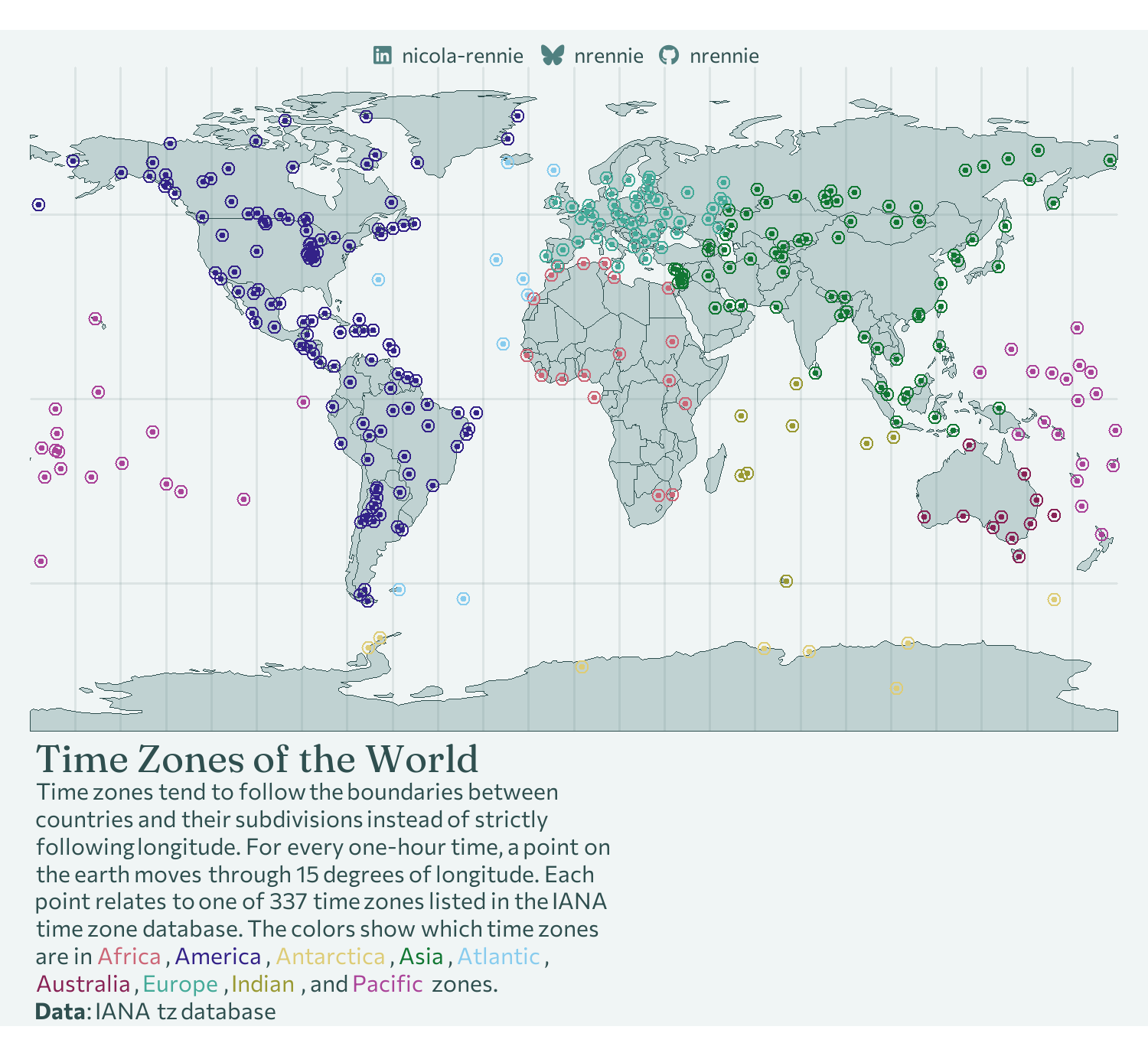
12.4.5 Joining plots with patchwork
Finally, we need to join the legend bar chart to our main plot. For this, we’ll use patchwork (Pedersen 2024). The patchwork package allows you to combine multiple visualizations (including ggplot2 graphics, base R plots, or gt tables) into a single layout. It’s very flexible, and you can arrange plots easily into simple rows or columns, or create very complex layouts with many nested plots. The patchwork package also allows you to add inset plots, i.e., a smaller plot placed within a larger plot to provide additional detail.
patchwork
Although this book doesn’t contain examples of arranging multiple plots side-by-side, patchwork makes it very easy to do so. If you have two plots g1 and g2, then you can arrange them side-by-side by simply running g1 + g2. More complex layouts can be achieved by specifying a grid of which plots should be placed where. The patchwork package also contains additional functions for adding multiplot annotations or titles, consistent themes across all subplots, and defining plot alignment across multiple pages. Read the package documentation at patchwork.data-imaginist.com for examples.
In this visualization, rather than the more traditional approach of arranging plots side by side, we instead want to position one plot (bar chart) on top of another (main map). We start with our styled_map and add the legend_plot on top using the inset_element() function. The four positions given in the inset_element() function are the left, bottom, right, and top outer bounds of the inset plot. The default unit is npc (normalized parent coordinates). In this setting, the bottom-left is (0, 0) and the top-right is (1, 1). This means specifying the left outer bound as 0.55 tells patchwork to start at the left-hand side of the inset plot 55% of the way in from the left of the main plot.
We also remove the added margin from around the edge of the plot using the theme() function and setting all of the margins to zero. Remember that when combining a theme() with a patchwork object, it’s added using the & operator rather than +.
styled_map + inset_element(legend_plot, 0.55, 0, 1, 0.3) &
  theme(plot.margin = margin(0, 0, 0, 0))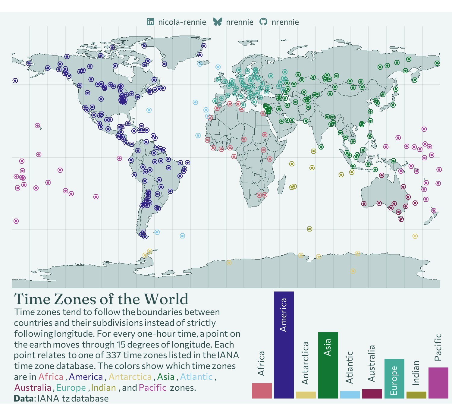
Now our map is finished, and we can save Figure 12.13 with ggsave()!
ggsave(
  filename = "time-zones.png",
  width = 5,
  height = 0.92 * 5
)
12.5 Reflection
What could still be improved about this plot?
Although the bar chart legend is an improvement on a boring, traditional legend, it could use further improvement. For example, it’s not immediately clear what the bar chart shows. With a little bit of time, readers probably put together the number of dots with the height of the bars, but it could be more obvious. Adding numbers to the bar chart would also improve readability. Perhaps this could be with a traditional y-axis, or perhaps as more informative labels. For example, instead of a label that reads "Africa", it could read "Africa (18 time zones)".
If we’re talking about improving readability of bar charts, an easy action is to make the bars (and therefore text) horizontal - it’s much easier to read text that’s the right way up!
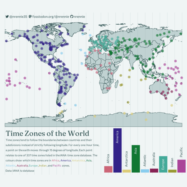
Each plot created during the process of developing the original version of this visualization was captured using camcorder, and is shown in the gif below. If you’d like to learn more about how camcorder can be used in the data visualization process, see Section 14.1.
12.6 Exercises
Edit the bar chart legend to include information about the number of time zones in each geographic region.
Edit the bar chart to have horizontal bars instead of vertical ones.
Consider where the updated bar chart legend is positioned. Is the bottom-right corner still a good location if the bars are horizontal? Try moving it somewhere else.