2 Programming languages: dumbbell charts with ggplot2
In this chapter we’ll learn how to combine points and lines to create dumbbell charts, create data-driven captions, and understand how to style charts using themes, fonts, and colors.
By the end of this chapter, you’ll be able to:
- Create a dumbbell chart using basic geometries available in
ggplot2; - Select an appropriate font for your chart design, and load it into R for use in plots; and
- Understand how to save high quality images of plots in different formats.
We begin by loading the packages required in this chapter.
It’s assumed that you’re already a little bit familiar with the dplyr and tidyr packages that we’ll be using for data wrangling, alongside ggplot2 itself, of course! We’ll introduce each of the other packages as we use them, but the following provides a brief summary of each package’s purpose:
-
ggtext: allows you to use Markdown, HTML, and CSS formatting inggplot2text. -
glue: for gluing together R code with strings to create text. -
showtextandsysfonts: for loading fonts and making them available within an R session. -
tidytuesdayR: for accessing data published on GitHub as part of the TidyTuesday project.
2.1 Data
The Programming Languages Database (PLDB) (PLDB contributors 2022) is an encyclopedia of programming languages, containing information on ranking, when it was created, what type of language it is, and how many GitHub repositories use the language - to name just a few variables. Programming language creators can use the database to help design and improve programming languages, while programming language users can use the database to help make decisions about which languages to use or learn.
The PLDB is published to the public domain and can be found online at pldb.io, where you can make queries and view the data. You can also download the data in CSV or JSON format. The PLDB data was used as a TidyTuesday dataset in March 2023 (after being suggested by Jesus M. Castagnetto), meaning we can also easily load the data into R using the tidytuesdayR R package (Hughes 2022b).
The tidytuesdayR R package has several functions for helping to get data and information about TidyTuesday data into R. One of the most commonly used functions is the tt_load() function, which loads the data from a specific week (specified by the date) into your R session. For a given week, there may be multiple datasets, and a specific one can be accessed using the $ notation:
tuesdata <- tt_load("2023-03-21")
languages <- tuesdata$languages
You can alternatively read the data in via tidytuesdayR using the year and week, e.g., languages <- tt_load(2023, week = 12). You can also read the data in directly from the CSV file on GitHub using read.csv() from base R or read_csv() from readr.
What does the data look like? We can inspect the first six rows of the data using head():
head(languages)# A tibble: 6 × 49
pldb_id title description type appeared creators website
<chr> <chr> <chr> <chr> <dbl> <chr> <chr>
1 java Java <NA> pl 1995 James G… https:…
2 javascr… Java… <NA> pl 1995 Brendan… <NA>
3 c C <NA> pl 1972 Dennis … <NA>
4 python Pyth… <NA> pl 1991 Guido v… https:…
5 sql SQL <NA> quer… 1974 Donald … <NA>
6 cpp C++ <NA> pl 1985 Bjarne … http:/…
# ℹ 42 more variables: domain_name <chr>,
# domain_name_registered <dbl>, reference <chr>,
# isbndb <dbl>, book_count <dbl>, semantic_scholar <dbl>,
# language_rank <dbl>, github_repo <chr>,
# github_repo_stars <dbl>, github_repo_forks <dbl>,
# github_repo_updated <dbl>,
# github_repo_subscribers <dbl>, …You can also use View() to open a new tab in RStudio to inspect the data in something that resembles a non-editable spreadsheet file if you prefer a more human-readable format. Inspecting the data in this very basic way (simply looking at it with our eyes first) helps to ensure that the data has been read in correctly. This dataset has 4303 rows and 49 columns - giving us many options for variables to explore further. What variables do we have? The data description contained in the TidyTuesday GitHub repository is often a good place to start. A table containing the column names and what the data in each column means, can help give you some more context for the data you are looking at - especially since columns are not always named intuitively! For the PLDB dataset, you can also look at an even more in-depth description of the variables on the dataset’s website at pldb.io/csv.html. Here, you’ll also notice that the TidyTuesday version of this dataset is a subset of a larger dataset which contains 356 variables - we’ll stick with the smaller version for this chapter!
There are many variables with missing (NA) values in the data. Few languages have an entry in the description column, github_ columns, reference column, or is_open_source column. Missing values are highly important. We don’t always want to simply discard rows or columns with missing values as they can often tells us a lot of important information about our data. For example, the many missing values in the github_ columns might be related to the fact that many programming languages precede GitHub’s creation in 2008. Discarding rows if they have any missing values in these columns might mean we bias any analysis to newer programming languages. There are many methods of dealing with missing data, and which method you use will depend on what you are trying to achieve. Having said that, this isn’t a statistics book, so for the purposes of visualization we’ll focus on columns that are mostly complete. Further discussion of missing data can be found in Chapter 4 and Chapter 10.
So which columns should we explore first? Often when we’re working with data, there is some outcome that we’re interested in. Depending on your field, you might instead hear this called the response variable or the dependent variable. You might have multiple outcomes of interest. For example, in the PLDB data, we might be interested in what affects the ranking and/or the number of GitHub stars for a programming language. These are often the variables we want to tell a story about. However, it’s also important to think about exploring relationships between other variables to make sure that the story you’re telling is the correct one. It might seem obvious that there could be a relationship between github_repo_stars and github_repo_forks, but what exactly is that relationship? What about a less obvious connection between last_activity and number_of_jobs? Is there a relationship there?
2.2 Exploratory work
Beyond looking at the data, counting the rows and columns, and inspecting the values in different columns, a key part of exploratory work is visualizing data. These initial visualizations can help you to check if there are any issues with your data (e.g., a misspelling of Monday as Mnoday). They can also help to identify interesting relationships or patterns in the data, which can guide you to further avenues for exploration and appropriate modelling techniques.
There are many different types of plot, and you’ll see several different examples in this book - some you may have seen before, others you may have not. But often, for those initial exploratory plots, the classic charts are a good place to start: scatter plots, bar charts, box plots, density plots, and line charts. Scatter plots are useful for exploring a relationship between two continuous variables; multiple density plots or box plots for exploring a relationship between a categorical and continuous variable; bar charts for exploring a relationship between multiple categorical variables; and line charts for how continuous variables change over time.
2.2.1 Data exploration
We can’t explore every column in this chapter, but you’re encouraged to do so at home. So we’ll start with language_rank - the most obvious outcome that we might want to consider. Note that, in this data, the rank starts at 0 (insert your own joke about indexing from 1 being better here…). We might want to look at the last_activity column in relation to the rank: are programming languages with more recent activity also more popular? Let’s start by making a scatter plot of last activity (on the x-axis) and language rank (on the y-axis). Adding better axis titles with xlab and ylab in Figure 2.1 isn’t necessary if it’s just you looking at these plots, but if you’re sharing them with anyone else, it can be a useful thing to do. Especially if the column names are less descriptive than we see here!
plot(
  x = languages$last_activity,
  y = languages$language_rank,
  xlab = "Last activity",
  ylab = "Rank"
)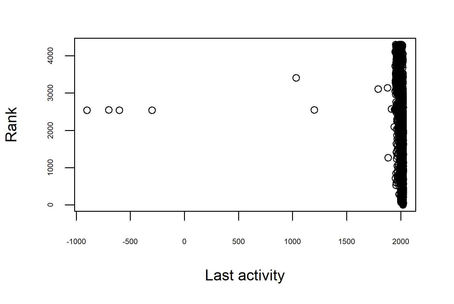
Straight away this highlights the role of data visualization in exploratory analysis. This scatter plot doesn’t look quite right; the last_activity data ranges from around -1000 to just over 2000, with most of the values close to the 2000 mark. If this is supposed to be a date column, we need to think about whether these values are correct.
- Are these simply incorrect entries?
- Are these missing values? It’s not uncommon for missing values to be encoded as
-999, for example. This is especially true if data has been processed in some other software before it’s loaded into R. Just because you haveNAvalues in your data, doesn’t mean you can’t also have these unusually coded missing values. Values can be missing for different reasons, and sometimes they are encoded in multiple ways to demonstrate this difference. - Are these values transformed in some way we don’t expect? Dates can be encoded as integer values - often as number of days since some origin time. The origin time used in R is often
"1970-01-01", so it’s perfectly reasonable to have negative dates if you’re dealing with data pre-1970.
In this case, the dates are actually given as just a year (rather than a Date object) so the negative values are unlikely to be incorrectly transformed values. If we’re going to filter out these rows, which year do we use to filter them out? Before 1500? Before 1970? Let’s actually look at these rows:
# A tibble: 6 × 49
pldb_id title description type appeared creators website
<chr> <chr> <chr> <chr> <dbl> <chr> <chr>
1 roman-n… Roma… <NA> nume… -900 <NA> <NA>
2 etrusca… Etru… <NA> nume… -700 <NA> <NA>
3 attic-n… Atti… <NA> nume… -600 <NA> <NA>
4 greek-n… Gree… <NA> nume… -300 <NA> <NA>
5 arezzo-… arez… "The stave… musi… 1033 <NA> <NA>
6 fibonac… Libe… "The Arabi… nota… 1202 <NA> <NA>
# ℹ 42 more variables: domain_name <chr>,
# domain_name_registered <dbl>, reference <chr>,
# isbndb <dbl>, book_count <dbl>, semantic_scholar <dbl>,
# language_rank <dbl>, github_repo <chr>,
# github_repo_stars <dbl>, github_repo_forks <dbl>,
# github_repo_updated <dbl>,
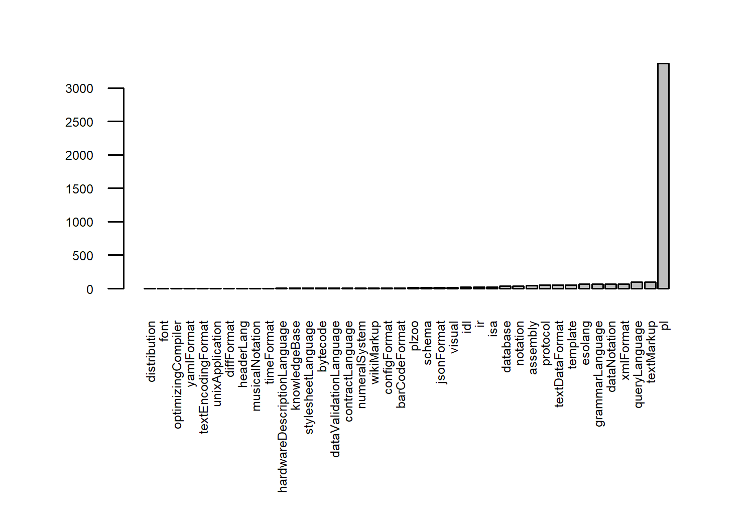
# github_repo_subscribers <dbl>, …Though the name of the Programming Languages Database may suggest that it focuses exclusively on programming languages, this isn’t true. It also includes information on query languages, stylesheet languages, and protocols, among other things; including numeral systems as you can see here.
Let’s look at the balance between these different types of languages in the data in Figure 2.2. The bar chart is created using the barplot() function from the {graphics} package in base R. The barplot() function takes a (named) vector or matrix of counts for each category. We can create this vector of counts using the table() function from base R. Wrapping the vector inside sort() means that the bars will be plotted in ascending order.
Almost all of them are programming languages so let’s focus on them only, and recreate our last_activity against language_rank scatter plot. We can use the subset() function to extract only rows of the data where the type is "pl" and save this to a new object called pl_df.
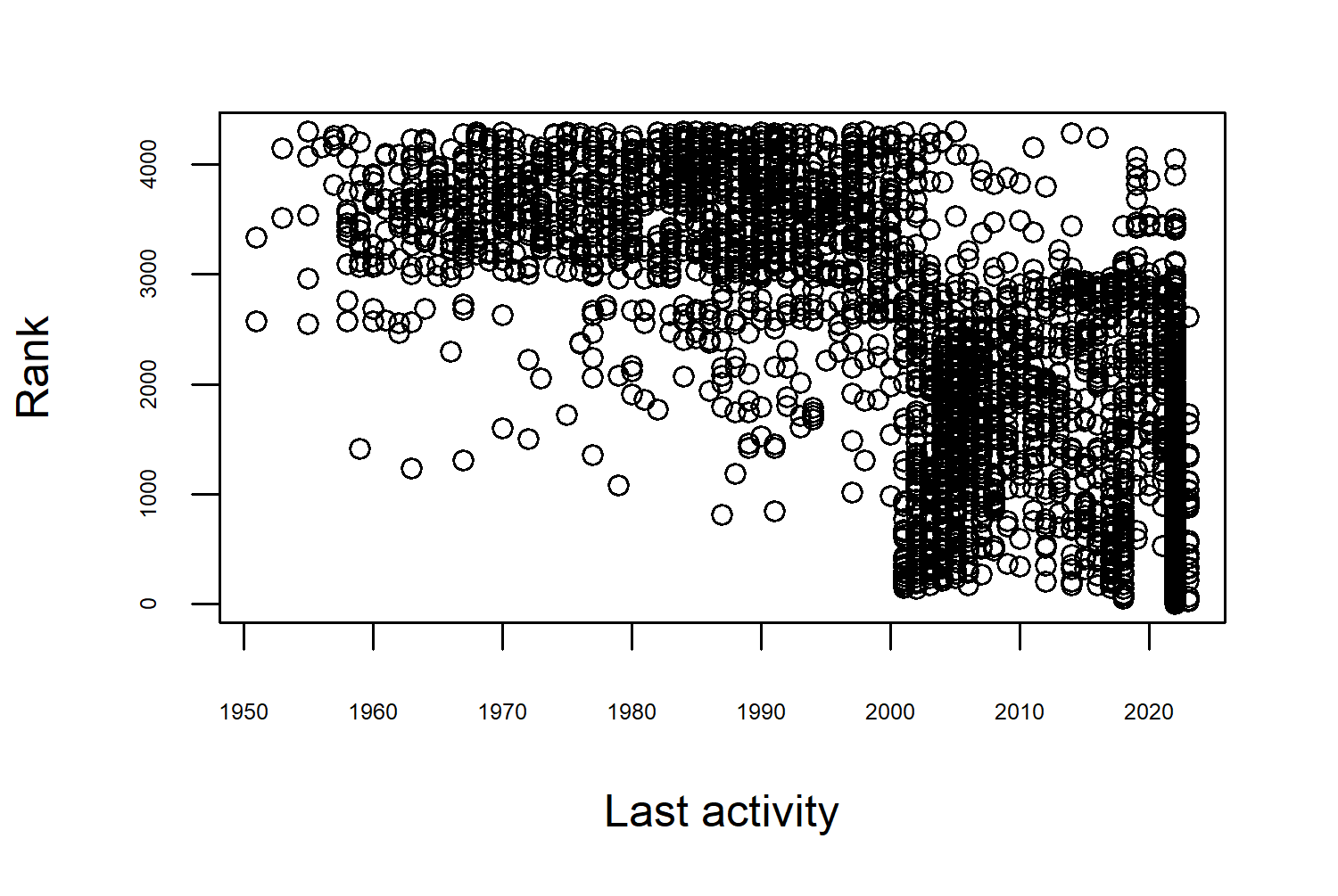
Now, our scatter plot in Figure 2.3 looks much more reasonable - with the first entries in the early 1950s. It also presents an interesting pattern where the programming languages are split into two different clusters. Languages with last_activity after 2000 are higher ranked (in the top 3000), and those with their last activity before 2000 mostly ranked below. Although this is interesting, remember that we can’t really make any directional statements here. Do people prefer using languages that are more actively maintained? Or are languages more actively maintained because people prefer using them?
You can also subset the data using the filter() function from dplyr, either with or without the use of the pipe operator:
pl_df <- filter(languages, type == "pl")Both approaches are equally valid. For this book, if we’re plotting in ggplot2, we’ll prepare data using other tidyverse packages. But if we’re plotting in base R, we’ll prepare data using base R as well.
Which other columns might we explore? In R, we write comments using the # symbol. For personal curiosity, we might be interested in how common that is. Of these programming languages, which symbols are used to denote comments? We can create a bar chart of the different types of line_comment_token using the barplot() function again:
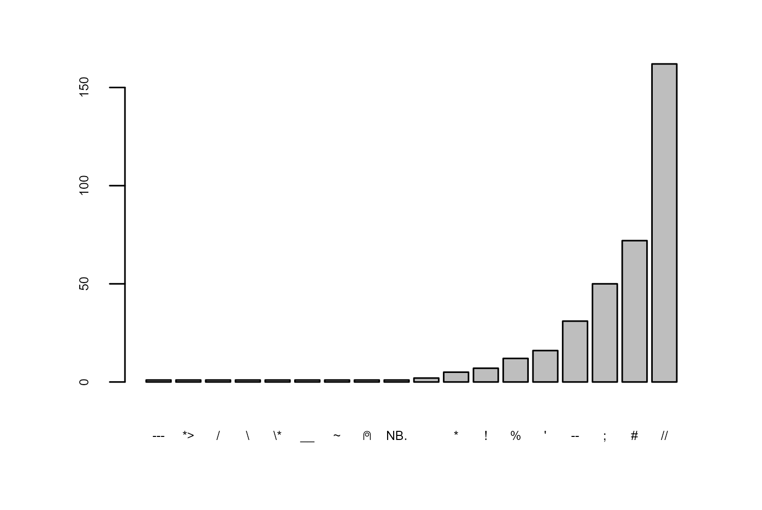
Using # for comments is the second most common symbol behind //. Is this a new trend?
2.2.2 Exploratory sketches
The aspects of the data that we are interested in visualizing are:
- when the programming language has been used (the time between
appearedandlast_activity_date) - what the comment symbol is
- the ranking of the programming languages
To visualize the time between two things happening, e.g., time between appeared and last_activity_date, we could use a dumbbell chart. Essentially, a point at each of the time points and a (usually horizontal) line connecting the two - named for their resemblance to dumbbell weights. Dumbbell charts are also commonly used to show the difference between values for two categories, e.g., heights for men and women, or blood pressure readings before and after treatment.
Whether you choose to use pen and paper or digital drawing tools, sketching is an important part of the design process. Sketching is for exploring visualizations (in the same way you explore the data before you decide how to process it) and refining your design ideas. It’s a quick way to describe an idea, it’s an easy way to collaborate with other people, and (because it’s just a sketch) it’s easy to throw it away if it doesn’t work. You’ll see exploratory sketches in every chapter of this book - you shouldn’t expect them to look polished or pretty!
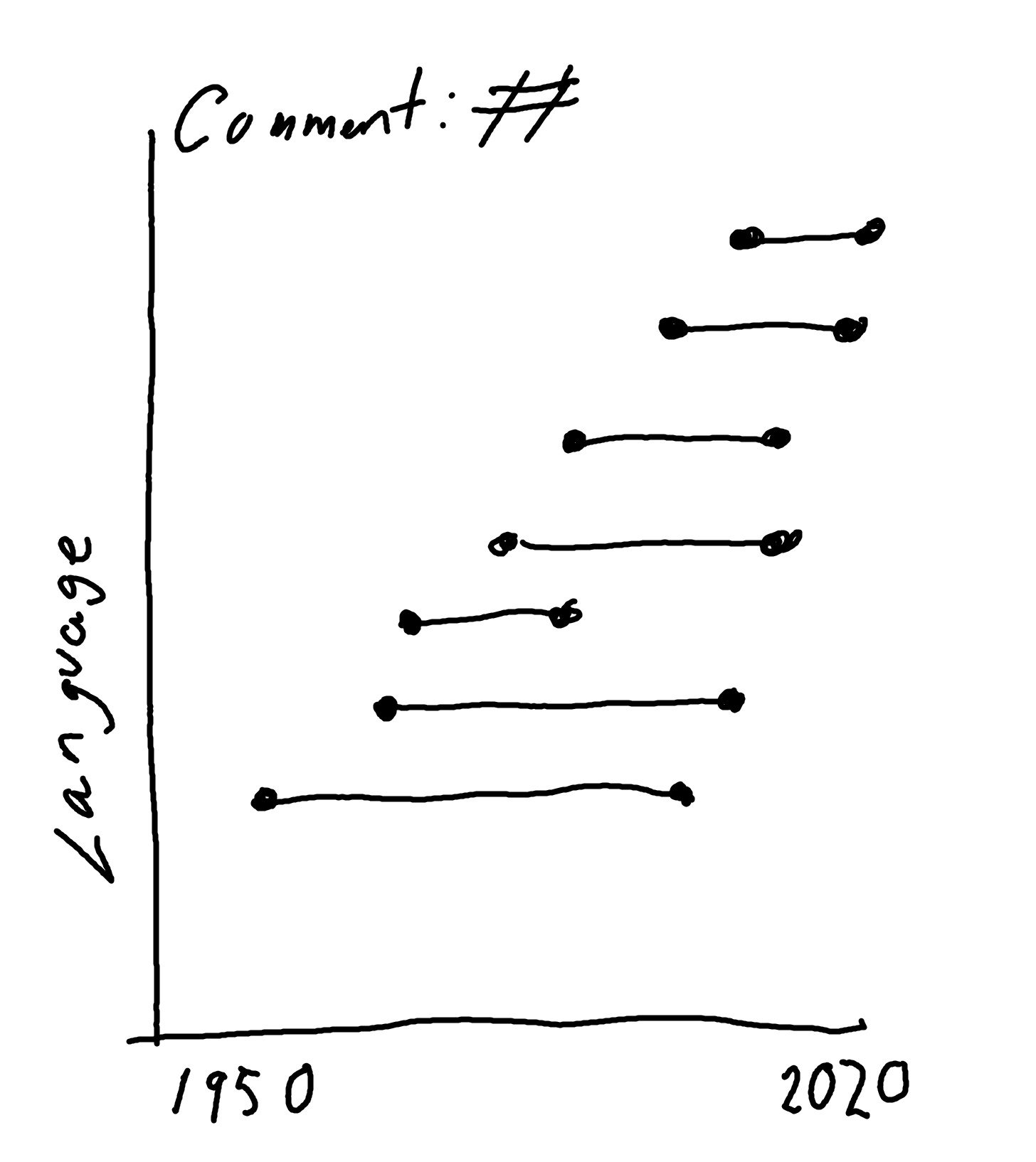
A dumbbell chart for the timelines of languages that use a # for comments might look something like Figure 2.5.
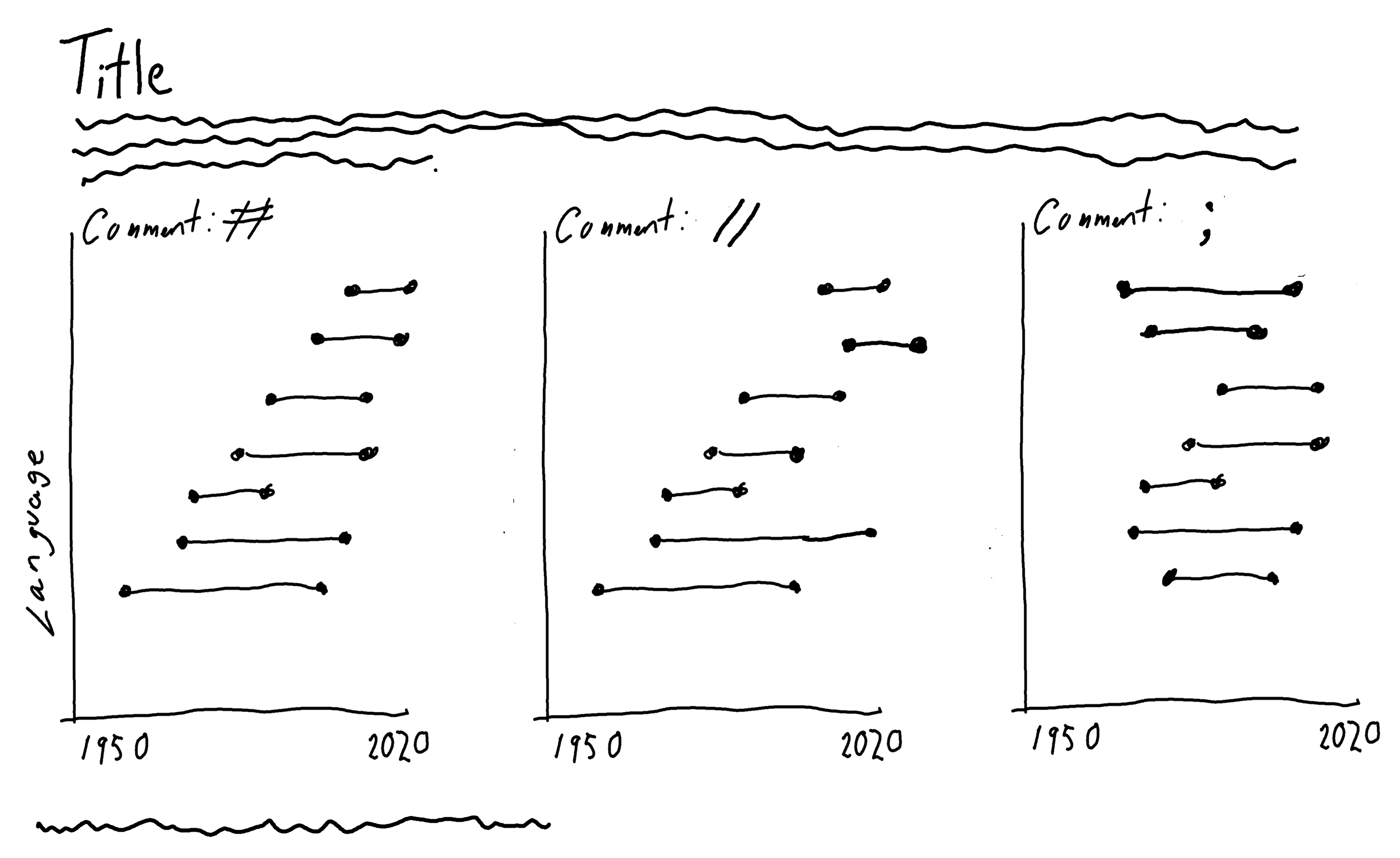
To show how this differs between different comment symbols, we might create small multiples of this chart - essentially creating the same plot multiple times for different subsets of the data. In ggplot2, these are called facets, and might look something like @#fig-languages-sketch-2.
2.3 Preparing a plot
Dumbbell charts are essentially a combination of two things: lines and points. Although there isn’t a built-in function for creating dumbbell charts in ggplot2, there are built-in functions for creating lines and points so we have everything we need to make a dumbbell chart.
There are a few extensions packages that can help you to make dumbbell charts without having to assemble the lines and points yourself. The ggalt package (Rudis et al. 2017) which provides additional coordinate systems, geoms, statistical transformations, and scales for ggplot2, includes the geom_dumbbell() function which, as the name suggests, provides a quick and easy way to create dumbbell charts. The dumbbell package (Cheung 2021) also provides functionality for creating dumbbell charts.
In this chapter, we’re not going to use either of those for a couple of reasons:
- Extension packages are perfect for making charts quickly and easily, and I would encourage you to try them. But it’s also really useful to understand that, as long as you can break down the chart you want into lines, points, and polygons, then you can make it with
ggplot2. That’s, at least in part, what this book is about. - We’re going to apply reasonably advanced customization to our dumbbell chart, and it’s useful to see how these work in
ggplot2first so that you can later apply them to other plot types more easily.
2.3.1 Data wrangling
We’ll start by subsetting the data to keep only the rows relating to languages that use one of the comment symbols that we’re interested in. If we want to look at only languages that use a //, #, or ; for comments, we can use the filter() function from dplyr in conjunction with the %in% operator. This keeps only rows where the value in the line_comment_token column is in the vector c("//", "#", ";"). We’ll be faceting by line_comment_token, and we want to make sure that the title of the facet is informative - not just a # symbol on its own. Although we could create a labeling function to do this, it’s even easier to just edit the text in the line_comment_token. We use the paste() function to add the phrase "Comment token:" before each symbol and add this as a new column called label using mutate() from dplyr.
To keep our data tidy and manageable, we can drop the columns we no longer need using the select() function from dplyr to keep only the five columns we’ll be using in the visualization. We’ll also discard any rows that contain an NA value in any of these columns using drop_na() from tidyr.
In each facet, we could list all programming languages that use the comment symbol related to that facet. This would also display information about how many languages use each symbol. Alternatively, we may choose to use only the top 10 ranked languages for each symbol.
We can extract the top 10 using slice_min() from dplyr and select the 10 with the smallest values in language_rank. Alternatively, since the data is already sorted in rank order, we can use slice_head() from dplyr to extract the first 10 rows. Since we want the top 10 rows from each comment symbol category (not just the top 10 overall), we need to group() the data based on the label column. Before we ungroup() the data, we also want to create a new column that defines the within-group ranking as this will help with plotting. The row_number() function from dplyr identifies the row number within each group so it is used to define this within-group ranking. We add it as a new column called n using mutate().
To aid in plotting, we also want to reformat the data to put both year columns (appeared and last_activity) into one column. We can do this using pivot_longer() from tidyr.
plot_data <- comment_df |>
  group_by(label) |>
  slice_head(n = 10) |>
  mutate(
    n = factor(row_number(), levels = 1:10)
  ) |>
  ungroup() |>
  pivot_longer(
    cols = c(appeared, last_activity),
    names_to = "type",
    values_to = "year"
  )
Our plot_data looks like this:
head(plot_data)# A tibble: 6 × 6
title label language_rank n type year
<chr> <chr> <dbl> <fct> <chr> <dbl>
1 Python Comment token: # 3 1 appeared 1991
2 Python Comment token: # 3 1 last_ac… 2022
3 Perl Comment token: # 9 2 appeared 1987
4 Perl Comment token: # 9 2 last_ac… 2022
5 Ruby Comment token: # 12 3 appeared 1995
6 Ruby Comment token: # 12 3 last_ac… 2022Now we’re ready to start plotting!
2.3.2 First plot
One of the especially nice features of ggplot2 is the ability to save plots as variables, and iteratively add (using +) layers to it. To make the code a little bit clearer, we’ll be creating each aspect of our plot in stages, and gradually adding more complex styling to it. We’ll save the first plot we create as basic_plot.
As with most plots created with ggplot2, we’ll start by calling the ggplot() function. We can define which data and aesthetic mapping we want to use either globally (in the ggplot() function) or in each individual layer. We’ll be using the same data (plot_data) for all layers, so we pass it into the data argument of ggplot().
Next, we start adding geometries: lines and points. The order in which we add the geometries is important here. We want the points to be plotted on top of the lines so that we don’t see the lines overlapping with the points. This means we need to plot the lines first, then the points. We add geometries using the different geom_* functions. To add lines, we use geom_line(). Although ggplot2 is smart, it’s not smart enough to guess which variables will be plotted on each axis. We need to specify an aesthetic mapping using the aes() function - to define which columns from the data are going on the x and y axes. We want to draw horizontal lines for our dumbbell chart, meaning that year goes on the x-axis, and the rank category, n, goes on the y-axis. By default, geom_line() draws lines between the coordinates in the order of the variable on the x-axis. That’s not really what we want here. We want a separate line drawn for each language, i.e., each rank, n. So we pass this into the group argument as well. This will still draw lines between coordinates in order of the variable of the x-axis, but separately for each rank category. To add points at each end of the dumbbell, we add geom_point() - specifying the aesthetic mapping to put the year on the x-axis and the rank on the y-axis again. We don’t need to specify a group here, although it won’t make any difference if we do.
Finally, we also add facet_wrap() to create a small multiple plot (facet) for each category in the label column. Note the ~ required before the name of the column we wish to facet by.
basic_plot <- ggplot(data = plot_data) +
  geom_line(mapping = aes(x = year, y = n, group = n)) +
  geom_point(mapping = aes(x = year, y = n)) +
  facet_wrap(~label)
basic_plot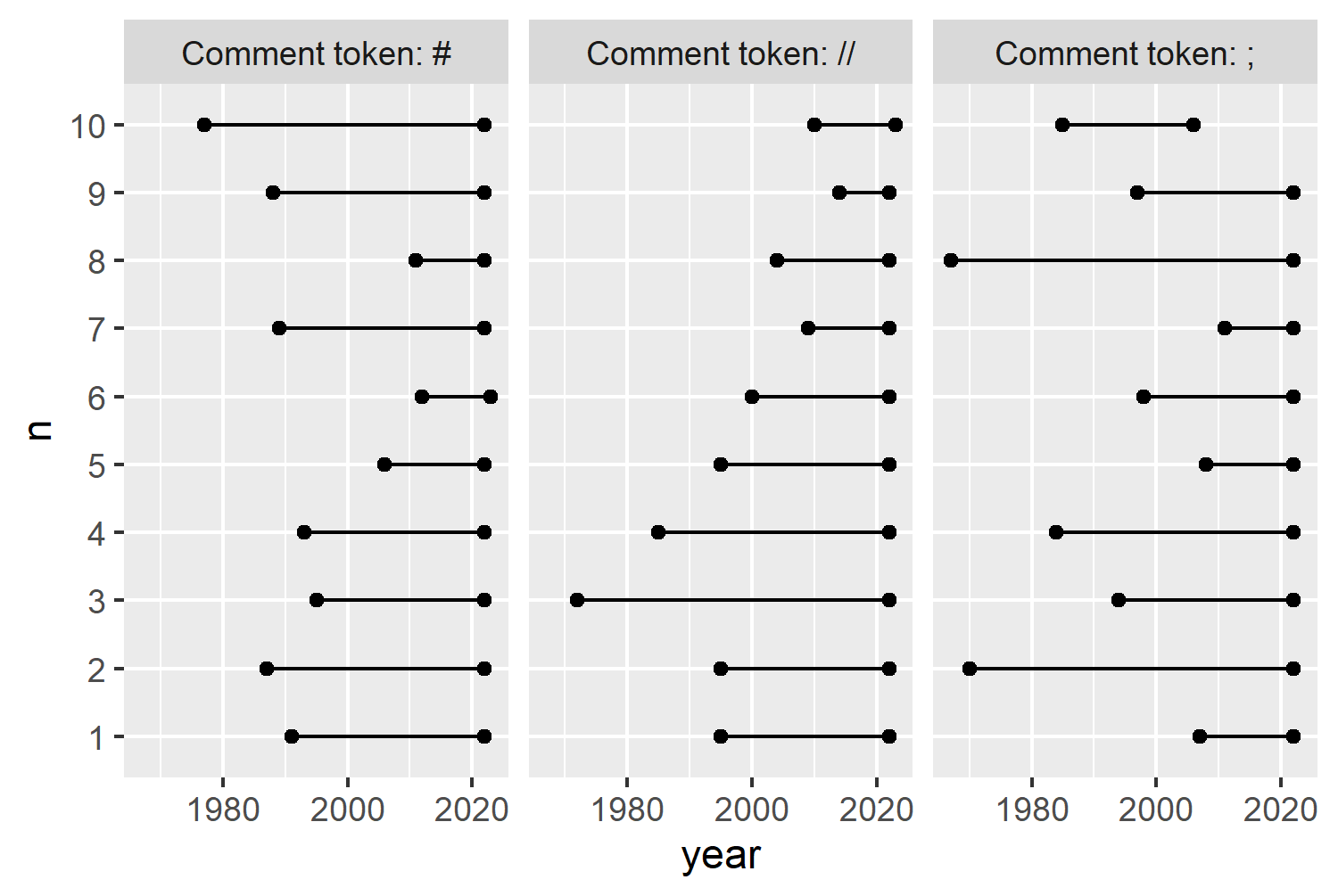
In ggplot2 (and most other plotting software) the y-axis starts with 0 at the bottom with increasing values going upward, as shown in Figure 2.7. However, when we visualize rankings, we usually want to put the smallest number (highest rank) at the top. So we want to reverse the y-axis here. In ggplot2, for discrete axes, we do this by passing the rev() (short for reverse) function to the limits argument of scale_y_discrete().
The current y-axis labels are not especially informative - it would be more useful to add in the names of the languages or the overall ranking rather than simply the numbers 1 to 10. Later, we’re going to add some labels in each facet to provide this information, so we’ll expand the left-hand side of the x-axis to leave some space for those labels. By setting expand = expansion(0, 0) we remove the extra space that’s automatically added at either side of the axis.
basic_plot +
  scale_y_discrete(limits = rev) +
  scale_x_continuous(
    breaks = c(1970, 1990, 2010, 2030),
    limits = c(1930, 2030),
    expand = expansion(0, 0)
  )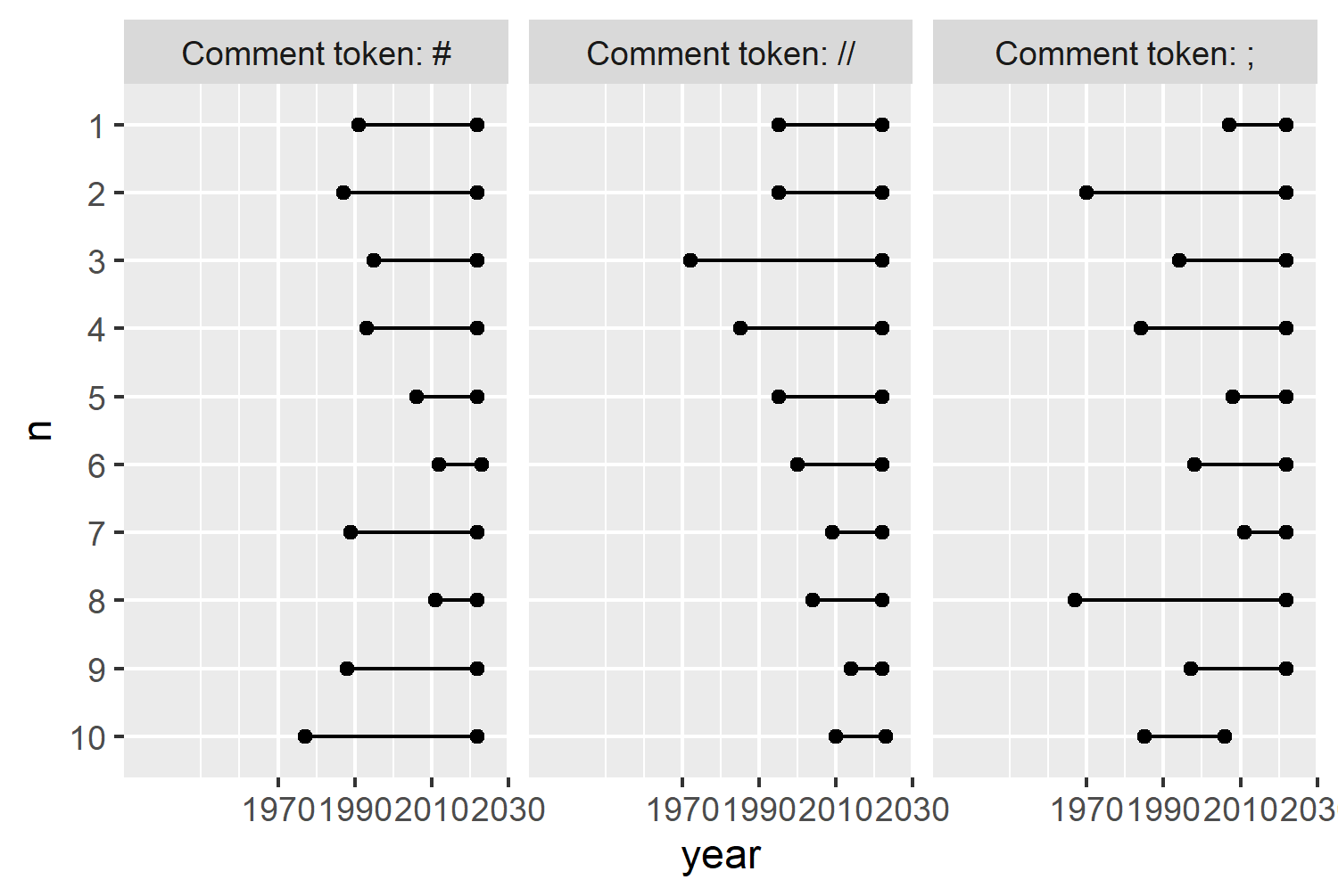
Now Figure 2.8 looks a little bit like the sketch in Figure 2.6. But it doesn’t look great yet. It needs a bit more work to improve both the aesthetics and the clarity of the visualization.
2.4 Advanced styling
There are lots of different elements of applying more advanced styling to charts, and we’ll cover a few of them in this section: colors, fonts, and themes.
2.4.1 Colors
Let’s start with colors. How do you decide which colors to use? The more complex case is where color represents a variable in the data - either through a color gradient for continuous variables, or a set of distinct colors for discrete, categorical data. We’ll come back to choosing colors for this setting in Chapter 3 and Chapter 9. Here, it’s a little bit easier since we only need to think about a few colors: the background color(s), the text color(s), and the colors for the different geometric elements.
To make visualizations that are more aesthetically pleasing, it’s often useful to think about whether you can match your color choices to the theme of the data. For example, if you’re creating a bar chart of pumpkin sizes, you might want to use orange for the bar color. Here, we’re creating a chart about programming languages. What color do you associate with programming languages? Personally, I think of green. Specifically, the green used in green screens (monochrome monitors that used green phosphor screens) typically in the early days of computing.
We can define some variables to store our colors in: a variable called bg_col that’s dark gray we’ll use for the background; and a variable called main_col that’s a hex code for a bright green we’ll use for the text and other geometric elements.
The dark gray, "gray5", is a pre-defined color in R. Run colors() to see the list of all 657 pre-defined colors available.
It’s useful to save colors as variables because it makes it much easier to edit colors later on. We could just use the hex code directly in each argument where we want to use the color. But as you’ll see when we start applying the colors to our chart, this can be many different arguments. If we decided we actually want to use a slightly different shade of green, we’d have to manually change all of them. By using a variable, we only need to change it once.
bg_col <- "gray5"
main_col <- "#66FF00"
Although you can use update_geom_defaults() to change the default colors used for lines, points, and text, this approach also changes the colors for all future plots in your R session and it’s quite tricky to return to the previous defaults. Instead, we can simply rewrite the code we already have and add in the additional colors. Note that these colors are added outside of the aes() function since they are not mapped to variables in the data.
The point character (pch) for geom_point() is also set to 22 - a square which allows you to color the square and its outline different colors. The outline color is set to our green main_col and the square fill color is set to the dark gray bg_col in Figure 2.9.
basic_plot <- ggplot(data = plot_data) +
  geom_line(
    mapping = aes(x = year, y = n, group = n),
    color = main_col
  ) +
  geom_point(
    mapping = aes(x = year, y = n),
    color = main_col,
    fill = bg_col,
    pch = 22
  ) +
  facet_wrap(~label) +
  # add scales back in
  scale_y_discrete(limits = rev) +
  scale_x_continuous(
    breaks = c(1970, 1990, 2010, 2030),
    limits = c(1930, 2030),
    expand = c(0, 0)
  )
basic_plot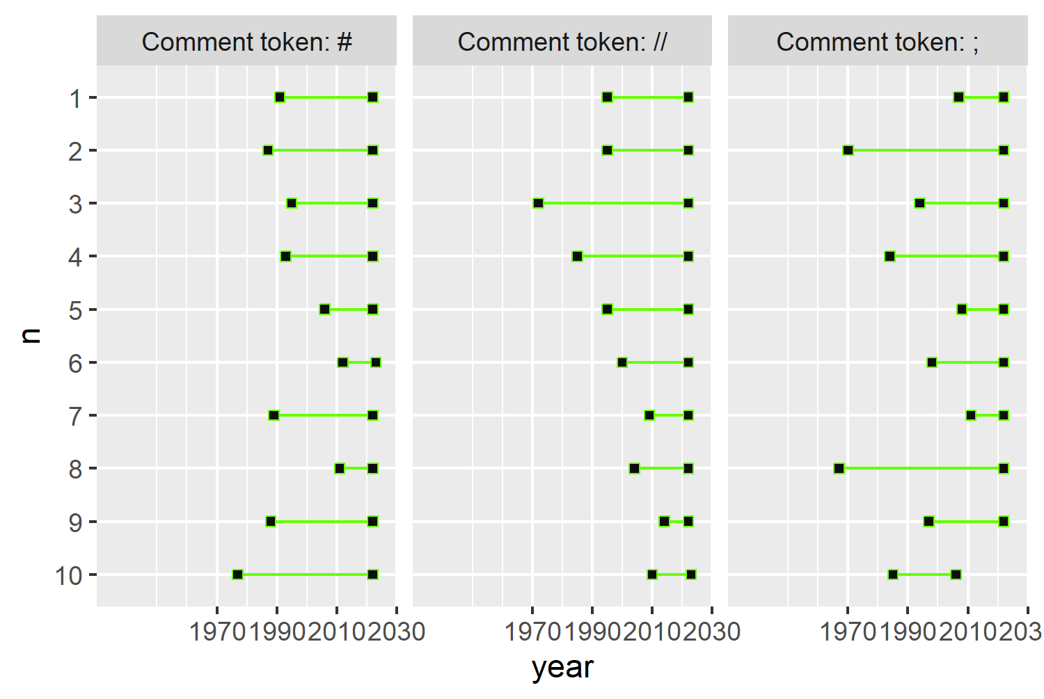
2.4.2 Text and fonts
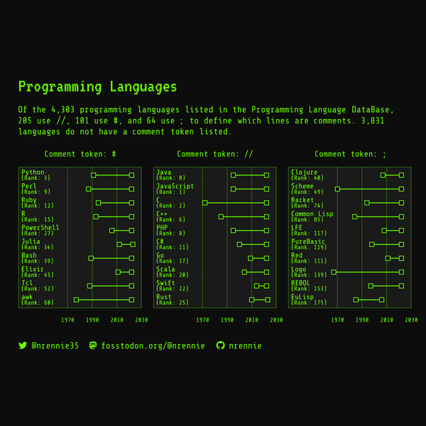
Adding text to a visualization is important - a title, subtitle, and perhaps caption can add information to make it easier for a reader to understand what’s going on. A title quickly explains what the chart is about. Though more informative titles may be viewed as more aesthetically pleasing, there’s no evidence that they are more effective for conveying information (Wanzer et al. 2021). A subtitle might give some more information about the underlying data, explain how to interpret more complex charts, or state the conclusions a reader should come to. Captions are a good place to put information such as who made the graphic, what the source of the data is, or other important conditions on the data.
As with colors, we’ll define text as variables. This helps to keep the plotting code looking a little bit cleaner. It’s often easier to write the text after you’ve made the plot, and defining variables make it easy to add placeholder text while you’re working on the plot.
title <- "Programming Languages"
caption <- "Data: Programming Language DataBase | Graphic: N. Rennie"
Since our visualization doesn’t give information on how many languages use each comment symbol and just focuses on the top 10, we might want to present this information in the subtitle instead:
subtitle <- "Of the 4,303 programming languages listed in the Programming Language DataBase, 205 use //, 101 use #, and 64 use ; to define which lines are comments. 3,831 languages do not have a comment token listed."The problem with writing out the values into a text string like this is that it’s hard to update. The snapshot of data we’re working with here is from March 2023. If we updated the data to a more recent version, we’d have to recalculate these values manually then copy and paste them into the text string. A better approach is to use data-driven text - combine calculation with text.
The glue package (Hester and Bryan 2024) makes it easy to combine text with variable values. The glue() function evaluates R code inside curly brackets {} and inserts it into the string. Alternatively, you can use paste() as we did earlier for the facet labels, or sprintf() in base R.
glue()
If you need to use a curly bracket inside the string text, you can change the .open and .close arguments of glue() to a different delimiter.
Since the values are going into a sentence we can make use of the format() function to add commas into the number formatting - showing 4,303 instead of 4303:
subtitle <- glue("Of the {format(nrow(languages), big.mark = ',')} programming languages listed in the Programming Language DataBase, {sum(languages$line_comment_token == '//', na.rm = TRUE)} use //, {sum(languages$line_comment_token == '#', na.rm = TRUE)} use #, and {sum(languages$line_comment_token == ';', na.rm = TRUE)} use ; to define which lines are comments. {format(sum(is.na(languages$line_comment_token)), big.mark = ',')} languages do not have a comment token listed.")Let’s add the title, subtitle, and caption to the plot using the labs() function:
text_plot <- basic_plot +
  labs(
    title = title,
    subtitle = subtitle,
    caption = caption
  )
text_plot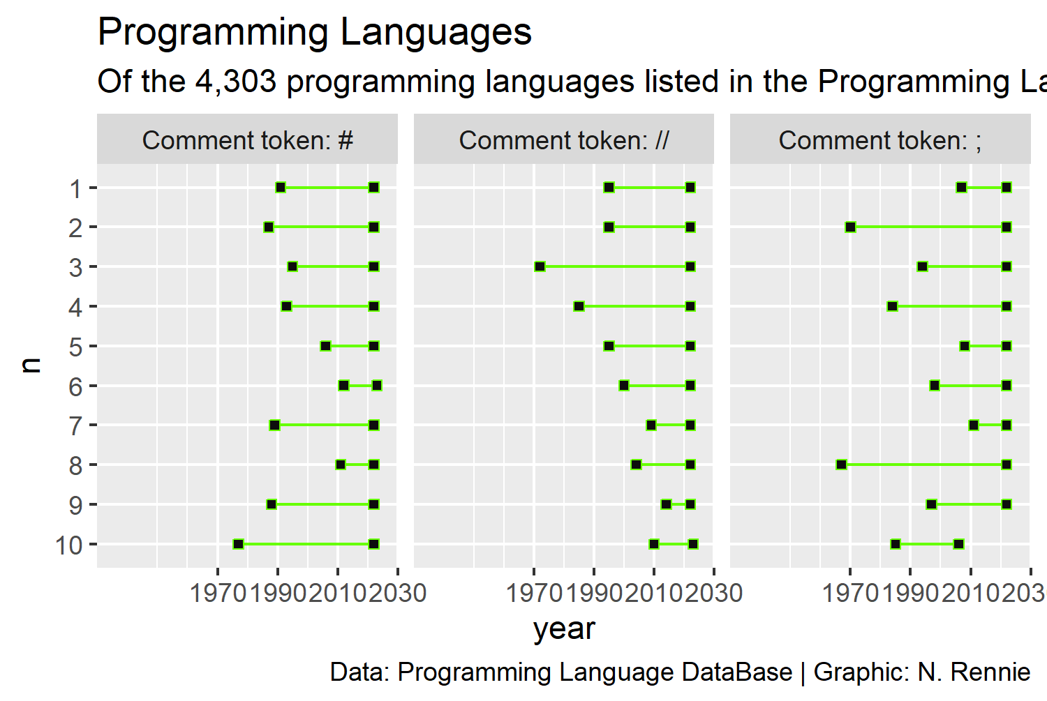
You’ll notice that the subtitle text in Figure 2.10 runs off the edge of the plot here - we’ll deal with that a little bit later. Let’s first decide on a typeface to use in the plot. As with choosing colors, when choosing typefaces it’s useful to think about choosing one that fits with the theme. Think about the typefaces used in horror films posters. Isn’t it quite different to the typefaces used in marketing children’s toys? Since we’re going with a monochrome monitor theme for the colors, we can extend that to the typeface choice by choosing a monospace typeface reminiscent of early computers.
Working with fonts in R isn’t always easy. When it comes to using a different font for text in R, you can use fonts that come installed with your operating system or download font files from elsewhere and load them into R. An easy way to use external fonts is through the font_add_google() function from sysfonts (Qiu 2022). This function allows you to load Google Fonts in R without worrying about downloading or installing font files. You can browse Google Fonts at fonts.google.com. The VT323 and Share Tech Mono typefaces both look like they’ll fit in with our theme. The font_add_google() function looks through the Google Fonts database for the specified typeface name (e.g. "VT323") and loads the font files you’ll need. The second argument, family is how we’ll refer to the typeface when using it in R. By default it’s the same as the name but it’s often useful to change it to something else (e.g. "vt"), especially for long typeface names.
We also need to make sure that whichever graphics device we are using, is able to make use of these fonts. This is where the showtext package (Qiu 2023) comes in. By running showtext_auto(), this means that the showtext package is automatically used to render text. We can also set showtext_opts(dpi = 300) to use fonts in the resolution we plan to save our image in later - see Section 2.4.4 for more details on image resolution.
font_add_google(
  name = "VT323", family = "vt"
)
font_add_google(
  name = "Share Tech Mono", family = "share"
)
showtext_auto()
showtext_opts(dpi = 300)showtext
There are several alternatives to showtext for working with fonts in R. Depending on what you’re creating, you might find one of these works better for you:
- The
raggpackage (Pedersen and Shemanarev 2023) uses a different graphics device, and allows to use any fonts installed on your system. You can usually install additional fonts by downloading the relevant font files, then right clicking and choosing the install option. - The
systemfontspackage (Pedersen et al. 2024) allows you to locate or load local font files based on font family and style. We’ll look at an example of using {systemfonts} in Chapter 9. - The
extrafontpackage (Chang 2023) which focuses on using TrueType fonts in PDF formats.
Exactly, as we did with colors, we’ll save typeface names as variables to make it easier to see how our plots look with different typefaces. We’ll save two variables: title_font that store the typeface for the title (and other important elements), and body_font for all other text.
body_font <- "share"
title_font <- "vt"
When it comes to styling to all of the non-geom elements of your plot (such as the background color, the typeface used for the title, or how the caption is aligned) this is handled by the theme() function in ggplot2. There are several built-in themes which pre-set some of the arguments such as theme_classic(), theme_minimal(), or theme_gray(). The default theme is theme_gray() - this is where the default gray background comes from.
Normally, we want the title text to appear larger than other text. Similarly, we might want the axis text to be smaller than other text. In ggplot2, all text is defined relative to some baseline text size. If we want to increase (or decrease) the size of all text used in the plot, changing the base_size argument in the built-in themes sets the baseline text size used for all elements. This means you don’t have to individually increase the size of every single text element. Similarly, the base_family changes the default typeface used for all (non-geom) text elements.
Here, we might start with theme_minimal() and set the base_size to 8. This is quite a small font size (smaller than the default size of 11) to make sure the plot fits within the width of the printed version of this book.
We can also set the base_family equal to body_font - the variable we defined earlier to store the name of the typeface we want to use for the text.
theme_plot1 <- text_plot +
  theme_minimal(
    base_size = 8,
    base_family = body_font
  )
theme_plot1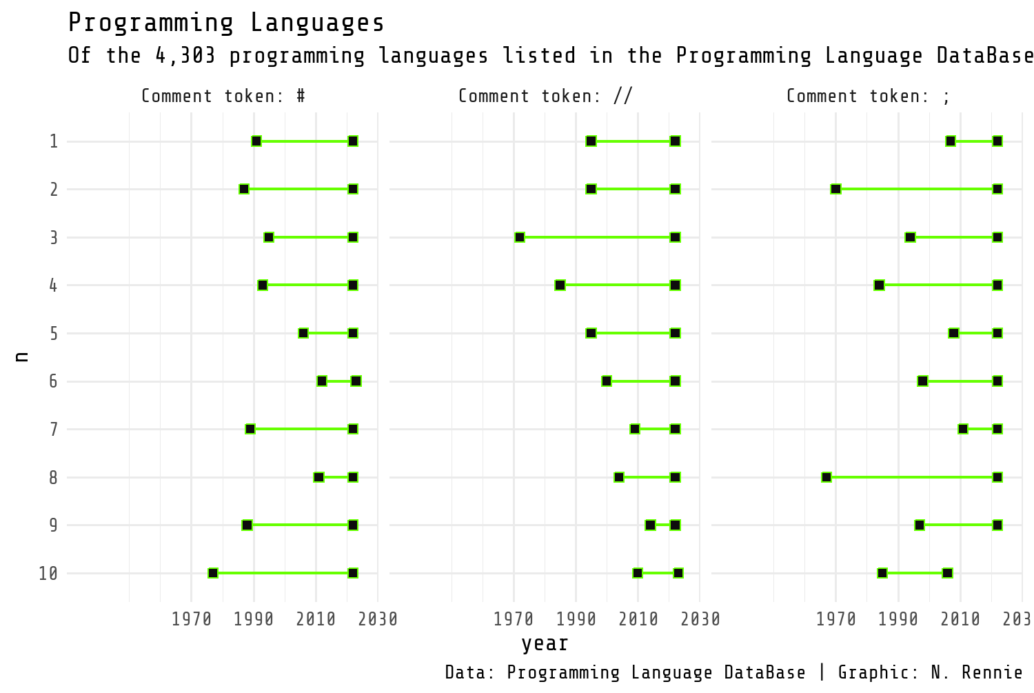
2.4.3 Adjusting themes
We can make some further adjustments to the styling of Figure 2.11 by editing individual arguments in the theme() function. When editing theme() arguments, many arguments are specified as a type of element: element_text(), element_line(), element_rect(), element_grob(), element_render(), or element_blank().
2.4.3.1 Background color
We can edit the background color using the panel.background and plot.background arguments. The panel.background refers to the area within the plot, e.g., the area that is gray by default. The plot.background refers to the area outside of this. Both of these are specified using element_rect() since they are effectively just rectangles. We want to change both the fill (inner color of the rectangle) and color (outline color of the rectangle to our chosen background color.)
2.4.3.2 Grid lines
Grid lines in ggplot2 fall into two categories: major and minor. Major grid lines are usually slightly bolder and correspond to the axis text labels. Minor grid lines are usually lighter and unlabeled. They can be controlled using the panel.grid.major and panel.grid.minor arguments, with finer control possible for x- and y-axis gridlines. They are all defined using element_line(). We can change the color of the major x-axis gridlines using the color element. To ensure the bright green color doesn’t become distracting as a background element, we can make it semi-transparent using the alpha() function from ggplot2 - 0 means fully transparent and 1 means fully opaque. The linewidth controls the width of the lines. We remove all the y-axis grid lines and all minor grid lines by setting both panel.grid.major.y and panel.grid.minor to element_blank() which removes the elements completely. We can also remove all axis ticks using axis.ticks = element_blank().
2.4.3.3 Text elements
Unfortunately, there is no base_color argument that allows us to change the color of all text elements in the same way as the base_size and base_family arguments. Within the theme() function, we can edit the text argument:
theme(
  text = element_text(color = text_col)
)
However, this unfortunately misses some of the text elements in the chart such as the axis labels which retain their default colors. To make sure we edit all the text elements we need to, we can edit the color of the relevant text elements individually and change them to the green main_col color. This includes the strip.text (the facet title text) and axis.text (axis value labels), as well as the plot.title, plot.subtitle, and plot.caption.
Version 4 of ggplot2 brings updates to the theme() functions, and adds arguments called ink which deals with the foreground colors, and paper which deals with the background colors. You can read about the updates at www.tidyverse.org/blog/2025/09/ggplot2-4-0-0 (Brand 2025).
For the x-axis text, we also adjust the vjust argument to move the text slightly higher up closer to the plot area. For the y-axis text, we’ll remove it using element_blank() as we’ll add our own labels later. The family of the title text can also be adjusted to the title_font variable we defined earlier to change the typeface. We may also want to make the title font even larger by adjusting the size element. Instead of specifying a number directly in the size argument, we instead use the rel() function. The rel() function defines the font size relative to the base size - meaning that if you change the base size, the title will also rescale accordingly.
2.4.3.4 Margins
To add a little bit of space around the outside edge of the plot, we can define the plot.margin argument. This is specified using the margin() function (instead of one of the element_*() functions) which takes four arguments: the top, right, bottom, and left margins. A little bit of trial and error can help you to find values that look good.
theme_plot1 +
  theme(
    # Background color
    plot.background = element_rect(
      fill = bg_col,
      color = bg_col
    ),
    panel.background = element_rect(
      fill = bg_col,
      color = alpha(main_col, 0.5),
      linewidth = 0.4
    ),
    # Grid lines
    panel.grid.major.x = element_line(
      color = alpha(main_col, 0.5),
      linewidth = 0.2
    ),
    panel.grid.major.y = element_blank(),
    panel.grid.minor = element_blank(),
    axis.ticks = element_blank(),
    # Text elements
    strip.text = element_text(
      color = main_col
    ),
    axis.text.y = element_blank(),
    axis.text.x = element_text(
      color = main_col,
      vjust = 2
    ),
    plot.title = element_text(
      color = main_col,
      family = title_font,
      size = rel(2),
    ),
    plot.subtitle = element_text(
      color = main_col,
      margin = margin(b = 5)
    ),
    plot.caption = element_text(
      color = main_col,
      margin = margin(b = 5),
      hjust = 0
    ),
    # Margins
    plot.margin = margin(10, 15, 5, 0)
  )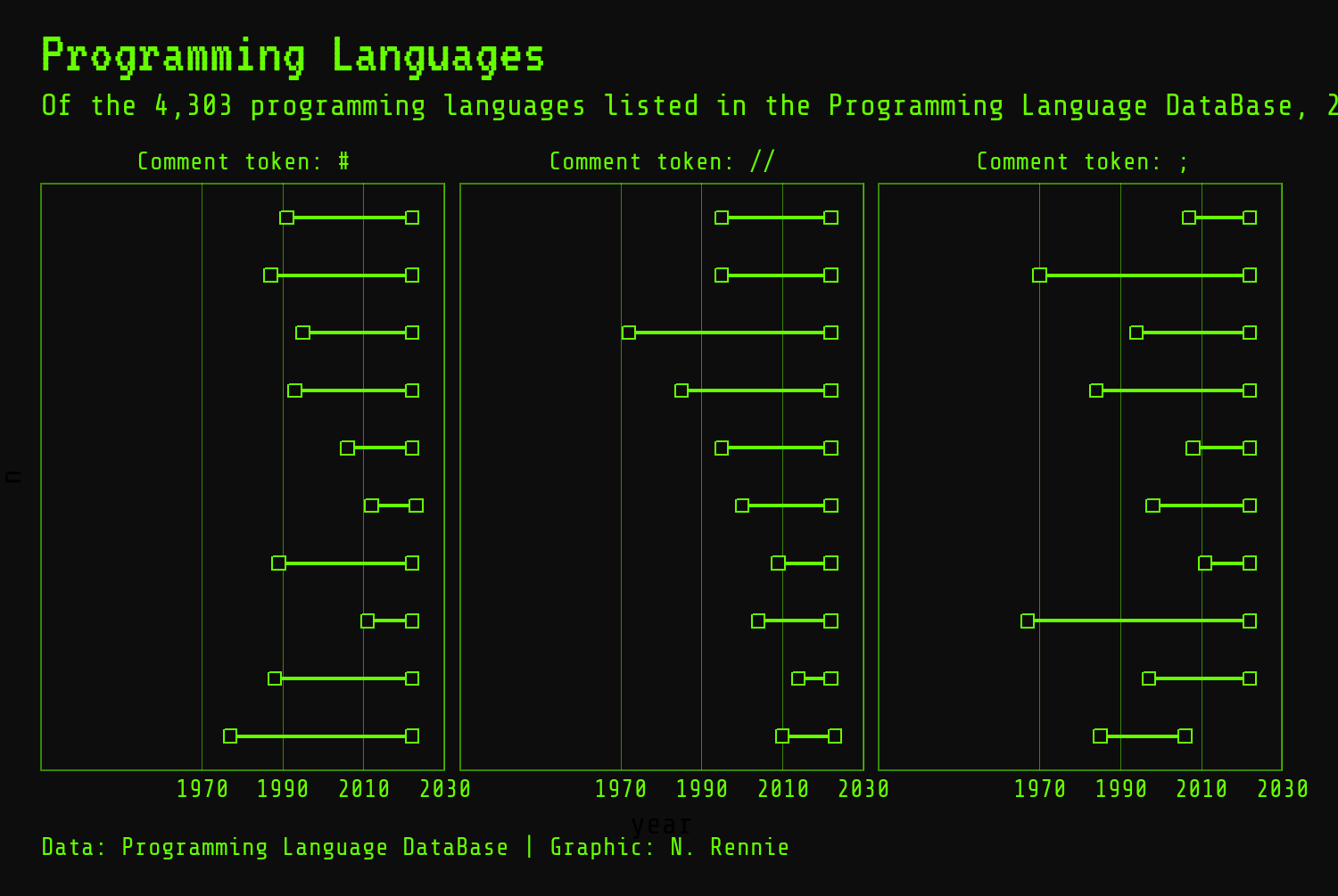
We also need to deal with the fact that the subtitle text is too long and is running off the side of the page in Figure 2.12. There are a few options for this:
- We can manually add line breaks by adding in
"\n"to the subtitle string where we want the line to break. This is very much a manual approach that requires a lot of trial and error. - We can use
str_wrap()fromstringrto split the text with a specified number of characters per line. This still involves a bit of trial and error to find the best line length. It also means you need to re-optimize the line length if you change the text size. - One of the best solutions is to use
element_textbox_simple()from theggtextpackage (Wilke and Wiernik 2022). Theggtextpackage provides improved text rendering support forggplot2, including support for using Markdown and HTML text which you’ll see several examples of in later chapters. Theelement_textbox_simple()function enables you to places text in a box, with word wrapping. - The
marqueepackage provides a similar functionality toggtext, which we’ll cover in Chapter 6.
We can replace element_text() with element_textbox_simple() in the theme() argument for plot.subtitle to wrap the subtitle text at any font size:
theme_plot2 <- theme_plot1 +
  theme(
    plot.background = element_rect(
      fill = bg_col,
      color = bg_col
    ),
    panel.background = element_rect(
      fill = bg_col,
      color = alpha(main_col, 0.5),
      linewidth = 0.4
    ),
    panel.grid.minor = element_blank(),
    panel.grid.major.x = element_line(
      color = alpha(main_col, 0.5),
      linewidth = 0.2
    ),
    panel.grid.major.y = element_blank(),
    strip.text = element_text(
      color = main_col
    ),
    axis.text.y = element_blank(),
    axis.text.x = element_text(
      color = main_col,
      vjust = 2
    ),
    plot.title = element_text(
      color = main_col,
      family = title_font,
      size = rel(2)
    ),
    plot.subtitle = element_textbox_simple(
      color = main_col,
      margin = margin(b = 5),
      lineheight = 0.5
    ),
    plot.caption = element_text(
      color = main_col,
      margin = margin(b = 5),
      hjust = 0
    ),
    axis.ticks = element_blank(),
    plot.margin = margin(10, 15, 5, 0)
  )
theme_plot2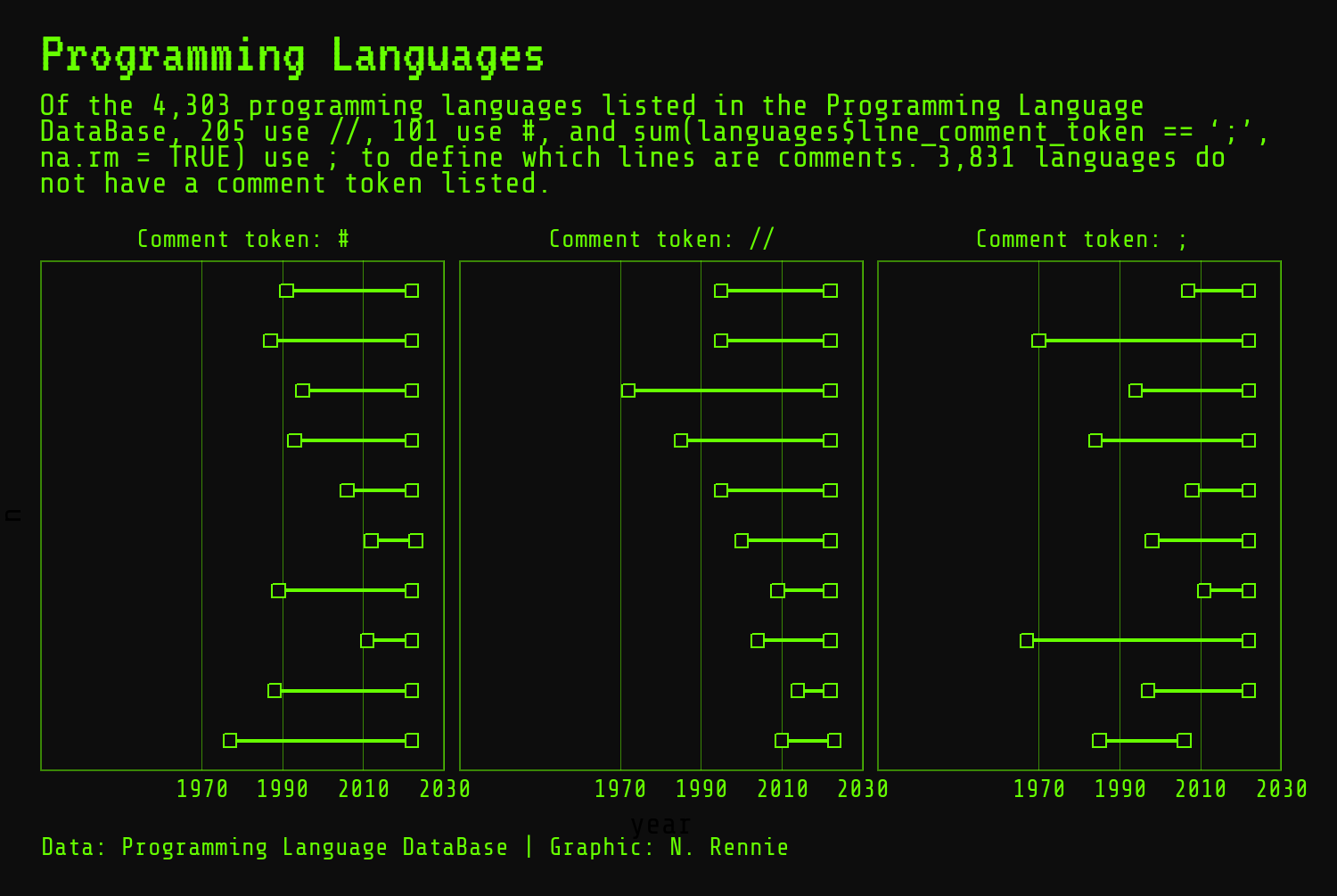
Finally, since we’ve removed the y-axis labels in Figure 2.13, we need to add in some labels using geom_text(). The geom_text() function has three required aesthetics: the x and y coordinates of where the label should be placed, and label which defines what text is written. Here, we use the language title as the label, and put a label in each rank category, n, on the y-axis. We override the x aesthetic to place all labels in the same horizontal alignment - the exact value will take a little bit of trial and error to get right.
We also need to edit the appearance of the text, since its styling is separate from the theme elements. We pass out body_font variable into the family argument to set the font family for the labels, and set hjust = 0 to left-align the text. The size and color arguments can also be adjusted.
geom_text()
The default font size of geom_text() is 3.88. This is slightly confusing because the size in geom_text() is defined in mm whereas the size in theme() elements is defined in pt. To match the font size in geom_text() to the theme’s font size, specify size.unit = "pt" in geom_text(). This argument is available from version 3.5.0 of ggplot2.
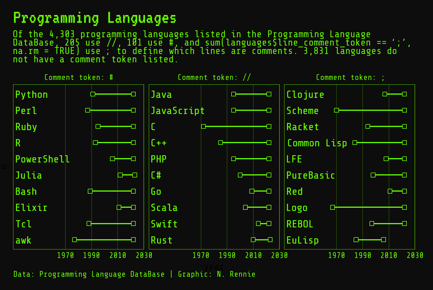
Although these labels in Figure 2.14 are an improvement on not having any language label, they’re still not as informative as they could be. There’s no information about the overall rank included in the plot. There’s no way to tell if the top ranked language that uses # as a comment symbol is also the top ranked language overall or ranked as low as 1000! Let’s create a more informative label using the glue package again. We can create a new rank_label column using mutate() which combines the language name from the title column, the text "Rank:, and the rank from the language_rank column. The \n adds a line break between the language name and rank text.
Let’s add these new and improved labels to our plot using geom_text(). Note that since we’ve updated the plot_data object, we need to pass the data in again:
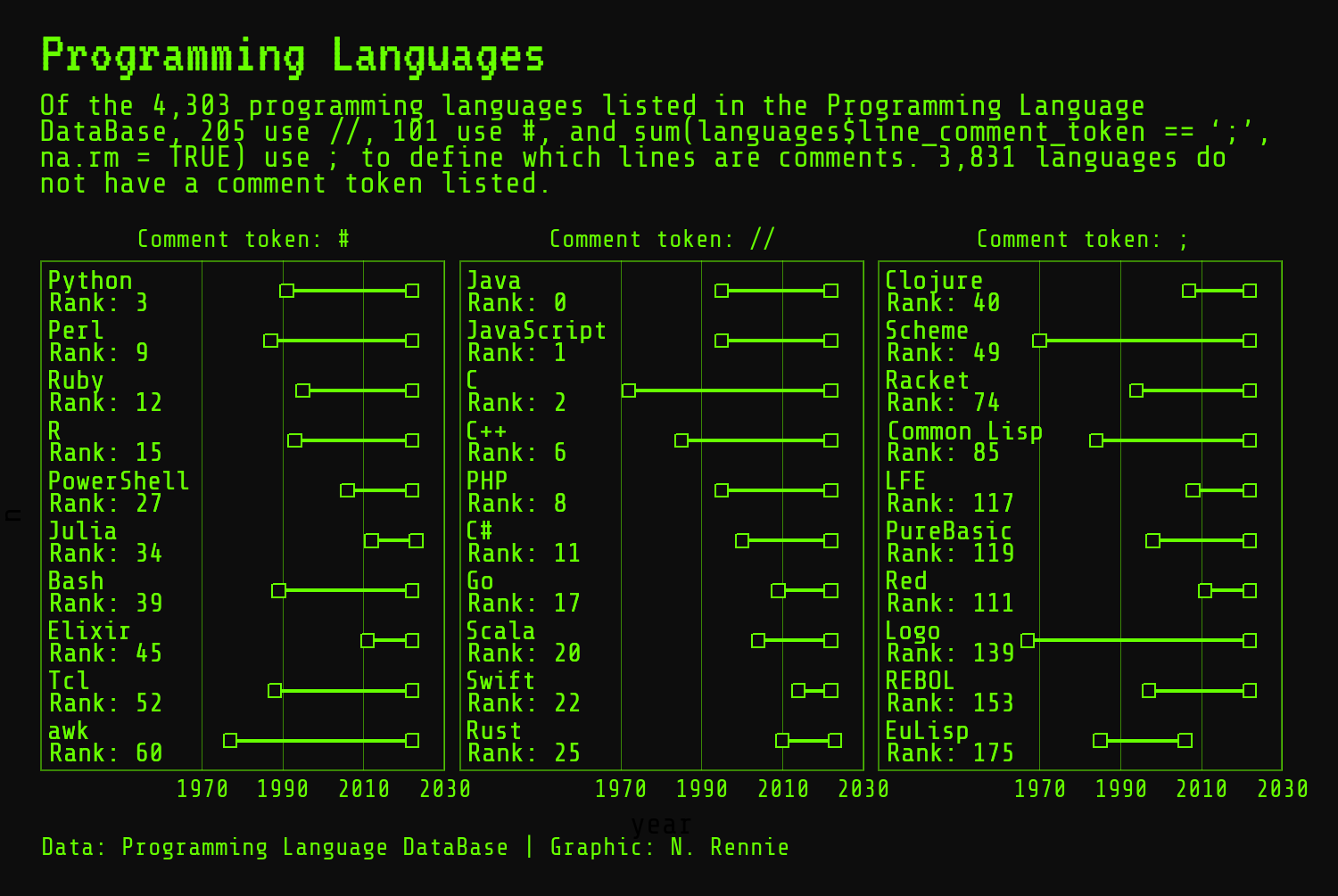
And we’re finished with Figure 2.15!
2.4.4 Saving to an image file
There are many different options available for saving plots created with R to a file you can later use in presentations, on social media, in publications, or anywhere else you might need to:
- You can use the interactive interface in RStudio by going to the Plots tab, then clicking Export and Save as Image. This creates a pop-up window where you can choose your desired file type, set the size, and choose a location to save the file in. However, this approach doesn’t allow you to set the resolution (image quality) of the file you save.
- The base R
grDevicespackage provides several functions for saving to different file types, for example, thepng()function enables you to save PNG files with a specific height, width, and resolution. You can also set other arguments such as the background color in thepng()function. Theraggpackage (Pedersen and Shemanarev 2023) provides a similar set of functions. For example, theagg_png()function. - If you are using
ggplot2to create your plots, theggsave()function is the easiest way to save your visualizations to a file. As detailed in the help file, it defaults to saving the last plot that you displayed, using the size of the current graphics device. It also guesses the type of graphics device from the extension.
It’s recommended to save your images in a specific size, rather than using the size of the current graphics device in RStudio - it makes it much easier to reproduce the same image again! You can set the width and height in ggsave(), using a calculation instead of a specific value if you want a specific aspect ratio:
ggsave(
  filename = "programming-languages.png",
  width = 5,
  height = 0.67 * 5
)
By default, the width and height is given in inches (though you can change this with the unit argument) and the resolution (set with the dpi argument) is 300. If you’ve saved your final plot to a variable in R, you can pass this directly to ggsave() instead of printing the object first:
ggsave(
  filename = "programming-languages.png",
  plot = final_plot,
  width = 5,
  height = 0.67 * 5
)
If you’re creating plots with other R packages, some of those packages will also come with their own built-in save functions.
If you’re saving images at a different size or resolution (e.g., 300 dpi) to the resolution that you preview images in, e.g., 96 dpi, then your saved image might not look quite how you expect. The lines and text might appear much thinner or thicker than you expect. The scale argument in ggsave() or the scaling argument in the ragg family of functions is one option for dealing with this. These arguments apply a scaling factor to line and text sizes allowing you to scale up (or down) your plot if it appears too small (or large) at your desired size and resolution. An even easier way to deal with this problem is to make sure you are previewing your plot at the same size and resolution as you’d like your final image to be. The camcorder (Hughes 2022a) package provides a solution to this issue, and you can read more about how to use it in Chapter 14.
2.5 Reflection
Even though we’re essentially finished with this visualization, it’s useful to get some feedback on how effective it is. You could share your visualization with a colleague or friend and ask for them to critique it. Alternatively, you can reflect on your own work with a critical eye. Reflecting on your own work is often more successful if you leave your visualization alone for a little while first. When you come back to it, think about whether your choice of plot was the best one, whether the fonts need resizing, or if you should use a different color scheme. So, which elements of this visualization could still be improved?
When using dumbbell charts to show time frames like this, the dots at each end are often taken as start and end time points. In this chart, that doesn’t quite make sense. Imagine a programming language that was last active 20 years ago and is officially no longer maintained. Then imagine a different language that was last updated last week. The end time point (showing last_activity) is represented the same way in these two cases. Using an open-ended dumbbell for languages that are still actively being maintained might be more representative of what’s actually happening in the data.
The labels showing the name and rank of the programming languages are a little bit hard to read. Each label isn’t distinct enough from the labels above or below it. One option would be to change the size of the image - making the image taller would allow more space between each label. A second option would be to make the language name a slightly larger bold font, with the rank in a slightly smaller font below. This would make it clearer that there are 10 labels rather than 20! We’ll discuss how to add more complex formatting to text labels in Chapter 7, using the ggtext package.
Each plot created during the process of developing the original version of this visualization was captured using camcorder, and is shown in the gif below. If you’d like to learn more about how camcorder can be used in the data visualization process, see Section 14.1.
2.6 Exercises
Use open-ended dumbbells for languages that were last active in 2023, i.e., don’t plot a closing point.
Instead of showing the top 10 ranked languages for these three comment symbols, recreate the visualization showing all languages that use each symbol.