8 Nobel Prize laureates: positioning text and parameterizing plots
In this chapter, we’ll learn how to access data through an API, create custom text layouts, and build parameterized plot functions.
By the end of this chapter, you’ll be able to:
- Build URLs in R in order to extract data from an API;
- Create a new type of plot with core functions in
ggplot2by using a little bit of trigonometry; and - Parameterize your plotting code to create a function, to make it easier to produce lots of similar graphics with a consistent layout.
We begin by loading the packages required in this chapter.
We’ve used all of these packages in previous chapters, but we’ll be using them to do some slightly more complicated data wrangling and plotting!
8.1 Data
In his final will signed in 1895, the inventor, entrepreneur, and businessman, Alfred Nobel, stated that his fortune should be used to reward those who, during the preceding year, have conferred the greatest benefit to humankind. The Nobel Prizes were first awarded in 1901 and are granted in the fields of Physics, Chemistry, Physiology or Medicine, Literature, Peace, and (since 1969) Economic Sciences. In this chapter, we’re going to explore Nobel Prize Laureates - people who have received such a prize.
In May 2019, the TidyTuesday challenge used several datasets about Nobel Prize Laureates and their publications. Those datasets contain data up to the year 2016. Since that data is now a little bit outdated, we’re going to look at an alternative way of obtaining the data and getting it into R - using an API (Application Programming Interface) which is essentially a tool that lets different software programs communicate with each other (Harmon 2024). The Nobel Prize API endpoint (www.nobelprize.org 2024) can be accessed at api.nobelprize.org/2.1/laureates, with some instructions and guidance about how to use it available on the nobelprize.org website at www.nobelprize.org/organization/developer-zone-2, which also links to the Terms of Use.
This API doesn’t require an API key, so we don’t need to worry about registering or authenticating an account. Instead, we simply pass the options into a URL and then read the CSV from that URL.
Let’s look at the data for just one of the fields to start with: Physics. There are lots of different options available for accessing the API, but we only need to specify a few:
-
limit: how many results are returned. The default is
25but there are more than 25 Nobel Laureates in physics, so we need to use a higher value. -
nobelPrizeCategory: the field. The value is a three-letter (lowercase) abbreviation for the field. For physics, the value is
phy. - format: the output format. The options are JSON or CSV, and we’ll use CSV since these files are easier to work with in R.
It’s important to be polite and not make too many API requests at once, so don’t choose 1,000 if you need 20 results.
If you have a limit of 250 requests and the data returned contains 250 results, you may want to check if you actually have all of the results!
We construct a URL in the following format: the base API URL, followed by the endpoint, followed by a ?, then a list of query parameters separated by &. Here, the base URL is http://api.nobelprize.org/2.1/ and the endpoint is laureates. You can either (1) build the URL as one long character string, or (2) construct the strings separately and stick them together with glue() as we’ve done here. If you are making multiple, different API calls then the second approach is more appropriate since you can reuse the base URL.
Once we’ve constructed the URL, we simply pass it into read_csv() from readr (or read.csv() from base R if you prefer) and save the output to a variable - nobel_physics in this case.
The data can also be accessed using the nobel R package (Rennie 2024b) which wraps the code above into the laureates() function.
We want to avoid querying the API multiple times if we don’t need to. Once we’ve downloaded the data, we can save it as a CSV file to allow us to use the data at a later time without re-querying the same query. We can use the write.csv() option to save the data to a file called nobel_physics.csv in an existing folder called data - you might choose to save it somewhere slightly different!
write.csv(
  nobel_physics,
  "data/nobel_physics.csv",
  row.names = FALSE
)
We can keep using the existing nobel_physics object, or we can read it back in from the CSV file using read_csv().
nobel_physics <- read_csv("data/nobel_physics.csv")Let’s have a quick look at the data.
head(nobel_physics)# A tibble: 6 × 13
id name gender birthdate birthplace deathdate
<dbl> <chr> <chr> <date> <chr> <date>
1 102 Aage N. Bohr male 1922-06-19 Copenhage… 2009-09-08
2 114 Abdus Salam male 1926-01-29 Jhang Mag… 1996-11-21
3 866 Adam G. Rie… male 1969-12-16 Washingto… NA
4 1012 Alain Aspect male 1947-06-15 Agen Fran… NA
5 11 Albert A. M… male 1852-12-19 Strelno P… 1931-05-09
6 26 Albert Eins… male 1879-03-14 Ulm Germa… 1955-04-18
# ℹ 7 more variables: deathplace <chr>, category <chr>,
# year <dbl>, share <chr>, overallmotivation <chr>,
# motivation <chr>, affiliations <chr>The data contains information for 13 variables for 226 laureates. The id column uniquely identifies a Nobel laureate. The name, gender, birthdate, birthplace, deathdate, and deathplace are fairly self-explanatory variables relating to the individual laureate. The category variable gives us the field of the award, e.g., Physics. The year they were awarded the prize is given in the year column. Nobel Prizes can be shared among multiple people, and the share column indicates what fraction of the award each individual has. For example, a value of "1" for share indicates the individual was the sole recipient, and a value of "1/3" indicates they were one of three recipients.
The overallmotivation and motivation columns give an explanation of the reason an individual was awarded the prize. There are many missing values in the overallmotivation column and, for those that do have a non-missing value, this appears to be a more general statement than the one given in motivation. The Nobel Laureates affiliations are also listed in the affiliations column.
8.2 Exploratory work
There are many different aspects of the data that we could explore: the demographics of the Nobel Laureates, how the geographical profile of awardees varies, or how the age of awardees has changed over time. Let’s have a look at the data to see if these are interesting questions to explore further.
8.2.1 Data exploration
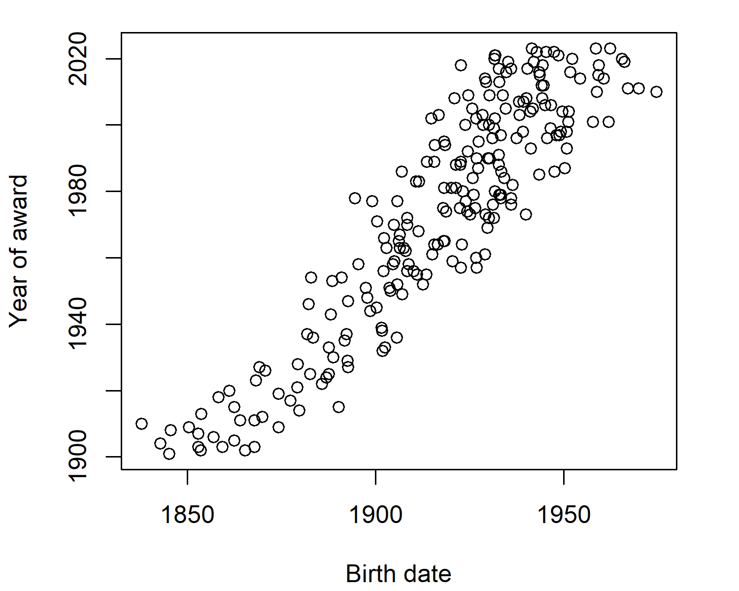
Let’s start by exploring the relationship between year of birth and year of award. We would expect that the people born earlier, are also the people awarded Nobel Prizes earlier, and the scatter plot in @ fig-nobel-scatter confirms this:
plot(
  x = nobel_physics$birthdate,
  y = nobel_physics$year,
  xlab = "Birth date",
  ylab = "Year of award"
)
We might be interested in seeing whether this relationship is changing over time. Essentially, is the age of awardees changing over time? We can use the year() function from lubridate to convert the birthdate into a year and subtract this from the award year to get an approximate age. Then we plot this against the award year in Figure 8.2.
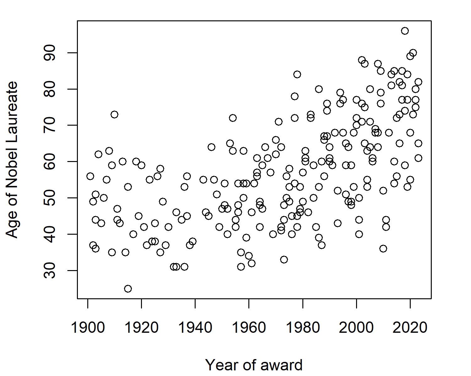
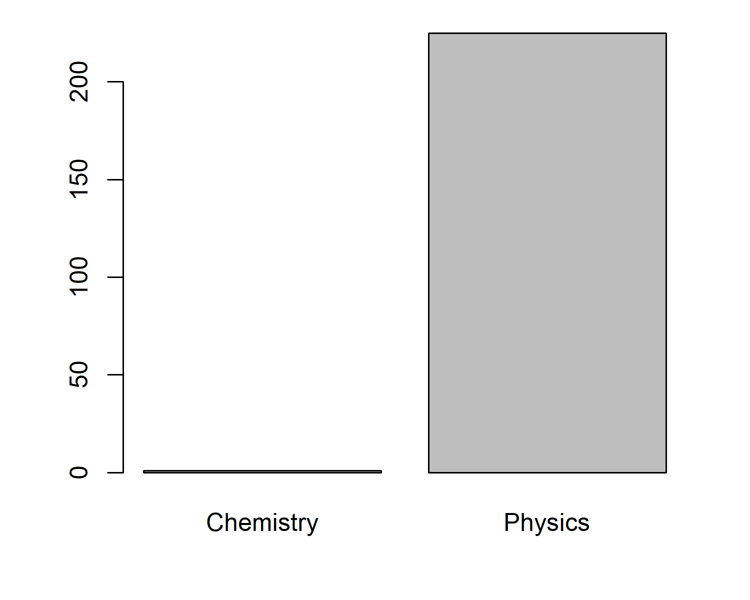
It looks like the age of awardees might be increasing slightly - this could be interesting to explore further. But let’s also look at the gender split for Nobel Laureates in Physics. We can calculate the number of "male" and "female" values in the gender column using the table() function, then plot it using barplot() (see Figure 8.3).
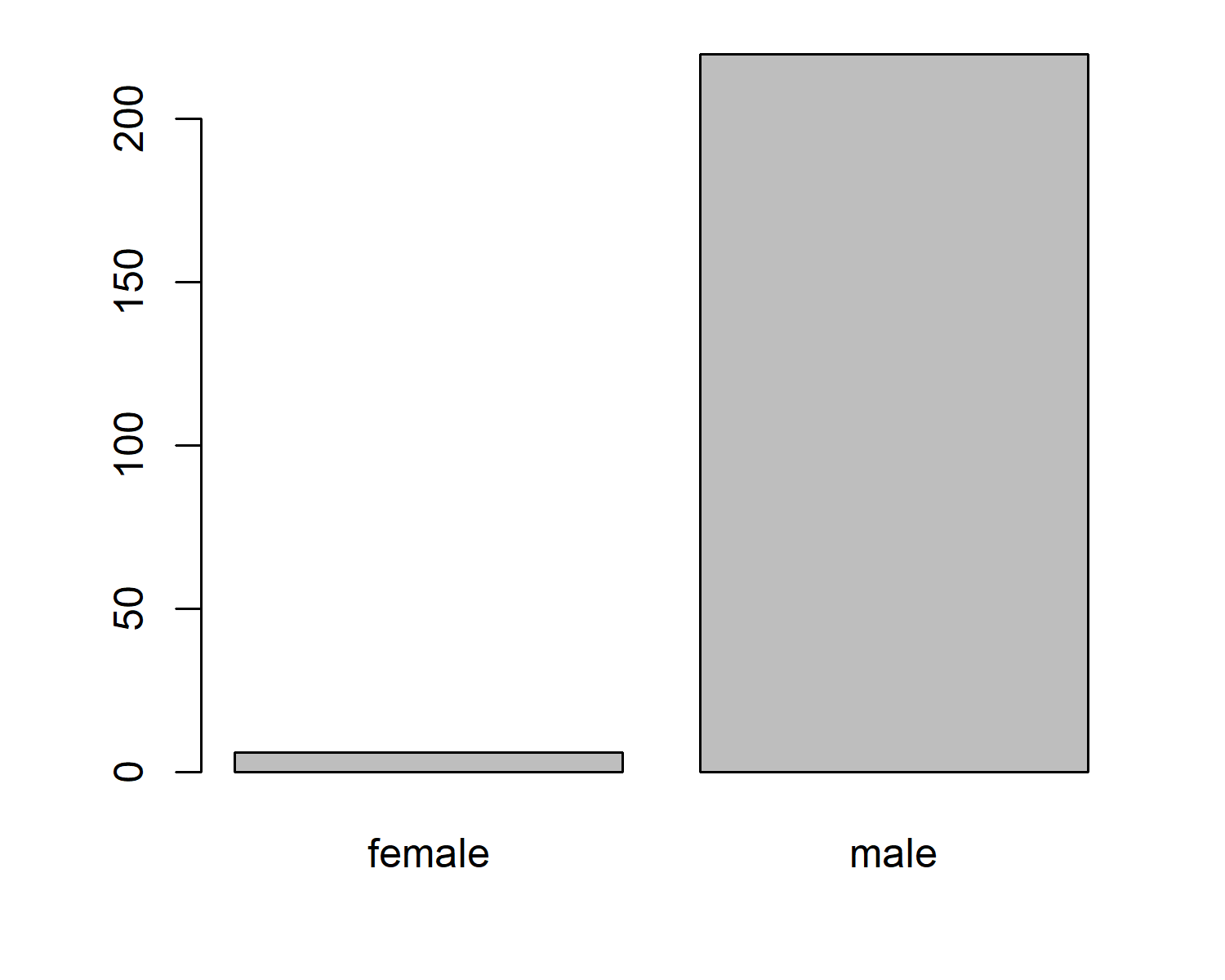
This is quite a significant difference! Let’s find a way to communicate and highlight this disparity.
8.2.2 Exploratory sketches
When thinking about how to construct a visualization, it’s important to consider multiple factors (Rennie and Krause 2024):
- What message are you trying to convey?
- Who are you trying to reach and what is their background?
- What is the purpose of the visualization?
- Does the way you’ve built that visualization support the purpose?
Let’s say that the purpose of the visualization is to highlight the gender disparity in Nobel Prize awardees. Yes, the bar chart of how many male and female Nobel Laureates there are shows the disparity very clearly. It’s a simple message. But it’s not eye-catching. It’s not a visualization that really makes a reader stop and pay attention. And it aggregates data down to just two categories - ignoring that these are individual people.
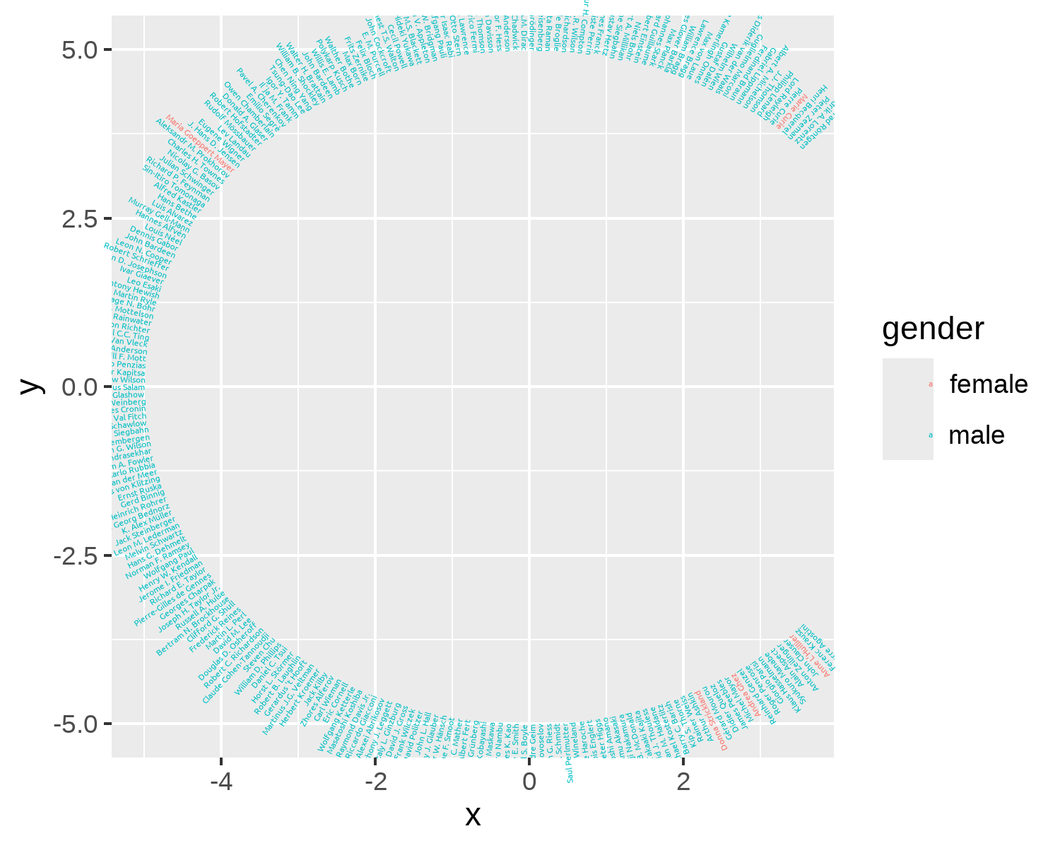
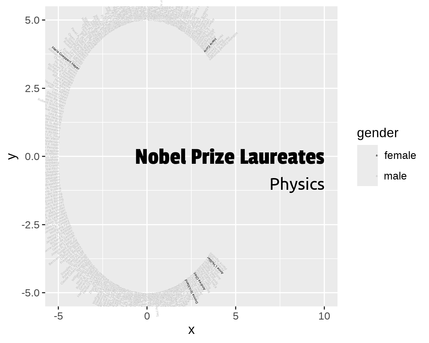
Instead, let’s think outside of box and present the information in a very non-standard way, as shown in Figure 8.4.
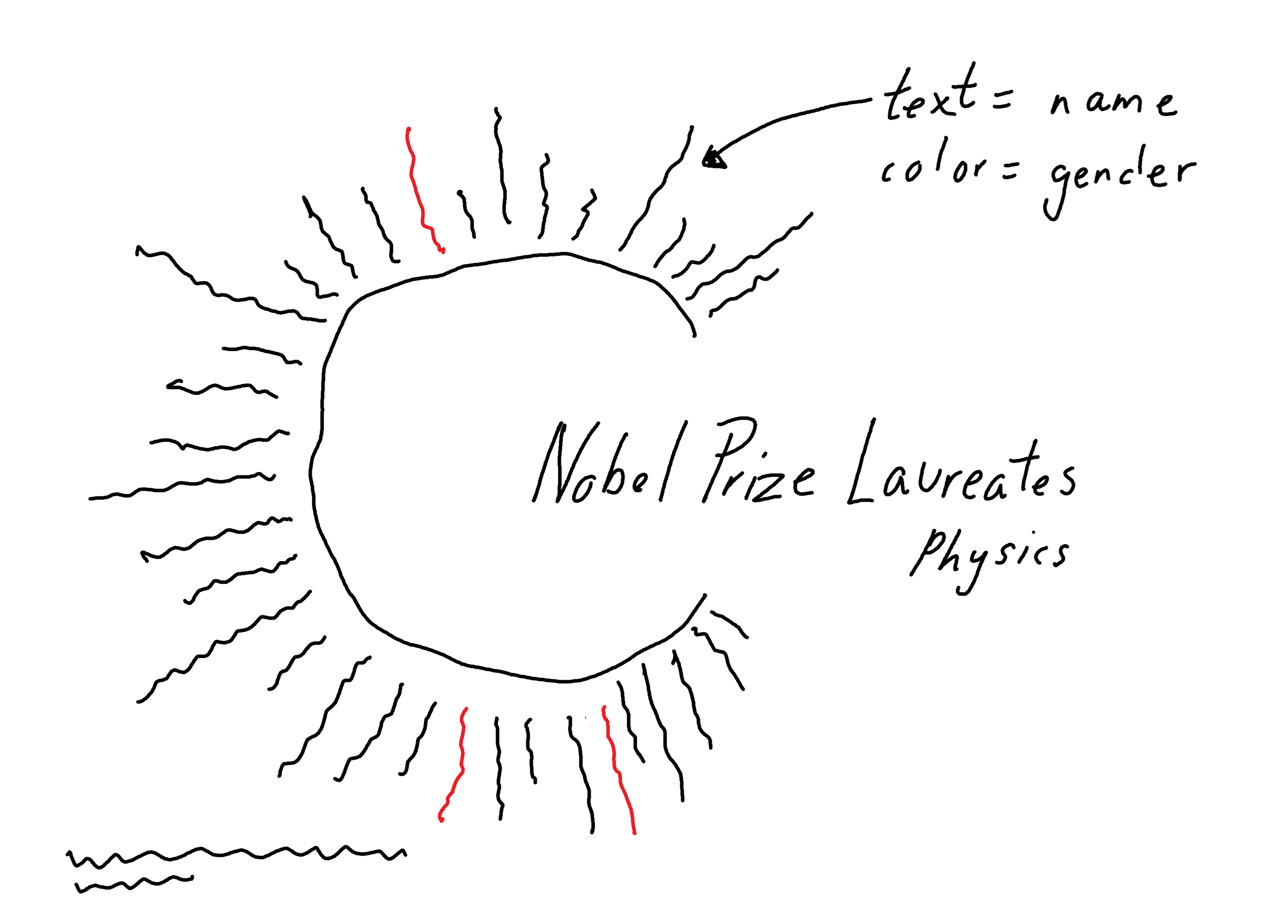
A bar chart would be a quicker, more efficient way of displaying how many male and female Nobel Laureates there are. A visualization of the names of every single Nobel Laureate might be a quicker, more efficient way of catching someone’s attention. This alternative visualization doesn’t sacrifice accuracy of information, but it might take a reader a little bit longer to digest the information. Whether that’s a sacrifice worth making comes back to what the purpose of the visualization is.
8.3 Preparing a plot
So let’s start making our custom visualization! We start by defining a variable for the award category we’re interested in: Physics. This first step might seem a little odd since we’ve only queried the API for physics data anyway, but when you get to the last section of this chapter, it’ll make more sense!
nobel_category <- "Physics"It’s always worth double-checking that we do actually only have the data we expect…
…because sometimes you find something unexpected!
Even though we’ve asked for only physics data from the API, Figure 8.5 shows that the data also includes an entry relating to the Chemistry prize. If we read the documentation for the API, this gives us the explanation as to why. The API we’ve used relates to Nobel Laureates, not Nobel Prizes - meaning the list includes all laureates who have won a prize in Physics. Marie Curie won two Nobel Prizes - in 1903 for Physics, and in 1911 for Chemistry.
8.3.1 Data wrangling
We’ll start by using filter() from dplyr to filter out any non-Physics entries, and then selecting only the columns we need for our plot: name, gender, and year. The data is currently arranged alphabetically based on name, so we’ll use the arrange() function to sort by year.
Now comes the tricky part of figuring out how to position the text in a circle. The first idea might be to simply plot the text in a line and then use the coord_polar() (or coord_radial()) function in ggplot2 to transform the coordinate space. However, coord_polar() makes it really hard to position other elements such as annotations on the plot. Alternatively, we could make use of the ggplot2 extension package, geomtextpath (Cameron and van den Brand 2024), which allows you to write text in ggplot2 that follows a curved path.
You may be wondering why we want to put so much work into building a custom layout from scratch, when you could easily just create a basic chart, apply coord_polar(), and then export it to other software (e.g., Inkscape or PowerPoint) to add the text annotations. This is certainly a valid point. If you were only making a single chart on one occasion, then adding the finishing touches outside of R would be both quicker and easier. However, if you’re making the same chart multiple times, or creating slightly different versions of a similar chart, the manual work can quickly accumulate. The benefit of creating annotations in R is that it’s easier to scale up your work, and automate the annotation creation.
But (just for the fun of it), let’s try to make the plot from scratch using only ggplot2.
We need to define the following to be able to position the text:
- the
xandycoordinates of where the text should end - the angle that the text should be positioned at
To calculate the x and y coordinates, we want to start thinking in polar coordinates. To keep it simple, let’s assume that the circle which the text is positioned around is centered at (0, 0) (see Figure 8.6). For the coordinates, this means we need to know:
- the radius (
r) of the circle: how far away from(0, 0)does the text start? This will be a constant value for all text labels. - the angle (
theta) of arc: how far around the circle from the horizontal axis should the text appear? This value will vary for each text label, since we want the labels to be equally spaced around the (semi-)circle.
Let’s start by defining a variable for the radius. It doesn’t really matter what value you choose at this point, since everything else can be rescaled around a different radius.
r <- 5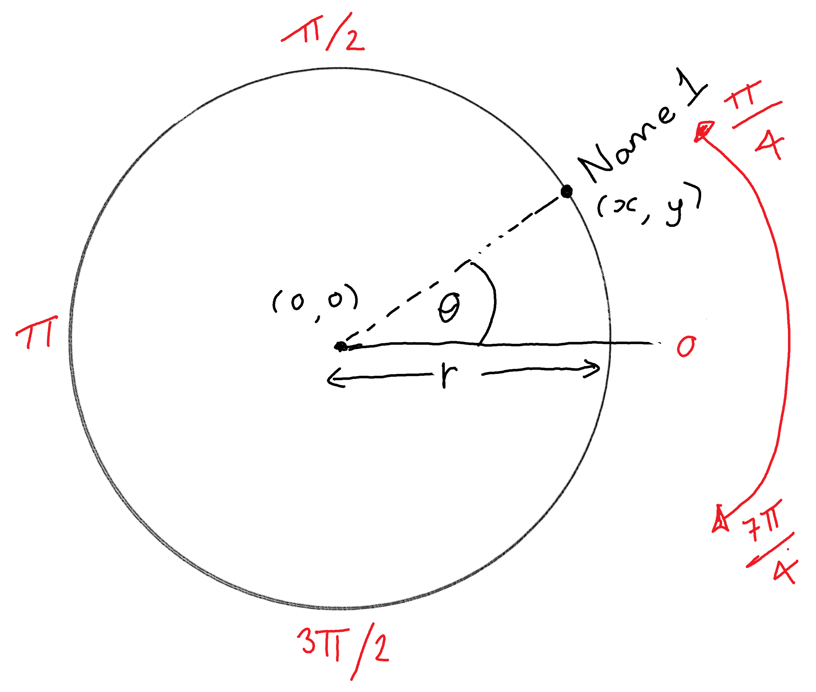
Assuming that we know the radius and angle of a point, we can calculate the x and y coordinates of a point using the following equations:
\[\begin{equation*} \begin{split} x & = r cos(\theta) \\ y & = r sin(\theta) \end{split} \end{equation*}\]
We don’t want to put the text all the way around the circle, since we want to leave some space to add the title as shown in Figure 8.4. We’ll leave a gap starting from \(\pi/4\) (between 1 and 2 on a clock face) to \(7\pi/4\) (between 4 and 5 on a clock face). We start by generating a sequence of equally spaced \(\theta\) values, starting from \(\pi/4\) and going to \(7\pi/4\), with one value for each observation in the data. This is added as a new column in the data using mutate() from dplyr. We then calculate the x and y coordinates using the equations above and, again, add these as new columns to the data.
The angle of the text is a little bit more tricky. We want the text to be positioned perpendicular to the circle, i.e., the angle of the text is different for each name. We can use the value of theta to calculate the angle of the text.
When we later pass the angle value into ggplot2 functions for plotting, it’s expected that the angle be expressed in degrees (rather than radians). For example, for vertical text, we would pass in angle = 90 rather than angle = pi/2. So we need to transform theta to degrees by dividing by \(2\pi\) and multiplying by 360. To make the text the right way up (at least on the left side of the circle), we add 180 degrees.
Let’s have a quick look at the data:
head(plot_data)# A tibble: 6 × 7
name gender year theta x y angle
<chr> <chr> <dbl> <dbl> <dbl> <dbl> <dbl>
1 Wilhelm Conrad Röntg… male 1901 0.785 3.54 3.54 225
2 Hendrik A. Lorentz male 1902 0.806 3.46 3.61 226.
3 Pieter Zeeman male 1902 0.827 3.38 3.68 227.
4 Henri Becquerel male 1903 0.849 3.31 3.75 229.
5 Marie Curie female 1903 0.870 3.23 3.82 230.
6 Pierre Curie male 1903 0.891 3.14 3.89 231.Now we’re ready to start plotting with ggplot2!
8.3.2 First plot
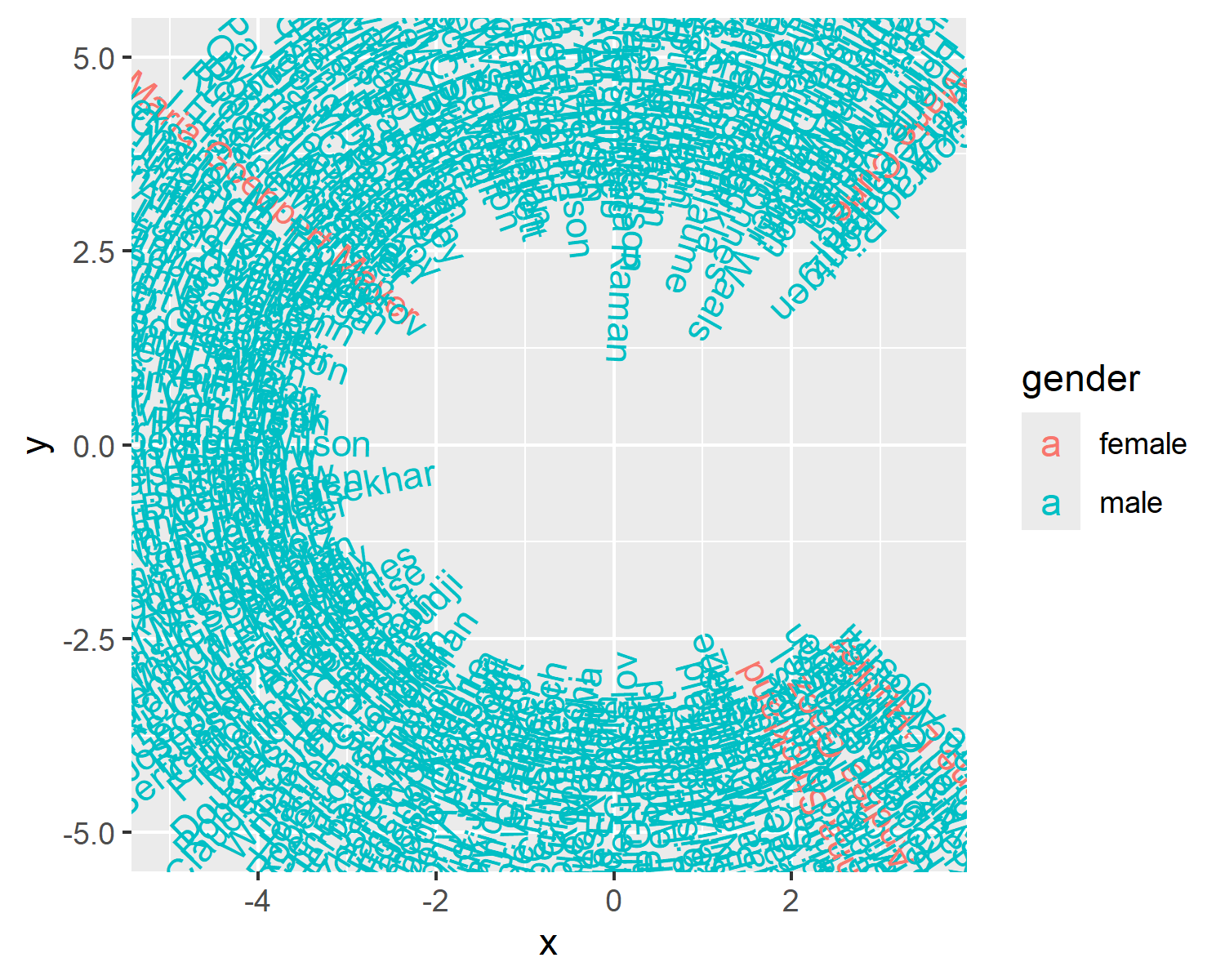
Constructing the base plot is reasonably straightforward - we’ve done the hard work in defining the x values, y values, and the angles already. Since our plot is a visualization of text data, we’ll use geom_text() to add the text. All we have to do is tell ggplot2 what to put where!
We pass plot_data into the data argument, and then set the aesthetic mapping using aes(). The mappings are as you would expect: x goes on the x-axis, y goes on the y-axis, the label comes from the name column, the text angle is defined by the angle column we created, and the color is based on the values in the gender column. This mapping could be passed into either ggplot() or directly into geom_text() as we’ve done here. Since we’ll only be using one geometry for this plot, it won’t make a difference!
8.4 Advanced styling
At first glance, Figure 8.7 might look like a complete mess, but with a little bit of work it will soon start looking like Figure 8.4.
8.4.1 Fonts
Let’s start by choosing some typefaces for our visualization. We’re going to pick two typefaces:
-
title_font: a bold typeface that will, as the name suggests, be used for the title. We’ll use Passion One - a display typeface with thick, bold strokes which make it ideal for titles. -
body_font: a simple typeface that will be used for all other text elements, including the text displaying the laureates’ names. This means the text will be quite a small font size, and so it’s important to use a clean and simple typeface. We’ll use Ubuntu - a sans serif typeface that we’ve used in previous chapters.
Both typefaces are provided through Google Fonts, so we’ll use font_add_google() from sysfonts to load them into R. We also run showtext_auto() and showtext_opts(dpi = 300) to use showtext for rendering text on plots at our desired resolution.
font_add_google(name = "Passion One")
font_add_google(name = "Ubuntu")
showtext_auto()
showtext_opts(dpi = 300)
body_font <- "Ubuntu"
title_font <- "Passion One"
Now, let’s remake our basic_plot - this time also setting the font family to body_font. We’ll also right-align the text using hjust = 1 to make the text appear around the outer edge of the circle (see Figure 8.8). The text also needs to be a bit smaller to avoid overlapping between names positioned next to each other.
8.4.2 Colors
As we’ve done in all previous chapters, we’ll define some variables for the colors we’ll be using in the visualization. Here, we’ll define a background color, a primary color, and a secondary color.
The primary color will be used to highlight the female laureates’ names, as well as the title and caption text. The secondary color will be used to color the male laureates’ names. The primary color should be bolder or brighter than the secondary color - meaning a few pops of color on the chart will stand out and highlight the female laureates.
bg_col <- "gray95"
primary_col <- "black"
secondary_col <- "gray75"
We can apply these colors to the text showing the names using scale_color_manual() where we manually specify which color maps to which value in the gender column:
col_plot <- basic_plot +
  scale_color_manual(
    values = c(
      "male" = secondary_col,
      "female" = primary_col
    )
  )
8.4.3 Adding text
Rather than adding a title and subtitle at the top of the plot, we’ll add them in the gap in the right-hand side of the circle. We’ll use the annotate() function from ggplot2 to add the text. Remember that for annotate(), we need to start by specifying the type of geometry we’re annotating - in this case, "text".
We’ll add two separate annotations: one for the title (Nobel Prize Laureates) and for a subtitle indicating the award category (Physics). The title and subtitle should be right-aligned, so we set the x-coordinate for each annotation to be equal to 10 and set hjust = 1. The title is vertically aligned with the center of the circle (at y = 0), and the subtitle slightly below it at y = -1. The font family is adjusted to either the body_font or title_font using the family argument, and the text size and color is also adjusted.
We can add a caption to Figure 8.9 which contains: (i) a description of the data source, and (ii) the social media links from the social_caption() function we defined in Chapter 7. We make both the icons and text the same color - primary_col. We can pass this into the source_caption() function defined in Chapter 6.
social <- social_caption(
  icon_color = primary_col,
  font_color = primary_col,
  font_family = body_font
)
cap <- source_caption(
  source = "The Nobel Foundation",
  sep = "<br>",
  graphic = social
)
We then add this caption to our existing plot using the caption argument in the labs() function:
text_plot <- annotated_plot +
  labs(caption = cap)
8.4.4 Adjusting scales and themes
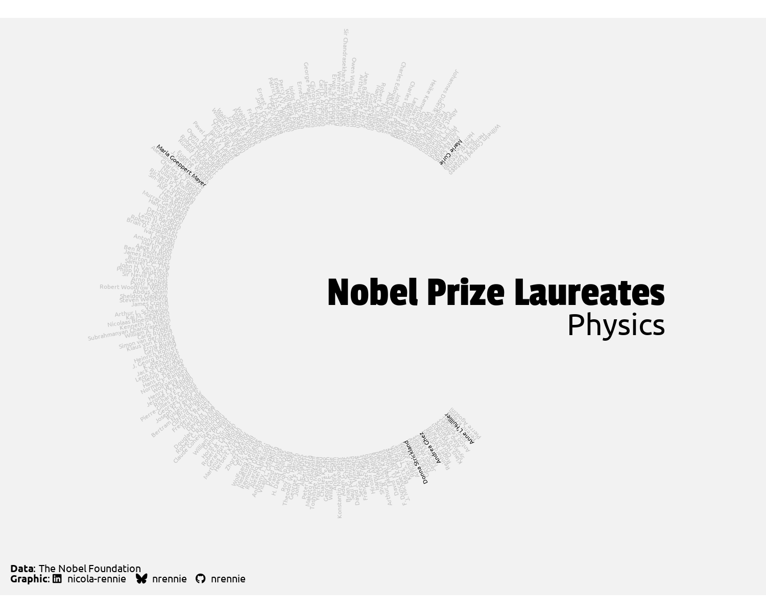
At the moment, the text isn’t arranged in a circle as such - it’s taking on more of an oval shape. To make sure it is displayed in a circle, we can use coord_fixed() to make sure that one unit on the x-axis is equal to one unit on the y-axis.
The limits of the plot also need to be extended. The scales are currently based on the x and y coordinates we passed in (the text at the inner edge of the circle) which means the text runs off the page. We can do this by extending the limits using scale_x_continuous() and scale_y_continuous(). We can extend the right-hand side of the x-axis a little bit further to accommodate the added annotations.
styled_plot <- text_plot +
  scale_x_continuous(limits = c(-9, 12)) +
  scale_y_continuous(limits = c(-7.5, 7.5)) +
  coord_fixed()
styled_plot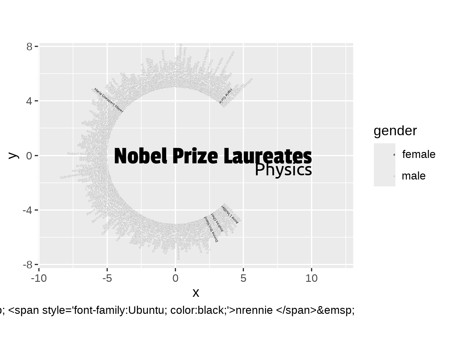
Since Figure 8.10 is an artistic visualization, we want to remove the distracting grid lines and axis labels (which don’t make much sense for this type of plot). As we’ve done in earlier chapters (such as Chapter 12), we use theme_void() to remove these background theme elements.
We can do some further, final customization by changing the following theme() elements:
- removing the legend
- changing the background color by passing in the
bg_colvariable toelement_rect() - using
element_textbox_simple()fromggtextto format the HTML tags that add the social media icons in the caption
styled_plot +
  theme_void(base_size = 6, base_family = body_font) +
  theme(
    legend.position = "none",
    plot.background = element_rect(
      fill = bg_col, color = bg_col
    ),
    plot.caption = element_textbox_simple(
      color = primary_col,
      hjust = 0,
      halign = 0,
      lineheight = 0.5,
      margin = margin(l = 5, b = 5)
    )
  )
With Figure 8.11, we now have a creative way of visualizing the recipients of the Nobel Prize for Physics! How might we go about visualizing the recipients of the other prize categories in a similar way?
8.4.5 Parameterized plots
Although we could copy and paste the code we already have, and change out physics for peace everywhere, for example, this isn’t a sustainable approach if we’re not just looking to create one additional plot. What if we also want to create plots for medicine, economics, chemistry, and literature? That’s a lot of copying and pasting! Instead, we might want to think about creating our own function.
This can be really useful if, for example, you want to create a plot of sales performance for a given month. Let’s say last month you wanted to create a histogram of the sales for only last month. This month, you want to create the same histogram but with the data for only this month. Nothing other than the underlying data (and perhaps the title of the plot) should change. You could create a function that takes the month as an argument, filters the data, and then plots it with the updated title. You don’t have to rewrite the plotting code every month, you just need to call your custom plot function.
Throughout this book, we’ve been using variables to store our choice of colors, and typefaces. This makes it easier to quickly try out a new color scheme. But it also makes it easier to convert your code into a function: those variables just become function arguments!
When we’re converting our code into a function, we need to think about what a user has to tell us, in order for the code to work. In the sales histogram example above, a user would need to specify which month they want the plot for. In our example of the Nobel Prize visualizations, a user needs to specify:
- which category they want to plot (we can’t read their mind or know what data they have)
- what the data is called (we don’t know what they’ve called their
data.frame) - the radius of the circle (we might need to vary this depending on how many observations are in a given category)
The data wrangling code assumes that year, name, gender, and category are columns that exist in the input data.frame. Since we’re working with data from an API that outputs it in a consistent format, this is a reasonable assumption to make. However, the API might change at some point. Or someone may want to use it with data sourced from somewhere else. To make the function more robust, we could add an initial step to check if those columns exist!
Now, we can also think about adding arguments that a user could specify:
- background color
- primary color
- secondary color
- body font
- title font
For these arguments, we can specify a default. This means that the function will work if a user doesn’t want to choose their own colors, but they are free to customize them if they choose to. None of these parameter choices make a fundamental difference to the plot created (other than how aesthetically pleasing it is).
Here, we’ve specified that the default title typeface is "Passion One". A similar approach is used for the body typeface. Usually, such an approach is not recommended since there’s no guarantee that a user will have the "Passion One" typeface installed or loaded when running the function. This makes it a bad choice of default typeface.
We could add the font_add_google() code inside the function, but this also isn’t a good solution. We don’t want to reinstall the fonts every time we run the function. A better option is to specify one of the integrated typefaces as a default, e.g., title_font = "sans".
(Or at the very least, add instructions for how to load the typefaces you’ve used as a default!)
Now we can stitch together all the code we’ve used in this chapter, into the function body:
category_plot <- function(
    nobel_category,
    nobel_data,
    r = 5,
    bg_col = "gray95",
    primary_col = "black",
    secondary_col = "gray70",
    body_font = "Ubuntu",
    title_font = "Passion One") {
  # Data wrangling
  category_data <- nobel_data |>
    filter(category == nobel_category) |>
    select(name, gender, year) |>
    arrange(year)
  plot_data <- category_data |>
    mutate(
      theta = seq(
        from = pi / 4,
        to = (7 / 4) * pi,
        length.out = nrow(category_data)
      ),
      x = r * cos(theta),
      y = r * sin(theta),
      angle = 180 + 360 * (theta / (2 * pi))
    )
  # Text
  social <- social_caption(
    icon_color = primary_col,
    font_color = primary_col,
    font_family = body_font
  )
  cap <- source_caption(
    source = "The Nobel Foundation",
    sep = "<br>",
    graphic = social
  )
  # Plot
  g <- ggplot() +
    geom_text(
      data = plot_data,
      mapping = aes(
        x = x, y = y,
        label = name,
        angle = angle,
        color = gender
      ),
      family = body_font,
      hjust = 1,
      size = 1
    ) +
    scale_color_manual(
      values = c(
        "male" = secondary_col,
        "female" = primary_col
      )
    ) +
    annotate("text",
      x = 10, y = 0,
      label = "Nobel Prize Laureates",
      hjust = 1,
      color = primary_col,
      family = title_font,
      size = 7
    ) +
    annotate("text",
      x = 10, y = -1,
      label = nobel_category,
      hjust = 1,
      color = primary_col,
      family = body_font,
      size = 5
    ) +
    labs(caption = cap) +
    scale_x_continuous(limits = c(-9, 12)) +
    scale_y_continuous(limits = c(-7.5, 7.5)) +
    coord_fixed() +
    theme_void(base_size = 6, base_family = body_font) +
    theme(
      legend.position = "none",
      plot.background = element_rect(
        fill = bg_col, color = bg_col
      ),
      panel.background = element_rect(
        fill = bg_col, color = bg_col
      ),
      plot.caption = element_textbox_simple(
        color = primary_col,
        hjust = 0,
        halign = 0,
        lineheight = 0.5,
        margin = margin(l = 5, b = 5)
      )
    )
  return(g)
}
Now let’s test if our function works with a completely different set of data! Let’s use the Nobel Prize API again to download data on Nobel Peace Prize laureates. We edit the end of the API URL to use nobelPrizeCategory=pea (pea for peace) and then save the output to a CSV file, just as we did before for the physics data, this time using base R functions.
Again, we can either keep working with the loaded data from the API, or read in the data from the CSV file:
nobel_peace <- read_csv("data/nobel_peace.csv")Then we pass the "Peace" category into our category_plot() function, alongside our newly downloaded nobel_peace data. The nobel_peace data doesn’t have quite as many observations as the nobel_physics data, so we can reduce the radius (r) slightly and start the text a little bit closer to the middle of the circle. We can also choose some different colors for the visualization (but leave the defaults for the fonts).
peace_plot <- category_plot(
  "Peace",
  nobel_peace,
  r = 4,
  bg_col = "#FFEDE1",
  primary_col = "#8B1E3F",
  secondary_col = "#7286A0"
)
peace_plot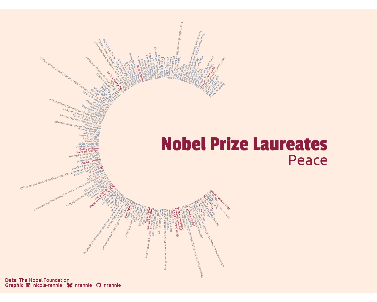
What you might notice about Figure 8.12 is that a third color has appeared! In scale_color_manual(), we only specified which colors relate to "male" and "female" laureates. However, the Nobel Peace Prize can also be awarded to an organization, not just an individual. The (newly appeared) gray text relates to organizations listed in the nobel_peace data.
ggplot2 extension
Once you’ve built a custom chart type with core ggplot2 functions, you might be considering turning it into a ggplot2 extension package to make it easier for you and other people to use. The Everyday ggplot2 extension website (Reynolds 2025) provides advice and tutorials for building your first (or next) extension.
We can save a copy of the visualization using ggsave():
ggsave(
  filename = "peace-plot.png",
  plot = peace_plot,
  width = 5,
  height = 4
)ggtextcircle
The ggtextcircle package (Rennie 2024a) implements this type of visualization in a generic way - if you want to create something similar with a different dataset!
8.5 Reflection
When we’re evaluating our visualizations, it’s important to remember the purpose for which we built it and evaluate how well it achieves that purpose. This visualization of the gender split of Nobel Laureates is not a standard plot that aims to communicate numbers as efficiently as possible.
There are a few standard aspects of this visualization we may wish to improve:
It’s quite a hard visualization to understand without knowing what the colors and the order of the names represent. With a little bit of time and thought, a reader will likely pick out that the pink (for the Peace category plot) text represents female laureates. However, the ordering of the names in a counterclockwise direction showing that the number of females laureates is generally increasing over time is much more difficult to pick up on. Add some text below the existing title and category label to explain how to interpret the visualization will help interested readers get the full message.
It’s a minimal visualization by design. But that means it doesn’t tell a reader the whole story. As we discussed earlier, Nobel Prizes can be awarded to multiple individuals. However, this visualization only shows laureates, and not whether they shared the prize with anyone else. Are female laureates more or less likely to share a prize than their male counterparts? You can’t tell from this visualization.
From a technical (or artistic) perspective, we might also want to consider alternative designs. For example, placing the text to the left of, or below, the circle rather than to the right. We may want to include the start and finish positions of the text around the circle as arguments to the parameterized function.
Despite the shortcomings when compared to more traditional visualizations, this approach is eye-catching, and it does attract attention. Sometimes, it’s not about the data visualization but about the art.
8.6 Exercises
Edit the
category_plot()to add another argument for the"Organisation"category. Make sure the function still works when there are no organizations in the data, e.g., for the Physics data.Download data for another category, e.g., Chemistry and use the
category_plot()function again to create a version of the plot for that category.