Best Practices for Data Visualisation
Data visualisation guidance produced for the Royal Statistical Society.
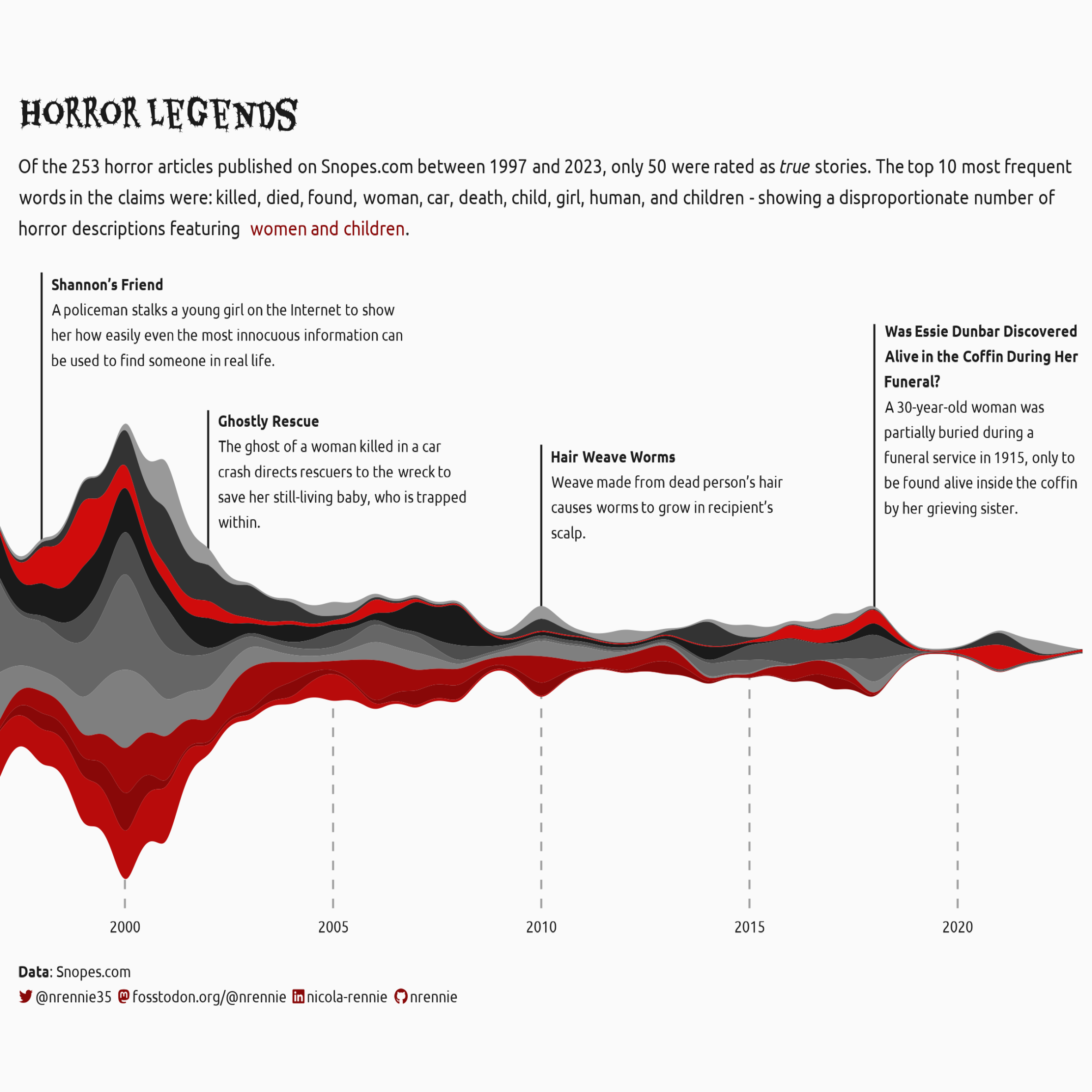
My data visualisation work has been highlighted in R-Weekly, the Datawrapper Data Viz Dispatch, the Visualising Data Newsletter, Quantum of Sollazzo and The Guardian’s The Crunch Newsletter, amongst others. You can view a gallery of my work at nrennie.rbind.io/viz-gallery.