The Art of Data Visualisation with ggplot2
Each chapter of The Art of Data Visualisation with ggplot2 covers a different data visualization, showing: the data exploration process; the choice of data visualization type; the initial design ideas with hand-drawn sketches; the first build of a plot; and the iterative process of styling plots. For each plot, full R code is provided and explained for each step of the creative process.
None of the visualizations you’ll see were created specifically for the book - each one is an original data visualization created using real TidyTuesday datasets over a series of years. Think of each chapter as a case study starting with a new data set you’ve never seen before, and working through a process to get to an insightful, artistic visualization.
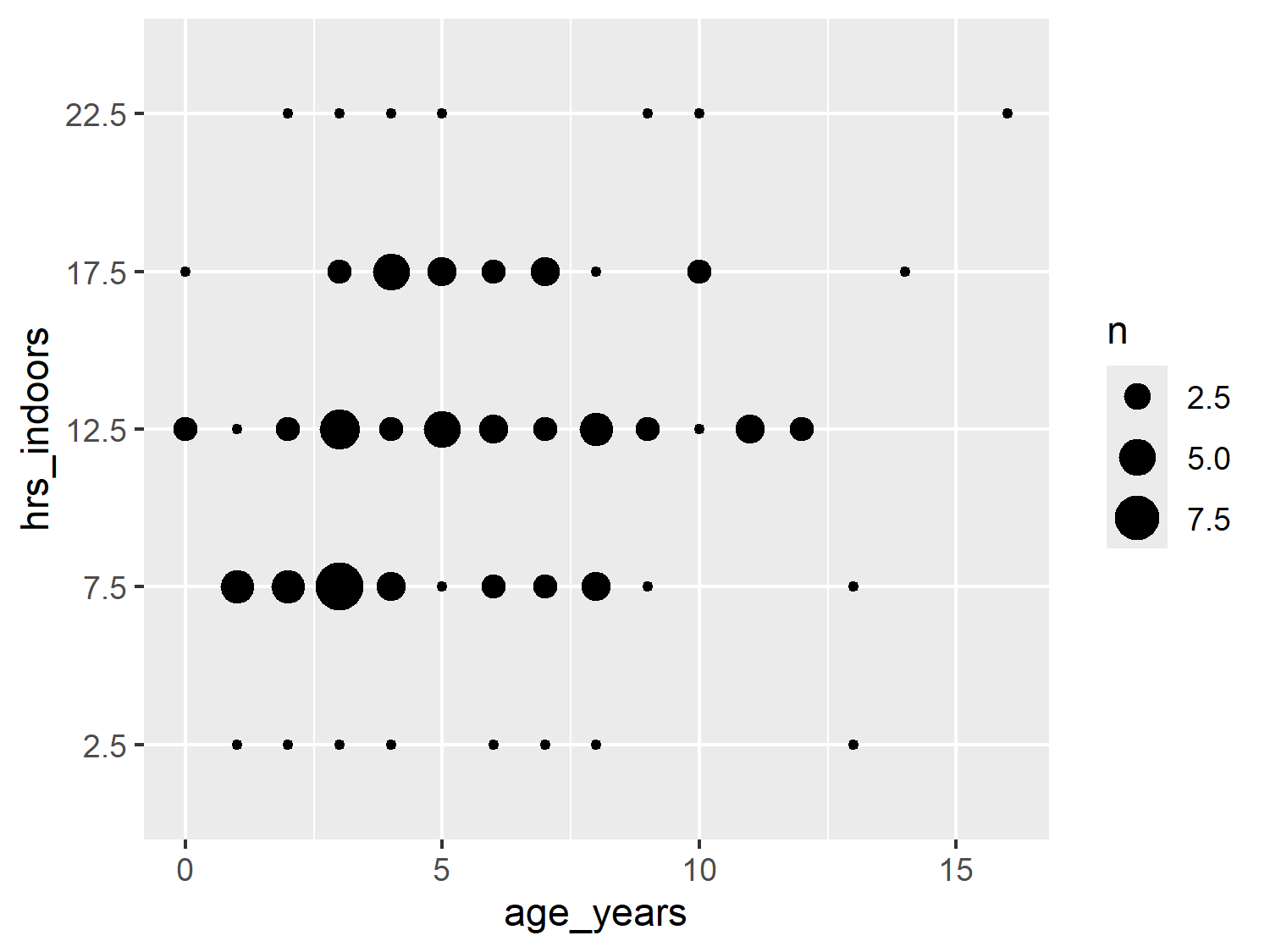
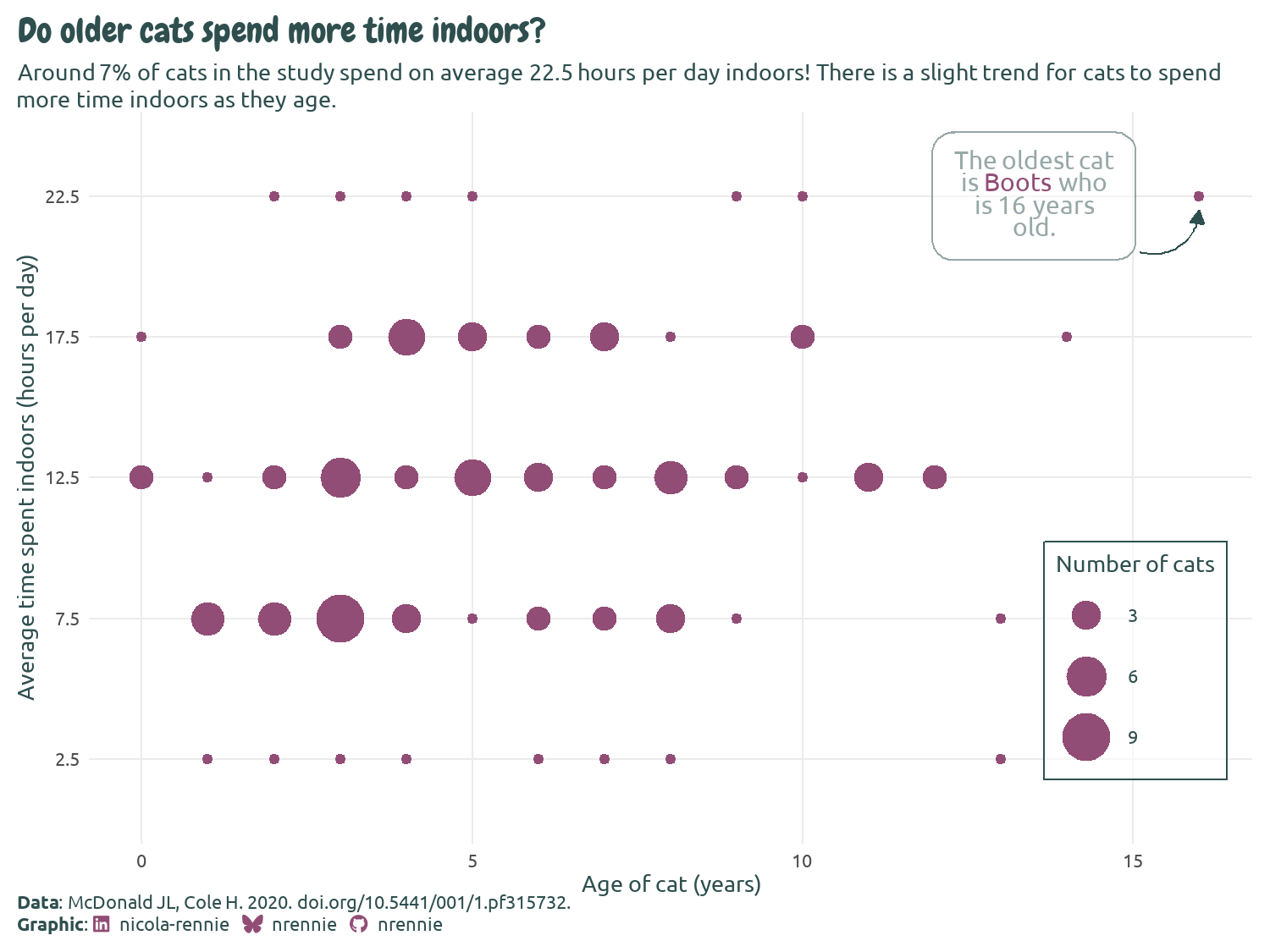
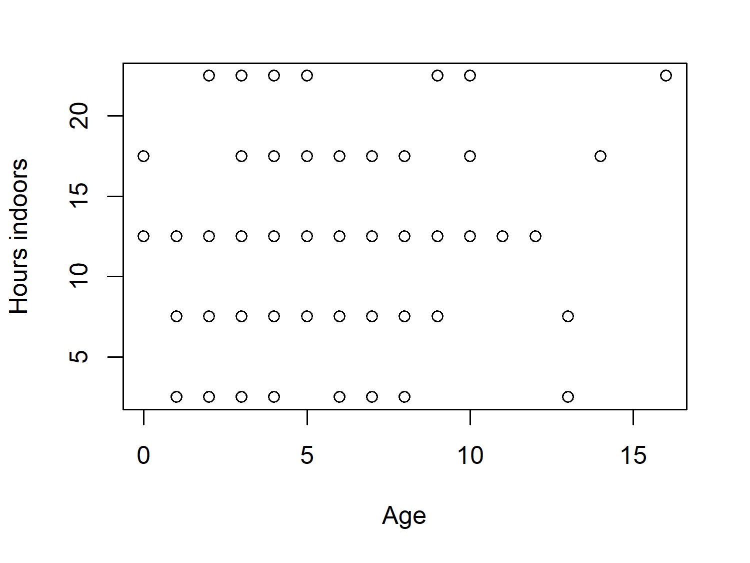
The following charts are examples from Chapter 7 - Cats: data-driven annotations with ggtext, which begins by highlighting the use of data visualisation as a method of exploring and quality checking the data you have.
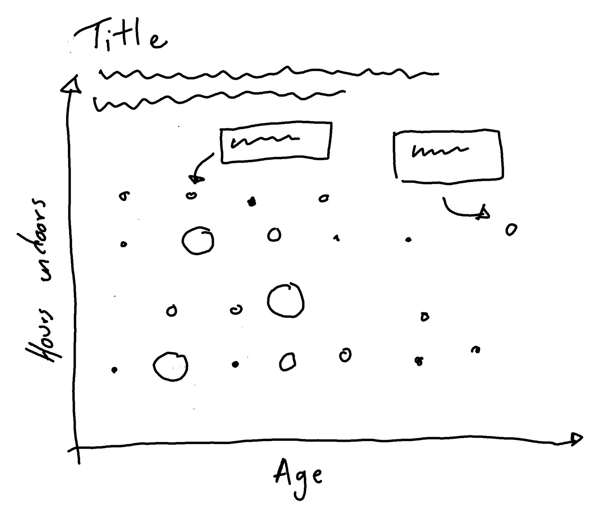
The book encourages starting out with no or low-code tools to sketch ideas.
After deciding on how the data will be visualised, the remainder of the chapter explains how to implement it using ggplot2 in R. It starts from creating a basic version of the chart using the default setting, before introducing the reader the various extension packages and tricks to elevate the design.