library(ggplot2)
plot_df <- data.frame(x = LETTERS[1:4], y = 1:4)
ggplot(data = plot_df,
       mapping = aes(x = x, y = y, fill = x)) +
geom_col()Best Practices for Data Visualisation
Data visualisation guidance produced for the Royal Statistical Society.
Alongside Andreas Krause (Idorsia Pharmaceuticals) and Brian Tarran (Royal Statistical Society), I co-authored the Royal Statistical Society’s Best Practices for Data Visualisation guidance, published in July 2023. The guide covers both the art and the science of data visualisation. It is written primarily for contributors to Royal Statistical Society publications – chiefly, Significance magazine, the Journal of the Royal Statistical Society Series A, and Real World Data Science – but the information and advice within is of broad relevance and use to any data visualisation task. The guide can be viewed at rss.org.uk/datavisguide.
Developing an R package
The guide also contains technical instructions for authors on how to edit the settings of their visualisation software to better style their graphics. The guide covers examples of doing so in R and Python (with examples added by the community for other software), with R being used often (both base R and {ggplot2}). To help authors with styling their charts to fit in with the guidance in this document, we have developed an R package, {RSSthemes}.
This R package:
- Stores and load font files
- Defines colour palettes with RSS colours
- Creates
theme_*()andscale_*functions for {ggplot2} - Sets (and unsets) different base R defaults
Let’s see an example in action! Let’s say you have simple data set that you want to use to make a bar chart with {ggplot2}
You can restyle it, using the {RSSthemes} package and two lines of code:
library(RSSthemes)
ggplot(data = plot_df,
       mapping = aes(x = x, y = y, fill = x)) +
  geom_col() +
  scale_fill_rss_d(palette = "signif_qual") +
  theme_significance()
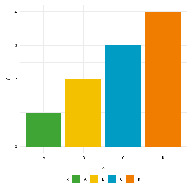
Before and after styling with {RSSthemes}
As of March 2024, the guide has been viewed by over 14,000 users, in 152 countries.