Data Visualisation Challenges
I use a combination of R, Python, ObservableJS, D3.js, Tableau, rawgraphs, Inkscape, and Figma for creating data visualisations. A sample of my personal projects can be found below.
TidyTuesday
TidyTuesday is a weekly data challenge aimed at the R community. Every week a new dataset is posted alongside a chart or article related to that dataset, and ask participants explore the data. You can access the data and find out more here.
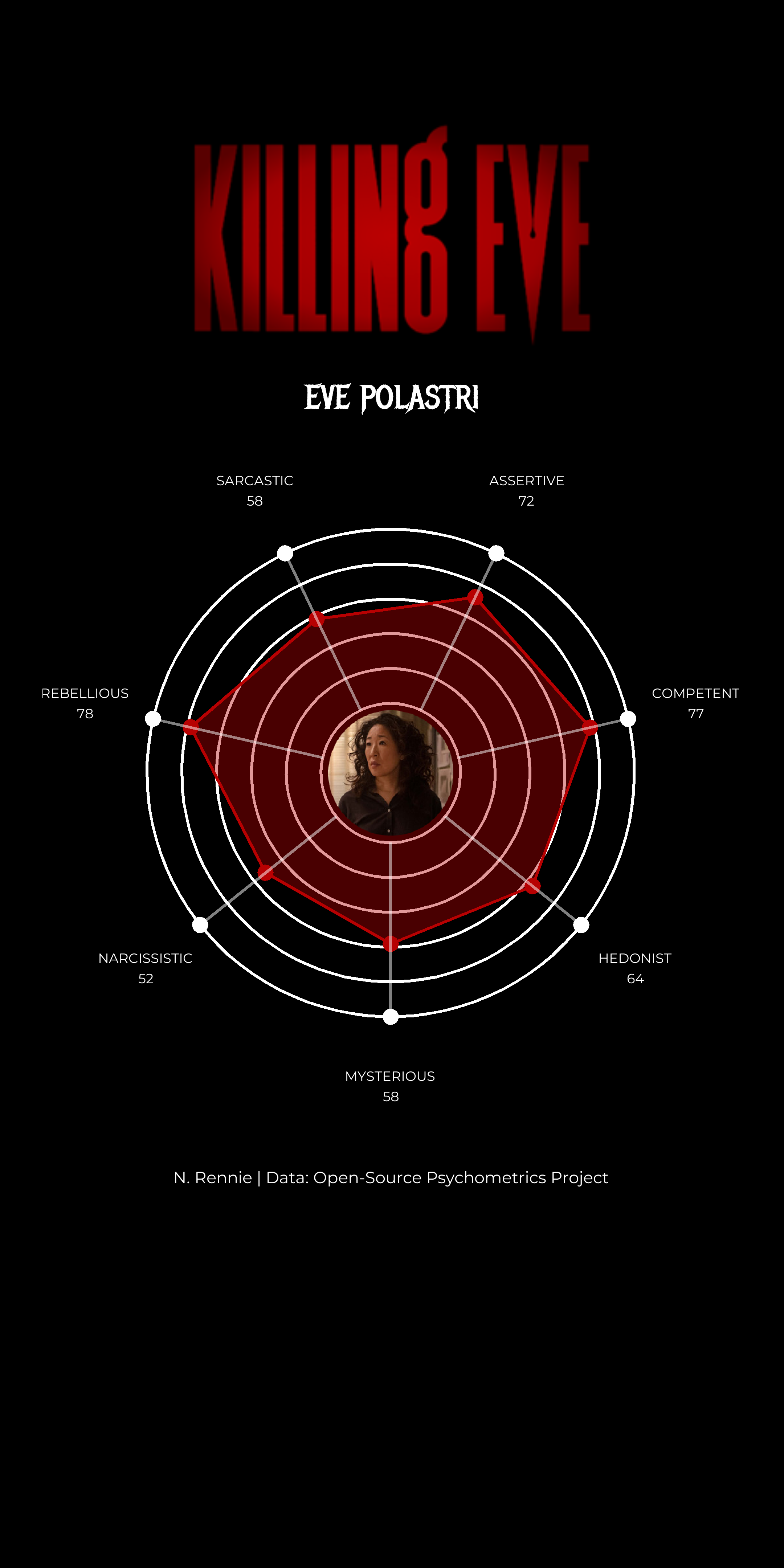
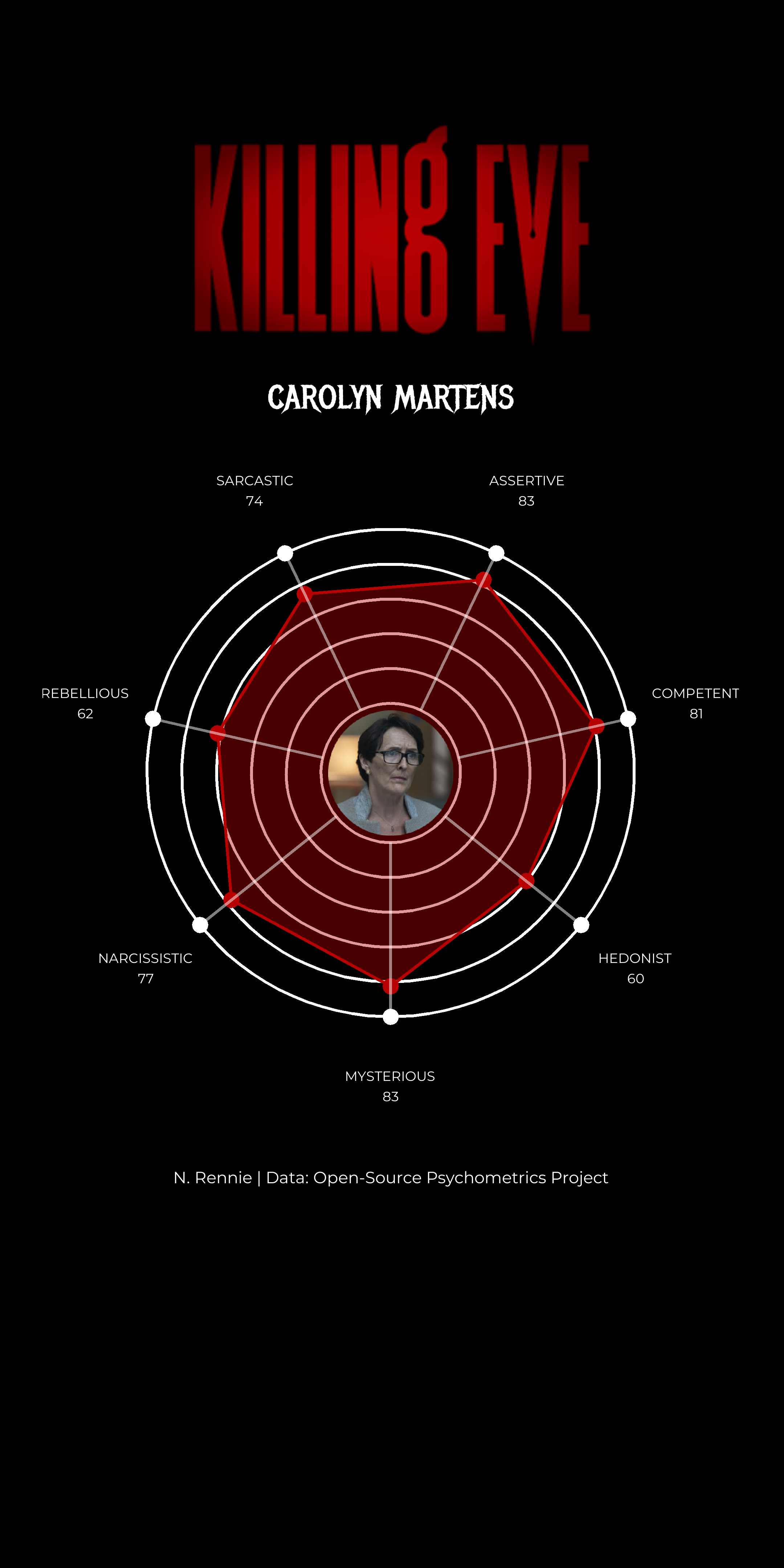
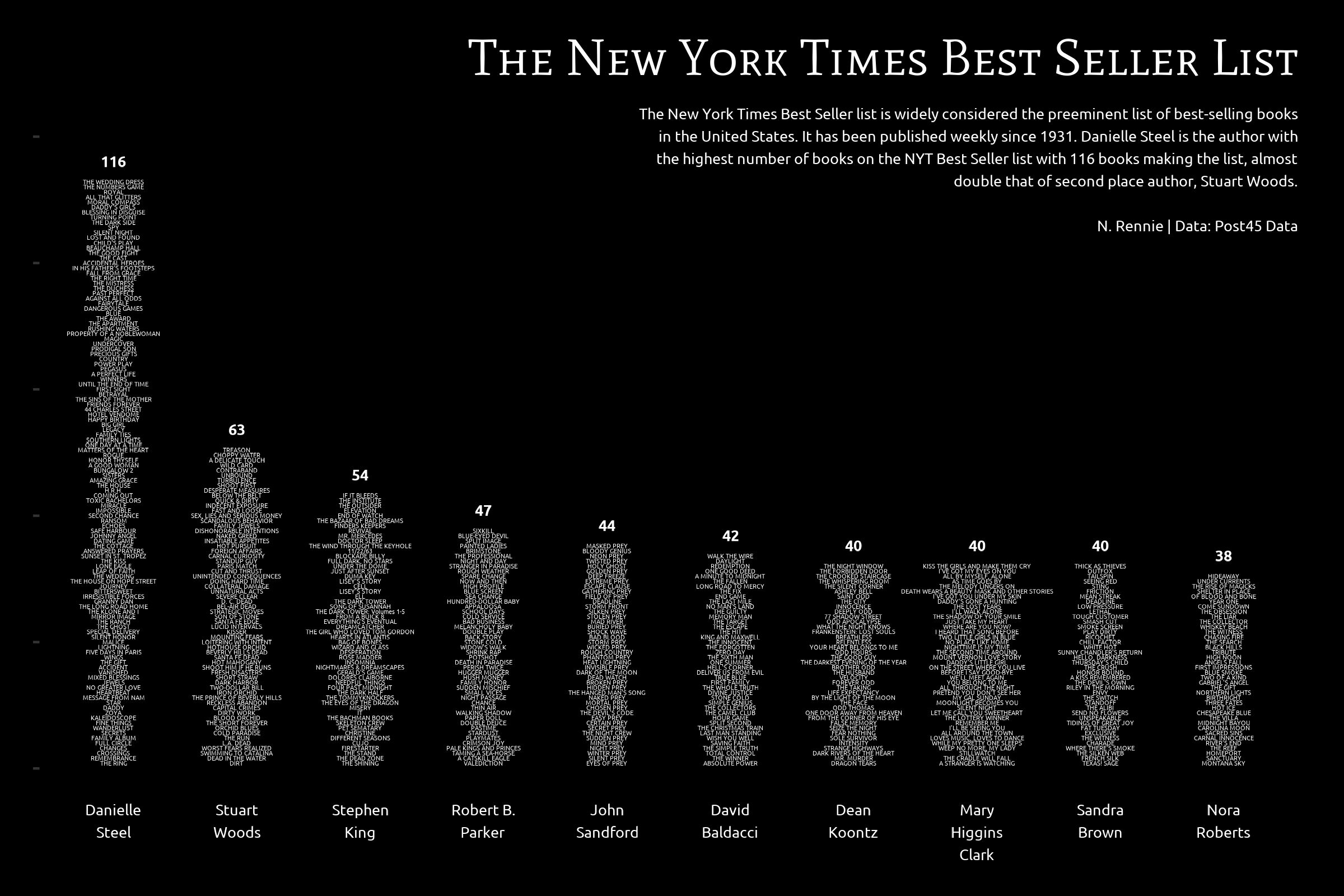
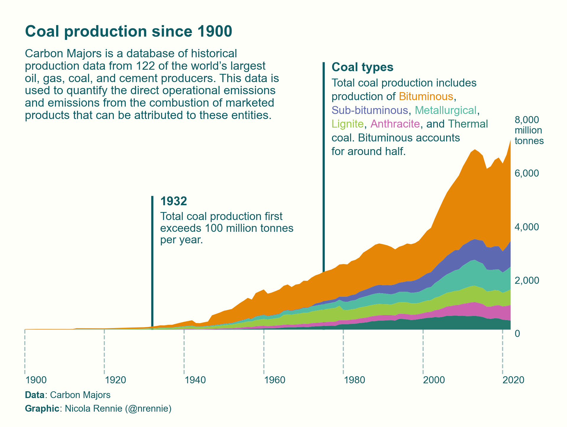
Below is a selection of my contributions to the TidyTuesday challenge. All contributions and the code used to generate them can be found on GitHub. You can also browse through all contributions using this dashboard.
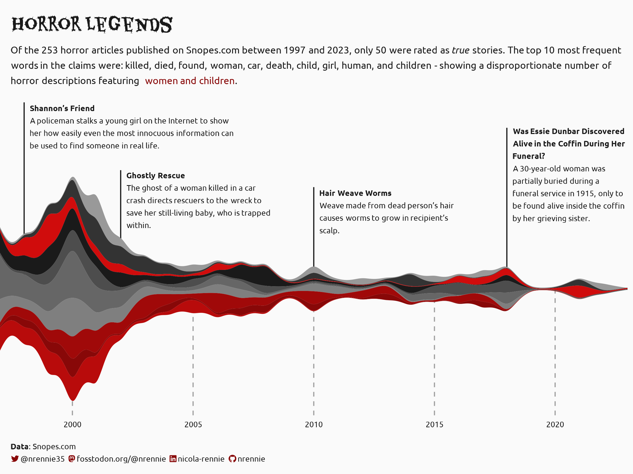
Inspired by this New York Times visualisation

View the scrollytelling version.
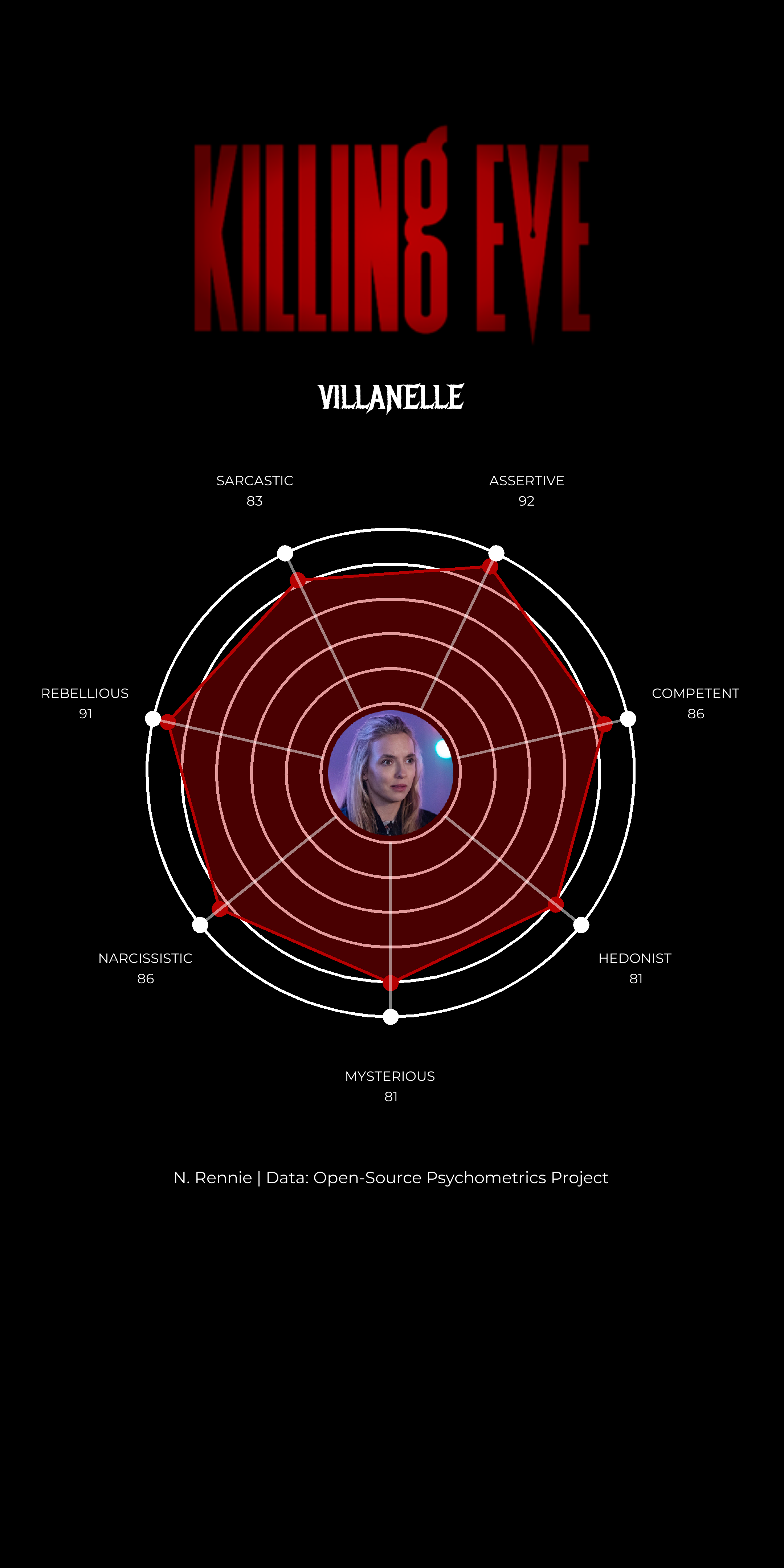
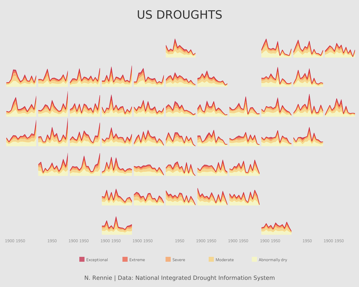
Plotnine contest
Plotnine is a visualisation library that brings the Grammar of Graphics to Python, and the 2024 Plotnine Contest aims to bring the community together to create and share with others great plotnine examples. You can read the blog post about how I created this annotated area chart for my entry into the Plotnine contest. This visualisation was a runner up in the Plotnine contest.
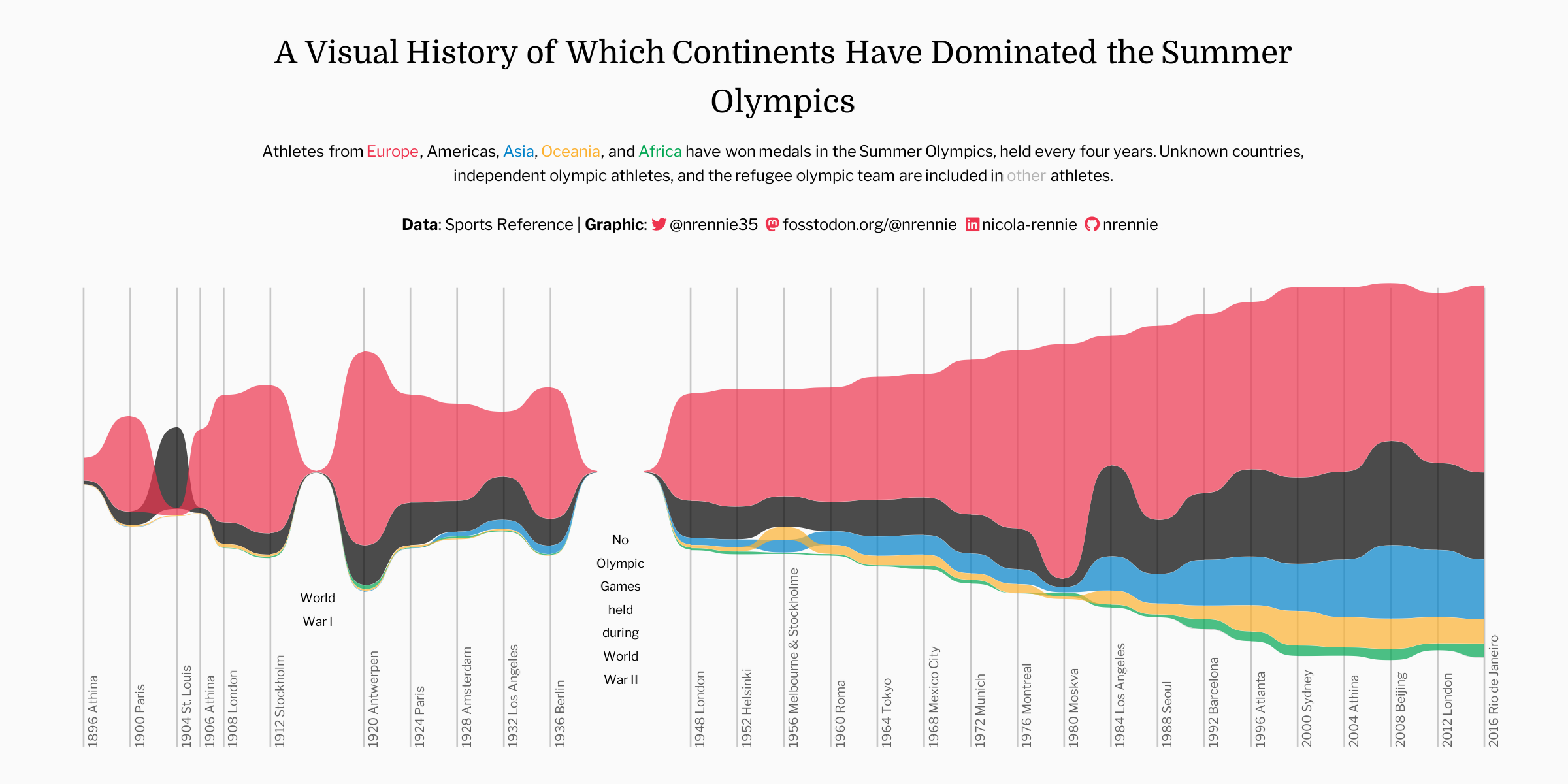
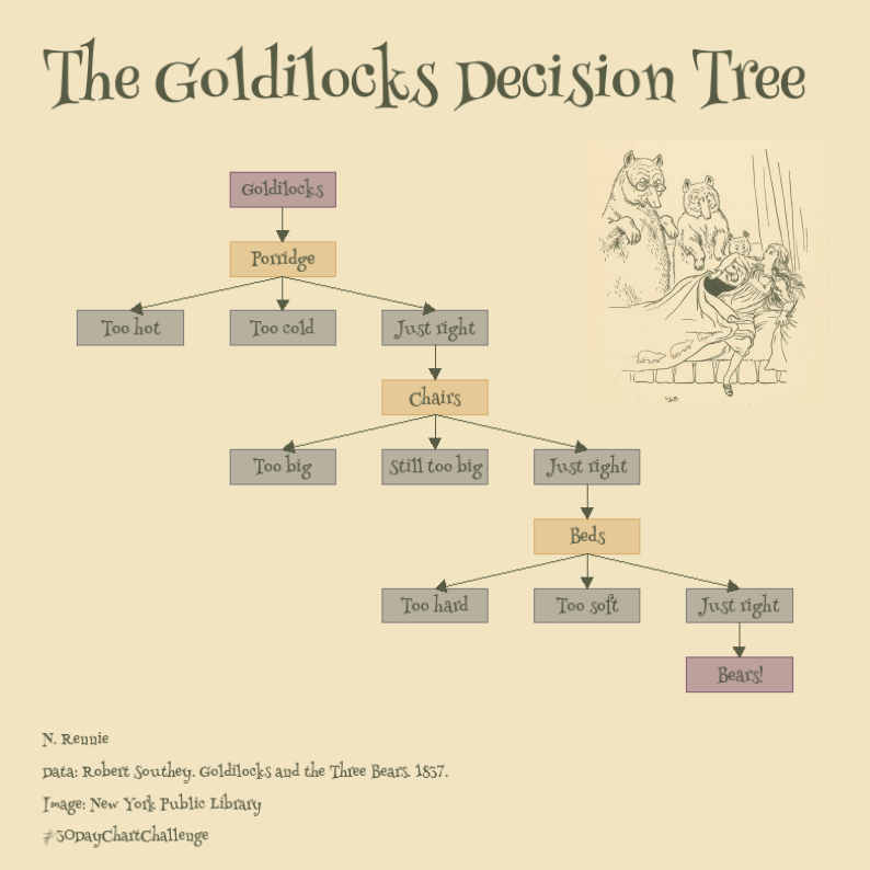
#30DayChartChallenge
The #30DayChartChallenge is a data visualisation challenge organised by Cédric Scherer and Dominic Royé. Participants make one chart each day of the challenge, inspired by the daily prompt. The prompts are also split across 5 different categories. Check out the challenge at twitter.com/30DayChartChall. I used a range of tools to create my charts, including R, Python, Tableau, rawgraphs, Inkscape, and Figma.


#30DayMapChallenge
The #30DayMapChallenge is a data visualisation challenge organised by Topi Tjukanov. Participants make one map each day of the challenge, inspired by the daily prompt. Check out the challenge on GitHub, or see contributions on the official website.
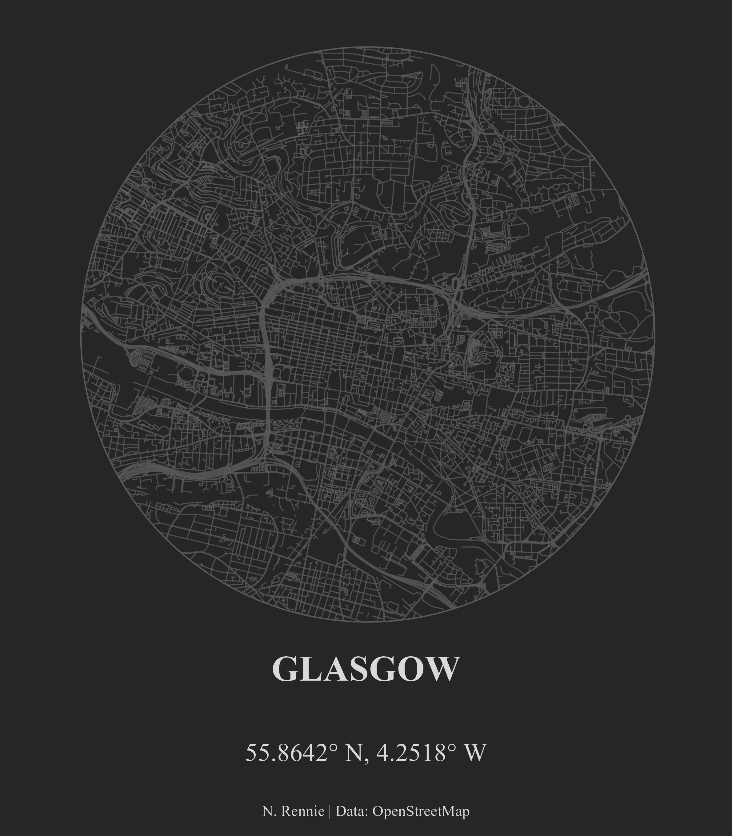
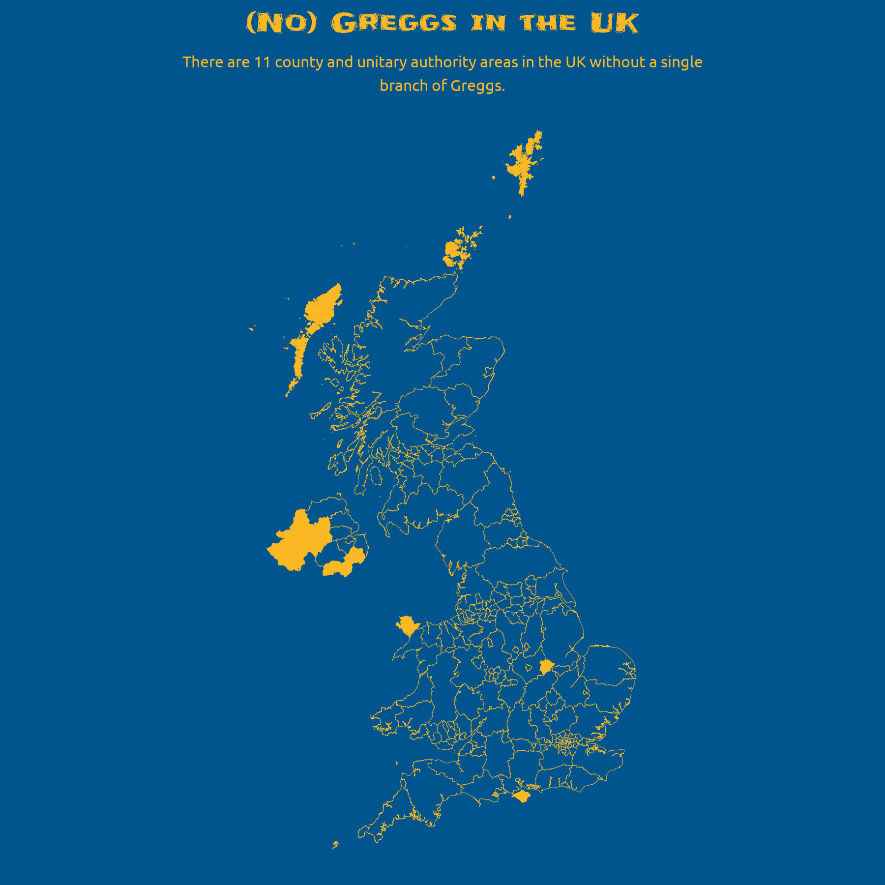
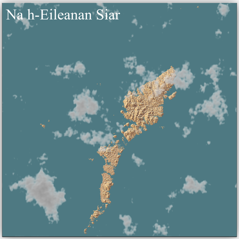
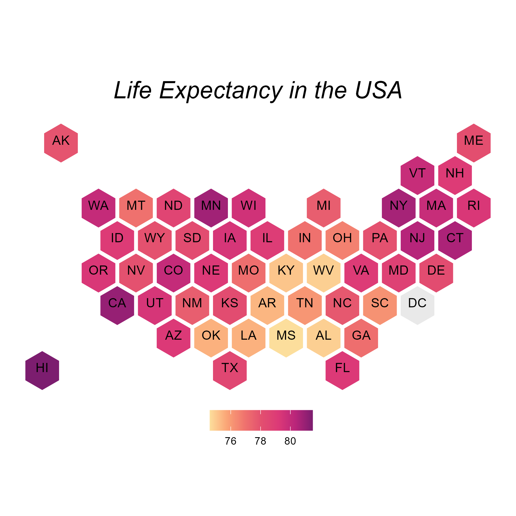
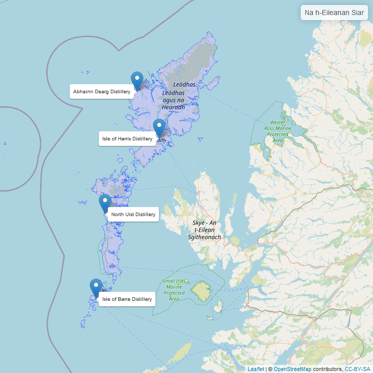
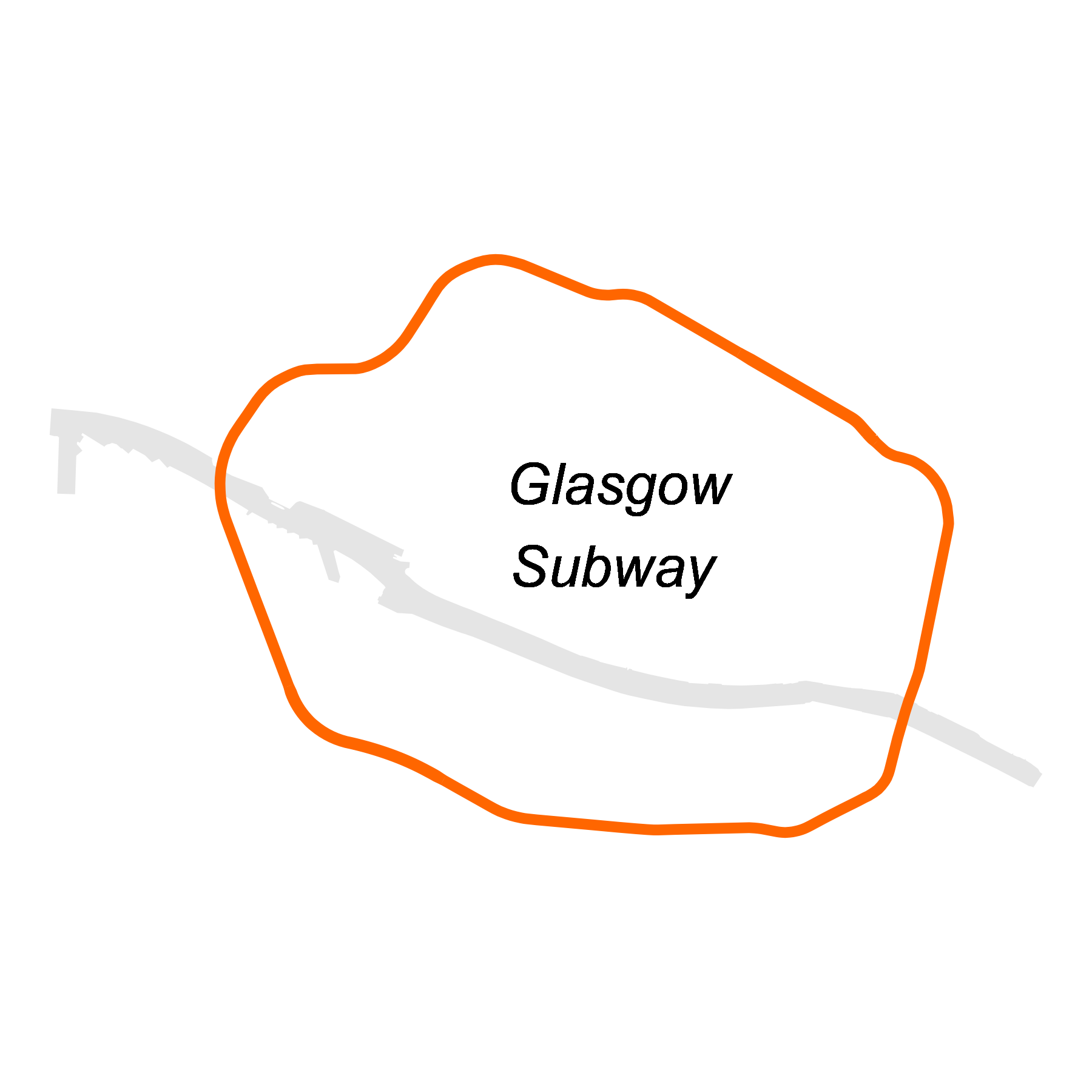
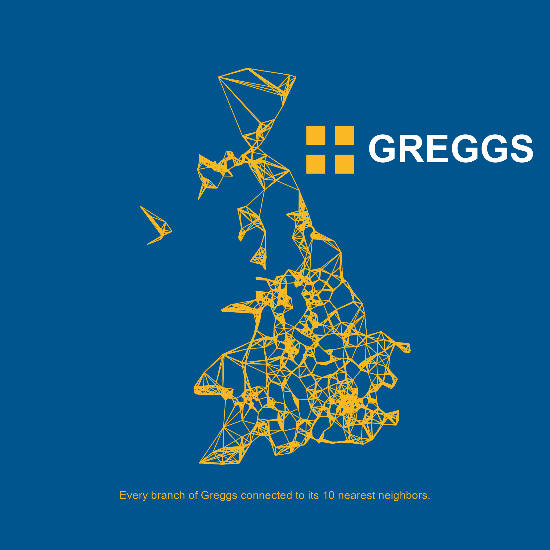
Tableau Public
You can find examples of my visualisations created using Tableau on my Tableau Public profile.
Other challenges
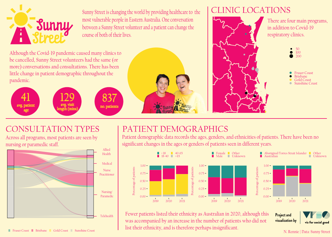
Viz For Social Good (VFSG) volunteers create informative and impactful data visualizations for mission-driven organizations across the globe. Check out the organisation here.