library(tidyverse)
library(ggview)
library(ggbeeswarm)
library(ggtext)Beeswarm chart of health by sexual orientation
Load required packages:
Prepare the data
Load the data:
sexual_general_health <- read_csv("data/additional-ew/sexual_general_health.csv")Prepare data for plotting by calculating the percentage of population in bad/very bad health by sexual orientation:
plot_data <- sexual_general_health |>
  group_by(area_name, sexual_orientation) |>
  mutate(population = sum(n)) |>
  ungroup() |>
  filter(
    general_health %in% c("Bad health", "Very bad health"),
    sexual_orientation != "Does not apply"
  ) |>
  mutate(percentage = 100 * n / population) |>
  group_by(area_name, sexual_orientation) |>
  summarise(percentage = sum(percentage)) |>
  ungroup()
Plot preparation
Save colours as variables:
highlight_col <- "#ff6b00"
bg_col <- "white"
Tip
Use ggview to preview your plots at the desired size and resolution by adding the following to the end of your ggplot2 call:
+
  canvas(
    width = 5, height = 7,
    units = "in", bg = bg_col,
    dpi = 300
  )
Create the chart
Version 1
ggplot(
  data = plot_data,
  mapping = aes(x = percentage, y = sexual_orientation)
) +
geom_quasirandom() 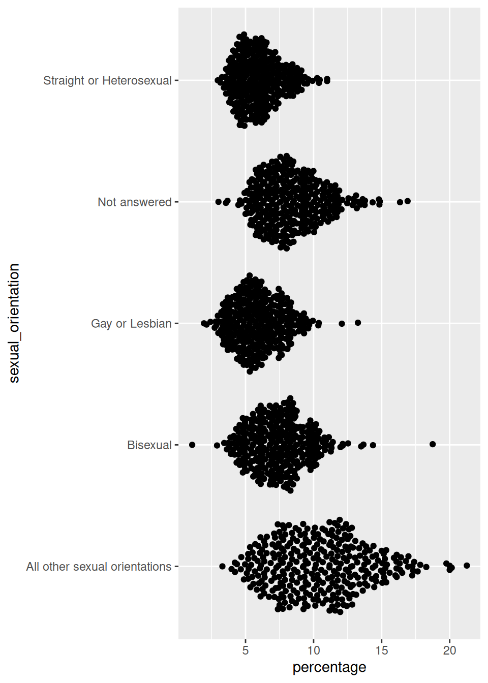
Version 2
ggplot(
  data = plot_data,
  mapping = aes(x = percentage, y = sexual_orientation)
) +
  geom_quasirandom(
    colour = highlight_col,
    size = 0.7
  ) +
theme_minimal() 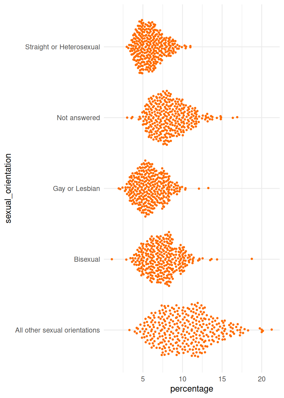
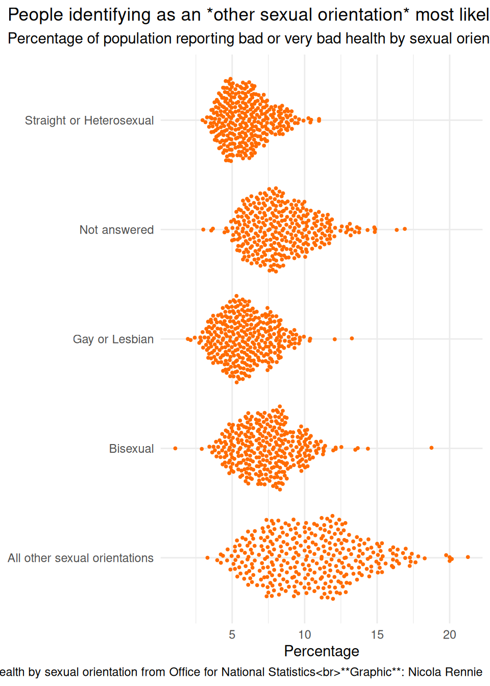
Version 3
ggplot(
  data = plot_data,
  mapping = aes(x = percentage, y = sexual_orientation)
) +
  geom_quasirandom(
    colour = highlight_col,
    size = 0.7
  ) +
  labs(
    title = "People identifying as an *other sexual orientation* most likely to report bad or very bad health",
    subtitle = "Percentage of population reporting bad or very bad health by sexual orientation",
    caption = "**Source**: General health by sexual orientation from Office for National Statistics<br>**Graphic**: Nicola Rennie",
    x = "Percentage", y = NULL
  ) +
  theme_minimal() +
  theme(
    plot.title.position = "plot",
    plot.caption.position = "plot"
) 
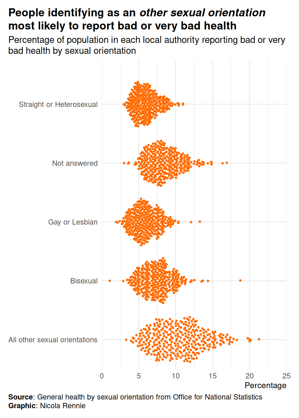
Version 4
ggplot(
  data = plot_data,
  mapping = aes(x = percentage, y = sexual_orientation)
) +
  geom_quasirandom(
    colour = highlight_col,
    size = 0.7
  ) +
  labs(
    title = "People identifying as an *other sexual orientation* most likely to report bad or very bad health",
    subtitle = "Percentage of population in each local authority reporting bad or very bad health by sexual orientation",
    caption = "**Source**: General health by sexual orientation from Office for National Statistics<br>**Graphic**: Nicola Rennie",
    x = "Percentage", y = NULL
  ) +
  scale_x_continuous(limits = c(0, 25), expand = expansion(0, 0)) +
  scale_y_discrete(expand = expansion(add = c(0.5, 0.75))) +
  theme_minimal() +
  theme(
    plot.title.position = "plot",
    plot.caption.position = "plot",
    plot.title = element_textbox_simple(face = "bold", margin = margin(b = 5)),
    plot.subtitle = element_textbox_simple(margin = margin(b = 5)),
    plot.caption = element_textbox_simple(margin = margin(t = 5)),
    axis.title.x = element_text(hjust = 1, size = rel(0.9)),
    plot.margin = margin(10, 15, 10, 10)
  )
Version 5
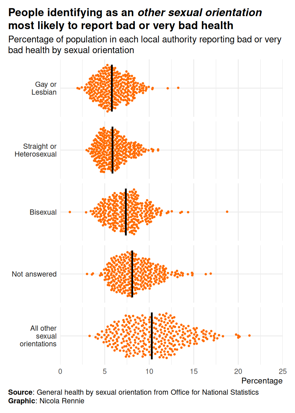
Prepare data where we:
- Want to order categories by median value
- Want to add a line showing median value
- Want to wrap long category labels
plot_data$sexual_orientation <- str_wrap(plot_data$sexual_orientation, 12)
summary_data <- plot_data |>
  group_by(sexual_orientation) |>
  summarise(med_perc = median(percentage)) |>
  arrange(med_perc)
plot_data$sexual_orientation <- factor(plot_data$sexual_orientation,
  levels = summary_data$sexual_orientation
)
summary_data$sexual_orientation <- factor(summary_data$sexual_orientation,
  levels = summary_data$sexual_orientation
)
Update plot:
ggplot(
  data = plot_data,
  mapping = aes(x = percentage, y = 0)
) +
  geom_quasirandom(
    colour = highlight_col,
    size = 0.7
  ) +
  geom_segment(
    data = summary_data,
    mapping = aes(x = med_perc, y = -0.4, yend = 0.4),
    colour = "black",
    linewidth = 1
  ) +
  facet_wrap(vars(sexual_orientation), ncol = 1, strip.position = "left") +
  labs(
    title = "People identifying as an *other sexual orientation* most likely to report bad or very bad health",
    subtitle = "Percentage of population in each local authority reporting bad or very bad health by sexual orientation",
    caption = "**Source**: General health by sexual orientation from Office for National Statistics<br>**Graphic**: Nicola Rennie",
    x = "Percentage", y = NULL
  ) +
  scale_x_continuous(limits = c(0, 25), expand = expansion(0, 0)) +
  scale_y_continuous(expand = expansion(0.05, 0.05), breaks = 0) +
  theme_minimal() +
  theme(
    plot.title.position = "plot",
    plot.caption.position = "plot",
    plot.title = element_textbox_simple(face = "bold", margin = margin(b = 5)),
    plot.subtitle = element_textbox_simple(margin = margin(b = 5)),
    plot.caption = element_textbox_simple(margin = margin(t = 5)),
    axis.title.x = element_text(hjust = 1, size = rel(0.9)),
    axis.text.y = element_blank(),
    strip.text.y.left = element_text(angle = 0, hjust = 1),
    panel.grid.minor.y = element_blank(),
    plot.margin = margin(10, 15, 10, 10)
) 
Save the plot
ggsave("beeswarm.png",
  bg = bg_col,
  height = 7, width = 5
)
If you’ve used ggview, then assign the plot to a variable e.g. p and then do:
save_ggplot(
  plot = p,
  file = "beeswarm.png"
)