library(tidyverse)
library(ggview)
library(ggtext)
library(scales)
library(glue)Bar chart of gender modality by age
Load required packages:
Prepare the data
Load the data:
genmod_age_scot <- read_csv("data/genmod_age_scot.csv")The first few lines look like:
# A tibble: 6 × 3
  age                         response                                         n
  <chr>                       <chr>                                        <dbl>
1 All people aged 16 and over Total                                       4.55e6
2 All people aged 16 and over No: Not trans and does not have a trans hi… 4.26e6
3 All people aged 16 and over Yes: Trans or has a trans history           2.00e4
4 All people aged 16 and over Not answered                                2.69e5
5 16 - 24                     Total                                       5.82e5
6 16 - 24                     No: Not trans and does not have a trans hi… 5.38e5
Prepare data for plotting:
plot_data <- genmod_age_scot |>
  filter(!str_starts(age, "All people"), response != "Total") |>
  mutate(age = factor(age, levels = c(
    "16 - 24", "25 - 34", "35 - 49", "50 - 64", "65 and over"
  )))

summary_data <- genmod_age_scot |>
  filter(str_starts(age, "All people"))

tot_percent <- round(100 * (summary_data |>
  filter(response == "Yes: Trans or has a trans history") |>
  pull(n)) / (summary_data |>
  filter(response == "Total") |>
  pull(n)), 2)
Plot preparation
Save colours as variables:
highlight_col <- "#880659"
bg_col <- "white"
Tip
Use ggview to preview your plots at the desired size and resolution by adding the following to the end of your ggplot2 call:
+
  canvas(
    width = 7, height = 5,
    units = "in", bg = bg_col,
    dpi = 300
  )
Create the bar chart
Version 1
ggplot(
  data = plot_data,
  mapping = aes(x = age, y = n, fill = response)
) +
  geom_col()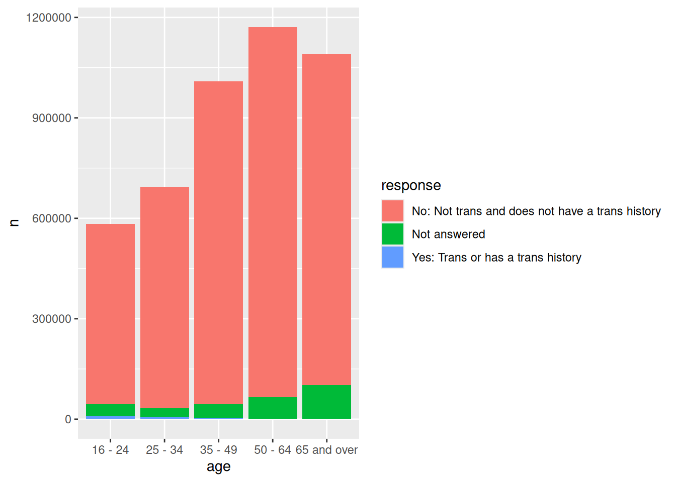
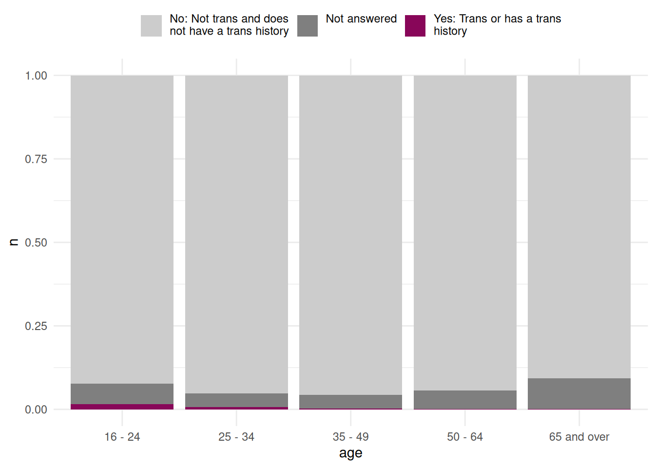
Version 2
ggplot(
  data = plot_data,
  mapping = aes(x = age, y = n, fill = str_wrap(response, 25))
) +
  geom_col(position = "fill") +
  scale_fill_manual(values = c("grey80", "grey50", highlight_col)) +
  theme_minimal() +
  theme(
    legend.position = "top",
    legend.title = element_blank(),
    legend.text = element_text(vjust = 1)
  )
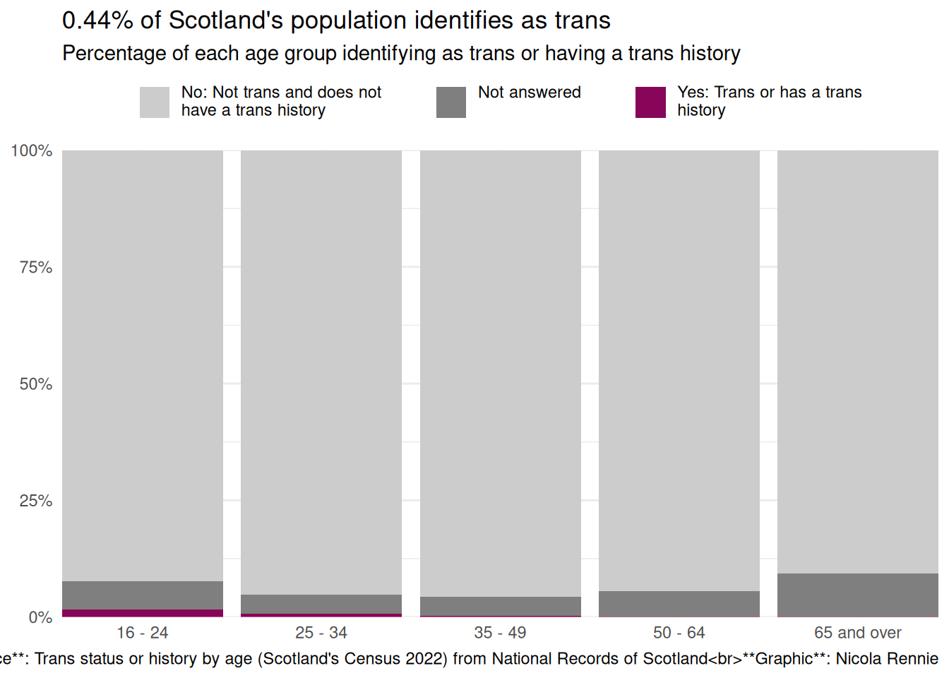
Version 3
ggplot(
  data = plot_data,
  mapping = aes(x = age, y = n, fill = str_wrap(response, 30))
) +
  geom_col(position = "fill") +
  scale_y_continuous(labels = label_percent()) +
  scale_fill_manual(values = c("grey80", "grey50", highlight_col)) +
  labs(
    title = glue("{tot_percent}% of Scotland's population identifies as trans"),
    subtitle = "Percentage of each age group identifying as trans or having a trans history",
    caption = "**Source**: Trans status or history by age (Scotland's Census 2022) from National Records of Scotland<br>**Graphic**: Nicola Rennie",
    x = NULL, y = NULL
  ) +
  coord_cartesian(expand = FALSE) +
  theme_minimal() +
  theme(
    legend.position = "top",
    legend.title = element_blank(),
    legend.text = element_text(vjust = 1),
    legend.key.spacing.x = unit(1, "cm")
  )
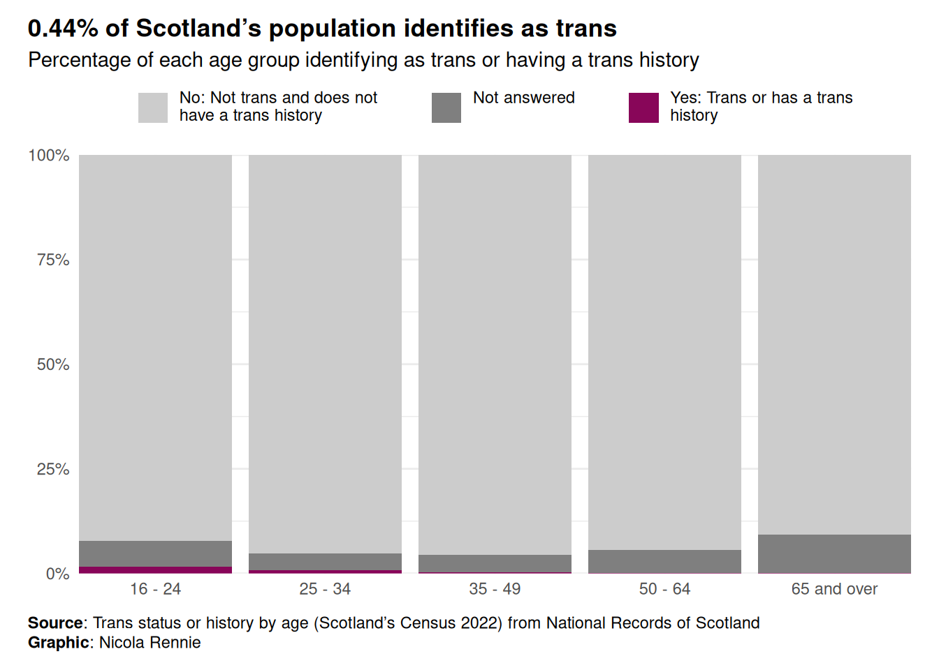
Version 4
ggplot(
  data = plot_data,
  mapping = aes(x = age, y = n, fill = str_wrap(response, 30))
) +
  geom_col(position = "fill") +
  scale_y_continuous(labels = label_percent()) +
  scale_fill_manual(values = c("grey80", "grey50", highlight_col)) +
  labs(
    title = glue("{tot_percent}% of Scotland's population identifies as trans"),
    subtitle = "Percentage of each age group identifying as trans or having a trans history",
    caption = "**Source**: Trans status or history by age (Scotland's Census 2022) from National Records of Scotland<br>**Graphic**: Nicola Rennie",
    x = NULL, y = NULL
  ) +
  coord_cartesian(expand = FALSE) +
  theme_minimal() +
  theme(
    legend.position = "top",
    legend.title = element_blank(),
    legend.text = element_text(vjust = 1),
    legend.key.spacing.x = unit(1, "cm"),
    plot.title.position = "plot",
    plot.caption.position = "plot",
    plot.title = element_textbox_simple(face = "bold", margin = margin(b = 5)),
    plot.subtitle = element_textbox_simple(margin = margin(b = 5)),
    plot.caption = element_textbox_simple(margin = margin(t = 10)),
    plot.margin = margin(10, 15, 10, 15)
  )
Save the plot
ggsave("barchart.png",
  bg = bg_col,
  height = 5, width = 7
)
If you’ve used ggview, then assign the plot to a variable e.g. p and then do:
save_ggplot(
  plot = p,
  file = "barchart.png"
)