• Home
  • Slides
    • PowerPoint
  • Data
  • Examples
    • Bar chart of gender modality and sex
    • Bar chart of gender modality by age
    • Map of sexual orientation in Northern Ireland
    • Beeswarm chart of health by sexual orientation
  • Gallery

On this page

  • Inputting the data
  • Visualising the data

Bar chart of gender modality and sex

Author

Kirstie Ken English

Published

February 17, 2026

Inputting the data

ONS had not released cross sectional data for gender modality by sex but did produce a table on these variables, which is available here.

The following code indicates how I input this into R. This could be used to create bar plots of any two categorical variables.

library(tidyverse)
sex <- c("Male", "Female", "Male", "Female")
genmod <- c("Trans Man", "Trans Man", "Trans Woman", "Trans Woman")
frequencies <- c(32695, 15740, 16100, 31470)

sex_data <- rep(sex, times = frequencies)
genmod_data <- rep(genmod, times = frequencies)

genmodsex <- data.frame(sex = sex_data, genmod = genmod_data)

table(genmodsex$sex, genmodsex$genmod)
        
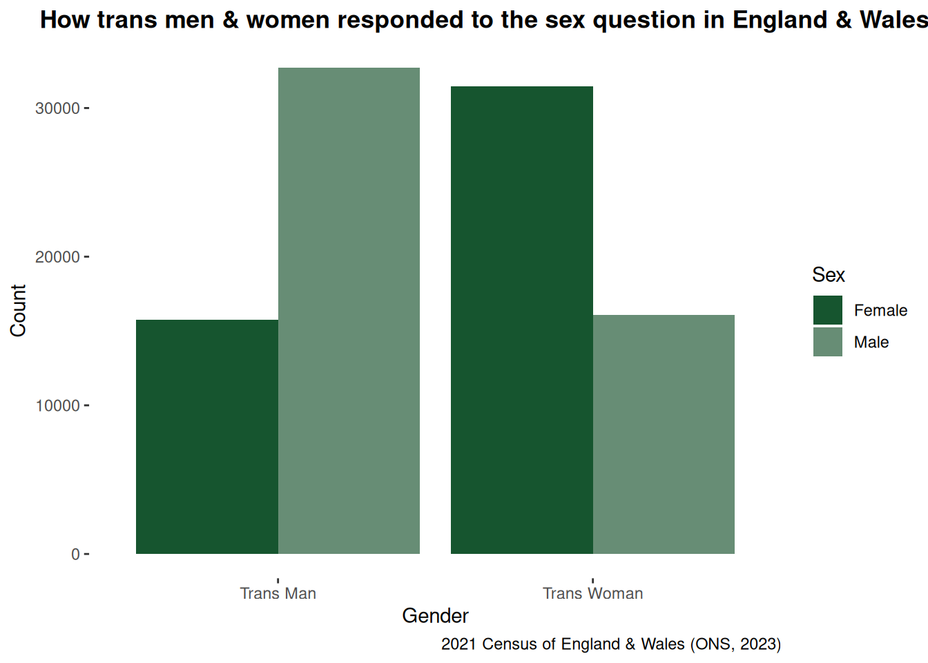
         Trans Man Trans Woman
  Female     15740       31470
  Male       32695       16100

Visualising the data

I then created a basic bar chart. This bar chart indicates that despite the use of documented or “legal sex” guidance in the 2021 census at least 67% of people who indicated they were trans men or women in the census responded to the sex question based on how they live.

genmodsex %>%
  ggplot(aes(genmod, fill = sex)) +
  geom_bar(position = "dodge") +
  labs(
    title = "How trans men & women responded to the sex question in England & Wales",
    x = "Gender",
    y = "Count",
    caption = "2021 Census of England & Wales (ONS, 2023)"
  ) +
  scale_fill_manual("Sex", values = c("Female" = "#16552f", "Male" = "#678D75")) +
  theme(
    panel.background = element_rect(fill = "transparent", color = NA),
    plot.background = element_rect(fill = "transparent", color = NA),
    panel.grid.major = element_blank(),
    panel.grid.minor = element_blank(),
    plot.title = element_text(face = "bold", hjust = 0.25)
  )