Why creativity matters in data visualisation
At the end of July, I delivered one of this year’s Ihaka Lectures at the University of Auckland. All three of this year’s lectures covered the topic of data visualisation in some way, with mine focusing on the creative aspects of charts and code. The other two talks from Kieran Healy and Rob Hyndman discussed trustworthiness and finding hidden data stories, respectively. Creativity is a topic is a topic I don’t see discussed quite as much (especially amongst academics and statisticians) so I wanted to write down some of those thoughts here.
You can find the slides and recording of my When creativity meets code talk for the Ihaka Lecture Series online.
When we talk about what makes a good data visualisation, we often talk about terms like clarity, accessibility, and efficiency. And all of those elements are incredibly important. But they’re not the only aspects that are important. Here’s a few more: attention-grabbing, memorable, and emotional. I’m aware that these terms can have some negative connotations, especially when it comes to data visualisation, so let me explain what I mean by these aspects.
Attention-grabbing: In a world where people are passing novels into ChatGPT for a summary to avoid having to actually read a book or where even a 10 minute YouTube video is deemed too long, a monochrome line chart on page 3 of an academic manuscript probably isn’t going to get noticed. If you’re reading this blog post, I’m guessing you’re a person who quite likes data and numbers. It’s important to remember that most people probably don’t like data and numbers as much as you do. If you see a table of numbers on a topic you’re interested in, you’ll probably look at those numbers. Many people won’t. Before people are able to understand a chart, they need to be convinced to actually look at it.
Memorable: research shows that information presented in memorable visualisations is more likely to be recalled, i.e., people don’t just remember the chart design, they also remember the numbers in it. Unfortunately, this applies for both memorable (good) and memorable (bad) charts. But if you want someone to not only notice your chart in the first place, but also remember what you were trying to tell them, then a default design is probably not going to do that.
Emotional: The whole point of data visualisation is communicating information to other human beings. Human beings are weird and not as formulaic as we might want them to be. And sometimes you want to inspire those human beings to do something. To take action. So we might have to get creative in order to do that. To me, data visualisation bridges the gap between data and art. Art is often used as an emotional expression. It’s personal. It’s political. Sometimes data visualisation needs to be as well. You are creating a data visualisation . In the academic and business settings, where you might be explaining a statistical result or showing how two forecasts differ, then showing neutrality can be important. (Which should be an active design choice in itself!) Other times, visualisations are deliberately not neutral, e.g. encouraging uptake of healthcare screening, or voting in elections. Federica Fragapane has some of the best examples of emotional data visualisation that I’ve seen.
And doing those things well often means stepping outside the traditional chart types and styling.
Traditional is perhaps not the best word here, since traditional has connotations of being made a long time ago. And I don’t know want to suggest that charts made many years weren’t creative. Because, in fact, the opposite is true - some of the most creative examples of charts I’ve seen were hand drawn over a hundred years ago. See the work of Florence Nightingale, Minard, and W.E.B. DuBois for inspiration.
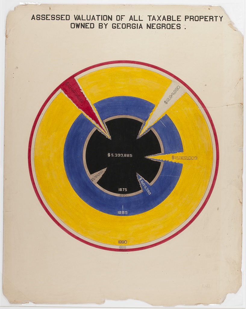
Much like writing, I’m not suggesting that every single chart needs to be a brand new idea that’s different from anything else that already exists. Sometimes writing is an expression of creativity and emotions. And sometimes it’s just a list of things to buy at the supermarket. Data visualisation is much the same. As the audience and purpose varies, so should the chart.
How to make more creative data visualisations
One of the responses when I talk about creativity in data visualisation is often something along the lines of “but I’m a …, I’m not a creative person”. Although it’s not something I personally identify with, it’s not an uncommon feeling among people working in fields like science or data. Perhaps related to the fairly common misconception that creativity and artistic tendencies have to go hand in hand. They don’t.
So here’s a few things that might help you to make some more creative choices in data visualisation.
Be inspired by your data
Sometimes, creativity is just about finding the right inspiration. And when it comes to inspiration for data visualisation, don’t forget the thing that’s sitting right in front of you - your data!
Let your data choose your chart type
When we talk about choosing a chart type, we often think about what type of data we have (e.g., continuous, categorical, or spatial) and what relationships we want to show (e.g., correlation, change over time, or ranking). The Financial Times Visual Vocabulary is often shared in introductory data visualisation teaching, including my own, to aid in identifying appropriate chart types based on these factors.
Consider adding another aspect: what the topic of the data is. Take this beautiful example of a map that is both aesthetic and effective. It’s a map about water, so the map cells are bubbles of water.
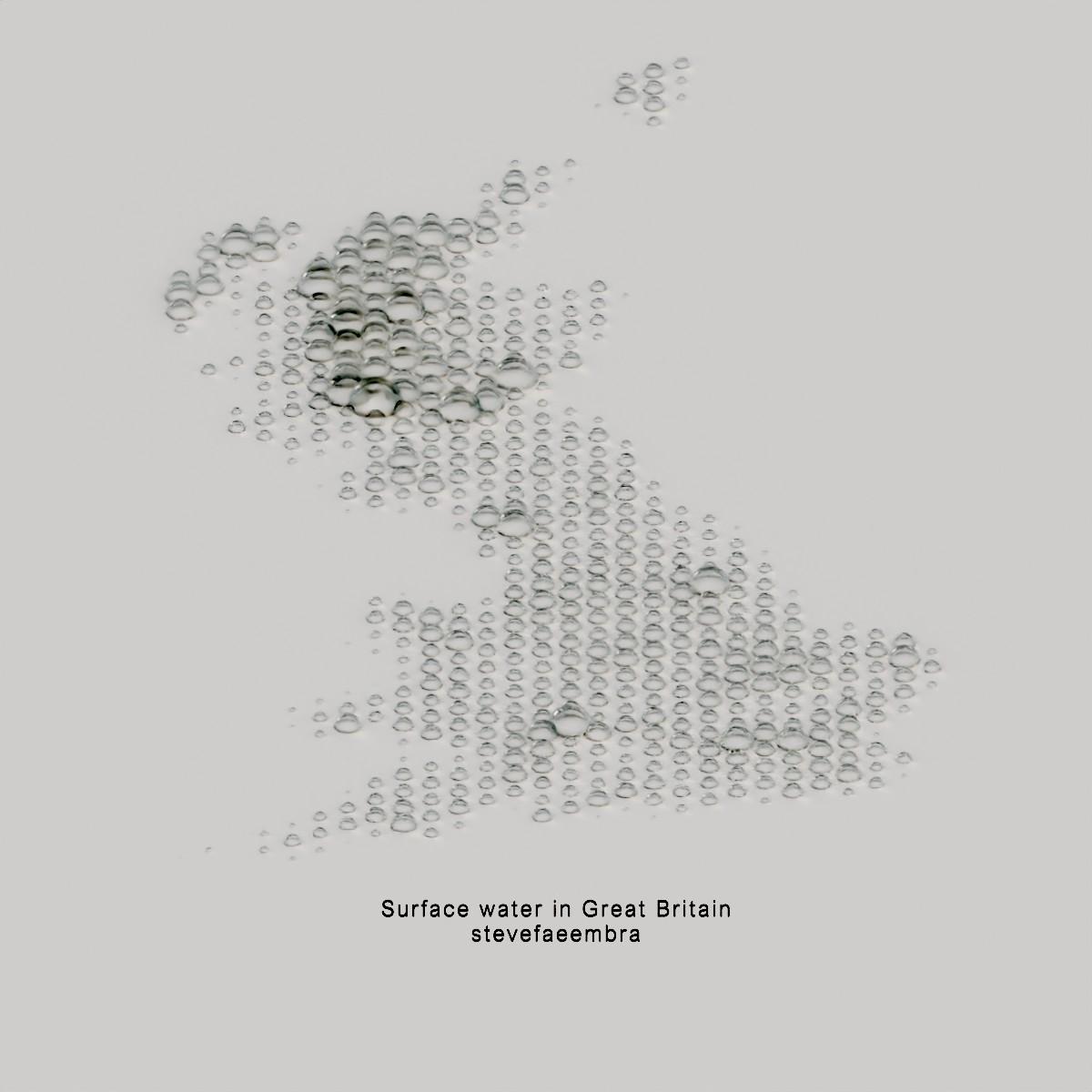
There are two main reasons why I love this map. First of all it’s very minimalist. I don’t believe in minimalism for the sake of minimalism, but it works really well here and I can easily imagine having a print of this on the wall. The other reason I love this map is because the styling and theme matches the topic of the data. It’s a map about surface water, and each cell contains a droplet of water. It’s so effective because your brain understands the map before you actually think about it or read the text.
An argument against this map design is that it’s not possible to extract the exact values. However, the default alternative is usually a choropleth map with a gradient colour scale and a legend on the side. It’s hard for humans to visually map values from gradient scales, and so you mostly just end up showing which areas have smaller or larger values. Which is exactly what you get from this map.
Whether or not using the data subject to inspire chart design is an appropriate approach obviously depends on nature and sensitivity of the data. Be careful not trivialise sensitive data or subjects.
Let your data choose your colours
Most chart software comes with a default colour palette. Most of those default colour palettes could be described as okay. I’d always recommend actively choosing your colours with accessibility and intuitiveness in mind rather than relying on defaults. So how do you choose those colours? That’s a big can of worms, and there are many (many!) blog posts already on this topic. So I just want to share one suggestion, which is again to look at the topic of your data!
Take this example of a line chart of baking ingredients across series of The Great British Bake Off from Cara Thompson.
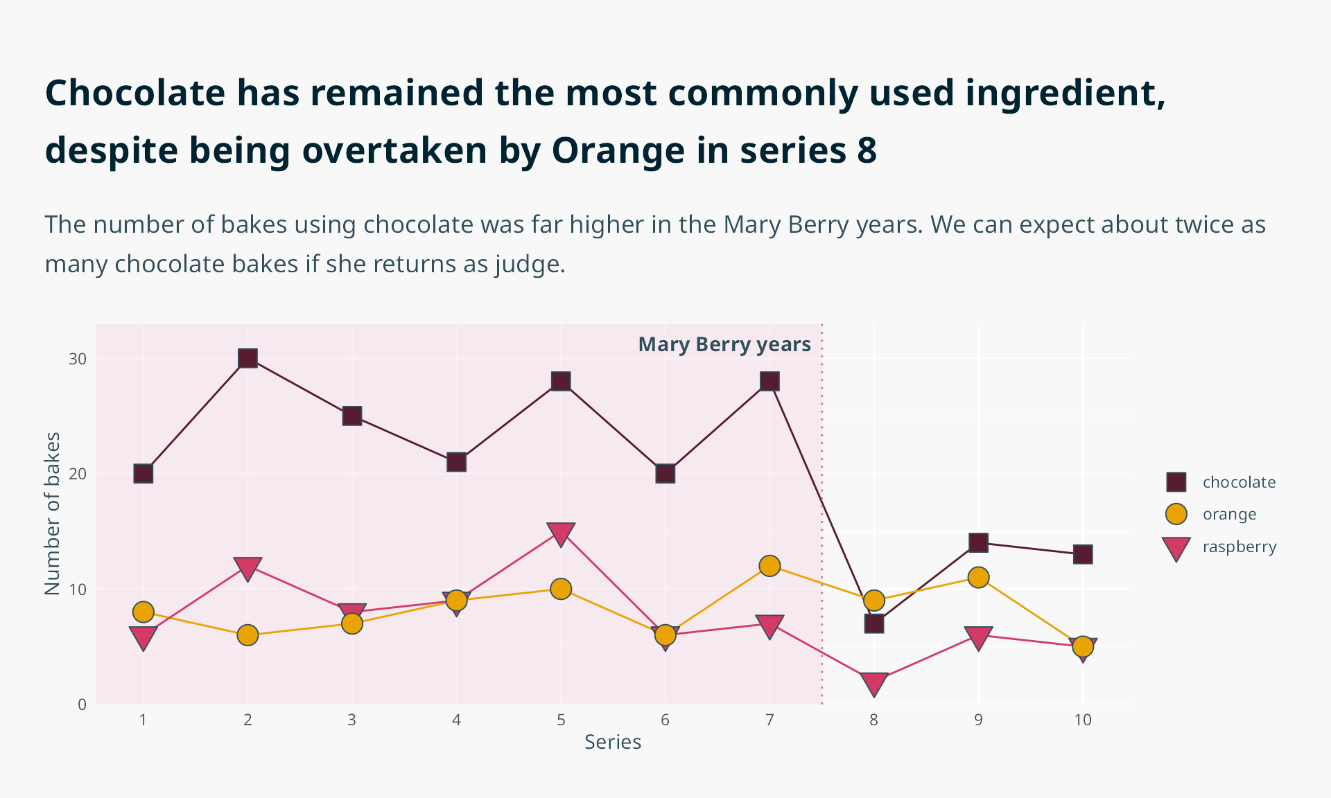
There are three coloured lines: pink, orange, and brown. These colours aren’t randomly chosen, and don’t come from a pre-defined colour palette. They come from the data. The ingredients in the data are raspberries, oranges, and chocolate. Raspberries are pink. Oranges are orange. Chocolate is brown. So the colour palette is pink, orange, and brown.
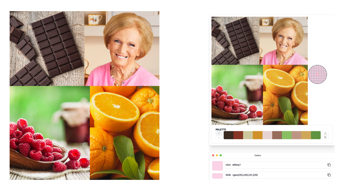
For those who can easily visually differentiate these colours, the cognitive load is reduced since you don’t need to look at the legend as often when mentally mapping colours to categories. For those who can’t easily visually differentiate these colours, the use of symbols alongside colours means that it’s still accessible.
Cara walked us through the process of designing this chart in the Accessibility in official statistics session at the 2025 RSS Conference. You can find her slides online.
Let your data choose the chart style
Alongside choosing the way that data is encoded into the geometry of the chart through the chart type, and the way it is represented through colours, you can also allow the general topic of the visualisation to influence the way that the non-data elements are presented. For example, the colours of the background, the choice of font, and the use of decorative images.
If you don’t think those elements are important aspects of data visualisation, then consider this classic example showing the impact of font choice.
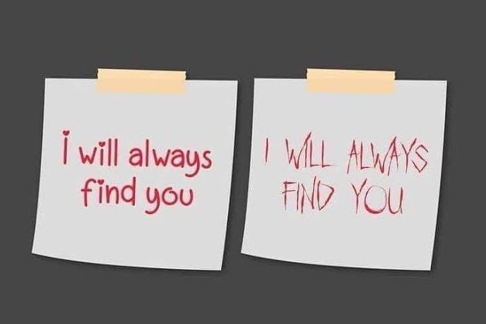
Same information, different interpretation. Styling choices in charts can affect how people feel about your chart (and about you by extension), e.g. how trustworthy your data and analytics are. How much would you trust a chart using Papyrus?
Take this example of a chart showing the life span of programming languages that use different comment symbols.
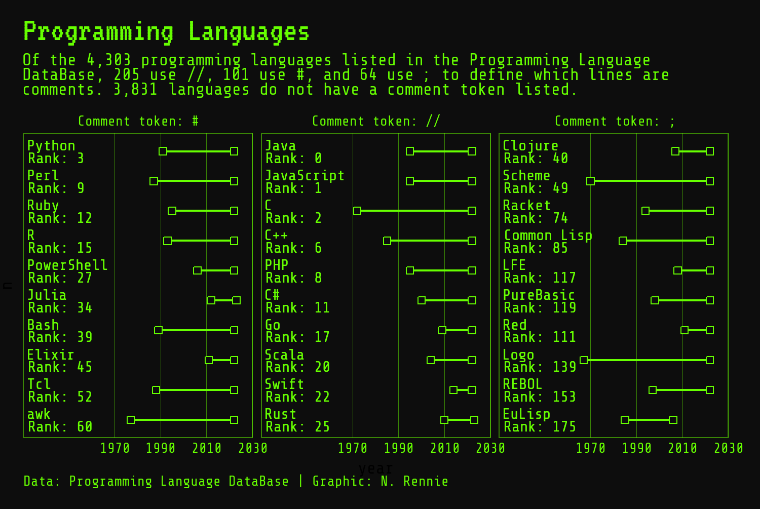
The choice of fonts and colours are based on green screens (monochrome monitors that used green phosphor screens) typical of the early days of computing, i.e. how many of these programming languages would first have been presented.
If you want to learn how to create this dumbbell chart in R, read Programming languages: dumbbell charts with ggplot2 in The Art of Data Visualization with ggplot2.
Realise you can draw anything
There are many, many pieces of software out there to help people create charts more easily. Some software is better than others. But almost all of them have built in options to choose from line charts, bar charts, and scatter plots. So we tend to default to using these charts types first without thinking about any other options.
True creativity in data visualisation comes when you realise that, as long as you have some way of drawing points, lines, and shapes, you can create anything.
The next time you’re creating a data visualisation, before you reach for your go-to chart building software, reach for pen and paper (whether that’s a fancy notepad, the back of an envelope, or a drawing app on a tablet, it doesn’t really matter). When we start creating a data visualisation by sitting in front of our plotting software, we subconsciously become limited by what it can create and use the defaults as a starting point. Hand drawn visualisations used to be the norm. Earlier this year, in his God’s Revenge Upon Murder: Florence Nightingale’s Mortality and Health Diagrams talk for the Florence Nightingale Museum, R.J. Andrews noted that because we often use computers to create charts, we tend to use rectangular based geometries in charts because computers are good at those. Before this, visualisation designers were more free in what basic shapes they would use.
I also find that scribbles on paper are easier to throw away when an idea isn’t working, compared to initial versions created with code. There’s much less investment in a pencil doodle than 10 lines of code.
Take this example of a chart showing tariff rates over time for different types of jam.
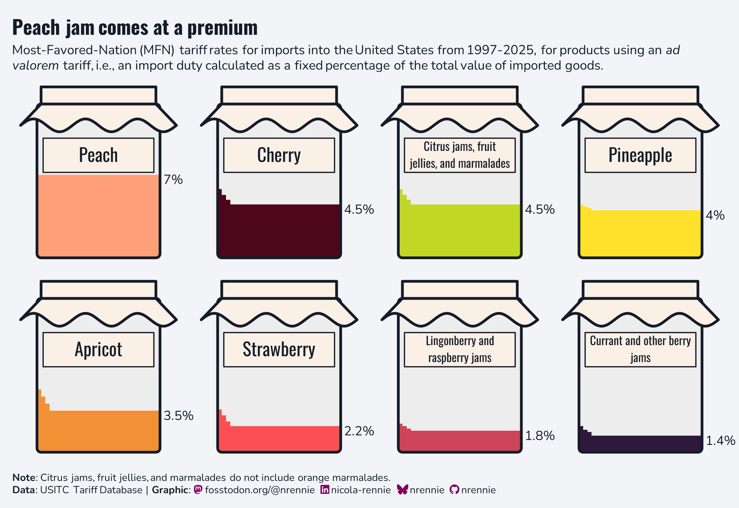
When you hear made with the statistical programming language R, you probably don’t think about jam jars straight away. And that’s fair. One of the compliments(?) I never quite know how to respond to is ‘that doesn’t look like it was made in R!’. But it is made in R. It’s essentially just an area chart with some decorative elements added on top. And those decorative elements are essentially just polygons. Depending on the audience and purpose, a classic area chart (or indeed line chart) might be more appropriate. But in other settings, the jam jar styling draws people in and starts a conversation in a way that a plain chart might not.
Don’t just add more
The mental image you might get when I say creative data visualisation is perhaps a chart that’s brightly coloured, has a lot going on, and is kind of overwhelming. But I want to be clear that isn’t what I mean by a creative visualisation. This interactive chart from the New York Times is one of my favourite data visualisations. And it works because it shows too little instead of too much.
When you arrive at the chart, you are presented with only the axes and you are asked to draw the line yourself.
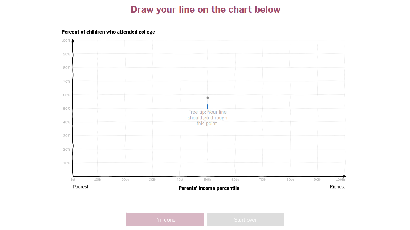
I’m not sure if it’s the very first example of this you draw it approach to data visualisation, but it’s certainty the first one I saw. I’ve seen many more since this one was release 11 years ago. It’s become a more popular approach because it works so well at making people think about what they kind of already know.
When you are asked to draw a line showing the relationship between parental income and likelihood of attending college, you already know that the line is going to be increasing. But you also begin asking questions like: does the effect of parental income flatten off at some point? what percentage of people at the bottom of the parental income scale go to college? How many people might be supported by financial aid?
In contrast, if you were just simply shown the information in a chart (where the line is exceptionally straight), all you see is a line that goes up. And you probably just acknowledge that information, then move on without really thinking about it.
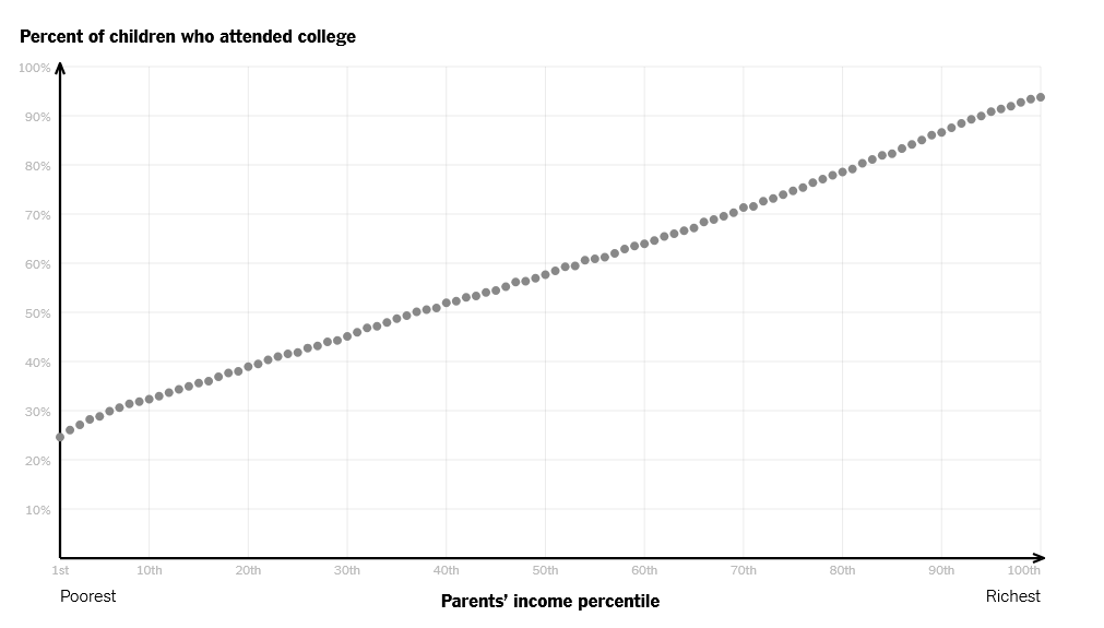
This approach isn’t just effective at grabbing attention (a chart with no information at all tends to do that), but also maintaining that attention long enough to encourage people to think deeply about something they kind of already know. The gamification of seeing how much closer you are to the truth than the average person also helps with this! This approach is incredibly creative, but not in a way that simply adds more information. Instead, the lack of information makes you think about the information all the more.
The types of creative data visualisations I’ve talked about here might seem at odds with classic data visualisation advice from the like of Tufte, who talk about removing chart junk. But I don’t think it is. Creativity in data visualisation is about balancing the cognitive load with engagement and understanding. In some cases, removing or reducing elements like gridlines or borders (or indeed, jam jars!). In other cases, like the New York Times example above, sometimes removing the data also works!
Creativity isn’t just about making things look pretty or adding more stuff into visualisations. It’s about designing charts well to draw people’s attention, make them think, and reduce the cognitive strain of doing so.
Cover image by Laura Adai on Unsplash.
Reuse
Citation
@online{rennie2026,
  author = {Rennie, Nicola},
  title = {Why Creativity Matters in Data Visualisation},
  date = {2026-08-14},
  url = {https://nrennie.rbind.io/blog/creativity-data-visualisation/},
  langid = {en}
}