Explore Explain: 30 Day Map Challenge
Data Visualisation
Ansgar Wolsing and I each discussed five of the maps we created as part of the 30 Day Map Challenge in November 2025, with Andy Kirk, as well as another one of our favourite maps from the challenge.
Here are a few of my notes:
My top five maps
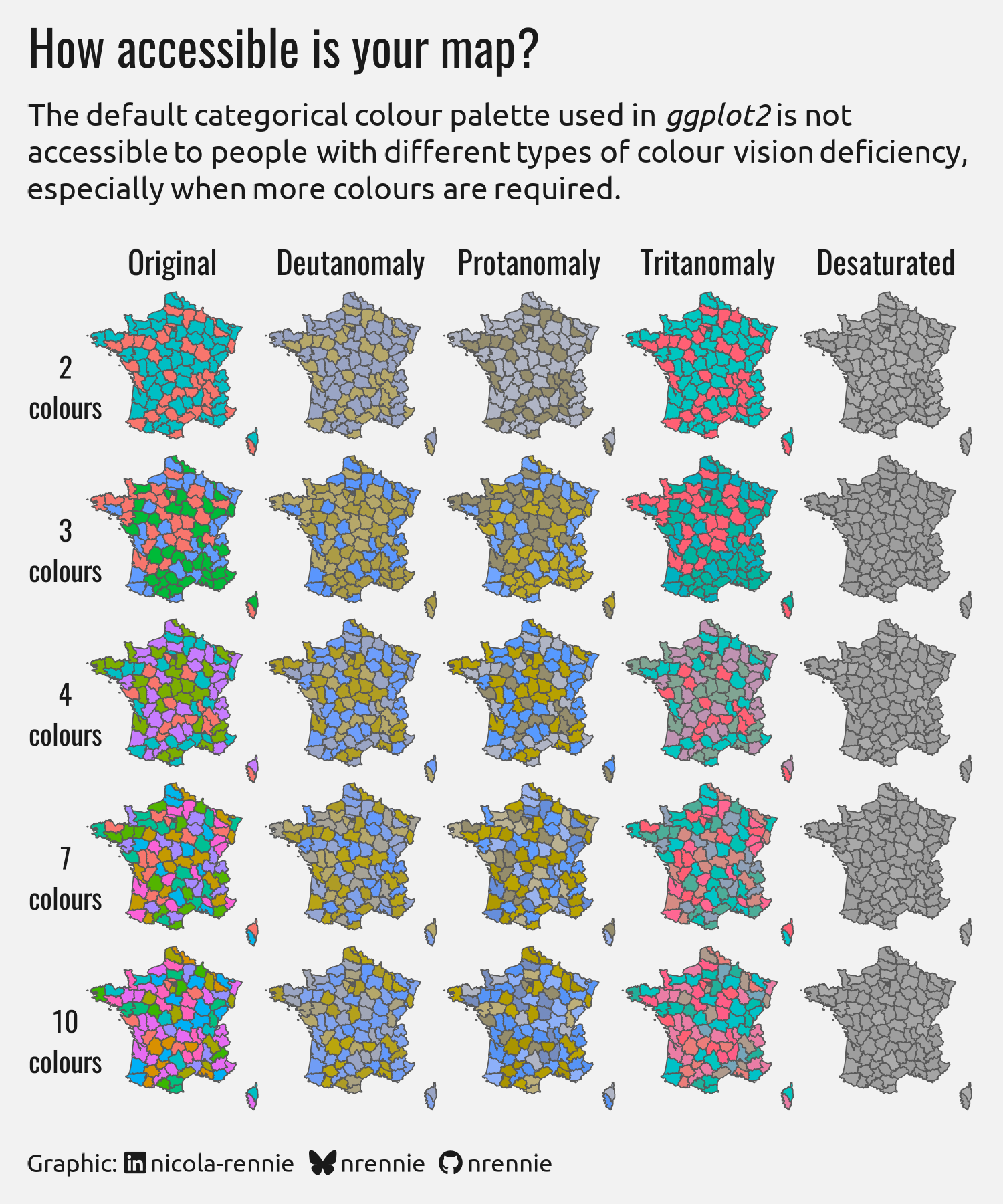
Day 7 (Accessibility)
- For the accessibility prompt, I focused on demonstrating how colour choices can affect how accessible charts and maps are, with choropleth maps being particularly affected.
- The 5x5 grid shows maps of France with regions coloured using either 2, 3, 5, 7, or 10 colours; and how those look under different types of colourblindness.
- The data itself is meaningless (colours are allocated randomly) but it highlights how even a small number of colours can be difficult to tell apart if they aren’t well chosen.
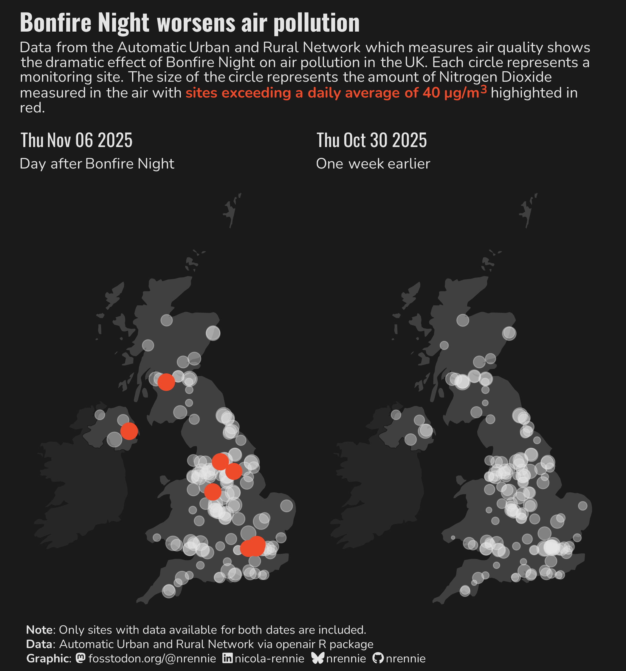
Day 10 (Air)
- This map was very topical at the time of making since, Bonfire Night takes place in the UK on November 5 with lots of fireworks set off. We know that fireworks are bad for the environment, so I wanted to bring some data into that story.
- I used the
openairR package to access data from the AURN (the UK’s largest automatic monitoring network for air quality). I extracted data to compare the day after Bonfire night to the same day in the previous, to account for day of the week effects. Only monitoring stations for both days are included. - Each circle represents the location of an air quality monitoring station, and the size of the circle represents the level of Nitrogen Dioxide.
- I used red, as a warning colour, to highlight stations where the level exceeded a threshold, showing only unsafe levels after fireworks.
- Though there are minimal annotations, if you’re familiar with UK geography, you can still easily pick out Glasgow, Belfast, London, and Manchester.
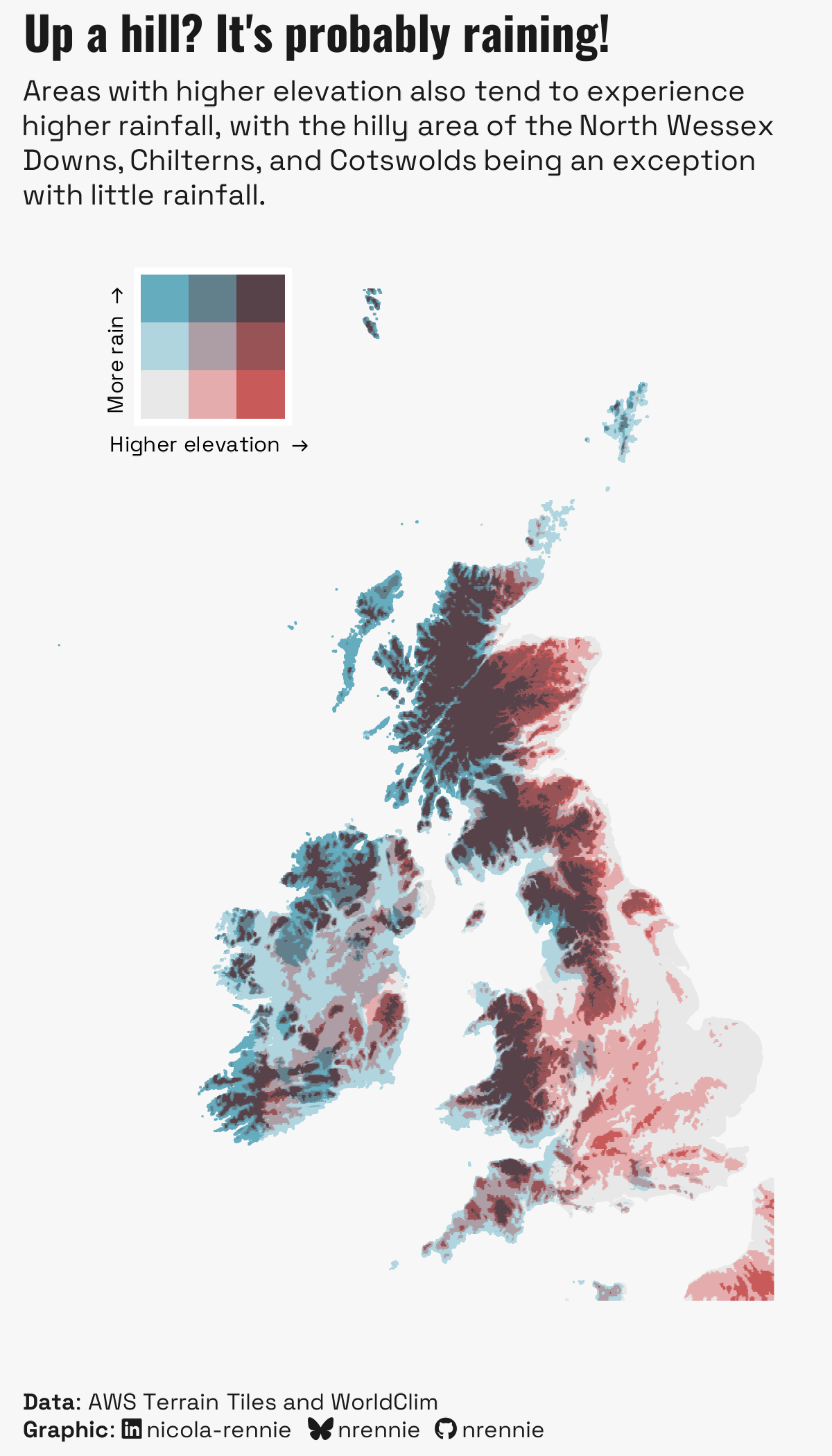
Day 22 (Data: Natural Earth)
- A loose interpretation of the Natural Earth prompt as it doesn’t use Natural Earth data, but instead uses data about things that naturally happen on Earth.
- Earlier in the challenge I’d made a 3D Rayshader map of rainfall in the UK, which looks very much like an elevation map of the UK.
- This map aimed to compare the two to see how closely rainfall and elevation in the UK correlate.
- The use of a bivariate colour scale, allows you to pick out the areas that don’t fit the pattern e.g. flat and wet, and high and dry!
- Most of the time for this map was spent on data wrangling, since the elevation data and climate data are both very high resolution but in very different formats and coordinate systems.
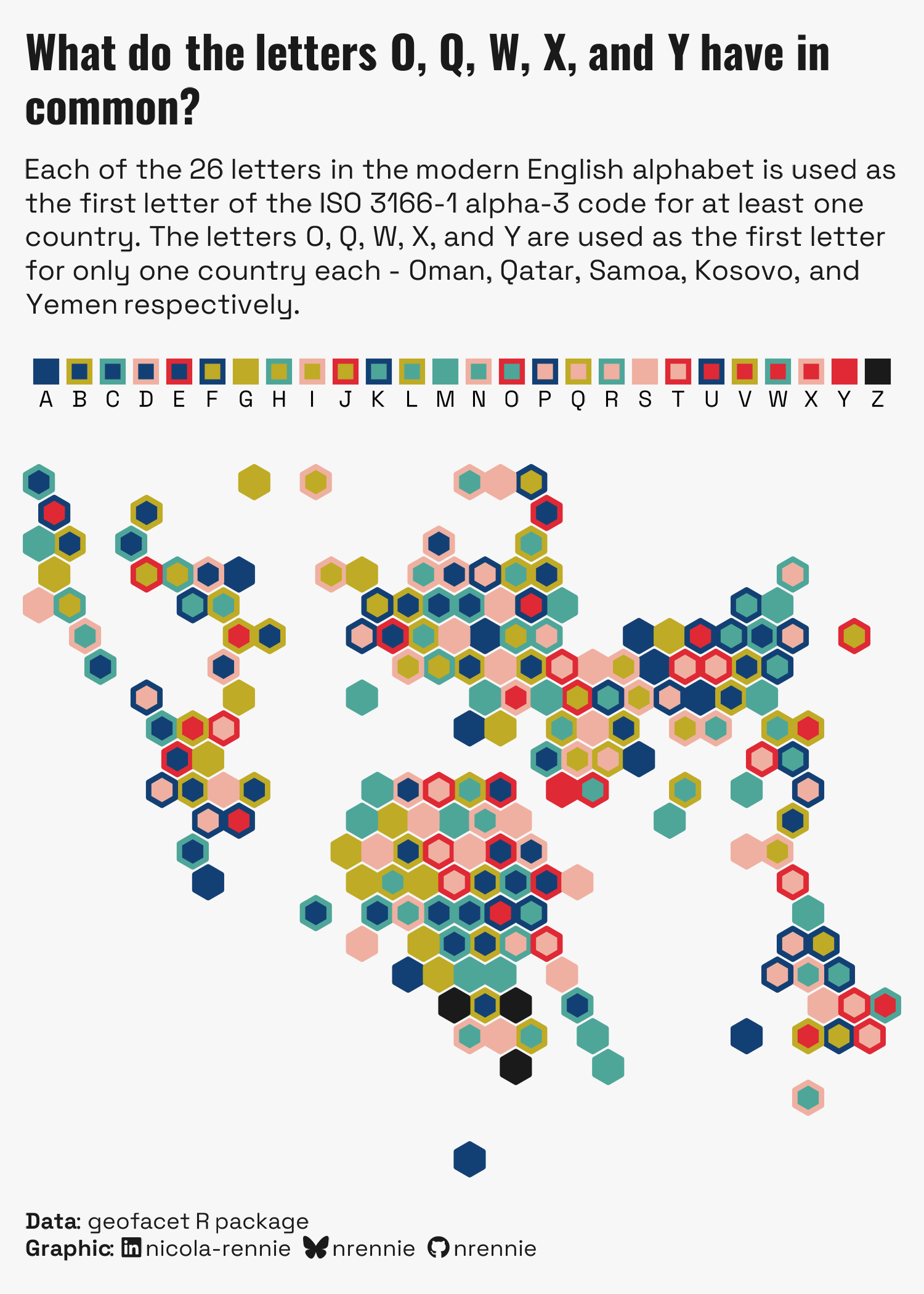
Day 25 (Hexagon)
- I made this map when I was on a train without any WiFi, so it imposed some restrictions on what I could make. I had to use only the software I already had installed, and only the data that I already had downloaded. Hence, the almost entirely pointless map of the first letters of ISO codes.
- Here, I’ve create a grid map of the world where each country is represented by a coloured hexagon, rather than the more traditional square or rectangle. I wrote a function to draw hexagons, and borrowed the grid layout from the
geofacetR package. - There are 26 letters in the alphabet so that means we require you 26 colours. However, there aren’t really 26 distinct colours and the default rainbow colour palette makes it really difficult to tell consecutive letters apart.
- Instead, I experimented with using only 5 colours, and instead combining the outline colour and fill colour of each hexagon to give 25 unique combinations (with one extra to round up to 26).
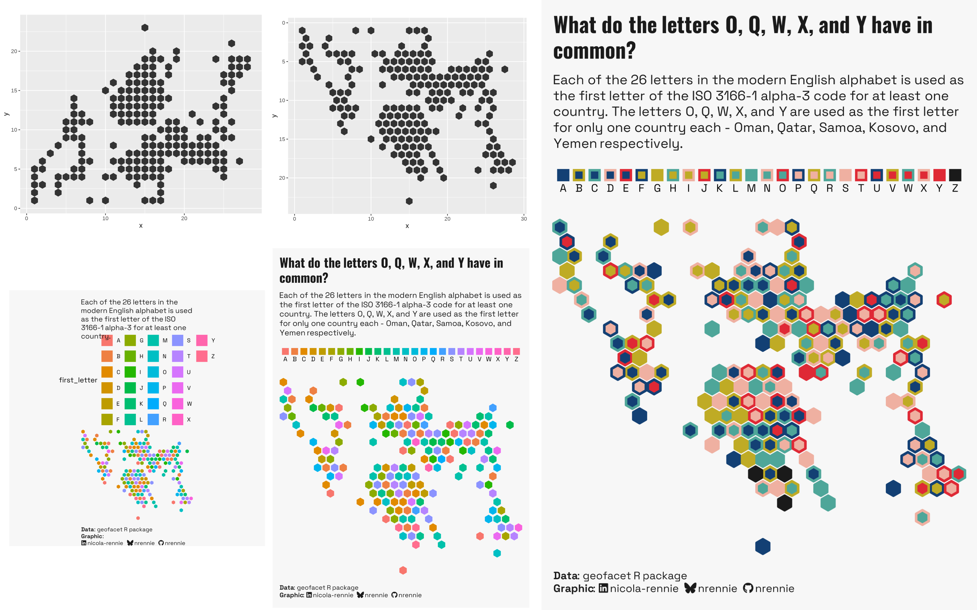
Bonus: For day 23’s prompt of progress, I showed some of the charts made along the way when creating this map:
Day 29 (Raster)
- This map of elevation is heavily inspired by a blog post from RJ Andrews about creating maps with a physical typewriter.
- The elevation data is binned, and then mapped to different letters, where the density of ink for each letter represents the elevation.
- I like this map because you can’t actually tell it’s just letters until you zoom right in!
- You can read the blog post about creating this type of map here: nrennie.rbind.io/blog/creating-typewriter-maps-r
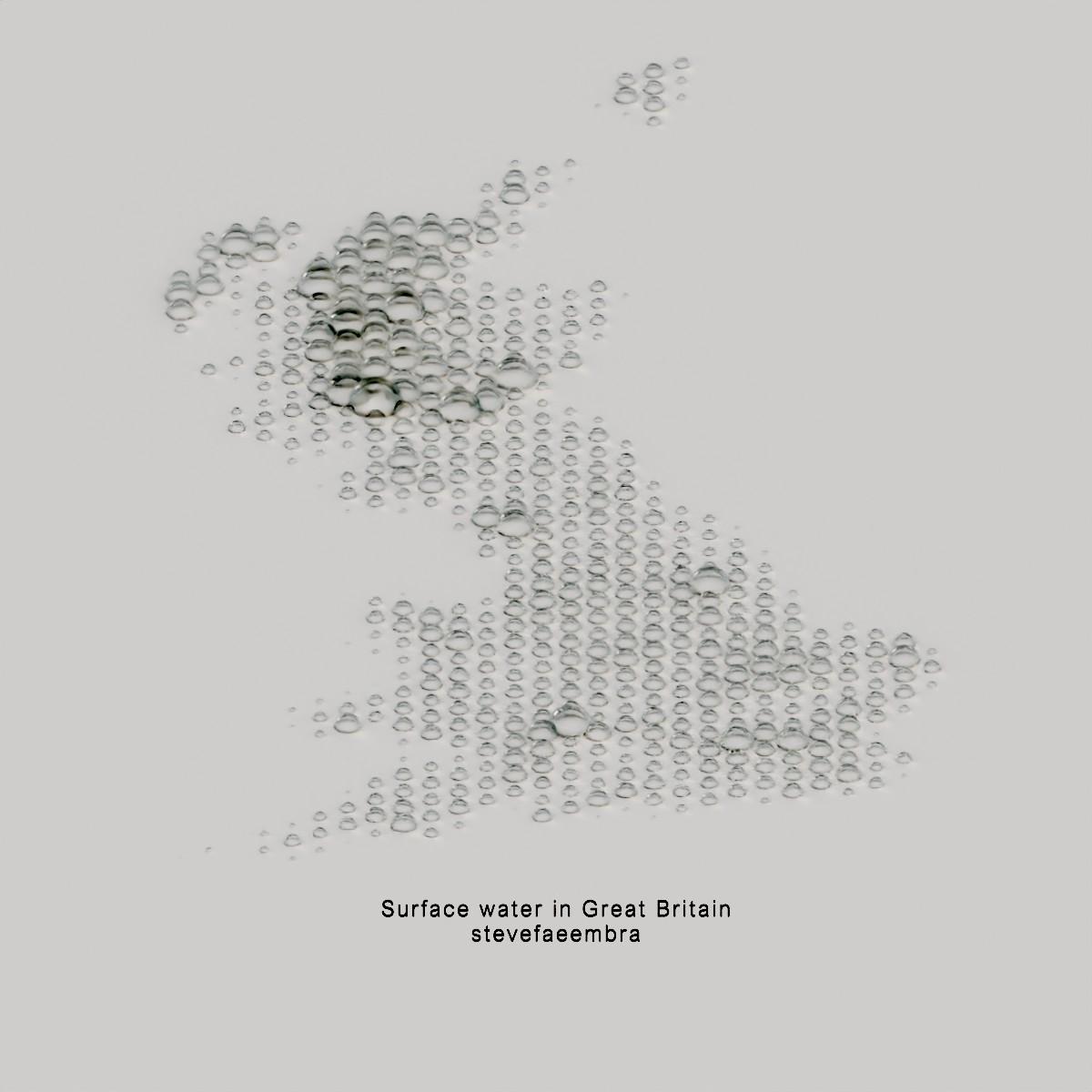
One of my other favourite maps
There are two main reasons why I love this map:
- First of all it’s very minimalist. I don’t believe in minimalism for the sake of minimalism, but it works really well here and I can easily imagine having a print of this on the wall.
- The other reason I love this map is because the styling and theme matches the topic of the data. It’s a map about surface water, and each cell contains a droplet of water. It’s so effective because your brain understands the map before you actually think about it or read the text.
A beautiful example of a map that is both aesthetic and effective!