Creating typewriter-styled maps in {ggplot2}
A couple of months ago I read a blog post by RJ Andrews, in which he described the process of making a map of California using a typewriter. It’s a beautiful map - made using over 2,500 keystrokes, all done by hand. The density of ink for each letter displays the elevation. He notes that he’s not the first to make maps using a typewriter. I started to wonder whether I could create a map with a typewriter feel using only {ggplot2}? By the end of this blog post, you should have the answer to that question. Although you can probably guess the answer already…
Elevation data
Before we get started with making maps, we need some data. Specifically, some elevation data. There are multiple ways you can get elevation data into R. I decided to start with a UK shapefile that I already had from some of the #30DayMapChallenge maps I made last year. t was originally downloaded from geoportal.statistics.gov.uk. Other methods for storing and reading geographic data into R are available - you can read about some of them in my R packages for visualising spatial data blog post. We can read the shapefile into R using st_read() from {sf}. I also filtered the data to only keep the map of Scotland using filter() from {dplyr}:
uk_sf <- sf::st_read("data/UK/CTRY_DEC_2021_UK_BUC.shp")
scot_sf <- uk_sf |>
  dplyr::select(CTRY21NM, geometry) |>
  dplyr::filter(CTRY21NM == "Scotland")
Now we need to obtain the elevation data. One of the easiest ways to do that is using the {elevatr} R package. This package provides access to elevation data from AWS Open Data Terrain Tiles and the Open Topography Global datasets API. We can simply pass in the {sf} object to the get_elev_raster() function, and it will return a RasterLayer object with the elevation in each grid square. The z argument controls the zoom level i.e. the resolution of the grid.
elev_data <- elevatr::get_elev_raster(
  locations = scot_sf,
  z = 3,
  clip = "locations"
)
Note that there are some changes planned for
get_elev_raster()soon due to the changes in spatial packages in R. I’ll try to keep the code in this blog post updated to reflect those changes but please refer to the package documentation for the most up to date functions.
Choosing a font
Raster elevation maps are often plotted as a heatmap - where the colour of each grid square represents the elevation, and the colours are taken from a continuous gradient. Instead of doing that, we’re going to print a letter in each grid square, where the letters represent the elevation. That leaves us with a key question - which letters should we use?
Let’s answer a slightly different question first - which font should we use? It’s really easy to work with Google Fonts in R thanks to {sysfonts} and {showtext}, so let’s use those as our candidate fonts. Since we’re trying to create a typewriter style, we’ll only look at monospace fonts. After a little bit of browsing around, I settled on the Special Elite Google Font. We can load it into R using the following code:
library(showtext)
font_add_google("Special Elite", "elite")
showtext_auto()
To decide which letters to use, I found it easiest to first view how each letter looks in Special Elite font. I could do this in R, but it’s also easy to simply type the letters into the Google Font website…
I eventually decided to use the letters lower case l, upper case I, H, and M to denote four different elevation levels (from lowest to highest). When you look at how the characters are printed, M uses a lot of ink, whereas l uses very little. In practice there’s little difference between lower case l and upper case I in Special Elite font, so three characters may have been enough.
Processing the data
Now we need to do some pre-processing of our elevation data before we plot it. We need to (i) convert it into four discrete elevation intervals, and (ii) assign a letter to each of those intervals.
To convert it into intervals, it’s first easiest to convert the RasterLayer file we currently have into a dataframe or tibble. By default, converting from RasterLayer to a dataframe results in a single column, so the following code simple adds back in the information about which grid row and column each elevation value belongs to.
library(tidyverse)
elev_mat <- terra::as.matrix(elev_data, wide = TRUE)
colnames(elev_mat) <- 1:ncol(elev_mat)
elev_df <- elev_mat |>
  as_tibble() |>
  mutate(y = row_number()) |>
  pivot_longer(-y, names_to = "x") |>
  mutate(x = as.numeric(x))
Now let’s create a look-up table for our selected letters and which elevation level they map to:
chars <- c("l", "I", "H", "M")
chars_map <- data.frame(value = seq_len(length(chars)),
                        value_letter = chars)
Our look up table looks like this:
  value value_letter
1     1            l
2     2            I
3     3            H
4     4            M
Now let’s turn the continuous elevation data into four levels (1, 2, 3, and 4) using the ntile() function from {dplyr}. I don’t use the ntile() function very often - it breaks the input vector into n buckets and returns an integer vector denoting which bucket each value falls into. We can then left_join() our bucketed elevation data to the chars_map look-up table we’ve already created.
Areas outside the boundary map of Scotland (e.g. in the sea) have an elevation level of NA. We don’t want to plot these, so we can drop any NA values from the data.
elev_plot <- elev_df |>
    mutate(value = ntile(value, n = length(chars))) |>
    left_join(chars_map, by = "value") |>
    drop_na()
The first five rows of elev_plot look like this:
# A tibble: 10,292 × 4
       y     x value value_letter
   <int> <dbl> <int> <chr>
 1     1     1    NA " "
 2     1     2    NA " "
 3     1     3    NA " "
 4     1     4    NA " "
 5     1     5    NA " "
(lots of missing values to be expected as the first rows relate to a corner of the area which is in the sea…)
Making the map
Now it’s map time! The basic map is fairly easy to make - we only need to use geom_text()! We map the x and y values in the elev_plot data to the x and y axes and specify that the value_letter should be used as the label inside the aes() call. We also need to remember to use the family argument to apply our chosen font - previously loaded in as "elite":
ggplot() +
  geom_text(
    data = elev_plot,
    mapping = aes(x = x, y = y, label = value_letter),
    family = "elite"
  )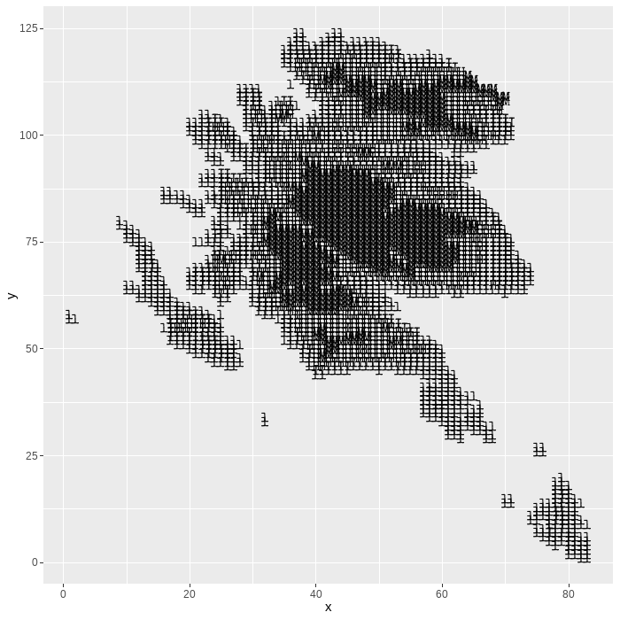
You might notice this looks a bit odd… It’s upside down! When we converted from a RasterLayer to a dataframe, we started counting the x and y values from the top-left corner. However, {ggplot2} starts counting from the bottom-left corner. The easiest way to fix this is simply adding scale_y_reverse():
ggplot() +
  geom_text(data = elev_plot,
            mapping = aes(x = x, y = y, label = value_letter),
            family = "elite") +
  scale_y_reverse()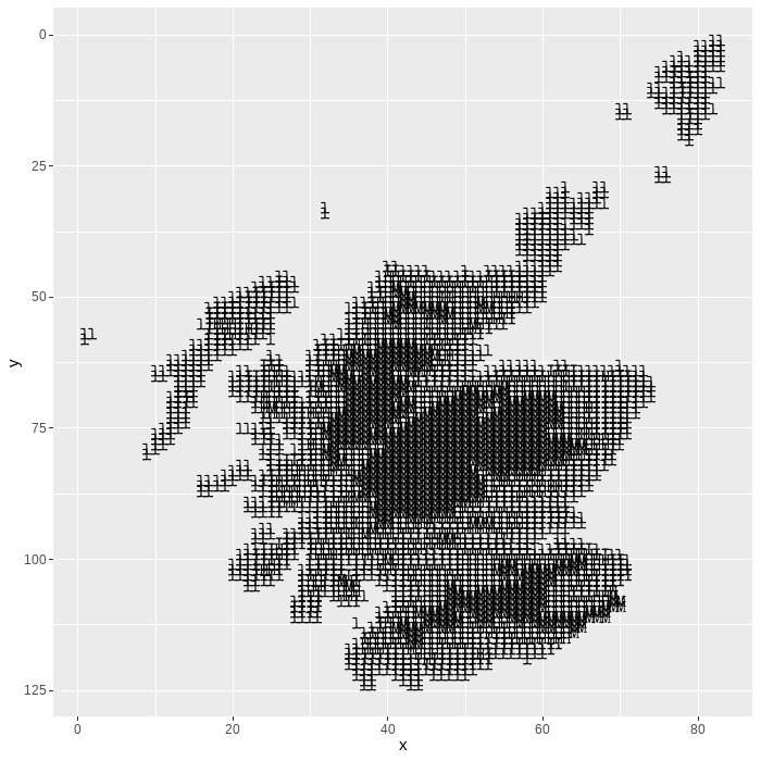
Let’s remove the grey grid in the background and the axis text using theme_void(), fix the aspect ratio of the grid to be 1:1 using coord_fixed(), and add the country name as a title:
ggplot() +
  geom_text(data = elev_plot,
            mapping = aes(x = x, y = y, label = value_letter),
            family = "elite") +
  scale_y_reverse() +
  labs(title = "SCOTLAND") +
  coord_fixed() +
  theme_void()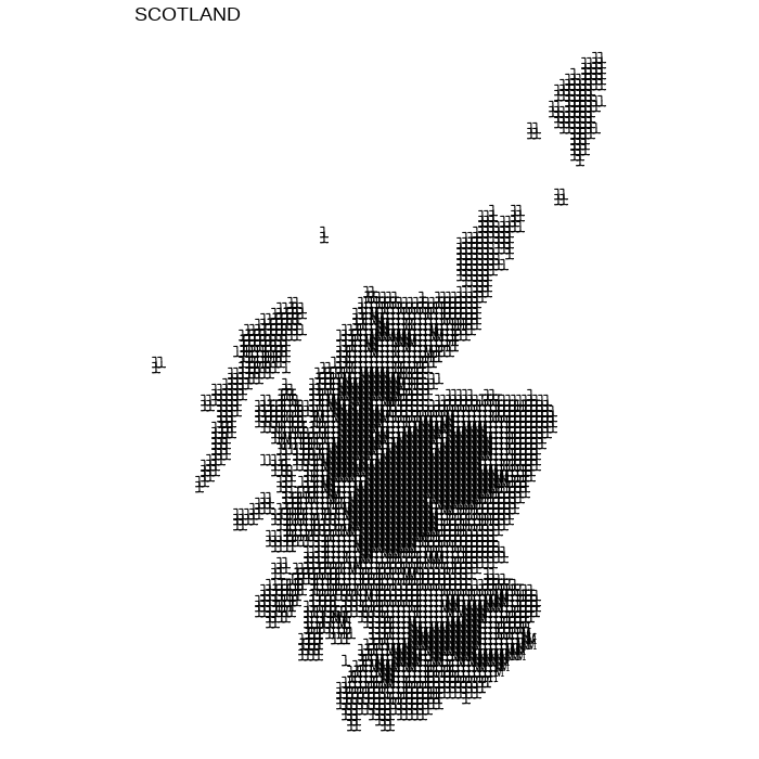
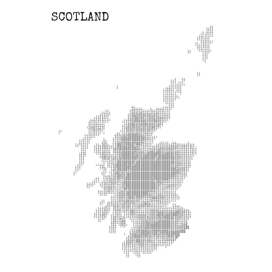
Finally, we can play around with the size and colour of the text to get it looking exactly as we want. I’ve also made the title bigger, repositioned it, and applied the Special Elite font to it as well using the plot.title argument in the theme() function:
ggplot() +
  geom_text(
    data = elev_plot,
    mapping = aes(x = x, y = y, label = value_letter),
    family = "elite",
    colour = "grey10",
    size = 2
  ) +
  scale_y_reverse() +
  labs(title = "SCOTLAND") +
  coord_fixed() +
  theme_void() +
  theme(
    plot.margin = margin(10, 10, 10, 10),
    plot.title = element_text(
      family = "elite", size = 30,
      colour = "grey10", margin = margin(t = 20, b = -20)
    )
  )
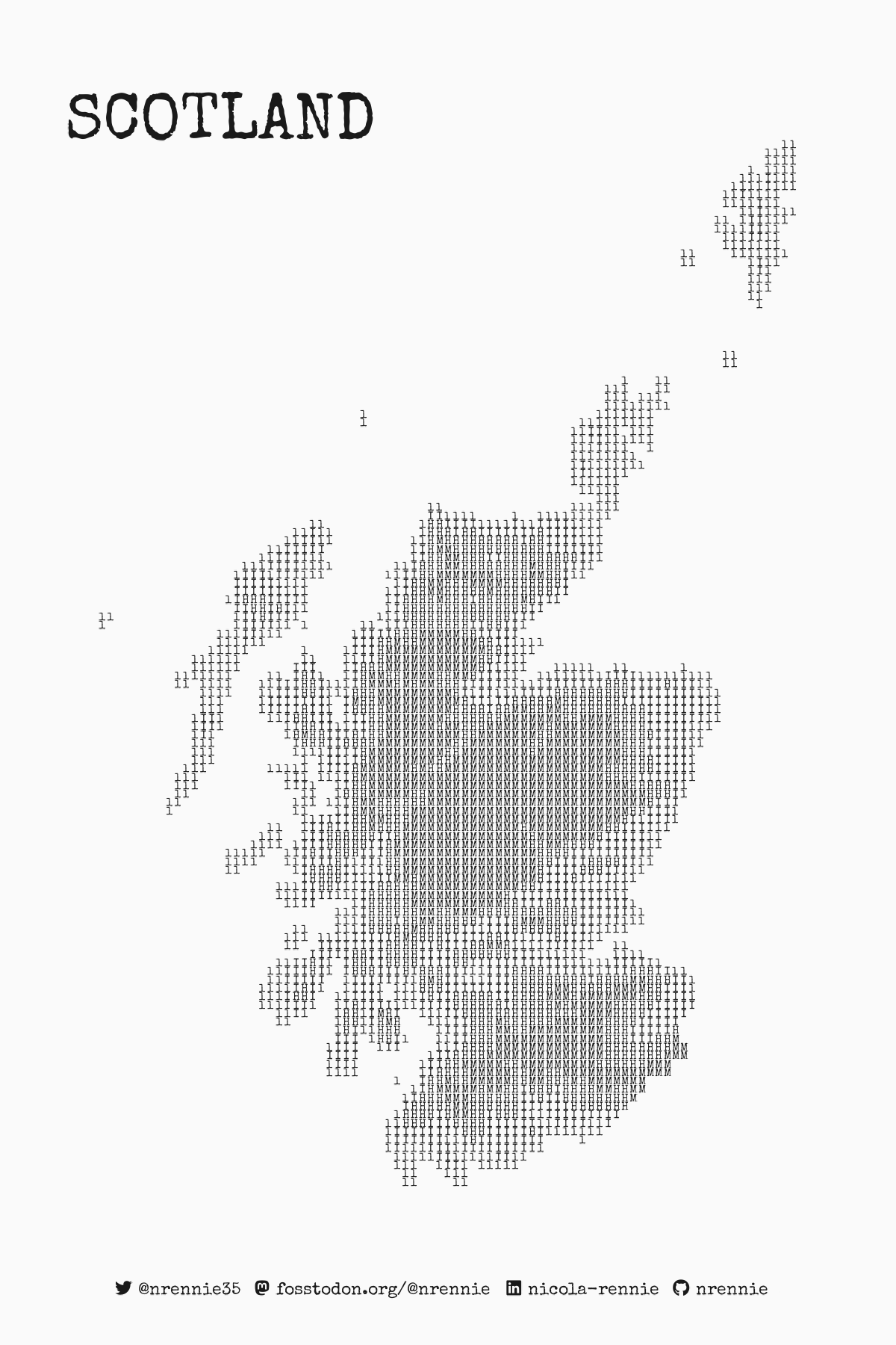
You can then add a caption with your social media handles if you choose to. My previous blog post on adding social media icons with {ggplot2} can show you how!
Additional resources
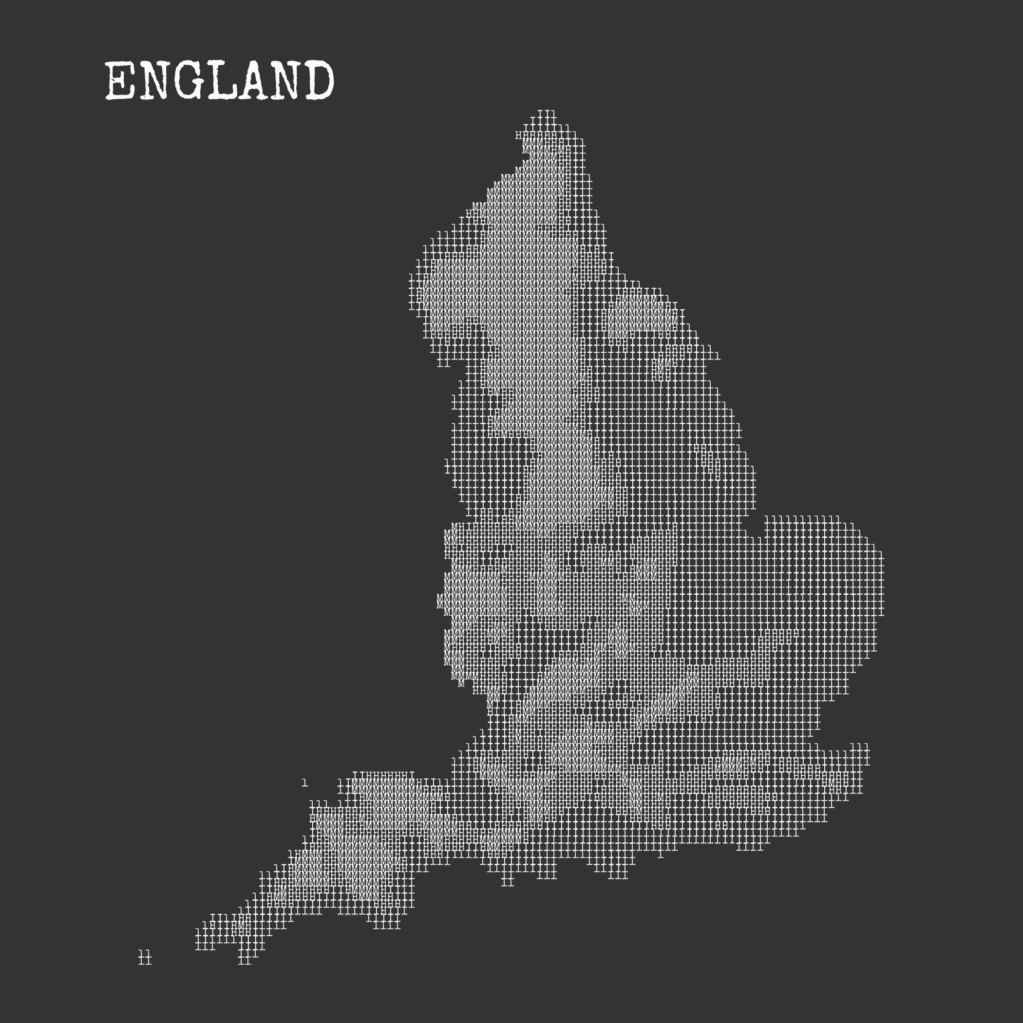
I’d recommend creating a function that wraps most of the code we have above. The function can take the initial map (e.g. shapefile) as an input, and can have additional arguments that specify the plot background colour, text colour, and size, for example. Writing a function made it possible to create this typewriter-styled map of England in one line:
You can see the function I wrote on GitHub. If you need help getting started with writing functions in R, the newly revised 2nd edition of R for Data Science has a chapter on functions!
After I published my initial plot, it inspired Jindra Lacko to create their own version of a map of Czechia. Made your own version? Share it!

Reuse
Citation
@online{rennie2023,
  author = {Rennie, Nicola},
  title = {Creating Typewriter-Styled Maps in \{Ggplot2\}},
  date = {2023-09-30},
  url = {https://nrennie.rbind.io/blog/creating-typewriter-maps-r/},
  langid = {en}
}