My year in data visualisation
To close out 2025, here’s a quick round up of some of the things I’ve been up to, alongside highlighting some of my favourite data visualisations I’ve seen this year!
Looking back on 2025
2025 has been a very busy year! In March, I changed jobs and I’m now very lucky to work on data visualisation projects full time!
The other big data visualisation-related news for me this year is that the online version of my book is now available! The Art of Data Visualization with ggplot2 is a book of data visualisation case studies showing the end-to-end process of building charts, starting from data acquisition to custom styling, entirely in R.
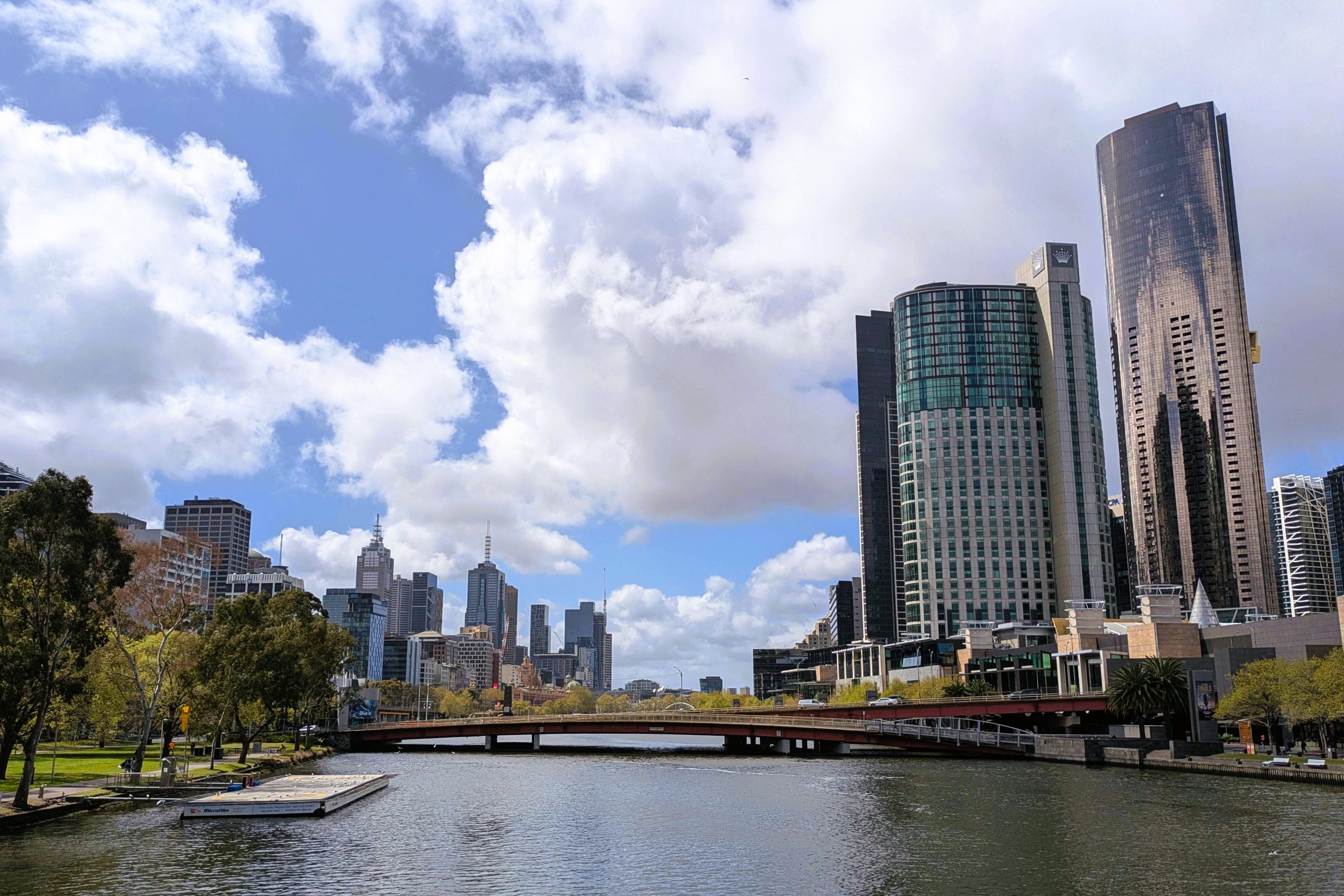
I delivered 21 public talks and workshops this year, with about half of them being in-person. A personal highlight was giving the keynote at WOMBAT in Melbourne. You can find the resources for most of these talks linked on my website.
I also finally got around to bringing together most of the charts and maps I’ve made over the last five years into one place - a visualisation gallery where you can browse charts by year and the software used to make them. I’d forgotten I’d made some of those charts so it was a nice trip down memory lane bringing them together! In 2026, I’ll be working to add links to code and interactive versions within the gallery.
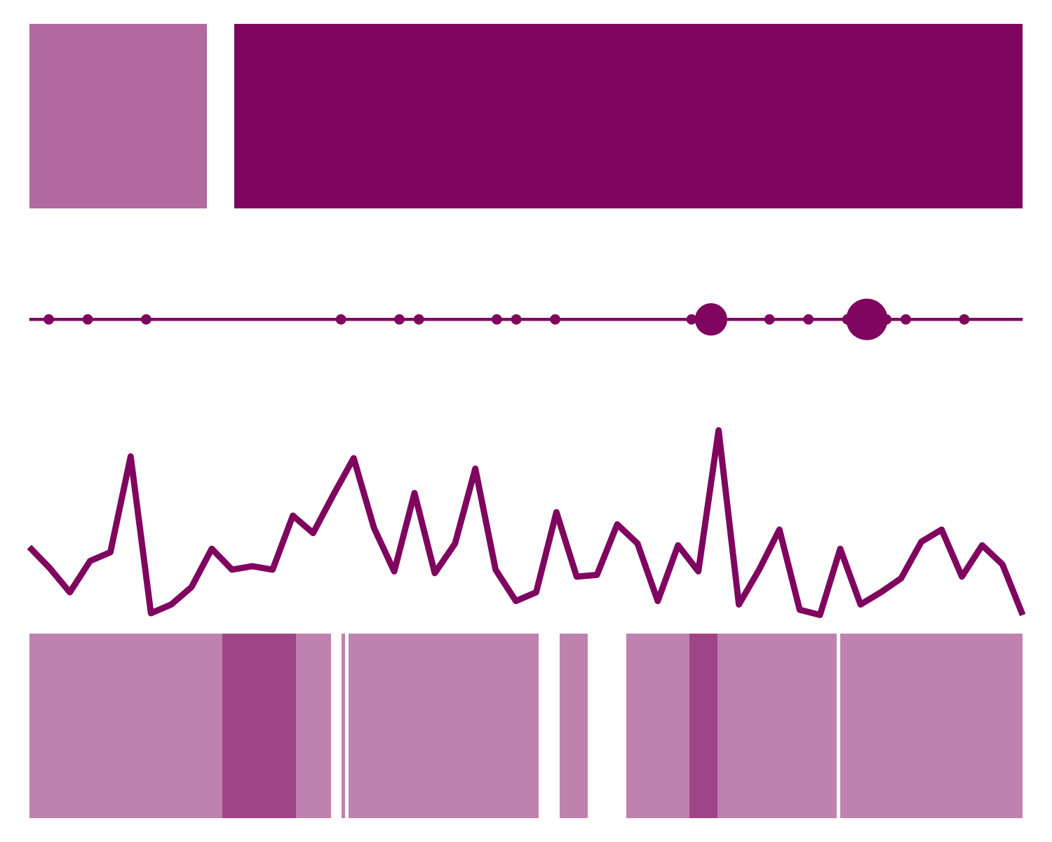
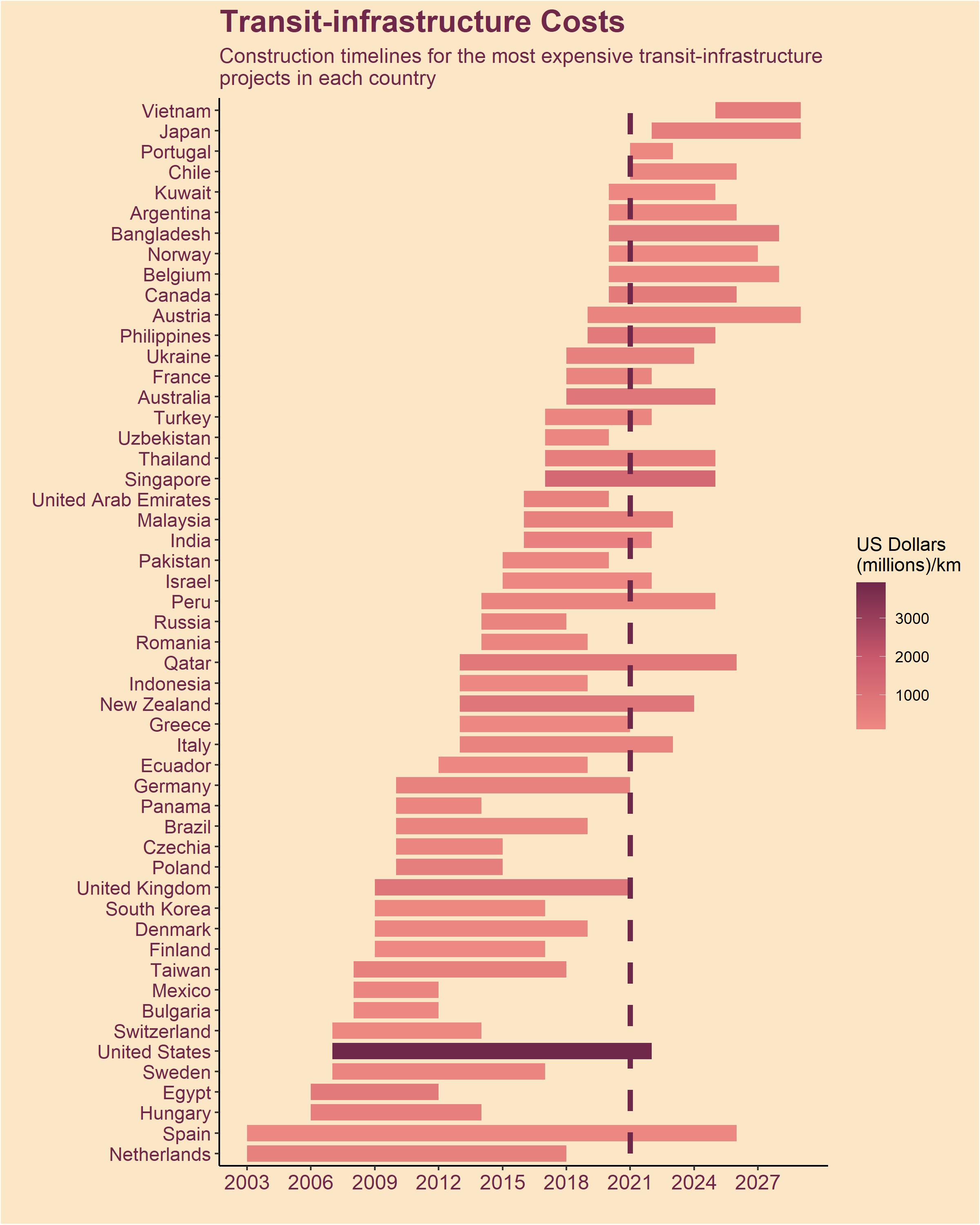
Here’s one more (very abstract) chart summarising my year in data visualisation 👇 Can you guess what the four variables are?
Favourite things I’ve made
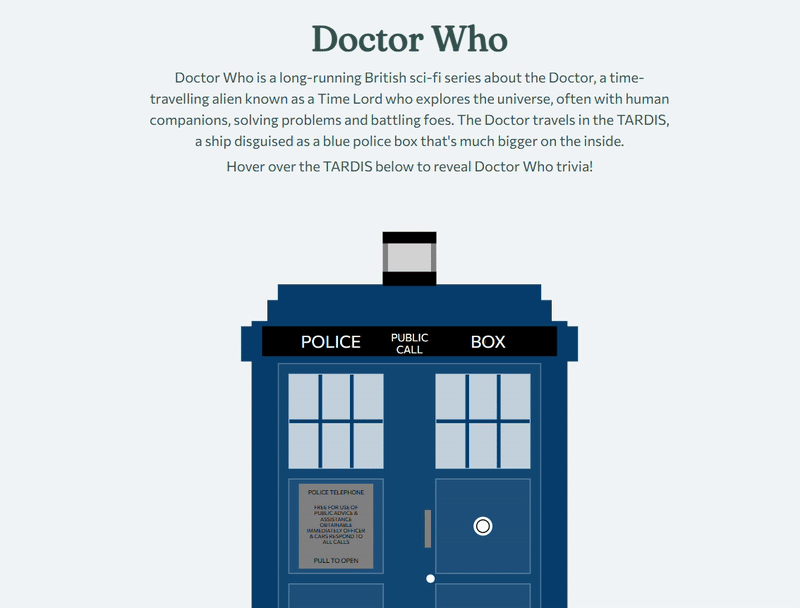
This one isn’t really a data visualisation as such, but building a TARDIS from scratch was fun project and I learnt a lot in the process. There are multiple datasets sitting behind this, specifying every rectangle, line, and letter - which were all populated by hand! Then I used D3 to actually build it and add the interactivity, which you can explore online. You can also read the blog post explaining how it was built.
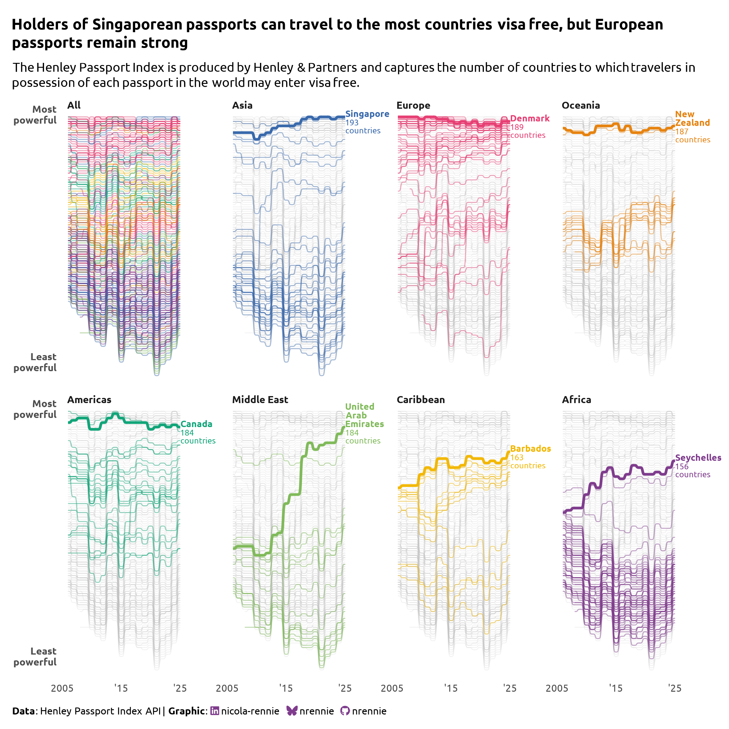
 In terms of more traditional data visualisations, one of my favourite ones to make was this small multiple chart of how passport strengths have changed over time in different continents. Although if I could change one thing, I’d switch the yellow for something with a bit more contrast!
Favourite things I’ve seen
These are a few of my favourite things (that are related to data visualisation and that I’ve seen for the first time in 2025):
The
ggplot2battles from Mike Lydeamore is one of the coolest things I’ve seen! It challenges users to recreate aggplot2chart as closely as possible using R code directly in their browser. It’s a really unique teaching resource, and it’s all powered by webR in the background!I’ve really enjoyed playing with SveltePlot so far, which brings the grammar of graphics to Svelte. The documentation is also incredibly good with a use gallery of examples and the accompanying code.
I absolutely love sketchy looking charts and have been using Rough.js for a while, so I’m really excited to see Making Plot Sketchy - an Observable Plot plugin to render Observable charts in Rough.js sketchy style!
Five years of TidyTuesday
The end of 2025 also marks five full years of TidyTuesday contributions for me!
Although TidyTuesday has been around since 2018, it was only in January 2021 that I started making charts every week and posting them on social media. Here’s the very first chart I made 👇
I don’t think I had any idea how long I’d keep going with TidyTuesday or how far it would take me. I certainly never expected to be sitting here having just finished writing a book about some of the charts I’ve made on those Tuesday evenings!
For me, TidyTuesday is first and foremost a place to play with data and learn new things - trying different programming languages (Python, Julia, JavaScript); figuring out how to make a new chart type; and playing with ideas to see what works. If you’re wondering whether or not to make and share something for TidyTuesday, I’d highly recommend it.
Here’s to another year of TidyTuesday in 2026!
What’s next in 2026?
I have quite a few talks and workshops already lined up for the first half of 2026 - with more details coming soon! Registration is open for Statistics for Every Body: Inclusive Data Communication for Audiences with Visual and Auditory Impairments which will take place online on Wednesday 28 January 2026, 12.00PM - 1.30PM (GMT) and is free to attend. Alongside other speakers, I’ll be talking about some practical tips for making visual outputs more accessible.
The print version of The Art of Data Visualization with ggplot2 will also be available in 2026 - keep your eyes peeled for further information!
Reuse
Citation
@online{rennie2025,
  author = {Rennie, Nicola},
  title = {My Year in Data Visualisation},
  date = {2025-12-09},
  url = {https://nrennie.rbind.io/blog/year-in-data-viz-2025/},
  langid = {en}
}