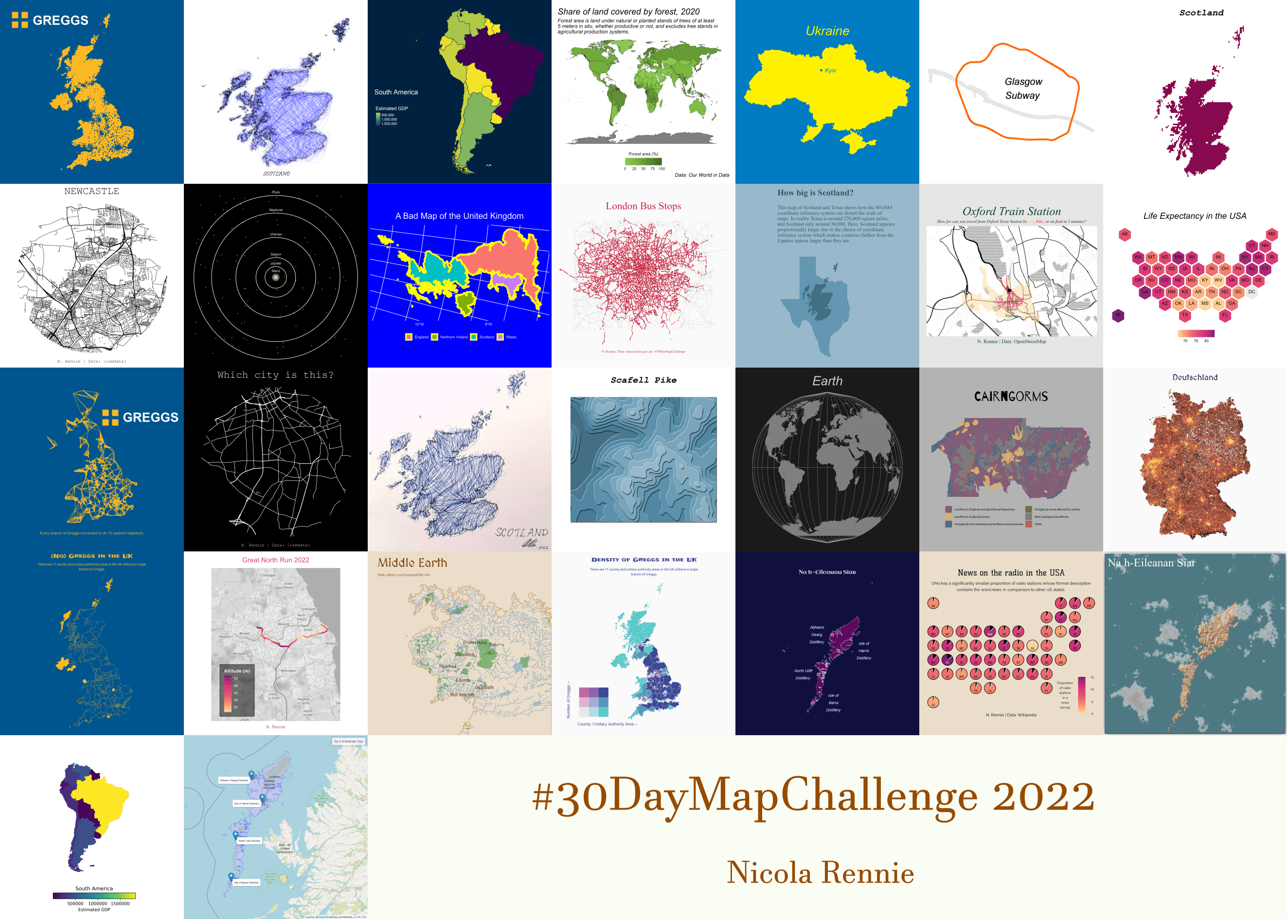
30 Day Map Challenge 2022
The #30DayMapChallenge is a daily mapping, cartography, and data visualization challenge aimed at the spatial community. Every day in November participants create a map with a given theme (e.g. red, movement, two colours) and share their results on social media using the #30DayMapChallenge hashtag. Check out the challenge here. This year, I created all 30 maps! You can view all of my maps and the code used to generate them on GitHub.
I also completed the challenge last year, and you can read my review of last year’s challenge in a blog post. Last year, I decided to create (almost) all of my maps with a theme of Scotland. This year, I did something slightly different: I decided to set myself a 15 minute time limit for each of my maps. Why did I decide to do this? Well…
- Having enough time can sometimes feel like a bit of a barrier to participating, especially when you see maps that look insanely beautiful and complicated shared on social media;
- Getting used to maps that aren’t quite perfect, and forcing myself to just leave the alone.
A few things that I found helpful with making maps within a 15 minute time limit:
- Re-using the same data source multiple times, saves time looking for 30 data sources;
- Using R packages for data or built-in data sources, reduces time spent data wrangling since the data is more likely to be in a format you can already use;
- Appreciating a minimalist style. makes the goals more achievable.
R packages I used for the first time
Most of the maps I created during the challenge were made using R and, due to the time limit I set myself, I often found myself reaching for packages I was already familiar with. However, I did manage to try out a few new packages (and some new functions from packages I’d used before)! Here are a few of the highlights:
{tanaka}: the {tanaka} package implements the Tanaka method of plotting contour lines (a shaded contour lines method). I’d never used this package before, but I found the results increased the readability and interpretability of contour maps.
{stars}: the {stars} package is designed for working with raster and vector datacubes. I don’t often work with raster data (since file sizes tend to be larger), and this package made it easy to convert some data I’d already read in with {sf} into raster format. It also allows users to specify grid resolution, and compare how maps change under different resolutions!

render_clouds()from {rayshader}: renders a 3D floating cloud layer on a map. This one is mostly for fun - it definitely give maps a more realistic feeling.mapshot()from {mapview}: allows you to save an interactive {leaflet} map as a static image (for example as a PNG). {leaflet} is perfect for creating interactive maps but if you need a static screenshot of your map (for example to share it on social media), thenmapshot()is incredibly useful - no more using Print Screen!
Comparing R and Python
For the out of my comfort zone theme on day 29, I decided to start recreating my map from day 2 in Python instead of R. I have some experience of programming in Python but I haven’t done much plotting or mapping in Python (at least not for a very long time)!
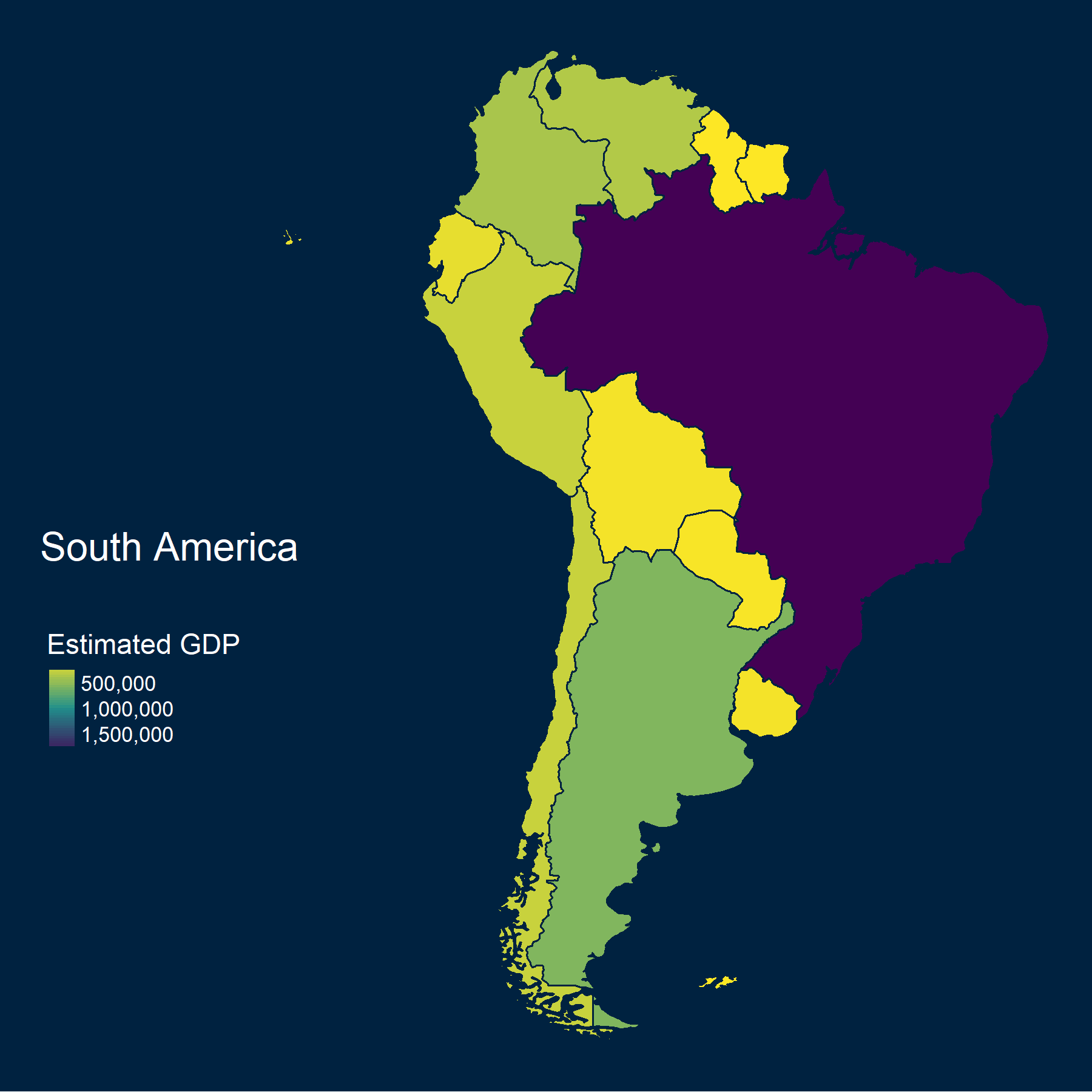
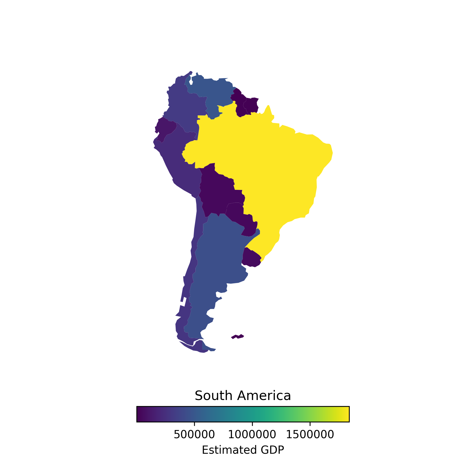
As you can see, the Python map isn’t quite so well styled as the R version - largely down to me being less familiar with Python and not getting quite as far in 15 minutes. There were a couple of similarities between the two languages which made converting the code to Python easier:
in-built {rnaturalearth} data which includes the polygons to plot the countries, and some data on each of the countries including GDP.
if I had used base R instead of {tmap} for the R version, I think the overall plotting code would have been more similar. Much like {ggplot2}, {tmap} adds layers to the plot. In Python, most of the plotting work occurs inside
sa.plot(), which feels somewhat analogous toplot()in R.
library(tmap)
library(viridis)
sa <- rnaturalearth::ne_countries(
  scale = "medium",
  continent = "south america",
  returnclass = "sf"
)
tm_shape(sa) +
  tm_polygons(
    col = "gdp_md_est",
    style = "cont",
    pal = viridis(3, direction = -1),
    title = "Estimated GDP"
  ) +
  tm_style("cobalt") +
  tm_layout(
    title = "South America",
    frame = FALSE,
    title.position = c("left", "center"),
    legend.position = c(0.02, 0.3)
  )
import geopandas as gpd
import matplotlib.pyplot as plt
from mpl_toolkits.axes_grid1 import make_axes_locatable
world = gpd.read_file(gpd.datasets.get_path('naturalearth_lowres'))
sa = world[(world.continent=="South America")]
plt.figure()
fig, ax = plt.subplots(1, 1)
divider = make_axes_locatable(ax)
cax = divider.append_axes("bottom", size="5%", pad=0.5)
sa.plot(column='gdp_md_est',
ax=ax,
legend=True,
cax=cax,
cmap='viridis',
legend_kwds={'label': "Estimated GDP",
'orientation': "horizontal",
'pad': 0.01,
'fmt': '%f'})
plt.title('South America')
ax.axis('off')
plt.ticklabel_format(useOffset=False, style='plain')
plt.show()My favourite map
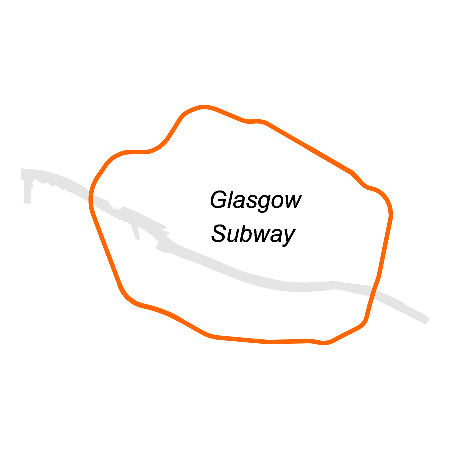
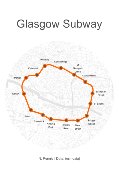
The map that I enjoyed the most, was this minimalist version of the Glasgow subway for the “network” theme. My initial idea for this map was to recreate the Glasgow subway logo which has a very simplified version of the subway as the main image. I obtained the data from OpenStreetMap using the {osmdata} package, and the data turned out to be a little bit more complicated than I expected: it gave me some extra parts of the subway tracks I wasn’t expecting, the river polygons split in different places, and the stations data was different from the station entrances data. Lots of small issues that meant the data wrangling took up a little bit more time.
I ended up spending a bit more time on this, and finishing it off. You can also see the process of making the map, which I recorded using the {camcorder} package!
Resources
The Geocomputation with R book is an excellent reference for getting started in working with spatial data in R - and it’s freely available online!
The R package I use most often for manipulating and visualising spatial data is {sf}. It’s compatible with the {tidyverse} suite of packages, which means I can use functions from {dplyr} for data wrangling, and {ggplot2} for mapping. The Spatial Data Science book provides a nice introduction.
Look out for another blog post coming soon, where I’ll discuss my favourite packages for spatial data in R!
Final thoughts
I definitely learnt a few new ways to visualise spatial data in the last 30 days, including some new packages and functions. Thanks to Topi Tjukanov for creating this challenge a few years ago, and well done to everyone who participated in this year’s challenge whether you made one or thirty maps in November!
Reuse
Citation
@online{rennie2022,
  author = {Rennie, Nicola},
  title = {30 {Day} {Map} {Challenge} 2022},
  date = {2022-11-30},
  url = {https://nrennie.rbind.io/blog/30-day-map-challenge-2022/},
  langid = {en}
}