30 Day Map Challenge 2021
The #30DayMapChallenge is a daily mapping, cartography, and data visualization challenge aimed at the spatial community. Every day in November participants create a map with a given theme (e.g. population, monochrome, raster) and share their results Twitter using the #30DayMapChallenge hashtag. Check out the challenge here.
Although I’ve been creating data visualisations for a while, I don’t normally have that many opportunities to work with spatial data. This year, I created all 30 maps (see below). You can view all of my maps (and the code used to generate them) at: github.com/nrennie/30DayMapChallenge.
Finding and processing data
One of the things that set the 30 Day Map Challenge apart from other data visualisation challenges I’ve participated in (like TidyTuesday, for example) was the lack of data. Not only did the challenge involve making 30 maps, it also involved deciding what to map and finding the relevant data. To make this part a little less intimidating, I focused most of my maps around Glasgow, Scotland, and the UK. This meant I could use the same base maps multiple times, and sometimes the same data. Unlike challenges where data is provided, most of the data I found “in the wild” wasn’t in a nice format. For example, I also learnt how to read in .tif and .asc files, and convert them into a format that R would understand.
Useful and interesting packages
Most of my maps were created using R, with the exception of days 14 and 15, which used Tableau and some watercolour paints (separately!). Although I’m very familiar with R and its various data visualisation tools, I discovered a number of new packages that I hadn’t used before. A few highlights:
For plotting:
{roughsf}: an R package for plotting spatial objects in a hand-drawn, sketch style.{rayshader}: an R package for producing (realistic) 2D and 3D data visualizations in R using elevation data.{rcartocolor}: a set of discrete and continuous colour palettes with colourblind friendly options.{MapColoring}: an R package for assigning colors to polygon maps such that no two adjacent features have the same color, while using a minimal number of colors.
For data:
{osmdata}: an R package for downloading and using data from OpenStreetMap.{osrm}: an R package for OSRM (a routing service based on OpenStreetMap data) which computes routes, trips, isochrones and travel distances and times.{rgeoboundaries}: an R package for the geoBoundaries API, providing country political administrative boundaries.{elevatr}: an R package which provides elevation data from Amazon Web Services Terrain Tiles, Open Topography Global Datasets, and the USGS Elevation Point Query Service.
My Favourite Map
My favourite map from the challenge was Day 9 (monochrome). This is a circular map of the roads and streets in Glasgow with data obtained from the {osmdata} package. I really liked the simplicity of this map, and that you can clearly see the river in the negative space, even without explicitly plotting it.
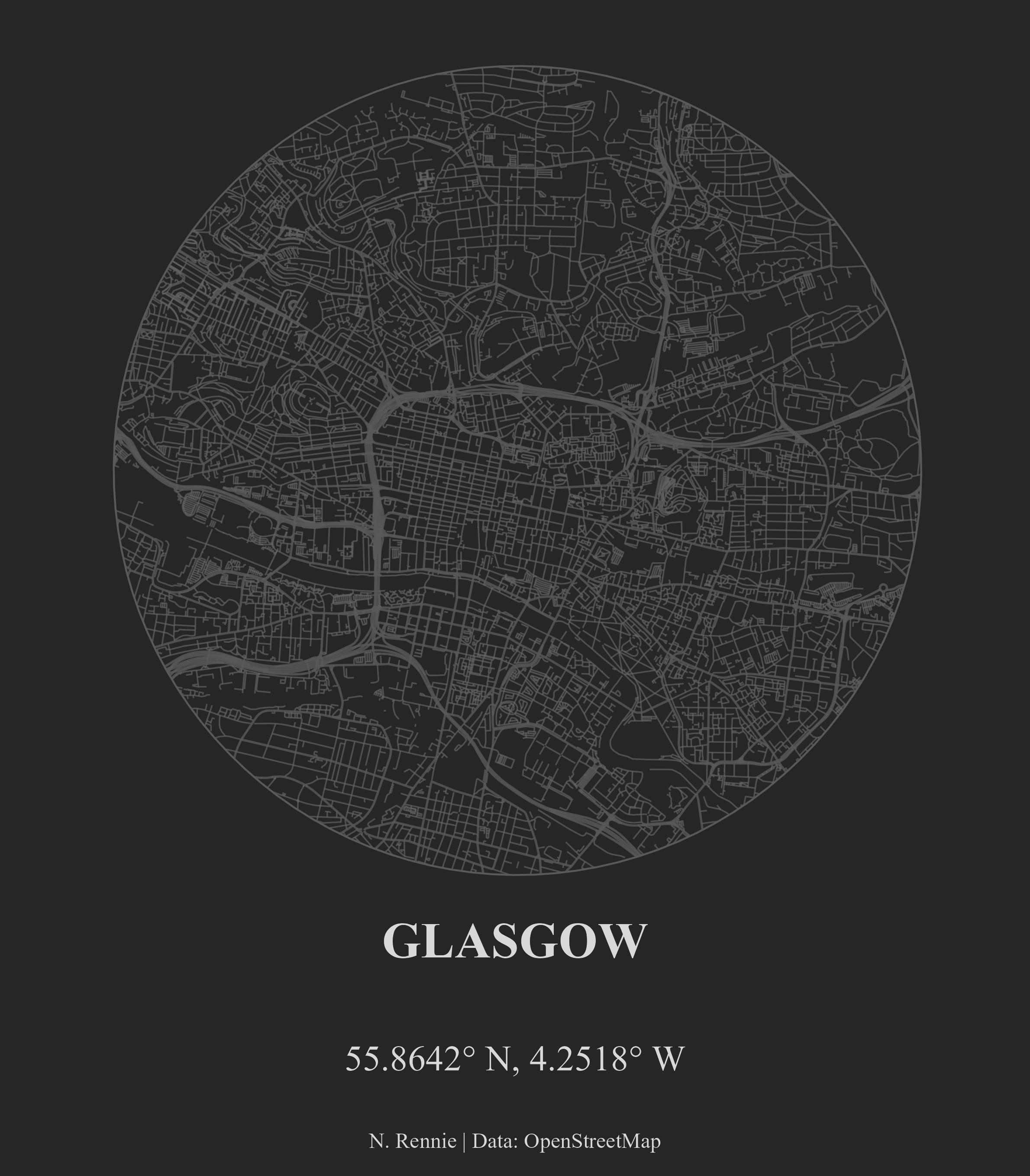
This one was mostly inspired by Abdoul Madjid. This was the first time I’d looked at intersections between different spatial objects (something I’d been meaning to learn for a while). Being restricted to monochrome colours also meant I didn’t spend too much time thinking about colour palettes, and could instead focus on the data.
Favourite Maps on Twitter
I saw so many cool maps in November, and it’s impossible to list them all, but here are a few I really liked:
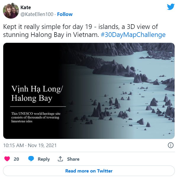
Day 19 (Islands) by Kate Ellen
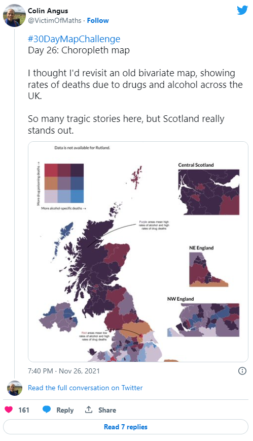
Day 26 (Choropleth) by Colin Angus
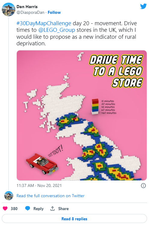
Day 20 (Movement) by Dan Harris
Final thoughts
I definitely learnt a lot of new ways to visualise spatial data in the last 30 days, including some new packages. I also learnt a lot about Glasgow, and the country I was born in through exploring new sources of data. Next year, I’d like to be more selective about which days to participate in. Rather than creating a map for the sake of ticking off a day, I’d like to spend more time on each individual map and delve a bit deeper into some of the new packages I find.
Thanks to Topi Tjukanov for creating this challenge a few years ago, and well done to everyone who participated in this year’s challenge whether you made one or thirty maps in November.
Reuse
Citation
@online{rennie2021,
  author = {Rennie, Nicola},
  title = {30 {Day} {Map} {Challenge} 2021},
  date = {2021-12-01},
  url = {https://nrennie.rbind.io/blog/30-day-map-challenge-2021/},
  langid = {en}
}