The data visualisation specialist approach to TidyTuesday
Data Visualisation
R
In this informal and interactive session, I’ll be live coding a TidyTuesday data visualisation, and sharing some tips for better R workflows and more effective charts.
Links
- https://github.com/nrennie/tidytuesday
- https://nrennie.rbind.io/tidytuesday-shiny-app/ (webR powered Shiny app so can take a little while to load)
- https://github.com/nrennie/templates
- https://github.com/rfordatascience/tidytuesday
- https://github.com/idmn/ggview
- https://jakubnowosad.com/rcartocolor/
- https://github.com/bothness/twin-cities (original data)
Code
```{r}
# Load packages -----------------------------------------------------------
library(tidyverse)
library(showtext)
library(ggtext)
library(nrBrand)
library(glue)
library(ggview)
library(rcartocolor)
library(ggiraph)
# Load data ---------------------------------------------------------------
tuesdata <- tidytuesdayR::tt_load("2026-05-12")
cities <- tuesdata$cities
links <- tuesdata$links
# Load fonts --------------------------------------------------------------
font_add_google("Oswald")
font_add_google("Nunito")
showtext_auto()
showtext_opts(dpi = 300)
title_font <- "Oswald"
body_font <- "Nunito"
# Define colours and fonts-------------------------------------------------
bg_col <- "#F2F4F8"
text_col <- "#151C28"
highlight_col <- "#7F055F"
continents <- unique(cities$continent)
col_palette <- rcartocolor::carto_pal(n = length(continents), "Safe")
names(col_palette) <- continents
# Data wrangling ----------------------------------------------------------
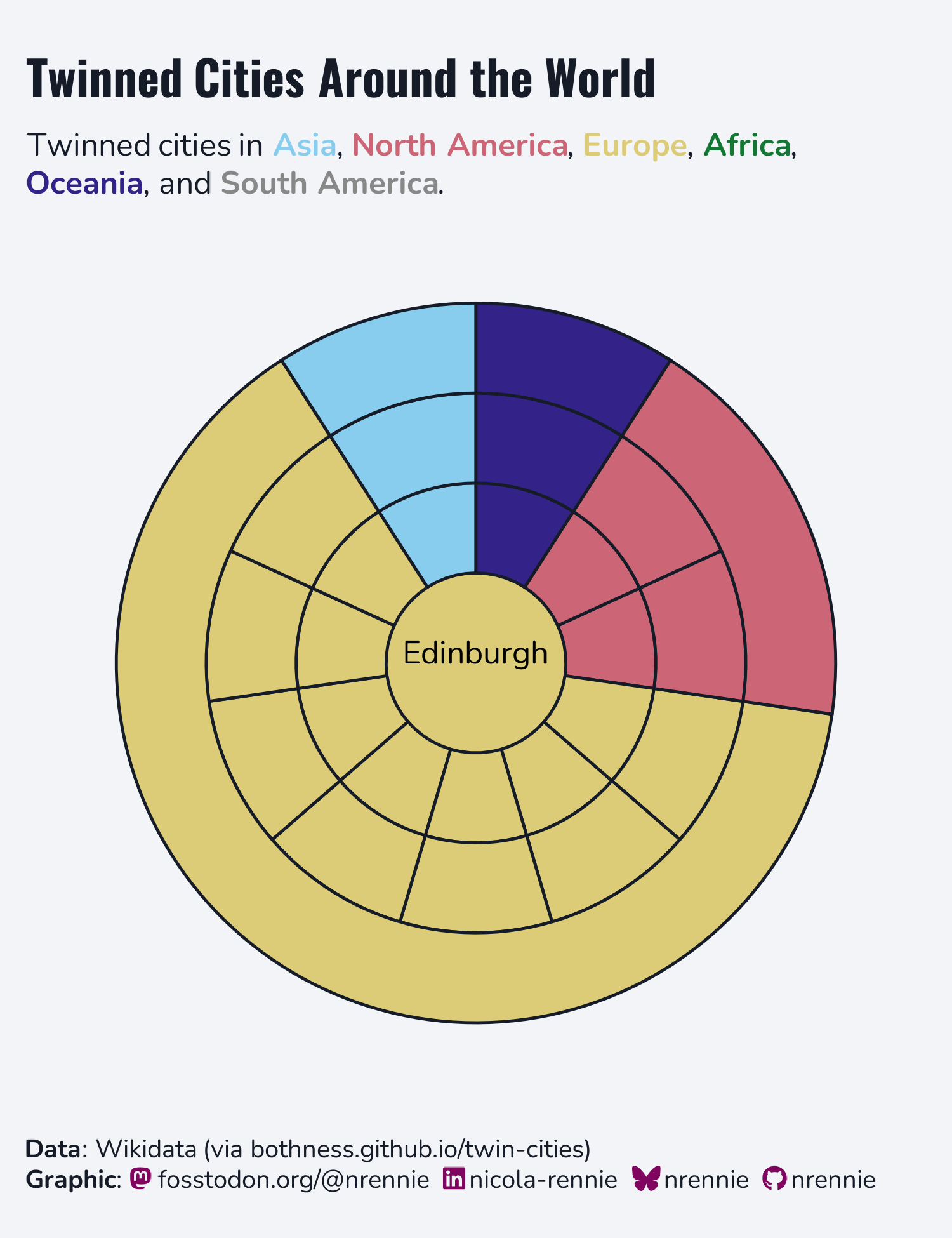
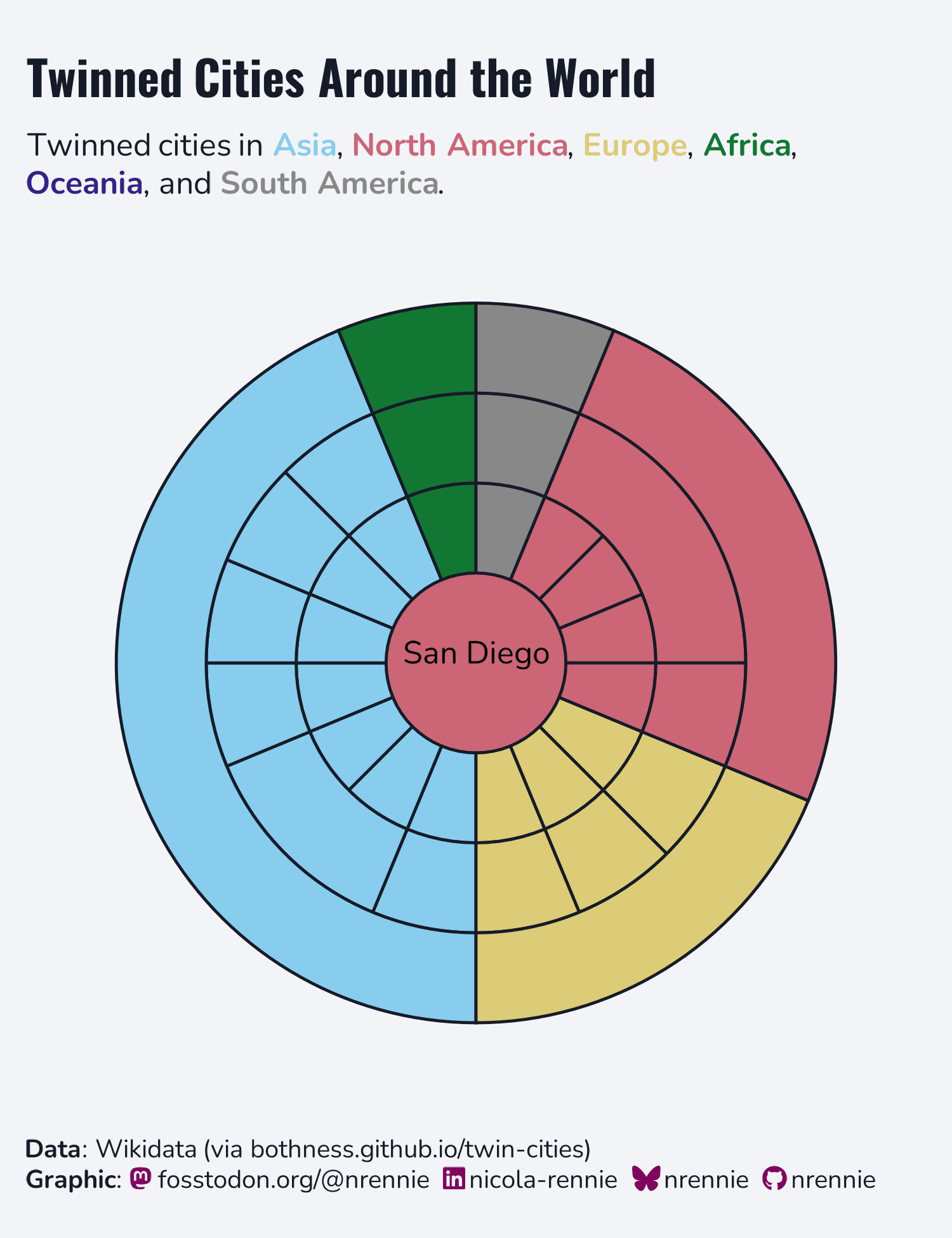
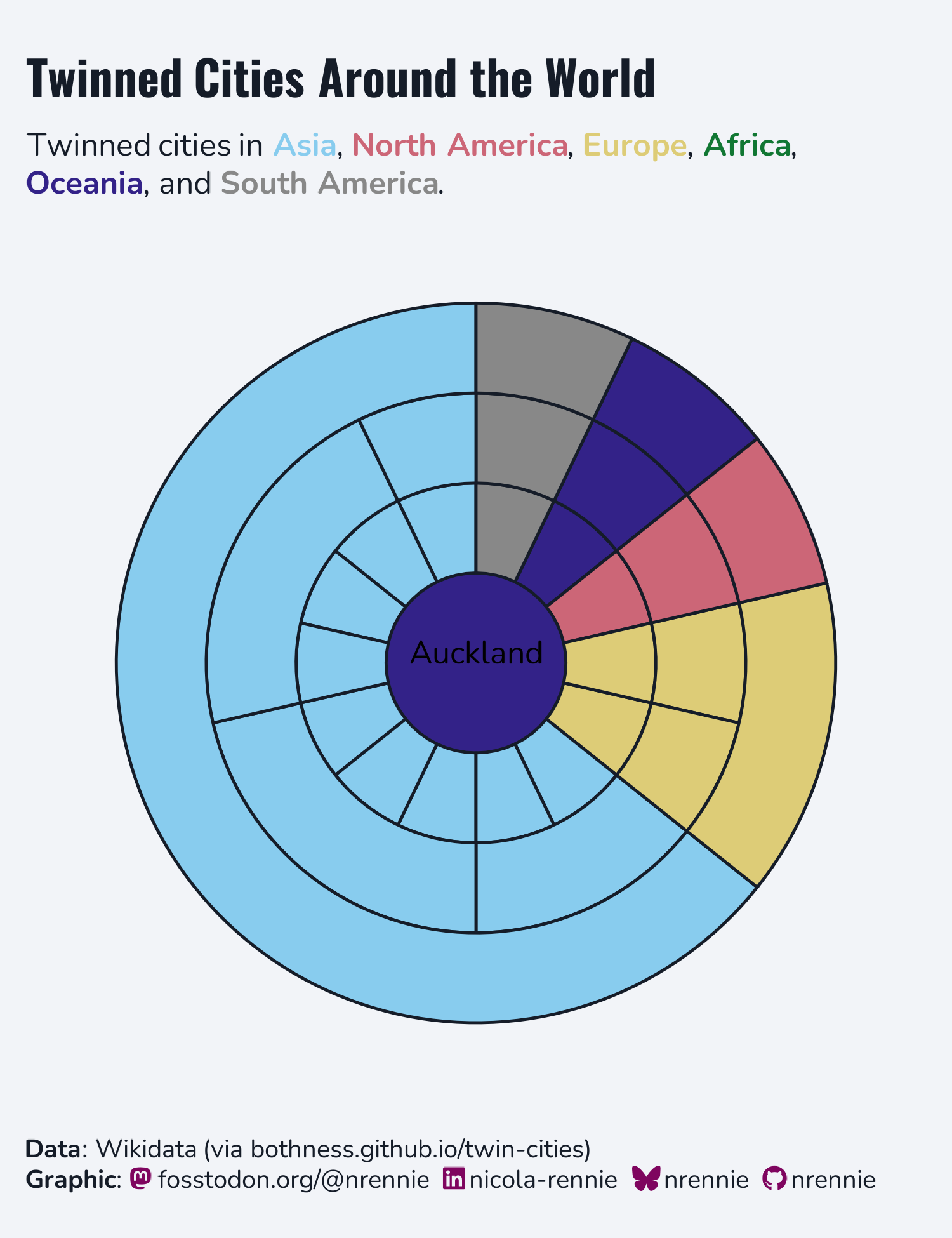
chosen_city <- "Edinburgh"
city_id <- cities |>
filter(name == chosen_city) |>
pull(id)
plot_data <- links |>
filter(source == city_id | target == city_id) |>
mutate(
id = if_else(
source == city_id, target, source
)
) |>
select(id) |>
left_join(
cities, by = "id"
) |>
rename(city = name)
# Define text -------------------------------------------------------------
social <- nrBrand::social_caption(
bg_colour = bg_col,
icon_colour = highlight_col,
font_colour = text_col,
font_family = body_font
)
title <- "Twinned Cities Around the World"
st_cols <- purrr::map_chr(
.x = 1:length(col_palette),
.f = ~glue("<span style='color: {col_palette[.x]}'>**{names(col_palette)[.x]}**</span>")
) |>
str_flatten(collapse = ", ", last = ", and ")
st <- paste0("Twinned cities in ", st_cols, ".")
cap <- source_caption(source = "Wikidata (via bothness.github.io/twin-cities)", graphic = social)
# Plot --------------------------------------------------------------------
region_data <- function(region) {
output <- plot_data |>
group_by({{ region }}) |>
mutate(n = n()) |>
ungroup() |>
select({{ region }}, n, continent) |>
distinct()
return(output)
}
ggplot() +
geom_col(
data = filter(cities, name == chosen_city),
mapping = aes(x = nrow(plot_data), y = "0", fill = continent),
width = 1
) +
geom_col_interactive(
data = region_data(city),
mapping = aes(x = n, y = "1", fill = continent, tooltip = city),
colour = text_col,
width = 1
) +
geom_col(
data = region_data(country),
mapping = aes(x = n, y = "2", fill = continent),
colour = text_col,
width = 1
) +
geom_col(
data = region_data(continent),
mapping = aes(x = n, y = "3", fill = continent),
colour = text_col,
width = 1
) +
annotate("text", x = 0, y = "0", label = chosen_city, vjust = 2) +
scale_fill_manual(values = col_palette) +
labs(subtitle = st,
title = title,
caption = cap) +
coord_radial(expand = FALSE) +
theme_void(base_size = 12, base_family = body_font) +
theme(
legend.position = "none",
plot.margin = margin(5, 10, 5, 10),
plot.title.position = "plot",
plot.caption.position = "plot",
plot.background = element_rect(fill = bg_col, colour = bg_col),
panel.background = element_rect(fill = bg_col, colour = bg_col),
plot.title = element_textbox_simple(
colour = text_col,
hjust = 0,
halign = 0,
margin = margin(b = 5, t = 5),
family = title_font,
face = "bold",
size = rel(1.5)
),
plot.subtitle = element_textbox_simple(
colour = text_col,
hjust = 0,
halign = 0,
margin = margin(b = 5, t = 5),
family = body_font
),
plot.caption = element_textbox_simple(
colour = text_col,
hjust = 0,
halign = 0,
margin = margin(b = 0, t = 10),
family = body_font
),
strip.text = element_textbox_simple(
face = "bold",
margin = margin(t = 10),
size = rel(0.9)
),
panel.grid.minor = element_blank()
) +
canvas(
width = 5, height = 6.5,
units = "in", bg = bg_col,
dpi = 300
) -> p
# Save --------------------------------------------------------------------
save_ggplot(
plot = p,
file = file.path("2026", "2026-05-12", paste0("20260512", ".png"))
)
```
Other contributions
Here are links to some other visualisations of the same data that I’ve spotted so far:
- https://bothness.github.io/twin-cities/
- https://bsky.app/profile/mitsuoxv.bsky.social/post/3mlnv3lrpm22q
- https://bsky.app/profile/fiserkarel.bsky.social/post/3mlntfhcrpc2c
- https://bsky.app/profile/afrikaniz3d.bsky.social/post/3mlnrdv67ns2d
- https://bsky.app/profile/mothsailor.bsky.social/post/3mlnkcrkvgc2g
- https://bsky.app/profile/manishdatt.com/post/3mlnk4cbmrk2k
- https://bsky.app/profile/deepalikank.in/post/3mlmya2mwsc2l
- https://bsky.app/profile/victorhartman.bsky.social/post/3mllyqh6gvk2j
- https://bsky.app/profile/cborstell.bsky.social/post/3mljejjityk23
- https://bsky.app/profile/kindsoul3.bsky.social/post/3mljdc5xlgs2l
You can join the Posit Data Science Lab every Tuesday at 12pm ET / 9am PT at pos.it/dslab.