Examples
We’ll be using some of the built-in datasets from
ggplot2 in these examples, so we’ll load the package
here:
Visualising distributions
If you have only continuous variable and you want to visualise the distribution, for example:
mpg |>
  ggauto(displ)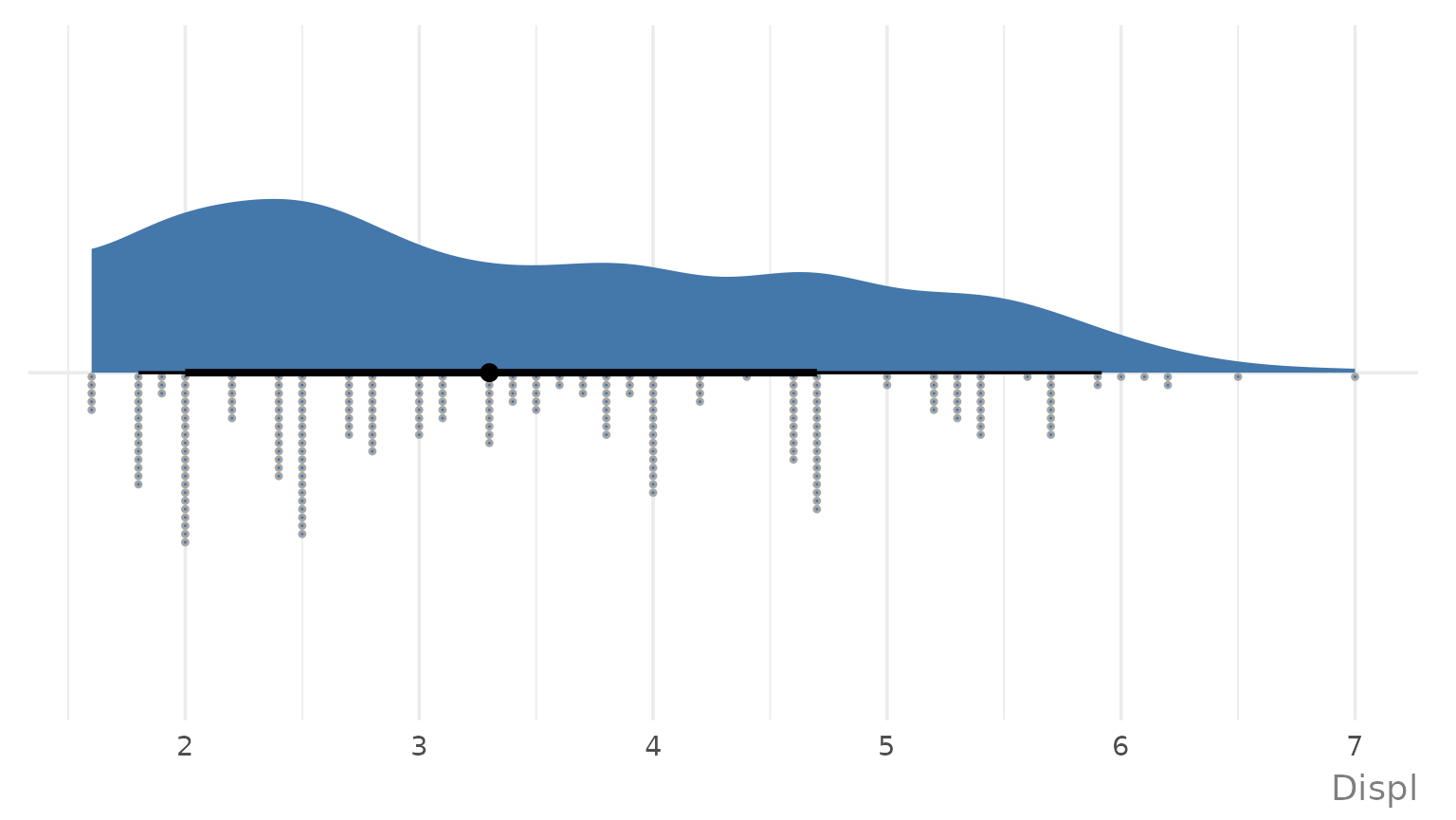
You can pass the data directly instead of using the pipe:
ggauto(mpg, displ)
Or pass it in as a vector:
ggauto(mpg$displ)
If you have multiple categories, and you want to visualise the distribution for each of them, i.e., you have one discrete variable, and one continuous variable, then multiple raincloud plots are produced.
mpg |>
  ggauto(drv, displ)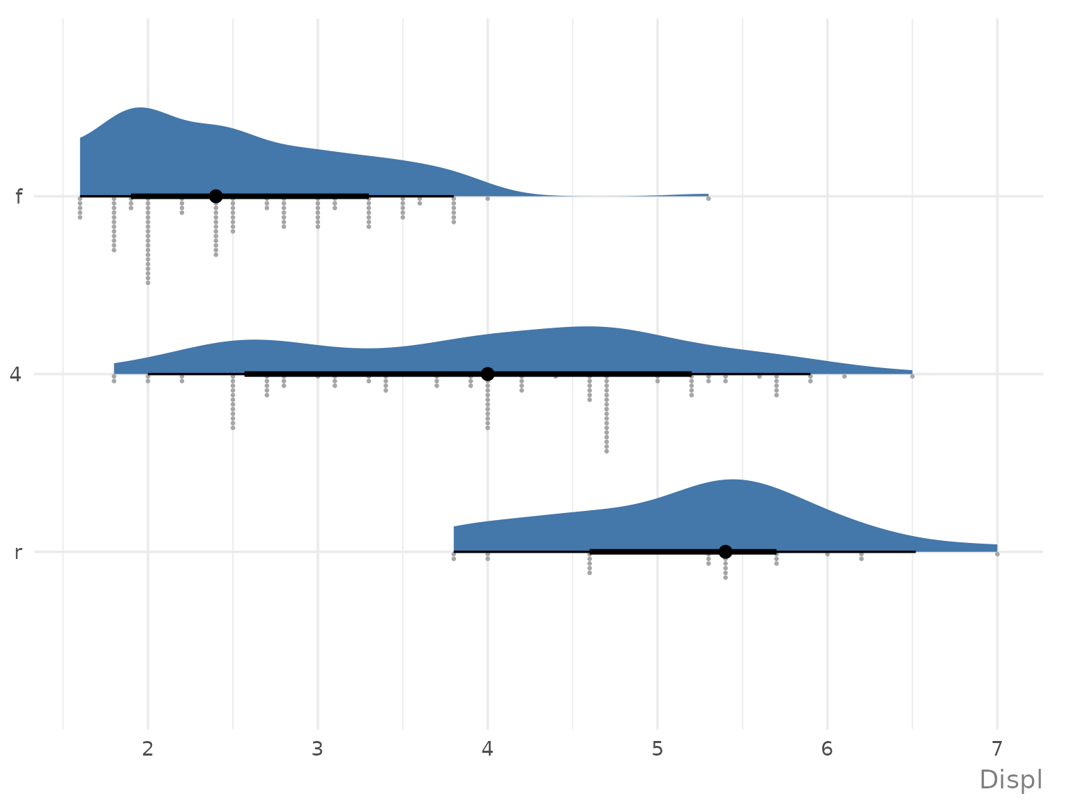
Visualising data over time
If you have a single variable to show over time, i.e., one date variable, and one continuous variable:
economics |>
  ggauto(date, unemploy)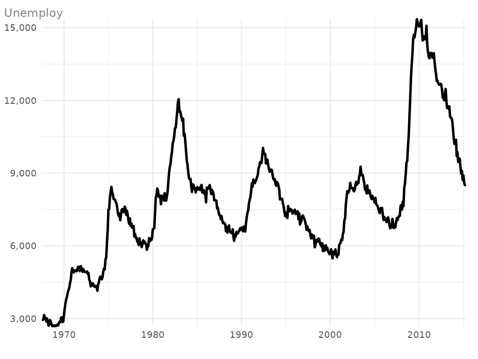
a line chart is produced.
If you need to show how multiple variables change over time, i.e., one date variable, continuous variable, and one discrete variable, the type of chart will depend on how many categories (unique values in the discrete variable) you have.
If you have 6 or fewer categories, a multi-line chart is created, with colours and symbols identifying the categories. Category labels are added at the end of each line automatically.
txhousing |>
  dplyr::filter(city %in% c("Houston", "Fort Worth", "San Antonio", "Austin")) |>
  dplyr::mutate(date = lubridate::ymd(paste0(year, "/", month, "/01"))) |>
  ggauto(date, sales, city)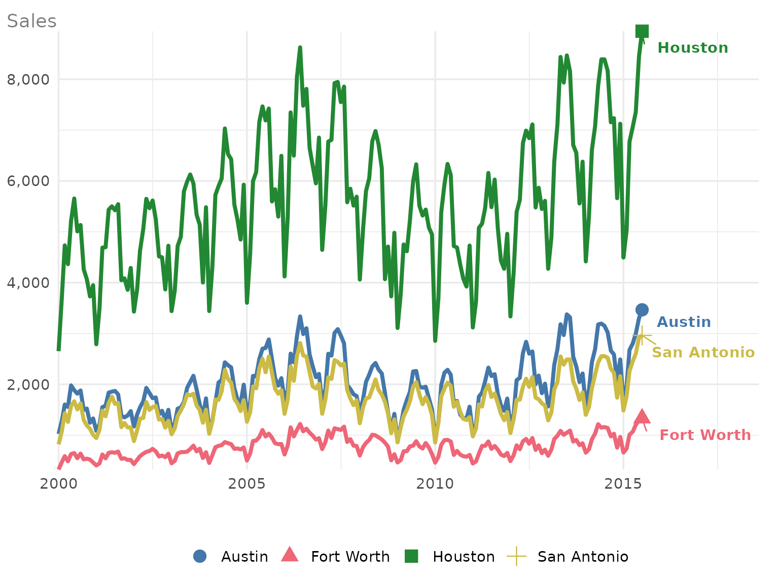
If you have more than 6 categories, the plot type changes to a faceted line chart, with one category highlighted on each facet:
txhousing |>
  dplyr::filter(city %in% c(
    "Houston", "Fort Worth", "San Antonio", "Austin",
    "Bay Area", "Dallas", "Paris", "San Angelo"
  )) |>
  dplyr::mutate(date = lubridate::ymd(paste0(year, "/", month, "/01"))) |>
  ggauto(date, sales, city)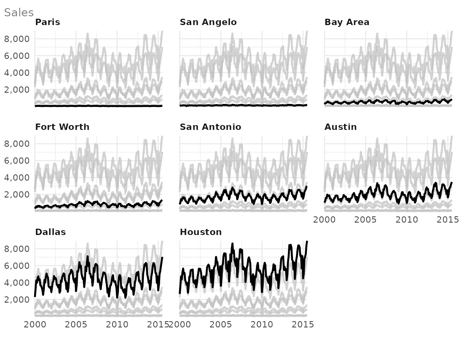
Visualising magnitudes and ranks
If you have a single discrete variable, a bar chart showing the counts of each category is created:
diamonds |>
  ggauto(cut)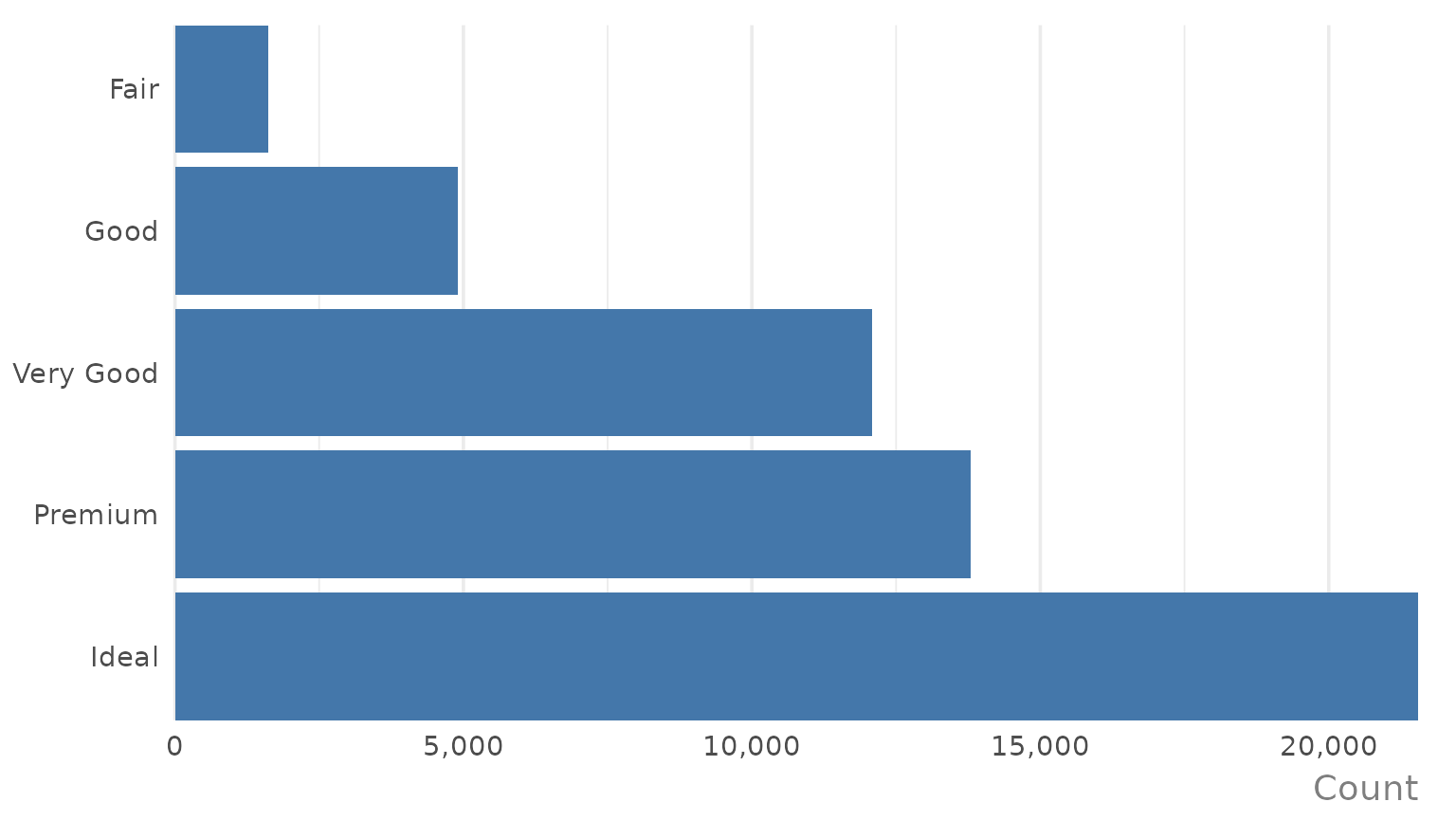
If you have pre-computed the counts or some other summary statistics, i.e., if you have one discrete variable, and one continuous variable with only a single value for each discrete variable, a bar chart of the values is created:
diamonds |>
  dplyr::group_by(cut) |>
  dplyr::summarise(median_price = median(price)) |>
  ggauto(cut, median_price)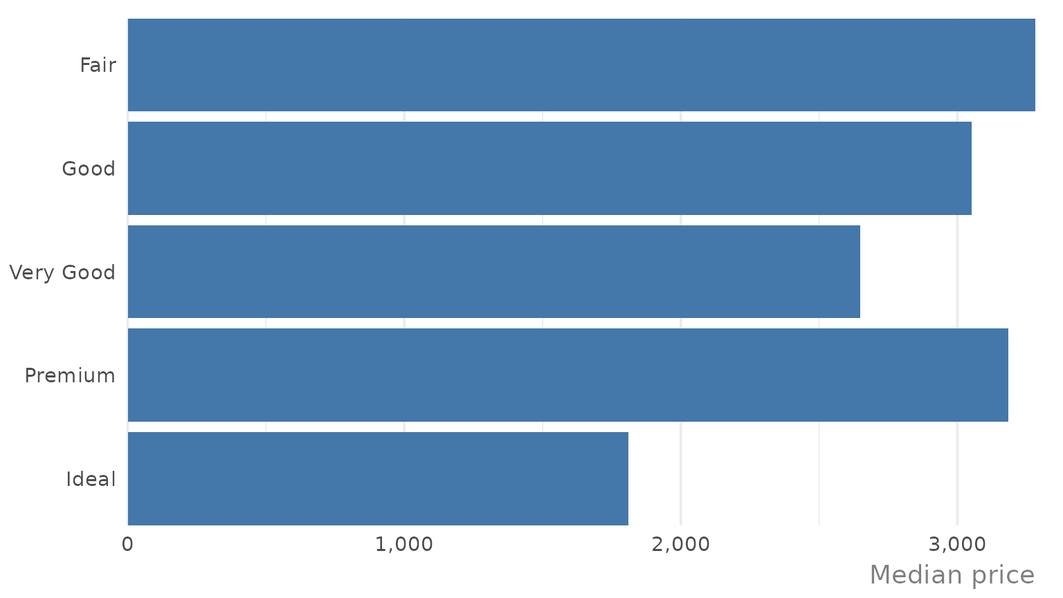
As you can see, when the discrete variable is a factor
(i.e. cut), the desired order is respected. If the discrete
variable is not a factor, the bars are ordered from highest to lowest
instead of the default alphabetical ordering:
diamonds |>
  dplyr::group_by(cut) |>
  dplyr::summarise(median_price = median(price)) |>
  dplyr::mutate(cut = as.character(cut)) |>
  ggauto(cut, median_price)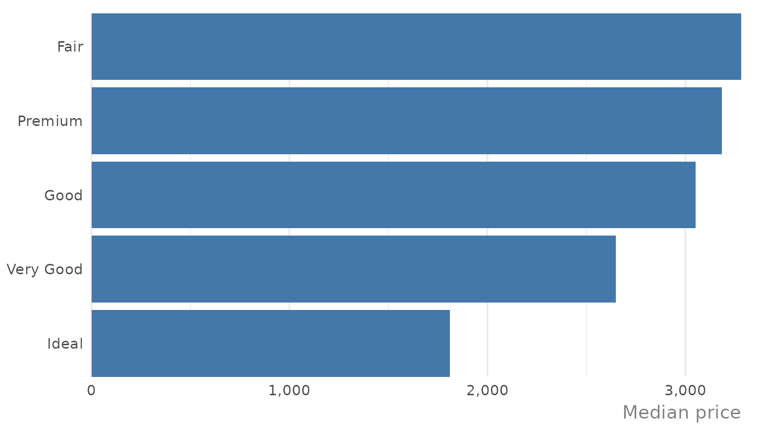
If you have two discrete variables, then a heatmap is created showing the count of each combination of categories. Labels are added showing the count.
mpg |>
  dplyr::mutate(cyl = as.character(cyl)) |>
  ggauto(cyl, drv)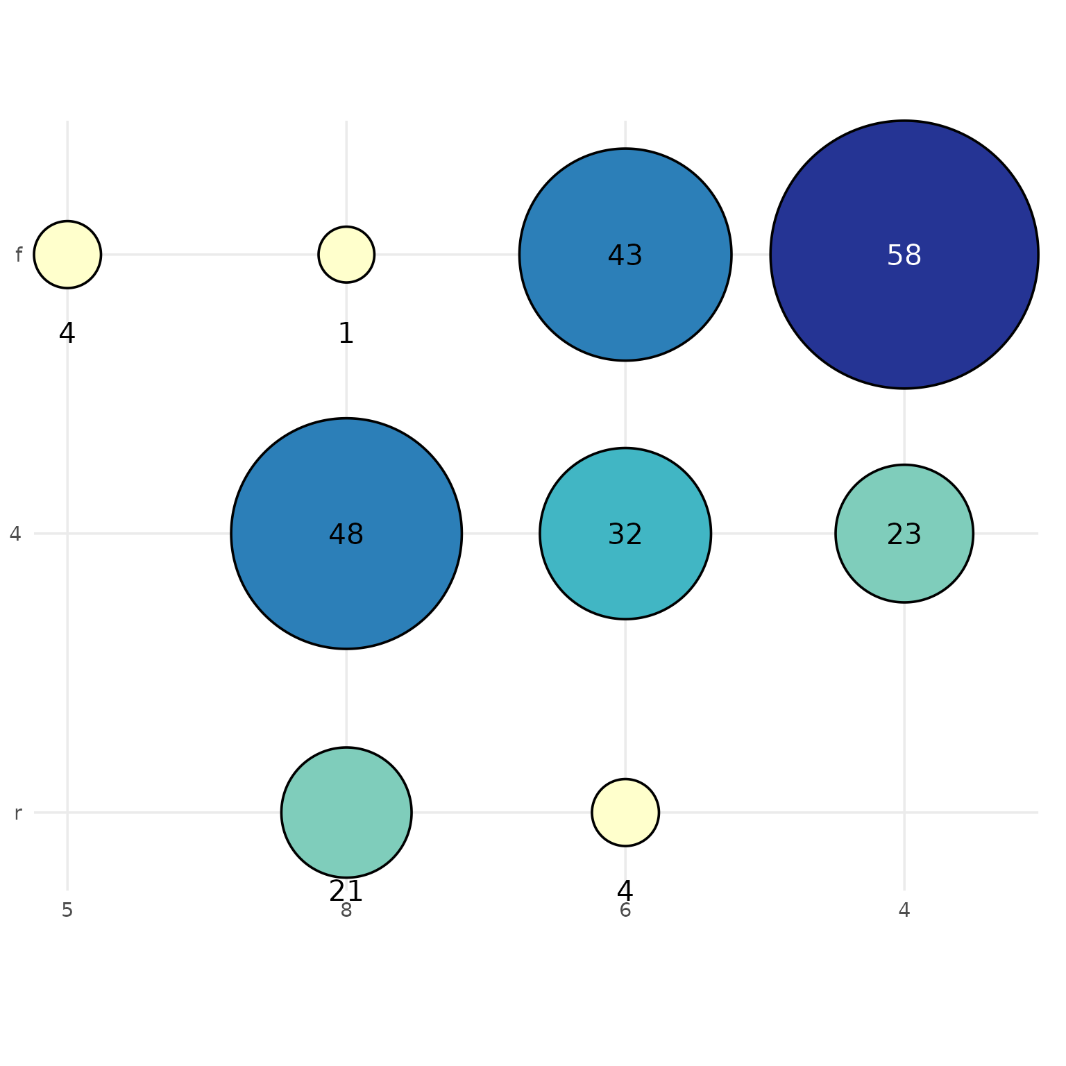
If there are more than 6 categories on either axis, labels are replaced with a legend:
mpg |>
  dplyr::mutate(cyl = as.character(cyl)) |>
  ggauto(trans, cyl)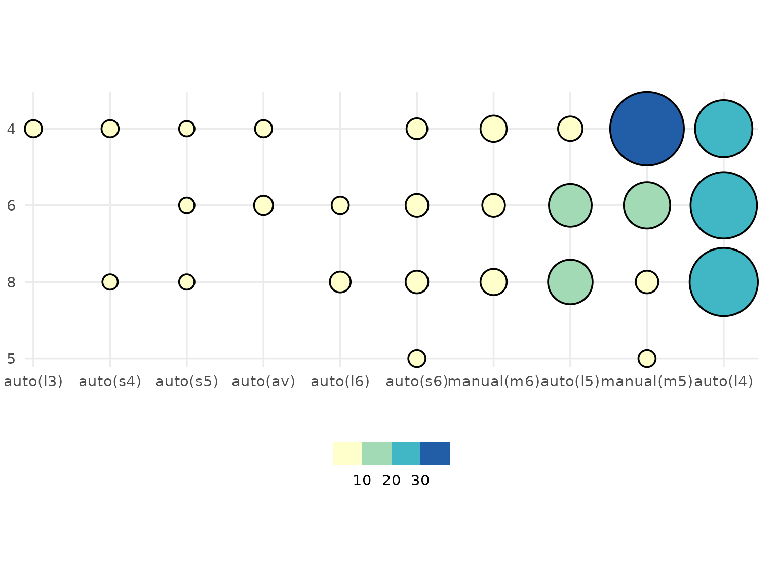
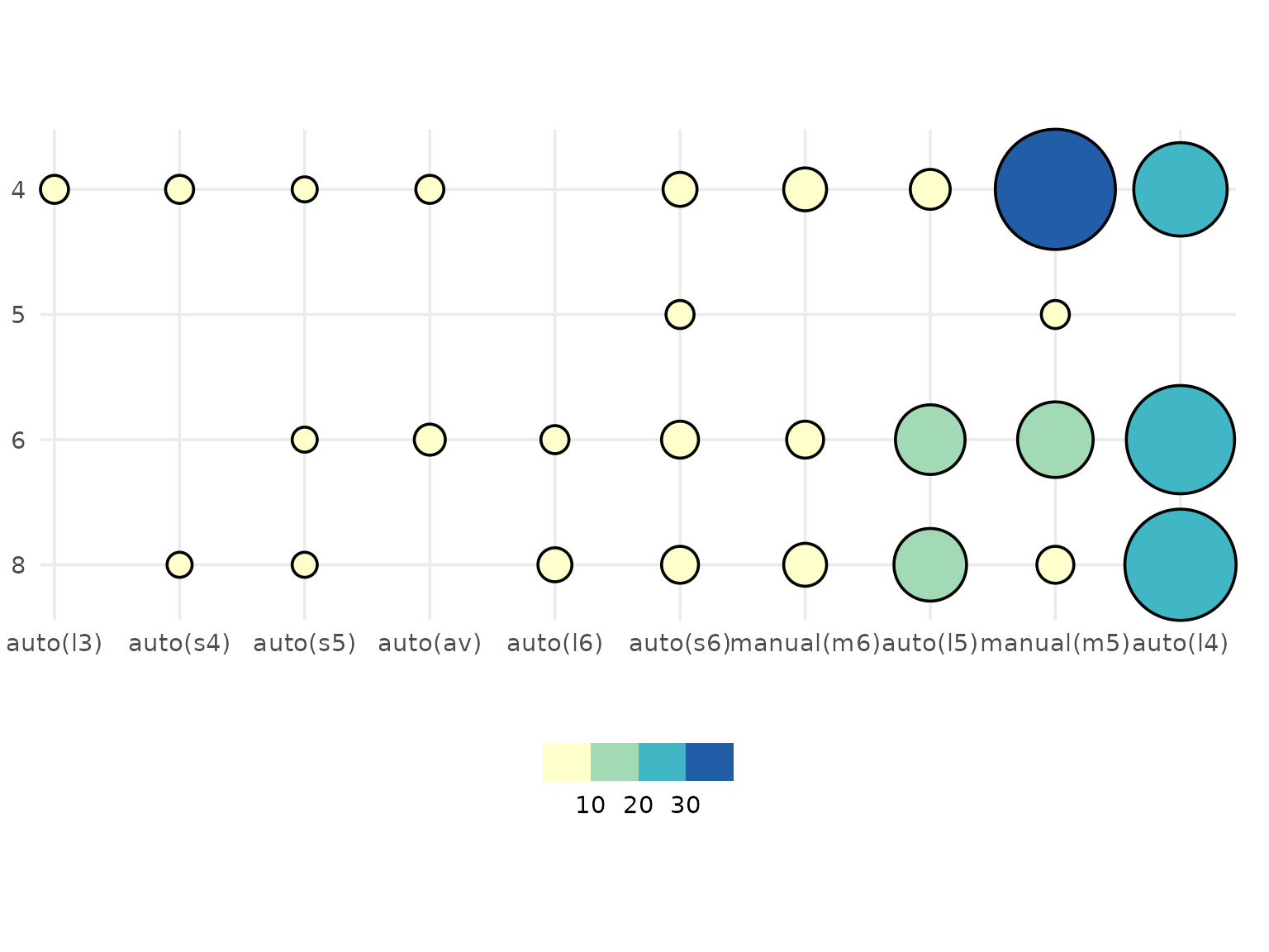
Again, if one or both of the discrete variables is a factor, then the order is respected:
If you have two discrete variables and a third continuous variable showing some summary statistic for each category combination, a heatmap showing that value is created. Labels are rounded to 2 decimal places.
mpg |>
  dplyr::mutate(cyl = as.character(cyl)) |>
  dplyr::group_by(cyl, drv) |>
  dplyr::summarise(mean_hwy = mean(hwy), .groups = "drop") |>
  ggauto(cyl, drv, mean_hwy)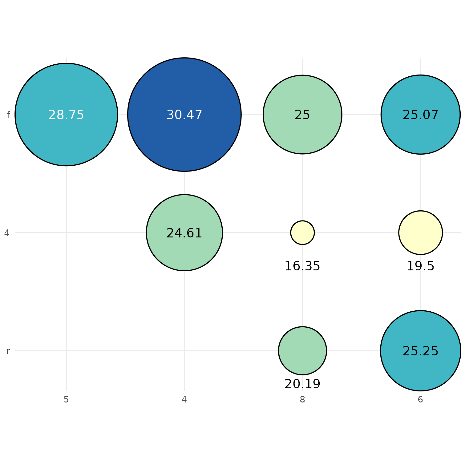
If there are multiple continuous values per combination of categories, and error is returned, asking you to first summarise the data:
mpg |>
  dplyr::mutate(cyl = as.character(cyl)) |>
  ggauto(cyl, drv, hwy)
#> Error in `ggauto()`:
#> ! Too many values per category. Summarise data first.
Visualising correlation
To show the correlation between two continuous variables:
mpg |>
  ggauto(displ, hwy)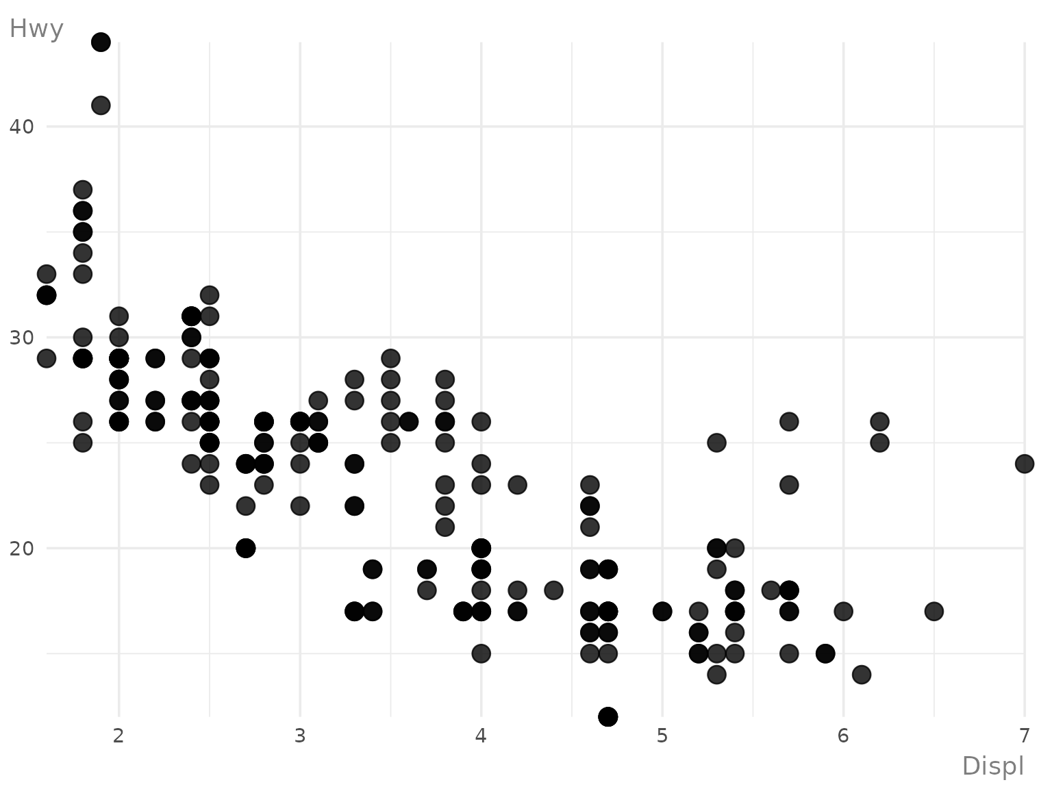
To show the correlation between two continuous variables, split by a third discrete variable, a scatter plot using colours and shapes is created:
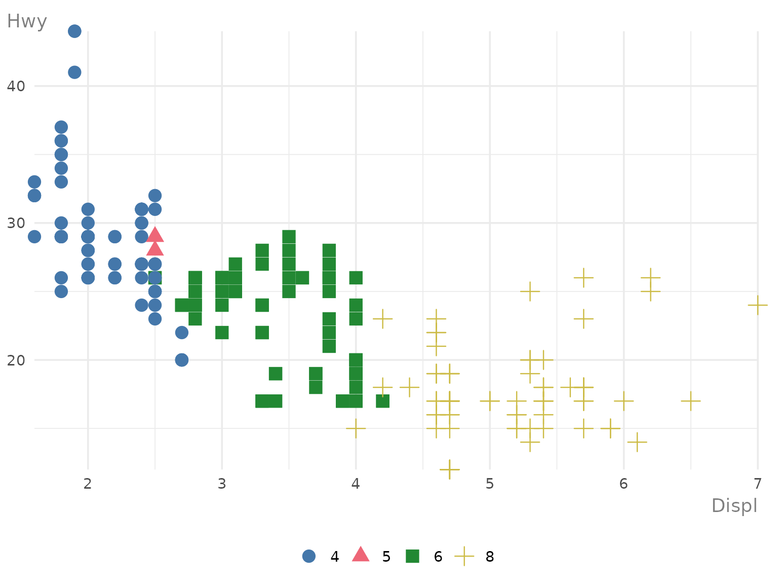
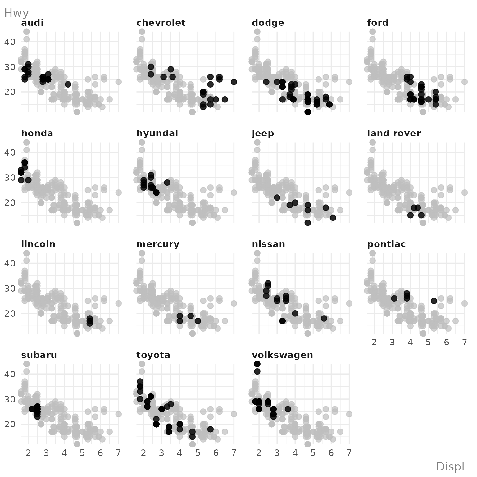
If you try to use more than 6 colours (categories), the chart type changes to a faceted scatter plot with one category highlighted on each facet:
Editing charts
Scales
For scatter plots, raincloud plots, and line charts, one or both of
the axes may be symmetric about 0 by default. This happens automatically
when 0 exists in the range of values. Since the output of
ggauto() is simply a ggplot2 chart, you can
override this if you don’t want it:
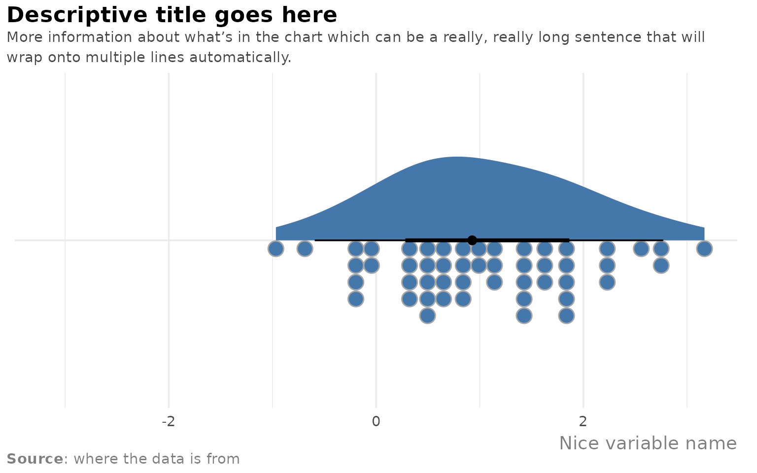
set.seed(123)
plot_data <- data.frame(
  v1 = rnorm(50, 1)
)
ggauto(plot_data, v1) +
  scale_x_continuous()
#> Scale for x is already present.
#> Adding another scale for x, which will replace the existing scale.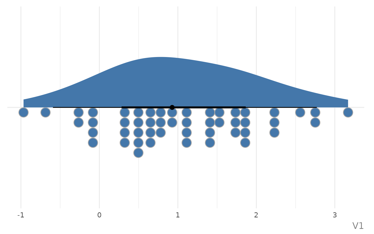
You’ll get a warning to say you are replacing the existing scale which you can ignore because it’s what you’re trying to do!
Similarly, you can edit the default colour/fill scales. However, the default palette is chosen to be accessible.
Text
You can a title, subtitle, caption, and labels with the
labs() function in ggplot2 as you normally
would, or directly using the same arguments in ggauto().
The latter is recommended as the arguments are used a little abnormally
to implement the styling. You can add markdown formatting into the
title, subtitle, or caption:
plot_data |>
  ggauto(v1,
    title = "Descriptive title goes here",
    subtitle = "More information about what's in the chart which can be a really, really long sentence that will wrap onto multiple lines automatically.",
    caption = "**Source**: where the data is from",
    xlab = "Nice variable name"
  )
By default, the x or y axis title is removed on chart types e.g. where the axis is a date or category and a further label stating that is unnecessary. Unless otherwise specified, the axis labels are clean versions of the column names where it’s parsed in sentence case, with underscores removed.
You can edit the size and family of the text using the
base_size and base_family arguments. Other
plot elements e.g. lines and points scale relative to the
base_size as well.