This site hosts a collection of my miscellaneous data visualisation projects. This home page includes all static charts, but you can also explore different interactive visualisations via the Interactive projects tab.
You can find other examples of my data visualisation work in my online gallery, and discussions of my process on my blog.
Static charts
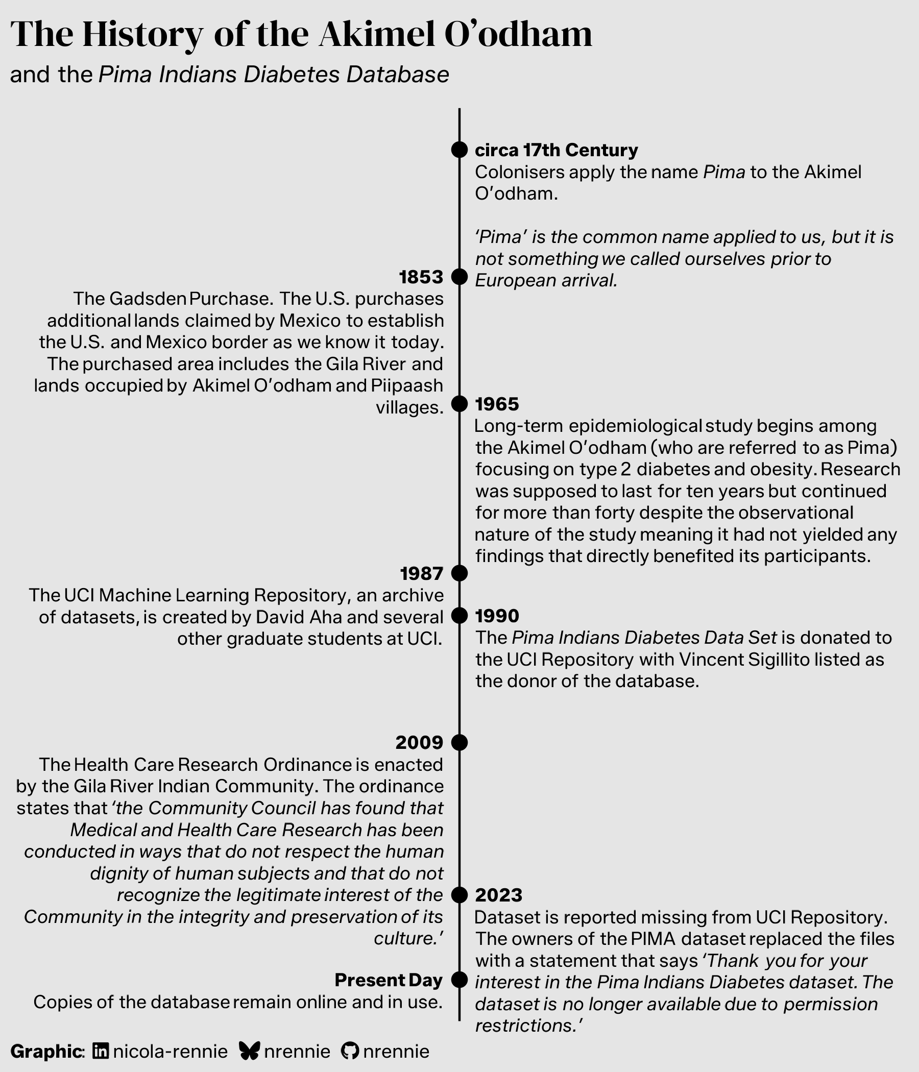
History of the Akimel O’odham
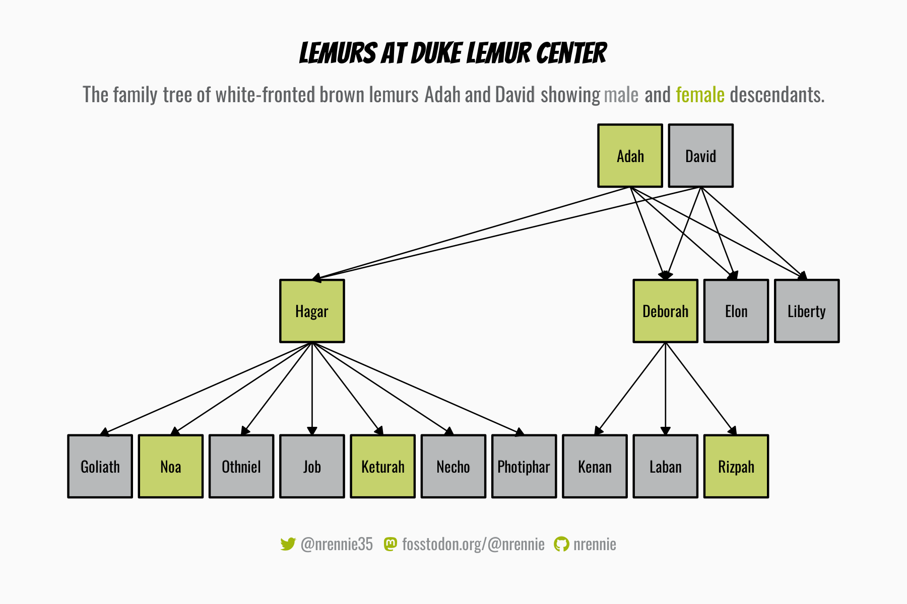
Lemur Family Tree
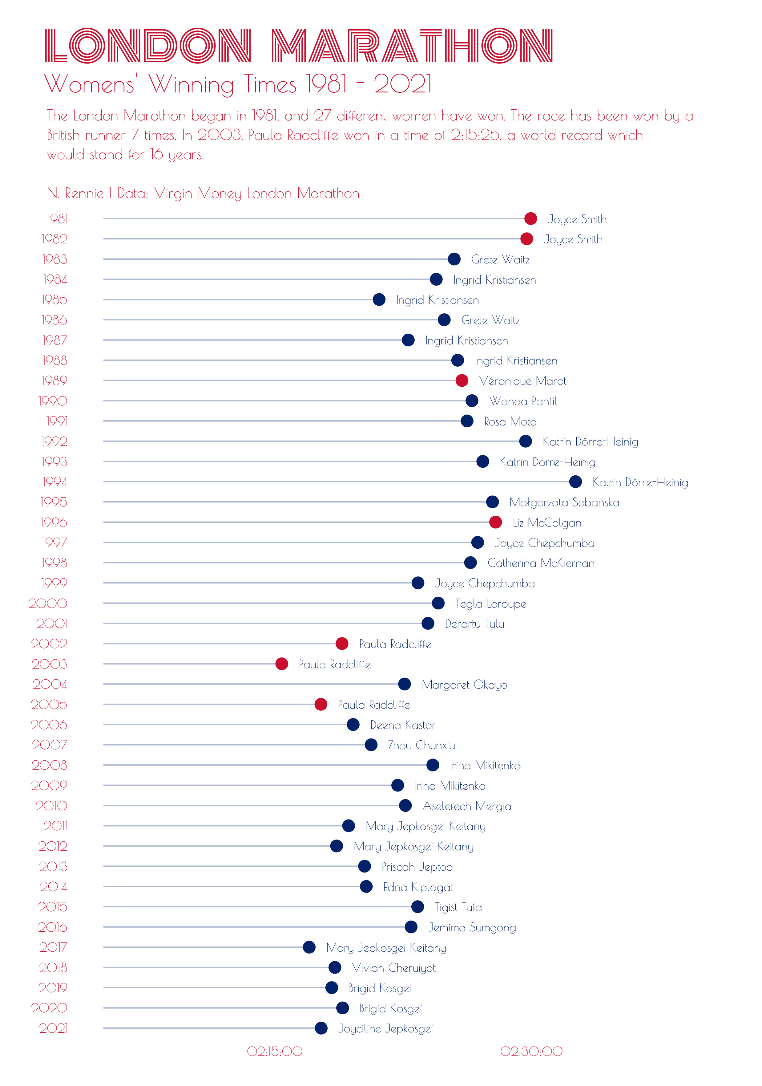
London Marathon
Nobel Prize Laureates

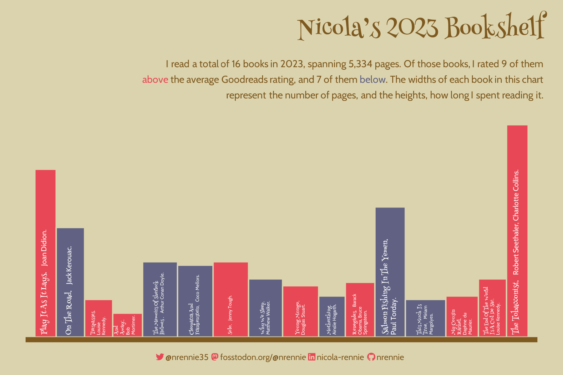
Reading Shelf
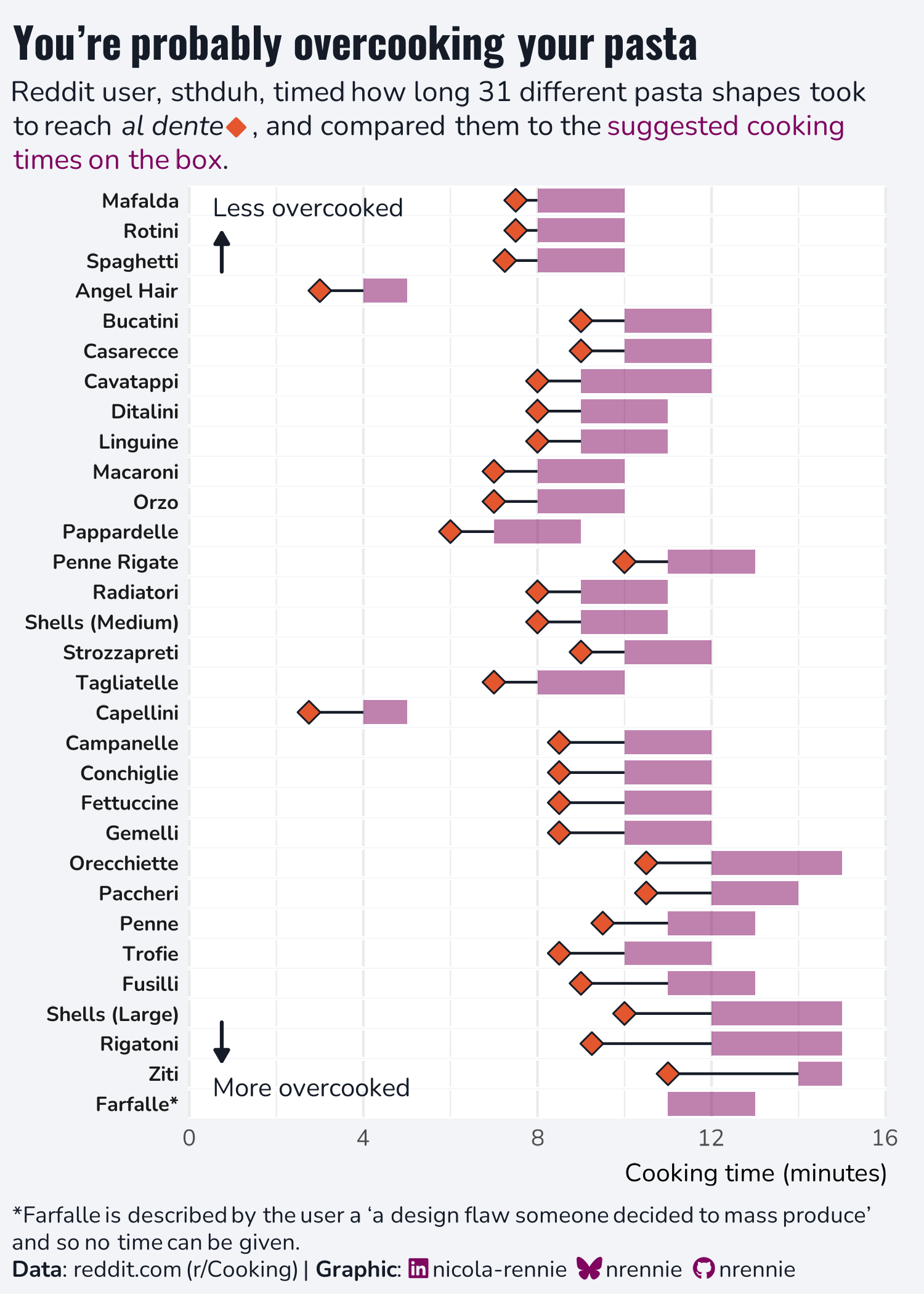
Reddit’s al dente pasta
Sea Surface Temperatures
Submitted for the European Space Agency Little Pictures competition.
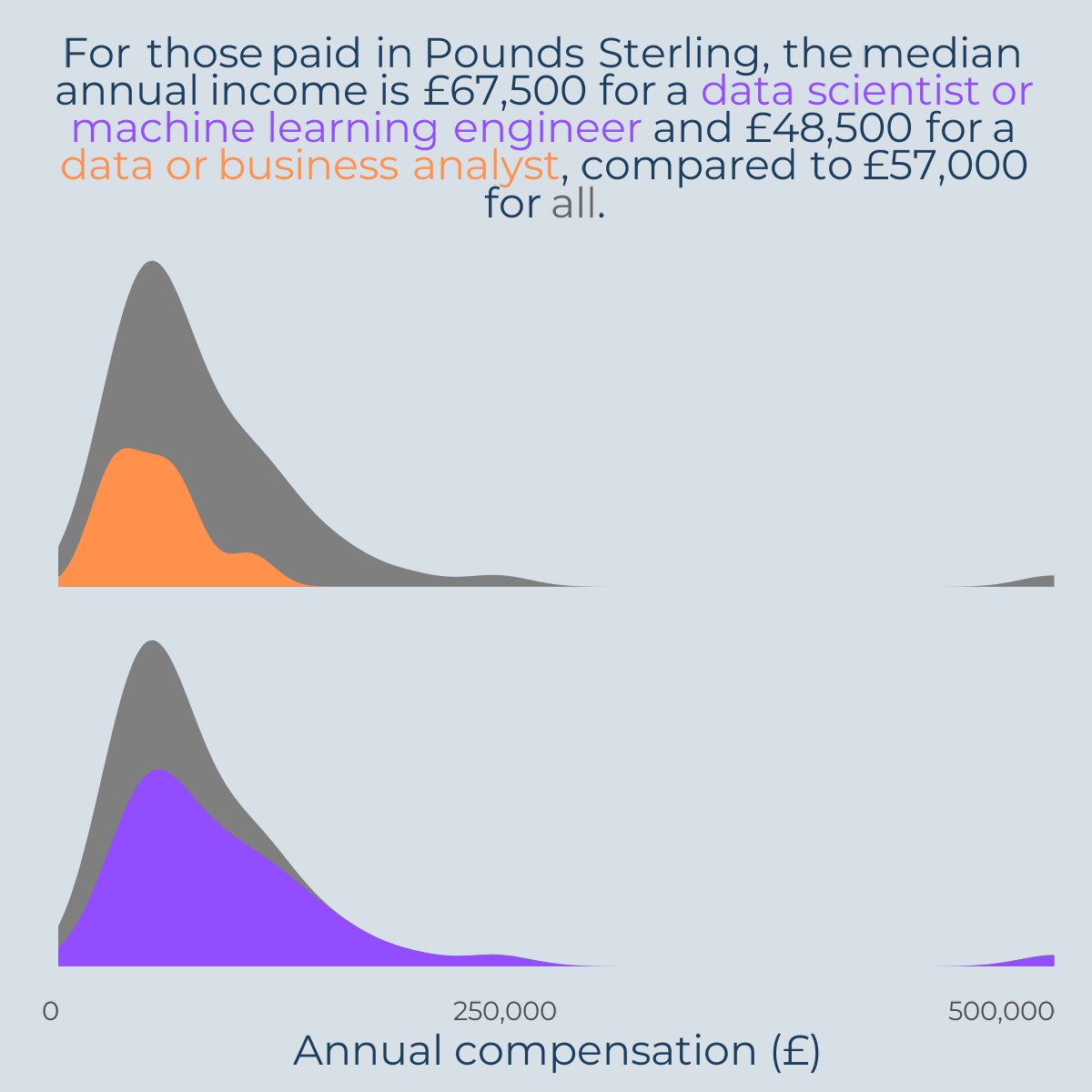
StackOverflow Survey

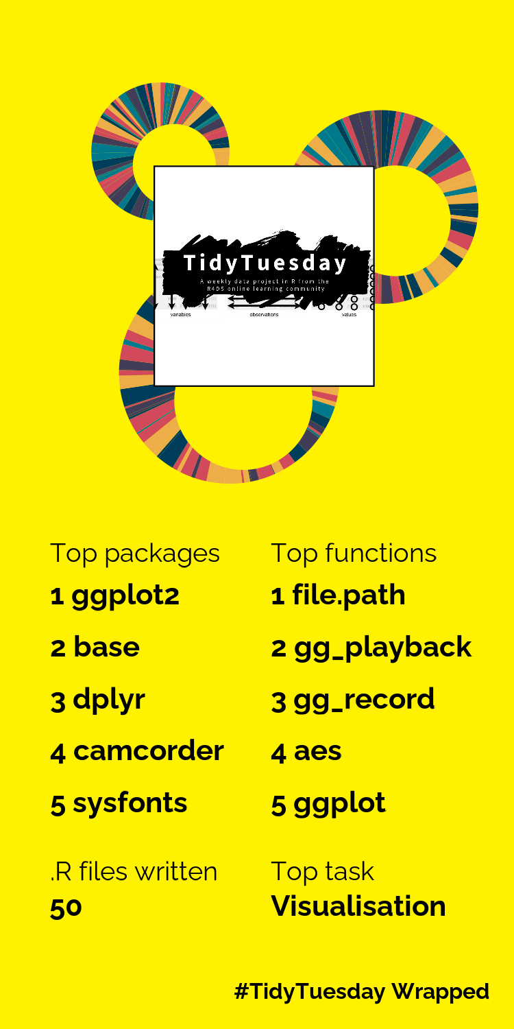
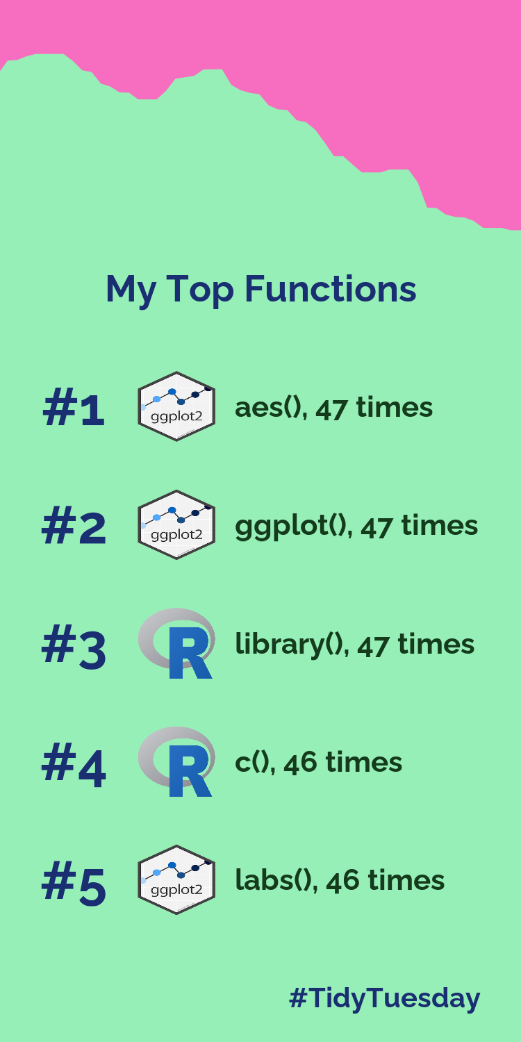
TidyTuesday Wrapped
Summary of my most used R functions and packages in TidyTuesday visualisations, inspired by Spotify Wrapped.
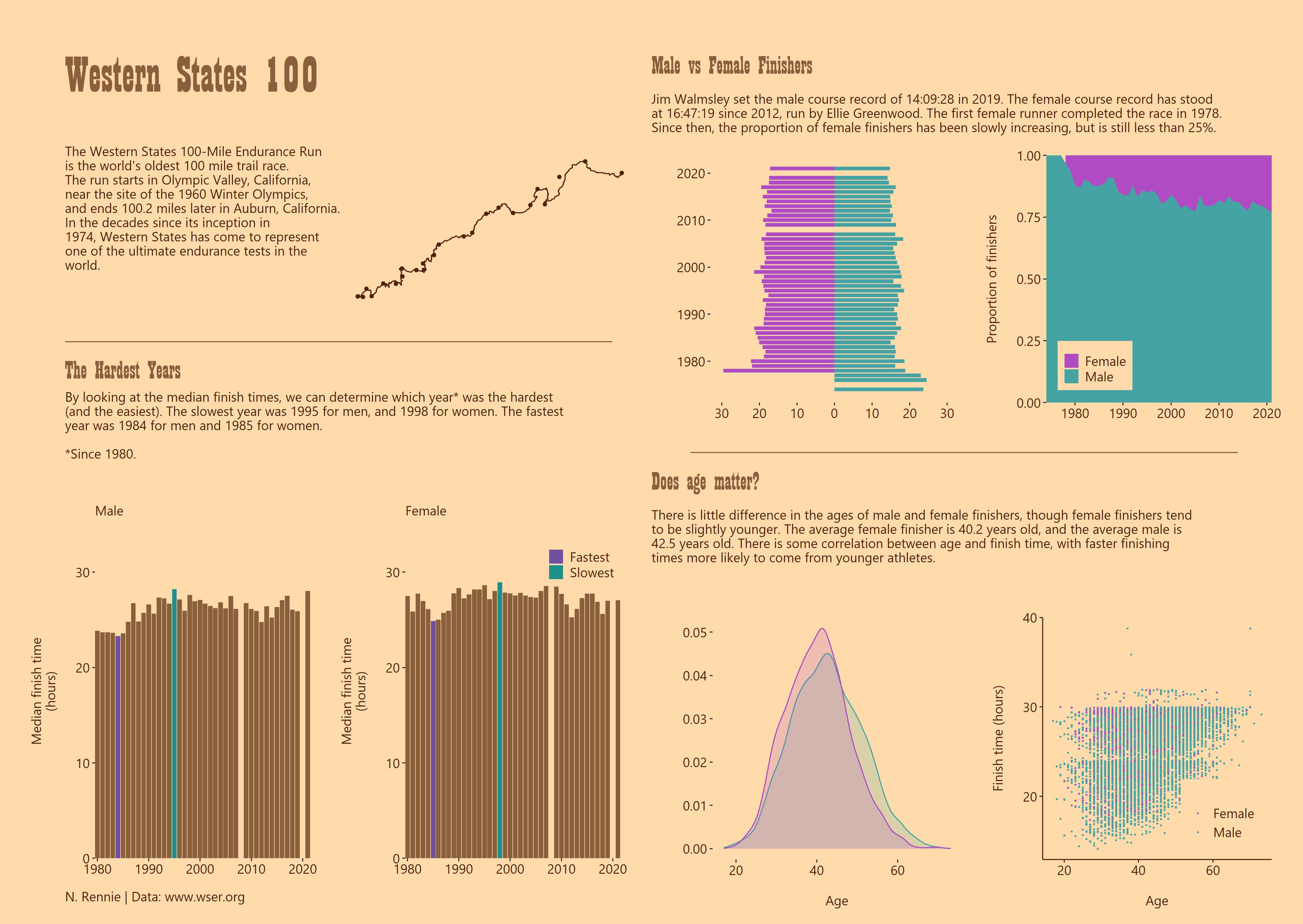
Western States 100
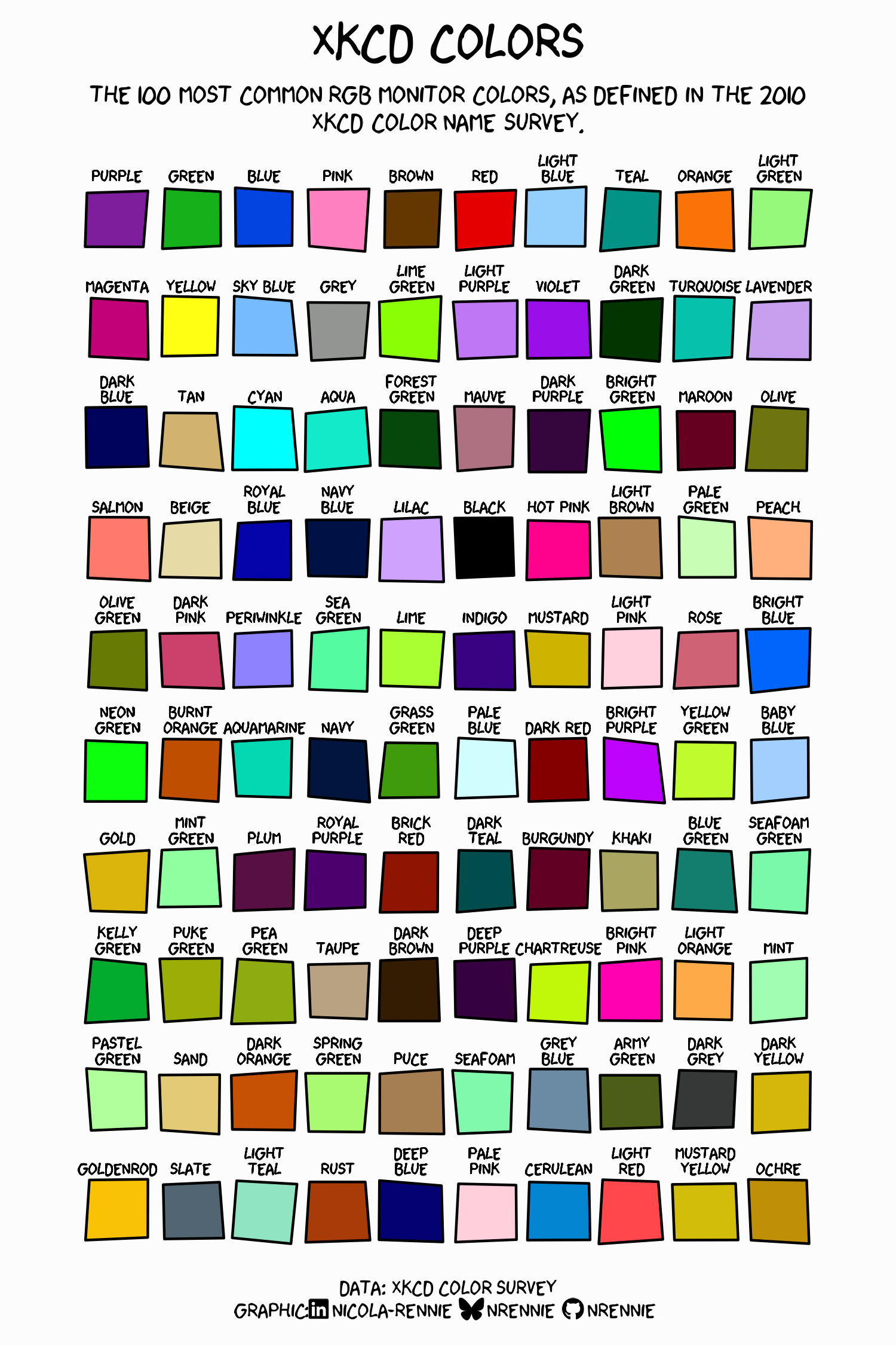
xkcd Colors
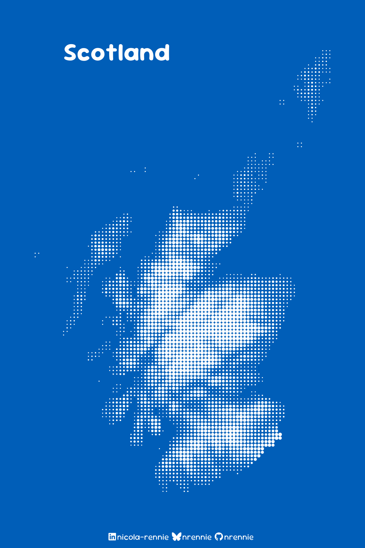
Static maps
Circography
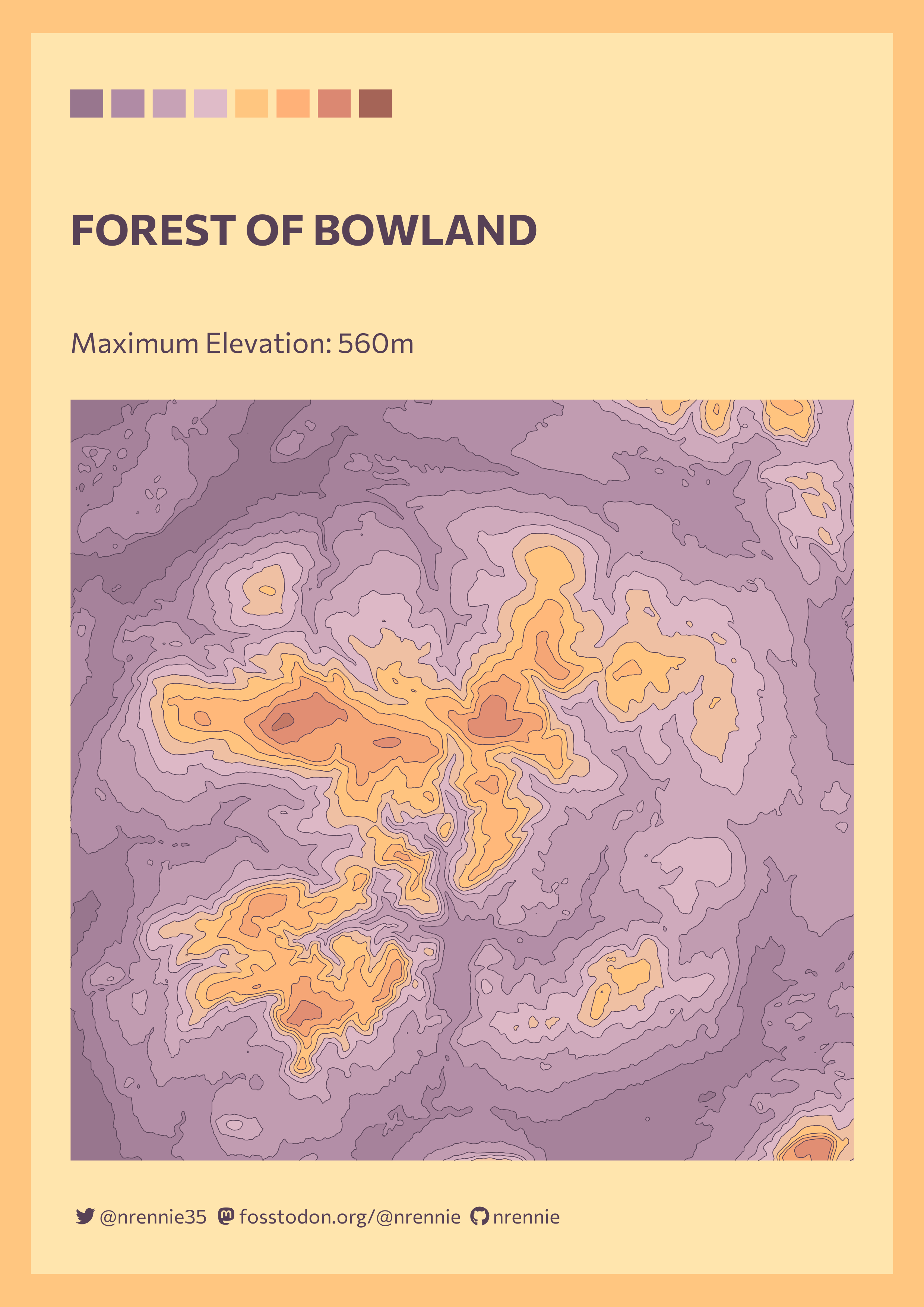
Forest of Bowland
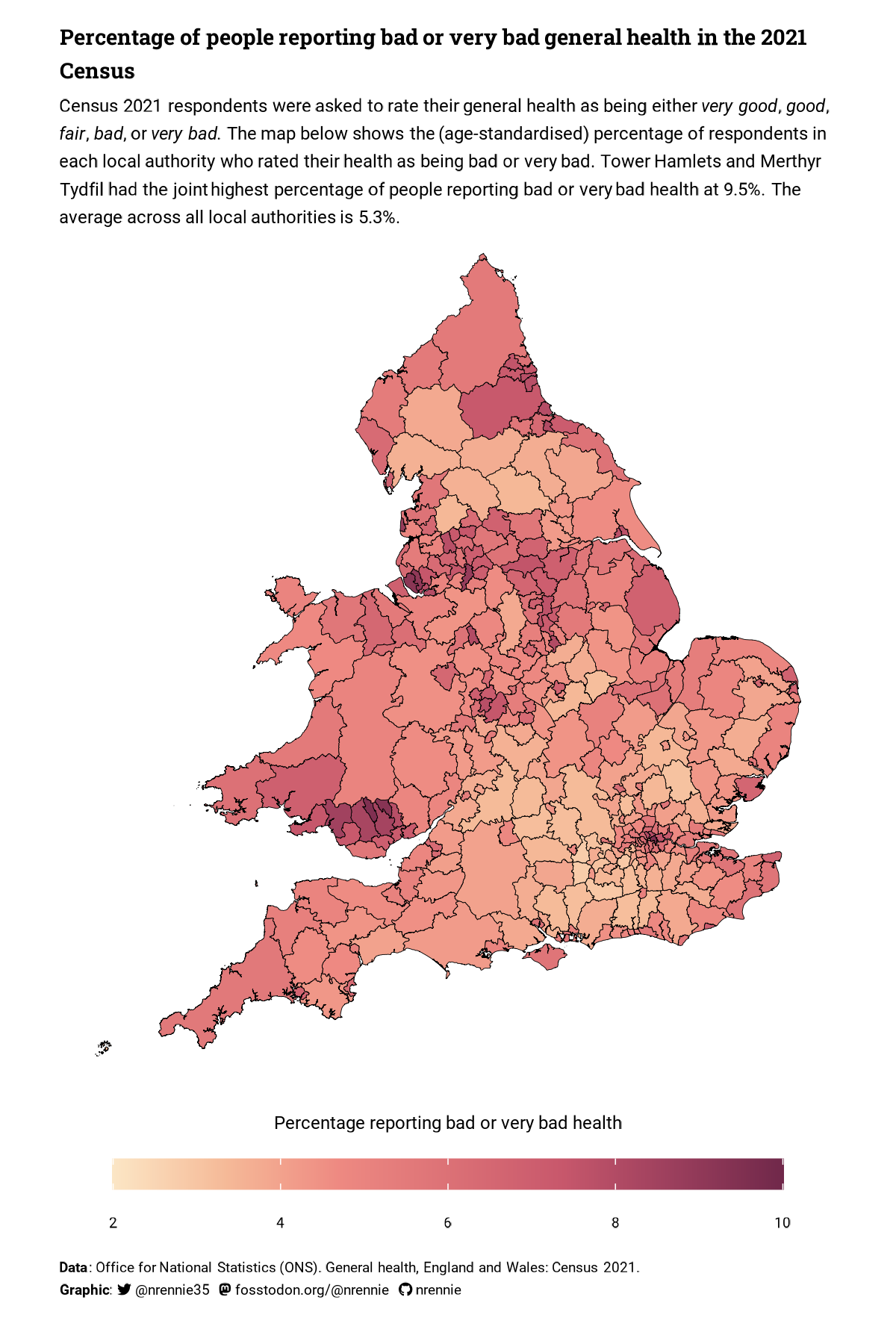
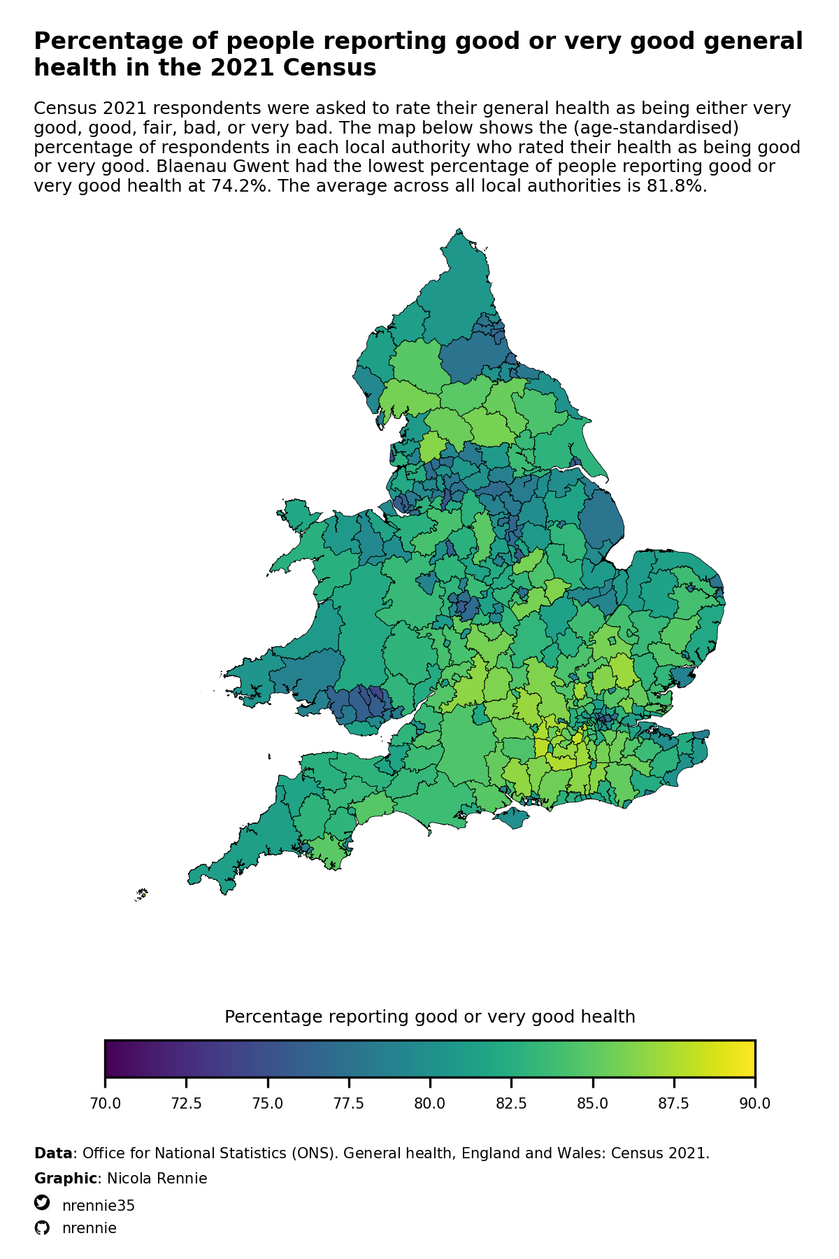
General Health
Two maps using Census 2021 data, one made with R and one made with Python.
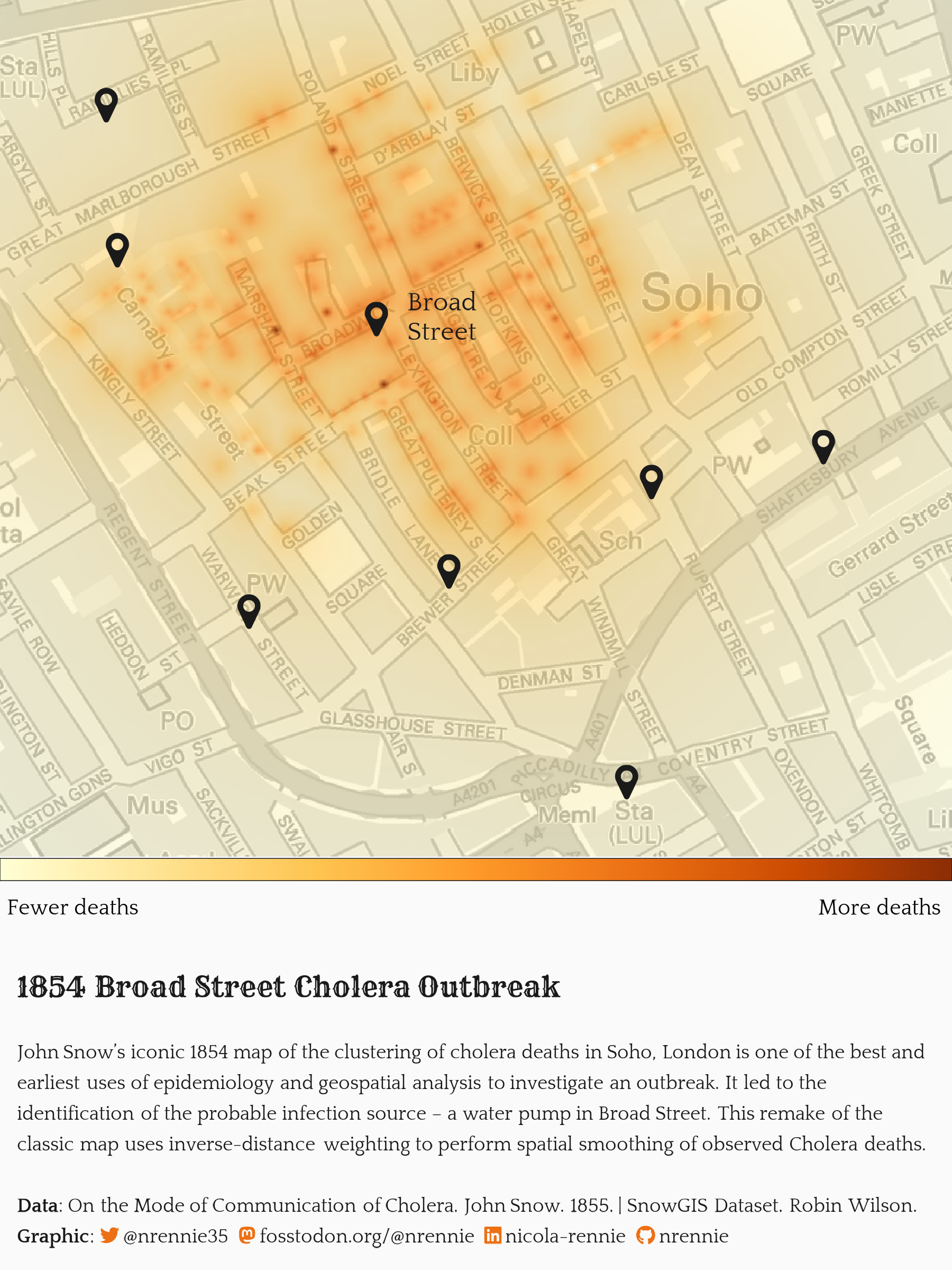
John Snow Cholera Map
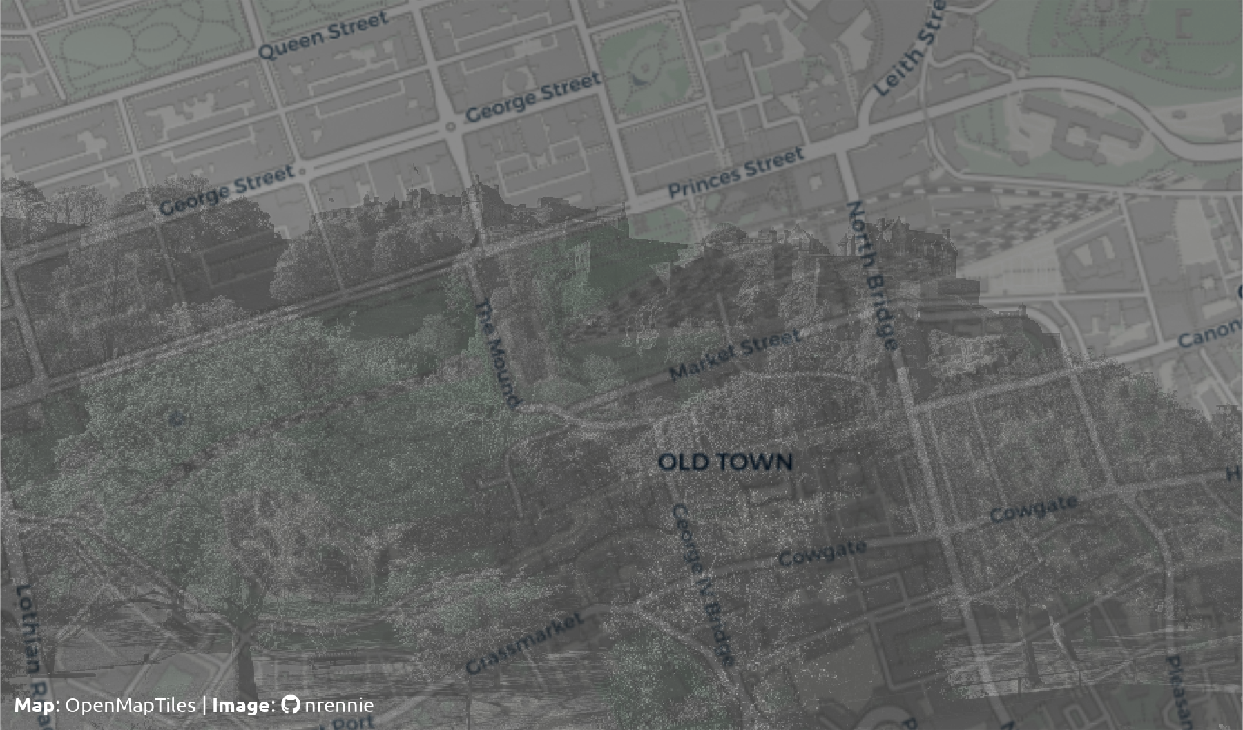
Photomap of Edinburgh
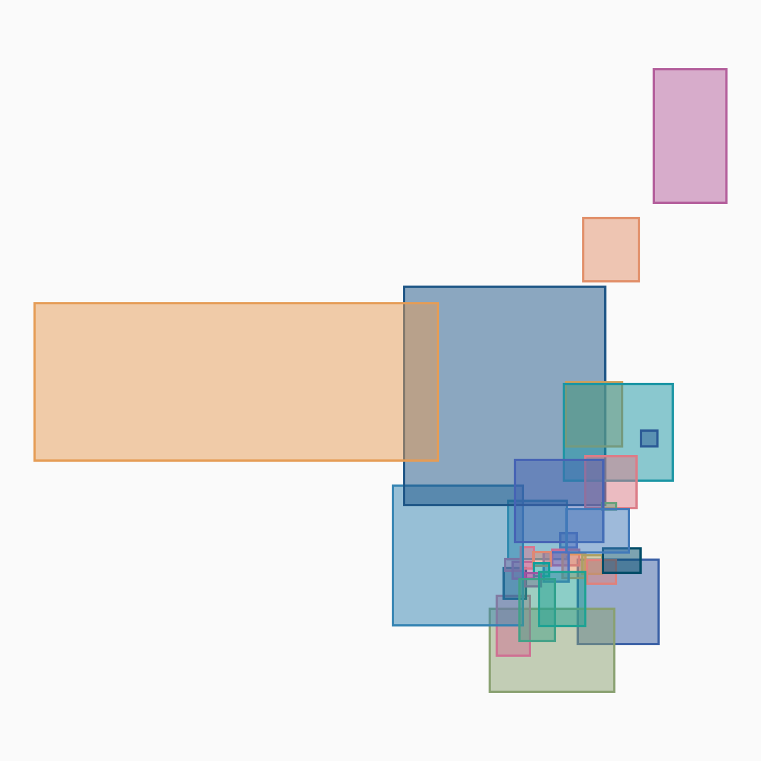
Regions in Boxes
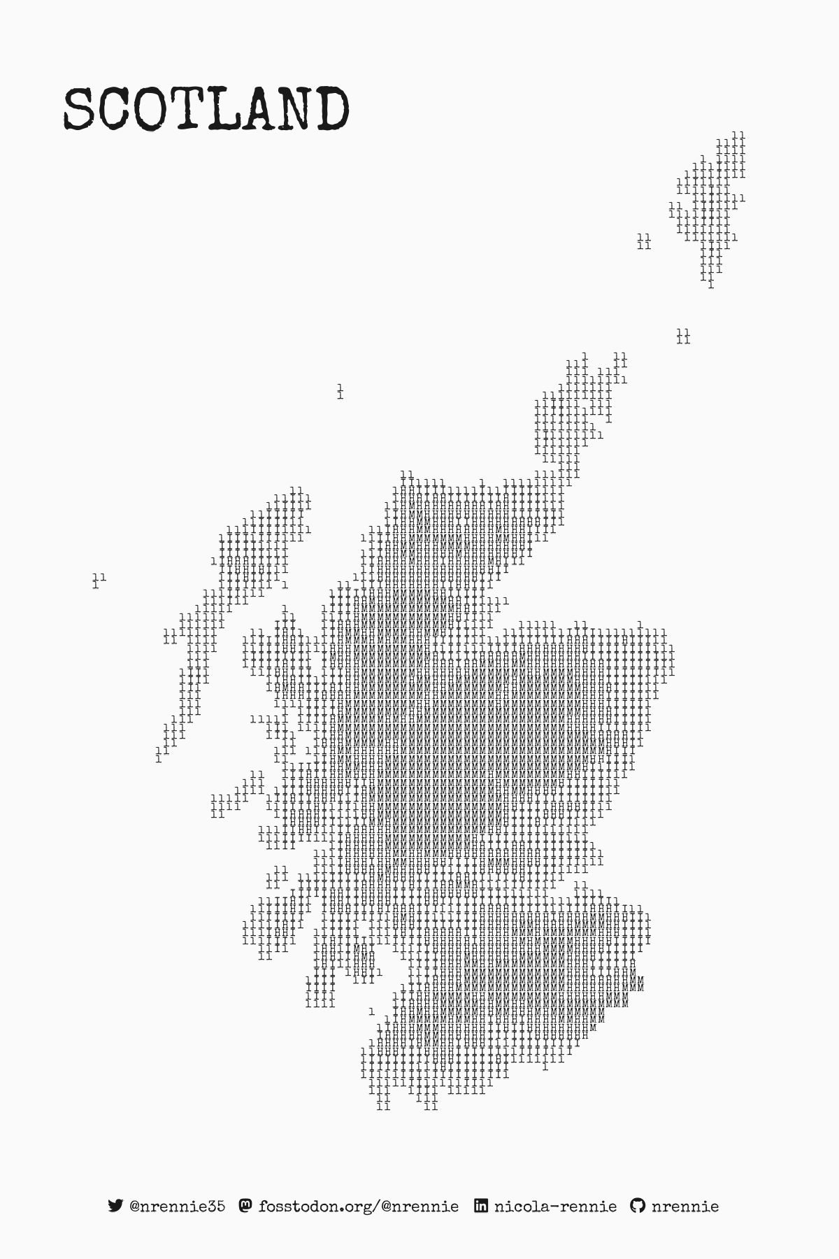
Typography Cartography
Data art
Bob Ross Paintings
Heatmap treemap of most common colours used in Bob Ross paintings.

Heatmap Blanket
Heatmap of HADCET data designed in R, then crocheted with yarn.
![]()
![]()
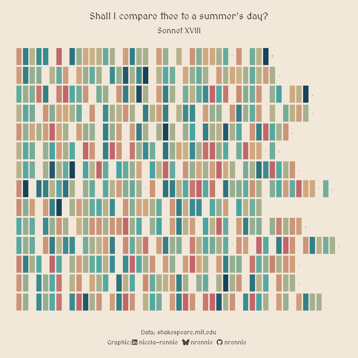
Poetry
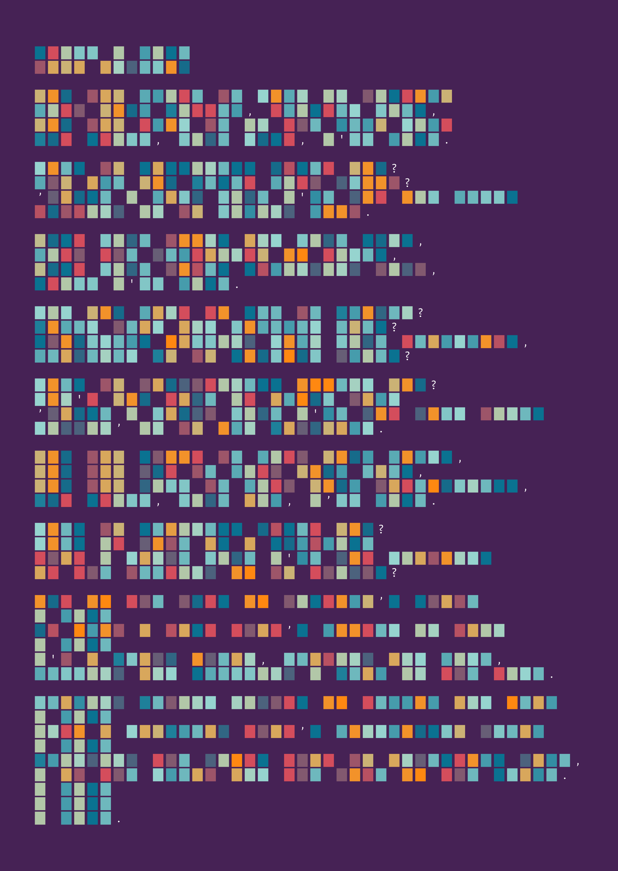
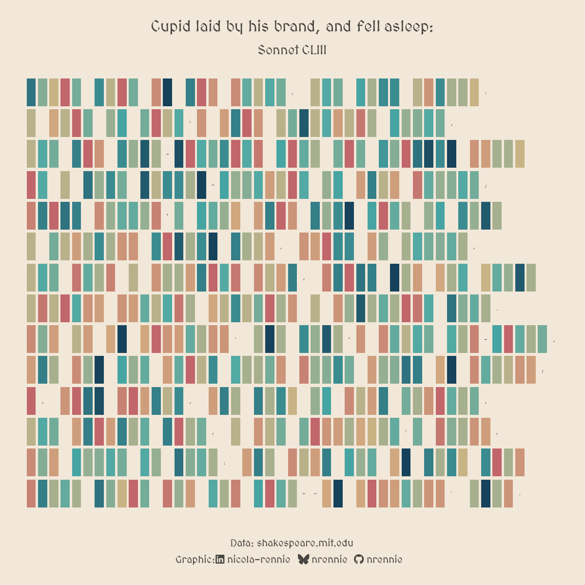
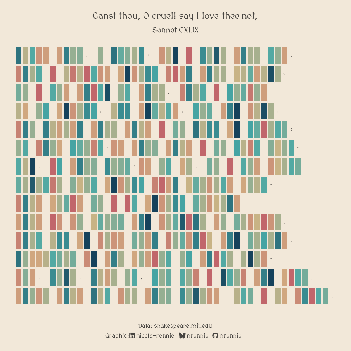
Shakespeare’s Sonnets
Interactive visualisations
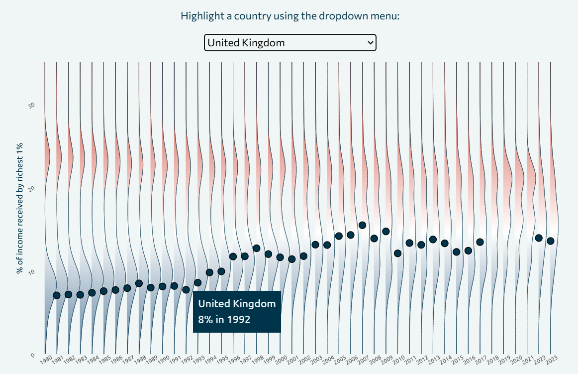
Income Inequality
Explore the interactive version.
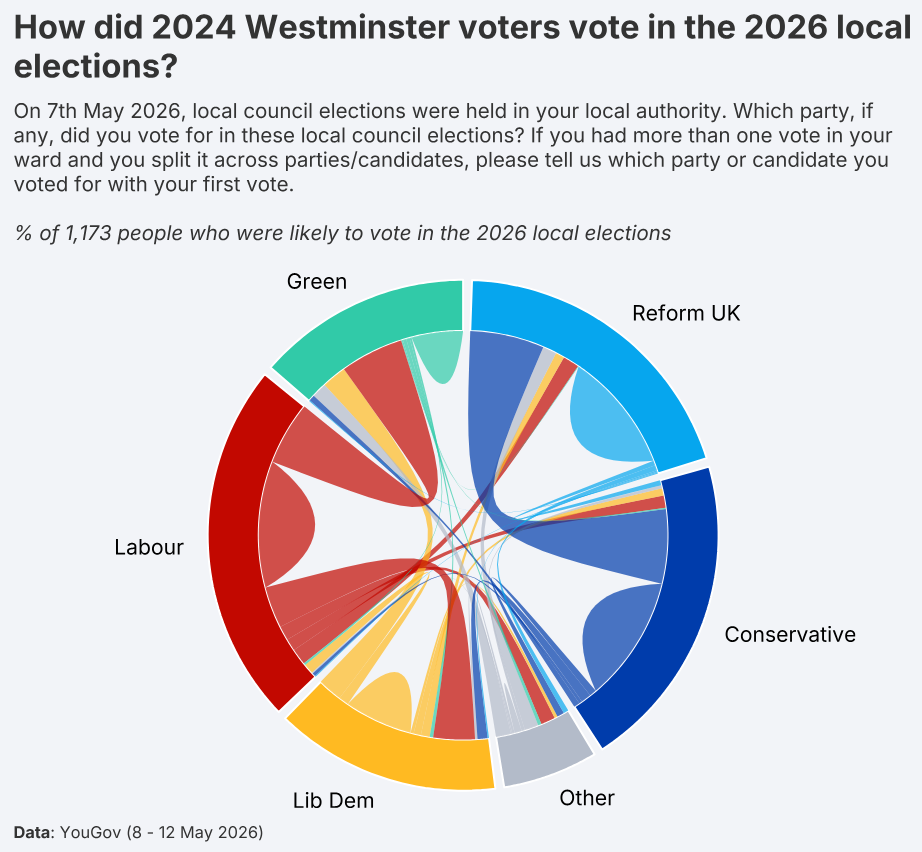
Local Council Elections
Explore the interactive version.
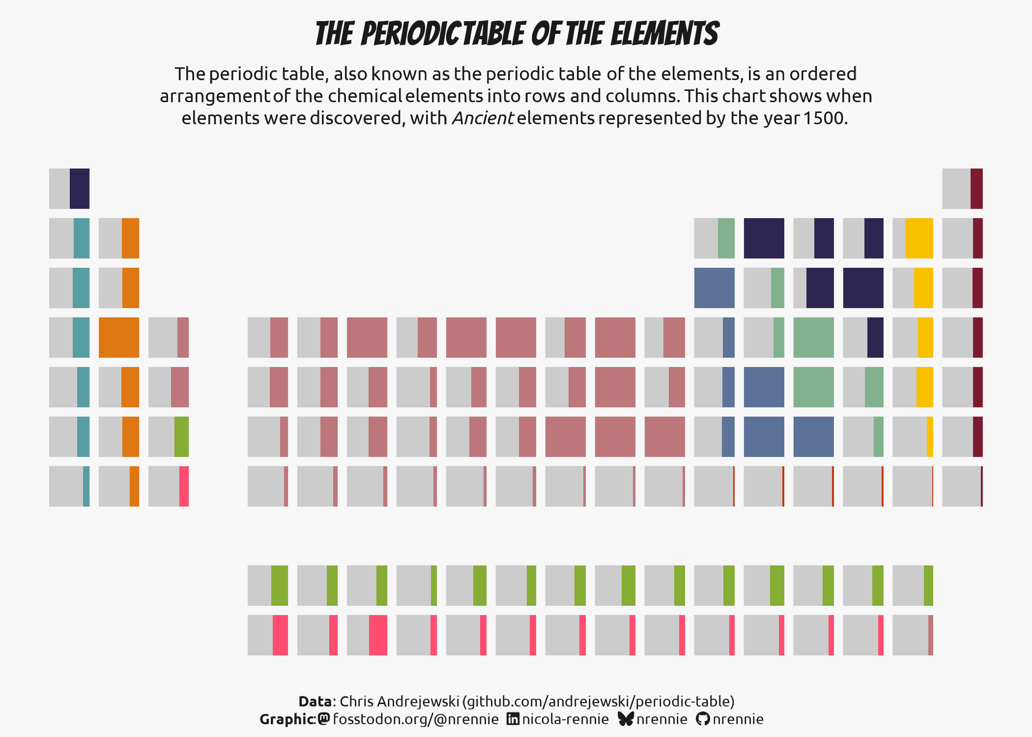
Periodic Table
Explore the interactive version.
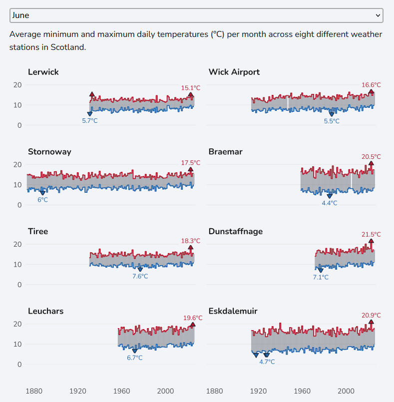
Scottish Temperatures
Explore the interactive version.
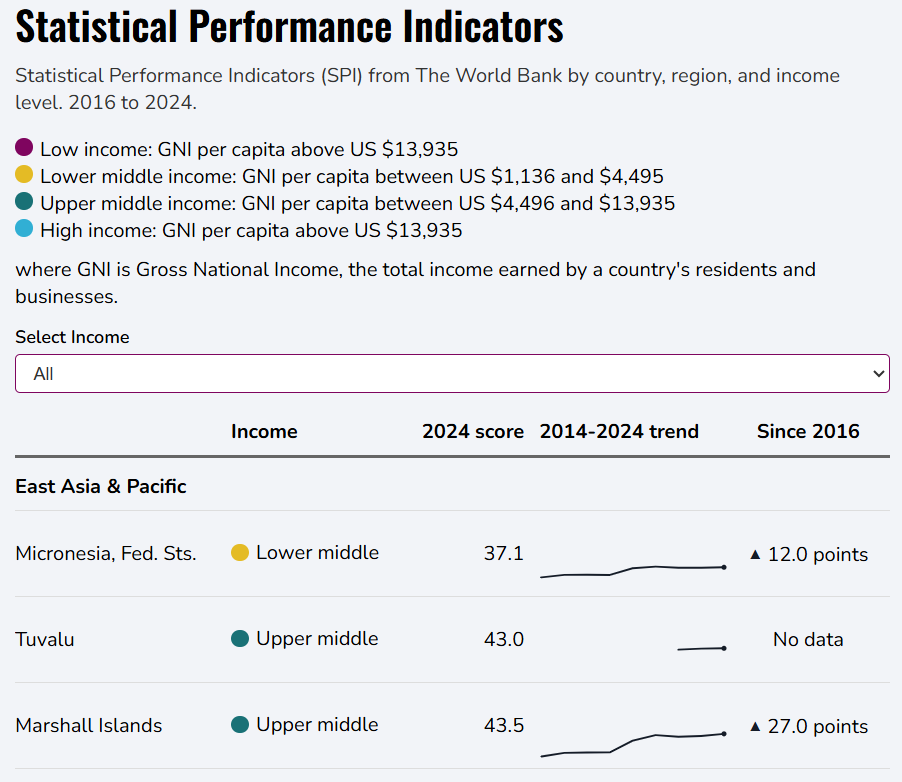
Statistical Performance Indicators
Explore the interactive version.
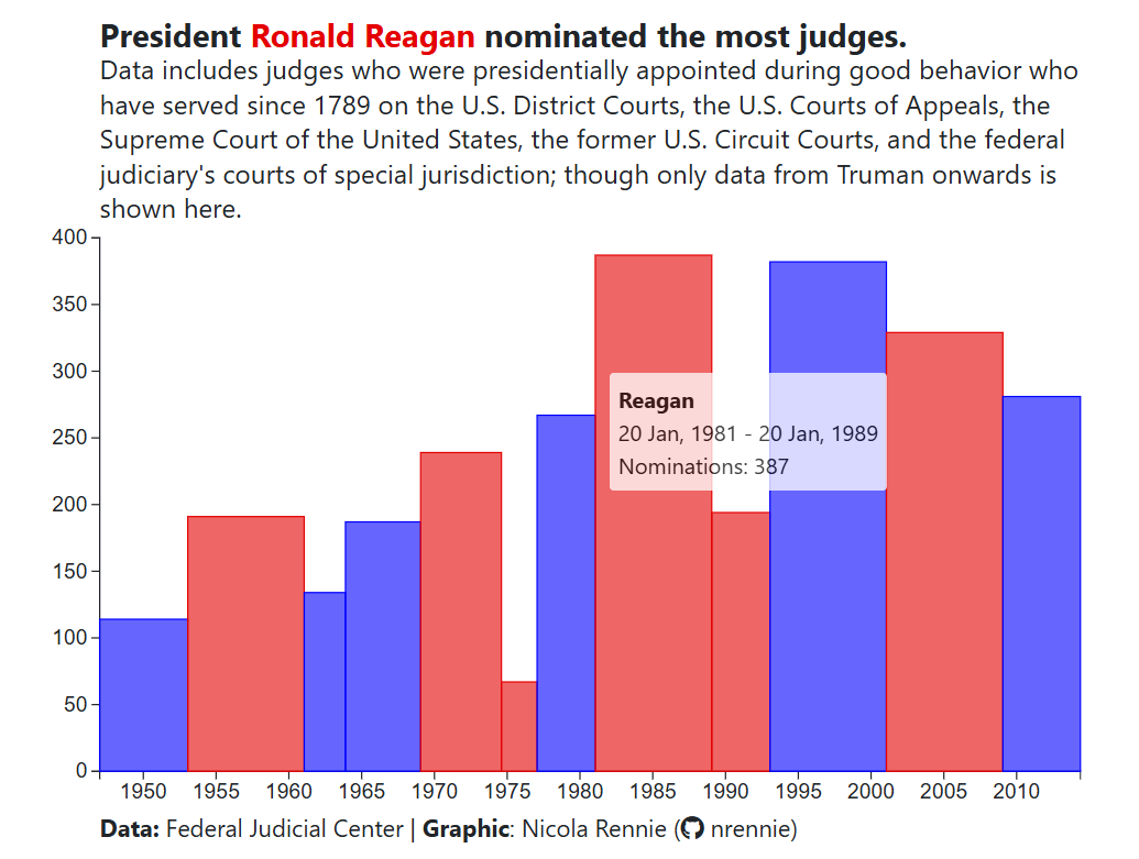
U.S. Judges
Explore the interactive version.
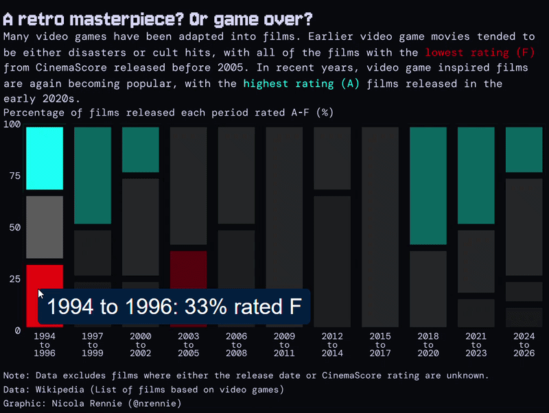
Video Game Films
Explore the interactive version.
The source code for all charts can be found on GitHub.