library(ggauto)Introducing ggauto: automating better charts
Data Visualisation
R
The
ggauto package is an opinionated ggplot2 extension package that aims to help people make better charts by default. This blog post explains why it exists and how it works.
Choosing the right chart type is key to creating an effective visualisation of your data. And styling that chart well can vastly improve its clarity and accessibility. However, it’s not always easy to switch between chart types, or tweak the styling of charts made with ggplot2. That’s where ggauto comes in.
What isggauto?
ggauto is an opinionated ggplot2 extension package to automatically choose the best chart type and styling, based on the types and values in the data.
It’s based on the following three principles:
- Data wrangling is separate to plotting
- Accessible default styling
- Some chart types are better than others
Data wrangling is separate to plotting
ggauto is designed to choose the best chart type, based on the type of data that you have. That means that you need to pre-process your data into the correct type before plotting it. This is a requirement to make ggauto possible, but is more generally a good idea because it forces you to understand what your data is before you plot it.
Tasks like ordering data, converting to correct date formats, or computing summary statistics should be performed before passing into a plotting function from ggauto. For example, if you have data collected over years, encoded as numeric values 2021, 2022, and so on then you should either convert these to a category or a date object first.
ggauto also assumes that all data is in long format, and can currently create plots with up to three different variables.
Accessible default styling
The default styling for charts should be as accessible as possible. In terms of styling, the defaults differ from ggplot2 in the following ways:
- Colours:
- Chart colours that are more likely to be accessible, using Paul Tol’s palettes.
- The use of a white background (rather than grey) to improve contrast.
- Combined use of either shapes or direct labels alongside colour to improve accessibility.
- Text:
- Larger default text sizes
- Text is aligned horizontally to improve readability, including axis titles and category labels.
- Improved styling for title and subtitle, including automatic text wrapping for long text.
- Some processing to default axis titles, to make them into sentence case instead of simply using column names.
- Axes:
- Unless the data is a
factorwhere a specific order is defined, categorical variables are arranged by magnitude instead of alphabetically. - For some chart types, if
0is included in the range of the data, the axis is set to be symmetric about0.
- Unless the data is a
Some chart types are better than others
ggauto tries to choose the best chart type based on:
- the type of data e.g. continuous, discrete, or date
- the values in the data e.g. number of categories
There is no automatically perfect chart type for a given data type, but some are better than others. The main aim of ggauto is to make it easier to make better charts.
What does ggauto not do?
ggauto isn’t designed to make especially complex charts, mainly because I don’t believe complex designs can’t be well automated and require human input on the design. It’s primarily designed to be used to create simple chart types (including bar charts, line charts, scatter charts, and distribution (raincloud) charts) with better design defaults that are appropriate for the data.
It also doesn’t have the capability to add additional features like summary statistics as annotations in a simple way. This is mainly because it’s starting to get into statistical modelling, and again, I think that’s something that requires human oversight. However, the output from ggauto is simply a ggplot2 object so you can always calculate summary statistics and add them as annotations yourself. If you need a simple way to create more statistical plots, have a look at tidyplots.
Installation
As of March 2026, ggauto can be installed from CRAN:
install.packages("ggauto")You can install the development version of ggauto from GitHub with:
# install.packages("pak")
pak::pak("nrennie/ggauto")
Mapping data to chart types
The available data types are based on the scale_x/y_ options in ggplot2:
- Continuous
- Discrete (categorical variables that are either a
characteror afactor) - Date
You can pass between 1 and 3 variables into ggauto to produce the following chart types:
| var1 | var2 | var3 | Chart Type |
|---|---|---|---|
| Continuous | - | - | Raincloud plot |
| Continuous | Continuous | - | Scatter plot |
| Continuous | Continuous | Discrete | Scatter plot with coloured shapes |
| Discrete | - | - | Bar chart (showing count of categories) |
| Discrete | Continuous | - | Bar chart (if one value per category) or raincloud plot (if multiple values per category) |
| Discrete | Discrete | - | Heatmap (showing count of category combinations) |
| Discrete | Discrete | Continuous | Heatmap (showing continuous variable) |
| Date | Continuous | - | Line chart |
| Date | Continuous | Discrete | Line chart with coloured lines |
Examples
Let’s start by loading the package:
We’ll be using some of the built-in datasets from ggplot2 in these examples, so we’ll also load it here:
library(ggplot2)Visualising distributions
If you have only continuous variable and you want to visualise the distribution, for example:
penguins |>
  ggauto(bill_dep)
You can pass the data directly instead of using the pipe:
ggauto(penguins, bill_dep)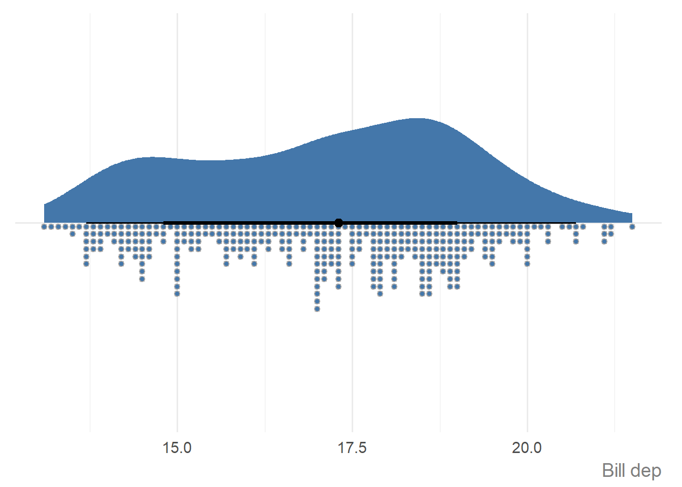
Or pass it in as a vector:
ggauto(penguins$bill_dep)
If you have multiple categories, and you want to visualise the distribution for each of them, i.e., you have one discrete variable, and one continuous variable, then multiple raincloud plots are produced.
penguins |>
  dplyr::filter(species == "Adelie") |>
  ggauto(island, flipper_len)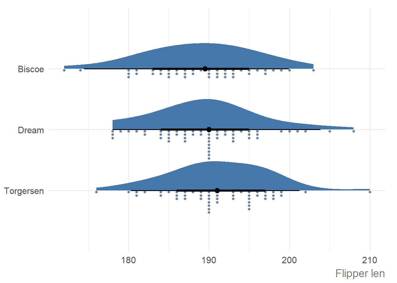
Visualising data over time
If you have a single variable to show over time, i.e., one date variable, and one continuous variable, a line chart is produced.
economics_long |>
  dplyr::filter(variable == "unemploy") |>
  ggauto(date, value)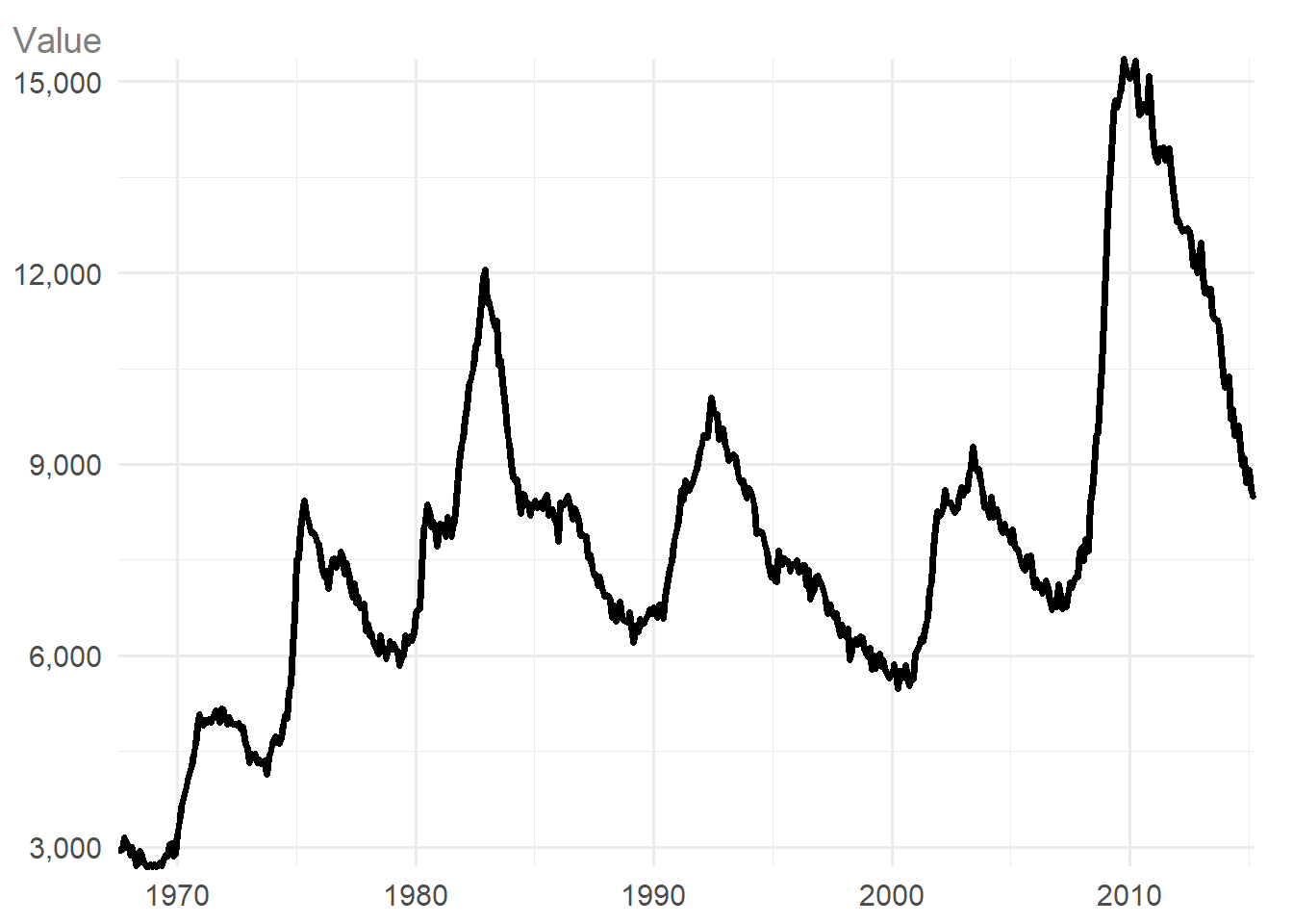
If you need to show how multiple variables change over time, i.e., one date variable, continuous variable, and one discrete variable, the type of chart will depend on how many categories (unique values in the discrete variable) you have.
If you have 6 or fewer categories, a multi-line chart is created, with colours and symbols identifying the categories. Category labels are added at the end of each line automatically.
txhousing |>
  dplyr::filter(city %in% c("Houston", "Fort Worth", "San Antonio", "Austin")) |>
  dplyr::mutate(date = lubridate::ymd(paste0(year, "/", month, "/01"))) |>
  ggauto(date, sales, city)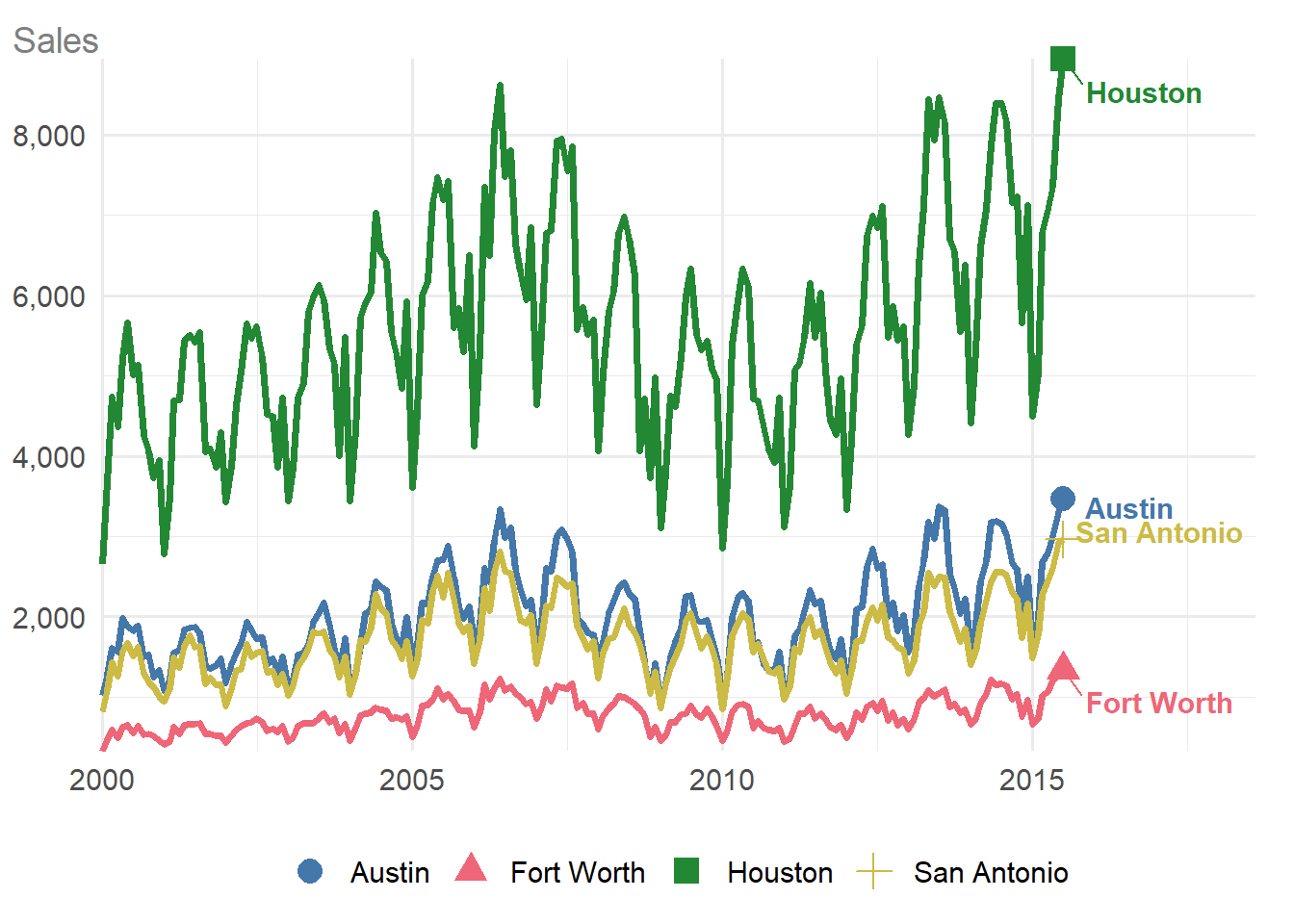
If you have more than 6 categories, the plot type changes to a faceted line chart, with one category highlighted on each facet:
txhousing |>
  dplyr::filter(city %in% c(
    "Houston", "Fort Worth", "San Antonio", "Austin",
    "Bay Area", "Dallas", "Paris", "San Angelo"
  )) |>
  dplyr::mutate(date = lubridate::ymd(paste0(year, "/", month, "/01"))) |>
  ggauto(date, sales, city)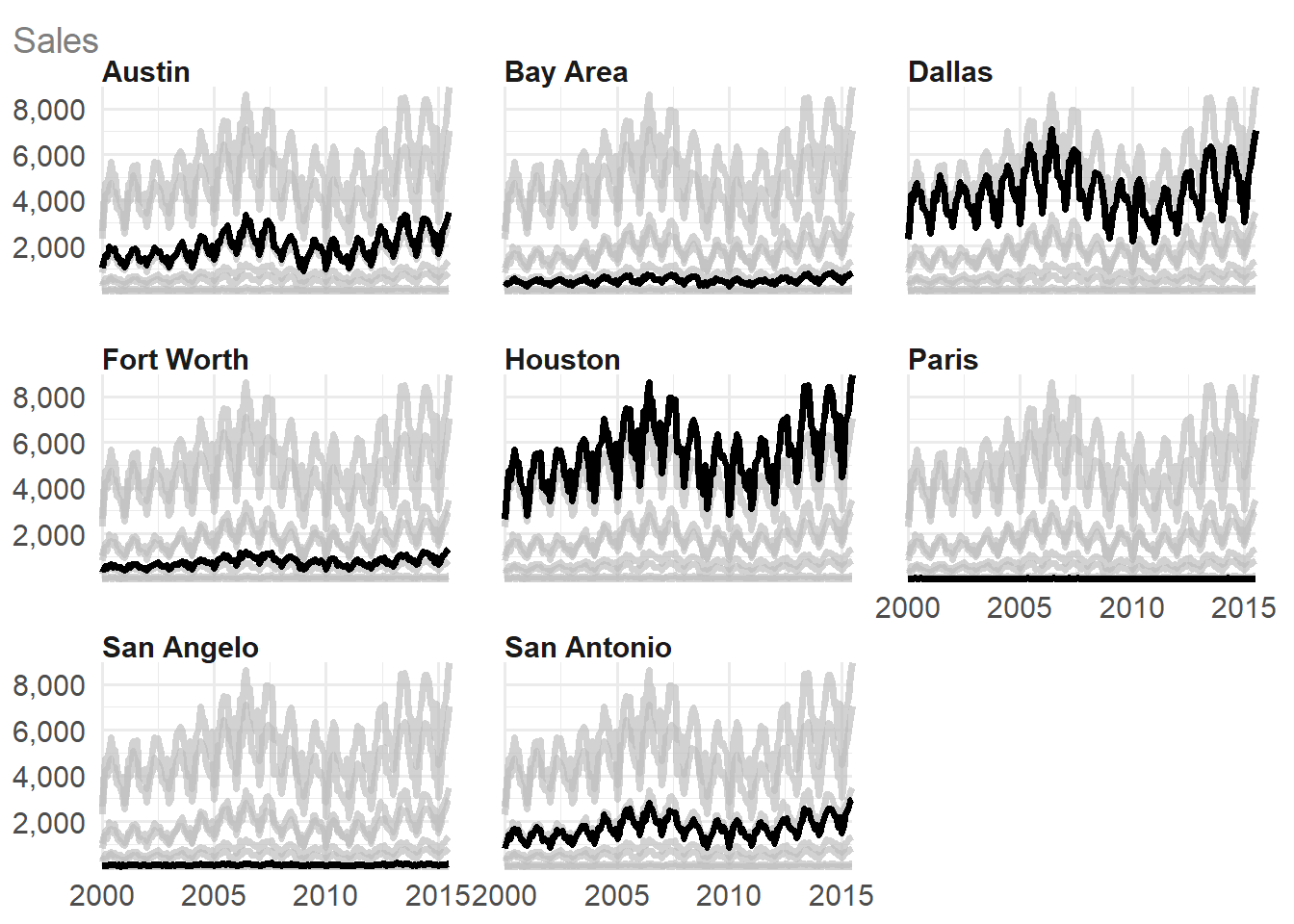
Visualising magnitudes and ranks
If you have a single discrete variable, a bar chart showing the counts of each category is created:
diamonds |>
  ggauto(cut)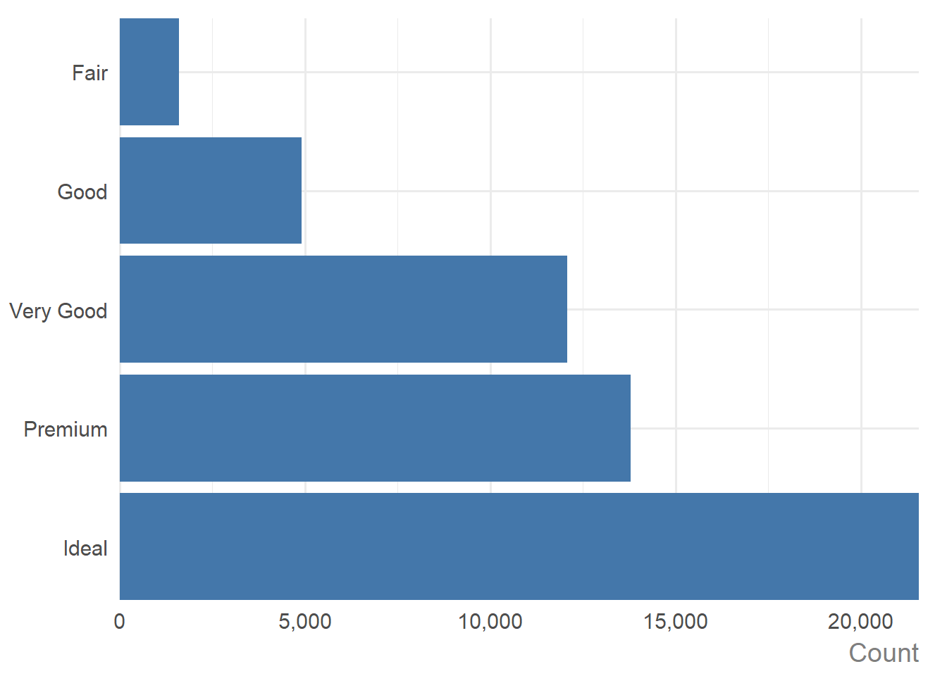
If you have pre-computed the counts or some other summary statistics, i.e., if you have one discrete variable, and one continuous variable with only a single value for each discrete variable, a bar chart of the values is created:
diamonds |>
  dplyr::group_by(cut) |>
  dplyr::summarise(med_price = median(price)) |>
  ggauto(cut, med_price)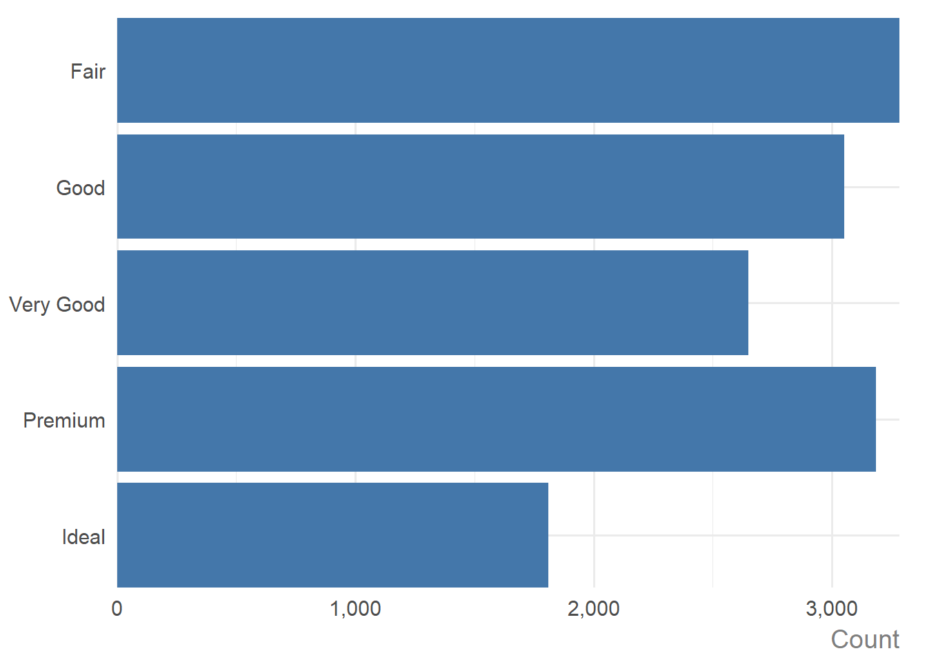
As you can see, when the discrete variable is a factor (i.e. cut), the desired order is respected. If the discrete variable is not a factor, the bars are ordered from highest to lowest instead of the default alphabetical ordering:
diamonds |>
  dplyr::group_by(cut) |>
  dplyr::summarise(med_price = median(price)) |>
  dplyr::mutate(cut = as.character(cut)) |>
  ggauto(cut, med_price)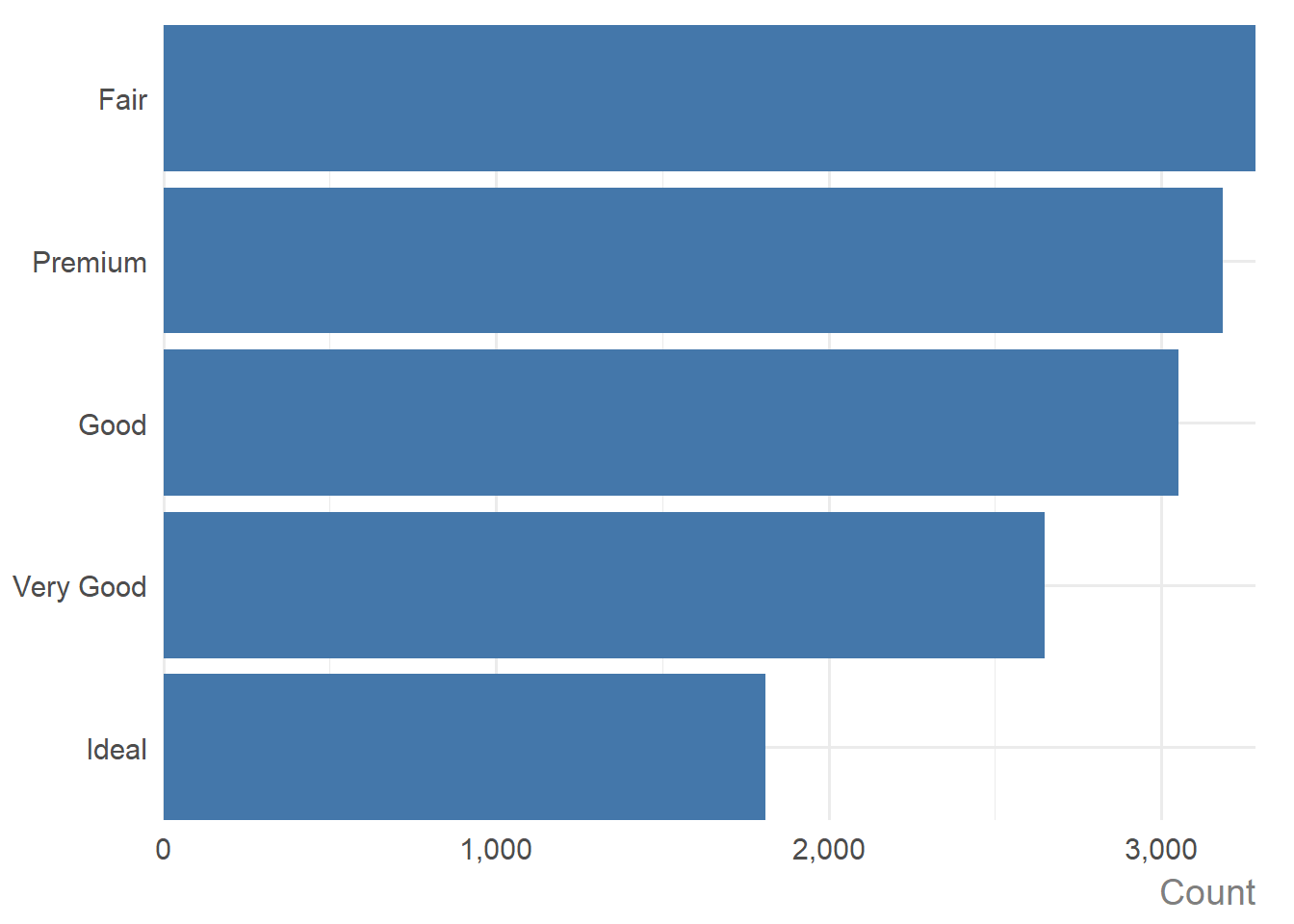
There was a small bug in version 0.0.1 affecting the ordering of categorical variables. This has now been fixed in the development version as of 27 March, 2026.
If you have two discrete variables, then a heatmap is created showing the count of each combination of categories. Labels are added showing the count.
mpg |>
  dplyr::mutate(cyl = as.character(cyl)) |>
  ggauto(cyl, drv)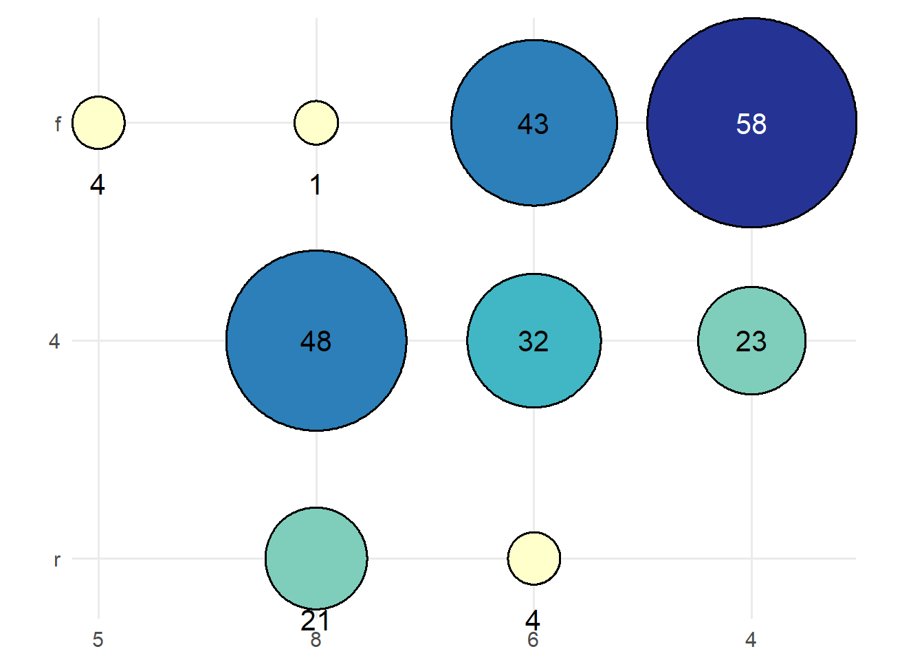
If there are more than 6 categories on either axis, labels are replaced with a legend:
txhousing |>
  dplyr::filter(median >= 150000, year >= 2005) |>
  dplyr::mutate(
    month = factor(month, levels = 1:12),
    year = factor(year, levels = 2005:2015)
  ) |>
  ggauto(month, year)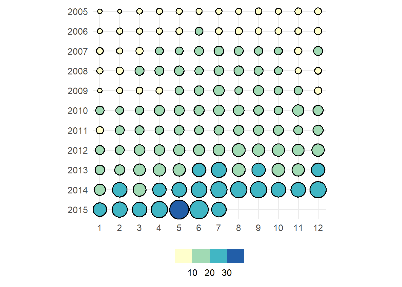
Again, if one or both of the discrete variables is a factor, then the order is respected. If not, the categories are ordered by magnitude (based on the sum).
txhousing |>
  dplyr::filter(median >= 150000, year >= 2005) |>
  dplyr::mutate(
    month = as.character(month),
    year = factor(year, levels = 2005:2015)
  ) |>
  ggauto(month, year)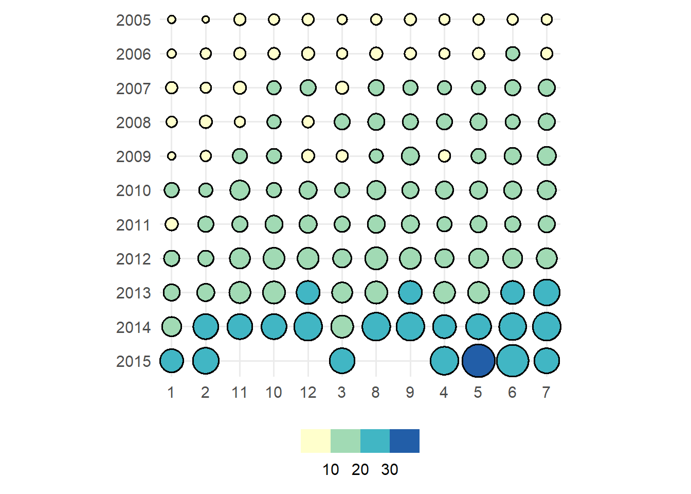
If you have two discrete variables and a third continuous variable showing some summary statistic for each category combination, a heatmap showing that value is created. Labels are rounded to 2 decimal places.
mpg |>
  dplyr::mutate(cyl = as.character(cyl)) |>
  dplyr::group_by(cyl, drv) |>
  dplyr::summarise(mean_hwy = mean(hwy)) |>
  dplyr::ungroup() |>
  ggauto(cyl, drv, mean_hwy)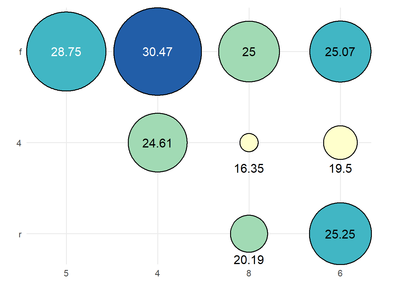
If there are multiple continuous values per combination of categories, an error is returned, asking you to first summarise the data:
mpg |>
  dplyr::mutate(cyl = as.character(cyl)) |>
  ggauto(cyl, drv, hwy)
Error in `ggauto()`:
! Too many values per category. Summarise data first.Visualising correlation
To show the correlation between two continuous variables:
mpg |>
  ggauto(displ, hwy)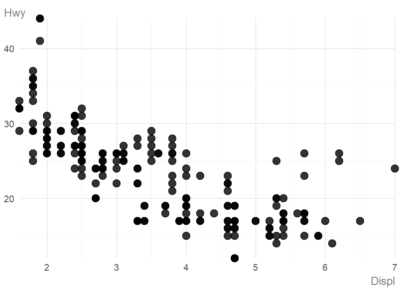
To show the correlation between two continuous variables, split by a third discrete variable, a scatter plot using colours and shapes is created:
mpg |>
  dplyr::mutate(cyl = as.factor(cyl)) |>
  ggauto(displ, hwy, cyl)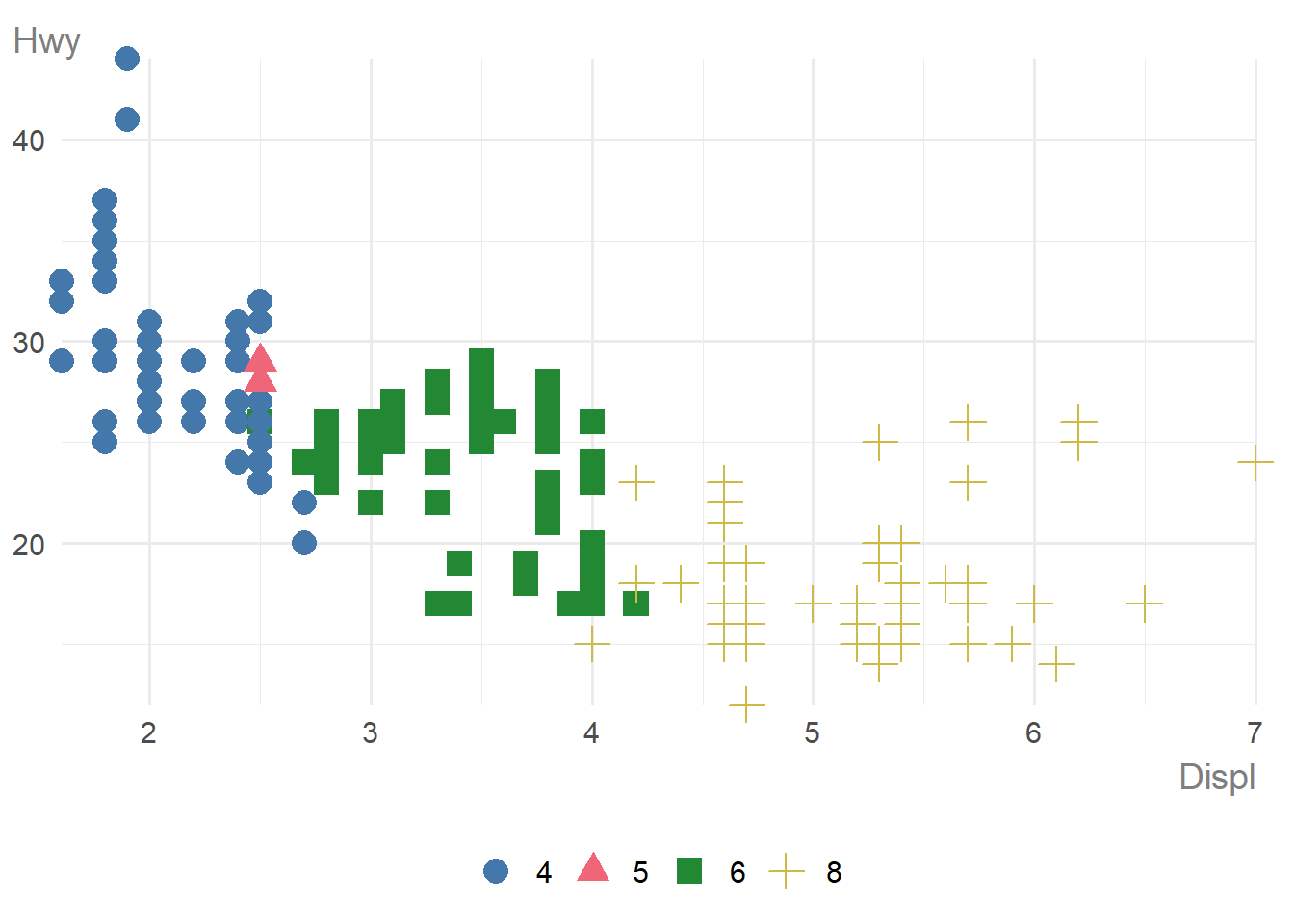
If you try to use more than 6 colours (categories), the chart type changes to a faceted scatter plot with one category highlighted on each facet:
mpg |>
  dplyr::mutate(cyl = as.factor(cyl)) |>
  ggauto(displ, hwy, manufacturer)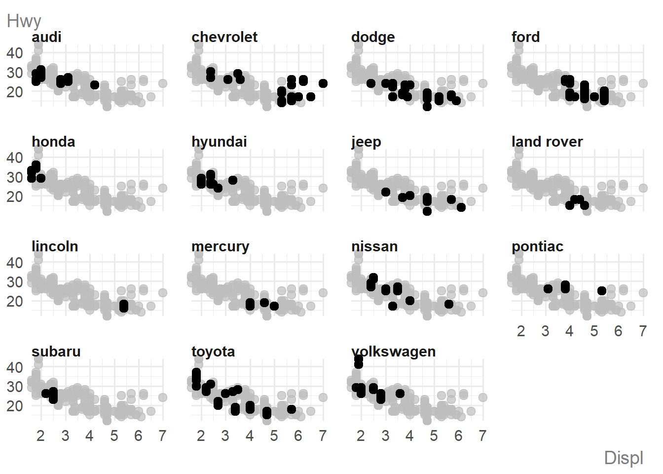
Comparing to ggplot2
Using the Texas housing data we can compare ggauto with ggplot2 defaults:
plot_data <- txhousing |>
  dplyr::filter(city %in% c(
    "Houston", "Fort Worth", "San Antonio", "Austin",
    "Bay Area", "Dallas", "Paris", "San Angelo"
  )) |>
  dplyr::mutate(date = lubridate::ymd(paste0(year, "/", month, "/01")))
With ggplot2 you have to decide on a line chart yourself:
plot_data |>
  ggplot() +
  geom_line(aes(x = date, y = sales, colour = city))
With ggauto the chart type is chosen for you, with more readable defaults:
plot_data |>
  ggauto(date, sales, city)
Editing charts
Scales
For scatter plots, raincloud plots, and line charts, one or both of the axes may be symmetric about 0 by default. This happens automatically when 0 exists in the range of values. Since the output of ggauto() is simply a ggplot2 chart, you can override this if you don’t want it:
set.seed(123)
plot_data <- data.frame(
  v1 = rnorm(50, 1)
)ggauto(plot_data, v1) +
scale_x_continuous()Scale for x is already present.
Adding another scale for x, which will replace the existing scale.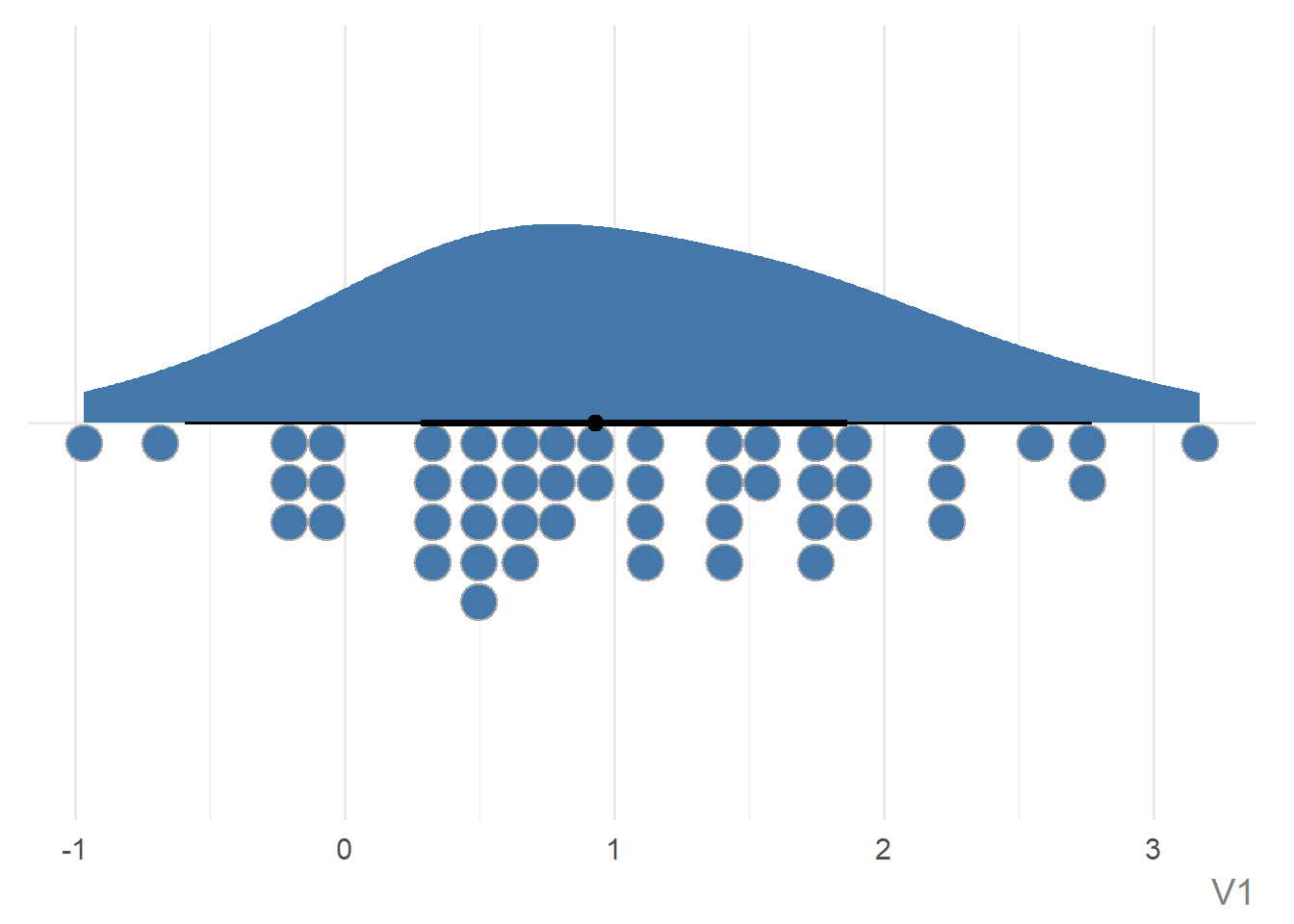
You’ll get a warning to say you are replacing the existing scale which you can ignore because it’s what you’re trying to do! Similarly, you can edit the default colour/fill scales. However, the default palette is chosen to be accessible.
Text
You can a title, subtitle, caption, and labels with the labs() function in ggplot2 as you normally would, or directly using the same arguments in ggauto(). The latter is recommended as the arguments are used a little abnormally to implement the styling. You can add markdown formatting into the title, subtitle, or caption:
plot_data |>
  ggauto(v1,
    title = "Descriptive title goes here",
    subtitle = "More information about what's in the chart which can be a really, really long sentence that will wrap onto multiple lines automatically.",
    caption = "**Source**: where the data is from",
    xlab = "Nice variable name"
  )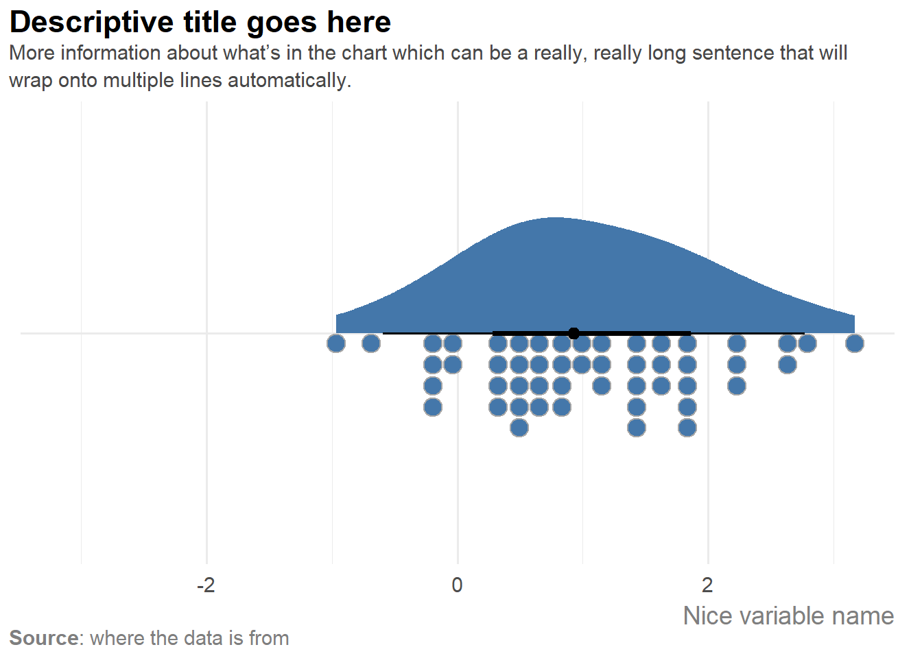
By default, the x or y axis title is removed on chart types e.g. where the axis is a date or category and a further label stating that is unnecessary. Unless otherwise specified, the axis labels are clean versions of the column names where it’s parsed in sentence case, with underscores removed.
You can edit the size and family of the text using the base_size and base_family arguments. Other plot elements e.g. lines and points scale relative to the base_size as well.
What’s next for ggauto?
Some of the features coming in later versions:
- Chart options for visualising distributions for combinations of discrete variables
- Better support for time and datetime data
- Better layering for points that overlap in scatter plots
- Ordering for faceted line charts
You can view the source code on GitHub, and if you find a bug, please raise an issue.
Reuse
Citation
BibTeX citation:
@online{rennie2026,
  author = {Rennie, Nicola},
  title = {Introducing `Ggauto`: Automating Better Charts},
  date = {2026-03-27},
  url = {https://nrennie.rbind.io/blog/introducing-ggauto/},
  langid = {en}
}
For attribution, please cite this work as:
Rennie, Nicola. 2026. “Introducing `Ggauto`: Automating Better
Charts.” March 27. https://nrennie.rbind.io/blog/introducing-ggauto/.