install.packages("ggchord2")Chord diagrams in R with ggchord2
Data Visualisation
R
Chord diagrams can be used to show relationships or flows between and within categories. This blog post introduces
ggchord2, a new package that makes it possible to create them using ggplot2 in R.
Chord diagrams are a type of chart that can be used to show relationships or flows between categories. A chord diagram is a circular chart that displays connections between categories using curved ribbons drawn inside a circle. The width of each ribbon represents the size of the relationship or flow, making it easy to see which categories are most strongly connected. They’re similar to Sankey and alluvial charts, but circular in nature.
Introducing ggchord2
The ggchord2 package is a ggplot2 extension that provides functions for drawing chord diagrams for visualising flows between categories. The package extends ggplot2 by adding geom and stat functions for drawing chord sectors, arcs, and labels.
Note
Before, we jump further into ggchord2, I want to note a couple of other R packages that can be used to create chord diagrams:
Installing ggchord2
As of July 2026, ggchord2 is available on CRAN so you can install it with:
You can also install the development version from GitLab:
pak::pkg_install("gitlab::nrennie/ggchord2")We can then load ggchord2 (alongside ggplot2) using library() as we normally would:
library(ggchord2)
library(ggplot2)
Basic chord diagrams
To demonstrate some chord diagrams, let’s create some (fictional) data for flows between countries.
flows <- data.frame(
  source = c("USA", "USA", "USA", "China", "China", "Germany"),
  target = c("USA", "China", "Germany", "USA", "Germany", "USA"),
  freq   = c(40, 50, 30, 60, 25, 35)
)
This data has examples of flows within a country (i.e. USA to USA), between countries (USA to China and vice versa), and asymmetric flows (China to Germany but not Germany to China). There are 3 required aesthetics: source, target, and freq to create chord diagrams with ggchord2. For simplicity, I’ve given the columns in the data those same names, but that’s not a necessity.
To create a basic chord diagram, we start with the ggplot() function as we normally would when making charts with ggplot2. In there, we pass in the data and specify the aesthetic mapping. The source and target aesthetics define which columns the flows are going from and to. The freq aesthetic is the value of the flow. We then add geom_chord_diagram() as the geometry we want to draw.
ggplot(
  data = flows,
  mapping = aes(
    source = source,
    target = target,
    freq = freq
  )
) +
  geom_chord_diagram()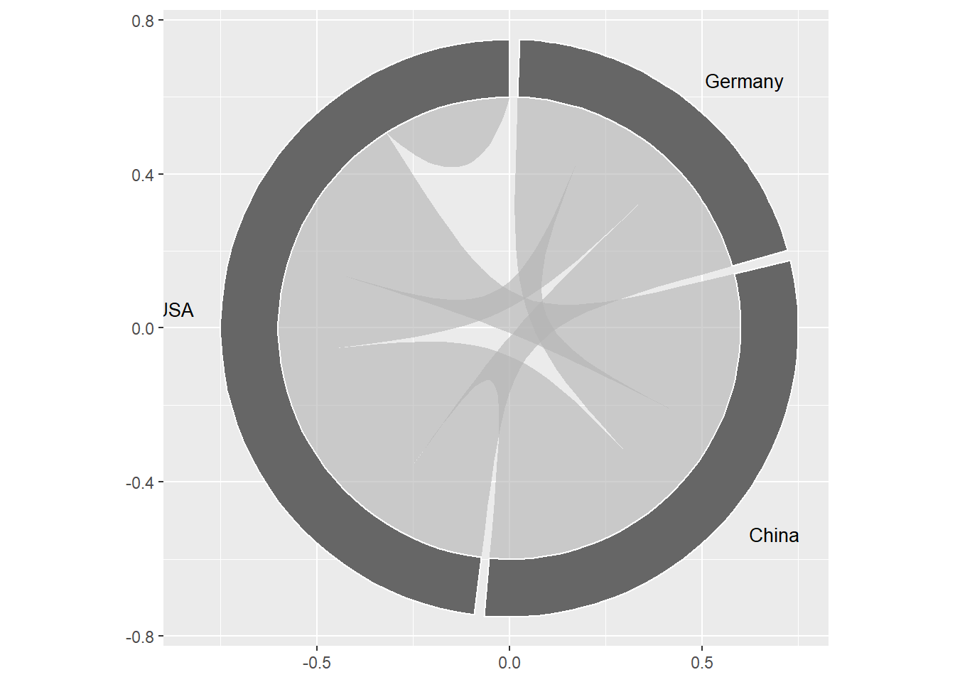
This creates a basic chord diagram. Here, the length of the sector band of each category shows the total flows associated with a category. The arc flows in chord diagrams are almost always coloured by either the source or target category, and we can pass the source column into fill in the aesthetic mapping.
ggplot(
  data = flows,
  mapping = aes(
    source = source,
    target = target,
    freq = freq,
    fill = source
  )
) +
  geom_chord_diagram()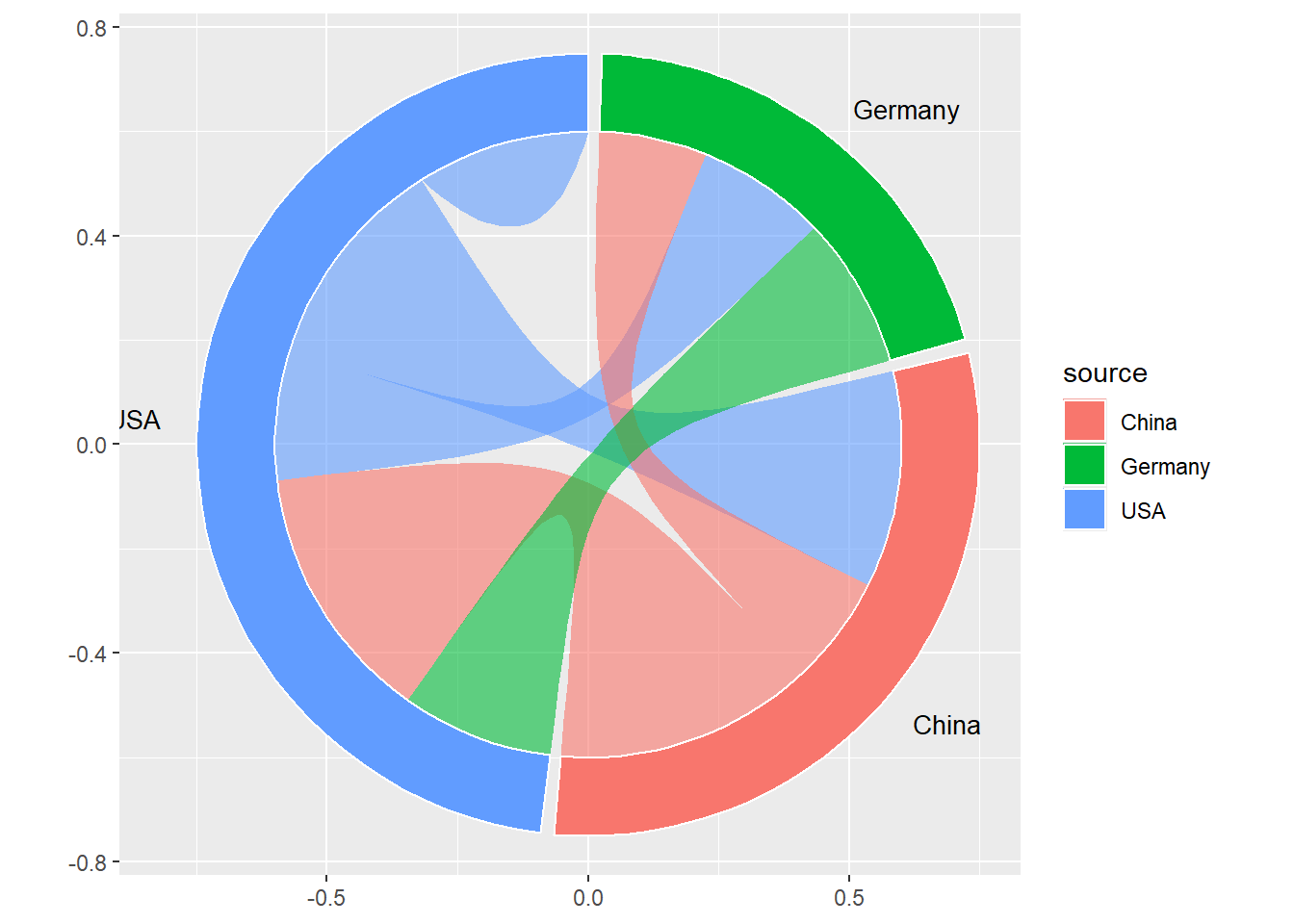
There are additional arguments in geom_chord_diagram() that you can use to elements such as the gap between sector bands, the radius of the arc flows and sector bands, and the degree of starting point.
Building chord diagrams with layers
The geom_chord_diagram() is essentially a wrapper function that adds multiple geometries at once: the arc flows, the sector bands, and the text labels. If you want more advanced customisation in your chord diagrams, you can build them using the individual layers instead of geom_chord_diagram().
Adding geom_chord_arcs(), geom_chord_sectors(), and geom_chord_labels() is essentially equivalent to geom_chord_diagram().
ggplot(
  data = flows,
  mapping = aes(
    source = source,
    target = target,
    freq = freq,
    fill = source
  )
) +
  geom_chord_arcs() +
  geom_chord_sectors() +
  geom_chord_labels()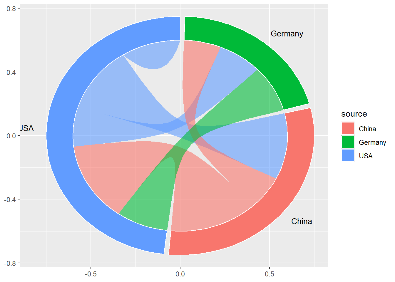
Tip
If you’re using geom_chord_diagram(), this applies a fixed coordinate system for you to make sure that the circle appears circular rather than as a squashed oval. If you’re constructing the chord diagram yourself using the different geom_* functions, you’ll need to add coord_fixed() at the end as well.
Adding the layers separately means that you can edit the appearance of the arc flows, sector bands, and text labels individually.
g <- ggplot(
  data = flows,
  mapping = aes(
    source = source,
    target = target,
    freq = freq
  )
) +
  geom_chord_arcs(
    mapping = aes(fill = source),
    alpha = 0.5
  ) +
  geom_chord_sectors(
    mapping = aes(fill = source),
    colour = "white",
    linewidth = 0.8
  ) +
  geom_chord_labels(
    mapping = aes(colour = source),
    size = 4
  )
g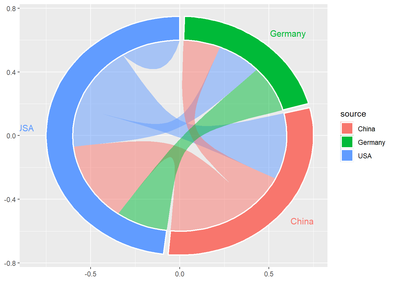
Adding ggplot2 styling
Since ggchord2 simply provides some new geometries on top of ggplot2, this means that all of the ggplot2 functions for scales, coordinate systems, and themes work as they normally would in ggplot2. You’ll likely want to choose better colours, remove the legend since the labels are already added, and get rid of the chart grid.
g +
  scale_x_continuous(limits = c(-1, 1)) +
  scale_colour_brewer(palette = "Dark2") +
  scale_fill_brewer(palette = "Dark2") +
  coord_fixed() +
  theme_void() +
  theme(legend.position = "none")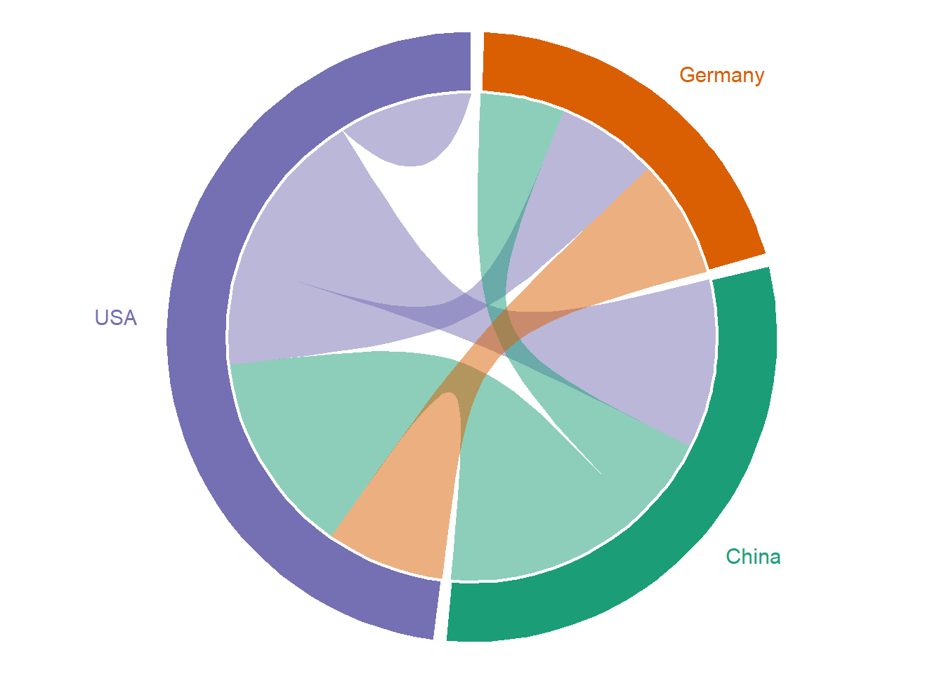
The usual ggplot2 functions such as facets, annotations, and labels also work as you would expect.
Positioning text labels
By default, the category labels are positioned next to the sectors with horizontal black text. Because of the way that geom_text() works in ggplot2, sometimes the ends of the category labels get truncated - as you might have noticed in a few of the examples above!
Create basic chord diagram without text labels
g <- ggplot(
  data = flows,
  mapping = aes(
    source = source,
    target = target,
    freq = freq
  )
) +
  geom_chord_arcs(
    mapping = aes(fill = source),
    alpha = 0.5
  ) +
  geom_chord_sectors(
    mapping = aes(fill = source),
    colour = "white",
    linewidth = 0.8
  ) +
  coord_fixed() +
  theme_void() +
  theme(legend.position = "none")
The simplest solution is to expand the limits of the x-axis to accommodate longer labels using xlim() or scale_x_continuous().
Tip
If you use the geom_chord_labels() layer functions instead of the geom_chord_diagram() wrapper function, you can also map the text colour as an aesthetic. However, you should be careful with colour choices to ensure sufficient contrast if you’re doing this.
g +
  geom_chord_labels() +
  scale_x_continuous(limits = c(-1, 1))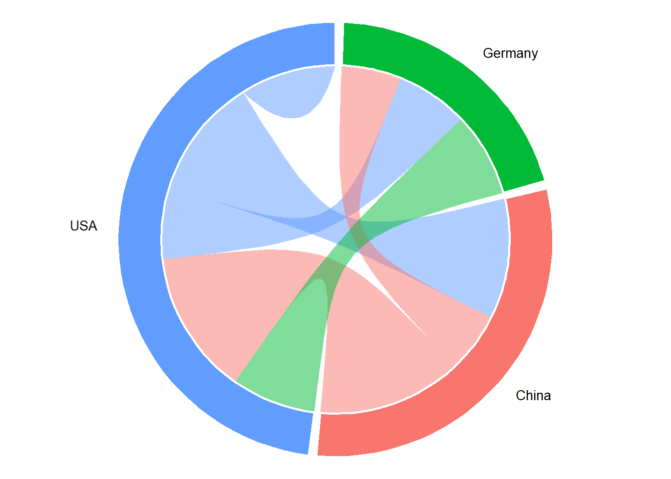
If you have many segments, or some segments which are very small, you can use perpendicular labels instead. You may also need to increase the available space at the top and bottom of the plot to create enough space for the labels with scale_y_continuous().
g +
  geom_chord_labels_perp() +
  scale_x_continuous(limits = c(-1, 1)) +
  scale_y_continuous(limits = c(-1, 1))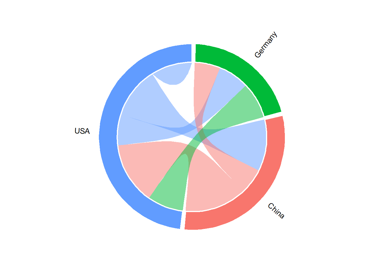
Another option is to use curved labels that wrap around the arcs using geom_chord_labels_curve(), which uses the geomtextpath package under the hood.
g +
  geom_chord_labels_curve() +
  scale_x_continuous(limits = c(-1, 1)) +
  scale_y_continuous(limits = c(-1, 1))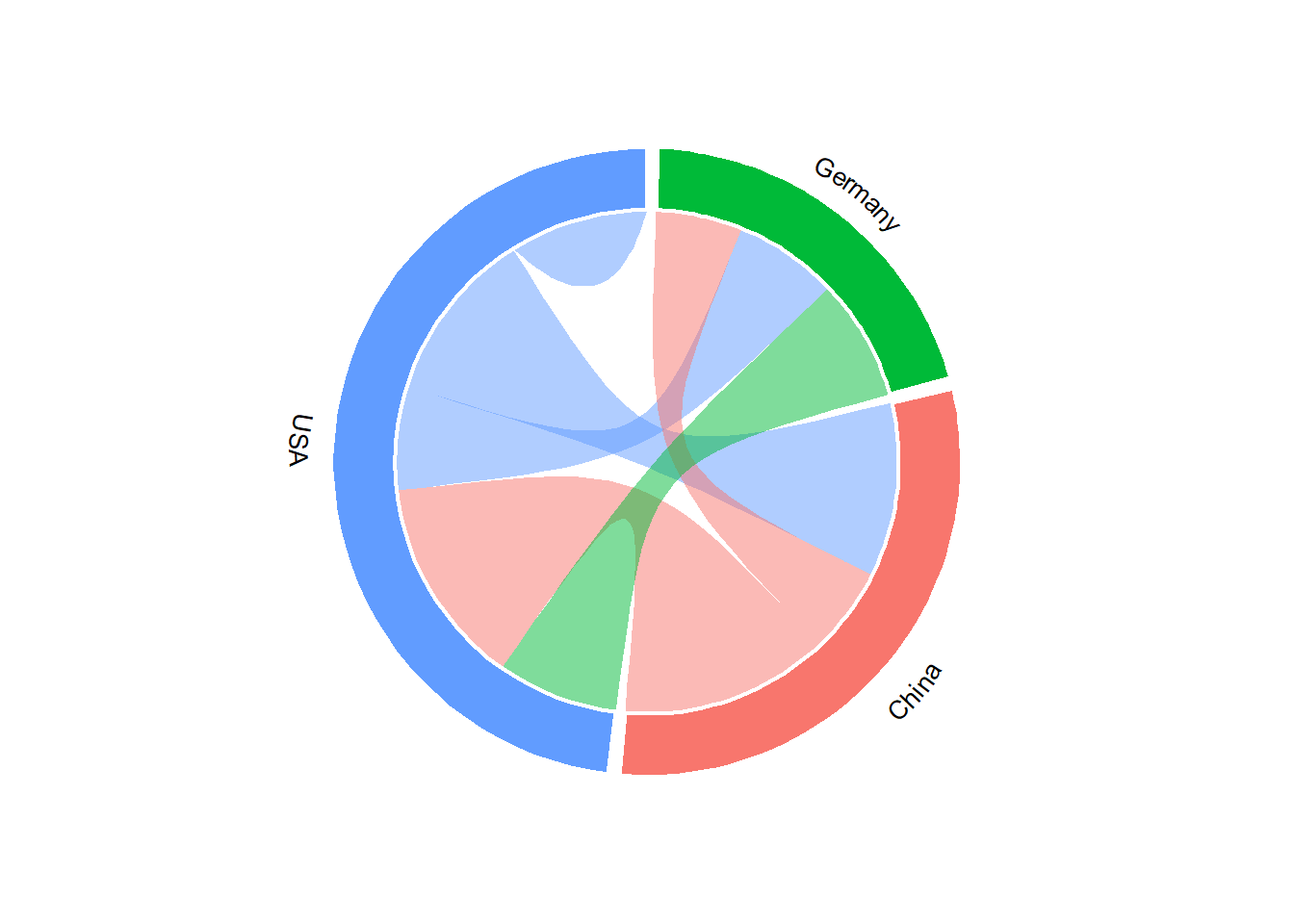
See more examples of ways to add labels in the Positioning labels vignette.
Sankey vs chord diagram example
When I see a Sankey (or alluvial) chart out in the wild, if it has only two nodes and they both contain the same categories, I often wonder what that chart would have looked like as a chord diagram. It’s fairly common to see Sankey charts used this way to visualise topics like election voting and trade flows.
A couple of months ago, I saw this Sankey diagram created by YouGov to show changes in voting behaviour between 2024 and 2026.
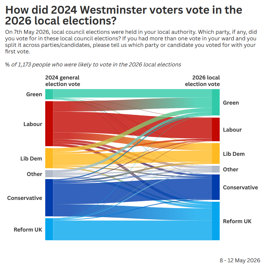
Let’s recreate it as a chord diagram using ggchord2. Let’s start by reading in the data:
sankey_data <- readr::read_csv("data.csv")which looks like this:
# A tibble: 6 × 3
  `2024 General Election Vote` `2026 Local Election Vote` Votes
  <chr>                        <chr>                      <dbl>
1 Green                        Green                      53.6
2 Green                        Labour                      2.13
3 Green                        Lib Dem                     3.59
4 Green                        Other                       3.54
5 Green                        Conservative                1.3
6 Green                        Reform UK                   0.72
It shows the people who voted for each combination of parties in 2024 and 2026. We can get a simple chord diagram very quickly with ggchord2 passing in the 2024 categories as the source (and colour), the 2026 categories as the target, and the votes as the frequency.
g <- ggplot(
  data = sankey_data,
  mapping = aes(
    source = `2024 General Election Vote`,
    target = `2026 Local Election Vote`,
    freq = Votes,
    fill = `2024 General Election Vote`
  )
) +
  geom_chord_diagram()
g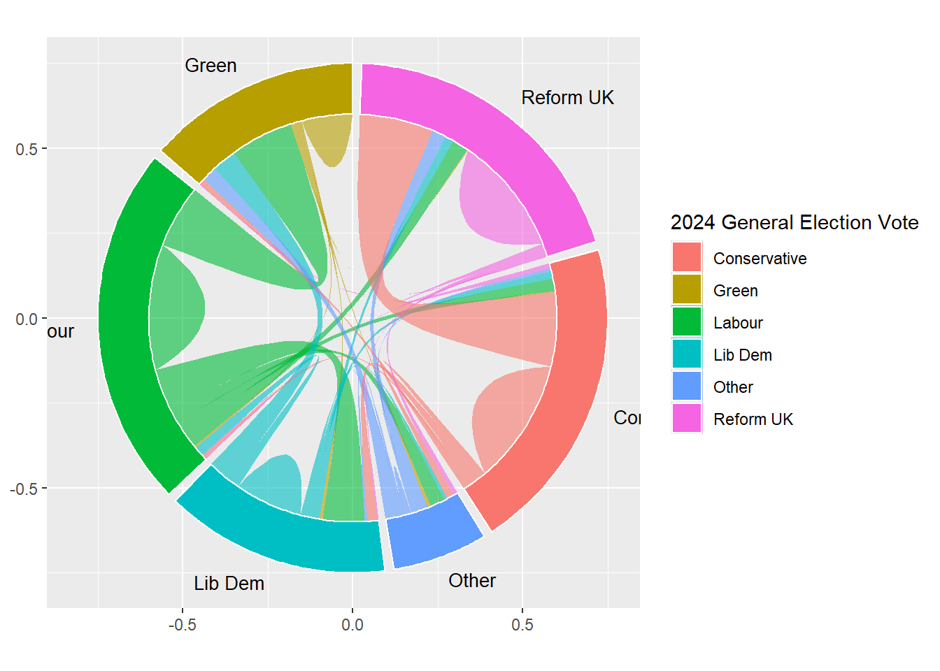
We can make a few small styling changes to improve how this looks, including using the same (party-inspired) colours as the YouGov Sankey chart, removing the redundant chart furniture, and making sure the labels aren’t truncated.
g +
  scale_fill_manual(
    values = c(
      "Green"        = "#31CAA8",
      "Labour"       = "#C20800",
      "Lib Dem"      = "#ffba22",
      "Other"        = "#B3BBC9",
      "Conservative" = "#003CAB",
      "Reform UK"    = "#06A6EE"
    ),
    guide = "none"
  ) +
  scale_x_continuous(limits = c(-1.2, 1.2)) +
  theme_void()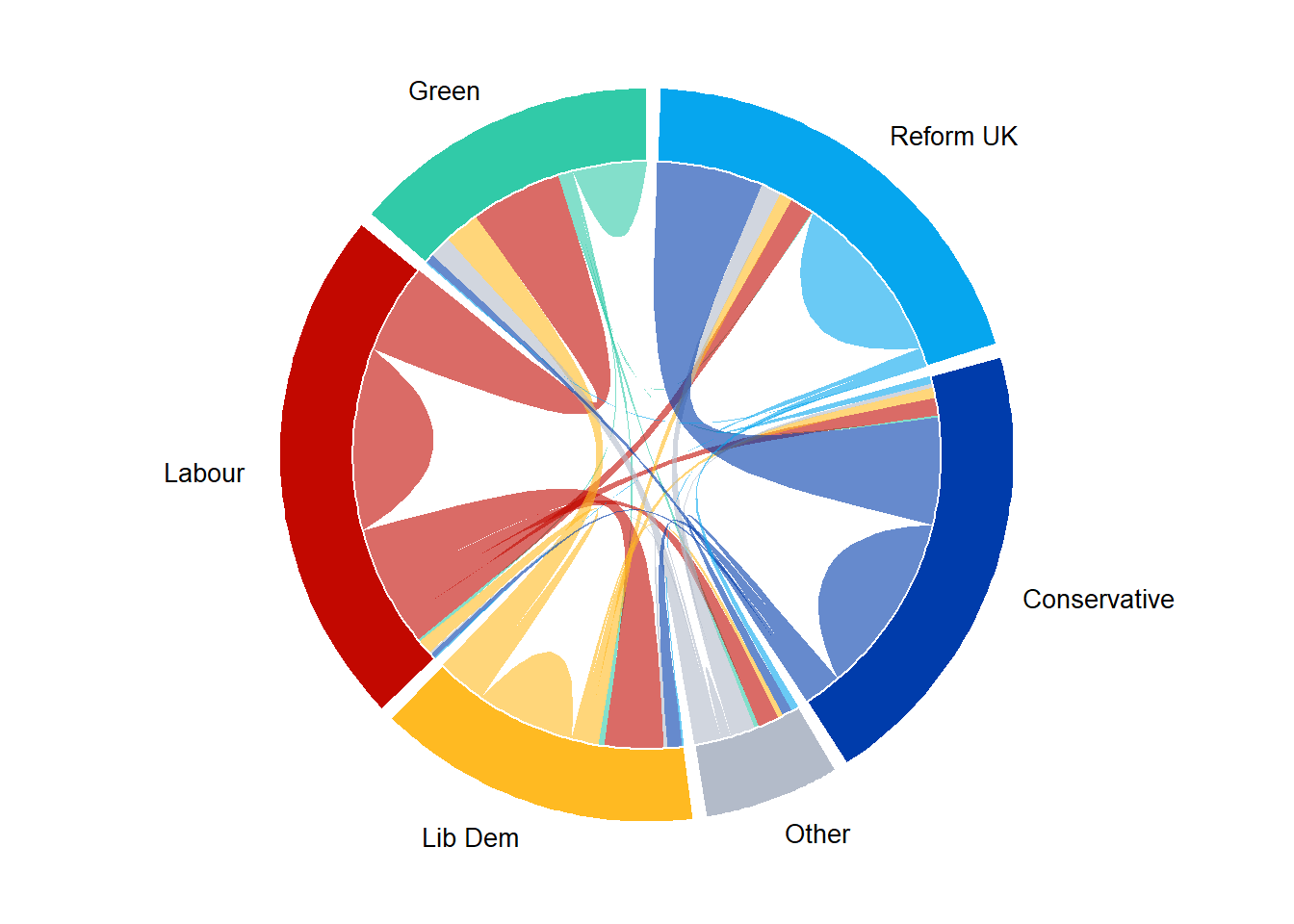
The Sankey chart and the chord diagram do serve slightly different purposes. In the Sankey diagram, it’s easier to compare total vote share across the two years because the nodes essentially serve as two stacked bar charts. However in the chord diagram, it’s a little bit easier to see self-flows (those who remained voting for the same party) and see where the biggest shifts from one party to another were.
Caution
Chord diagrams aren’t usually the most well understood charts. Arguably, a couple of stacked bar charts would be the easiest way to show before and after here. If you’re thinking about using chord diagrams in your work, I’d advise adding some verbal or textual explanation of how they should be interpreted.
You can explore an interactive version of this chord diagram at nrennie.rbind.io/data-viz-projects/local-council-elections.
Future work
This is an early version of ggchord2 and there are some additional features that will be added in future. This will include a geom_chord_diagram_interactive() function which will integrate with the ggiraph package. This means that in future, it will be easier to create interactive chord diagrams with hover effects, tooltips, and Shiny integration.
You can find the documentation and more examples on the package website. If you find a bug or a have a feature request, please raise an issue on GitLab.
Reuse
Citation
BibTeX citation:
@online{rennie2026,
  author = {Rennie, Nicola},
  title = {Chord Diagrams in {R} with `Ggchord2`},
  date = {2026-07-13},
  url = {https://nrennie.rbind.io/blog/chord-diagrams-ggchord2/},
  langid = {en}
}
For attribution, please cite this work as:
Rennie, Nicola. 2026. “Chord Diagrams in R with
`Ggchord2`.” July 13. https://nrennie.rbind.io/blog/chord-diagrams-ggchord2/.