The default settings for chart software are not guaranteed to be accessible, and often need to be adapted for your own chart. In this blog post, we’ll transform a line chart to make it more accessible and more aesthetically pleasing.
Author
Nicola Rennie
Published
January 12, 2026
It’s a myth that accessibility means compromising on aesthetics. Instead, as Michela Tjan writes, accessibility means prioritising communication. In this blog post, we’re going to walk through an example of creating a line chart and transforming it to make it more accessible as well as more aesthetic.
Transforming a line chart
Let’s say I have data where the observations:
are continuous;
and are recorded over time;
for four different categories (A. B, C, D)
The first chart type that most likely comes to mind is a line chart, with four different lines (one for each category).
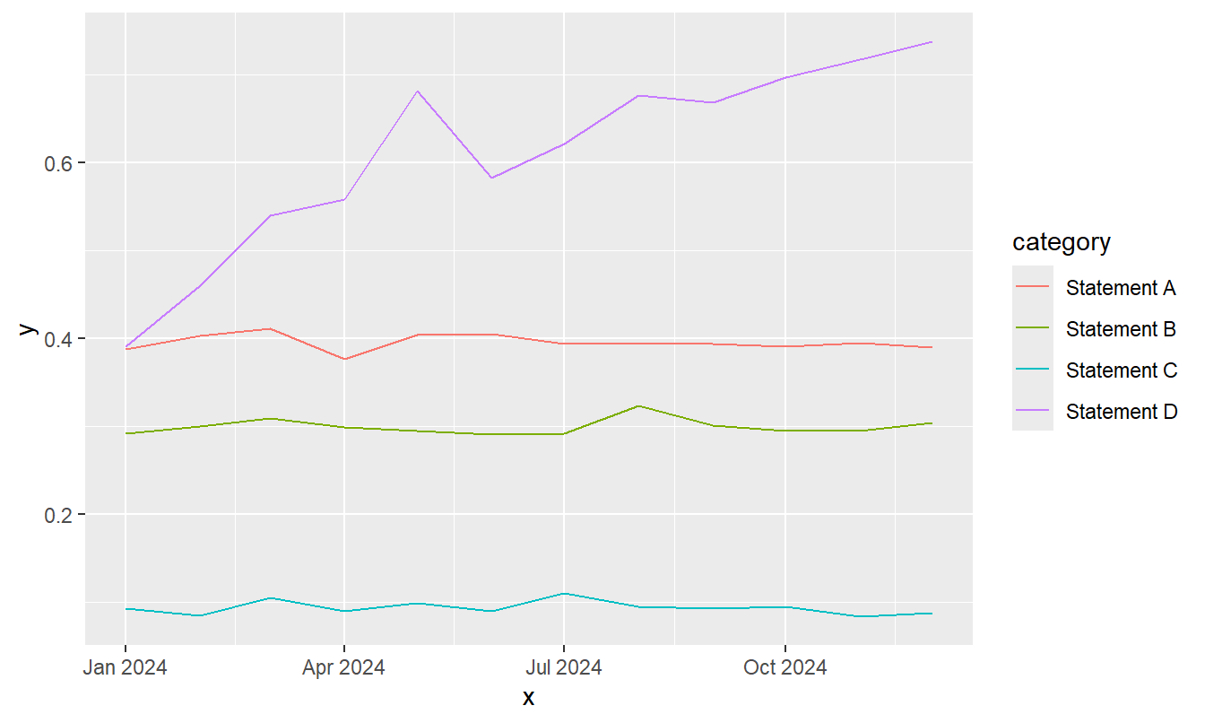
Let’s simulate some data and create a line chart using ggplot2.
Although the examples here are created using ggplot2 in R, this is primarily for demonstration purposes and isn’t intended to call out inaccessibility in ggplot2 over other choices. The advice and warnings reply regardless of which software you are using.
Code
theme_set(theme_grey(base_size =11))g0 <-ggplot(data = plot_data,mapping =aes(x = x, y = y, colour = category)) +geom_line()g0
There are many things that we can do to improve this line chart, both in terms of accessibility and aesthetics. Regardless of your software choice, don’t assume default settings are well-chosen.
Sizing
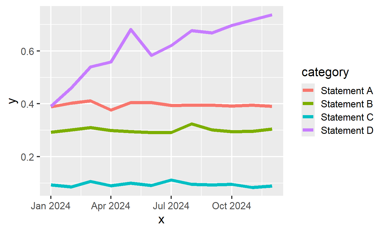
The first thing that jumps out at me in the default chart, is how thin the lines are and how that makes them quite difficult to see. The default font size is also quite small. Let’s increase the line width and font size. If we had points or bars in our chart, we would also want to increase the size of the points and the line width of the bar outlines.
Code
theme_set(theme_grey(base_size =16))g <-ggplot(data = plot_data,mapping =aes(x = x, y = y, colour = category)) +geom_line(linewidth =2)g
Problems resulting from small sizes for fonts and lines are often amplified when viewing charts on smaller screens e.g. on mobile. People shouldn’t have to zoom in to see your chart.
Colours
Let’s move on to thinking about the line colours. Ideally, we want the line colours to be distinguishable from each other, and also from the background.
Tip
The WCAG (Web Content Accessibility Guidelines) require specific colour contrast ratios for text and graphics to ensure readability: 4.5:1 for normal text and 3:1 for large text or UI components. This guidance isn’t written with data visualisation in mind so it can be tricky to apply in the context of charts.
APCA (Advanced Perceptual Contrast Algorithm) includes checks for contrast at different line widths and sizes, so might be more helpful when choosing colours for e.g. lines vs areas in charts.
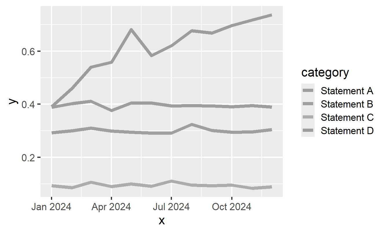
The first thing we can check is whether the default colours are appropriate and accessible for people with colour vision deficiency. There are many different tools that you can use to simulate colour-blindness, both for palettes in general and for the way a chart might appear. A quick way to check whether your colours are likely to be colour-blind-friendly, is to see how the image would look printed in black and white. You can use simple image editing tools to desaturate the image, or if viewing in a browser use File -> Print to PDF.
Let’s see what our default colours look like in greyscale:
Code
des <-function(c) colorspace::desaturate(c, severity =1)g_des <- colorblindr:::edit_colors(g, des)plot(g_des)
Since all of the default colours are equally bright, in greyscale they look identical and there’s no way to tell apart the lines.
So how do you choose a good colour palette? There isn’t a single colour palette that is the best colour palette for everyone. For example, some people may require high contrast colours whilst other people may require lower contrast. However, some colour palettes are better than others.
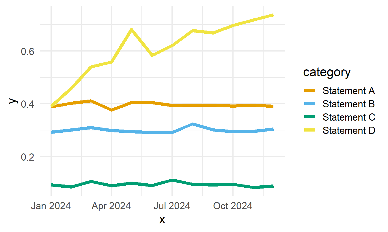
There are a couple of good default options. The colours in the Okabe-Ito palette were chosen specifically to be distinguishable by those with the three frequent forms of colour-blindness. Since version 4.0.0, it’s been the default colour palette for base R plots. Paul Tol also introduced several colour-blind-friendly palettes, including high contrast options.
Let’s replace our default line chart colours with the Okabe-Ito palette. We’ll also remove the grey background from the chart and replace it with white to increase the contrast between the lines and the background.
Code
theme_set(theme_minimal(base_size =16))g <- g +scale_colour_manual(values = okabeito)g
I particularly like Viz Palette for evaluating colour palette options. It gives you some sample charts, and simulates how they are likely to look to people with different types of colour vision deficiency. The feature I appreciate the most is the report on how distinguishable colours are at different line widths. For example, colours may be okay for use in an area chart but not for a line chart.
Don’t rely on colour
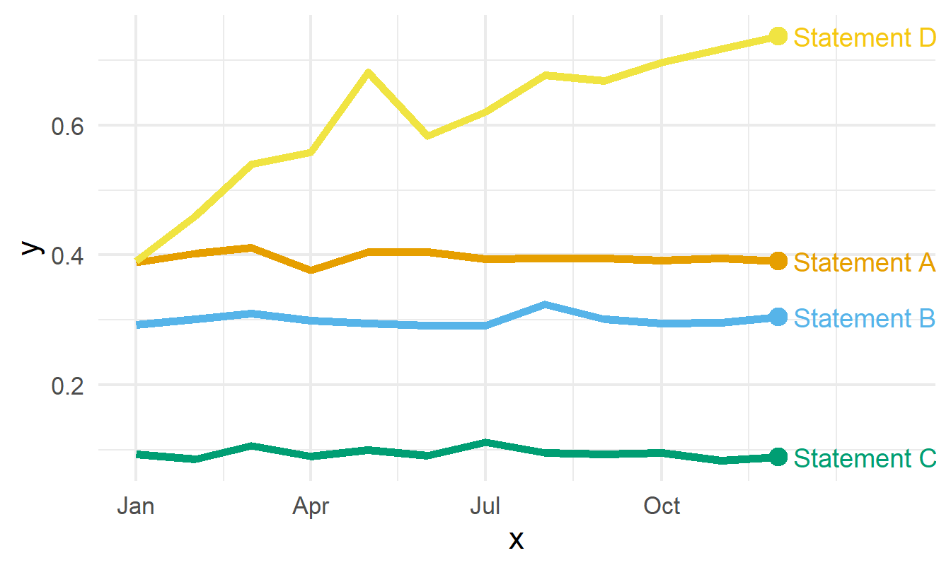
Regardless of how well chosen you think your colours are, it’s important never to rely on them as the only method of distinguishing groups. When creating line charts, an easy way to improve the accessibility of your chart is to add category names to the end of each line as a direct label.
Tip
If you choose to use coloured text for the labels, the colours don’t need to be an exact match to the line colour. Here, the shade of yellow used for the Statement D label is slightly darker than the yellow for the line. This is because the text lines are slightly thinner and so benefit from slightly higher contrast.
Now, we have a much more accessible chart. There’s still some more work we can do around chart text but before we do that, let’s double check if this approach to line charts is always sufficient.
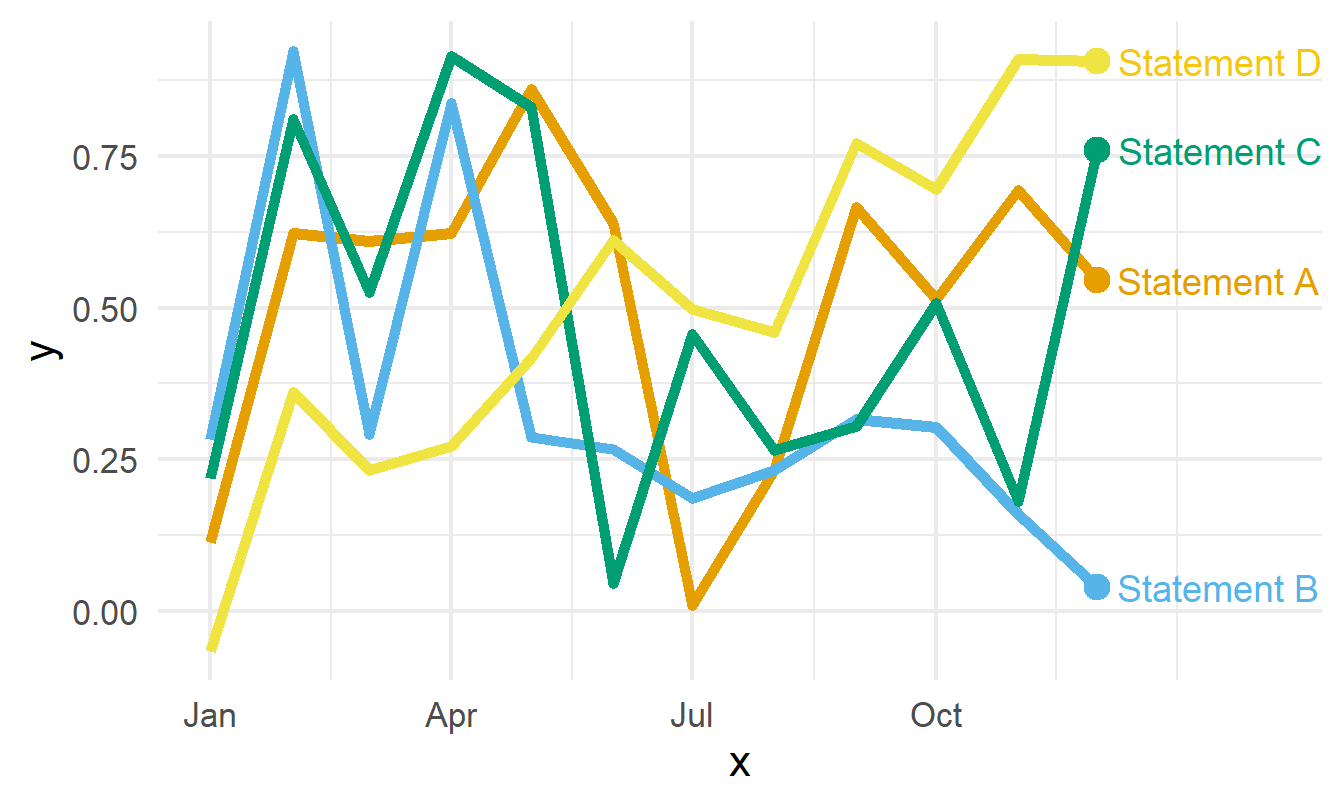
Let’s say we have a second data set. It’s still the same type of data e.g. continuous observations for four categories over time. Surely the same chart type should work for the same data type? Let’s check.
Regardless of how well you can distinguish colours, it’s really hard to distinguish the lines from each other here. There’s lots of crossing over, and so the direct labels become ineffective.
Using different line types (e.g. dashed, dotted) is often suggested as a potential solution. However, using lines that are less complete compared to a solid line has the effect of reducing contrast of the line with the background and so it’s often not a great solution.
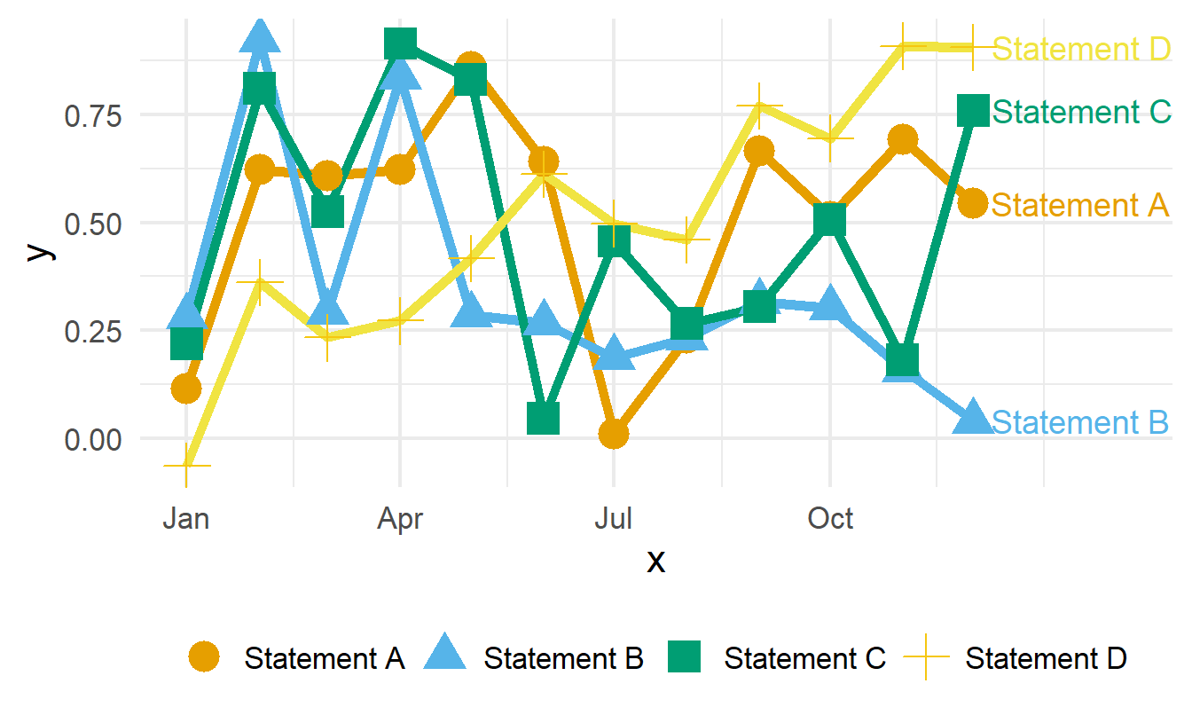
A similar but alternative approach is to use different symbols along each category line. So let’s try that.
It’s might be more accessible in terms of distinguishing categories but it’s actually less accessible in terms of how easy it is to read and interpret. With a quick glance, how easy is it to see which line(s) are increasing? Not very.
Choosing a chart type isn’t just about the type of data, it’s also about the values in the data you are plotting. Sometimes you have to adapt or even throw away the chart you’ve made if it doesn’t work for your data.
Change the chart type
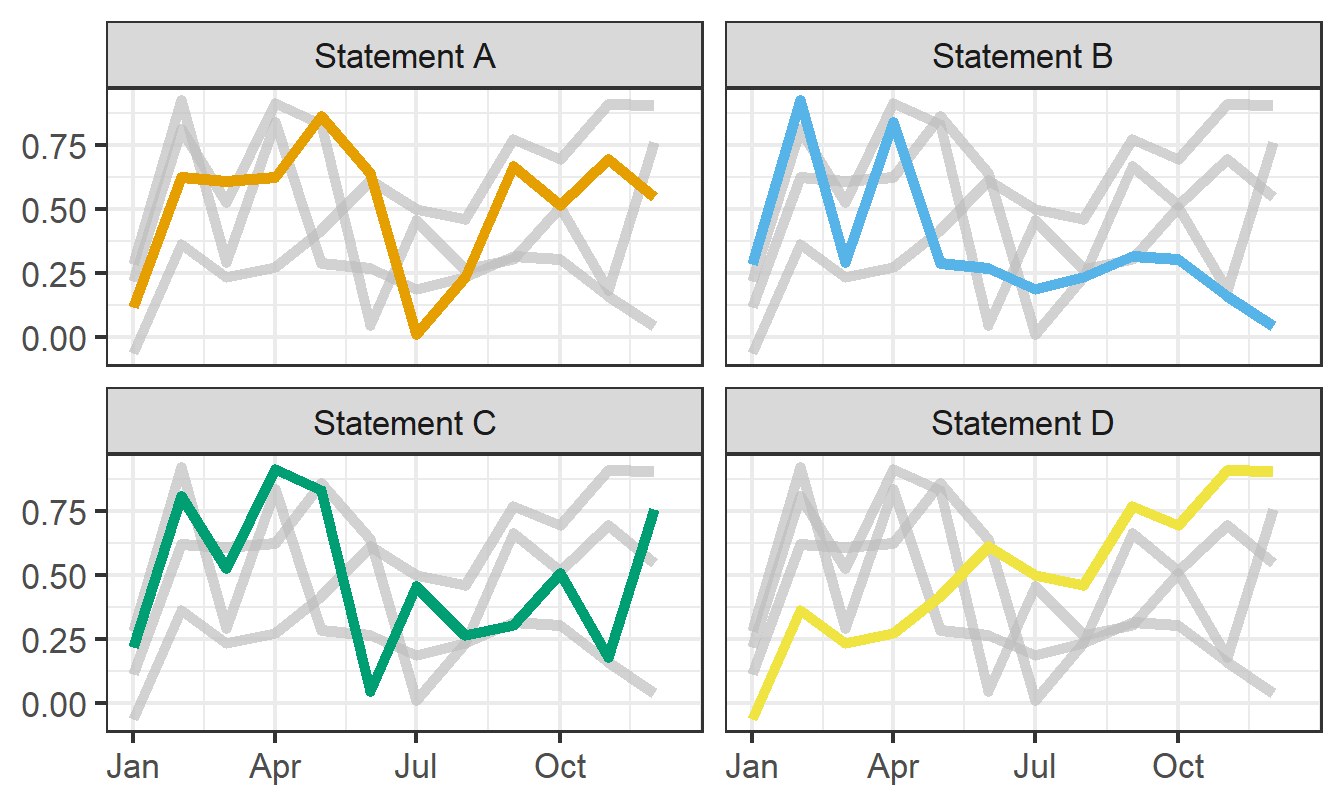
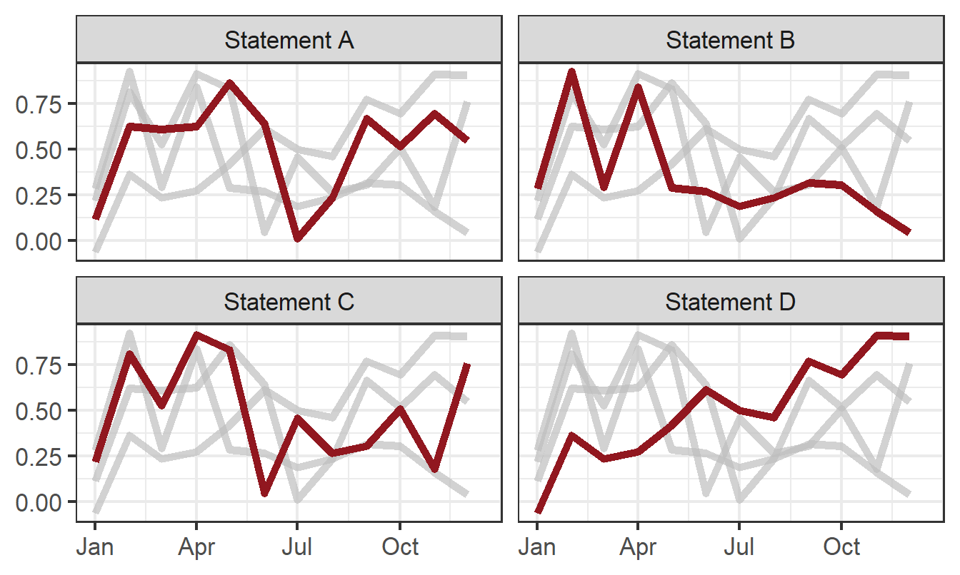
A good alternative to spaghetti line charts is small multiple line charts. Here, instead of one plot showing all four categories in different colours, we create four small line charts, each highlighting one category.
The grey lines in the background still allow comparisons between categories, but it’s much easier to see the trend for each individual category now. However, with this new version of the chart, do we actually need colour? No, we don’t. Since the categories are on separately labelled charts, there’s no need for colours (or symbols) to differentiate. When thinking about colours in charts, we don’t want to rely on colour and we don’t want to over use colour. Let’s instead use it to highlight lines, rather than decorate with extra colours.
Tip
If using brand colours in your charts is important to you, then small multiple charts with a single highlight colour will also likely look more on-brand than a single line chart with 4 or more colours. You can create a chart that is more accessible, more aesthetic, and more on-brand all at the same time!
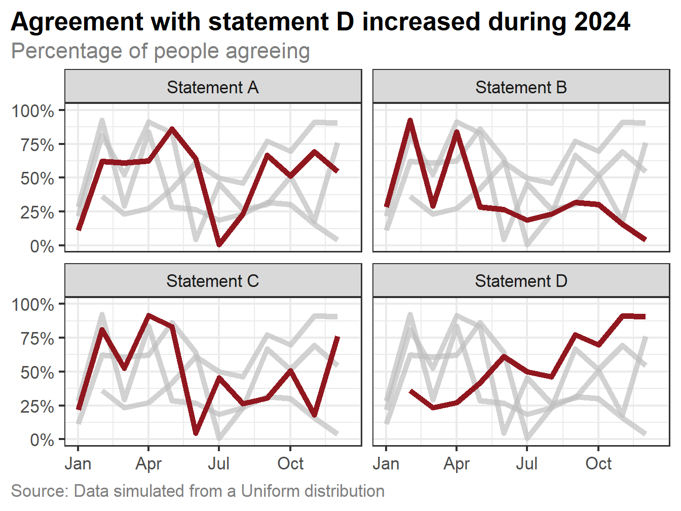
We can further improve our transformed chart by adding text, and adding it thoughtfully. A few tips for text:
Chart text should be horizontal. People shouldn’t have to twist their neck to read category or axis labels.
Choose a sensible font. Much like colours, there isn’t a single font that’s the best choice for everyone. However, choose one that is familiar and where all letters and numbers are distinguishable. For example, make sure you check that an upper-case I, number 1, and lower-case l look different.
We should also make sure that the y-axis labels are well-presented. Percentage data is often recorded between 0 and 1, but if we don’t transform that axis to be between 0 and 100% it’s not always clear whether a value of e.g. 0.2 represents 20% or 0.2%.
Code
g2_final <- g2 +labs(title ="Agreement with statement D increased during 2024",subtitle ="Percentage of people agreeing",x =NULL, y =NULL,caption ="Source: Data simulated from a Uniform distribution") +scale_y_continuous(limits =c(0, 1),labels = scales::label_percent() ) +theme(plot.title =element_textbox_simple(face ="bold"),plot.subtitle =element_text(colour ="grey50", margin =margin(t =5, b =5)),plot.caption =element_text(hjust =0, colour ="grey50"),plot.title.position ="plot",plot.caption.position ="plot",axis.title =element_blank() )g2_final
Before and after
Let’s compare what the default chart looks like (for our second messier dataset), with our transformed version.
I hope you’ll agree that the transformed version is much easier to read, more accessible, and more aesthetically pleasing.
Chart alternatives
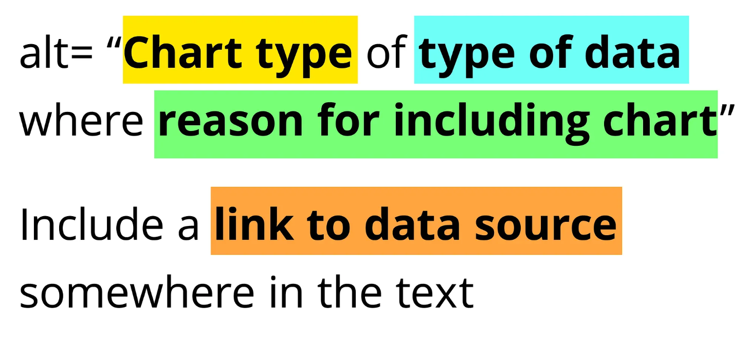
When producing a chart, make sure you include alt text describing the chart. Alt text is read out by screen readers or used in place of an image if internet connection is poor. Amy Cesal’s advice for Writing Alt Text for Data Visualization is especially useful.
Some software such as Word or PowerPoint may try to auto-generate alt text for images, including charts. It’s important that you check this yourself and re-write if needed, since auto-generated alt text often misses the what’s the point? aspect of the chart.
Make sure you also provide access to the data in the chart e.g. in the form of an accessible spreadsheet. This allows people who prefer table formats or who use a screen reader to interact with the data.
Summary
There’s isn’t an easy, formulaic way of designing the best and most accessible chart based solely on what type of data you have. And there isn’t a chart that is the best and most accessible chart for everyone because different people have different needs. The key things to think about are:
What are you trying to show?
Who are you trying to show it to?
What type of data do you have and what are the values in that data?
What is the clearest way to communicate what you’re trying to show to as much of your audience as you can?
You need to start by asking yourself those questions, actively trying different things, and being willing to throw them away if it’s not working. But mostly, if you’re designing things for humans, one of the best things you can do is go and talk to those humans about what they need.
Note
One thing I haven’t mentioned in this blog post is interactivity, and I’m not going to go into detail here because it’s a very big topic on it’s own. All I will say is that, interactivity done well can improve accessibility. Interactivity done badly can make it worse.
I’ll be speaking at Statistics for Every Body: Inclusive Data Communication for Audiences with Visual and Auditory Impairments. This is an online event jointly organised by the Celebrating Diversity SIG and the Statistical Ambassadors of the Royal Statistical Society. The event takes place on Wednesday 28th January 2026 from 12:00 - 13:30, and you can register via the RSS website. The slides will be available online soon.
@online{rennie2026,
  author = {Rennie, Nicola},
  title = {How to Create a More Accessible Line Chart},
  date = {2026-01-12},
  url = {https://nrennie.rbind.io/blog/accessible-line-chart/},
  langid = {en}
}