26 May 2022
About me
PhD Statistics and Operational Research
Data scientist at Jumping Rivers
- Consultancy: shiny, statistics, slides, …
- Internal projects: blogdown websites, reports, plot styling, admin, …
- Training: all things R (and some Tableau coming soon…)
A lot of data visualisation…
My R Journey
- Compulsory R coursework for a statistics course during undergraduate degree
- Learnt Python instead…
- Final year of undergrad gave R another go
- Started learning {tidyverse} during PhD
Why data visualisation?

#30DayChartChallenge
Part 1
What is the #30DayChartChallenge?
- Data visualisation challenge where participants make one chart each day inspired by a daily prompt and category.
- Organised by Cédric Scherer and Dominic Royé, with support from Wendy Shijia and Marco Sciaini.
- Post charts on Twitter with the #30DayChartChallenge (and #DayX)
- See also: 30daychartchallenge.org
Prompts

Why did I make 30 charts?
- One “new tool” for each of the five categories
- Learn some new things
- Make charts that I wanted to make
- Have fun!
How did I make 30 Charts?

The 30 Charts

Day 1 (Part to whole) in R

Day 2 (Pictogram) in R

Day 3 (Historical) in R

Day 4 (Flora) in Tableau (left) and R (right)


Day 5 (Slope) in R

Day 6 (Our World in Data) in R

Day 7 (Physical) in R

Day 8 (Mountains) in Figma

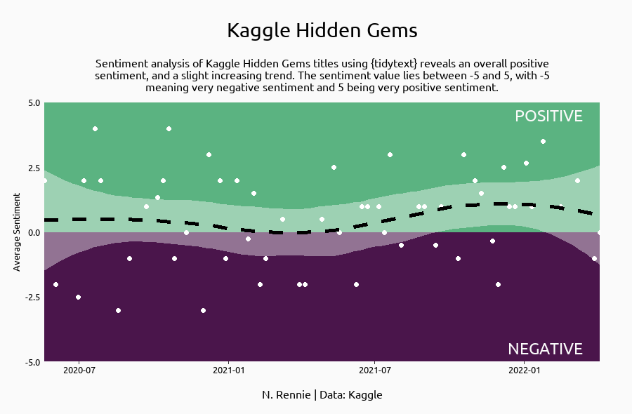
Day 9 (Statistics) in R

Day 10 (Experimental) in R

Day 11 (Circular) in R

Day 12 (The Economist) in R

Day 13 (Correlation) in R

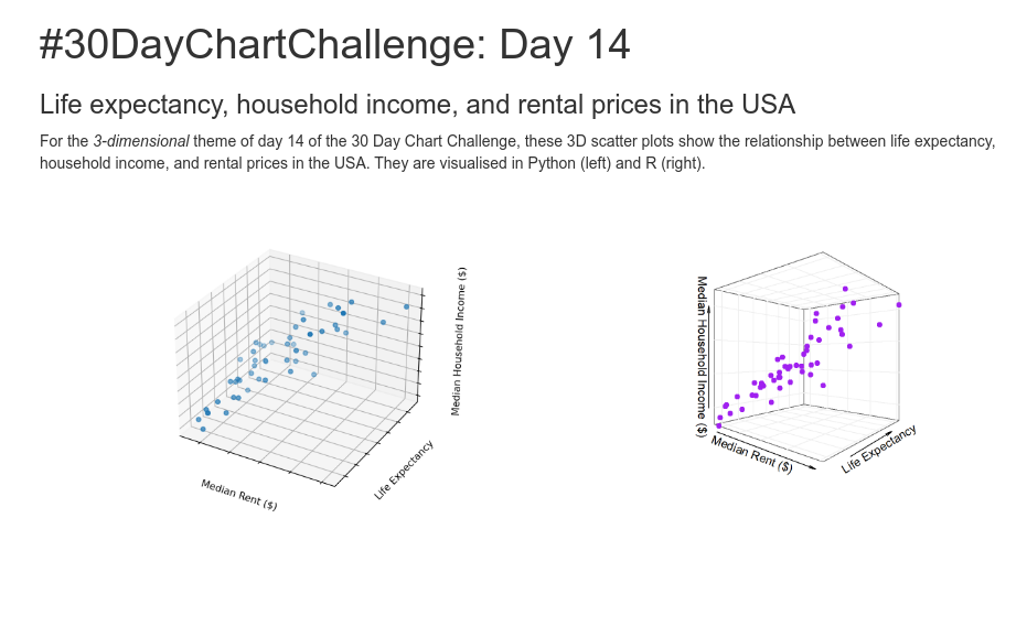
Day 14 (3-Dimensional) in Python and R
Day 15 (Multivariate) in R

Day 16 (Environment) in R

Day 17 (Connections) in R

Day 18 (OECD) in R

Day 19 (Global Change) in R

Day 20 (New Tool) in Inkscape

Day 21 (Down and Upwards) in R

Day 22 (Animation) in R

Day 23 (Tiles) in R

Day 24 (Financial Times) in R

Day 25 (Trend) in R

Day 26 (Interactive) in R
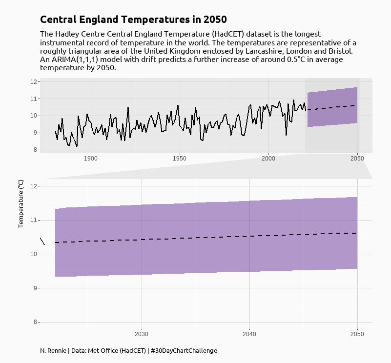
Day 27 (Future) in R
Day 28 (Deviations) in RAWgraphs and Inkscape

Day 29 (Storytelling) in R and Inkscape
Day 30 (UN Population) in R

Lessons Learned
What did I learn?
- R packages
facet_zoom()from {ggforce}- Quarto
- {tidytext}
- Non-R tools can be very helpful…
- Repeating styles should be bundled into an R package
What did I find difficult?
- Time
- Didn’t make charts each day, took breaks, reuse data
- Fitting my ideas and things I wanted to try to fit prompts
- More planning
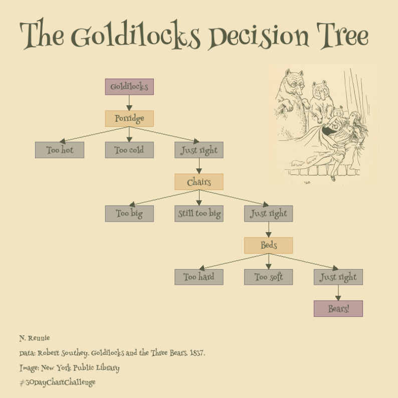
The Goldilocks Decision Tree
Part 2
Flow charts in R
- {grid}
- {DiagrammeR}
- {igraph}
- {ggnetwork} / {ggnet2} / {ggraph}
- {tikz} (LaTeX)
- others…
Let’s try to make a flowchart with {ggplot2}…
R Packages
library(tidyverse)
library(igraph)
library(showtext)
library(rcartocolor)
Data
goldilocks <- tibble(from = c("Goldilocks",
                              "Porridge", "Porridge", "Porridge",
                              "Just right",
                              "Chairs", "Chairs", "Chairs",
                              "Just right2",
                              "Beds", "Beds", "Beds",
                              "Just right3"),
                     to = c("Porridge",
                            "Too cold", "Too hot", "Just right",
                            "Chairs",
                            "Still too big", "Too big", "Just right2",
                            "Beds",
                            "Too soft", "Too hard", "Just right3",
                            "Bears!"))
## # A tibble: 6 × 2
##   from       to
##   <chr>      <chr>
## 1 Goldilocks Porridge
## 2 Porridge   Too cold
## 3 Porridge   Too hot
## 4 Porridge   Just right
## 5 Just right Chairs
## 6 Chairs     Still too big
Defining the layout
g = graph_from_data_frame(goldilocks, directed = TRUE)
coords = layout_as_tree(g)
colnames(coords) = c("x", "y")
##       x y
## [1,]  0 7
## [2,]  0 6
## [3,] -1 5
## [4,] -1 4
## [5,] -2 3
## [6,] -2 2
Adding attributes
output_df = as_tibble(coords) %>%
  mutate(step = vertex_attr(g, "name"),
         x = x*-1,
         type = factor(c(1, 2, 3, 2, 3, 2, 3, 3, 3, 3, 3, 3, 3, 1)),
         label = gsub("\\d+$", "", step))
## # A tibble: 6 × 5
##       x     y step        type  label
##   <dbl> <dbl> <chr>       <fct> <chr>
## 1     0     7 Goldilocks  1     Goldilocks
## 2     0     6 Porridge    2     Porridge
## 3     1     5 Just right  3     Just right
## 4     1     4 Chairs      2     Chairs
## 5     2     3 Just right2 3     Just right
## 6     2     2 Beds        2     Beds
Making the boxes
plot_nodes = output_df %>%
  mutate(xmin = x - 0.35,
         xmax = x + 0.35,
         ymin = y - 0.25,
         ymax = y + 0.25)
## # A tibble: 6 × 9
##       x     y step        type  label       xmin  xmax  ymin  ymax
##   <dbl> <dbl> <chr>       <fct> <chr>      <dbl> <dbl> <dbl> <dbl>
## 1     0     7 Goldilocks  1     Goldilocks -0.35  0.35  6.75  7.25
## 2     0     6 Porridge    2     Porridge   -0.35  0.35  5.75  6.25
## 3     1     5 Just right  3     Just right  0.65  1.35  4.75  5.25
## 4     1     4 Chairs      2     Chairs      0.65  1.35  3.75  4.25
## 5     2     3 Just right2 3     Just right  1.65  2.35  2.75  3.25
## 6     2     2 Beds        2     Beds        1.65  2.35  1.75  2.25
Making the edges
plot_edges = goldilocks %>%
  mutate(id = row_number()) %>%
  pivot_longer(cols = c("from", "to"),
               names_to = "s_e",
               values_to = "step") %>%
  left_join(plot_nodes, by = "step") %>%
  select(-c(label, type, y, xmin, xmax)) %>%
  mutate(y = ifelse(s_e == "from", ymin, ymax)) %>%
  select(-c(ymin, ymax))
## # A tibble: 3 × 5
##      id s_e   step           x     y
##   <int> <chr> <chr>      <dbl> <dbl>
## 1     1 from  Goldilocks     0  6.75
## 2     1 to    Porridge       0  6.25
## 3     2 from  Porridge       0  5.75
Choosing fonts
- Google fonts and the {showtext} package
- Browse fonts: fonts.google.com
library(showtext)
font_add_google(name = "Henny Penny", family = "henny")
showtext_auto()
Plotting (finally!)
p = ggplot() +
  # draw rectangles
  geom_rect(data = plot_nodes,
            mapping = aes(xmin = xmin, ymin = ymin, xmax = xmax, ymax = ymax,
                          fill = type, colour = type),
            alpha = 0.5,
            linejoin = "round") +
  # add text labels
  geom_text(data = plot_nodes,
            mapping = aes(x = x, y = y, label = label),
            family = "henny",
            color = "#585c45") +
  # add arrows
  geom_path(data = plot_edges,
            mapping = aes(x = x, y = y, group = id),
            colour = "#585c45",
            arrow = arrow(length = unit(0.3, "cm"), type = "closed"))
p

Colour schemes
- {rcartocolor}: jakubnowosad.com/rcartocolor
p = p +
  scale_fill_carto_d(palette = "Antique") +
  scale_colour_carto_d(palette = "Antique")
p

Some text labels
p = p +
  labs(title = "The Goldilocks Decision Tree",
       caption = "N. Rennie\n\nData: Robert Southey. Goldilocks and the Three Bears.
       1837.\n\nImage: New York Public Library\n\n#30DayChartChallenge")
p

Background colours
- Choose image
- Extract hex colour: imagecolorpicker.com

Themes
p = p +
  theme_void() +
  theme(plot.margin = unit(c(1, 1, 0.5, 1), "cm"),
        legend.position = "none",
        plot.background = element_rect(colour = "#f2e4c1", fill = "#f2e4c1"),
        panel.background = element_rect(colour = "#f2e4c1", fill = "#f2e4c1"),
        plot.title = element_text(family = "henny", hjust = 0, face = "bold",
                                  size = 40, color = "#585c45",
                                  margin = margin(t = 10, r = 0, b = 10, l = 0)),
        plot.caption = element_text(family = "henny", hjust = 0,
                                    size = 10, color = "#585c45",
                                    margin = margin(t = 10)))
p

Adding images
- {magick} and {cowplot}
- Inkscape: inkscape.org
Questions?
- Twitter: @nrennie35
- GitHub: github.com/nrennie
- Website: nrennie.rbind.io
- Slides: nrennie.rbind.io/talks/2022-may-rladies-nairobi/