health_spending <- readr::read_csv("https://raw.githubusercontent.com/rfordatascience/tidytuesday/main/data/2026/2026-04-21/health_spending.csv")Exercises
Data
For the exercises, we’ll be using data on global health spending via the TidyTuesday project. There are several datasets available, we’ll focus on health_spending. You can read in the data directly from GitHub.
This dataset has the following variables:
| variable | class | description |
|---|---|---|
| country_name | character | Country or territory name as used by WHO. |
| iso3_code | character | ISO 3166-1 alpha-3 country code. |
| year | integer | Year of observation. |
| indicator_code | character | GHED indicator code. Suffix indicates unit: _che = % of CHE, _usd2023 = constant 2023 US dollars. Indicators: che — Current health expenditure (total, only _usd2023). gghed — Domestic general government health expenditure (GGHE-D). pvtd — Domestic private health expenditure (PVT-D). ext — External health expenditure (EXT). |
| expenditure_type | character | Type of health expenditure. |
| value | double | Indicator value in the unit specified. |
| unit | character | Unit of measurement: % of current health expenditure or constant 2023 US$. |
Since we’re focusing on making visualisations, the following code will clean up the raw data and find the continent for each country:
library(tidyverse)
library(countrycode)
clean_data <- health_spending |>
  filter(str_starts(indicator_code, "che")) |>
  select(country_name, iso3_code, year, value) |>
  mutate(continent = countrycode(iso3_code, "iso3c", "continent"))
Exercises
Exercises 1
The following code produces a chart using ggplot2. Edit the code to:
- Change to using facets instead of (or as well as) colours.
- Make sure the year labels can all be read.
- Make sure it saves nicely with a width of 6 inches and a height of 4 inches.
- Increase all font sizes to be larger.
- Further increase the size of the title.
plot_data <- clean_data |>
  filter(continent == "Oceania")

ggplot(
  data = plot_data,
  mapping = aes(x = year, y = value, colour = country_name)
) +
  geom_line()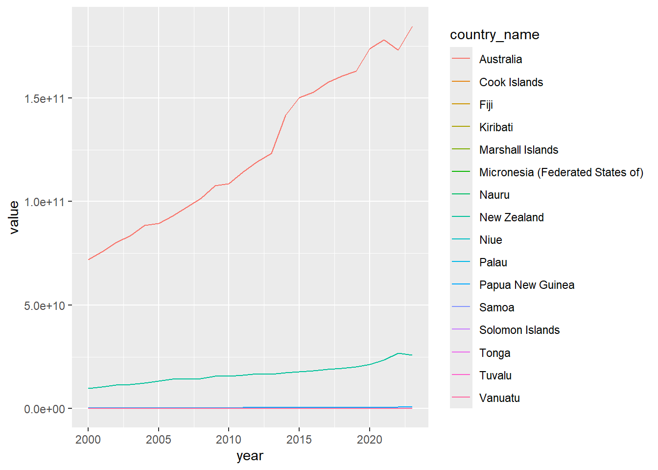
Exercises 2
The following code produces a chart using ggplot2. Edit the code to:
- Use either
ggtextormarqueeto ensure the subtitle text wraps onto multiple lines. - Use either
ggtextormarqueeto make sure country names are all visible in the face labels. - Add an annotation to the
"Australia"facet.
ggplot(
  data = plot_data,
  mapping = aes(x = year, y = value)
) +
  geom_line() +
  facet_wrap(~country_name) +
  scale_x_continuous(
    guide = guide_axis(check.overlap = TRUE)
  ) +
  labs(
    x = NULL, y = NULL,
    title = "Australia has highest healthcare expenditure in Oceania",
    subtitle = "Health expenditure by country. 2000 to 2023. Values are scaled to US Dollars (2023).",
    caption = "Source: WHO Global Health Expenditure Database"
  ) +
  theme_minimal(base_size = 12) +
  canvas(
    width = 6, height = 4,
    units = "in",
    dpi = 300
  )
Exercises 3
Create your own theme using some of the options and packages we’ve already discussed:
my_theme <- function() {
  # Your theme code goes here
}
Apply your theme:
ggplot(
  data = plot_data,
  mapping = aes(x = year, y = value)
) +
  geom_line() +
  facet_wrap(~country_name, scales = "free_y") +
  scale_x_continuous(
    guide = guide_axis(check.overlap = TRUE)
  ) +
  scale_y_continuous(labels = label_currency(scale = (1/1000000), suffix = "M")) +
  labs(
    x = NULL, y = NULL,
    title = "Australia has highest healthcare expenditure in Oceania",
    subtitle = "Health expenditure by country. 2000 to 2023. Values are scaled to US Dollars (2023).",
    caption = "Source: WHO Global Health Expenditure Database"
  ) +
  my_theme() +
  canvas(
    width = 6, height = 6,
    units = "in",
    dpi = 300
  )