health <- readr::read_csv("https://raw.githubusercontent.com/rfordatascience/tidytuesday/main/data/2026/2026-09-29/health.csv")Examples
Data
For the exercises, we’ll be using data on health metrics in urban centres via the TidyTuesday project. You can read in the data directly from GitHub.
This dataset has the following variables:
health.csv
| variable | class | description |
|---|---|---|
| ID_UC_G0 | double | Unique ID. |
| GC_UCN_MAI_2025 | character | Urban Centre Main Name. |
| GC_CNT_GAD_2025 | character | Country name. GADM. |
| GC_UCA_KM2_2025 | double | Urban centre area in 2025. |
| GC_POP_TOT_2025 | double | Urban centre total population. |
| GC_DEV_WIG_2025 | character | World Bank Income Group. |
| GC_DEV_USR_2025 | character | UN SDG Region, geographic and statistical groupings of countries used by the UN. |
| HL_FCL_HOS_2024 | double | Number of hospitals in 2024. |
| HL_FCL_PHA_2024 | double | Number of pharmacies in 2024. |
| HL_FDE_HOS_2024 | double | Number of hospitals per urban centre area (km2) in 2024. |
| HL_FDE_PHA_2024 | double | Number of pharmacies per urban centre area (km2) in 2024. |
| HL_FPC_HOS_2025 | double | Number of hospitals per capita in 2025. |
| HL_FPC_PHA_2025 | double | Number of pharmacies per capita in 2025. |
| HL_POP_HOS_2025 | double | Population living within 1 km buffer from a hospital in 2025. |
| HL_POP_PHA_2025 | double | Population living within 1 km buffer from a pharmacy in 2025. |
| HL_SHP_HOS_2025 | double | Share of the urban centre population living within 1 km buffer from a hospital in 2025. |
| HL_SHP_PHA_2025 | double | Share of the urban centre population living within 1 km buffer from a pharmacy in 2025. |
Examples
Since we’re focusing on making visualisations, the following code will clean up the raw data and find the continent for each country:
library(tidyverse)
plot_data <- health |>
  select(
    region = GC_DEV_USR_2025,
    hospitals = HL_FPC_HOS_2025
  ) |>
  drop_na()
Example 1
Initial plot:
ggplot() +
  geom_density(
    data = plot_data,
    mapping = aes(x = hospitals),
    fill = "red4",
    colour = "red4",
    alpha = 0.4
  ) +
  facet_wrap(~region)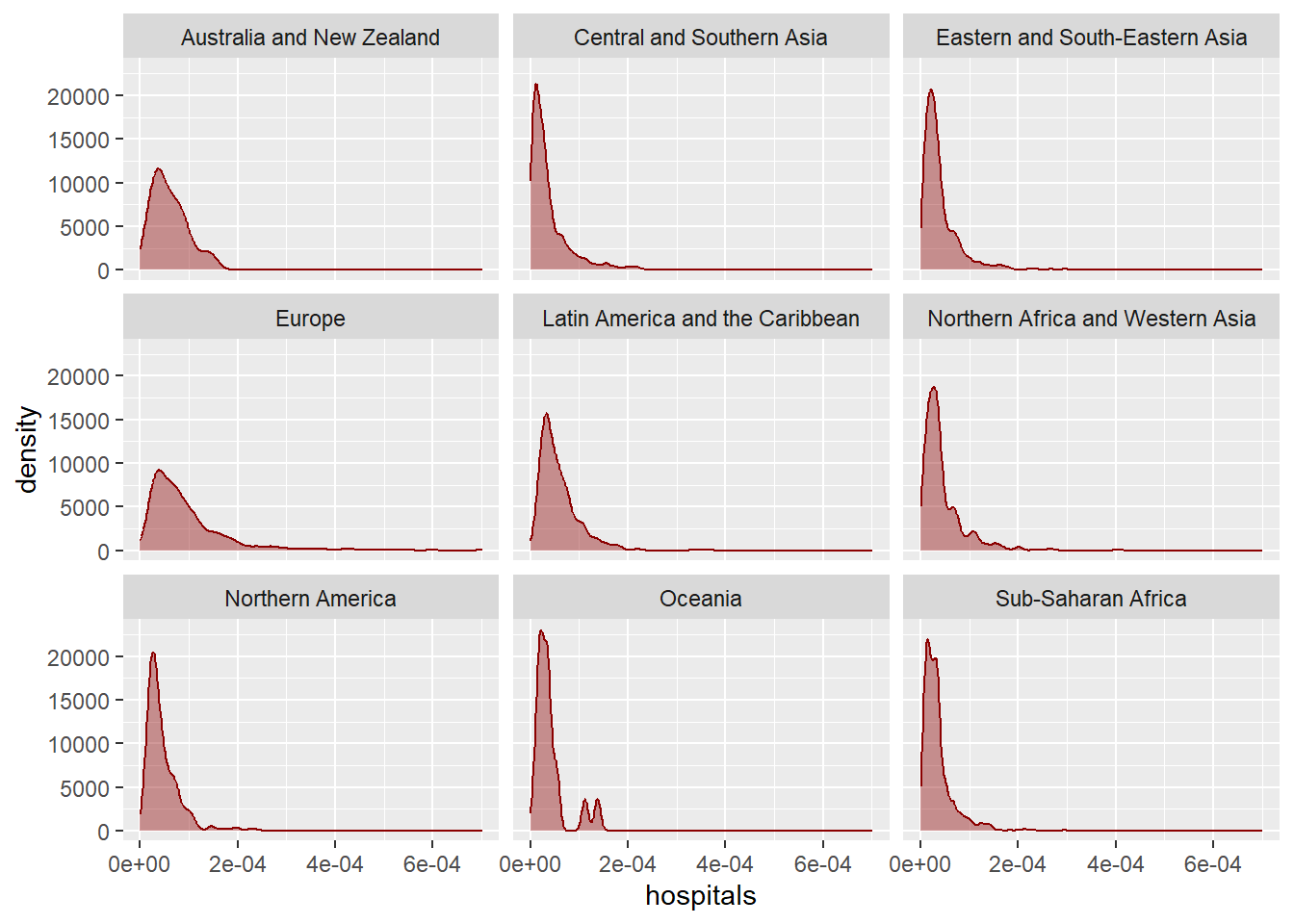
Add ggview():
ggplot() +
  geom_density(
    data = plot_data,
    mapping = aes(x = hospitals),
    fill = "red4",
    colour = "red4",
    alpha = 0.4
  ) +
  facet_wrap(~region) +
  canvas(
    width = 6, height = 4,
    units = "in",
    dpi = 300
  )
Saving with ggview():
ggplot() +
  geom_density(
    data = plot_data,
    mapping = aes(x = hospitals),
    fill = "red4",
    colour = "red4",
    alpha = 0.4
  ) +
  facet_wrap(~region) +
  canvas(
    width = 6, height = 4,
    units = "in",
    dpi = 300
  ) # -> p

save_ggplot(
  plot = p,
  file = "plot.png"
)
Increase the base size:
ggplot() +
  geom_density(
    data = plot_data,
    mapping = aes(x = hospitals),
    fill = "red4",
    colour = "red4",
    alpha = 0.4
  ) +
  facet_wrap(~region) +
  theme_minimal(base_size = 13)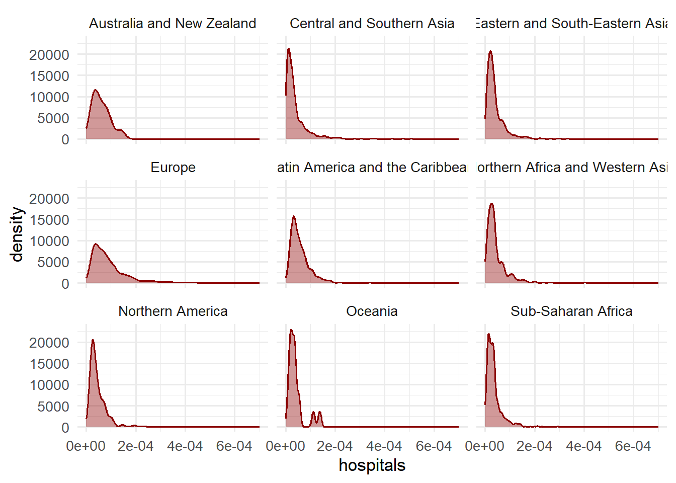
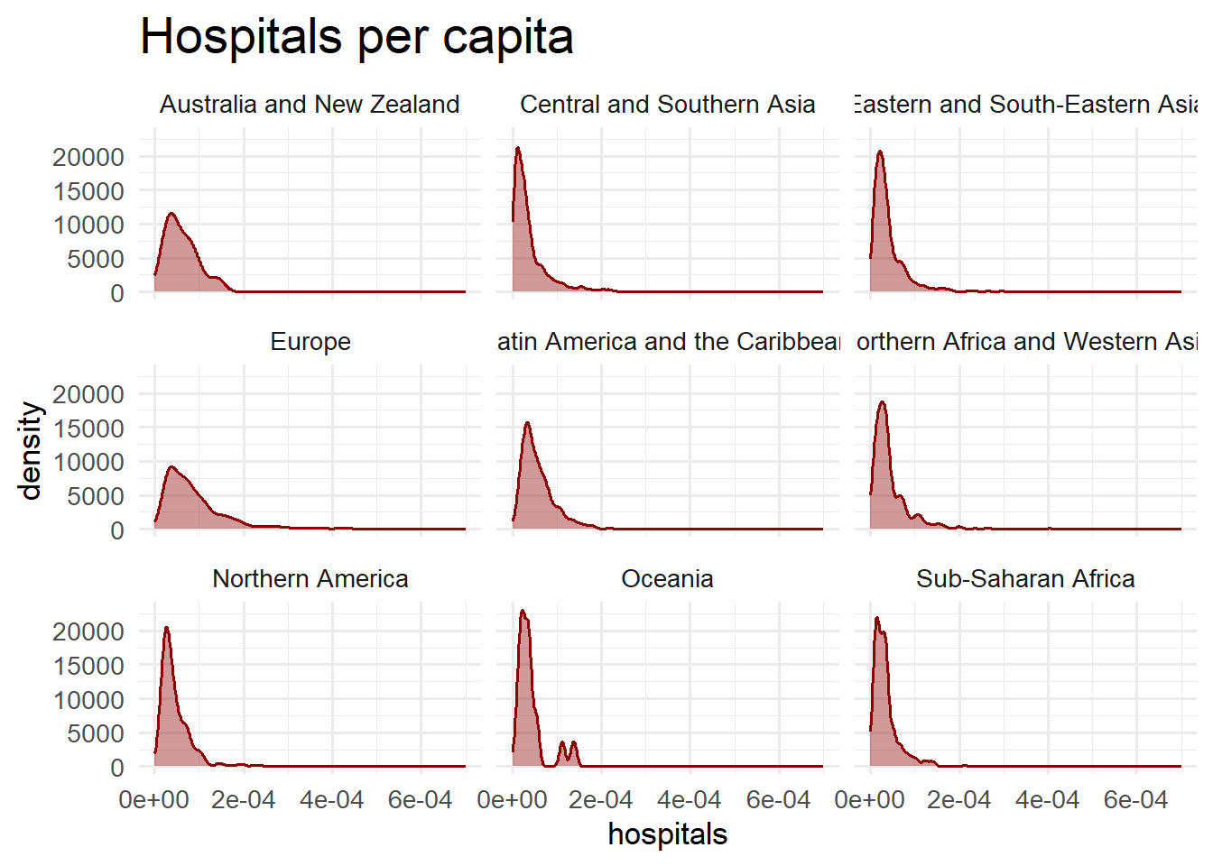
Increase specific element sizes relative to the base size:
ggplot() +
  geom_density(
    data = plot_data,
    mapping = aes(x = hospitals),
    fill = "red4",
    colour = "red4",
    alpha = 0.4
  ) +
  facet_wrap(~region) +
  labs(title = "Hospitals per capita") +
  theme_minimal(base_size = 13) +
  theme(
    plot.title = element_text(size = rel(1.6))
  )
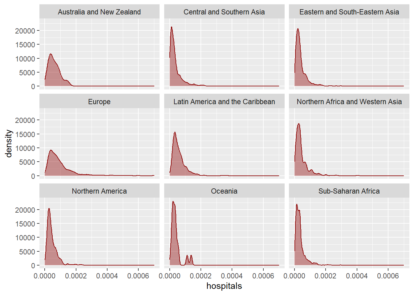
Format y-axis labels:
ggplot() +
  geom_density(
    data = plot_data,
    mapping = aes(x = hospitals),
    fill = "red4",
    colour = "red4",
    alpha = 0.4
  ) +
  facet_wrap(~region) +
  scale_x_continuous(
    labels = scales::label_comma()
  )
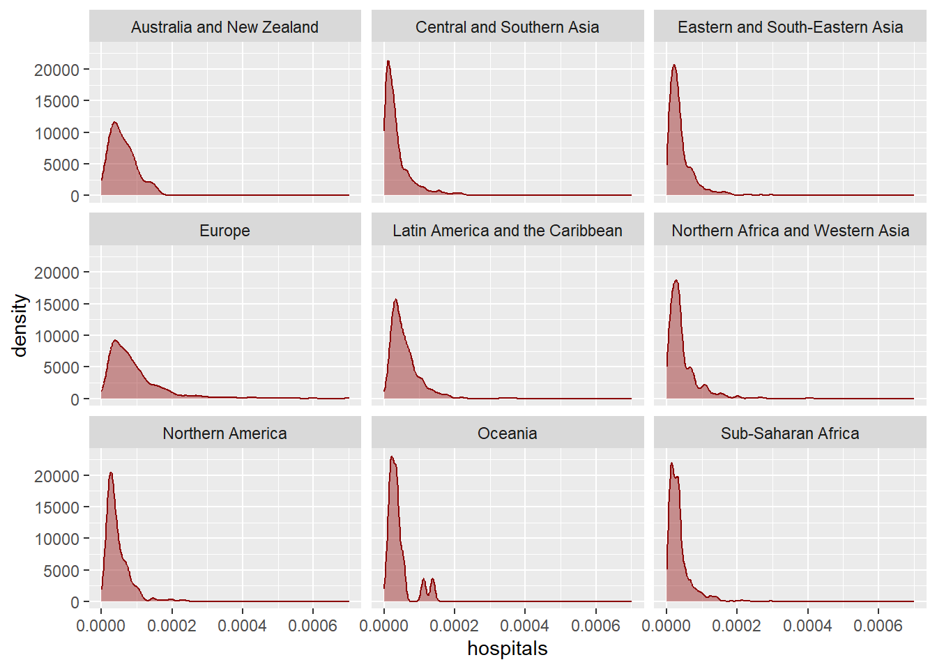
Prevent overlapping axis labels:
ggplot() +
  geom_density(
    data = plot_data,
    mapping = aes(x = hospitals),
    fill = "red4",
    colour = "red4",
    alpha = 0.4
  ) +
  facet_wrap(~region) +
  scale_x_continuous(
    labels = scales::label_comma(),
    guide = guide_axis(check.overlap = TRUE)
  )
Example 2
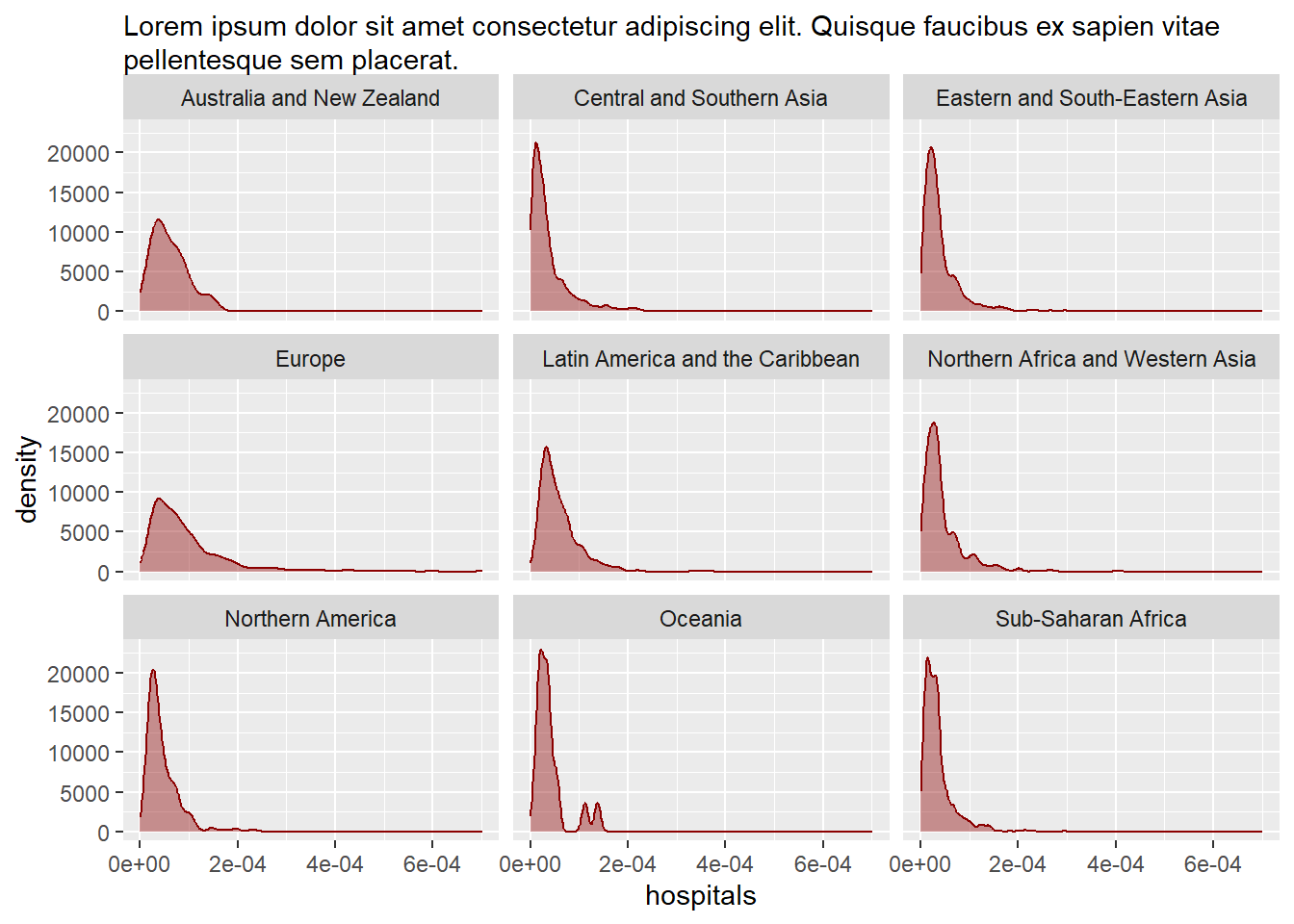
Add a long subtitle:
long_st <- "Lorem ipsum dolor sit amet consectetur adipiscing elit. Quisque faucibus ex sapien vitae pellentesque sem placerat."Wrap with ggtext:
library(ggtext)
ggplot() +
  geom_density(
    data = plot_data,
    mapping = aes(x = hospitals),
    fill = "red4",
    colour = "red4",
    alpha = 0.4
  ) +
  facet_wrap(~region) +
  labs(subtitle = long_st) +
  theme(
    plot.subtitle = element_textbox_simple()
  )
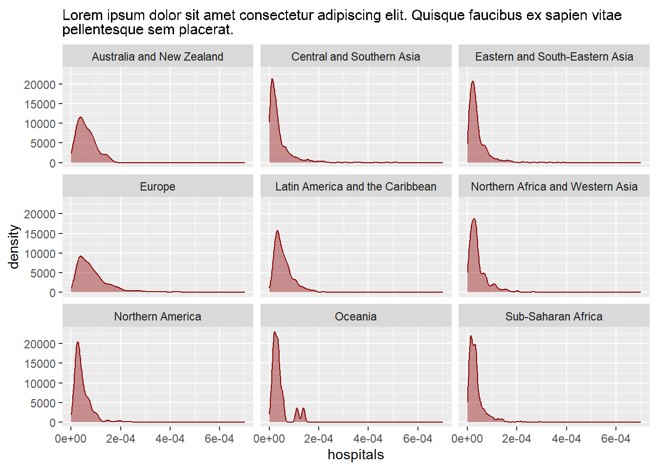
Or marquee:
library(marquee)
ggplot() +
  geom_density(
    data = plot_data,
    mapping = aes(x = hospitals),
    fill = "red4",
    colour = "red4",
    alpha = 0.4
  ) +
  facet_wrap(~region) +
  labs(subtitle = long_st) +
  theme(
    plot.subtitle = element_marquee(width = 1)
  )
Add Markdown formatting:
long_st <- "**Note**: Lorem ipsum dolor sit amet consectetur adipiscing elit. Quisque faucibus ex sapien vitae pellentesque sem placerat."Add the region name to the top right corner:
ggplot() +
  geom_density(
    data = plot_data,
    mapping = aes(x = hospitals),
    fill = "red4",
    colour = "red4",
    alpha = 0.4
  ) +
  geom_text(
    data = plot_data |> slice_head(by = region),
    mapping = aes(x = I(0.95), y = I(0.95), label = region),
    hjust = 1
  ) +
  facet_wrap(~region)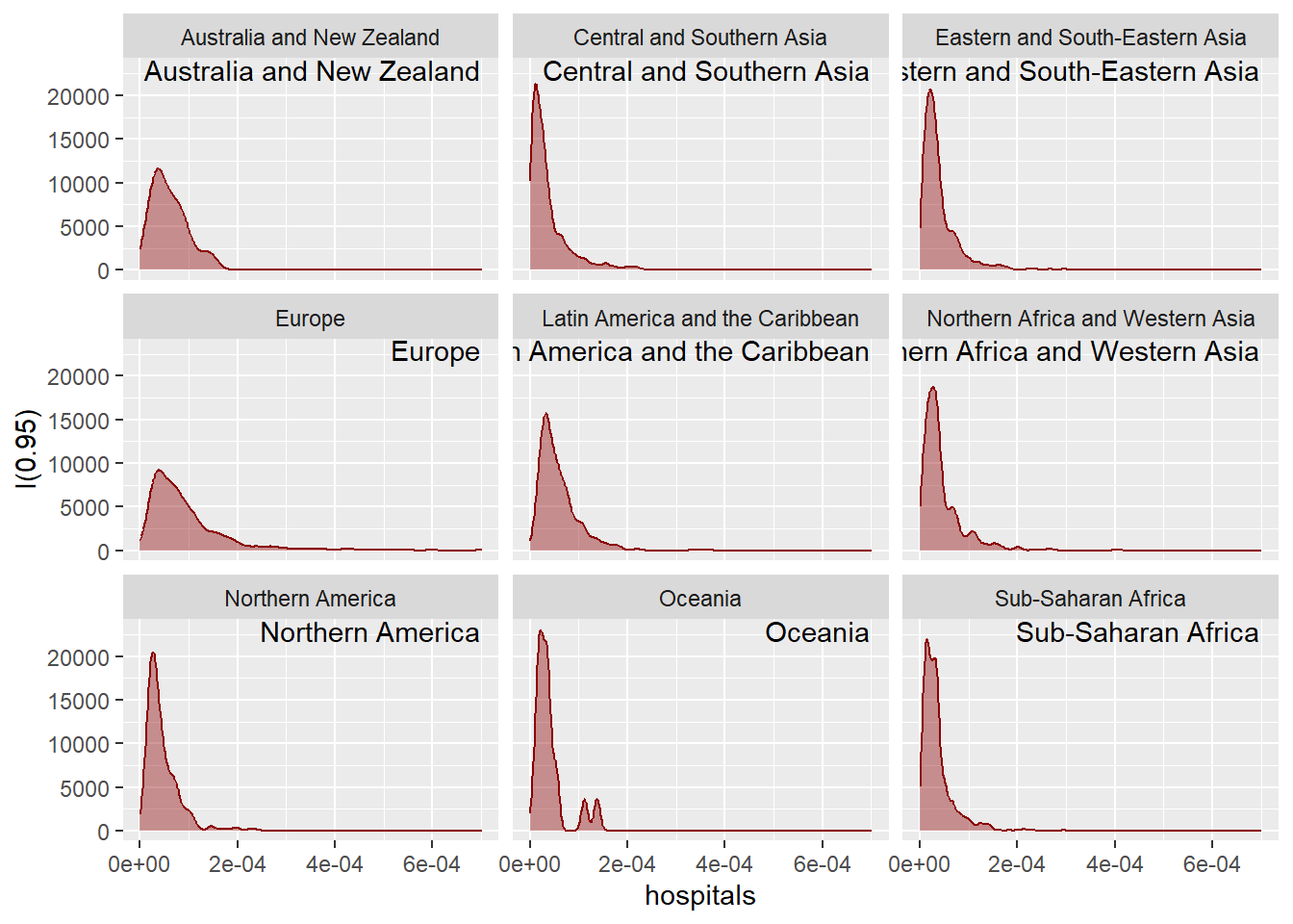
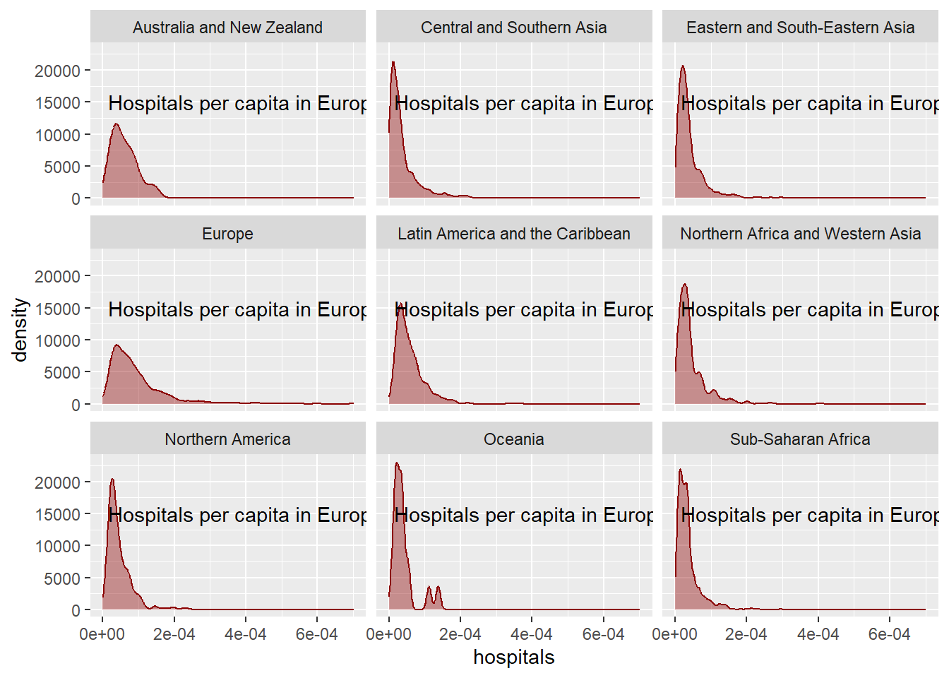
Add an annotation:
ggplot() +
  geom_density(
    data = plot_data,
    mapping = aes(x = hospitals),
    fill = "red4",
    colour = "red4",
    alpha = 0.4
  ) +
  facet_wrap(~region) +
  annotate("text",
    x = 0.0004, y = 15000,
    label = "Hospitals per capita in Europe"
  )
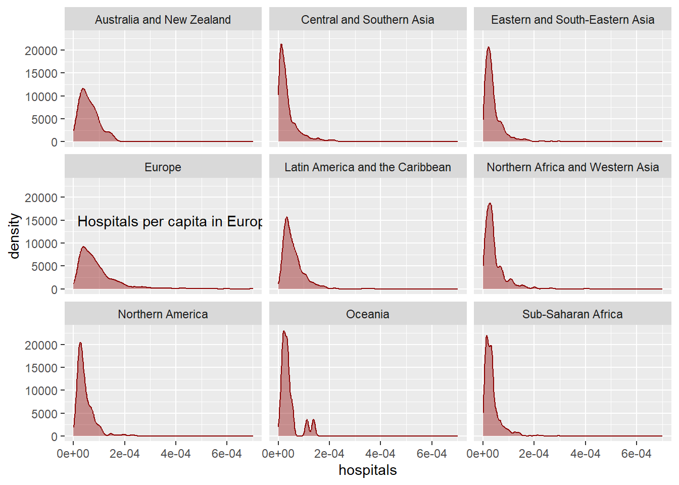
Add an annotation to the European facet:
library(ggh4x)
ggplot() +
  geom_density(
    data = plot_data,
    mapping = aes(x = hospitals),
    fill = "red4",
    colour = "red4",
    alpha = 0.4
  ) +
  facet_wrap(~region) +
  at_panel(
    annotate("text",
      x = 0.0004, y = 15000,
      label = "Hospitals per capita in Europe"
    ),
    region == "Europe"
  )
Example 3
Create variables to store colours:
text_col <- "grey10"
highlight_col <- "#B01D5F"
bg_col <- "white"
Create your own basic theme():
my_theme <- function(base_size = 13) {
  theme_minimal(base_size = base_size)
}ggplot() +
geom_density(
data = plot_data,
mapping = aes(x = hospitals),
fill = highlight_col,
colour = highlight_col,
alpha = 0.4
) +
facet_wrap(~region) +
my_theme()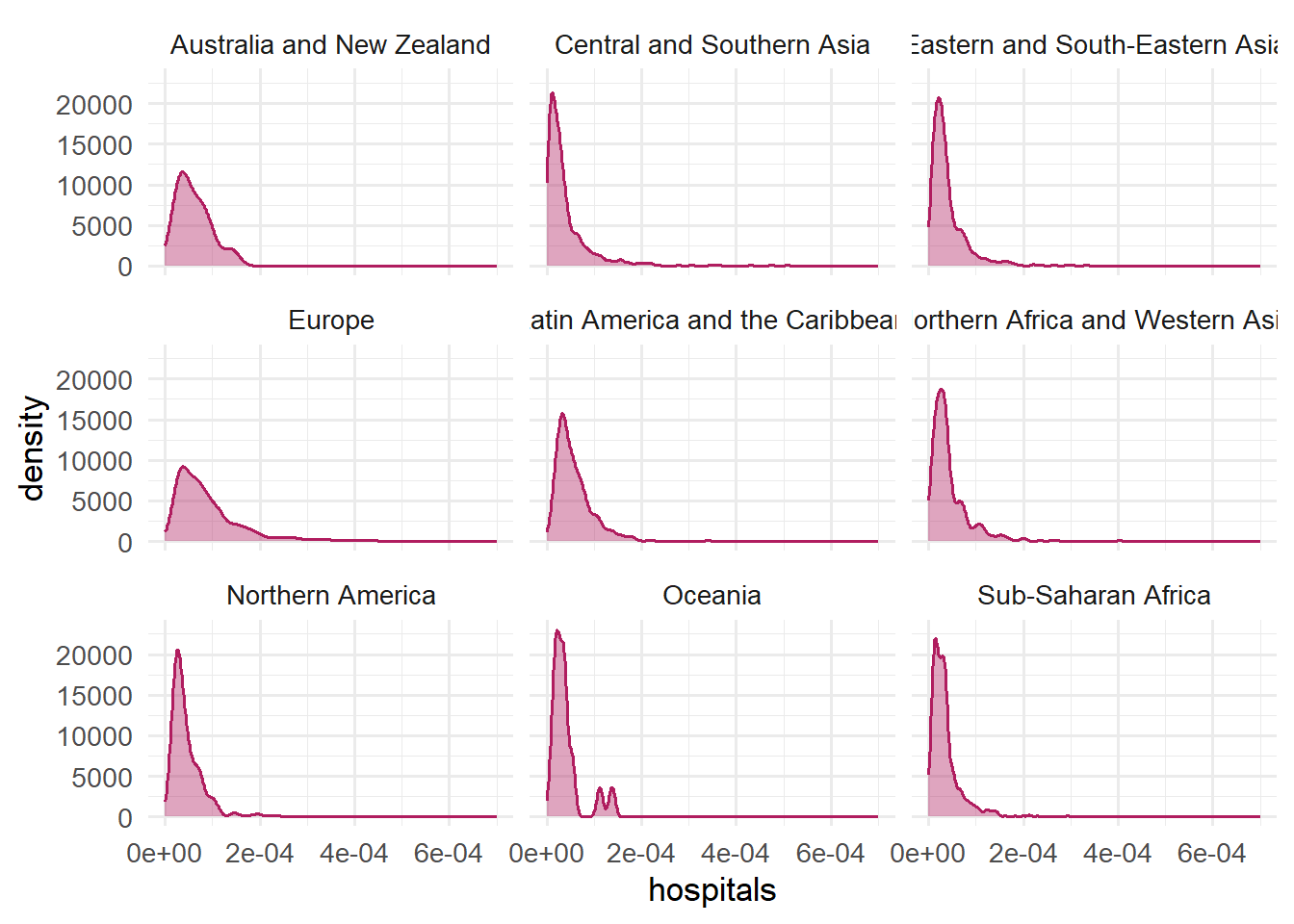
Create your own more complex theme():
my_theme <- function(base_size = 13) {
  theme_minimal(base_size = base_size) +
    theme(
      plot.title = element_textbox_simple(face = "bold", size = rel(1.3)),
      plot.subtitle = element_textbox_simple(),
      plot.caption = element_textbox_simple(),
      strip.text = element_textbox_simple(minheight = unit(0.3, "in"))
    )
}ggplot() +
geom_density(
data = plot_data,
mapping = aes(x = hospitals),
fill = highlight_col,
colour = highlight_col,
alpha = 0.4
) +
facet_wrap(~region) +
labs(title = "Hospitals per capita", subtitle = long_st) +
my_theme() 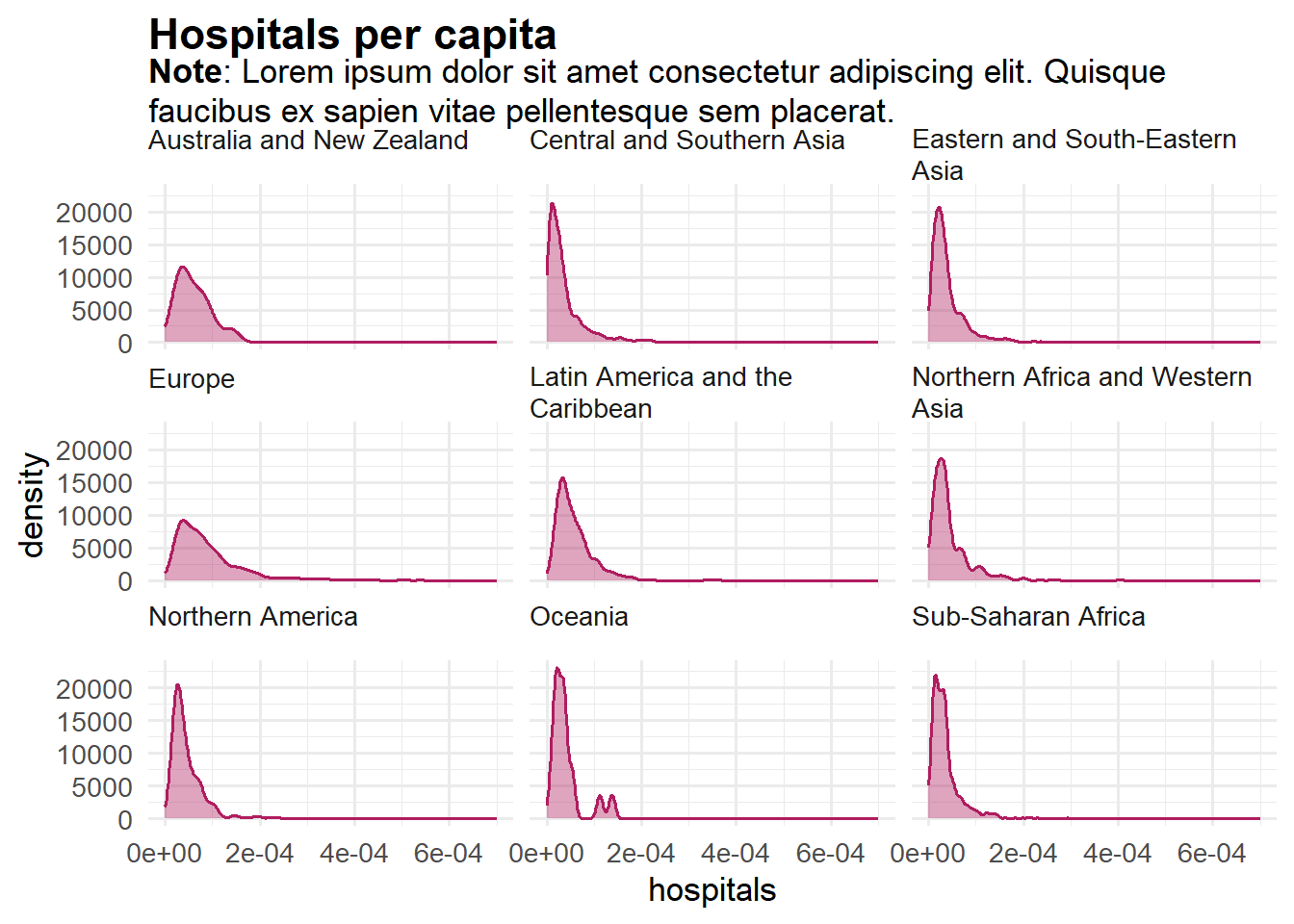
Use namespacing (::) to make it easier to reuse:
my_theme <- function(base_size = 13) {
  ggplot2::theme_minimal(base_size = base_size) +
    ggplot2::theme(
      plot.title = ggtext::element_textbox_simple(face = "bold", size = rel(1.3)),
      plot.subtitle = ggtext::element_textbox_simple(),
      plot.caption = ggtext::element_textbox_simple(),
      strip.text = ggtext::element_textbox_simple(minheight = unit(0.3, "in"))
    )
}