Detecting heart murmurs from time series data in R
R
Statistics
Machine Learning & AI
Time series analysis can uncover hidden structures in data collected over time. In this blog post, I’ll use {tsfeatures} to extract time series features and {tidymodels} to predict which sound recordings of heartbeats contain heart murmurs, using those time series features.
Author
Nicola Rennie
Published
April 14, 2023
Time series data often contains information that’s not easily seen when simply visualising the data. We can uncover these hidden features using time series analysis, and use them to classify time series that exhibit similar features.
Data
In this blog post, we’ll extract features from and classify time series relating to sound recordings of patients’ heart beats. The data comes from the CirCor DigiScope Phonocardiogram Dataset, and consists of 5,272 heart sound recordings of 1,568 different patients. The data can be downloaded from www.physionet.org/content/circor-heart-sound/1.0.3 - see references at the end of this post for full attribution.
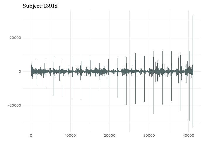
Time series plot of aortic valve sound recording for subject 13918.
Show code: plot sound data
subject1 <-read_data("13918_AV.wav")ggplot(data = subject1) +geom_line(aes(x = sample_time,y = value ),colour ="#546666" ) +labs(x ="", y ="",title =glue("Subject: {subject1$subject_id[1]}") )
Recordings were made at four main locations:
PV: pulmonary valve point
TV: tricuspid valve point
AV: aortic valve point
MV: mitral valve point
Phc: any other auscultation location
Recordings relating to any other auscultation locations were discarded as there were insufficient samples to draw conclusions from. Each sound recording lasted around 10 seconds, recorded at 4000 Hertz, resulting in approximately 40,000 observations per time series - though due to variability in the length of time of the recordings, the lengths of the time series vary slightly. These differing lengths makes direct comparisons of the time series difficult.
In addition to the sound recording data, information on the subjects such as height, weight, age, and whether or not they had been diagnosed with a heart murmur, was also available. The key question I’m interested in is: do time series features differ between people with heart murmurs and those without? There are a total of 2,385 recordings from subjects without heart murmurs, and 610 with heart murmurs, split across the four recording locations:
Location
Absent
Present
AV
602
151
MV
636
171
PV
585
146
TV
562
142
Calculating time series features
The {tsfeatures} package provides support for calculating these time series features in R. Not all features will be useful. For example, trend: we know that there isn’t an increasing trend, given the nature of the sound recording data, so we don’t need to compute this.
For this blog post, I’ve focused on five key features:
Entropy: measures the forecastability of a time series, with lower values indicating a high signal-to-noise ratio, and higher indicating a lower signal-to-noise ratio.
ACF: measures the similarity between a time series and a lagged version of itself. For this post, we consider the first autocorrelation coefficient.
Hurst parameter: measures the long-term memory of a time series. It relates to the rate at the autocorrelations decrease as the lag between values increases.
Comparing features in subjects with and without murmurs
Let’s compare these time series features for subjects with and without heart murmurs. In this analysis, only subjects that have complete data were considered: recordings available at all four locations, and data relating to sex, height, and weight has no missing values - a total of 533 patients.
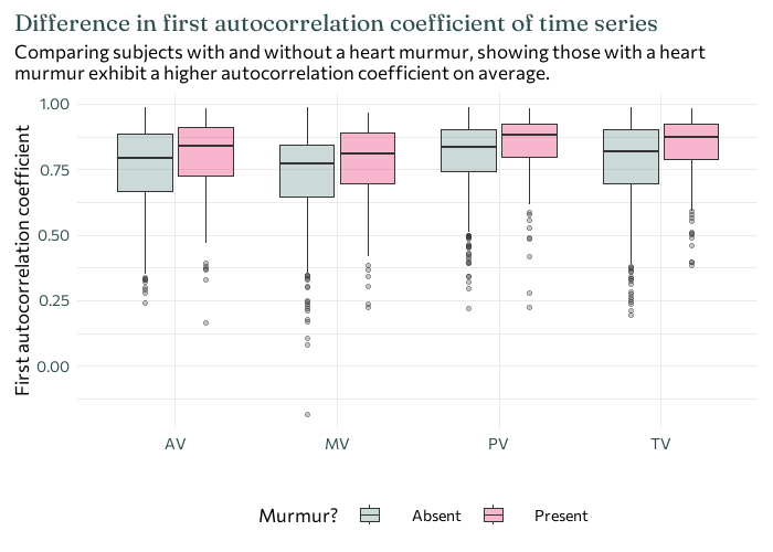
The boxplot below shows the distribution of the first autocorrelation coefficient at each of the four recording locations, and shows how they differ between patients with heart murmurs and those without. On average, those with a heart murmur exhibit a higher autocorrelation coefficient. Though there is considerable overlap in the distributions with and without murmurs, the first autocorrelation coefficients in those with murmurs are consistently higher across all four recording locations - meaning this is a potential variable to consider when trying to predict whether or nor a recording contains a heart murmur.
Show code: plot distribution of ACF
ggplot(all_data) +geom_boxplot(aes(x = aus_loc, y = x_acf1, fill = murmur), alpha =0.3) +labs(x ="", y ="First autocorrelation coefficient",title =str_wrap("Difference in first autocorrelation coefficient of time series", 80),subtitle =str_wrap("Comparing subjects with and without a heart murmur, showing those with a heart murmur exhibit a higher autocorrelation coefficient on average.", 80) ) +theme(legend.position ="bottom",plot.title.position ="plot",legend.spacing.x =unit(0.7, "cm") )
Fitting a model with {tidymodels}
The {tidymodels} framework is a collection of R packages that can be used for statistical modelling and machine learning. Before rushing into fitting and evaluating different models, let’s think a little bit about the data we have:
a binary outcome: a heart murmur is either present or absent.
multiple numeric explanatory variables: 42 in total (10 outputs from the time series features for each recording location, plus height and weight).
a single categorical explanatory variable: sex.
For patients with multiple recordings at the same location, the average of each feature was used.
When it comes to fitting models to data, I always recommend starting with simple models. They’re usually easier to interpret, quicker to run, and easier to explain to someone else. If the simple models give good results, then great - we’re done! If they don’t, you at least have something to benchmark other models against, and a way to justify the use of more complex, often more computationally intensive models.
So to start with, let’s keep it simple and try logistic regression. Logistic regression models a probability based on a linear combination of some (independent) variables. Since they model a probability, the outcome is a value between 0 and 1. Then the classification into whether or not the time series featured a heart murmur is based on the output being greater than or less than 0.5 (be default). Another aspect we need to think about with a regression model is: which explanatory variables are relevant?. There’s currently 43 potential explanatory variables, which is a reasonably high number for a data set of this size. It’s also likely that there’s some collinearity (a relationship between explanatory variables) present, and we probably don’t want to include all potential variables.
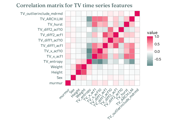
For example, in the correlation heatmap below you can see that, as expected, height and weight are highly correlated, and it’s unlikely to be useful to include both in a model.
Show code: correlation heatmap
all_model_data |>mutate(murmur =case_when( murmur =="Absent"~0, murmur =="Present"~1 ) ) |>select(murmur, Sex, Height, Weight, starts_with("TV_")) |>cor() |>ggcorrplot() +labs(title ="Correlation matrix for TV time series features",x ="", y ="" ) +theme(plot.title.position ="plot",axis.text.x =element_text(angle =45, vjust =1, hjust =1) )
So we need a way of picking which variables to include in our model. One potential way is stepwise regression (where variables are iteratively included/removed from the model and the fit compared). With 43 variables, this approach could take quite a while, and it could be easy to go down the wrong path in selecting variables. Instead, we’re going to use Lasso regression.
Lasso regression is a method for estimating coefficients in linear models, with a special constraint that forces the sum of the absolute value of the coefficients to be less than a particular value. This means that some coefficients are forced to be zero, and so Lasso can be used to automatically select which variables are included in the model, i.e. those that are non-zero.
Julia Silge uses Lasso regression in her blog post looking at data from The Office, and I’d highly recommend having a look at it if you want more examples and explanation of how {tidymodels} can be used for Lasso regression. Read it at juliasilge.com/blog/Lasso-the-office.
We may also want to consider principal component analysis (PCA) which transforms the explanatory variables into a new set of artificial variables (or components). These new variables are chosen to explain the most variability in the original variables, and can also help to deal with correlations between explanatory variables in the data.
In this blog post, let’s compare using Lasso logistic regression on the raw data and Lasso logistic regression on the principal components. Before a model is fitted to the data, we need to split the data into a training set and a test set. This allows us to perform model selection using the training data without biasing the evaluation on the test set.
Within {tidymodels}, we can create what’s called a recipe: a description of the steps to be applied to a data set in order to prepare it for data analysis. Here, we’ll have two recipes: one that simply normalises the raw data, and a second that normalises the data and computes the principal components.
The next step in fitting a Lasso regression model is dealing with \(\lambda\) (a hyperparameter). This isn’t something like the regression coefficients which can be optimally computed based on the data. Instead, we need to try lots of different values of \(\lambda\) and pick the one that performs best. A (potentially) different value of \(\lambda\) should be selected for the model using the principal components as explanatory variables.
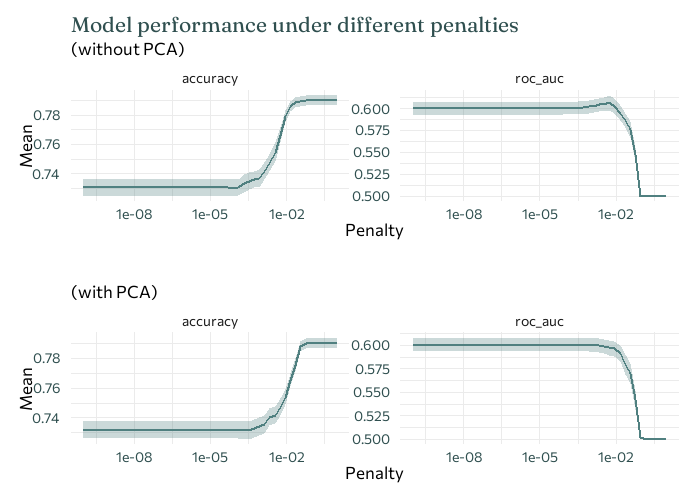
So how do we know which value of \(\lambda\) is best? For each value of \(\lambda\) that we want to consider, we fit the model using that value, and then compute some performance metric. Here, let’s compare two different performance metrics: accuracy and ROC-AUC.
Accuracy: the proportion of the data that are predicted correctly.
ROC-AUC: a metric that computes the area under the ROC curve (which compares specificity and sensitivity). A higher value of ROC-AUC indicates better performance.
Show code: plot performace for different \(\lambda\)
Unfortunately, here our two performance indicators don’t agree on the best value of \(\lambda\). ROC-AUC is usually more robust when the data is imbalanced - when there are a lot more examples of one of the classes in the data than the other. Here, there are a lot more examples of subjects without heart murmurs, compared to those with (464 no murmur present, compared to 119 present). So ROC-AUC is probably more reliable here - and we’ll stick with it for the rest of the analysis here.
We can then use this best value of \(\lambda\) in our final model.
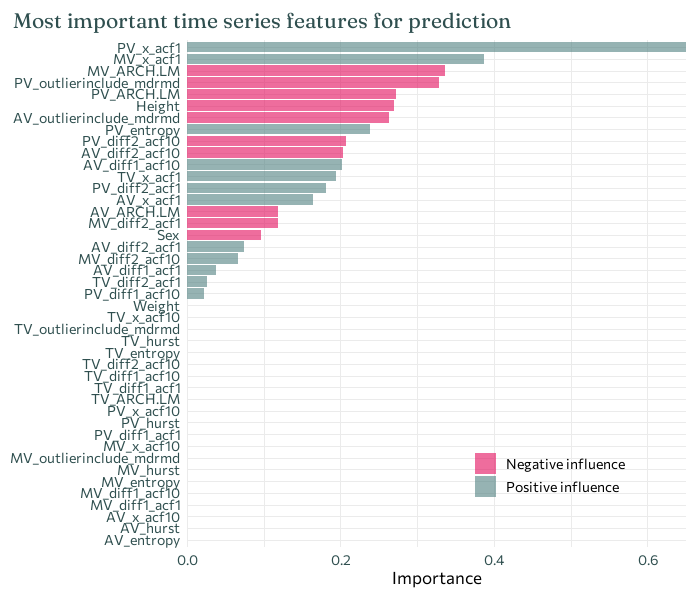
Let’s look at which explanatory variables the Lasso regression has selected as important. I’ll only look at the model fitted to the raw data, as the PCA data can’t really be interpreted in the same way.
Show code: plot predictors
final_Lasso %>%fit(murmurs_train) %>%extract_fit_parsnip() %>% vip::vi(lambda = highest_roc_auc$penalty) %>%mutate(Importance =abs(Importance),Variable =fct_reorder(Variable, Importance) ) %>%ggplot(mapping =aes(x = Importance, y = Variable, fill = Sign)) +geom_col(alpha =0.6) +scale_x_continuous(expand =c(0, 0)) +labs(y =NULL,title ="Most important time series features for prediction" ) +theme(legend.position =c(0.7, 0.15),legend.title =element_blank(),plot.title.position ="plot" )
Here, the top two most important predictors are both first autocorrelation coefficients for two of the different recording locations. Each have a positive impact on prediction - meaning that an observation of a higher first autocorrelation coefficient is more likely to result in a positive prediction for the presence of a heart murmur - which agrees with what was observed in the earlier boxplots.
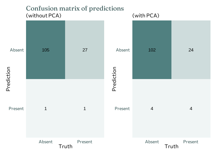
We can then finally fit our final model to the test data to evaluate how well it’s working.
Confusion matrices are a common way of initially evaluating whether a classification model has performed well. It outlines the number of:
True positives (TP): number of murmurs correctly classified
True negatives (TN): number of non-murmurs correctly classified
False positives (FP): number of non-murmurs incorrectly classified as murmurs
False negatives (FN): number of murmurs incorrectly classified as non-murmurs
Sometimes we’ll care about these four things equally, and sometimes some will be more important than others. Here, it’s probably most important to think about false negatives - incorrectly classifying a patient with a heart murmur as not having one is likely to have more significant consequences. Metrics such as accuracy, specificity, and sensitivity can be computed from the confusion matrix if desired.
Well, that didn’t work quite so well… This isn’t ideal, but we can still draw some conclusions. And also let’s normalise sharing the results that don’t always tell us what we want!
Both approaches have an overall accuracy of 0.791, which isn’t terrible. However, fitting the model to the principal components performs slightly better in terms of ROC-AUC: 0.529 (without PCA) vs 0.535 (with PCA). In either case, this performance is fairly poor, since 0.5 is essentially a baseline for randomly guessing. In both cases, the false negatives are high (top right corner) - which is exactly what we don’t want.
The autocorrelation coefficients are consistently found to be among important variables (of those considered), suggesting that this may be something to look into further.
It’s easier to predict whether some doesn’t have a heart murmur, than to predict if someone does. This is partly due to the fact that most people don’t have a heart murmur so if you had to guess if someone did or didn’t have a heart murmur, you’d probably guess they didn’t. If we reconsider the boxplot, we might see a second reason. For some recording locations, the first autocorrelation coefficients of the murmur present data lie within the range of the first autocorrelation coefficients of the murmur absent data - the more unusual autocorrelation coefficients values actually belong those without heart murmurs. Perhaps this is just a larger range due to the larger number of patients without heart murmurs, or perhaps it’s something worth delving into a bit deeper.
There may or may not be a part two to this blog, where I’ll look at some alternative approaches that could help improve the performance:
More complex machine learning models.
Considering a wider range of time series features. It’s very possible that the features considered here just aren’t sufficiently different to tell the two groups apart.
Dealing with the imbalanced nature of the data.
References
Oliveira, J., Renna, F., Costa, P., Nogueira, M., Oliveira, A. C., Elola, A., Ferreira, C., Jorge, A., Bahrami Rad, A., Reyna, M., Sameni, R., Clifford, G., & Coimbra, M. (2022). The CirCor DigiScope Phonocardiogram Dataset (version 1.0.3). PhysioNet. doi.org/10.13026/tshs-mw03.
J. H. Oliveira, F. Renna, P. Costa, D. Nogueira, C. Oliveira, C. Ferreira, A. Jorge, S. Mattos, T. Hatem, T. Tavares, A. Elola, A. Rad, R. Sameni, G. D. Clifford, & M. T. Coimbra (2021). The CirCor DigiScope Dataset: From Murmur Detection to Murmur Classification. IEEE Journal of Biomedical and Health Informatics. doi.org/10.1109/JBHI.2021.3137048.
Goldberger, A., Amaral, L., Glass, L., Hausdorff, J., Ivanov, P. C., Mark, R., Mietus, J. E., Moody, B., Peng, C. K., & Stanley, H. E. (2000). PhysioBank, PhysioToolkit, and PhysioNet: Components of a new research resource for complex physiologic signals. Circulation [Online]. 101 (23), pp. e215–e220.
Tibshirani, R. Regression Shrinkage and Selection via the Lasso (1996). Journal of the Royal Statistical Society. Series B (Methodological). Vol. 58, No. 1, pp. 267-288. www.jstor.org/stable/2346178.
@online{rennie2023,
  author = {Rennie, Nicola},
  title = {Detecting Heart Murmurs from Time Series Data in {R}},
  date = {2023-04-14},
  url = {https://nrennie.rbind.io/blog/detecting-heart-murmur-time-series-r-tidymodels/},
  langid = {en}
}