ocean_temperature <- readr::read_csv("https://raw.githubusercontent.com/rfordatascience/tidytuesday/main/data/2026/2026-03-31/ocean_temperature.csv")
ocean_temperature_deployments <- readr::read_csv("https://raw.githubusercontent.com/rfordatascience/tidytuesday/main/data/2026/2026-03-31/ocean_temperature_deployments.csv")Styling Charts
Data
For this exercise, we’ll use data on coastal ocean temperatures by depth. The dataset was used as a TidyTuesday dataset so you can load it in directly from GitHub.
NoteDownload data
Alternatively, you can download the CSV files:
Download
ocean_temperatureCSV: ocean_temperature.csvDownload
ocean_temperature_deploymentsCSV: ocean_temperature_deployments.csv
Load the data from your local copy:
ocean_temperature <- readr::read_csv("../data/ocean_temperature.csv")
ocean_temperature_deployments <- readr::read_csv("../data/ocean_temperature_deployments.csv")
For more information on the datasets, look at the data dictionaries.
Code
Here’s some R code which produces that chart below. You can either use this code as a starting point, or write your own to complete the exercises below. The aim of the chart is to compare when temperatures peak at different depths.
First load the required packages and prepare the data:
library(ggplot2)
library(dplyr)
library(lubridate)
plot_data <- ocean_temperature |>
  mutate(sensor_depth_factor = factor(sensor_depth_at_low_tide_m)) |>
  filter(year(date) >= 2023, year(date) <= 2025)
Then create a default line chart:
g <- ggplot(
  data = plot_data,
  mapping = aes(
    x = date, y = mean_temperature_degree_c,
    colour = sensor_depth_factor
  )
) +
  geom_line()
g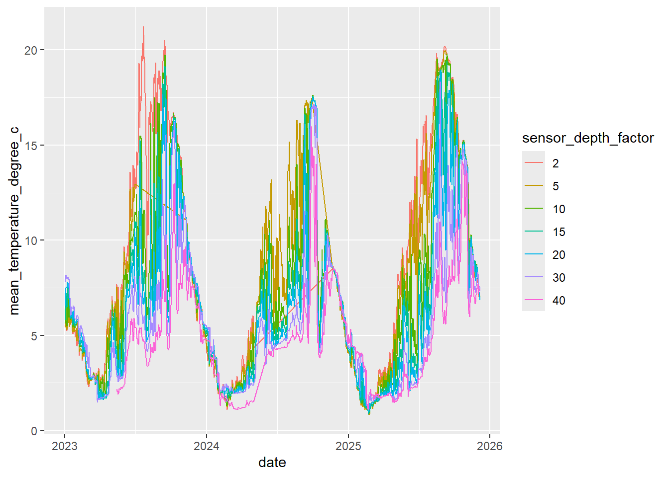
Exercises
Choose and implement a more appropriate colour palette. Hint: Use
scale_colour_manual()orscale_colour_brewer().Is your new colour palette accessible? Hint: Use ColorBrewer or VizPalette to check the colours.
Edit the chart design to improve how easy it is to compare temperatures at different depths. Hint: Consider marks at the end of lines, facets, or labels.
Add an appropriate title, subtitle, and caption. Hint: Use the
labs()function to add text. You may also want to look at theggtextpackage for automatic text wrapping.Bonus: Add annotations highlighting an interesting aspect of the data e.g. times when data is missing.
Bonus: How might you change the chart type to show deviations rather than overall trend and seasonal patterns? How might you show uncertainty? Should you show uncertainty? You can calculate confidence intervals using the code below.
plot_data_ci <- plot_data |>
  mutate(
    lower = mean_temperature_degree_c - qnorm(0.975) * (sd_temperature_degree_c / sqrt(n_obs)),
    upper = mean_temperature_degree_c + qnorm(0.975) * (sd_temperature_degree_c / sqrt(n_obs))
  )
TipSolution
The default palette makes it hard to tell the lines apart. Instead, we’ll use the viridis package to find better colours. Although the depths are categories, they are ordered.
library(viridis)
g <- g +
  scale_colour_viridis(discrete = TRUE)
g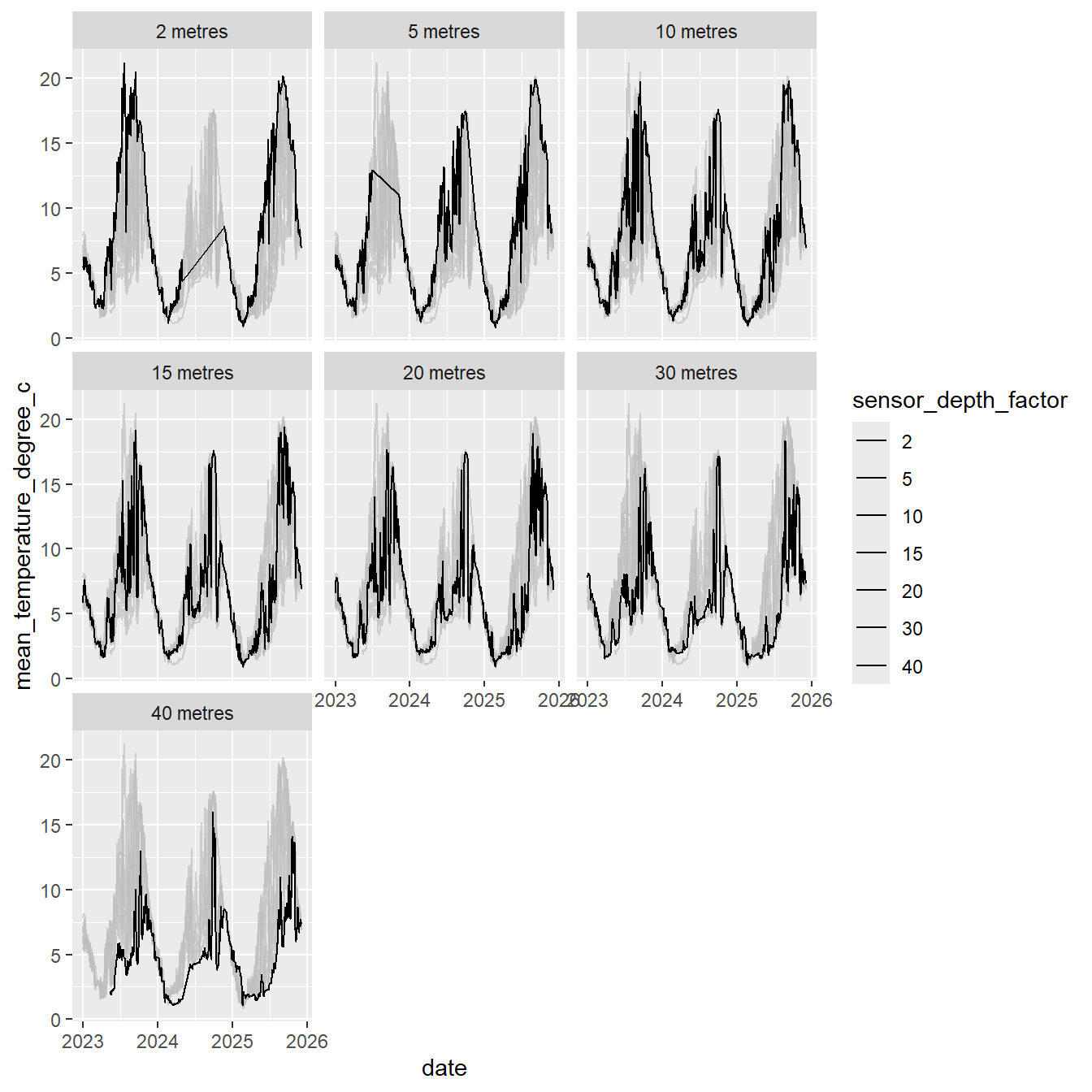
It’s still hard to tell the lines apart, so let’s remove the dependency on colour by using facets. The gghighlight package allows us to keep other lines in the background as reference lines. This means we don’t need colour at all.
library(gghighlight)
g <- g +
  facet_wrap(~sensor_depth_factor,
    labeller = as_labeller(function(x) paste(x, "metres"))
  ) +
  gghighlight(use_direct_label = FALSE) +
  scale_colour_manual(values = rep("black", 7))
g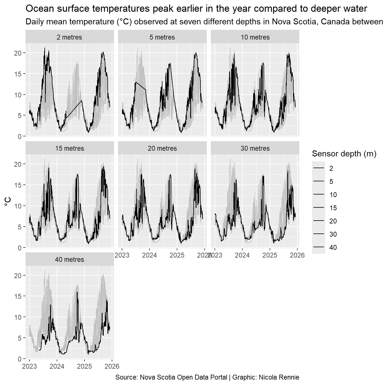
We can use the labs() function to add text. We remove the y-axis title as the information is in the subtitle, and the x-axis title as it’s clearly a date.
g <- g +
  labs(
    title = "Ocean surface temperatures peak earlier in the year compared to deeper water",
    subtitle = "Daily mean temperature (°C) observed at seven different depths in Nova Scotia, Canada between 2023 and 2025.",
    caption = "Source: Nova Scotia Open Data Portal | Graphic: Nicola Rennie",
    colour = "Sensor depth (m)",
    x = NULL,
    y = "°C"
  )
g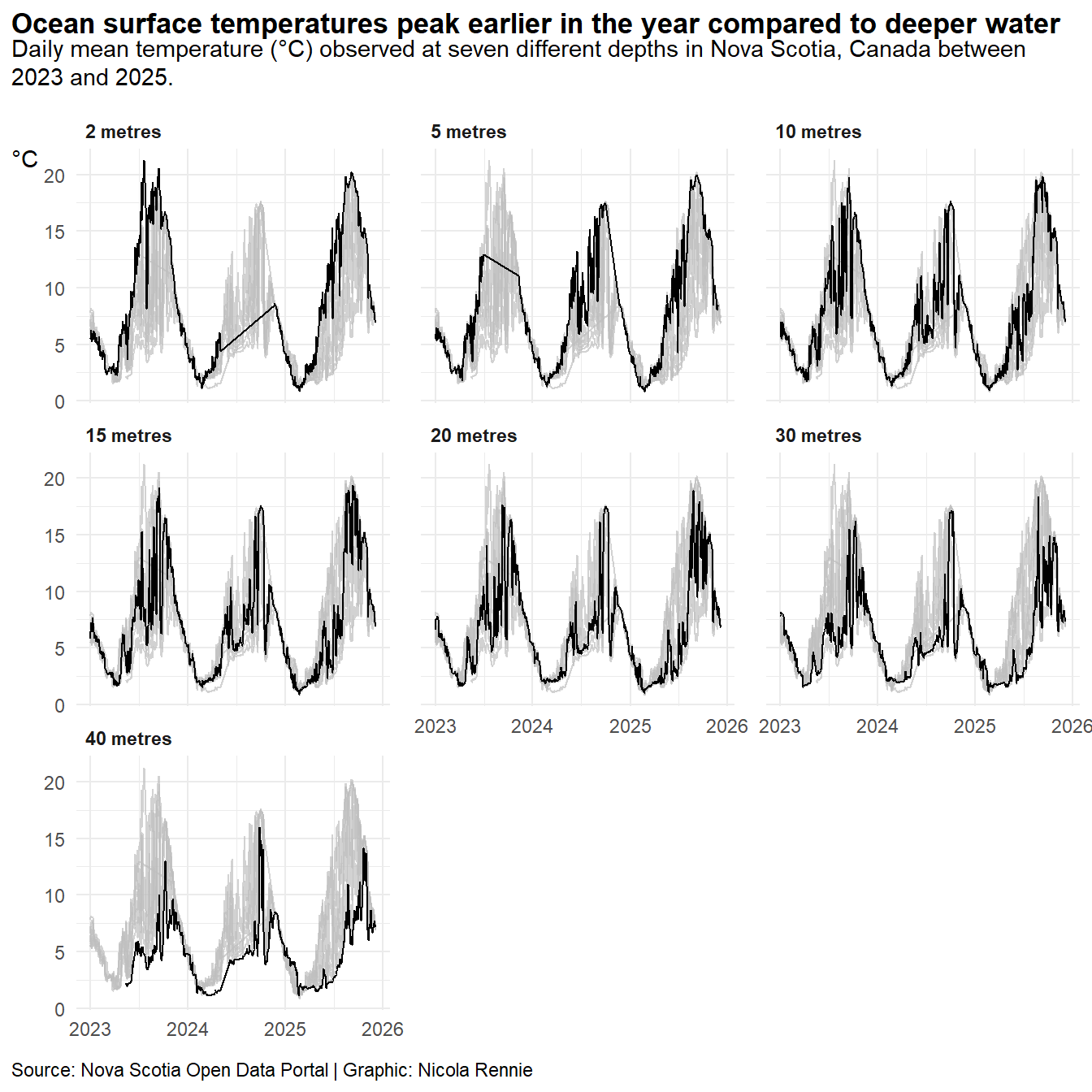
Since the subtitle text is quite long, it gets cropped to the chart width. We want it to automatically wrap onto multiple lines which we can do by using the ggtext package to edit the theme. The legend takes up a lot of space but doesn’t add any more information that isn’t already given by the y-axis so we can remove it.
library(ggtext)
g <- g +
  theme_minimal() +
  theme(
    # auto-wrap text
    plot.title = element_textbox_simple(
      face = "bold"
    ),
    plot.subtitle = element_textbox_simple(
      margin = margin(b = 10)
    ),
    plot.caption = element_textbox_simple(
      margin = margin(t = 10)
    ),
    axis.title.y = element_text(angle = 0, vjust = 1),
    # align to left edge of plot, not panel
    plot.title.position = "plot",
    plot.caption.position = "plot",
    # remove legend
    legend.position = "none",
    # subplot styling
    panel.spacing.x = unit(1, "lines"),
    strip.text = element_text(hjust = 0, face = "bold")
  )
g
Further edits should deal with the line showing for missing data. The tsibble package can make dealing with time series data easier.