import pandas as pd
import plotnine as gg
import matplotlib.pyplot as pltChoosing a chart type
Data
For this exercise, we’ll use data on temperature anomalies and latitude from Our World in Data.
NoteDownload data
Download temperature CSV: temperature.csv
You are welcome to use any package you like. If you are using Plotnine, you will need to following packages:
Load the data from your local copy:
temperature = pd.read_csv('../data/temperature.csv')Exercises
For these questions, try not to worry too much about styling the chart. We’ll talk about that more later.
- Create a chart that shows the trend over time for countries in South America.
temperature_sa = (
    temperature
    .query("World_Region == 'South America'")
    .dropna(subset=['Temperature_Anomaly'])
)
TipSolution
p = (gg.ggplot(temperature_sa, gg.aes(x='Year', y = 'Temperature_Anomaly'))
    + gg.geom_line()
    + gg.facet_wrap('Entity')
    + gg.theme_minimal()
)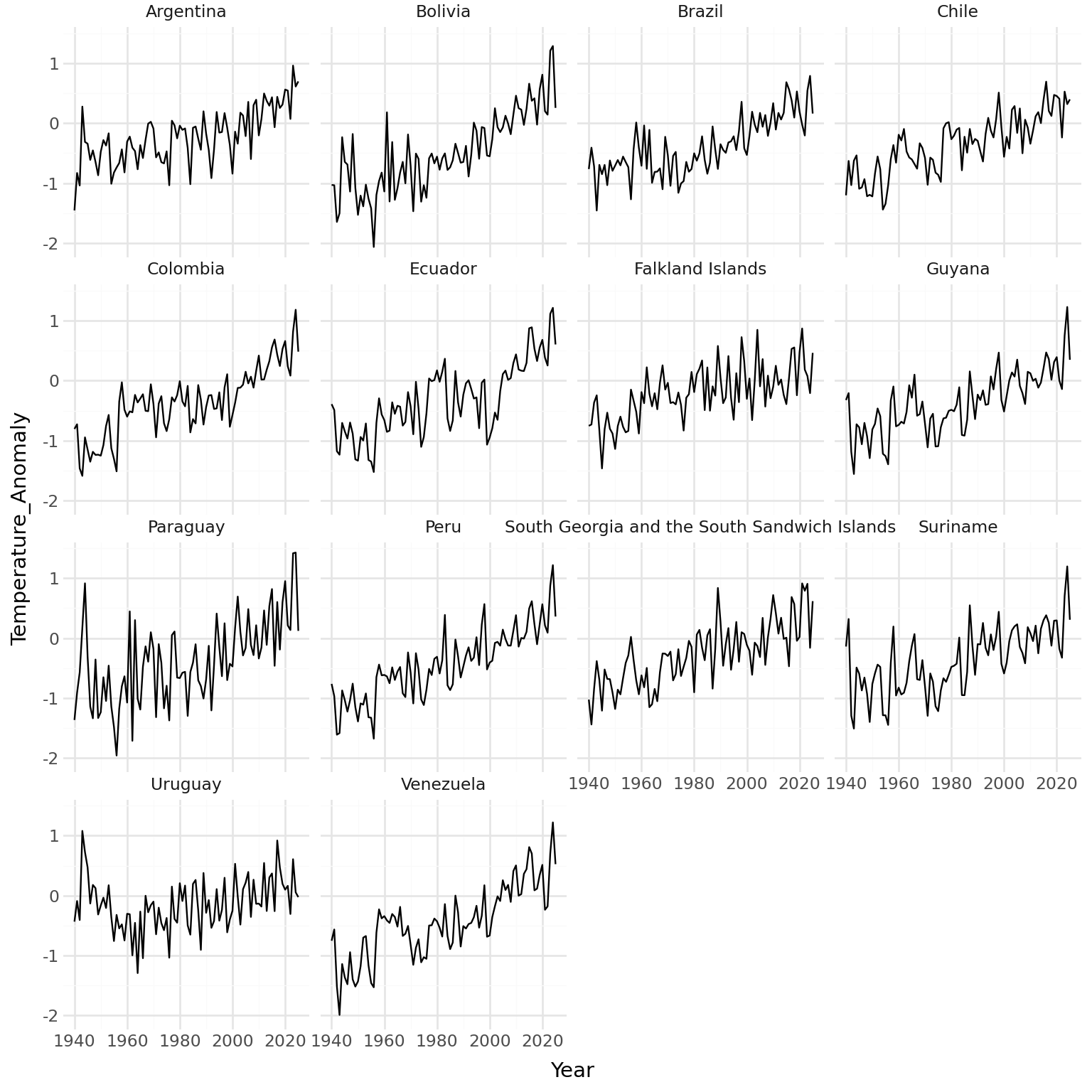
This would make more sense if the countries were ordered.
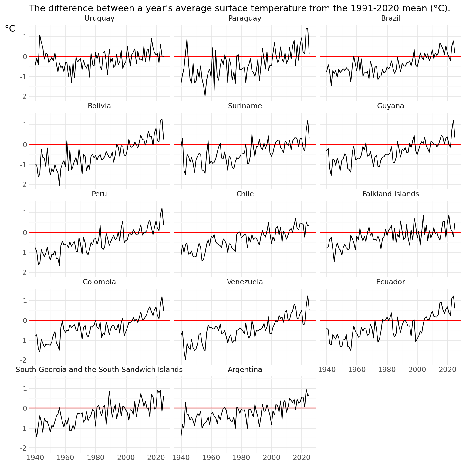
order_2025 = (
    temperature_sa
    .query("Year == 2025")
    .sort_values('Temperature_Anomaly')
    ['Entity']
    .tolist()
)

temperature_sa = temperature_sa.copy()
temperature_sa['Entity'] = pd.Categorical(temperature_sa['Entity'], categories=order_2025, ordered=True)
temperature_sa = temperature_sa.sort_values('Entity')
Re-run the chart code, and add a horizontal line and text.
p = (gg.ggplot(temperature_sa, gg.aes(x='Year', y = 'Temperature_Anomaly'))
    + gg.geom_hline(yintercept=0, color='red')
    + gg.geom_line()
    + gg.facet_wrap('Entity', ncol = 3)
    + gg.labs(x = "", y = "°C", subtitle = "The difference between a year's average surface temperature from the 1991-2020 mean (°C).")
    + gg.theme_minimal()
    + gg.theme(
      axis_title_y = gg.element_text(angle = 0, va = 'top')
))
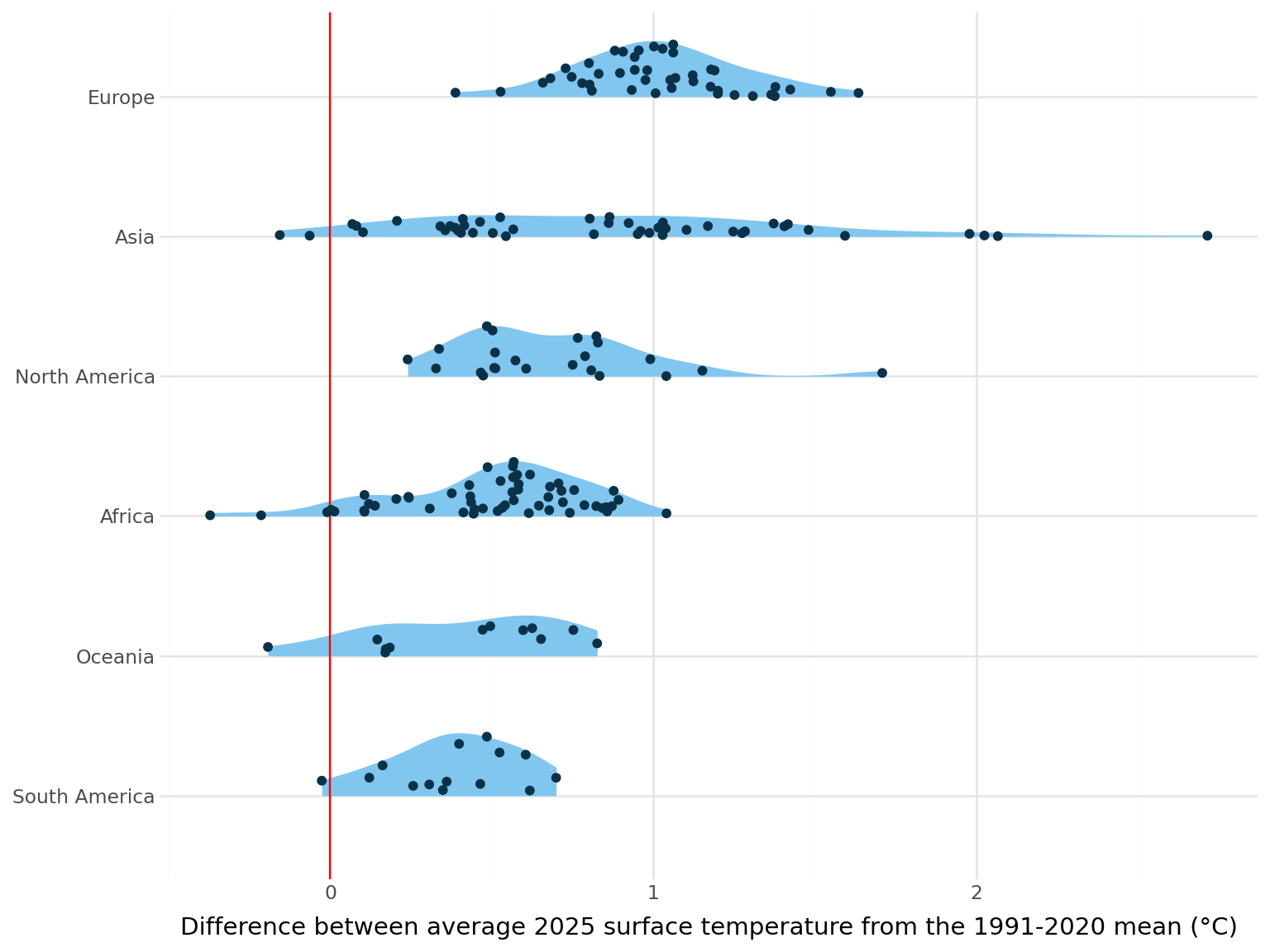
- Create a chart that compares the temperature anomalies for countries in different world regions in 2025.
temperature_2025 = (
    temperature
    .query("Year == 2025")
    .dropna(subset=['World_Region', 'Temperature_Anomaly'])
)
TipSolution
region_order = (
    temperature
    .query("Year == 2025")
    .dropna(subset=['World_Region', 'Temperature_Anomaly'])
    .groupby('World_Region')['Temperature_Anomaly']
    .median()
    .sort_values()
    .index
    .tolist()
)
temperature_2025['World_Region'] = pd.Categorical(temperature_2025['World_Region'], categories=region_order, ordered=True)
p = (gg.ggplot(temperature_2025, gg.aes(x='World_Region', y = 'Temperature_Anomaly'))
+ gg.geom_violin(position="identity", style="right", colour="none", fill="#81C6EF")
+ gg.geom_hline(yintercept=0, color='red')
+ gg.geom_sina(position="identity", style="right", colour="#093148")
+ gg.labs(x = "", y = "Difference between average 2025 surface temperature from the 1991-2020 mean (°C)")
+ gg.coord_flip()
+ gg.theme_minimal()
)
- Create a chart that compares the temperature anomalies for countries at different latitudes in 2025.
TipSolution
Let’s create a scatter plot.
p = (gg.ggplot(temperature_2025, gg.aes(x='Temperature_Anomaly', y = 'Latitude'))
    + gg.geom_point()
    + gg.theme_minimal()
)
C:\Users\nrenn\OneDrive\DOCUME~1\VIRTUA~1\R-RETI~1\Lib\site-packages\plotnine\layer.py:374: PlotnineWarning: geom_point : Removed 1 rows containing missing values.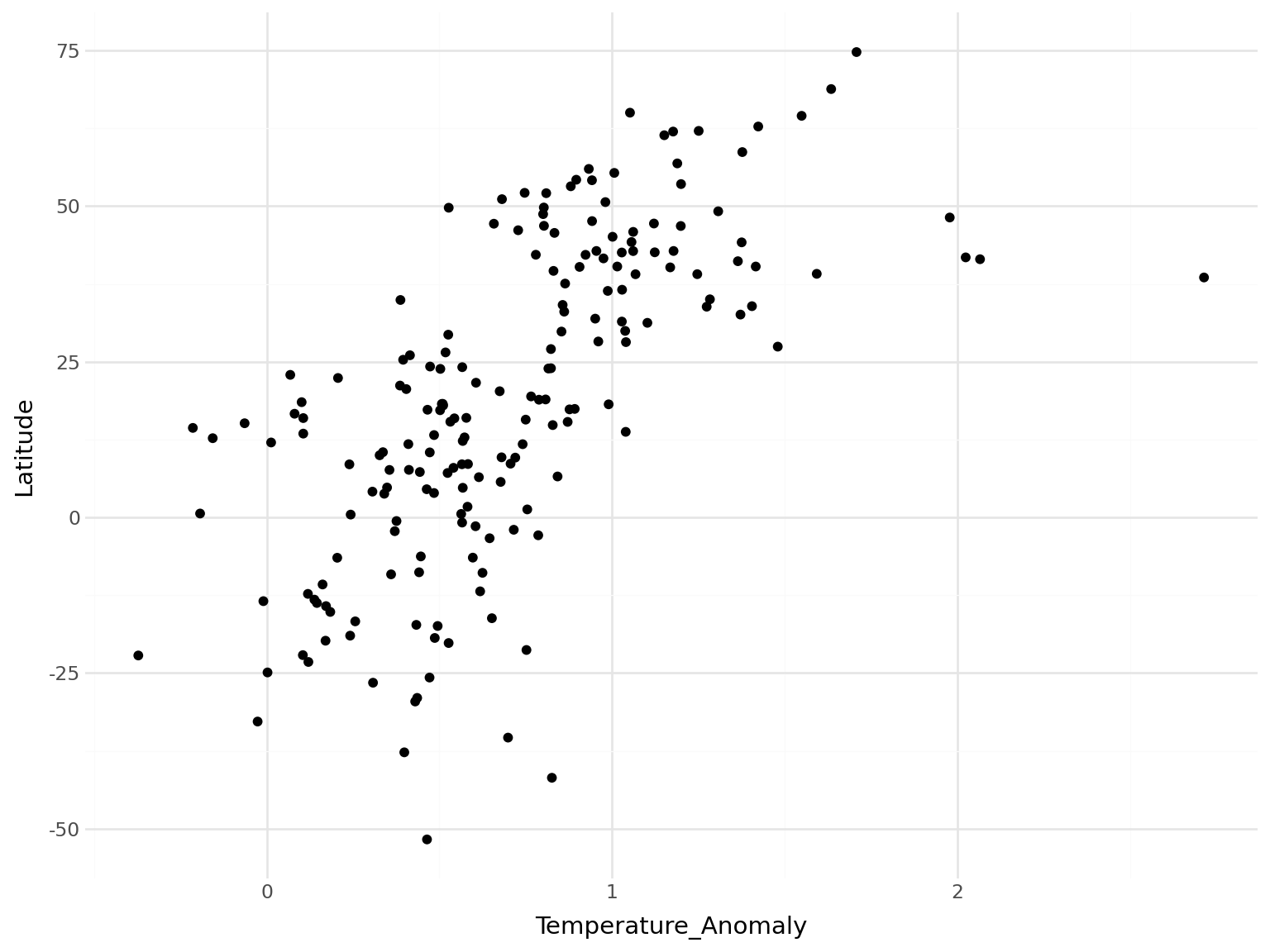
We can add some reference lines and annotations to aid understanding. Using symmetric axes emphasises how skewed the data is.
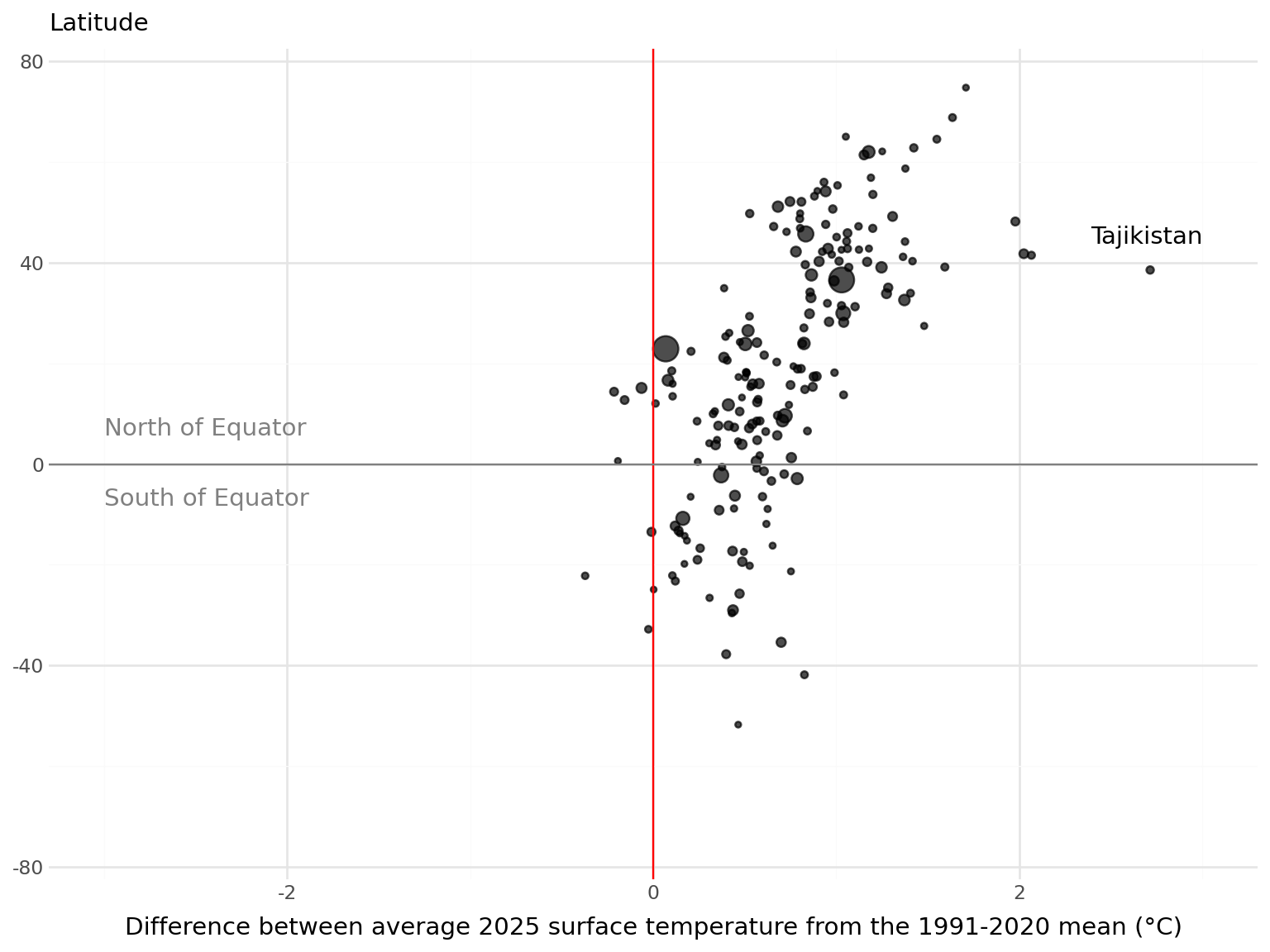
p = (gg.ggplot(temperature_2025, gg.aes(x='Temperature_Anomaly', y = 'Latitude', size='Population'))
    + gg.geom_point(alpha = 0.7)
    # Reference lines
    + gg.geom_vline(xintercept=0, color='red')
    + gg.geom_hline(yintercept=0, color='grey')
    # Scales
    + gg.scale_x_continuous(
      limits = (-3, 3)
    )
    + gg.scale_y_continuous(
      limits = (-75, 75)
    )
    # Equator labels
    + gg. annotate("text", x=-3, y=7, label="North of Equator", ha="left", color='grey')
    + gg. annotate("text", x=-3, y=-7, label="South of Equator", ha="left", color='grey')
    # Point annotations
    + gg. annotate("text", x=3.0, y=45, label="Tajikistan", ha="right")
    + gg.labs(x = "Difference between average 2025 surface temperature from the 1991-2020 mean (°C)", y = "", subtitle = "Latitude")
    + gg.theme_minimal()
    + gg.theme(
      legend_position = "none"
))
C:\Users\nrenn\OneDrive\DOCUME~1\VIRTUA~1\R-RETI~1\Lib\site-packages\plotnine\layer.py:374: PlotnineWarning: geom_point : Removed 1 rows containing missing values.