Exercises
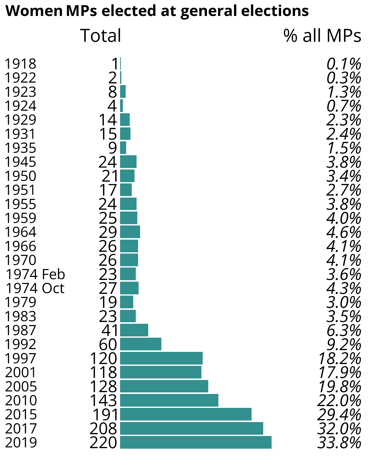
Data
General Election 2019: How many women were elected?
The chart used in the discussions is based on a chart published by the House of Commons Library and is available under the Open Parliament Licence.
You do not need to download the data for the discussions, but if you’d like to explore the data for yourself you can download a CSV file.
Download CSV: women_elected.csv
Exercises
Exercise 1: Critique a chart
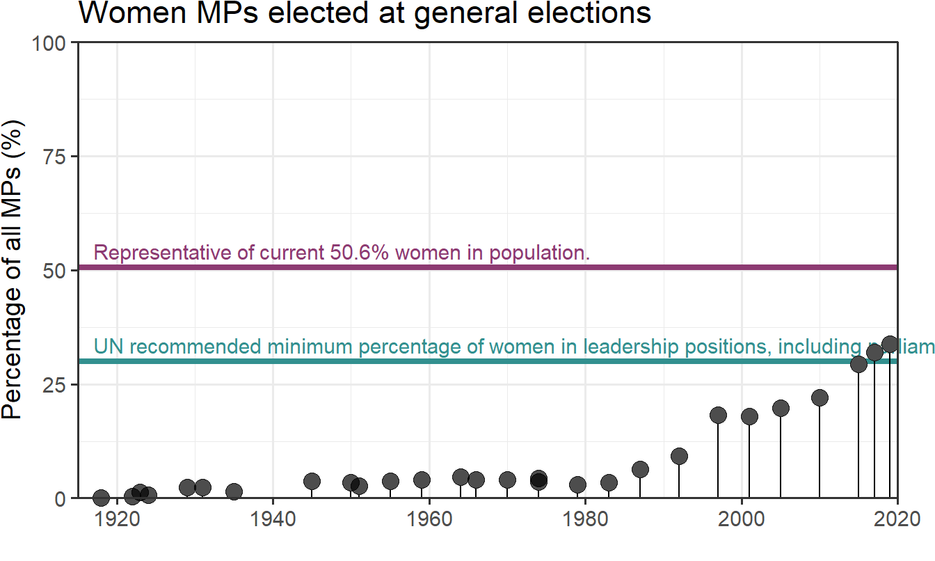
In groups, discuss the following chart.
- What is good and bad about it?
- How might you improve the chart?
Solution
An example of an alternative way of showing this data:
- Time on the x-axis as this is more natural.
- Dates are placed based on their date value, rather than their index.
- Shows the full range of percentages to give more context to the data rather than stopping the percentage axis at 40%.
- Doesn’t overload the chart by showing both counts and percentages at the same time.
- Uses annotations to give further context.