import pandas as pdimport plotnine as ggimport matplotlib.pyplot as plt# Dataincome = pd.read_csv("income-share-of-the-richest-1.csv")# Wranglingplot_data = income[(income["Country"] =="World") & (income["Year"] >=1980)].rename(columns={"Income share of the richest 1% (before tax) (World Inequality Database)": "Income"})plot_data['y'] =1# Plotg = (gg.ggplot()+ gg.geom_tile(gg.aes(x="Year", y="y", fill="Income"), data=plot_data)+ gg.scale_fill_continuous(cmap_name="bwr")+ gg.coord_cartesian(expand=False)+ gg.theme_void()+ gg.theme( legend_position="none", plot_margin=0, figure_size = (6, 6) ))g.draw()
Our World in Data is an online publication and research organisation that provides comprehensive, data-driven insights on global issues, such as health, education, poverty, and environment. It aims to make complex global trends accessible by visualising data through interactive charts and research. The share of income received by the richest 1% of the population, can be used as a measure of economic inequality. Income here is measured before taxes and benefits.
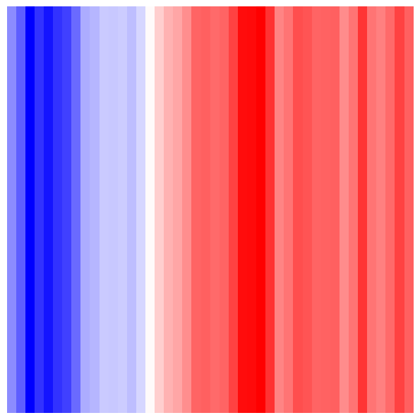
This heatmap shows the percentage of the world’s wealth held by the richest 1% of people between 1980 and 2023, with red areas indicating higher economic inequality. Globally, economic inequality has risen over the last 40 years.