Using functional analysis to model air pollution data in R

Let's say you need to understand how your data changes within a day, and between different days. Functional analysis is one approach of doing just that so here's how I applied functional analysis to some air pollution data using R!

November 14, 2022

Let’s say you need to understand how your data changes within a day, and between different days. For example, if you have hourly pollution data that follows a regular pattern throughout a day, but follows different patterns on a Wednesday and Saturday. Functional analysis is one approach of doing just that. During my PhD, I developed methods based on functional analysis to identify outlier demand in booking patterns for trains in railway networks. To demonstrate that those statistical methods are also applicable in other areas, I started to analyse air pollution data across the United Kingdom. This blog post will discuss the idea of using functional analysis to model air pollution data with the aim of identifying abnormal pollution days.

Introducing the data

The data comes from DEFRA’s (Department for Environment, Food and Rural Affairs) Automatic Urban and Rural Network (AURN), which reports the level of nitrogen dioxide (among other pollutants) in the air every hour at 164 different locations. For this analysis, we considered data recorded between November 6, 2018 to November 6, 2022.

The data can be downloaded from uk-air.defra.gov.uk/data/data_selector_service.

Show code: reading in data
1
2
3
4
5
6
7
8
9
# Load R packages
library(tidyverse)
library(PrettyCols)
library(fda)
library(usefunc) #remotes::install_github("nrennie/usefunc")
library(funcnetout) #remotes::install_github("nrennie/funcnetout")

# Read in data
pollution <- read_csv("air_pollution.csv", skip = 3)

Data wrangling

It’s often said that 80% of data science is cleaning data, and this analysis was no exception. The data initially looked a little bit like this:

…1…2Aberdeen…4Aberdeen Erroll Park…6
DateTimeNitrogen dioxideStatusNitrogen dioxideStatus
2018-11-0601:00:0027.56325V ugm-3No dataNA
2018-11-0602:00:0025.3542V ugm-3No dataNA
2018-11-0603:00:0022.12239V ugm-3No dataNA

…with another 324 columns for the remaining stations. With a little but of help from {dplyr} and {lubridate}, we can clean this up into something a little bit nicer:

DateTimeDateTimeAberdeenAberdeen Erroll Park
2018-11-061H 0M 0S2018-11-06 01:00:0027.56325NA
2018-11-062H 0M 0S2018-11-06 02:00:0025.35420NA
2018-11-063H 0M 0S2018-11-06 03:00:0022.12239NA
2018-11-064H 0M 0S2018-11-06 04:00:0017.13361NA
Show code: tidying the data
 1
 2
 3
 4
 5
 6
 7
 8
 9
10
11
12
13
air_data <- pollution %>% 
  rename("Date" = "...1",
         "Time" = "...2") %>% 
  select(-starts_with("...")) %>% 
  slice(-1) %>% 
  slice(1:(n() - 1)) %>% 
  mutate(across(c(Aberdeen:`York Fishergate`),
    ~case_when(.x == "No data" ~ NA_character_,
               TRUE ~ as.character(.x)))) %>% 
  mutate(across(c(Aberdeen:`York Fishergate`), as.numeric)) %>% 
  mutate(DateTime = ymd_hms(paste(Date, Time)), .after = 2) %>% 
  mutate(Date = ymd(Date), 
         Time = hms(Time))

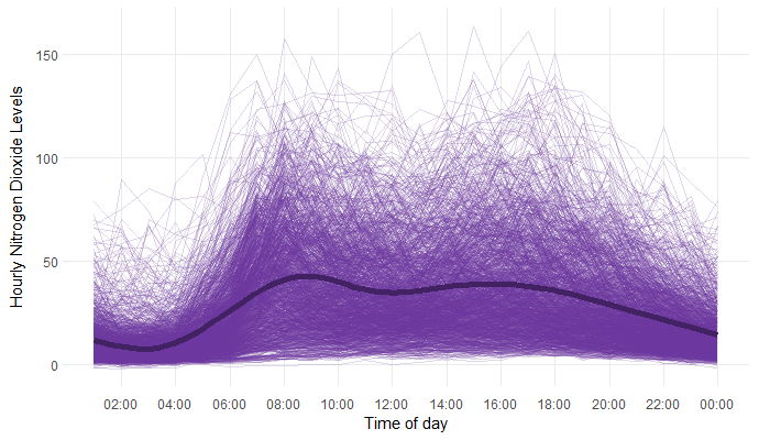
For this example, let’s focus on a single station (we might come back to how to deal with multiple stations in a later blog post…). Here, let’s choose the Aberdeen Wellington Road to analyse…

Show code: selecting a station
1
2
3
Aberdeen_WR <- air_data %>% 
  select(c(Date, Time, DateTime, `Aberdeen Wellington Road`)) %>% 
  rename(`NO2` = `Aberdeen Wellington Road`)

… and have a little look at what the data looks like. It’s a little bit difficult to see in this plot, but there are a few missing values. Not every hour of every day has a recorded value for the level of Nitrogen Dioxide - there are 55 days with at least one missing value.

Show code: plotting the data
1
2
3
4
5
6
7
8
9
ggplot(data = Aberdeen_WR,
       mapping = aes(x = DateTime, y = NO2)) +
  geom_line(linewidth = 0.1,
            colour = alpha(prettycols("Purples")[2], 0.5)) +
  labs(x = "", 
       y = "Hourly Nitrogen Dioxide Levels") +
  theme_minimal() +
  theme(axis.text.y = element_text(margin = margin(l = 5)),
        plot.margin = unit(c(0.2, 0.5, 0.2, 0.2), unit ="cm"))

There are a few different approaches to dealing with missing data - we’ll utilise two different approaches here, depending on how many missing values there are. If there are more than 10 hours of data missing for a single day - we’ll discard that entire day and exclude it from our data set. There are only six days in the four year period the data covers that fit this criteria, so we’re not losing too much data. For the remaining days, we use mean imputation. For example, if a value is missing from 04:00 on a specific day, we’ll use the mean of the non-missing values taken at 04:00 on every other day.

Show code: dealing with missing data
 1
 2
 3
 4
 5
 6
 7
 8
 9
10
11
12
13
14
15
16
17
18
19
20
21
22
23
24
# days with missing values
missing <- Aberdeen_WR %>% 
  group_by(Date) %>% 
  summarise(num_missing = sum(is.na(NO2))) %>% 
  filter(num_missing > 0) %>% 
  arrange(desc(num_missing)) 

# which ones are missing >= 10 hours of data
too_many_missing <- missing %>% 
  filter(num_missing >= 10)

# remove missing data
Aberdeen_WR <- Aberdeen_WR %>% 
  filter(Date %notin% too_many_missing$Date)

# mean imputation for the others
avg_hour <- Aberdeen_WR %>% 
  group_by(Time) %>% 
  summarise(avg = mean(NO2, na.rm = TRUE))
Aberdeen_WR <- Aberdeen_WR %>% 
  left_join(avg_hour, by = "Time") %>% 
  mutate(NO2 = case_when(is.na(NO2) ~ avg,
                           TRUE ~ NO2)) %>% 
  select(-avg)

Functional approaches to modelling

Now that we’ve tidied up the data and dealt with the missing values, it’s time to get stuck into the modelling process! First of all, let’s have another look at our data but in a slightly different way:

Line chart of nitrogen dioxide levels every hour from November 2018 to November 2022. Each line represents a different day. A line showing the average level per hour is shown. There are two bumps showing higher levels around 9am and 5pm.

Show code: plotting the data
 1
 2
 3
 4
 5
 6
 7
 8
 9
10
11
12
13
14
15
16
17
18
19
20
21
ggplot(data = Aberdeen_WR,
       mapping = aes(x = hour(Time), y = NO2)) +
  geom_line(mapping = aes(group = Date),
            linewidth = 0.1,
            colour = alpha(prettycols("Purples")[4], 0.2)) +
  geom_smooth(colour = prettycols("Purples")[1],
              linewidth = 2) +
  labs(x = "", 
       y = "Hourly Nitrogen Dioxide Levels") +
  scale_x_continuous(name = "Time of day",
                     limits = c(1, 24),
                     breaks = seq(2, 24, by = 2),
                     labels = c("02:00", "04:00", "06:00",
                                "08:00", "10:00", "12:00",
                                "14:00", "16:00", "18:00",
                                "20:00", "22:00", "00:00")) +
  theme_minimal() +
  theme(axis.text.y = element_text(margin = margin(l = 5)),
        axis.text.x = element_text(margin = margin(t = 5)),
        plot.margin = unit(c(0.2, 0.5, 0.2, 0.2), unit ="cm"),
        panel.grid.minor = element_blank())

The nitrogen dioxide levels follow a similar pattern each day, with higher levels around rush hour in the morning and evening. Functional analysis treats the pollution pattern for each day as an observation of a function over time. This allows us to compare the differences between patterns on different days, without complications from the varying pollution levels throughout each day.

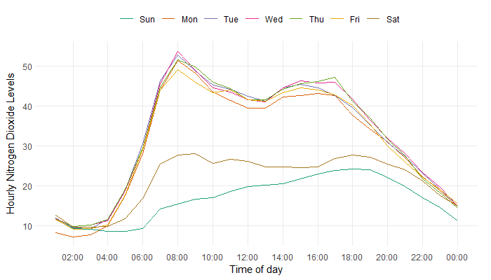
We still need to deal with seasonal and trend components of the functional data. For example, since the higher levels of pollution around 8am and 5pm are most likely caused by people travelling to work, this raises the question of whether pollution levels are lower on weekends, when there are generally fewer people travelling to work. Are there different pollution patterns on different days of the week?

Line chart of average nitrogen dioxide levels every hour from November 2018 to November 2022. Each line represents a different day of the week. Saturdays and Sundays follow different patterns from the rest of the days.

Show code: plotting the data
 1
 2
 3
 4
 5
 6
 7
 8
 9
10
11
12
13
14
15
16
17
18
19
20
21
22
23
24
25
26
Aberdeen_WR %>% 
  mutate(hr = hour(Time),
         wday = wday(Date, label = TRUE)) %>% 
  group_by(wday, hr) %>% 
  summarise(avg = mean(NO2)) %>% 
  ggplot(mapping = aes(x = hr, y = avg)) +
  geom_line(mapping = aes(colour = wday),
            linewidth = 0.1) +
  labs(x = "", 
       y = "Hourly Nitrogen Dioxide Levels") +
  scale_x_continuous(name = "Time of day",
                     limits = c(1, 24),
                     breaks = seq(2, 24, by = 2),
                     labels = c("02:00", "04:00", "06:00",
                                "08:00", "10:00", "12:00",
                                "14:00", "16:00", "18:00",
                                "20:00", "22:00", "00:00")) +
  scale_colour_brewer(palette = "Dark2") +
  guides(colour = guide_legend(nrow = 1)) +
  theme_minimal() +
  theme(axis.text.y = element_text(margin = margin(l = 5)),
        axis.text.x = element_text(margin = margin(t = 5)),
        plot.margin = unit(c(0.2, 0.5, 0.2, 0.2), unit ="cm"),
        panel.grid.minor = element_blank(),
        legend.title = element_blank(),
        legend.position = "top")

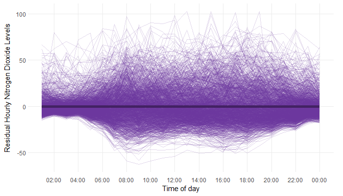
Visualising the average daily patterns suggests that pollution patterns on weekdays are generally very similar, with Saturdays and Sundays being lower on average but still different from each other. To test this formally, a functional ANOVA test can be applied. This tests whether the average pollution pattern on a weekday is significantly different from the average pollution pattern on a Saturday or Sunday. The test returns the probability that, if the two pollution patterns were equal, the observed patterns would be this different. For this analysis, the probability was 0. Therefore, we can conclude there is a significant difference in the pollution levels on weekdays compared to Saturdays and Sundays. We can either analyse Saturdays, Sundays, and weekends separately, or fit a model to remove the seasonality and analyse the residuals instead.

A simplified version of the regression model might look something like this:

$$ y_{n} = I_{weekday, n} + I_{Saturday, n} + e_{n}$$

where $I_{weekday, n}$ is 1 if the $n^{th}$ day is a weekday and 0, otherwise. We can use an analogous method to test if different months follow different daily patterns, and if there is a significant different between years. Interestingly, November, December, and January all exhibit higher level of nitrogen dioxide, particularly in the evening. One possible explanation for why these months have higher levels of nitrogen dioxide is fireworks. Fireworks are commonly set off on Bonfire Night, around Christmas, and New Year’s Eve. Fireworks have been shown to contribute to elevated levels of gaseous pollutants, including nitrogen dioxide.

We can account for all three types of variation (weekday, monthly, and annual) within a functional regression model.

Show code: fitting the functional regression model
 1
 2
 3
 4
 5
 6
 7
 8
 9
10
11
12
13
14
15
16
17
18
19
20
21
22
23
# Convert to matrix
Aberdeen_matrix <- Aberdeen_WR %>% 
  mutate(hr = hour(Time)) %>% 
  select(-c(Time, DateTime)) %>% 
  pivot_wider(names_from = hr,
              values_from = NO2) %>% 
  column_to_rownames(var = "Date") %>% 
  as.matrix()

# create factors
m <- months(as.Date(rownames(Aberdeen_matrix)), abbreviate = TRUE)
d <- weekdays(as.Date(rownames(Aberdeen_matrix)), abbreviate = TRUE)
d <- case_when(d %in% c("Mon", "Tue", "Wed", "Thu", "Fri") ~ "Weekday",
               TRUE ~ d)
yrs <- as.character(year(as.Date(rownames(Aberdeen_matrix))))

# apply function regression model
Aberdeen_func <- fd(t(Aberdeen_matrix))
func_fit <- fRegress(Aberdeen_func ~ d + m + yrs)
fitted_curves <- t(as.matrix(func_fit$yhatfdobj$coefs))
colnames(fitted_curves) <- 1:24
rownames(fitted_curves) <- c()
Aberdeen_residuals <- Aberdeen_matrix - fitted_curves

We can then analyse the residuals, that look a little bit like this:

Line chart of residual nitrogen dioxide levels every hour from November 2018 to November 2022. Each line represents a different day. The variation is higher on the positive side of the residuals.

Show code: plotting the residuals
 1
 2
 3
 4
 5
 6
 7
 8
 9
10
11
12
13
14
15
16
17
18
19
20
21
22
23
24
25
26
27
28
29
30
31
# convert to tibble
Aberdeen_residuals_tbl <- Aberdeen_residuals %>% 
  as.data.frame() %>% 
  rownames_to_column() %>% 
  as_tibble() %>% 
  rename("Date" = "rowname") %>% 
  pivot_longer(cols = `1`:`24`, names_to = "hr", values_to = "NO2") %>% 
  mutate(hr = as.numeric(hr))

# plot residuals
ggplot(data = Aberdeen_residuals_tbl,
       mapping = aes(x = hr, y = NO2)) +
  geom_line(mapping = aes(group = Date),
            linewidth = 0.1,
            colour = alpha(prettycols("Purples")[4], 0.2)) +
  geom_smooth(colour = prettycols("Purples")[1],
              linewidth = 2) +
  labs(x = "", 
       y = "Residual Hourly Nitrogen Dioxide Levels") +
  scale_x_continuous(name = "Time of day",
                     limits = c(1, 24),
                     breaks = seq(2, 24, by = 2),
                     labels = c("02:00", "04:00", "06:00",
                                "08:00", "10:00", "12:00",
                                "14:00", "16:00", "18:00",
                                "20:00", "22:00", "00:00")) +
  theme_minimal() +
  theme(axis.text.y = element_text(margin = margin(l = 5)),
        axis.text.x = element_text(margin = margin(t = 5)),
        plot.margin = unit(c(0.2, 0.5, 0.2, 0.2), unit ="cm"),
        panel.grid.minor = element_blank())

Finding outliers in the data

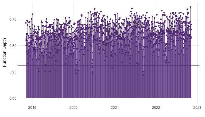
To describe how normal (or abnormal) the (residual) pollution pattern for each day is, we calculate the functional depth. A depth measurement attributes a sensible ordering to observations, such that observations which are close to average have higher depth and those far from the average have lower depth. Days which have very low depth can be classified as outliers. Functional depth takes into account the abnormality both in the magnitude (for example, overall higher pollution levels throughout the day), and shape (for example, pollution levels peak earlier in the day than normal) of the pollution pattern.

The mathematics behind the calculation of functional depth isn’t super friendly so we won’t go into detail here, but if you’re interested in it, I’d recommend reading this paper which introduces the concept.

Show code: calculating the depths
1
depths <- func_depth(data = Aberdeen_residuals, times = 1:24)

A threshold is then calculated for the functional depths. If the functional depth for a given day is below that threshold, the day is classified as an outlier.

Show code: calculating the threshold
1
threshold <- func_depth_threshold(data = Aberdeen_residuals, times = 1:24)

Now we can take a look at the functional depths, and the associated threshold.

Lollipop chart of functional depths for each day from November 2018 to November 2022. Each line represents a different day.

Show code: plotting the data
 1
 2
 3
 4
 5
 6
 7
 8
 9
10
11
12
13
14
15
16
17
18
19
20
21
22
23
24
25
26
27
28
29
30
31
# depths to tibble
colnames(depths) <- "depths"
plot_depths <- depths %>% 
  as.data.frame() %>% 
  rownames_to_column() %>% 
  as_tibble() %>% 
  rename("Date" = "rowname") %>% 
  mutate(Date = as.Date(Date)) 

# plot depths
ggplot(plot_depths) +
  geom_segment(aes(x = Date,
                   xend = Date, 
                   y = 0, 
                   yend = depths),
               colour = alpha(prettycols("Purples")[2], 0.5),
               linewidth = 0.5) +
  geom_point(aes(x = Date, 
                 y = depths),
             colour = prettycols("Purples")[2]) +
  geom_hline(yintercept = threshold,
             colour = prettycols("Purples")[2]) +
  labs(x = "", 
       y = "Function Depth") +
  theme_minimal() +
  theme(axis.text.y = element_text(margin = margin(l = 5)),
        axis.text.x = element_text(margin = margin(t = 5)),
        plot.margin = unit(c(0.2, 0.5, 0.2, 0.2), unit ="cm"),
        panel.grid.minor = element_blank(),
        legend.title = element_blank(),
        legend.position = "top")

Much like when inspecting residuals, a scatter plot of functional depths over time should appear random. If there is evidence of seasonality, or trend in the functional depths, we would want to revisit the functional regression model. Here, the depths look alright.

The days classified as outliers, are those that fall below the threshold. In this case, 16 days were classified as outliers. As we would expect, the outliers appear randomly distributed across the period of time the data covers.

Show code: classify the outliers
1
2
3
outliers <- plot_depths %>% 
  mutate(outlier = depths < threshold) %>% 
  filter(outlier) 

If you’re super keen on finding out more about applying function depth to find outlying time series, you can read our paper on how we applied similar methodology to railway booking data.

gif of fireworks exploding


For attribution, please cite this work as:

Using functional analysis to model air pollution data in R.
Nicola Rennie. November 14, 2022.
nrennie.rbind.io/blog/using-functional-analysis-to-model-air-pollution-data-in-r

Licence: creativecommons.org/licenses/by/4.0