Blog

A blog about all things visualisation, data science, and open source software. Some of these blog posts can also be found on R-bloggers, and many have been featured in the R Weekly highlights.

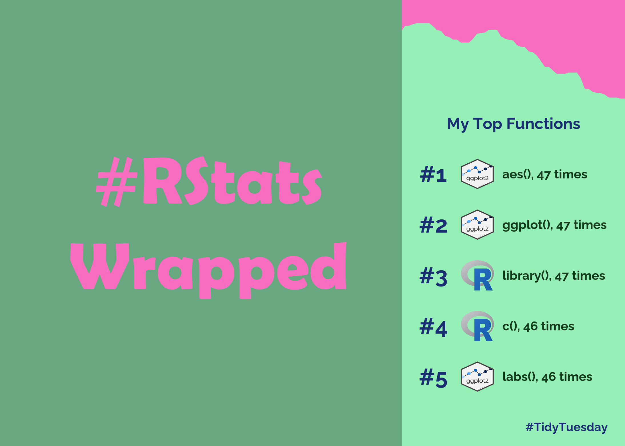
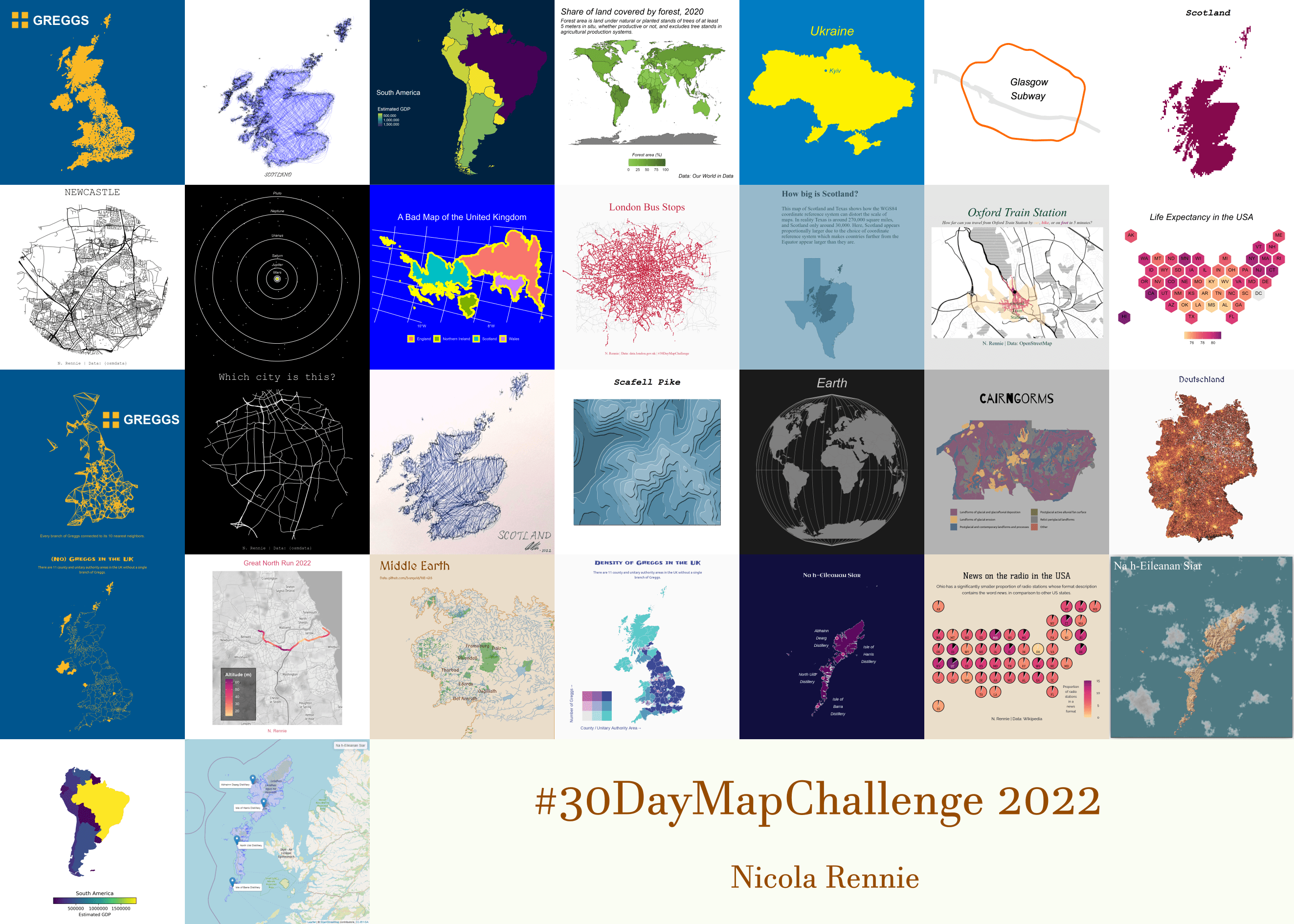
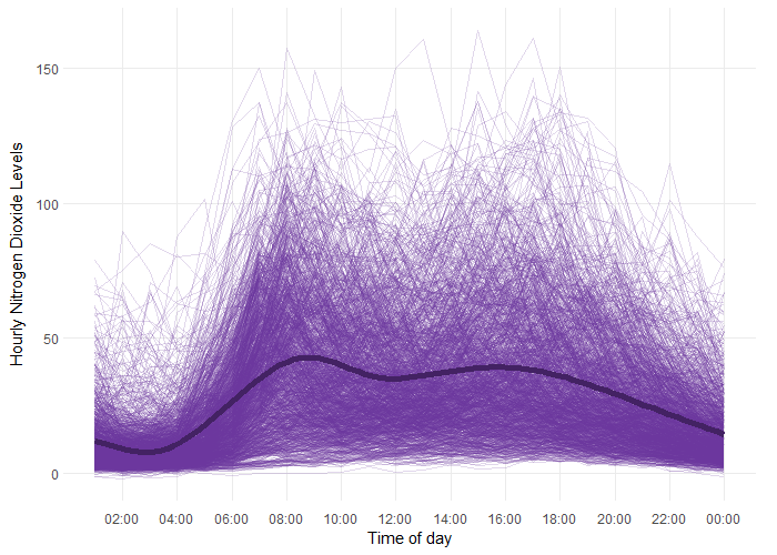
Another Year of #TidyTuesday

After another 52 data visualisations created for #TidyTuesday, it’s time for the annual round-up! Read this blog post for some interesting R packages discovered, a few new I’ve tricks learnt, and the data visualisations I’d like to do again.

December 27, 2022

R packages for visualising spatial data

Throughout the #30DayChartChallenge I made most of my maps with R. This blog post details the R packages I find myself using most often when visualising spatial data.

December 17, 2022

How to make your own #RStats Wrapped!

Forget about Spotify Wrapped and make your own #RStats Wrapped instead! This blog post will show you how to find your most used functions and make a graphic with {ggplot2}!

December 3, 2022

30 Day Map Challenge 2022

The #30DayMapChallenge is a month-long mapping, cartography, and data visualization challenge aimed at the spatial community. Here are the things I’ve learnt from participating in the challenge for a second time.

November 30, 2022

Using functional analysis to model air pollution data in R

Let’s say you need to understand how your data changes within a day, and between different days. Functional analysis is one approach of doing just that so here’s how I applied functional analysis to some air pollution data using R!

November 14, 2022