How to make your own #RStats Wrapped!
Forget about Spotify Wrapped and make your own #RStats Wrapped instead! This blog post will show you how to find your most used functions and make a graphic with {ggplot2}!
Blog about all things R, data science, and visualisation.
Forget about Spotify Wrapped and make your own #RStats Wrapped instead! This blog post will show you how to find your most used functions and make a graphic with {ggplot2}!
The #30DayMapChallenge is a month-long mapping, cartography, and data visualization challenge aimed at the spatial community. Here are the things I’ve learnt from participating in the challenge for a second time.
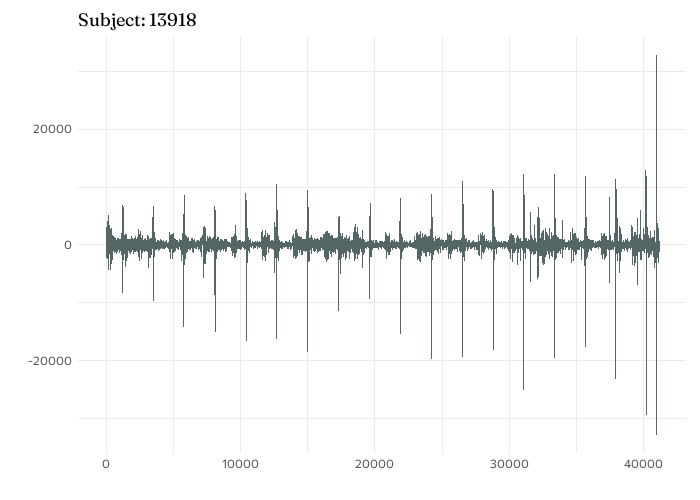
Let’s say you need to understand how your data changes within a day, and between different days. Functional analysis is one approach of doing just that so here’s how I applied functional analysis to some air pollution data using R!
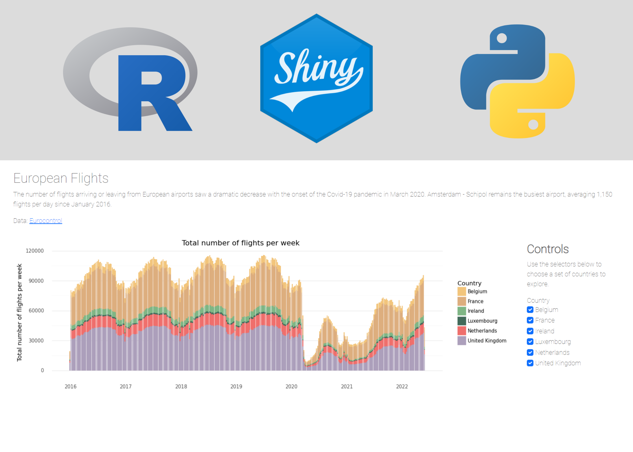
This tutorial blog will show you how to use GitHub actions to automatically update a data source and re-deploy a Shiny app, with an example Shiny application which uses {rtweet} to browse R-related tweets.
An introduction to {PrettyCols} - a new R package containing aesthetically pleasing colour palettes that are compatible with {ggplot2}.
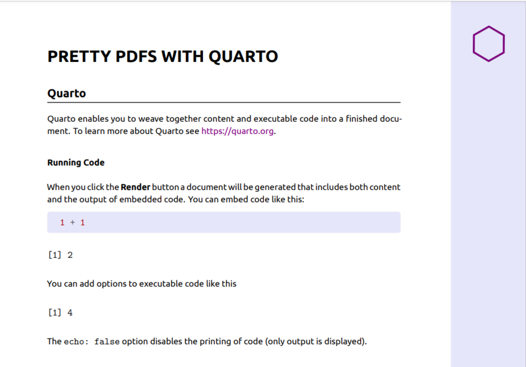
If, like me, you mostly scroll through Twitter on your phone, you might want to consider designing your content specifically aimed at people who look at Twitter on their phone. Here’s how to do it in R, with a little help from Quarto.