Blog

Blog about all things R, data science, and visualisation.

Combining R and Python with {reticulate} and Quarto

Sometimes you might need to use R. Sometimes you might need to use Python. Sometimes you need to use both at the same time. This blog post shows you how to combine R and Python code using {reticulate} and output the results using Quarto.
January 6, 2023

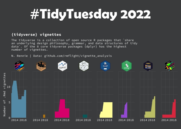
Another Year of #TidyTuesday

After another 52 data visualisations created for #TidyTuesday, it’s time for the annual round-up! Read this blog post for some interesting R packages discovered, a few new I’ve tricks learnt, and the data visualisations I’d like to do again.

December 27, 2022

R packages for visualising spatial data

Throughout the #30DayChartChallenge I made most of my maps with R. This blog post details the R packages I find myself using most often when visualising spatial data.

December 17, 2022

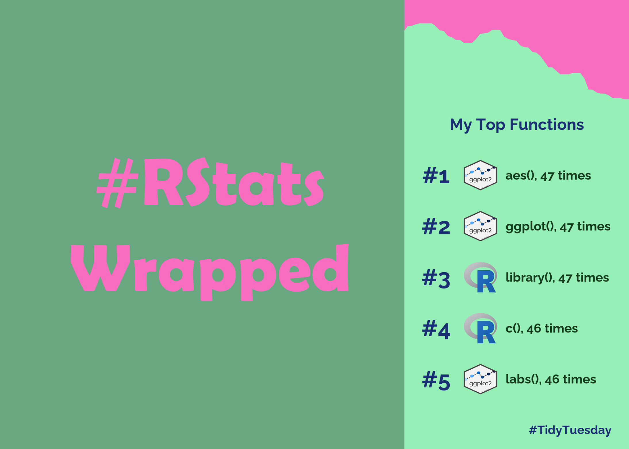
How to make your own #RStats Wrapped!

Forget about Spotify Wrapped and make your own #RStats Wrapped instead! This blog post will show you how to find your most used functions and make a graphic with {ggplot2}!

December 3, 2022

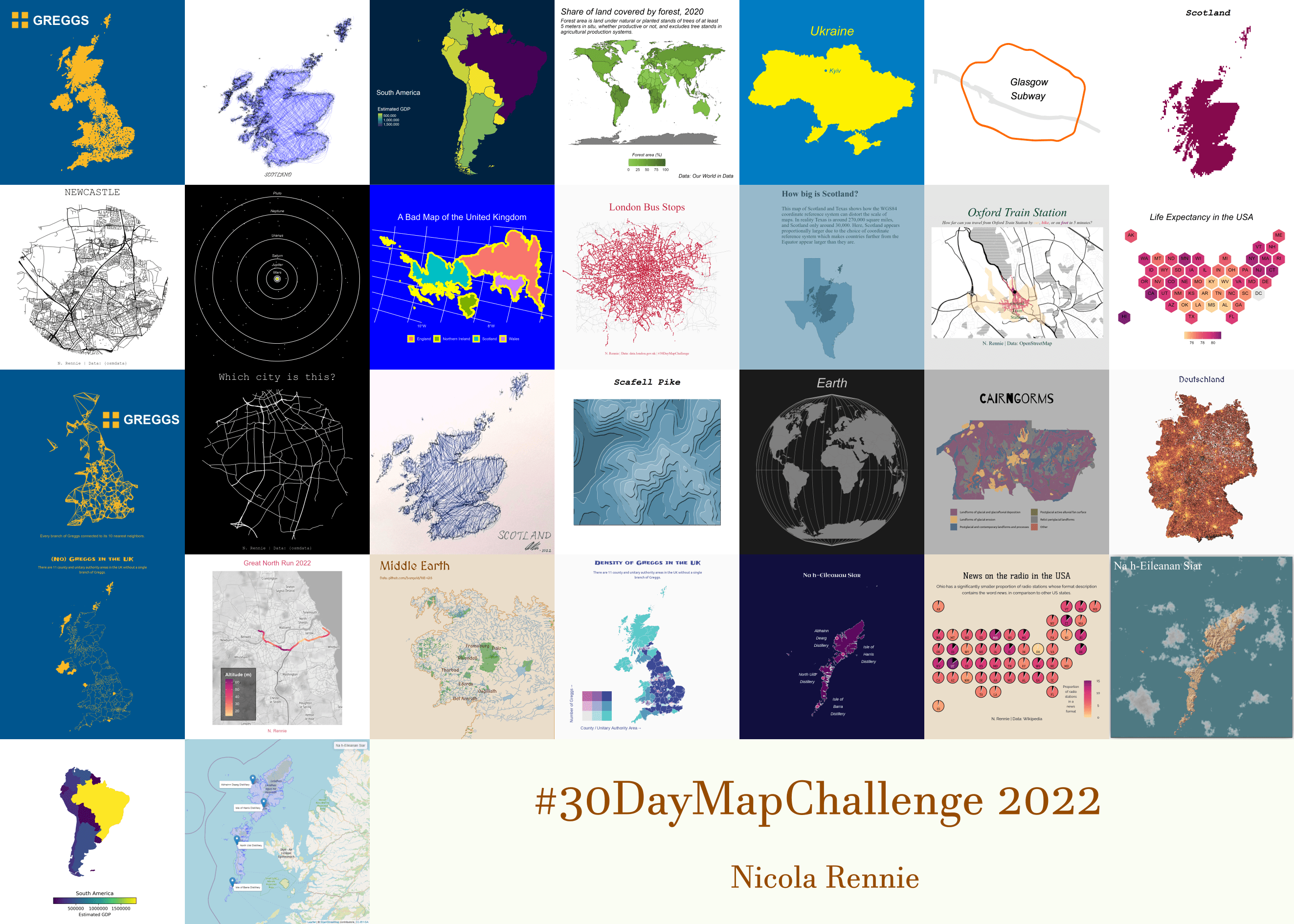
30 Day Map Challenge 2022

The #30DayMapChallenge is a month-long mapping, cartography, and data visualization challenge aimed at the spatial community. Here are the things I’ve learnt from participating in the challenge for a second time.

November 30, 2022

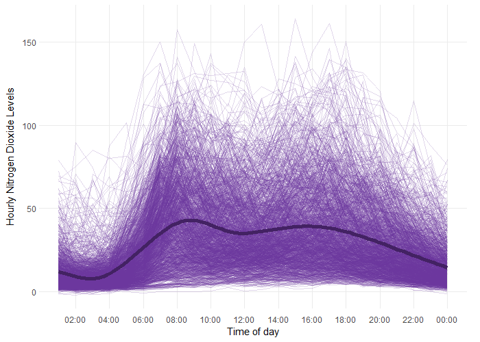
Using functional analysis to model air pollution data in R

Let’s say you need to understand how your data changes within a day, and between different days. Functional analysis is one approach of doing just that so here’s how I applied functional analysis to some air pollution data using R!

November 14, 2022