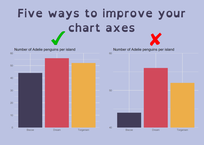
Blog

A blog about all things visualisation, data science, and open source software. Some of these blog posts can also be found on R-bloggers, and many have been featured in the R Weekly highlights.

Sketchy waffle charts in R

Waffle charts can be used to visualise counts or percentages of categorical data. This blog post describes a slightly unusual solution to creating sketchy looking waffle charts in R using the {sf} and {roughsf} packages.

April 29, 2024

A webR powered Shiny app for browsing TidyTuesday plots

Shinylive, GitHub Actions, and R - the magic combination to create an app that updates itself every week. This blog post gives a walk-through of scheduled data collection, building a Shiny app to display it, and deploying with Shinylive.

March 26, 2024

Answering some ‘Forecasting with GAMs in R’ questions

After running the ‘Forecasting with generalised additive models (GAMS) in R’ workshop with Forecasting for Social Good, there were a few questions that we didn’t get the chance to answer. This blog post aims to answer some of them.

February 26, 2024

Four ways to streamline your R workflows

Finding ways to reduce manual tasks when programming, like copying and pasting files or code, can save you time and minimise the risk of errors. This blog post guides you through a few small changes to your R workflow to help reduce manual tasks and streamline your programming workflows in R.

December 31, 2023