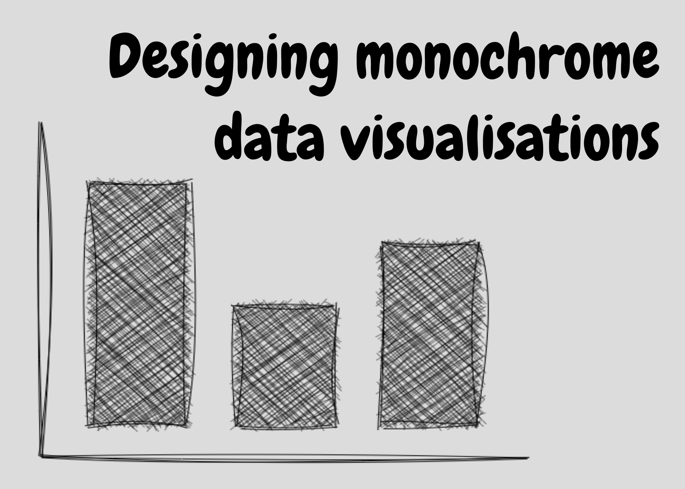
Blog

Blog about all things R, data science, and visualisation.

Five ways to improve your chart axes

A poor choice of axes for your chart can make it more difficult to understand, and in some cases, suggest misleading conclusions. In this blog post, we’ll look at five ways to make better choices about your axes and stop relying on default settings.

September 3, 2024

Creating typewriter-styled images in R

This blog post explains the process of manipulating images using {imager} in R, processing pixel data, and using it to create a new version of an image that looks like it was printed with a typewriter!

August 1, 2024

Annotated area charts with plotnine

The plotnine visualisation library brings the Grammar of Graphics to Python. This blog post walks you through the process of creating a customised, annotated area chart of coal production data.

July 11, 2024

What’s new in {PrettyCols} 1.1.0?

Series: {PrettyCols}

{PrettyCols} is an R package containing aesthetically pleasing colour palettes that are compatible with {ggplot2}. Find out about new features and palettes contained in the latest release!

June 20, 2024

Coloured text in {ggplot2}: {ggtext} vs {marquee}

An alternative to a traditional legend is using coloured text in a subtitle. In {ggplot2}, we can do this using the {ggtext} package. You can also do it using the new {marquee} package. How do they compare?

June 4, 2024