Making art in Python with plotnine
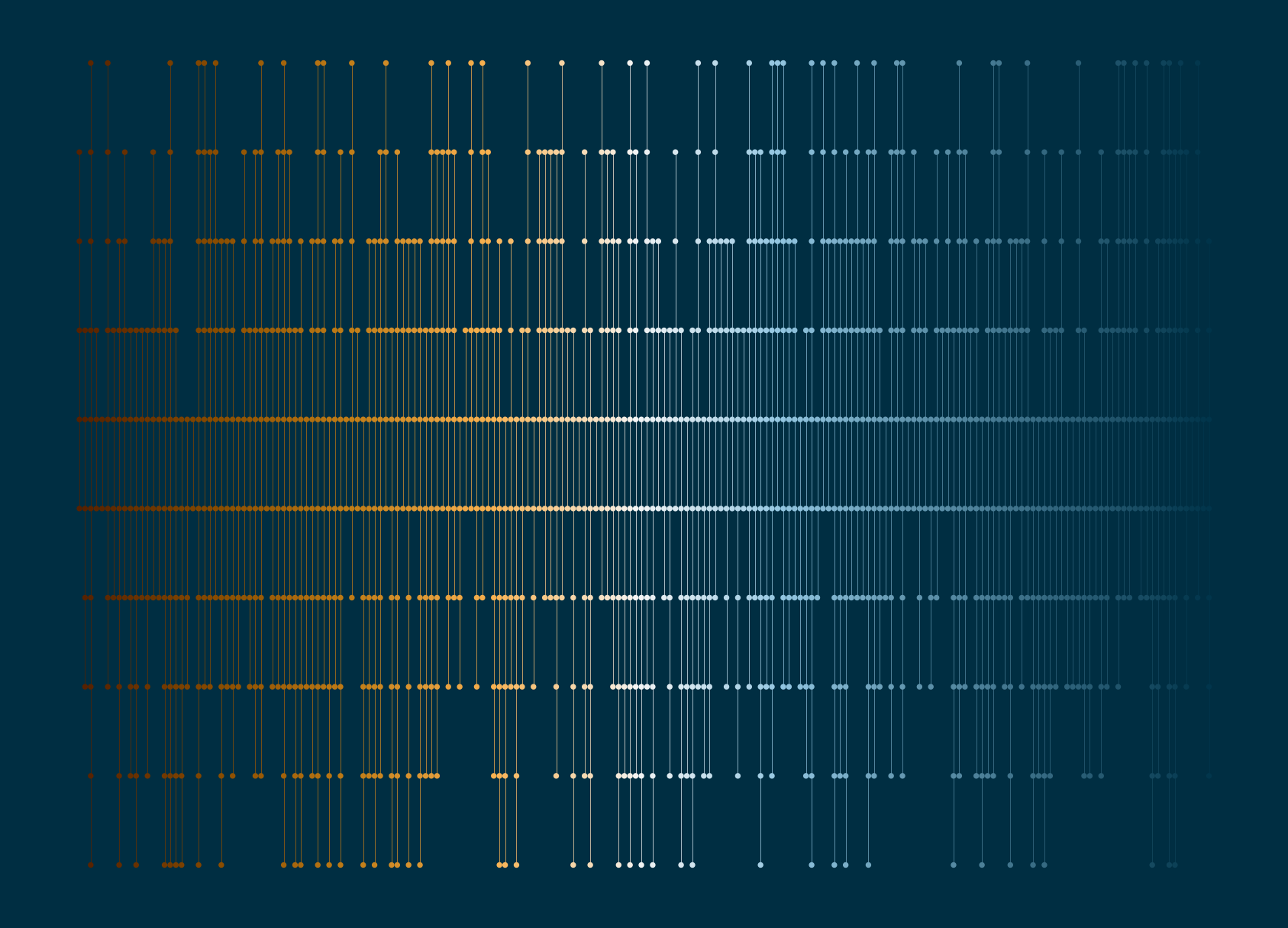
Generative art is the process of creating artwork through a set of pre-determined rules often with an element of randomness - art with algorithms. And Python is great for implementing algorithms, so we can use it to make art! We’re going to walk through step-by-step how to make the following piece of art in Python:
Let’s start by importing the packages we’ll need:
import random
import pandas as pd
import matplotlib.colors as mcolors
import plotnine as pn
We’ll use random for generating random samples of data, pandas for manipulating our generated data, matplotlib.colors for generating random colours, and plotnine for visualising.
I’ve seen
import plotnine as p9orimport plotnine as ggused as alternatives topnand there doesn’t seem to be a strong consensus on which one to use, so use whichever you like!
We’re later going to create a function that generates this piece of art, so let’s save ourselves some time by setting up some parameters that we’ll later use as function arguments:
n_x=200
max_y=10
size=0.001
linewidth=0.1
bg_col="#002e42"
col_palette=["#552000", "#8a4d00", "#c17d17", "#f8b150", "#f5f5f5", "#93c6e1", "#5f93ac", "#2e627a", "#00344a"]
s=1234
Here, n_x is the number of vertical lines; max_y is the maximum height of the vertical lines; size is the size of the points; linewidth is the width of the vertical lines; bg_col is the background colour; col_palette is a list of hex colours that we’ll use to colour the lines and points; and s is the random seed to make sure we can reproduce our art twice!
The mathematics of art
When I first started making generative art, I quickly realised there was a lot more maths involved than I initially thought. Generally we have a combination of rules and randomness. In this art piece these take the following forms:
Randomness:
- the start point of each vertical line
- the end point of each vertical line
Rules:
- lines start and end within some range (between 0 and some upper value)
- the line should start in the first half of the range, and end in the second half
- points should be drawn equally spaced between each the start and end points of each line
Let’s start with the random elements! We start by setting a random.seed() to make sure we can always recreate our art. The start points are always integer values between 0 and half of our max_y value. The end points are similar but exist in the upper half of the range. We use range to generate a sequence of possible start/end points, and then the random.choices() function to sample from that sequence and set the start and end points for each of our n_x vertical lines.
# start and end points
random.seed(s)
n_y_start=random.choices(range(round(max_y/2)), k=n_x)
n_y_end=random.choices(range(round(max_y/2)+1, max_y + 1), k=n_x)
Now we can move onto the rules…
Here, we want to use the start and end points to construct the x and y coordinates where the plotted points will go (and where the lines will connect). For each vertical line, the y-cordinates will be an integer sequence between the start and end values. The x-coordinate will be a vector of the same length, with a repeated value denoting the number of the vertical line.
x_list=[]
y_list=[]
for i in range(n_x):
  x_list.extend([i]*len(range(n_y_start[i], n_y_end[i])))
  y_list.extend(range(n_y_start[i], n_y_end[i]))
We can then create a pandas dataframe to prepare our data for plotting:
plot_data = pd.DataFrame({'x': x_list, 'y': y_list})Finally, we need to decide what colours to use! We have our list of hex colours, and what we can do is interpolate between those colours to get a smooth gradient using mcolors.LinearSegmentedColormap. The mcolors.to_hex() function then converts them to hex values that we can pass into our plotting functions later on.
# choose colours
cmap=mcolors.LinearSegmentedColormap.from_list('custom_cmap', col_palette, N=len(plot_data.index))
plot_data['col']=[mcolors.to_hex(cmap(i)) for i in range(len(plot_data.index))]
Visualisation with plotnine
The plotnine library is a Python implementation of a grammar of graphics based on the {ggplot2} R package. It allows you to create plots by mapping variables in a dataframe to the visual aspects that make up the plot.
Let’s create an initial plot by using the pn.ggplot() function. We need to specify two arguments: (i) which data set we want to plot in the data argument; and (ii) which columns in the data should be mapped to each plot element in the mapping argument. Here, we (unsurprisingly) put the x values on the x-axis, and the y values on the y-axis. Since we want to draw only vertical lines, rather than connect all points, we also using the group argument and group by the x values to draw one line for each unique x value. We also set map the colour column col to the colour element. Note that this all happens inside the pn.aes() function - aes being short for aesthetics.
(pn.ggplot(data=plot_data, mapping=pn.aes(x="x", y="y", group="x", colour="col")))
This gives us very little so far. We have a plotting grid with the axes limits and labels, but no actual points or lines yet. We can add geometries i.e. plotting shapes using different geom_ functions. We add points with pn.geom_point() and lines with pn.geom_line(). We can control the size of the points and the width of the points using the size argument inside each of these functions.
(pn.ggplot(data=plot_data, mapping=pn.aes(x="x", y="y", group="x", colour="col")) +
  pn.geom_line(size=linewidth) +
  pn.geom_point(size=size))
There’s one very clear issue with this plot - there’s a huge legend on the right hand side! Also, the colours aren’t actually the ones we wanted to use. These two problems are actually related and can be solved with one additional line: add pn.scale_colour_identity() to set the colour scale equal to the values in the dataframe. Since the colour elements are no longer mapped to data values, the legend will disappear as well.
The grey background and axis lines also aren’t very useful in the context of art, and so we want to remove them completely using pn.theme_void(). Instead, we can add a different colour to the background with a custom theme. The plot_background argument of pn.theme() allows us to add our own background colour.
(pn.ggplot(data=plot_data, mapping=pn.aes(x="x", y="y", group="x", colour="col")) +
  pn.geom_line(size=linewidth) +
  pn.geom_point(size=size) +
  pn.scale_colour_identity() +
  pn.theme_void() +
  pn.theme(plot_background=pn.element_rect(fill=bg_col, colour=bg_col)))
Building a function
We can create multiple different versions of our art by varying the different parameters. It’s much easier to do this if we create a function first:
def art(n_x, max_y, size, linewidth, bg_col, col_palette, s):
  """Generates plot of lines and points."""
  # generate data
  random.seed(s)
  # start and end points
  n_y_start=random.choices(range(round(max_y/2)), k=n_x)
  n_y_end=random.choices(range(round(max_y/2)+1, max_y + 1), k=n_x)
  # get x and y co-ordinates in dataframe
  x_list=[]
  y_list=[]
  for i in range(n_x):
    x_list.extend([i]*len(range(n_y_start[i], n_y_end[i])))
    y_list.extend(range(n_y_start[i], n_y_end[i]))
  plot_data = pd.DataFrame({'x': x_list, 'y': y_list})
  # choose colours
  cmap=mcolors.LinearSegmentedColormap.from_list('custom_cmap', col_palette, N=len(plot_data.index))
  plot_data['col']=[mcolors.to_hex(cmap(i)) for i in range(len(plot_data.index))]
  # plot data
  p = (pn.ggplot(data=plot_data, mapping=pn.aes(x="x", y="y", group="x", colour="col")) +
    pn.geom_line(size=linewidth) +
    pn.geom_point(size=size) +
    pn.scale_colour_identity() +
    pn.theme_void() +
    pn.theme(plot_background=pn.element_rect(fill=bg_col, colour=bg_col)))
  return p
Then we can finally call our function:
p = art(n_x=200, max_y=10, size=0.001, linewidth=0.1, bg_col="#002e42", col_palette=["#552000", "#8a4d00", "#c17d17", "#f8b150", "#f5f5f5", "#93c6e1", "#5f93ac", "#2e627a", "#00344a"], s=1234)
and save a copy as a PNG with pn.ggsave():
pn.ggsave(p, filename="Images/nexus.png", height=5, width=7, dpi=300)or try different values for the arguments!
art(n_x=300, max_y=20, size=0.001, linewidth=0.1, bg_col="#FAE3E3", col_palette=["#F7D4BC", "#CFA5B4", "#C98BB9", "#846B8A"], s=1234)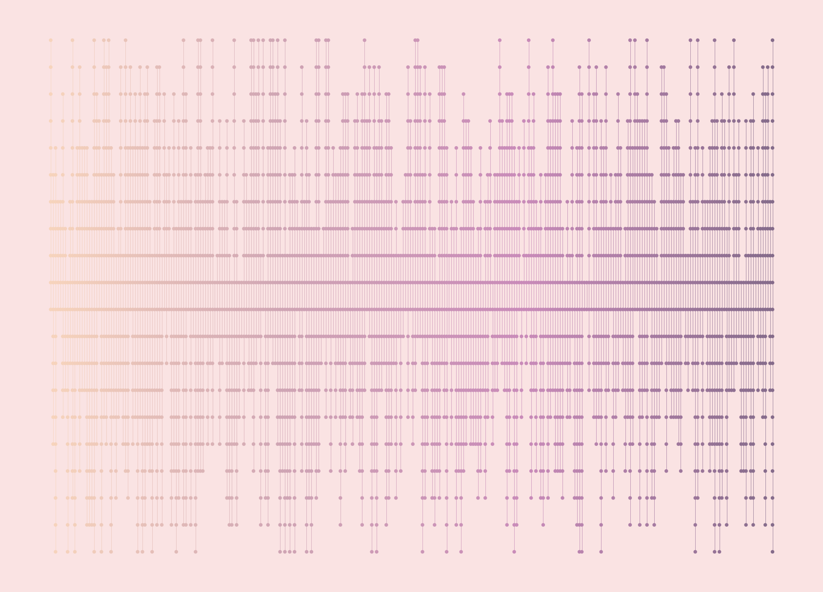
Other resources
The
plotninedocumentation provides instructions for creating plots usingplotnineand there are plenty of examples in the Gallery section.I previously wrote a blog post about Best (artistic) practices in R, and pretty much everything written there also applies to art in Python.
Geoffrey Bradway wrote a blog post about plotter art using voronoi diagrams that uses
matplotlibinstead ofplotninefor visualisation.
Reuse
Citation
@online{rennie2023,
  author = {Rennie, Nicola},
  title = {Making Art in {Python} with Plotnine},
  date = {2023-11-08},
  url = {https://nrennie.rbind.io/blog/making-art-python-plotnine/},
  langid = {en}
}