Getting started with {gt} tables
What is {gt}?
{gt} is an R package designed to make it easy to make good looking tables. My favourite feature of the {gt} package, is the ability to combine plots and tables. I’ve definitely spent time in the past deciding whether data would better presented in a table or in a plot, but {gt} allows me to combine them.
I recently found some time to explore {gt} and make a table which combines textual data with plots, to visualise the most spoken languages in the world. This blog post will demonstrate how to create a basic {gt} tables, adding plots as a column, and editing the look of the table. All code used in this post is available in this GitHub repository.
This blog post assumes you have some basic knowledge of {tidyverse} packages - mainly {dplyr} and %>%, the pipe operator. Although it will demonstrate the data wrangling process, it is not the focus of the blog post. We’ll be using multiple packages from the {tidyverse}, along with {readxl} to read in the data, {purrr} to create multiple plots, and of course {gt}.
library(readxl)
library(tidyverse)
library(gt)
library(purrr)
Data
The dataset used in this blog post comes from Diversity in Data and can be downloaded here. The date set contains information on the top 100 most spoken languages in the world. To limit the length of the table we’ll be producing, we’ll only look at the top 10. The data set contains information on the rank of each language, the total number of speakers, the number of native speakers and the origin of each language.
The data can be read in using read_xlsl() and converted to a tibble. The data is already sorted in rank order so we can simply using slice_head(n = 10) to look at the top 10 most widely spoken languages.
df <- tibble(read_xlsx("100 Most Spoken Languages.xlsx")) %>%
    slice_head(n = 10)
Data Wrangling
To create a table using {gt}, we first need to create a tibble (or data frame) where each column in the tibble will become a column of our table. So before we begin wrangling our data, we need to think about what columns we want our final table to contain.
The final table will contain 4 columns: (i) the rank, (ii) the name of the language, (iii) some textual information about the language, and (iv) a bar chart showing the total and native speakers of the language. We should have a tibble with 4 columns and 10 rows.
The first two columns and quite simple - they already exist in the original data set in the format we need them to be in. For the third column, we can use mutate() to add a new character column called "description" to the tibble.
df <- df %>%
  mutate(description =
           c("English is the most spoken language in the world in terms of total speakers, although only the second most common in terms of native speakers.",
             "Mandarin Chinese is the only language of Sino-Tibetan origin to make the top ten, and has the highest number of native speakers.",
             "Hindi is the third most spoken language in the work, and is an official language of India, and Fiji, amongst others.",
             "Spanish is an Indo-European language, spoken by just over half a billion people worldwide.",
             "French is an official language of Belgium, Switzerland, Senegal, alongside France and 25 other countries. It is also of Indo-European origin.",
             "Standard Arabic is the only language of Afro-Asiatic origin in the top ten, and has no native speakers according to www.ethnologue.com.",
             "Bengali is the official and national language of Bangladesh, with 98% of Bangladeshis using Bengali as their first language.",
             "Russian is an official language of only four countries: Belarus, Kazakhstan, Kyrgyzstan and Russia; with over a quarter of a billion total speakers.",
             "Portuguese is spoken by just under a quarter of a billion people, with almost all (around 95%) being native speakers.",
             "Indonesian is the only Austronesian language to make the top ten"))
Alternatively, you could store these descriptions in a separate file and then join it to the original data frame.
Before getting started on making the plots, we need to format the two numeric columns we’ll be using. Currently, both "Total Speakers" and "Native Speakers" are stored as character vectors in the form "1,132M". We want this to be a numeric value of 1132. We use mutate() again to add new columns with the correctly formatted numeric columns. This is done using regular expressions.
df <- df %>%
  mutate(
    Total = as.numeric(
      unlist(lapply(
        regmatches(`Total Speakers`, gregexpr("[[:digit:]]+", `Total Speakers`)), function(x) str_flatten(x)))),
    Native = as.numeric(
      unlist(lapply(
        regmatches(`Native Speakers`, gregexpr("[[:digit:]]+", `Native Speakers`)), function(x) str_flatten(x)))))
We also convert and NA values to 0, and remove columns we no longer need.
df <- df %>%
  mutate(Native = replace_na(Native, 0),
         Nonnative = Total - Native) %>%
  select(Rank, Language, description, Total, Native, Nonnative)
Adding plots to tables
In order to add a column of plots to the table, we need to:
- filter the dataframe to use only the relevant row
- make a bar chart using the data in each row
- programmatically create the plot for each row of the table
The easiest way to do this, in my opinion, is to create a function which takes two inputs: (i) the dataframe, (ii) a unique identifier for each row - in this case, we’ll use the name of the language to identify each row. Alternatively, we could use the rank, for example.
The function filters the data set to only give the row related to the chosen language. It then converts it into long format, ready to use with {ggplot2}. I initially manually filtered the data set, and prepared one plot to mess around with getting it to look the way I wanted it to, before I made it a function. The output of the function is a single plot, relating to a specific language.
plot_lang <- function(lang, df){
  # prep data
  p_data <- filter(df, Language == lang) %>%
    select(Native, Nonnative, Total) %>%
    pivot_longer(1:2) %>%
    mutate(x = 1,
           name = factor(name, levels = c("Nonnative", "Native")))
  # limits
  lower <- filter(p_data, name == "Native")$value
  upper <- unique(p_data$Total)
  if ((upper - lower) < 100){
    upper = upper + 50
    lower = lower - 50
  }
  # make plot
  ggplot(data = p_data,
         mapping = aes(x = x, y = value, fill = name)) +
    geom_col() +
    scale_fill_manual(values = c("lightgrey", "#355C7D")) +
    labs(x = "", y = "") +
    scale_y_continuous(limits = c(0, plyr::round_any(max(df2$Total), 100, ceiling)),
                       breaks = c(lower, upper),
                       labels = c(filter(p_data, name == "Native")$value, unique(p_data$Total))) +
    theme_minimal() +
    coord_flip() +
    theme(legend.position = "none",
          panel.grid.major = element_blank(),
          panel.grid.minor = element_blank(),
          axis.text.y = element_blank(),
          axis.text.x = element_text(colour = "#355C7D", size = 60, face = "bold"))
}
There were a couple of things to be aware of when making this plot:
- By default, {ggplot2} sets the limits of the plot equal to the limits of the data. If I wanted to display only the proportional difference between native and non-native speakers, this would be fine. Since, I also wanted to display the difference in total speakers across languages, I had to manually specify the limits based on the maximum values in the whole dataframe (not just the selected row).
- I added labels on the x-axis to show the values. Sometimes the values for total and native speakers were close together and the labels overlapped. I also manually specified the position of the labels if they were too close together.
After the plot function was created, we can use map() from {purrr} to create a list of plots, by applying to a list of all languages.
all_lang <- df %>%
  pull(Language)
lang_plots <- purrr::map(.x = all_lang, .f = ~plot_lang(.x, df = df))
Columns of tibbles don’t just store numeric or character vectors, they can also store lists of ggplots. So we can use mutate() again to add our list of plots resulting from applying map() as another column. We also filter out the columns we no longer need.
df <- df %>%
  mutate(plots = lang_plots) %>%
  select(Rank, Language, description, plots)
Making a {gt} table
We now have out input ready to make a table using {gt}. Unfortunately, because our table contains plots, we can’t simply pipe in the tibble to the gt() function. If you try it, you’ll see that the plot column contains code, rather than a plot.
Instead, we:
- select the non-plot columns,
- add a
NAcolumn for the plots, - pipe this into
gt()
tb <- df %>%
  select(Rank, Language, description) %>%
  mutate(plots = NA) %>%
  gt()
Now, we use the text_transform() function to add in our plots to the table. Again, we use map() from {purrr} to apply ggplot_image().
tb <- tb %>%
text_transform(
locations = cells_body(columns=plots),
fn = function(x){
purrr::map(
df$plots, ggplot_image, height = px(80), aspect_ratio = 4
)
}
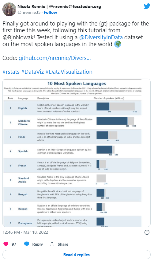
) This results in the table shown below.
All the key components we need are there, but we may want to add some styling to improve the finished look.
Styling tables
There are a lots of different ways to style {gt} tables, so we’ll just highlight a few here:
- Adding text: adding in titles, subtitle, and captions is a key part that you’ll likely want to include in most of your tables. The
tab_header()function adds text above the main body of the table, andtab_source_note()add text below the table.
tb <- tb %>%
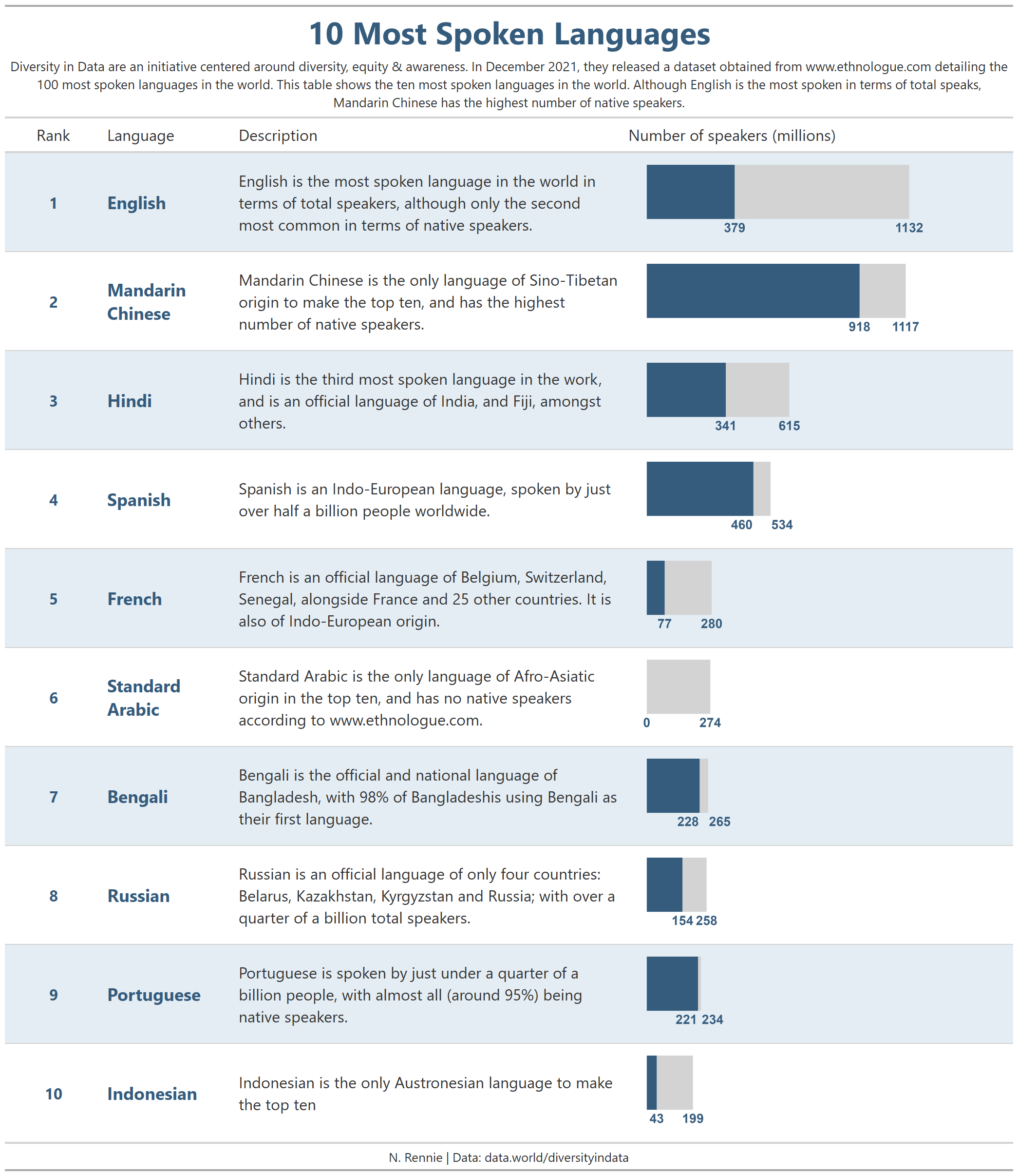
tab_header(
title = "10 Most Spoken Languages",
subtitle = "Diversity in Data are an initiative centered around diversity, equity & awareness. In December 2021, they released a dataset obtained from www.ethnologue.com detailing the 100 most spoken languages in the world. This table shows the ten most spoken languages in the world. Although English is the most spoken in terms of total speaks, Mandarin Chinese has the highest number of native speakers."
) %>%
tab_source_note(
source_note = "N. Rennie | Data: data.world/diversityindata"
)- Styling text: you may want to change the font colour, font family, sizing etc. of the titles or subtitles, as well as the text contained in the columns of the table.
tab_style()is the function used to do all of these.
tb <- tb %>%
  tab_style(
    locations = cells_title(groups = 'title'),
    style = list(
      cell_text(
        size = "xx-large",
        weight="bold",
        color='#355C7D'
      ))) %>%
  tab_style(
    style = list(
      cell_text(
        align = "center",
        size='medium',
        color='#355C7D',
        weight="bold")),
    locations = cells_body(Rank)
  ) %>%
  tab_style(
    style = list(
      cell_text(
        align = "center")),
    locations = cells_column_labels(Rank)
  ) %>%
  tab_style(
    style = list(
      cell_text(
        size='large',
        color='#355C7D',
        weight="bold")),
    locations = cells_body(Language)
  ) %>%
  tab_style(
    style = list(
      cell_text(
        align = "left")),
    locations = cells_body(plots)
  ) %>%
  tab_style(
    style = list(
      cell_text(
        align = "left")),
    locations = cells_column_labels(plots)
  ) %>%
  tab_style(
    style = list(
      cell_text(size = 'small',
                align = "center")),
    locations = cells_source_notes()
)- Edit column names: by default the column headings in the table are the same as the column names in the input tibble. These may not be named in a presentation-ready format, so we can manually rename them using
cols_label().
tb <- tb %>%
  cols_label(
    Rank = "Rank",
    Language = "Language",
    description = "Description",
    plots = "Number of speakers (millions)"
)- Edit column widths: editing the column widths can be done using
cols_width()to make sure that the column is wide enough to make the plot legible.
tb <- tb %>%
  cols_width(
    Rank ~ px(100),
    Language ~ px(135),
    description ~ px(400),
    plots ~px(400)
)- Table width: to ensure that the final table will be displayed and saved correctly, it’s useful to set the total width of the table equal to the sum of the column widths we just set using
tab_options().
tb <- tb %>%
  tab_options(table.width = 1035,
container.width = 1035)- Colouring rows: tables can sometimes be tricky to read, especially if they have lots of rows.
tab_style()can also be used to set different colours for alternating rows.
tb <- tb %>%
tab_style(
style = list(cell_fill(color = "#e4edf4")),
locations = cells_body(rows = seq(1,9,2))
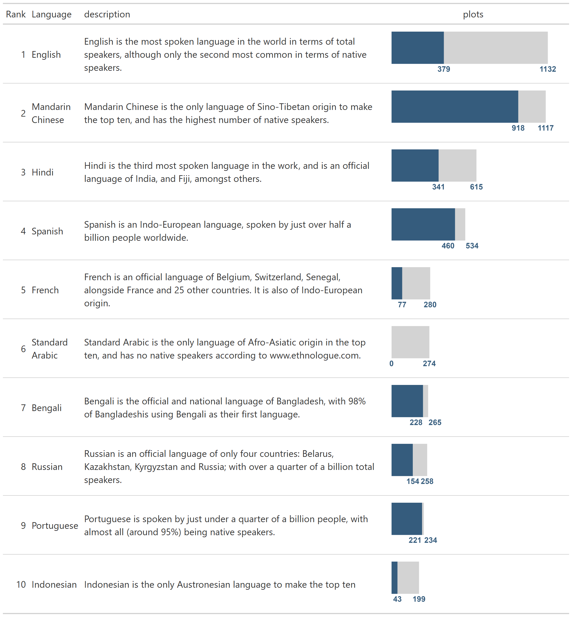
)The final table now looks a little more polished.
Saving your {gt} table
If you’re using RStudio you’ll notice that {gt} tables are previewed in the Viewer pane, rather than the Plots pane, so you can’t just use the Export button. However, the {gt} package does have the gtsave() function which you can use to save a static version of your plot.
gtsave(tb,"languages.png")Alternatively, you can use Rmarkdown to output to HTML, or PDF documents, for example.
Final thoughts
These are just a couple of the things you can do with {gt}. Hopefully, it’s inspired you to explore what it can do. If you want to recreate this table for yourself, the data can be downloaded here and the code is available on GitHub.
When I was first exploring {gt}, I found some resources by Benjamin Nowak very helpful. If you’re already a fan of {gt}, it’s also worth checking out {gtExtras} which provides some additional helper functions to assist in creating beautiful tables with {gt}.
Reuse
Citation
@online{rennie2022,
  author = {Rennie, Nicola},
  title = {Getting Started with \{Gt\} Tables},
  date = {2022-04-21},
  url = {https://nrennie.rbind.io/blog/getting-started-with-gt-tables/},
  langid = {en}
}