theta <- seq(0, 2 * pi, length.out = 1000)
a <- 1
b <- 3
k <- 70
r <- k * (cos(theta)^2 + a * cos(theta) + b)
egg_data <- data.frame(
  x = r * sin(theta),
  y = r * cos(theta)
)Creating a cracked egg plot using {ggplot2} in R
R
Data Visualisation
Inspired by a Visual Capitalist chart, this blog post will show you how to utilise spatial data R packages in a slightly unusual way to create an infographic in the shape of a cracked egg in R.
You can’t make an R plot without breaking eggs… that’s how the saying goes, right? A recent #TidyTuesday data set explored US egg production and, thanks to an excellent suggestion from Tanya Shapiro to create a plot in the style of the Visual Capitalist US egg prices chart, and Deepali Kank’s incredible version of it, I decided to figure out how to crack an egg in R.
Making the egg
First things first, we need to make an egg! The equation of an egg, looks a bit like this:
\[ r = k (cos^2(\theta) + a cos(\theta) + b)\]
We can then get the \(x\) and \(y\) coordinates of the outline using:
\[x = r sin(\theta)\] \[y = r cos(\theta)\]
We can do this in R using the following code:
Let’s check it looks egg-shaped by plotting it using geom_path() from {ggplot2}:
library(ggplot2)
ggplot(
  data = egg_data,
  mapping = aes(x = x, y = y)
) +
  geom_path()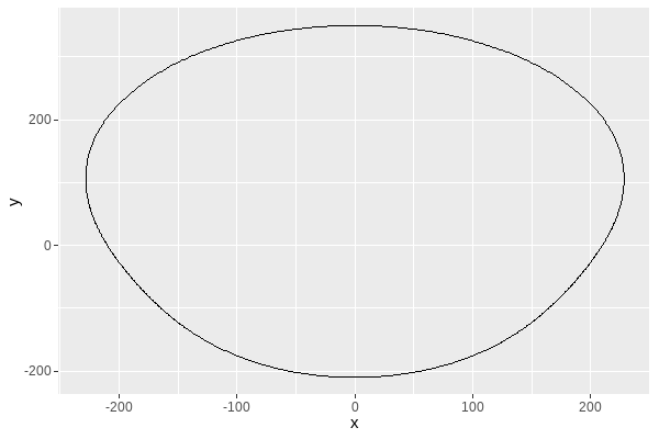
It’s squashed, but you can still tell it looks like an egg shape. Changing to using coord_fixed() should help with how squashed at looks, and you can see what different values of a, and b do in the different versions below:
ggplot(
  data = egg_data,
  mapping = aes(x = x, y = y)
) +
  geom_path() +
  coord_fixed()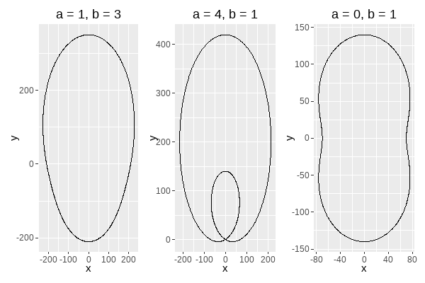
The one on the left is the most egg-shaped of the values I tried so I’ll stick with a = 1 and b = 3. Ideally, I’d also like it to be upside down, with the smaller pointy end at the top, and the easiest way to do that is to multiply the \(y\) coordinate by -1:
egg_data <- tibble::tibble(
  x = r * sin(theta),
  y = -1 * r * cos(theta)
)
There are other ways to flip the axis, including by changing the scales in {ggplot2}, but this approach will make the next steps a little bit easier.
Transforming the egg
Now we need to decide where the egg shape will be cracked into two. There’s a couple of things we need to think about here:
- creating a line chart that shows our data
- transforming the data such that the egg and the line chart can overlap
Let’s start with the line chart, and read in the data:
eggproduction <- readr::read_csv("https://raw.githubusercontent.com/rfordatascience/tidytuesday/master/data/2023/2023-04-11/egg-production.csv")And then calculate the average production per quarter for cage-free organic eggs, and change the units to millions. I also decided to keep the information about quarters, as I’ll use this for annotations later on:
library(dplyr)
library(lubridate)
plot_data <- eggproduction |>
  mutate(
    q_year = quarter(observed_month, type = "year.quarter"),
    q = quarter(observed_month)
  ) |>
  filter(prod_process == "cage-free (organic)") |>
  select(q_year, q, n_eggs) |>
  group_by(q_year) |>
  mutate(n = round(mean(n_eggs) / 1000000)) |>
  select(-n_eggs) |>
  unique()
I tried different levels of aggregation besides quarterly, including monthly and annually but decided that quarterly looked the most cracked-egg-like. We can plot the aggregated data as a line chart using geom_line():
ggplot(
  data = plot_data,
  mapping = aes(x = q_year, y = n)
) +
  geom_line()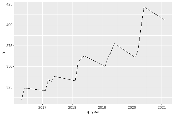
Now let’s plot the egg and our line chart together:
ggplot() +
  geom_path(
    data = egg_data,
    mapping = aes(x = x, y = y)
  ) +
  geom_line(
    data = plot_data,
    mapping = aes(x = q_year, y = n)
  )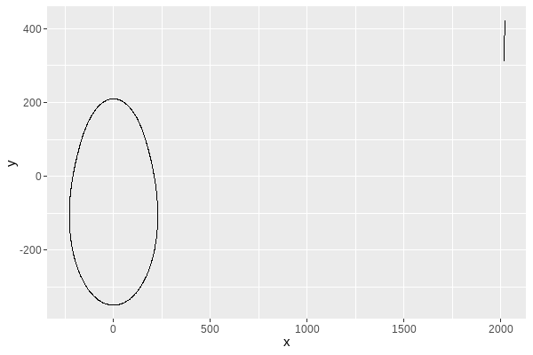
You can see that technically they’re both on the same plot but the line is very squashed in the top right corner. We need to transform the coordinates of either the egg or the line to make them intersect. We can add an constant and a multiplier to the x and y co-ordinates of the egg data, as well as changing the value of k to rescale the egg if need be:
plot_egg <- egg_data |>
  mutate(
    x = 0.0115 * x + 2018.9,
    y = y + 350
  )
and let’s plot the egg and line again:
ggplot() +
  geom_path(
    data = plot_egg,
    mapping = aes(x = x, y = y)
  ) +
  geom_line(
    data = plot_data,
    mapping = aes(x = q_year, y = n)
  )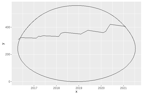
This involved a lot of trial and error to pick the values I was happy with. You can see the process in this making of gif recorded with the {camcorder} package:
Cracking the egg
Now comes the slightly tricky part: we need to crack the egg. There are two things we want here:
- to retain only the bottom part of the cracked egg.
- to be able to colour in the egg
For this, we’re going to use two different packages: {sf} and {lwgeom}. These packages were probably designed for making maps and doing spatial analysis, but it turns out they’re also good for (graphical) egg-making purposes.
The first thing I’m going to do, is convert the line and the egg into spatial objects. The egg will be converted to a polygon, and the line will be converted to a linestring. I’ve applied a further transformation to the y-axis here, to making plotting easier later on (since specific aspect ratios are enforced when we plot spatial data). I probably should have re-factored my initial transformation of the x and y coordinates earlier, but I didn’t for reasons of pure laziness.
library(sf)
egg_poly <- st_polygon(list(cbind(plot_egg$x, plot_egg$y / 70)))
egg_line <- st_linestring(
  matrix(c(plot_data$q_year, plot_data$n / 70),
    ncol = 2
  )
)
Finally, we can split the egg into two pieces using the st_split() function from {lwgeom}. This function returns a list of polygons created by an intersecting line. Here, we get two polygons: the first for the bottom part of the egg, and the second for the top part of the egg.
library(lwgeom)
cropped_sf <- lwgeom::st_split(egg_poly, egg_line) %>%
  st_collection_extract(c("POLYGON"))
We only want to keep the bottom part of the egg, so we can simply plot the first polygon using geom_sf():
ggplot() +
  geom_sf(data = cropped_sf[[1]])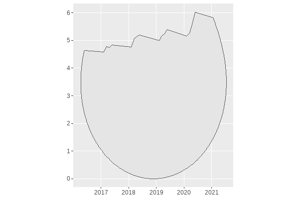
We can add some points and annotations onto the line at the top if we want to make the data easier to read:
ggplot() +
  geom_sf(
    data = cropped_sf[[1]]
  ) +
  geom_point(
    data = filter(plot_data, q == 1),
    mapping = aes(
      x = q_year,
      y = n / 70
    )
  ) +
  geom_text(
    data = filter(plot_data, q == 1),
    mapping = aes(
      x = q_year,
      y = n / 70,
      label = paste0("Jan ", round(q_year), "\n", n)
    )
  )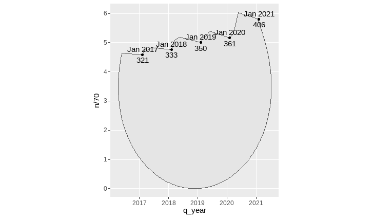
And with a little bit of styling using the theme() function, we have a cracked egg!
Show code: colour and theme
library(ggtext)

# choose colours
bg_col <- "#FFEDDE"
egg_col <- "peachpuff2"
line_col <- "sienna4"
dark_line_col <- "#1B0E07"

# write text
title <- "US Egg Production"
st <- "The cracked line in the egg below shows the average monthly production (in millions)
of cagefree organic eggs in the USA. The data used in this infographic is based on reports produced by the
United States Department of Agriculture, which are published weekly or monthly.<br><br>Data: The Humane League Labs US Egg Production Dataset"

# plot
ggplot() +
  geom_sf(
    data = cropped_sf[[1]],
    fill = egg_col,
    colour = line_col
  ) +
  geom_point(
    data = filter(plot_data, q == 1),
    mapping = aes(
      x = q_year,
      y = n / 70
    ),
    colour = line_col
  ) +
  geom_text(
    data = filter(plot_data, q == 1),
    mapping = aes(
      x = q_year,
      y = n / 70,
      label = paste0("Jan ", round(q_year), "\n", n)
    ),
    colour = dark_line_col,
    size = 8,
    lineheight = 0.8,
    fontface = "bold",
    family = "Commissioner",
  ) +
  labs(
    title = title,
    subtitle = st
  ) +
  theme_void() +
  theme(
    plot.background = element_rect(
      colour = bg_col, fill = bg_col
    ),
    panel.background = element_rect(
      colour = bg_col, fill = bg_col
    ),
    plot.title = element_textbox_simple(
      lineheight = 0.4,
      colour = dark_line_col,
      family = "Fraunces",
      hjust = 0,
      size = 50,
      margin = margin(b = 5, t = -20)
    ),
    plot.subtitle = element_textbox_simple(
      lineheight = 0.45,
      colour = line_col,
      family = "Commissioner",
      hjust = 0,
      size = 24,
      margin = margin(b = 5)
    ),
    plot.margin = margin(10, 10, 10, 10)
  )

# save
ggsave("final.png", units = "in", width = 4, height = 6)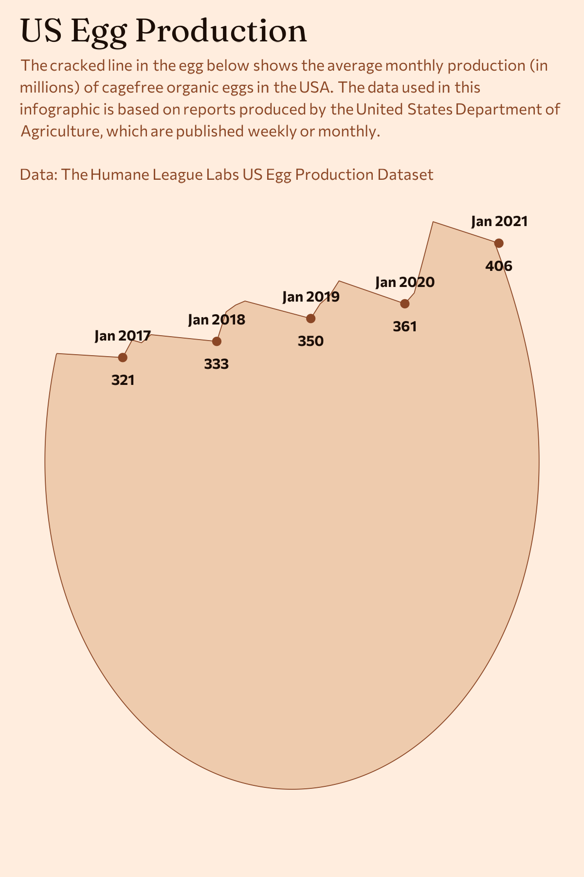
It’s not identical to the Visual Capitalist version, but you should now have all the ingredients you need to crack an egg with R!
A word of caution
Although this was a fun exercise in figuring out how to make this type of chart from a technical perspective, I don’t think it’s an easy to interpret infographic for a couple of reasons. I didn’t include an x or y axis here (although the Visual Capitalist original does), so it’s hard to figure out where the zero line is. It’s not clear which element of the chart is representing the data: the height of the line above the bottom of the egg? the area of the egg shape? If I simply wanted to clearly communicate the data, the line chart alone probably would have sufficed.
You can view the complete code I used to create this visualisation on GitHub.
Reuse
Citation
BibTeX citation:
@online{rennie2023,
  author = {Rennie, Nicola},
  title = {Creating a Cracked Egg Plot Using \{Ggplot2\} in {R}},
  date = {2023-05-04},
  url = {https://nrennie.rbind.io/blog/cracked-egg-plot-ggplot2/},
  langid = {en}
}
For attribution, please cite this work as:
Rennie, Nicola. 2023. “Creating a Cracked Egg Plot Using {Ggplot2}
in R.” May 4. https://nrennie.rbind.io/blog/cracked-egg-plot-ggplot2/.