
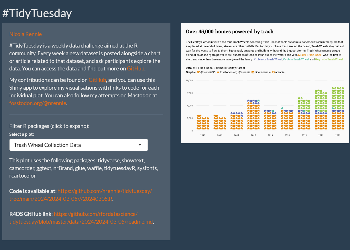
Sketchy waffle charts in R
Waffle charts can be used to visualise counts or percentages of categorical data. This blog post describes a slightly unusual solution to creating sketchy looking waffle charts in R using the {sf} and {roughsf} packages.
Blog about all things R, data science, and visualisation.
Waffle charts can be used to visualise counts or percentages of categorical data. This blog post describes a slightly unusual solution to creating sketchy looking waffle charts in R using the {sf} and {roughsf} packages.
Shinylive, GitHub Actions, and R - the magic combination to create an app that updates itself every week. This blog post gives a walk-through of scheduled data collection, building a Shiny app to display it, and deploying with Shinylive.
After running the ‘Forecasting with generalised additive models (GAMS) in R’ workshop with Forecasting for Social Good, there were a few questions that we didn’t get the chance to answer. This blog post aims to answer some of them.
With the latest 1.4 release of Quarto, it’s now possible to create PDF documents with Quarto using Typst. How does it compare to LaTeX, and is it actually easier to learn and use?

Finding ways to reduce manual tasks when programming, like copying and pasting files or code, can save you time and minimise the risk of errors. This blog post guides you through a few small changes to your R workflow to help reduce manual tasks and streamline your programming workflows in R.
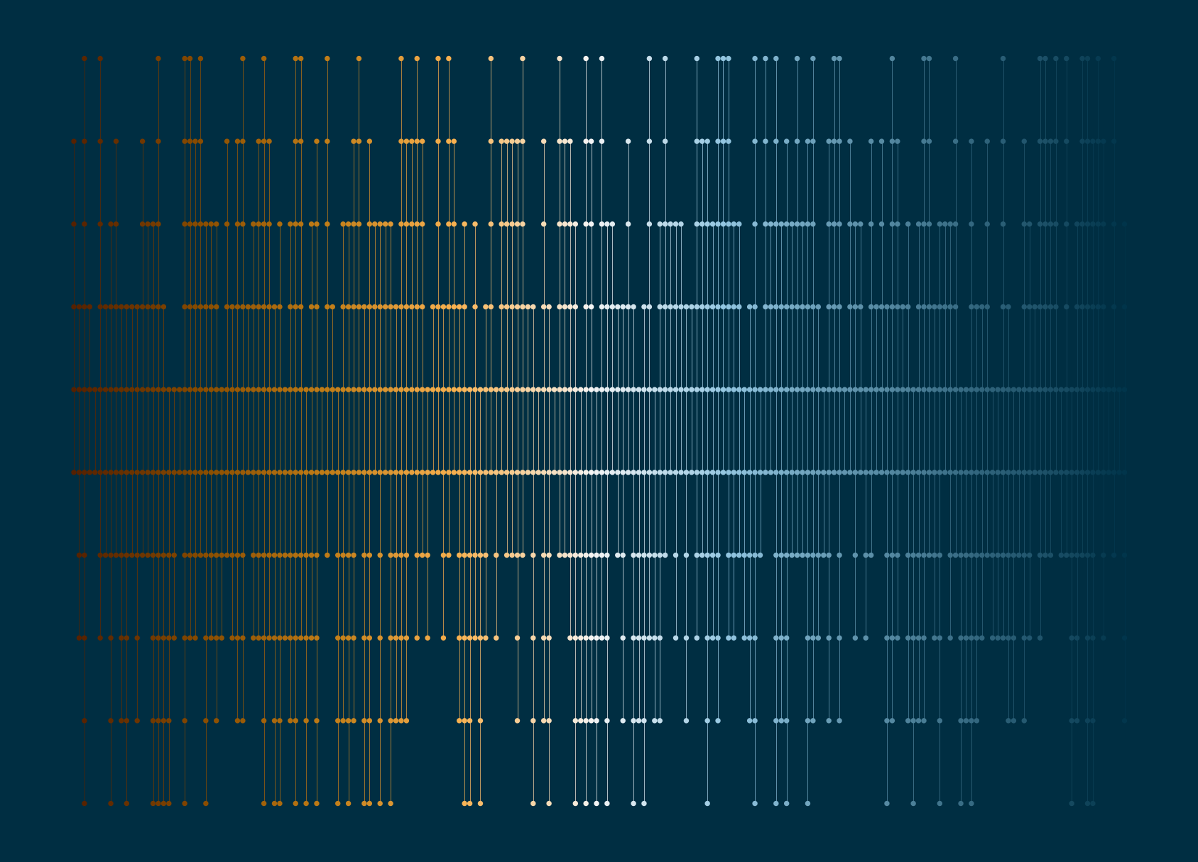
A step-by-step guide to creating art in Python. This blog post covers creating random data, generating colour palettes, visualising with plotnine, and making artistic functions.